Millfield Primary Bath


Town and Country, MO
Designer
Jennifer Chapman
Senior Designer
Photographer
Karen Palmer
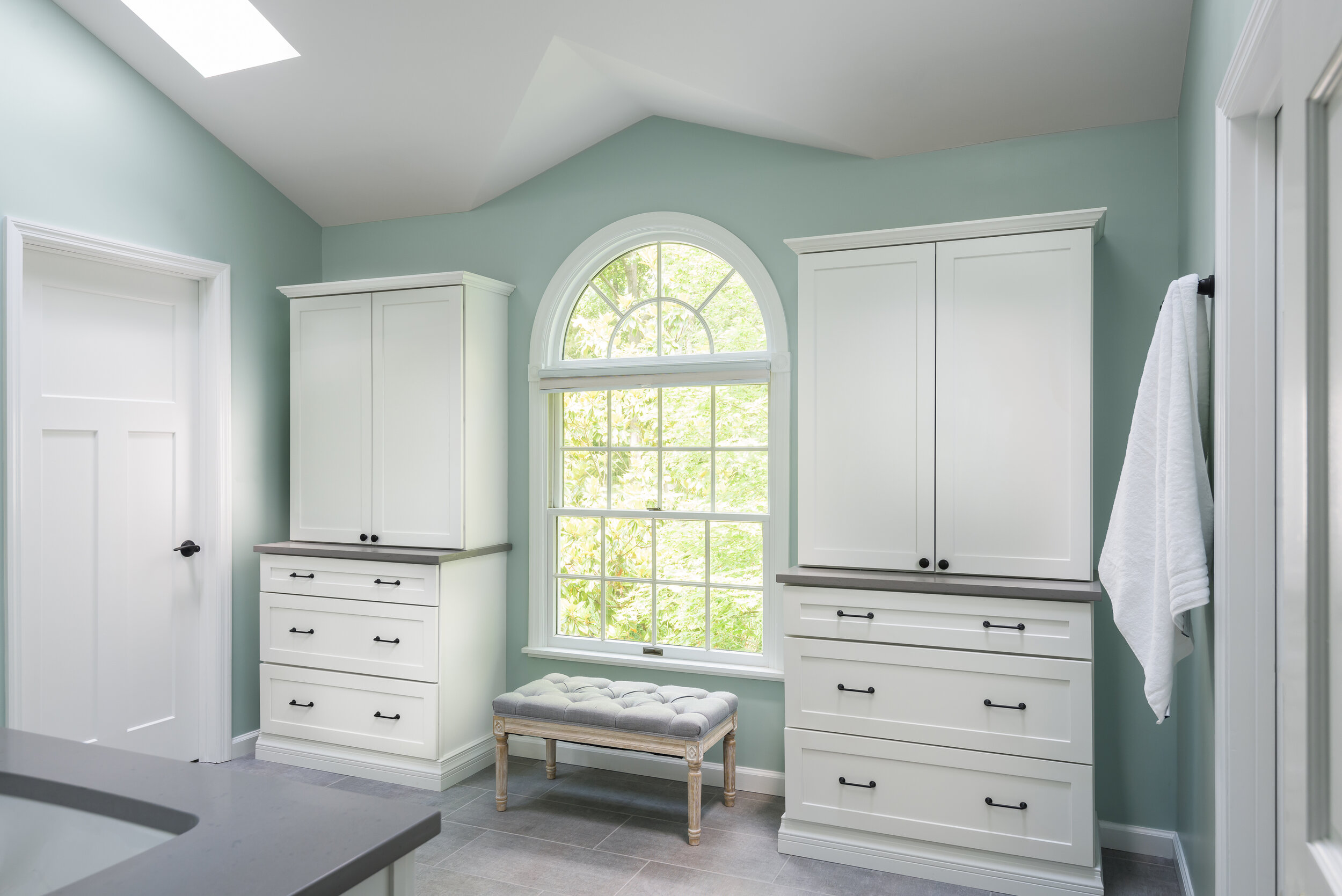
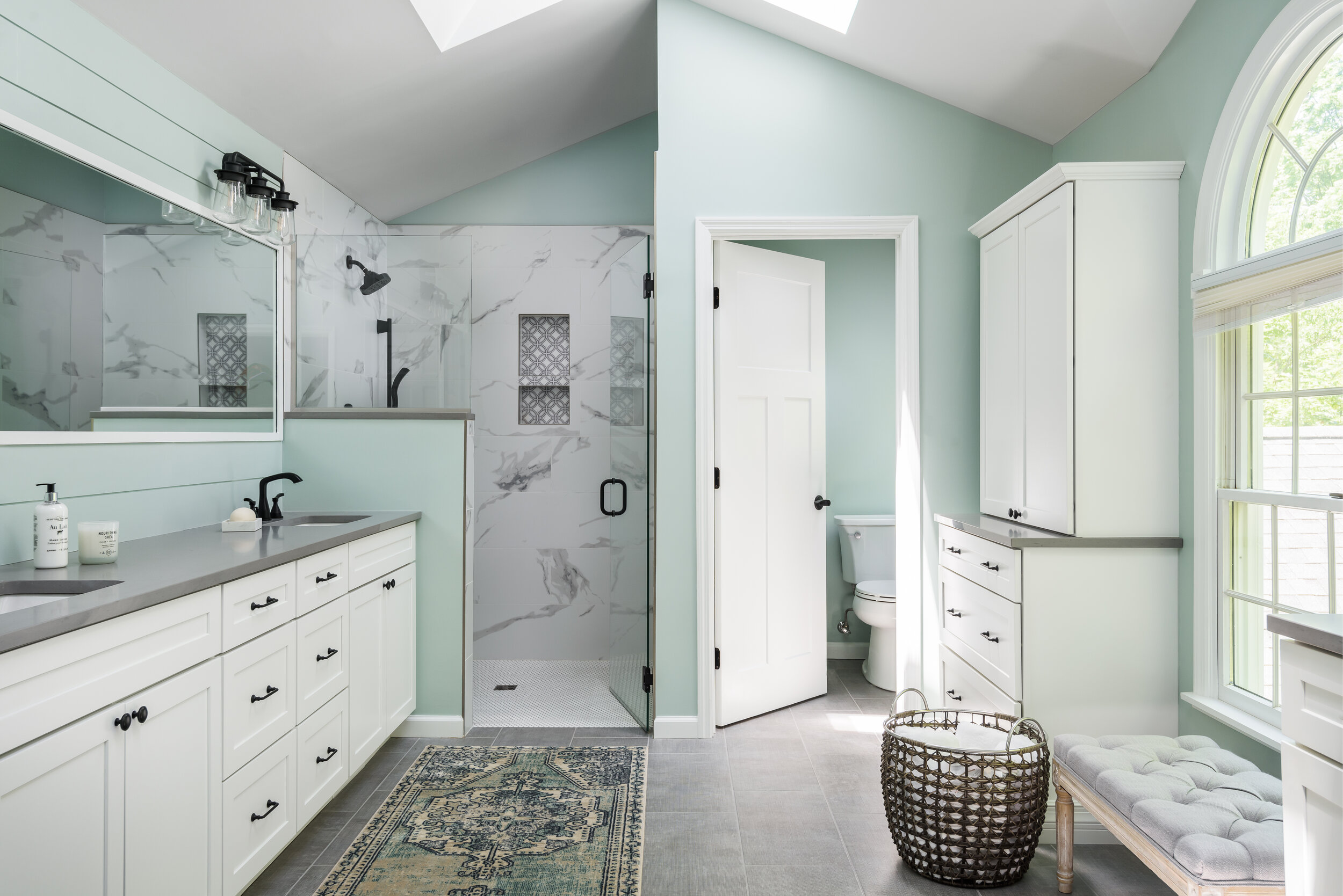
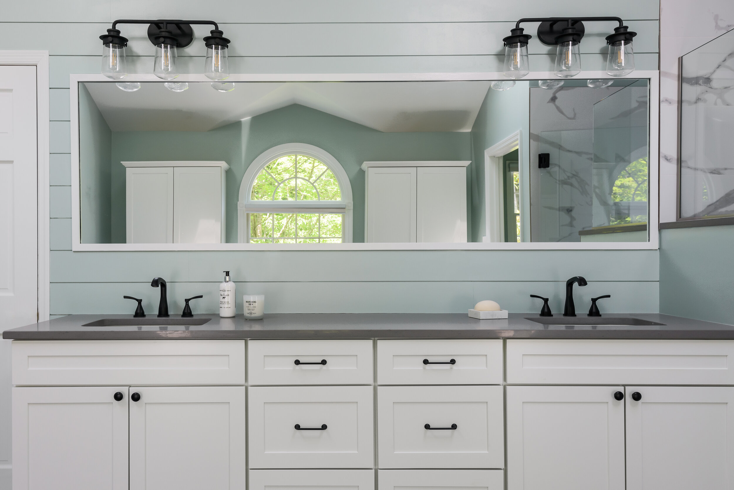
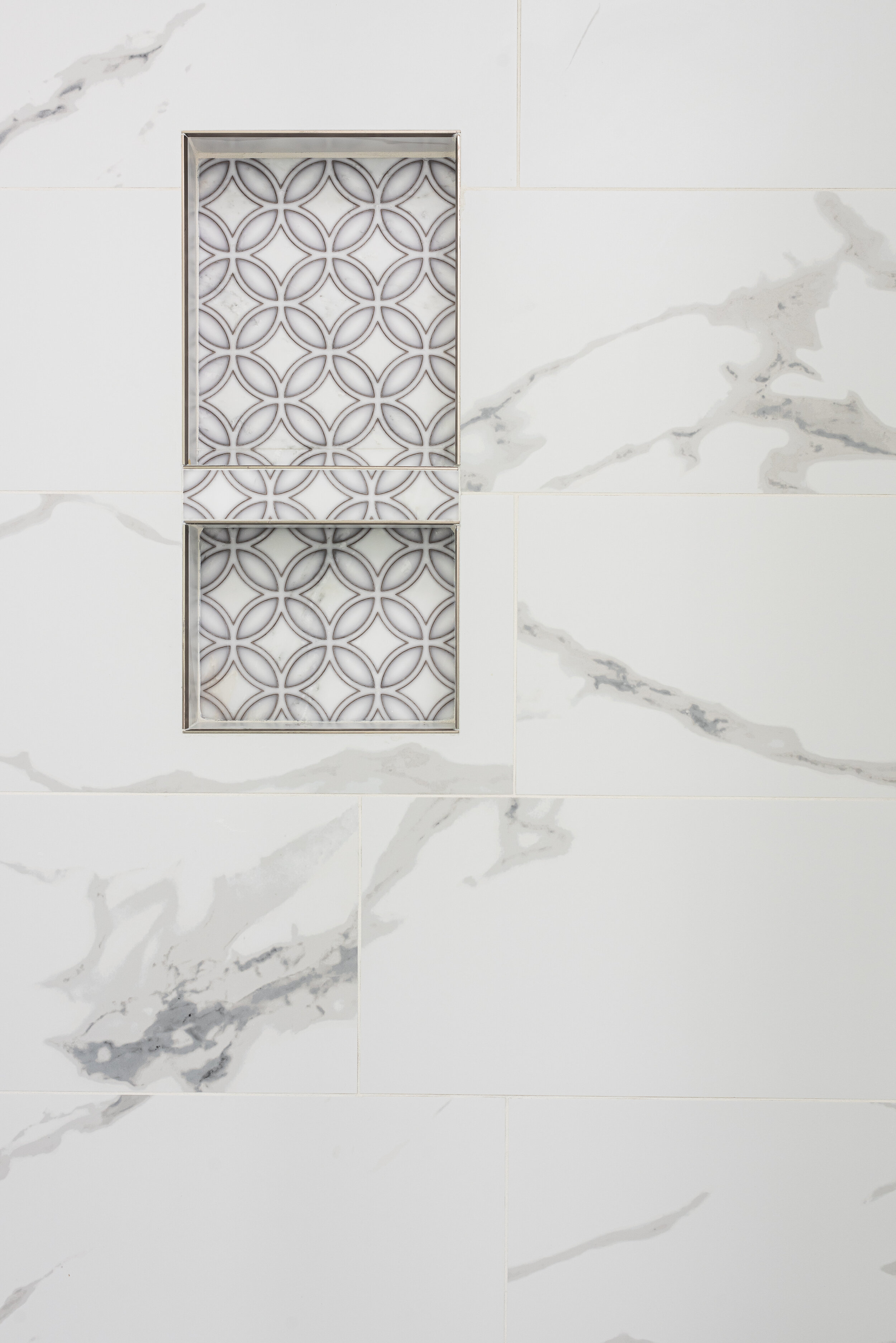
We took this primary bathroom from dark and heavy to light and bright! We started by slightly changing the layout- the water closet and the shower created a strange "V" shape where they intersected. We straightened this line out in order to create more space for each. We chose white cabinets, a large scale white porcelain tile with bold marble-like veining, and gray quartz countertops. We chose a 12 x 24 gray porcelain floor tile with a linen texture for the main flooring and complemented it with white penny tile with gray grout for the zero entry shower floor. We used matte black plumbing fixtures for contrast. The homeowner loved the idea of shiplap so we used it on the vanity wall to add some character. We painted the walls a beautiful aqua to create the feeling of a spa retreat!
“We loved working with Jennifer from LU Design Build to design our master bath! Our finished product turned out amazing. Having a team of experienced people made the whole process so much easier!”


