Cedar Springs
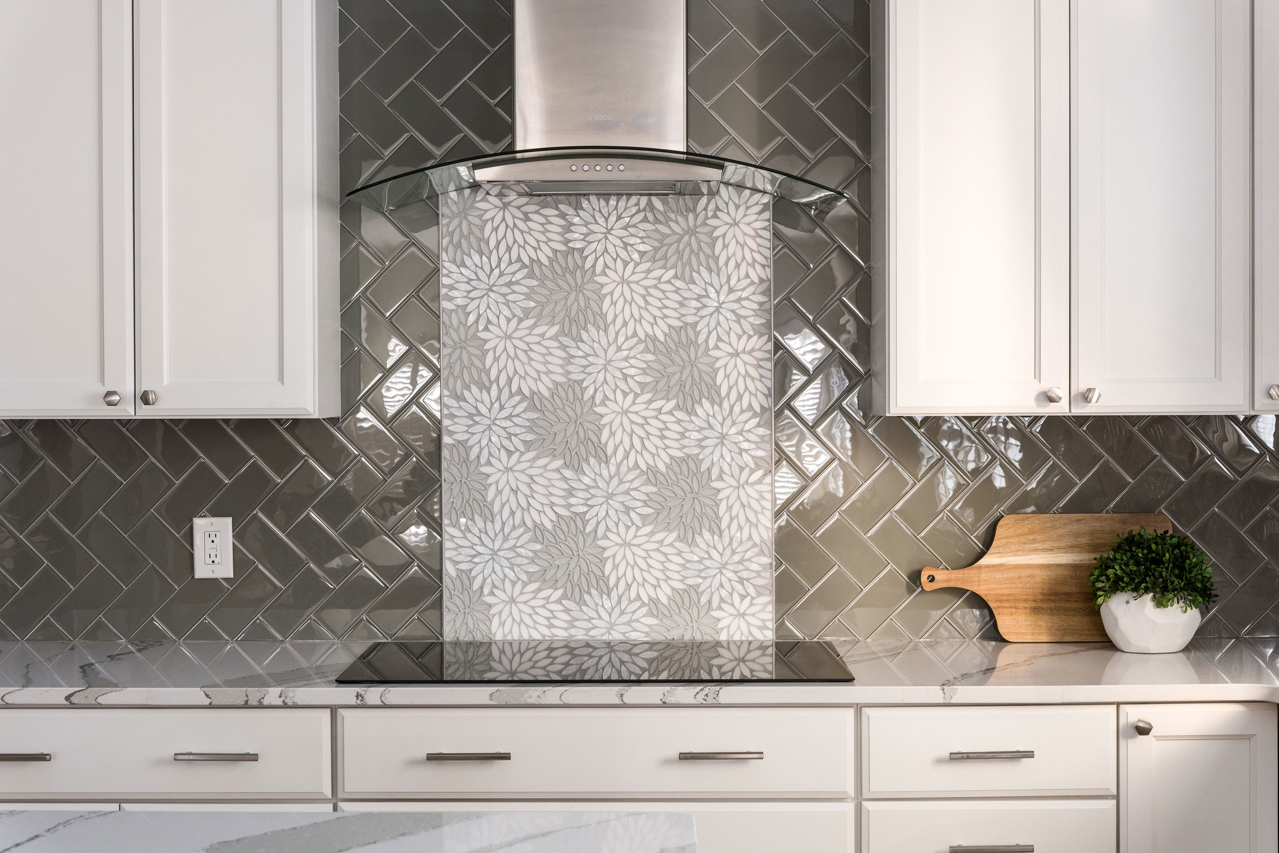
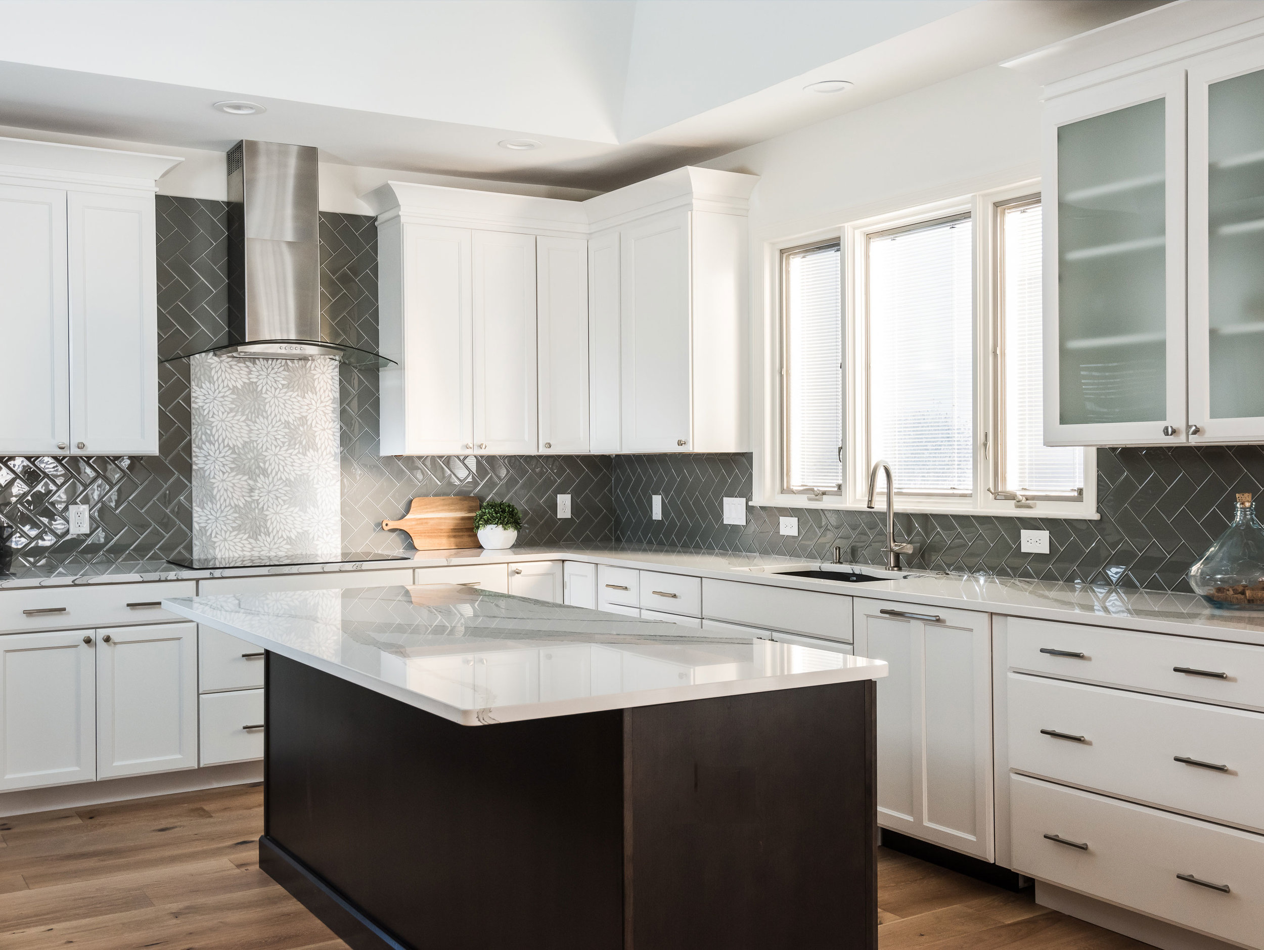
The client wanted a bright and clean but welcoming look for her kitchen. We started with a dark island that grounds the space and kept everything bright and focused on the floral back splash tile that my client fell in love with from the start.
Missouri, 2019
DESIGNER:
Rochelle McAvin
PHOTOGRAPHER:
Karen Palmer Photography
The client wanted a bright and clean but welcoming look for her kitchen. We started with a dark island that grounds the space and kept everything bright and focused on the floral back splash tile that my client fell in love with from the start.
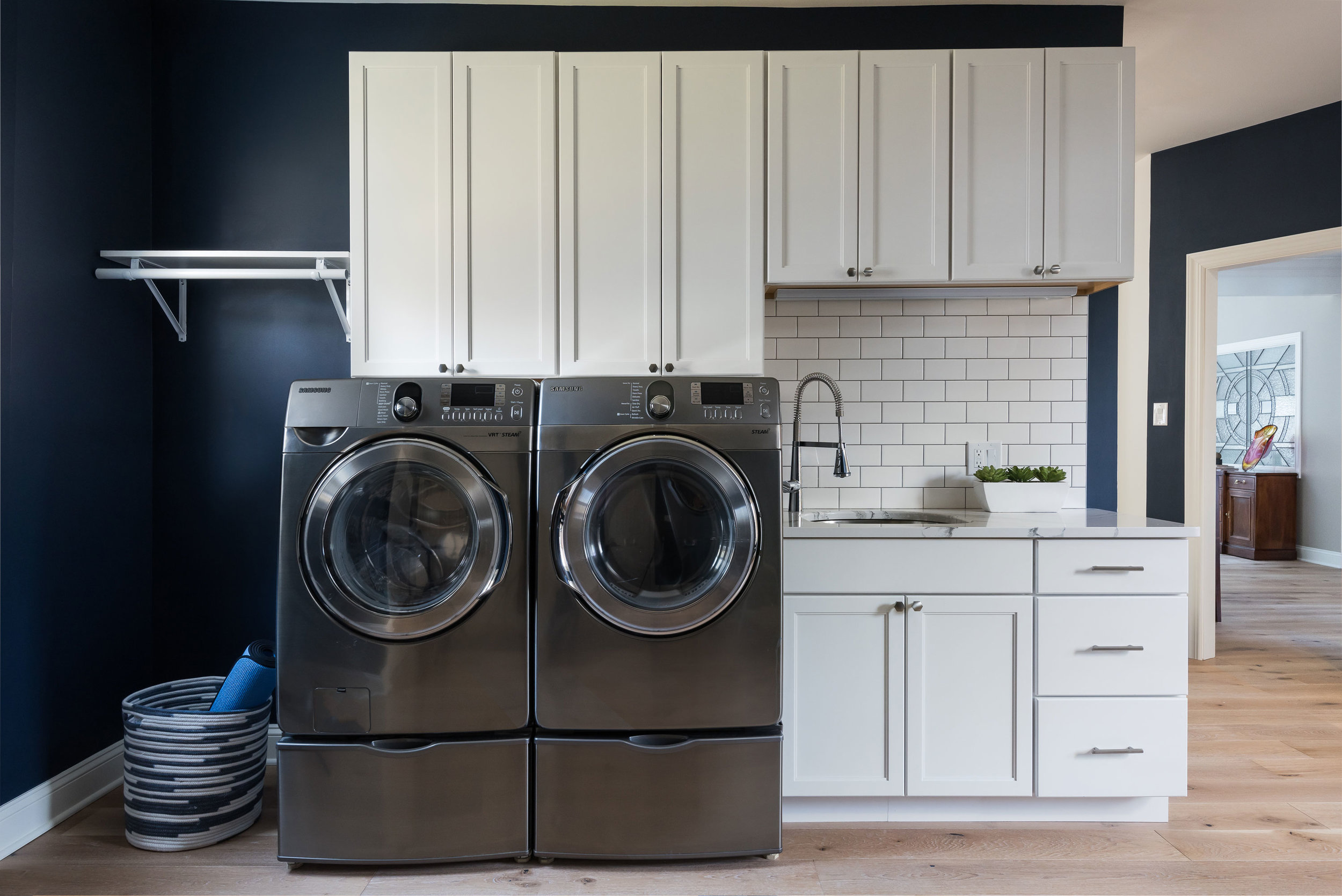
The laundry room is Sherwin Williams Naval and the white cabinets and subway tile keep the look clean and fresh!
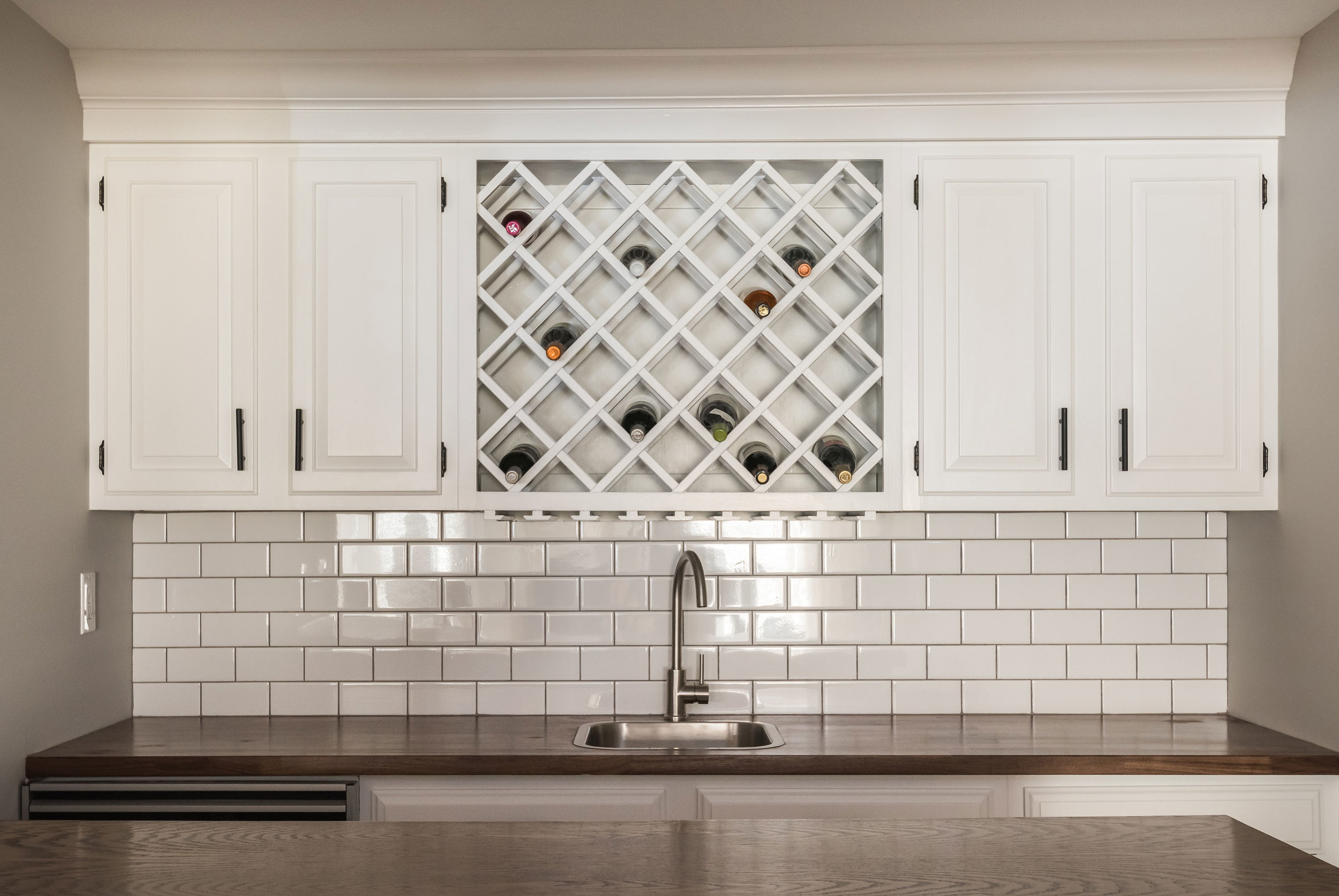
Downstairs in the bar, we freshened up the cabinetry and added a butcher block counter top to cozy up the relaxed space.
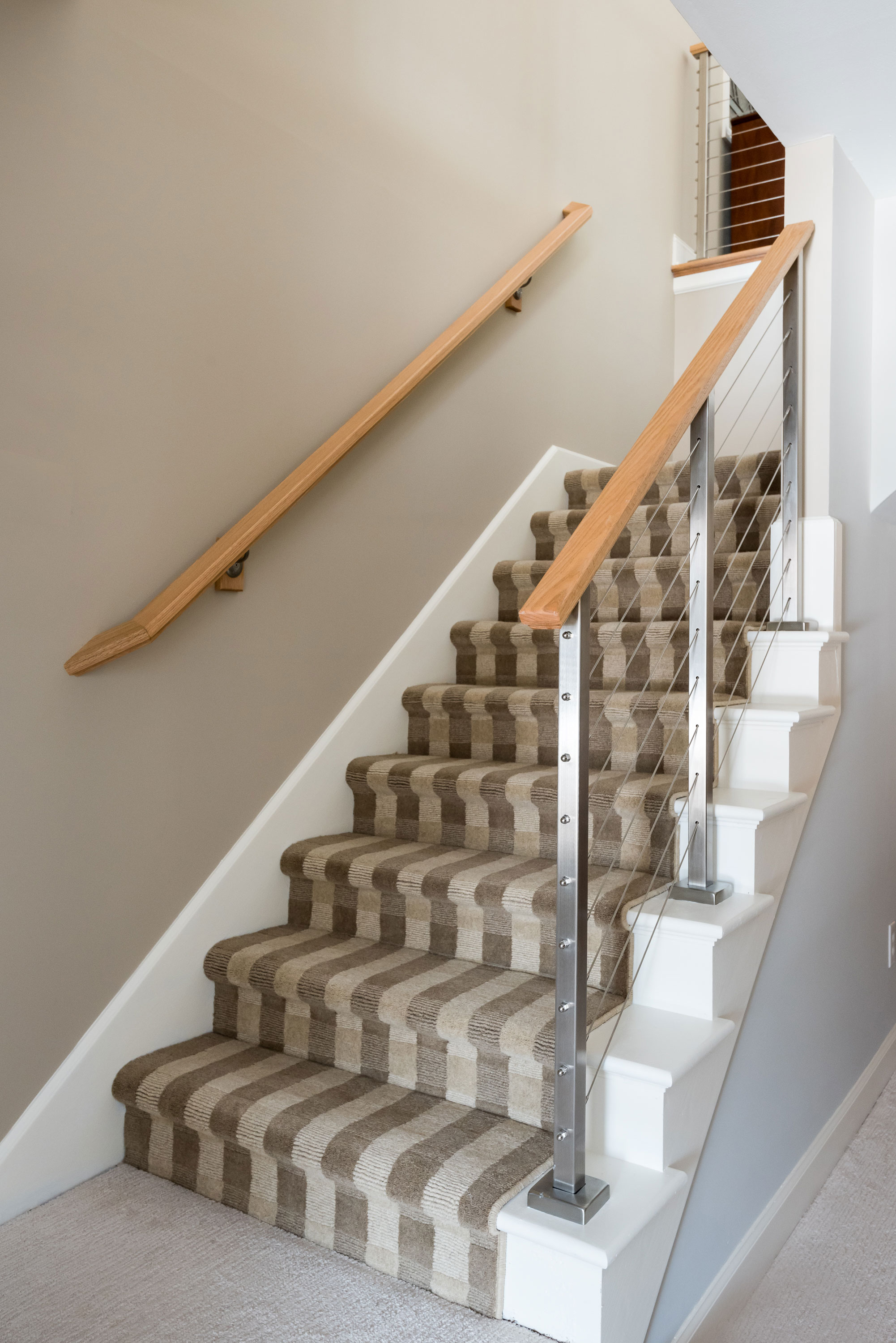
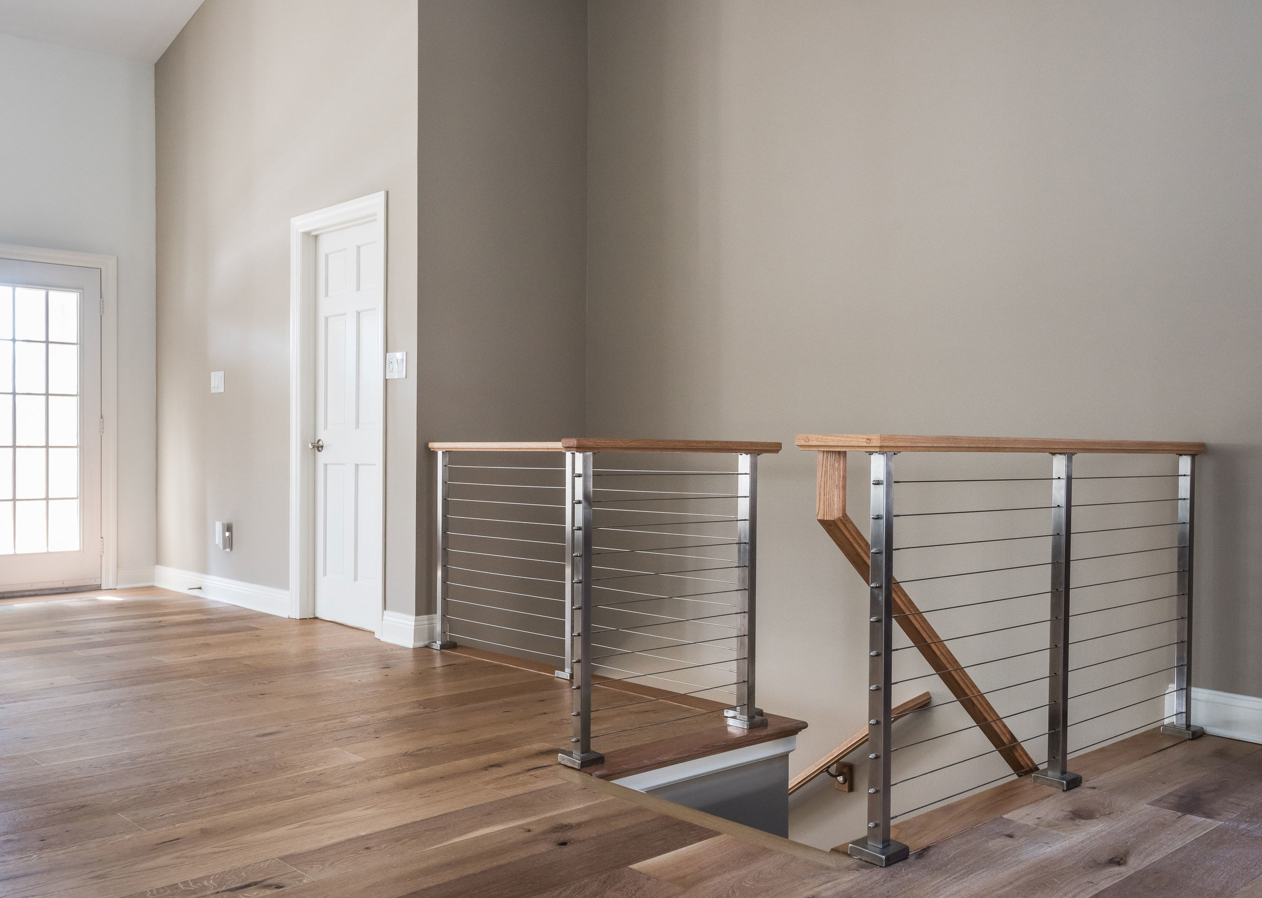
The handrail to the basement originally was a dark and dated wood. We replaced it with a cable rail system that lets the light filter down the steps onto the new textured carpeting. The light, bright space is welcoming and open!
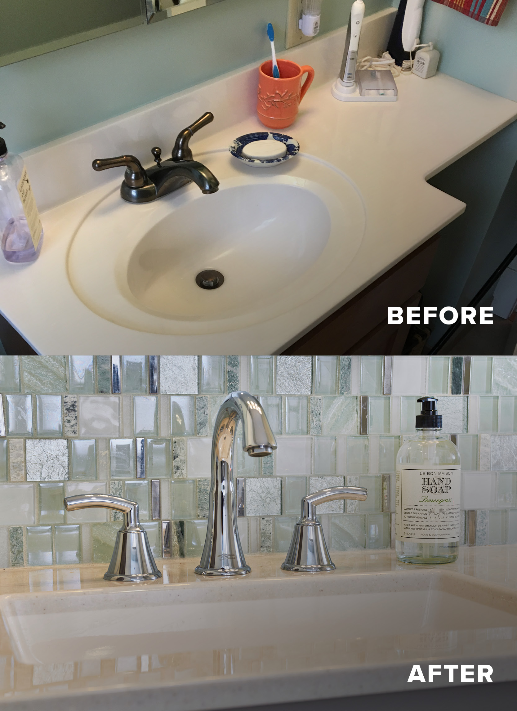
Before and After
Accessible Master Suite Bathroom
Our clients have loved their 86 year old home for nearly half a century. Unfortunately, older homes were not built with aging in place or universal design in mind. That's where we come in!
Accessible Primary Suite Bathroom
Missouri, 2018
DESIGNER:
Jennifer Chapman
PHOTOGRAPHER:
Karen Palmer Photography
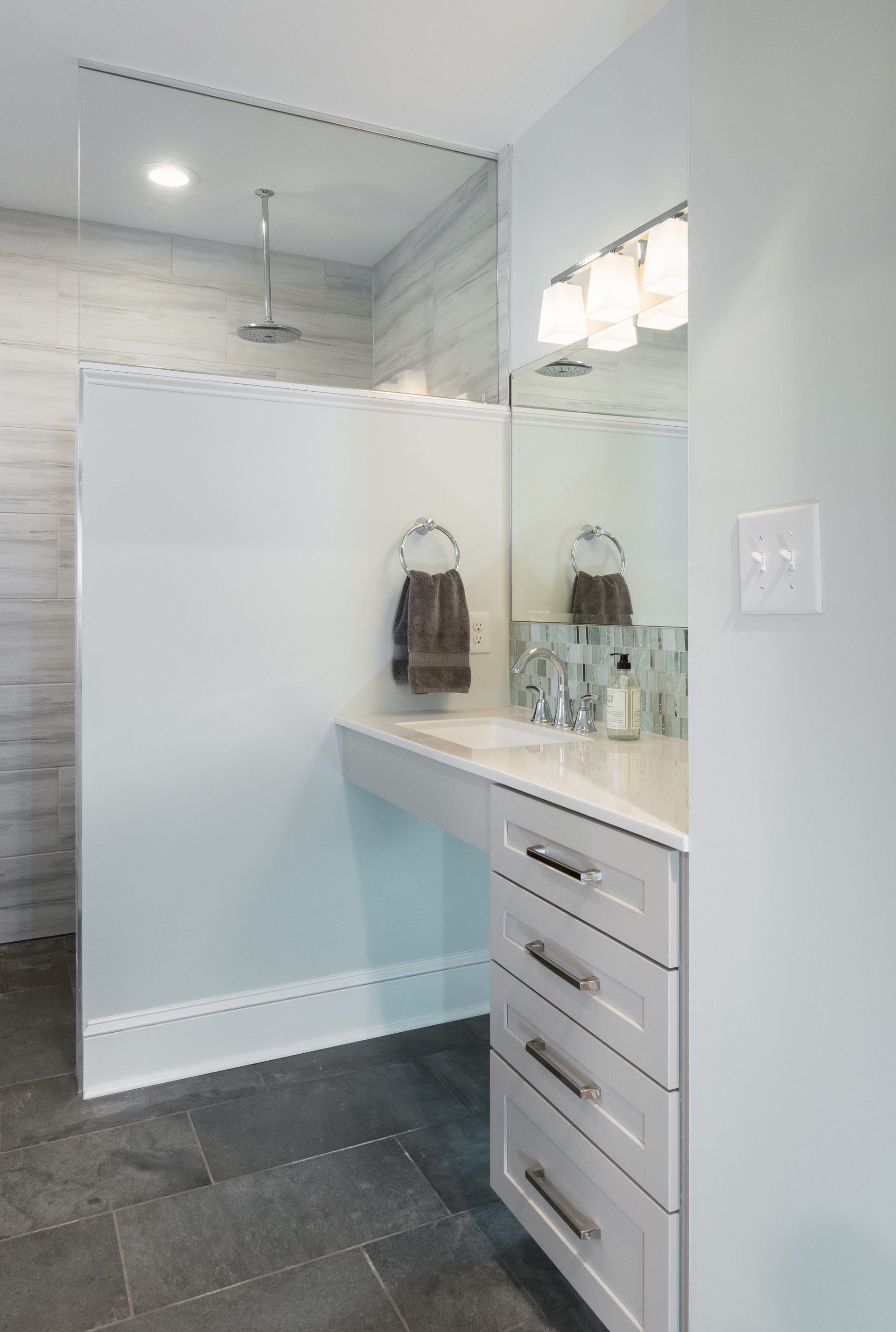
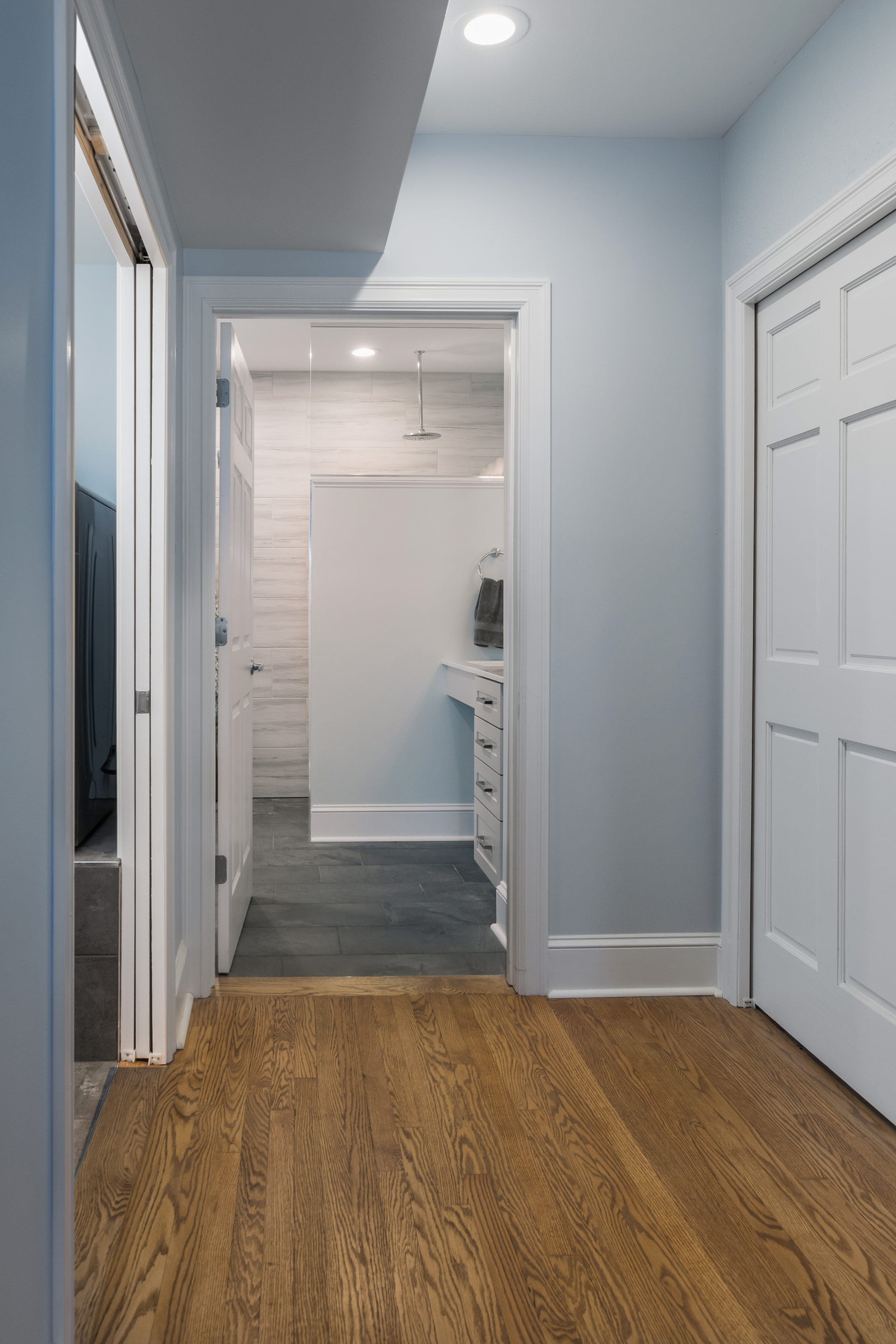
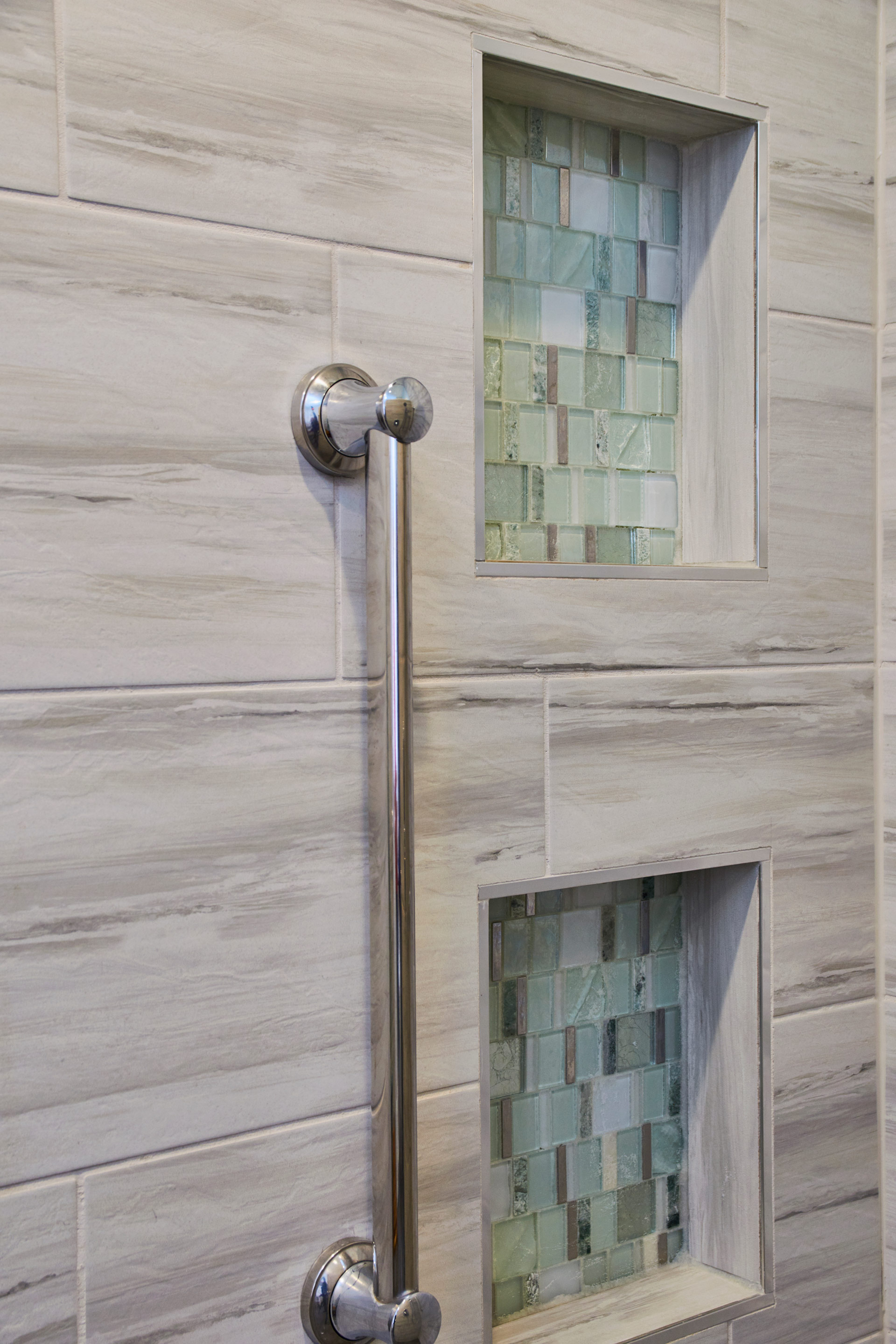
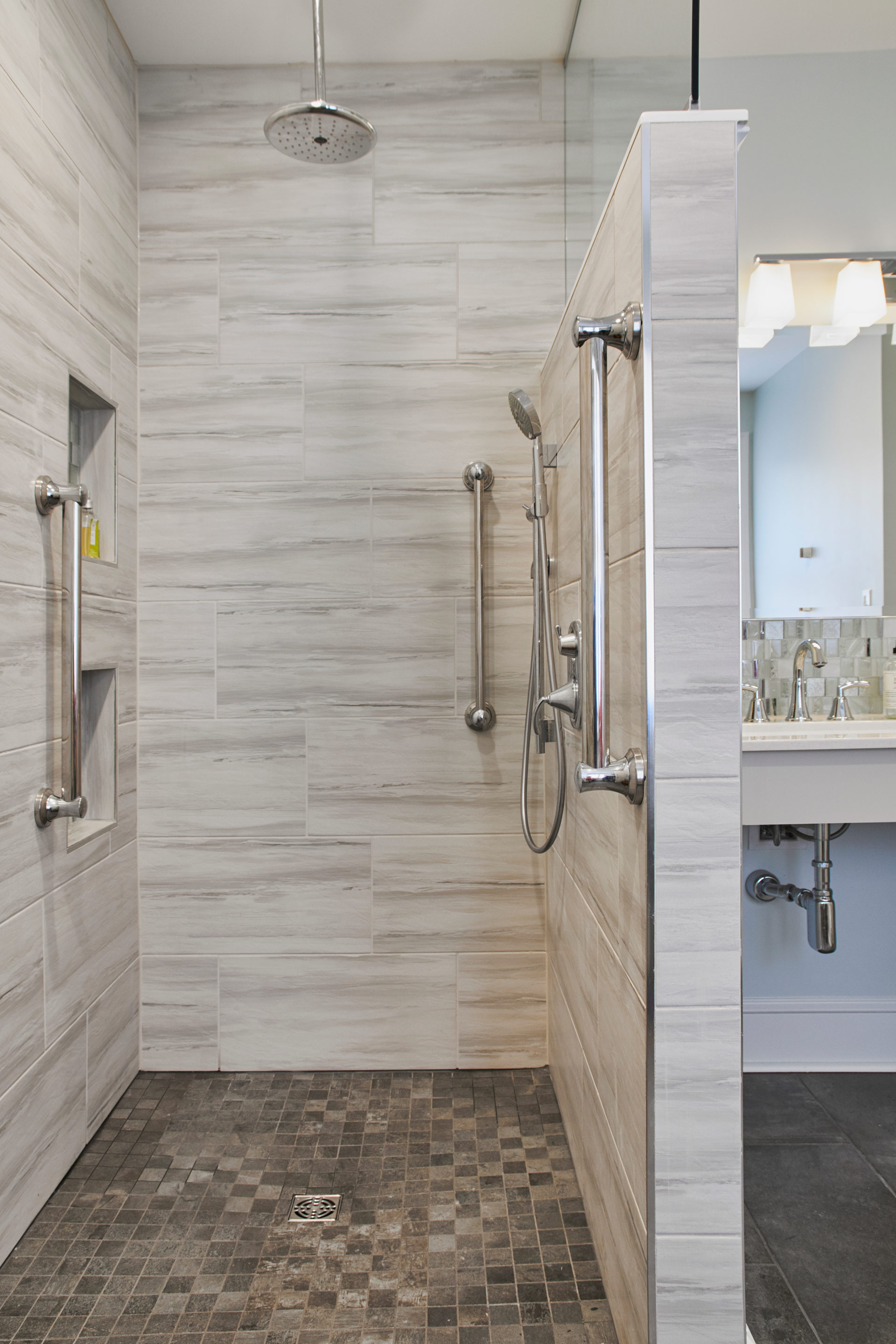
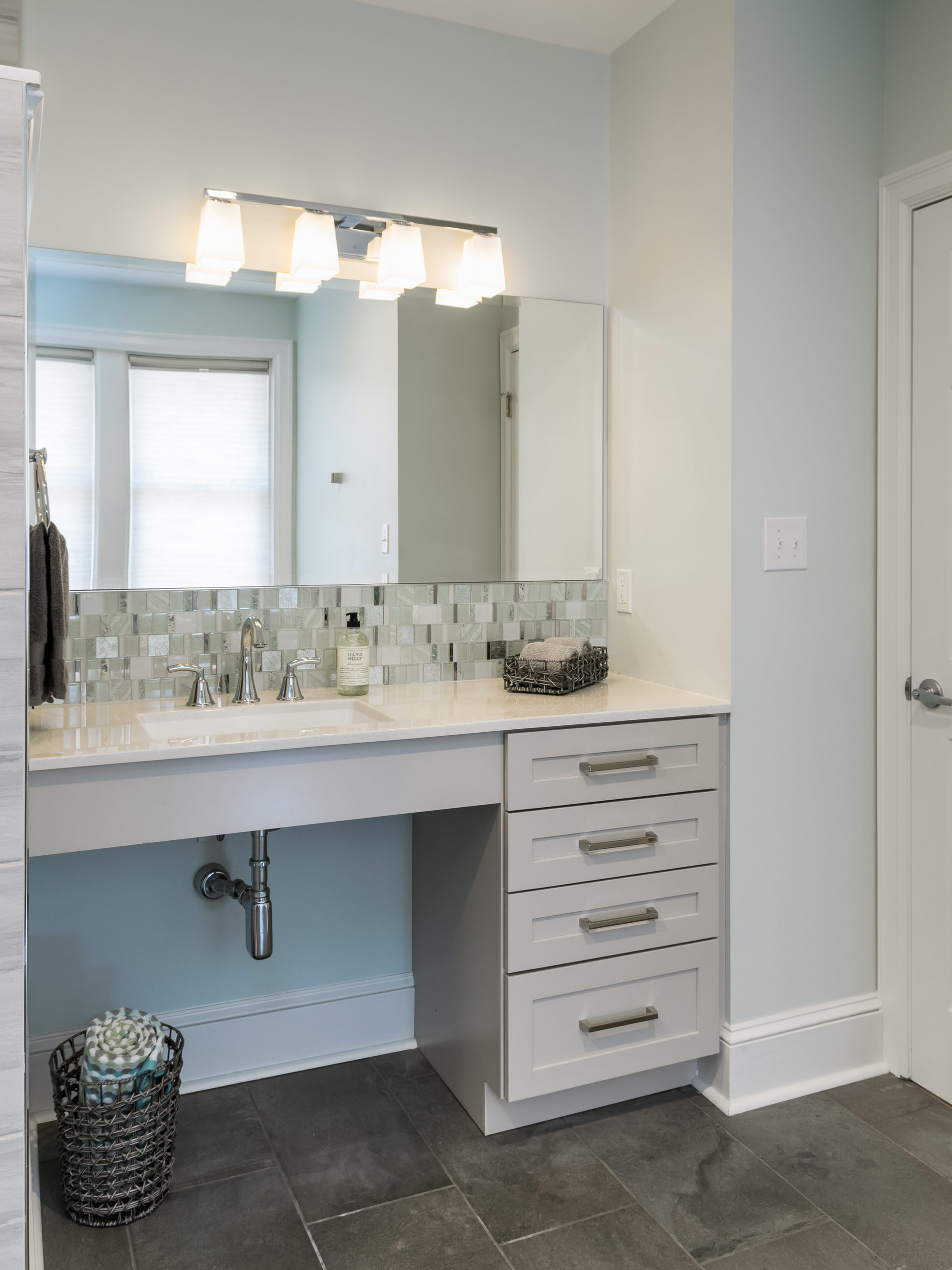
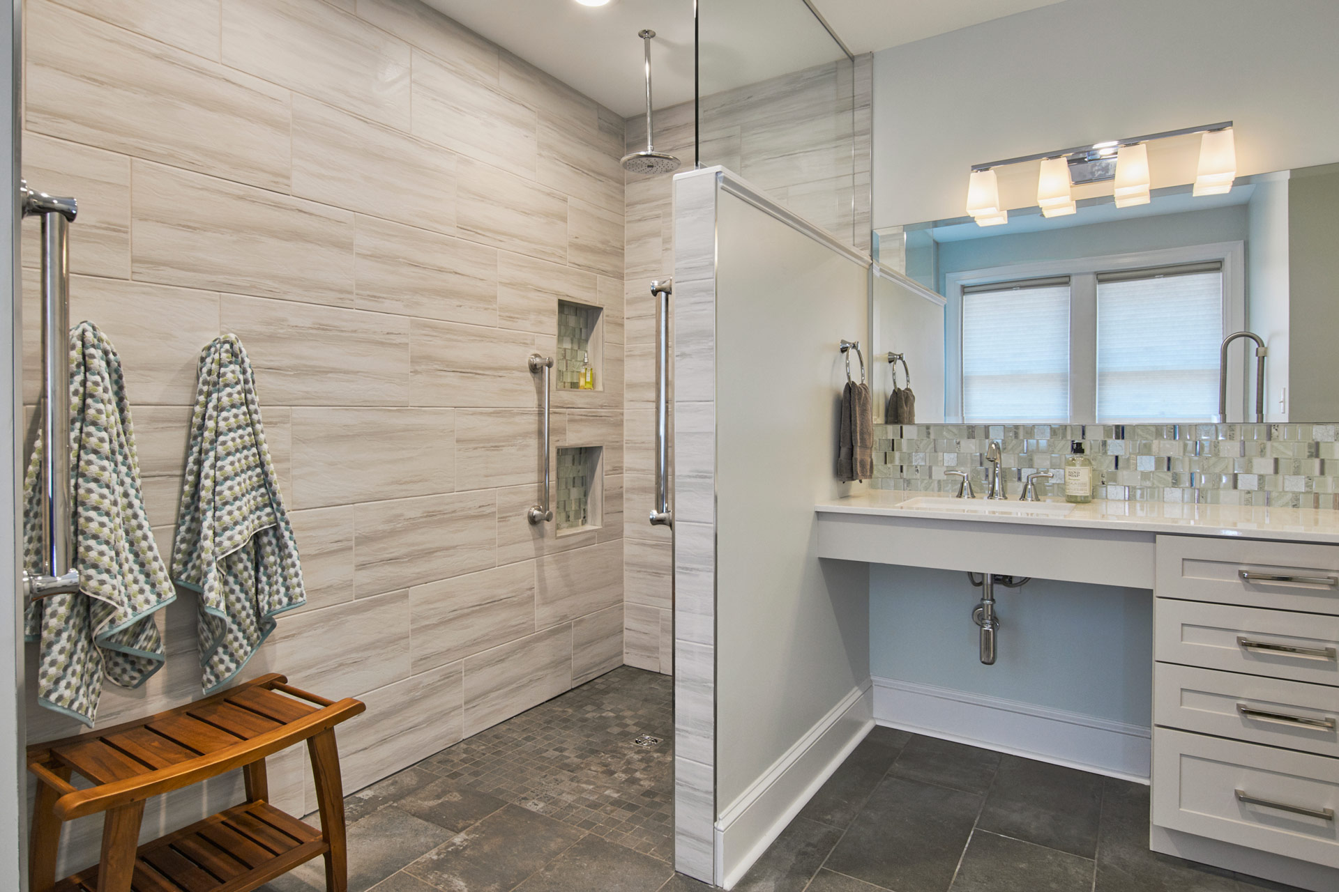
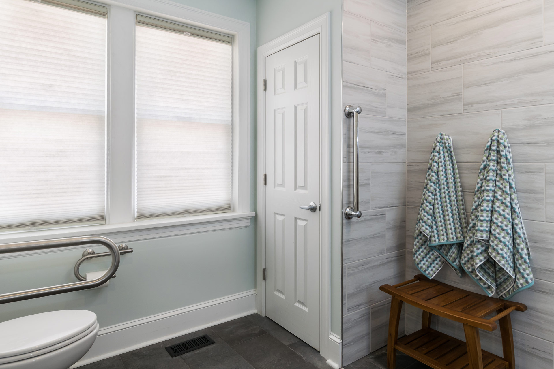
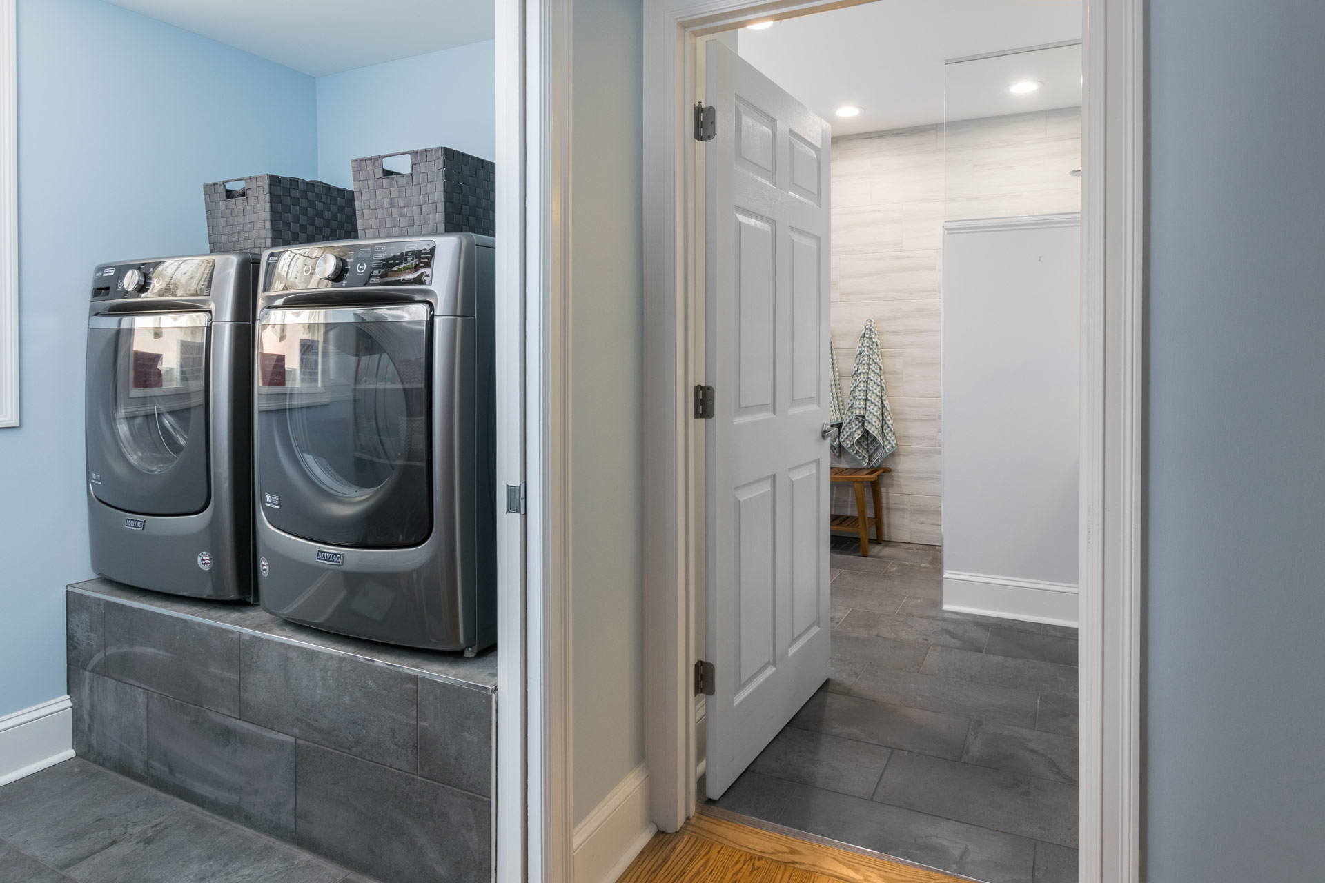
Our clients have loved their 86 year old home for nearly half a century. Unfortunately, older homes were not built with aging in place or universal design in mind. The homeowners were facing the sad reality that they may have to move somewhere that offered more accessible living. Their two story home had two bedrooms, separated by a small bathroom and hallway, on the first floor. We came up with a plan to convert this entire space into an one accessible ensuite. It was important to design a primary bathroom that allowed for different levels of accessibility as they age. We started the design by creating an open shower that allowed for standing or sitting and placed grab bars in key places for both functions. We kept the space beneath the sink open to accommodate a wheelchair if needed in the future. At the toilet area, we wanted to provide grab bars on both sides of the toilet, but we also needed to keep clearance to one side so that someone could transfer from a wheelchair if they needed to. A flip down grab bar was the perfect solution! It completely folds up and flattens against the wall. On the other side of the toilet we used a grab bar/ toilet paper holder combo to keep it less cluttered on the wall below the window. One of the must haves in this suite was to bring the laundry up to the main floor from the basement so we created a laundry room/closet in the master suite.We elevated their front loading washer and dryer on a tiled platform so that they do not have to bend down to do laundry.
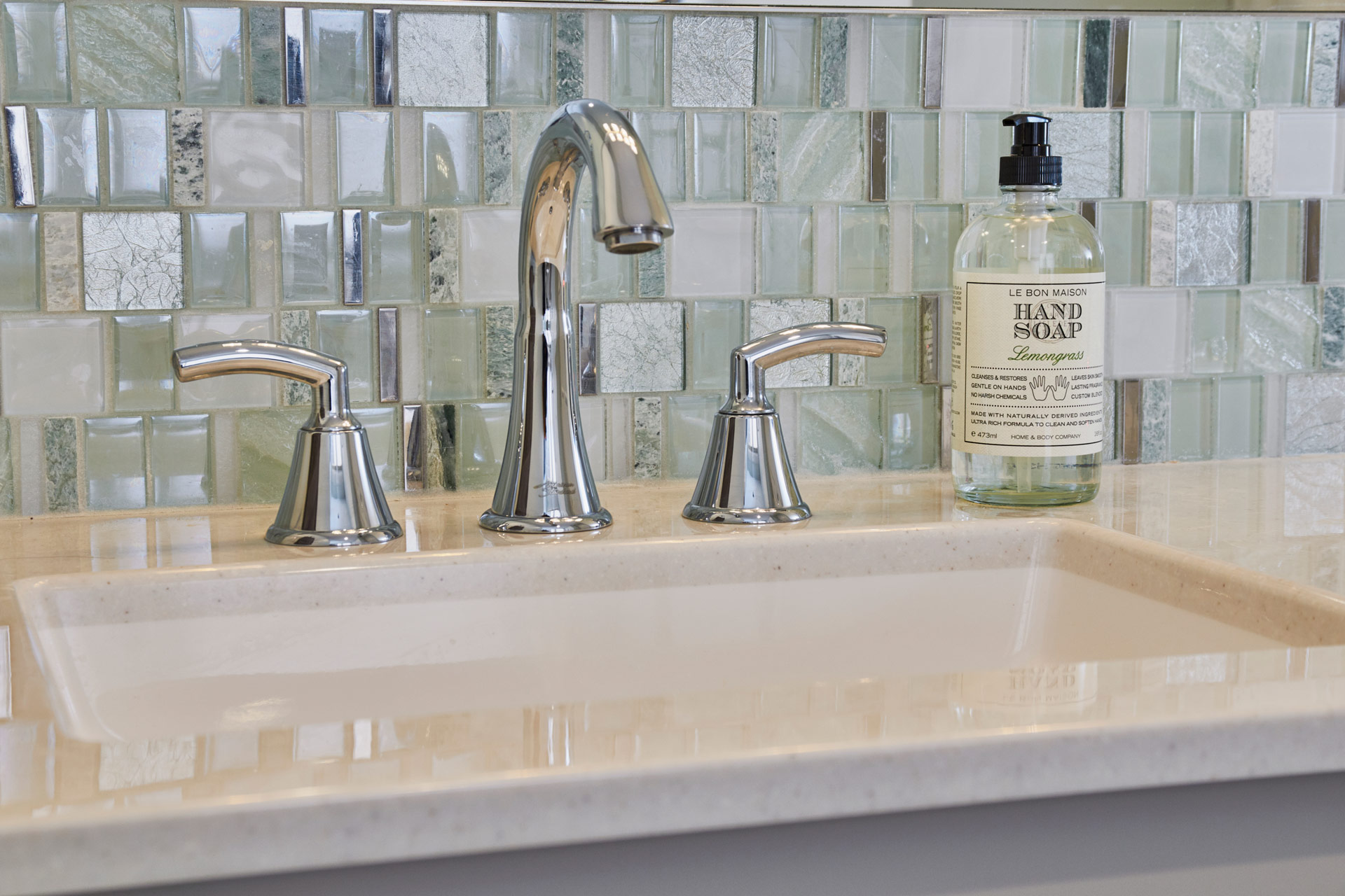
The clients wanted the space to feel clean and bright and modern. When we found the the sea green glass tile mosaic we knew we had to use it! We kept the shower walls light and the floor darker. The onyx vanity top is easy to clean and looks beautiful on the light gray vanity. We used chrome fixtures to match the chrome in the accent tile mosaic. The overall look we achieved is reminiscent of a modern spa and our clients can join their family home for years to come!


