Classic Modern Kitchen
This charming 77 year old home in Glendale has so much character and many beautiful features. However, it was lacking a kitchen that functioned well and appealed to the homeowners' tastes. We started by re-configuring some of the back hallway to allow us to open up the kitchen into the sunroom and create more functional space and better flow.
Classic Modern Kitchen


Glendale, MO, 2018
DESIGNER:
Jennifer Chapman
PHOTOGRAPHER:
Karen Palmer Photography
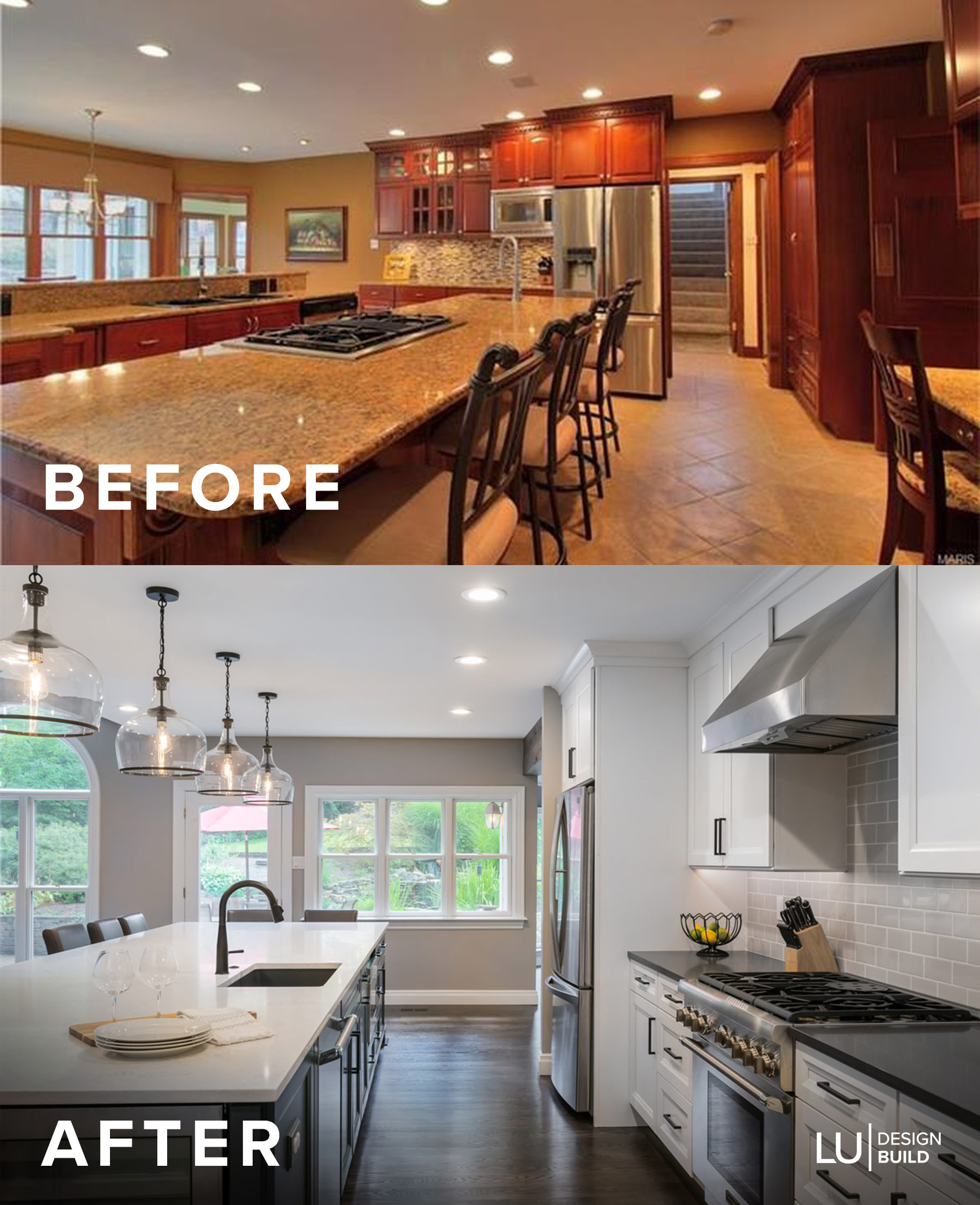
This charming 77 year old home in Glendale has so much character and many beautiful features. However, it was lacking a kitchen that functioned well and appealed to the homeowners' tastes. There were two islands in the center of the room that made it awkward for entertaining and moving around in their daily lives. The room was cut off from the back sunroom and as a result, the homeowners never used it or even knew what to do with it.
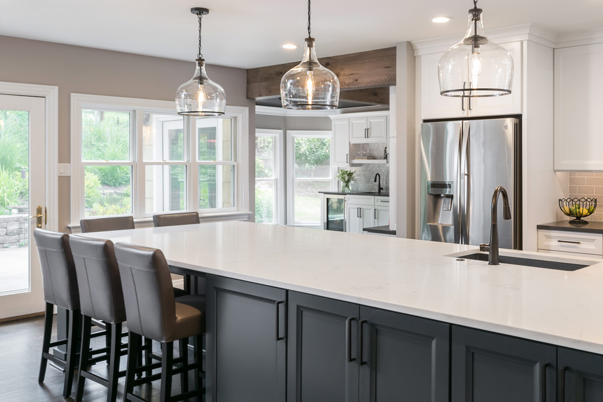
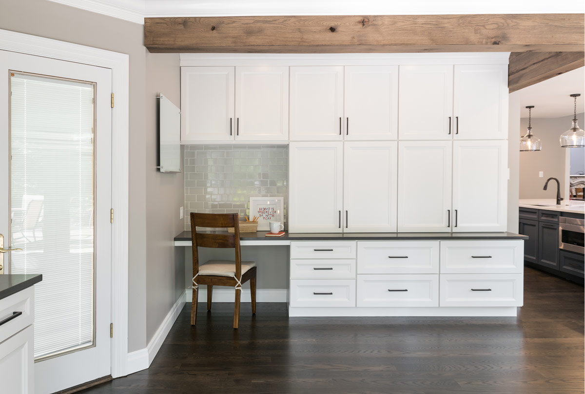
We started by re-configuring some of the back hallway to allow us to open up the kitchen into the sunroom and create more functional space and better flow. The homeowners knew they wanted a large island that acted as a workhorse with sink, microwave drawer, and dishwasher and also had enough seating for their family of four. They wanted the kitchen to work well for entertaining, as well, and feel more connected to their adjoining family room. We decided that the back sunroom would now function as game room and bar and we added office space there as well. Our clients really wanted a style that withstood the test of time, but wanted it to be different than every other white, shaker style kitchen. We used dark blue cabinets at the island to really ground it and provide contrast to the other white cabinetry in the space. (Fun fact! The island is 186" long! It is definitely a showpiece!) We chose a shaker style cabinet with a bevel that added a modern twist to the traditional shaker style shape. They love subway tile, but instead of white, we went with a soft gray and we chose oil rubbed bronze hardware and accents to provide even more contrast. We wanted to make the bar a little more sophisticated so we went with a 2" marble hexagon backsplash. The ceiling in the new game room needed some love- it has a unique shape, but it was painted white, which made it feel dated. By painting it dark gray, it makes the room feel warmer and more cozy. We had to keep structural headers when we opened up the kitchen into the sunroom so we wrapped them with reclaimed wood to add some warmth and character to the space. It's the perfect amount of rustic!
The homeowners' love their new space and we had so much fun with this transformation!


