Organic Oasis


St. Louis, MO
Designer
LU Design Build
Photographer
Karen Palmer Photography
As Featured In:
St. Louis Home + Lifestyles
Homeowners looking to downsize create a nature-centric, cozy home tailored specially to them.
By Moe Godat
“I’ve tried to let my style evolve over time,” says the homeowner. “But it’s really a mixed bag. I like change.” Change is what she and her husband were looking for in their next house; as empty-nesters seeking a home to age in place, they knew they wanted a smaller space with more land and calming views of the outdoors.
Before their move, the family had always lived in subdivisions. “Our previous homes were a great place to raise our kids, and we always loved getting to know our neighbors,” she notes. However, she and her husband began looking for a home with a little extra outdoor space and a more manageable interior that would accommodate them as they grew older.
Though they’d toured many houses and even put contracts on a few, this Westwood ranch-style home spoke to them as soon as they stepped foot through the front door. “The house and the property just had the feeling I was looking for, even though it wasn’t in the best condition yet. It was just so peaceful.”
Peacefulness and a connection to nature were the main focuses for the renovation. The homeowners sought the help of Rochelle McAvin of LU Design Build to make their vision come to life.
“I needed a designer who understood my love for gently-used furniture, which I find more personal and interesting. They also needed to get the look I was going for; Mid-century modern with a twist. I felt that LU Design Build was creating the kind of projects I was looking for.”
Designer Rochelle McAvin has worked in the design build industry for over six years, and she focuses mainly on residential remodeling. For all projects, she believes in letting the clients’ priorities fuel the design. “Form follows function, and we wanted to make this house as efficient and comfortable as possible for the homeowners.”
The goal of the project was to create a personal oasis for the pair they could enjoy for years to come while leaving a minimal environmental footprint. They aimed to make the space feel calm, serene and interesting without making the entire house white.
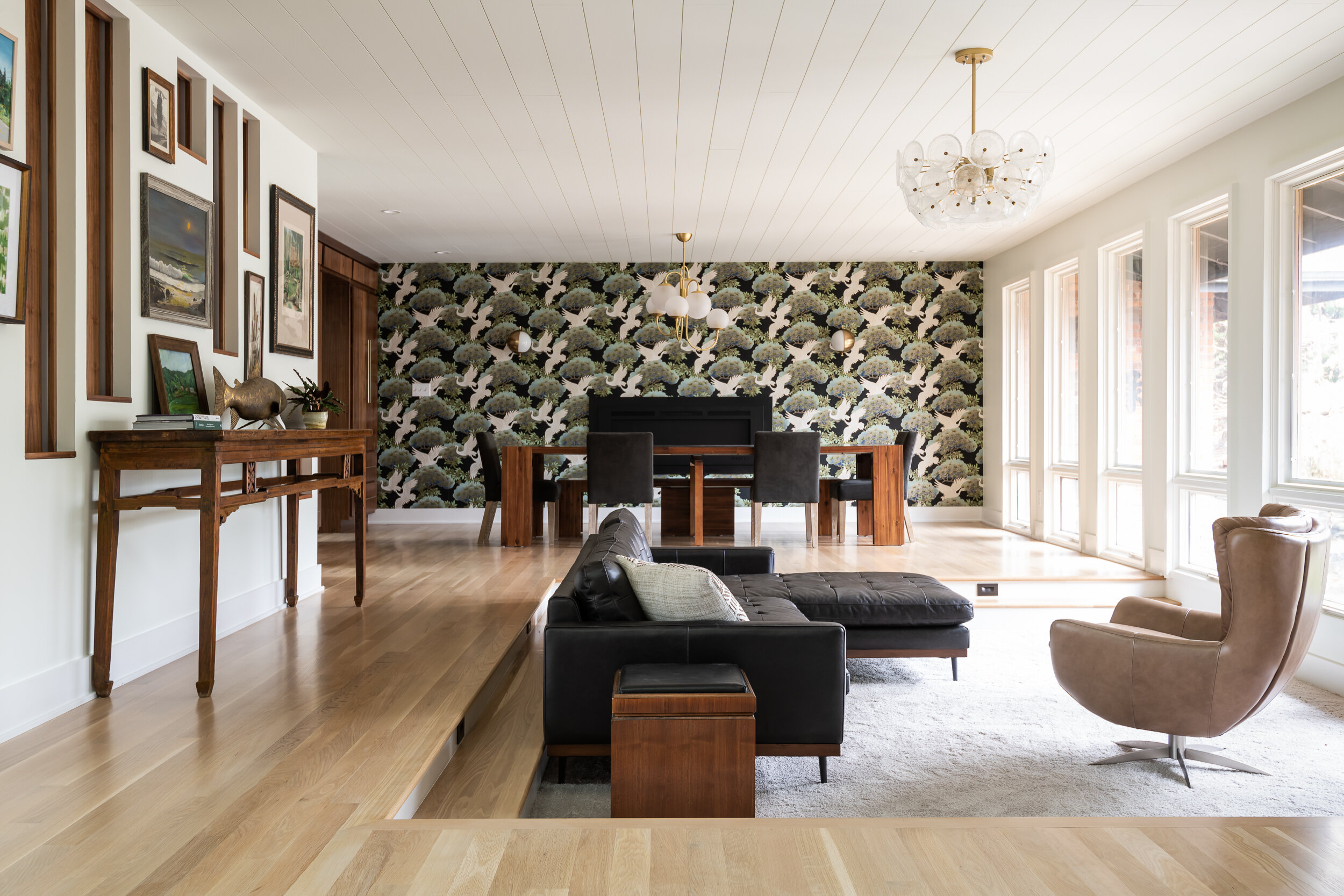
The home is interesting from the moment you enter. To the right of the front door is a sunken living room that the homeowners lovingly call “The Pit.” Built in 1967, the sunken living room was original to the home, but the previous owners leveled the space in a 1980s remodel. Both the new owners and Rochelle agreed that restoring the sunken floor plan gave the home character, though they made it smaller to increase coziness and intimacy.
Primarily used as a family gathering place and game room, “The Pit” needed ample seating and enough space for visitors to pull up a chair and enjoy each other’s company. The large couch was a find from Stash Home, and the gray swivel chair and roomy coffee table came from Pottery Barn. The homeowner finished off the space with vintage ottomans from an estate sale to act as side tables. Large windows at the front of the room give a perfect view of the pond just outside and let in plenty of natural light during the day. Dimmable light fixtures from West Elm give the room a warm glow once the sun sets.
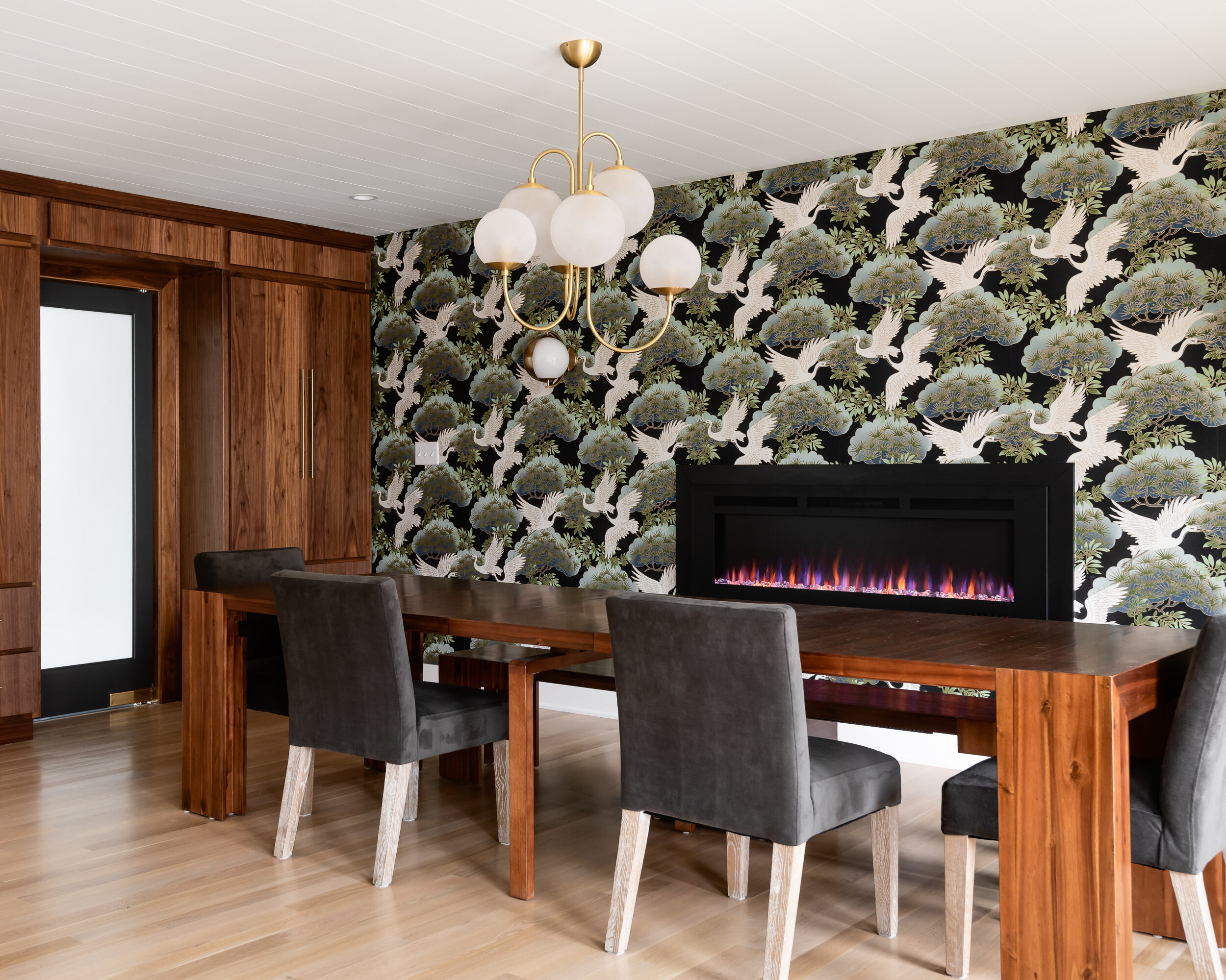
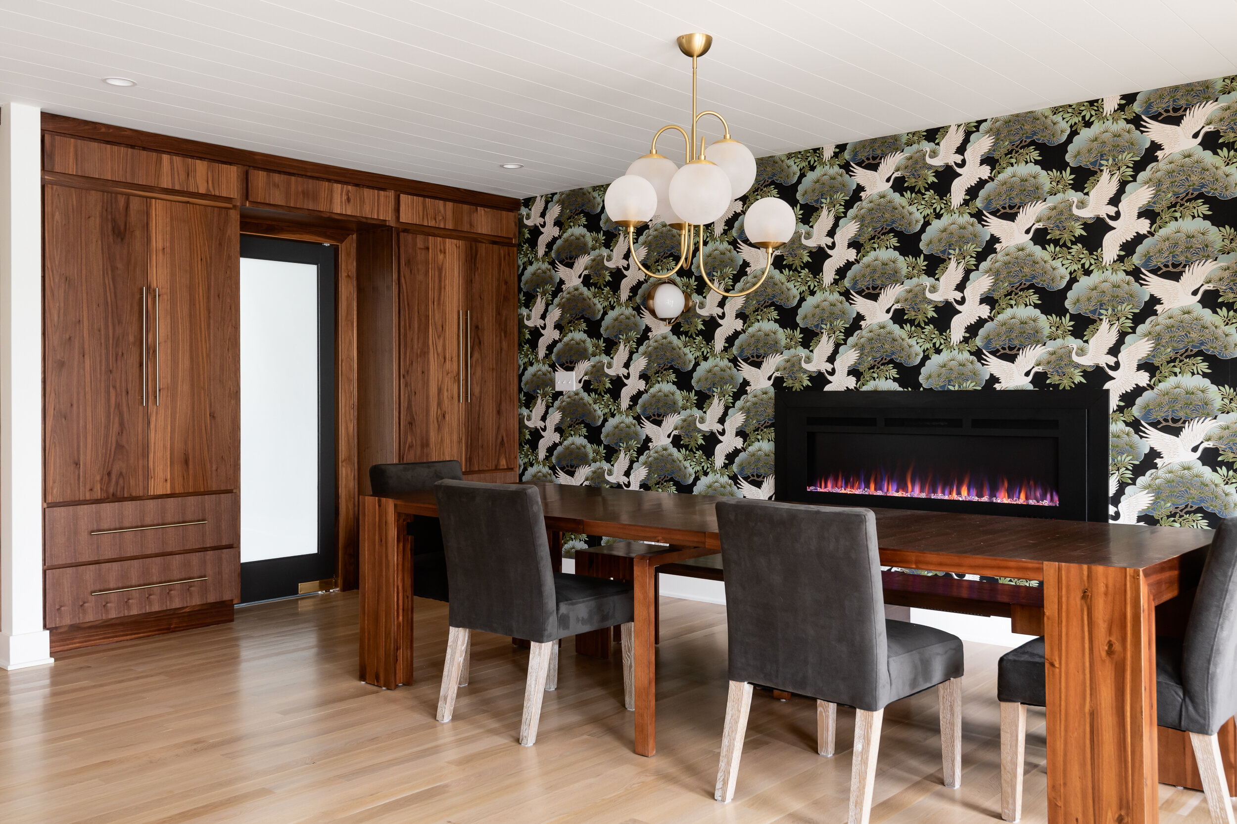
Because the homeowners don’t always require a lot of seating, they opted for a table in their dining room with many removable leaves, allowing it to shrink down to the size of a desk. A Napoleon electric fireplace adds to the warm ambience at dinners, gently lighting the striking wallpaper.
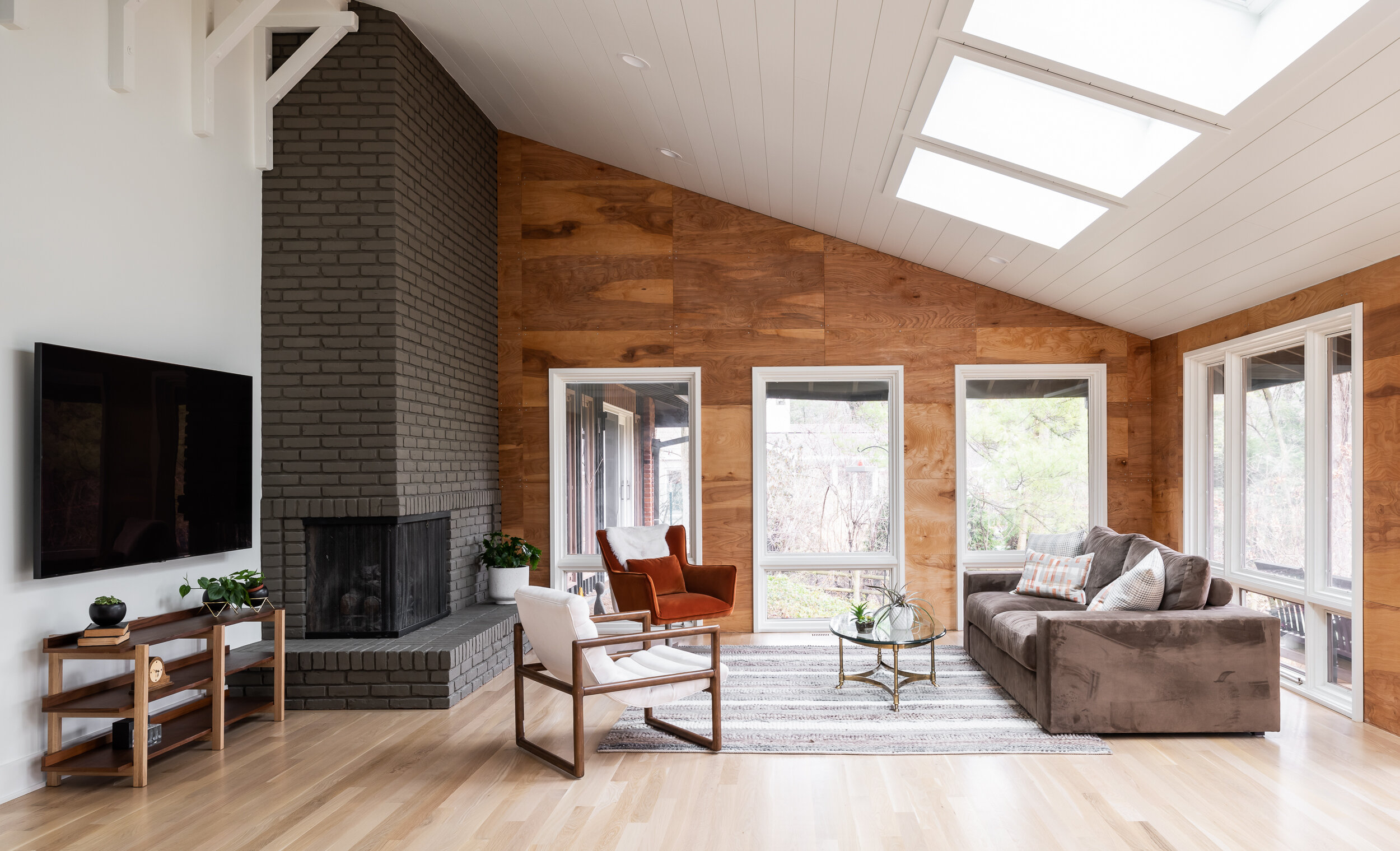
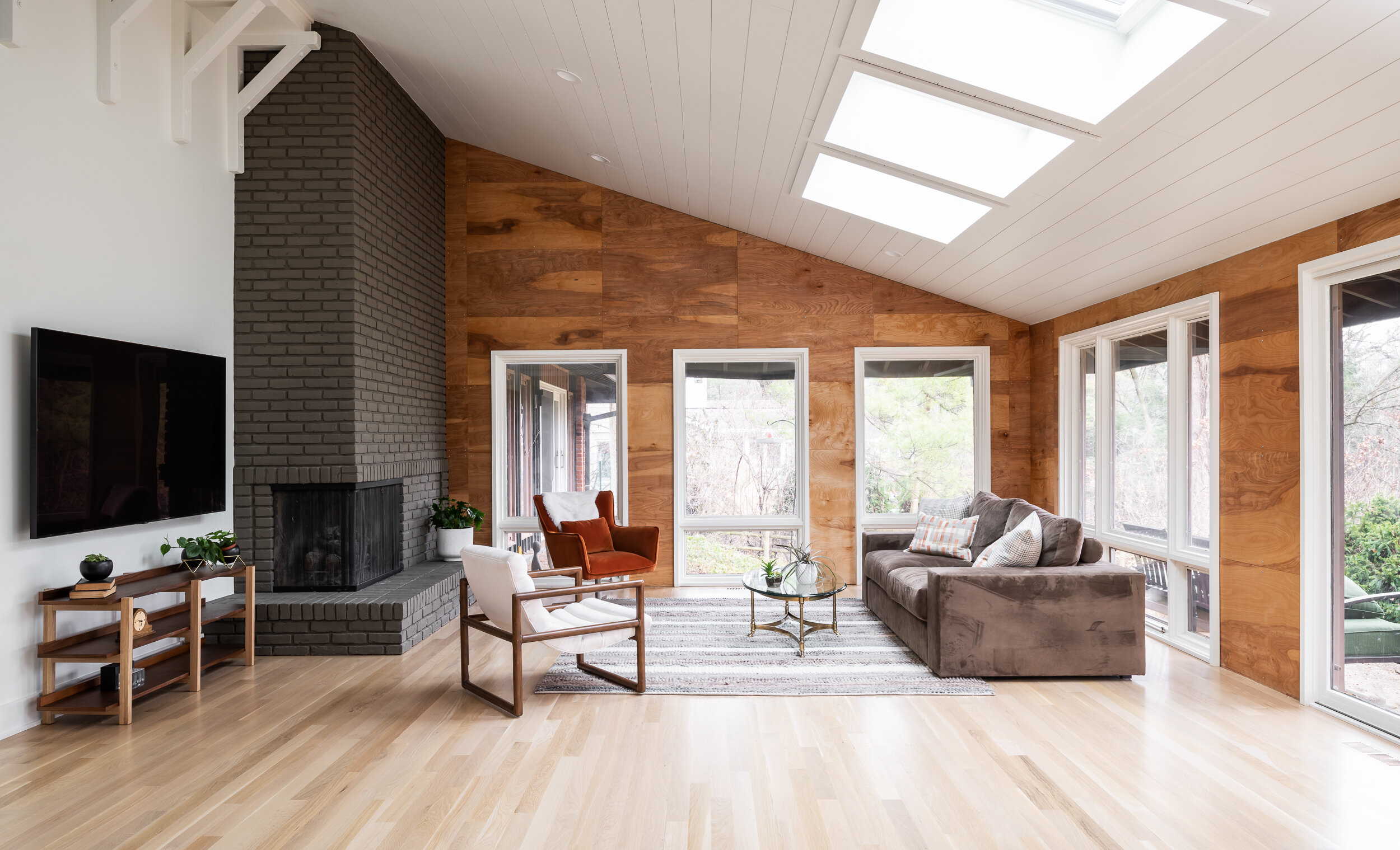
White oak floors and tongue-and-groove white ceilings lead from the front of the home back into the main living space. The living room has vaulted ceilings and an original brick fireplace. The homeowners wanted to find a perfect balance between bright and cozy; the windows and the added skylights gave the room great natural light, but the team added an oiled plywood wall to warm up the color scheme. The fireplace, painted beige in a previous remodel, received a fresh coat of gray paint to act as the room’s anchor.
The homeowner found the majority of the home’s furniture from Facebook marketplace. Buying furniture second-hand is a great way to recycle interesting pieces and minimize one’s environmental footprint in the remodeling process. “She has such a good eye bringing in earthy, vintage pieces that made every space more personal and cozy,” says Rochelle. “I think she nailed it!”
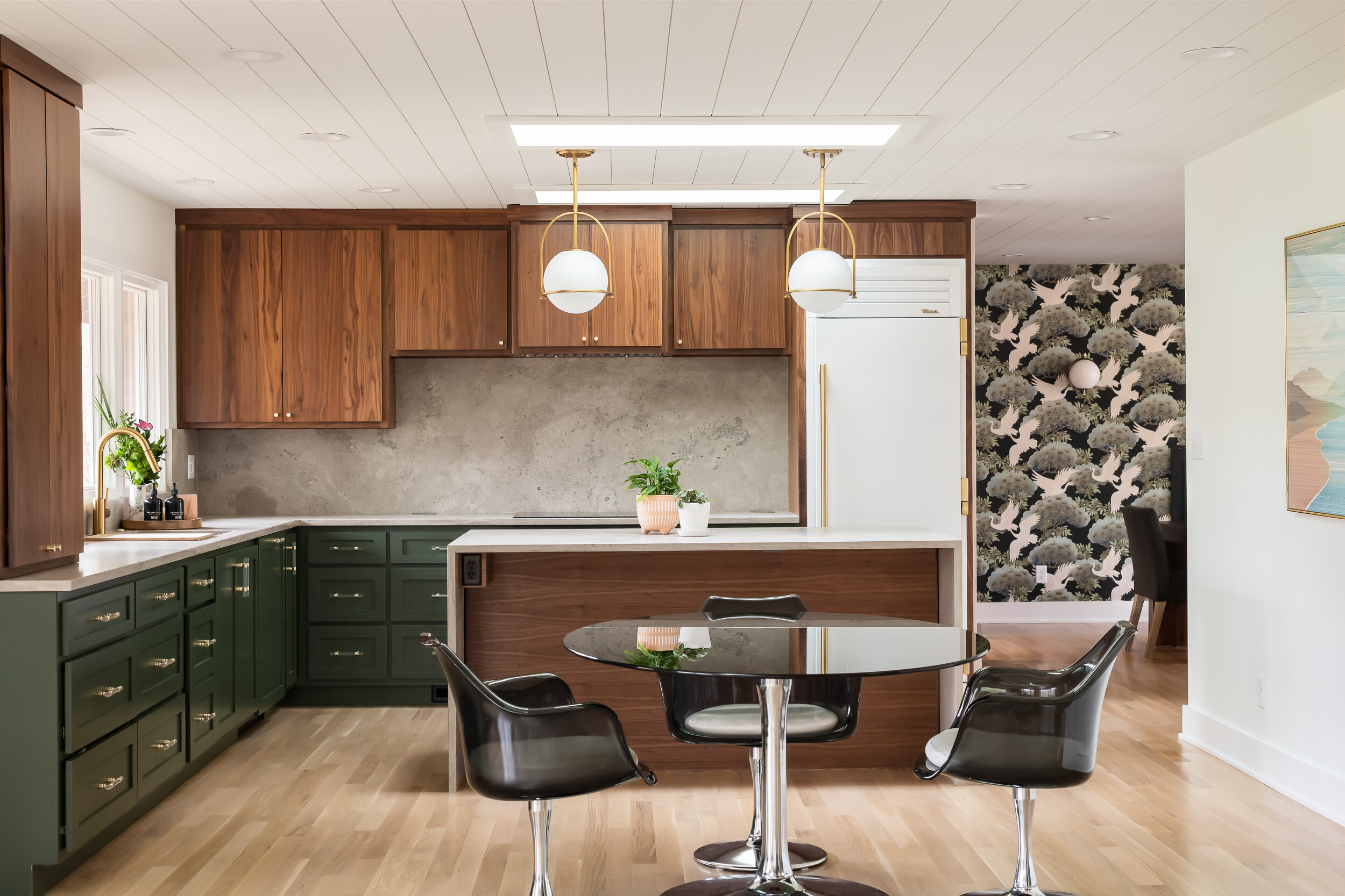
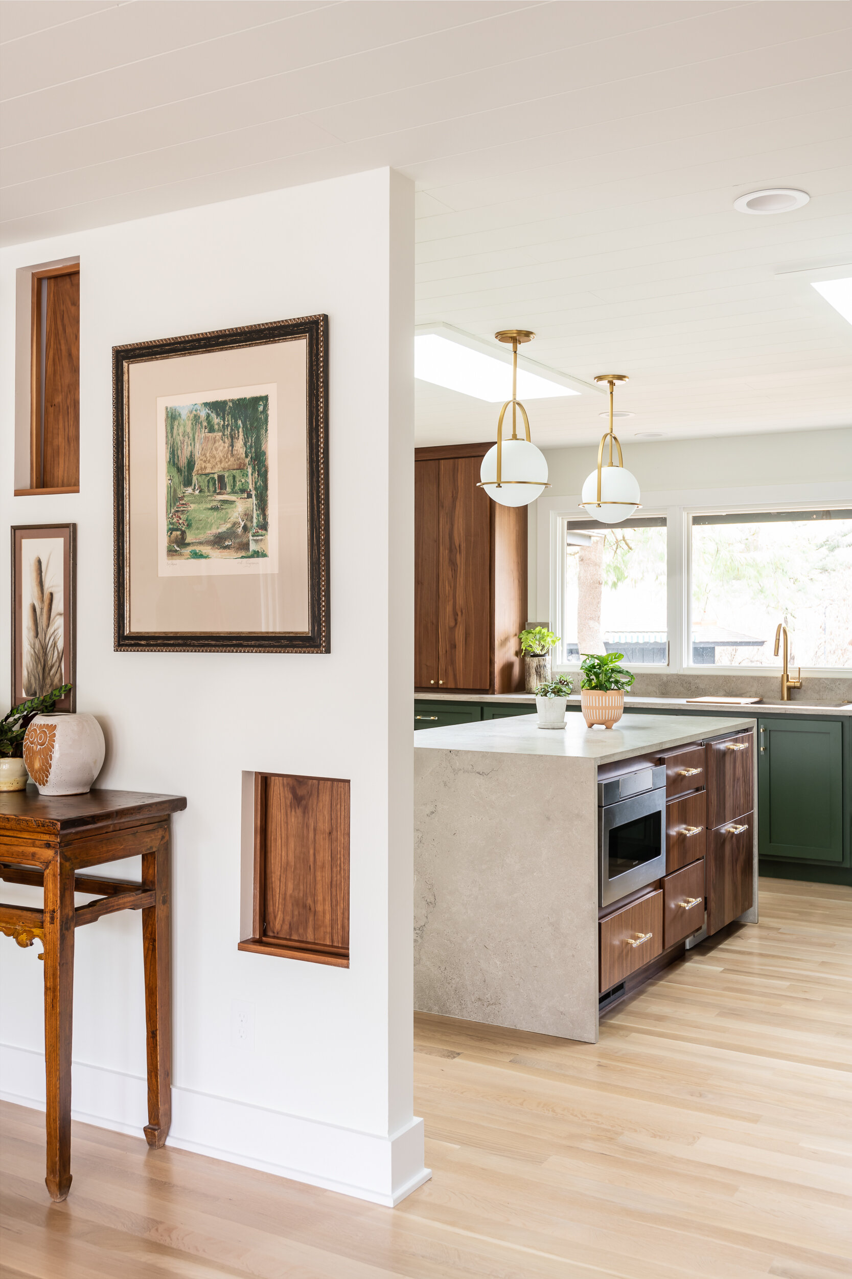
In the kitchen, the homeowner desired a space that “felt like any other room. I didn’t want it to scream ‘kitchen.’” To achieve this look, the team chose natural Missouri limestone from SFI for the island and countertops. The walnut cabinets are custom-made from Hulls Cabinetry; the bottom cabinets are painted evergreen to match the lush trees shown through the large windows. Lucite hardware with brass accents from CB2 add interest and ease. The Facebook marketplace table keeps the space light and fun.
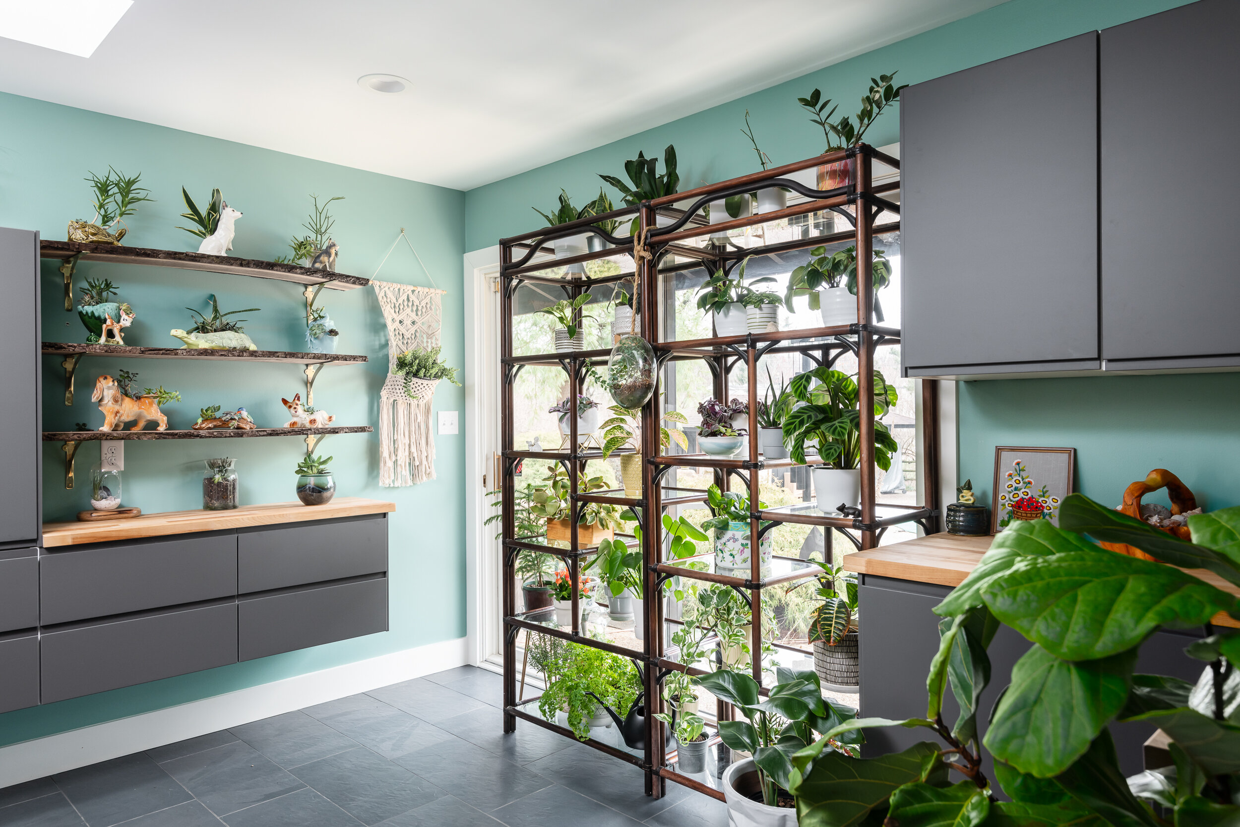
To avoid clutter, the team created a butler’s pantry off the kitchen to house the family’s odds and ends, as well as the wife’s house plant collection. “We created a bright, functional space for her off the main living area for her to stow all her keepsakes," comments Rochelle. "She’s a collector, and we wanted to give all her things a home without affecting the rest of the home’s design.”
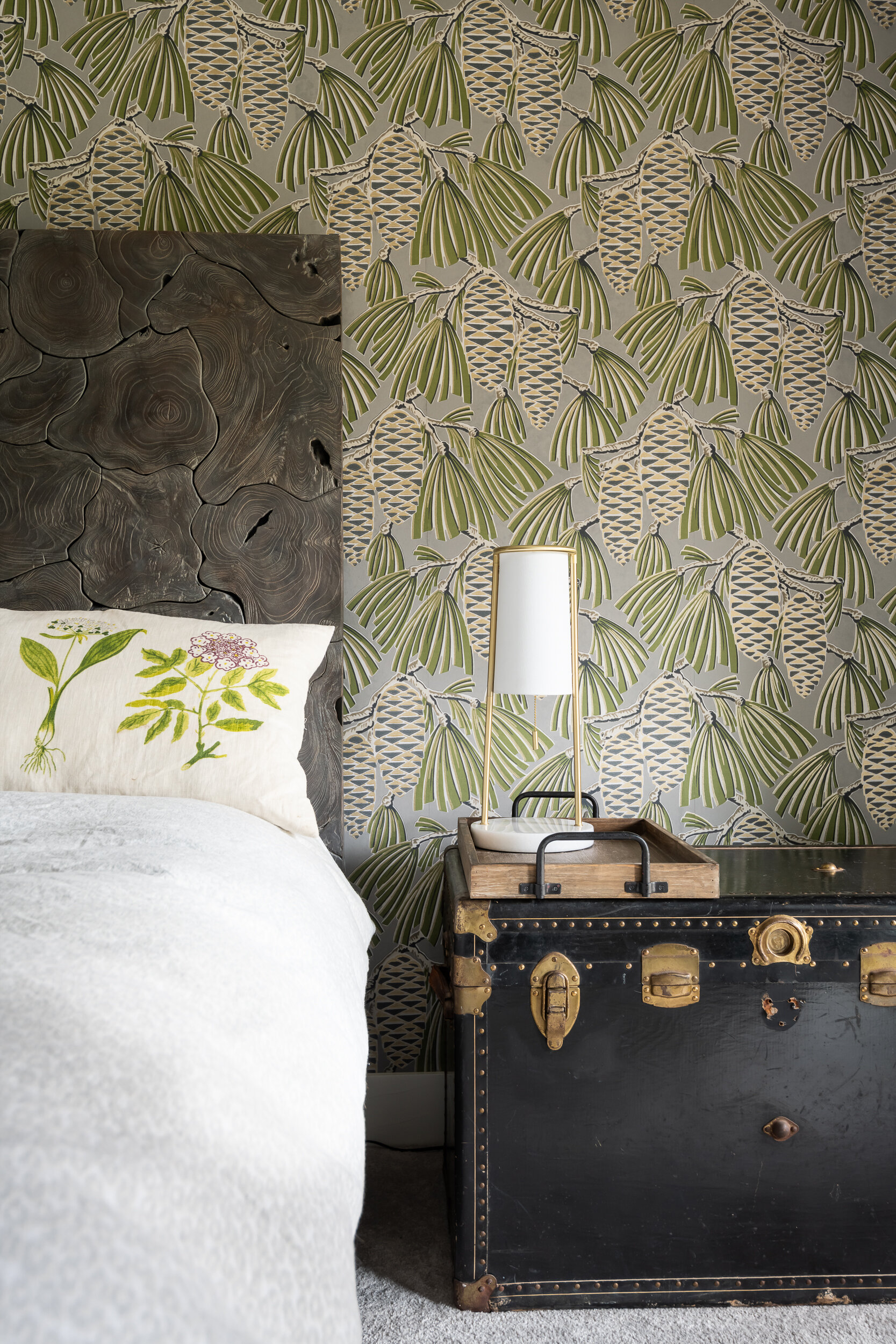
Rochelle knew the main bedroom needed a calming, relaxing vibe for both homeowners to enjoy. “I don’t spend much time in my bedroom, but I wanted it to feel like a getaway, almost like our own personal hotel room,” the wife notes. She and Rochelle chose the softest carpet they could find. A Harlequin “Foxley” wallpaper accent wall elevates the suite, complemented by walls painted in a custom gray/taupe. A tree trunk headboard in gray adds a final natural element.
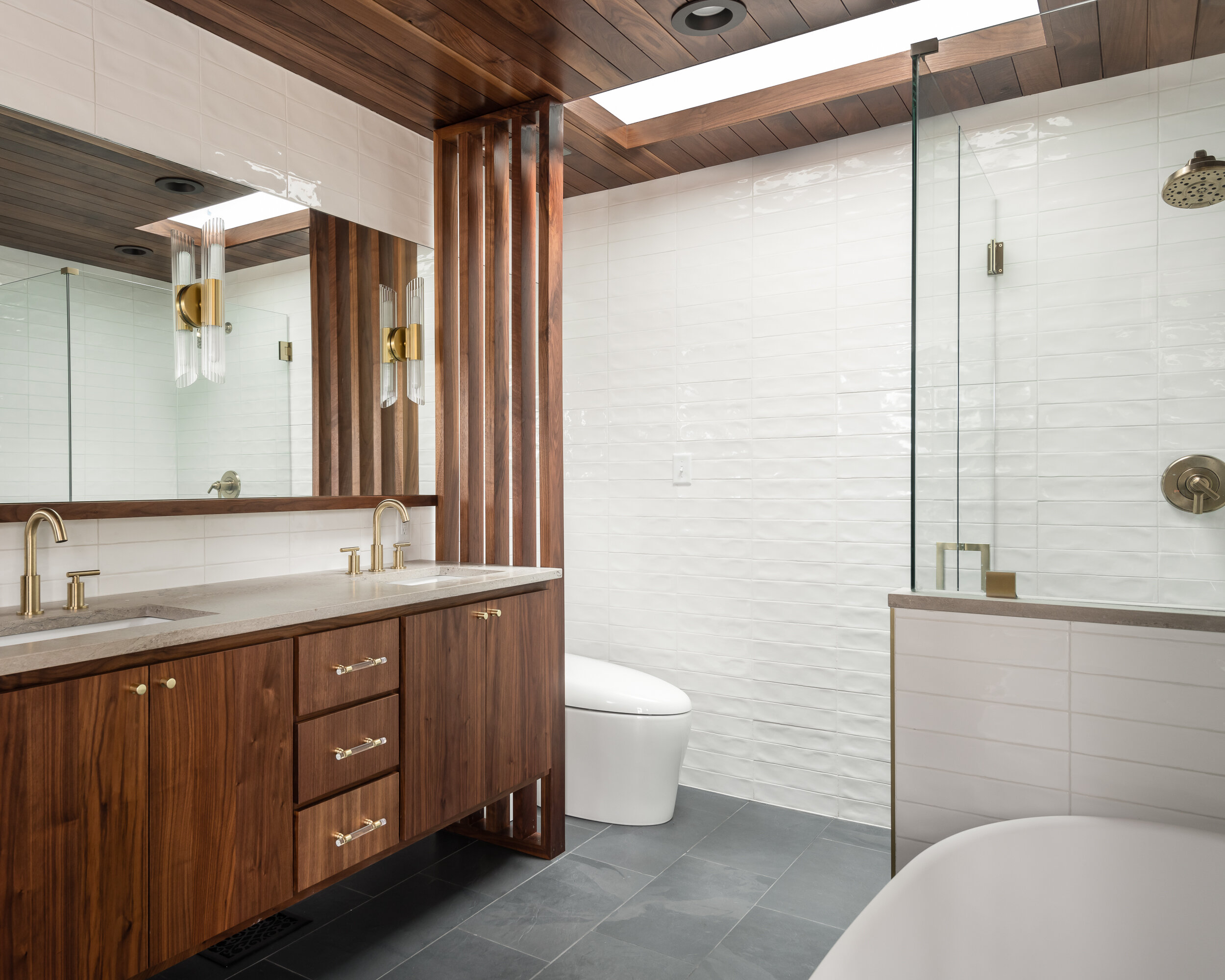
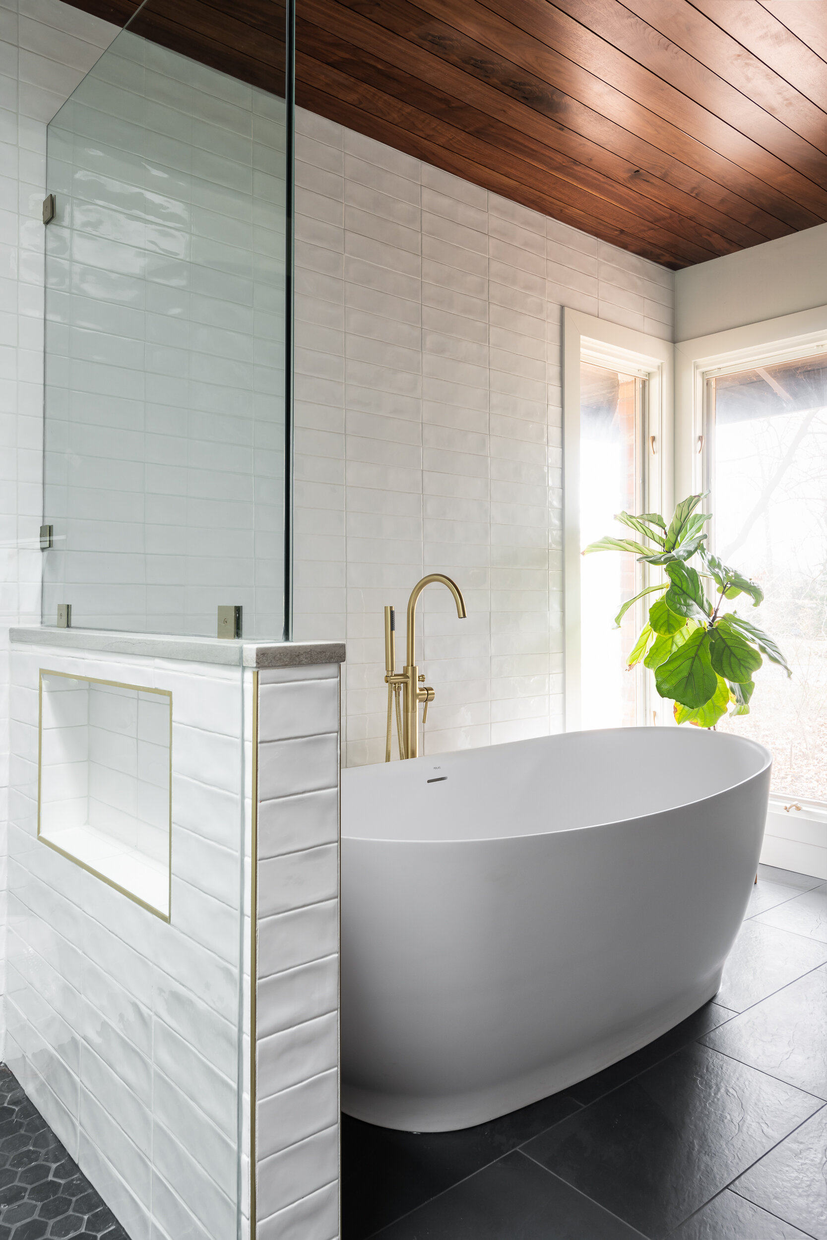
“Our last bathroom was very large, and it was always cold,” the wife says. “We wanted this bathroom to be as warm as possible.” They kept the bathroom’s layout relatively small, but it allowed enough space for all the wife’s requests, including a matte eco-friendly Perlato Vittoria tub in lapis stone, zero-entry shower and Missouri limestone vanity. Heated porcelain floors designed to mimic slate paired with high-gloss, straight stacked tile on the walls keep the bathroom both natural and eye-catching.
“This project was so organic from beginning to end,” says Rochelle. “The homeowner and I made changes to the design as we went along. Our constant collaboration is what made this home so customized for them. It really fits their personality."
“We don’t intend to move again, so with this house, we really went for it,” the wife says. “It’s everything we wanted from the start: easy to live in, peaceful, beautiful. I’m so happy every time I come home because I know this space made for us.”
Resources
Appliances: AUTCOhome
Builder: LU Design Build
Cabinetry: Hulls Cabinets
Flooring: Champion Floor
Glass/Mirror: Boujee Glass
Granite: SFI
Interior Design: LU Design Build
Tile/Granite Supplier: The Tile Shop
Window/Door: Lincoln Window & Door
Woodworking/Millwork: LU Design Build
