Mission Ct Kitchen
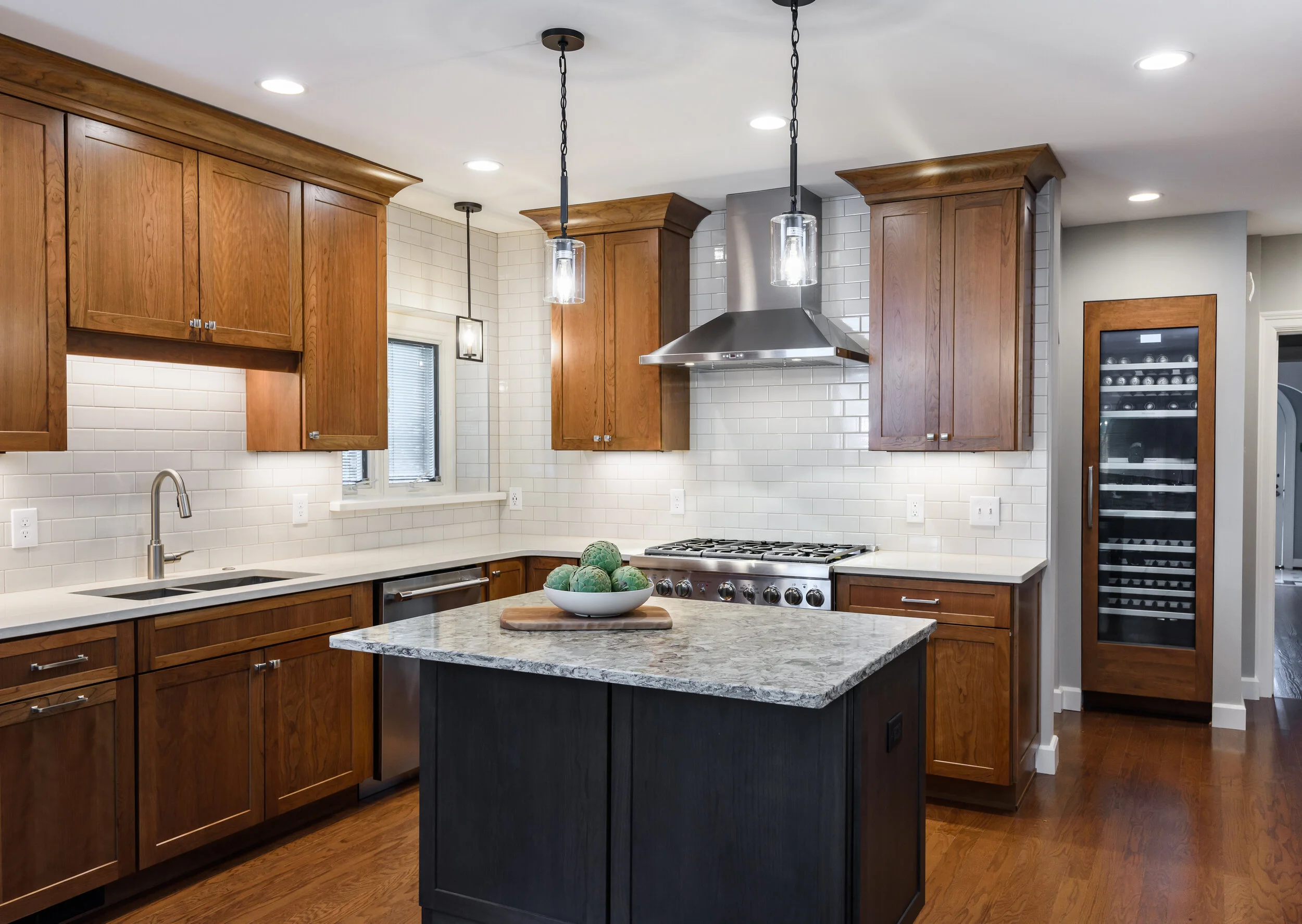
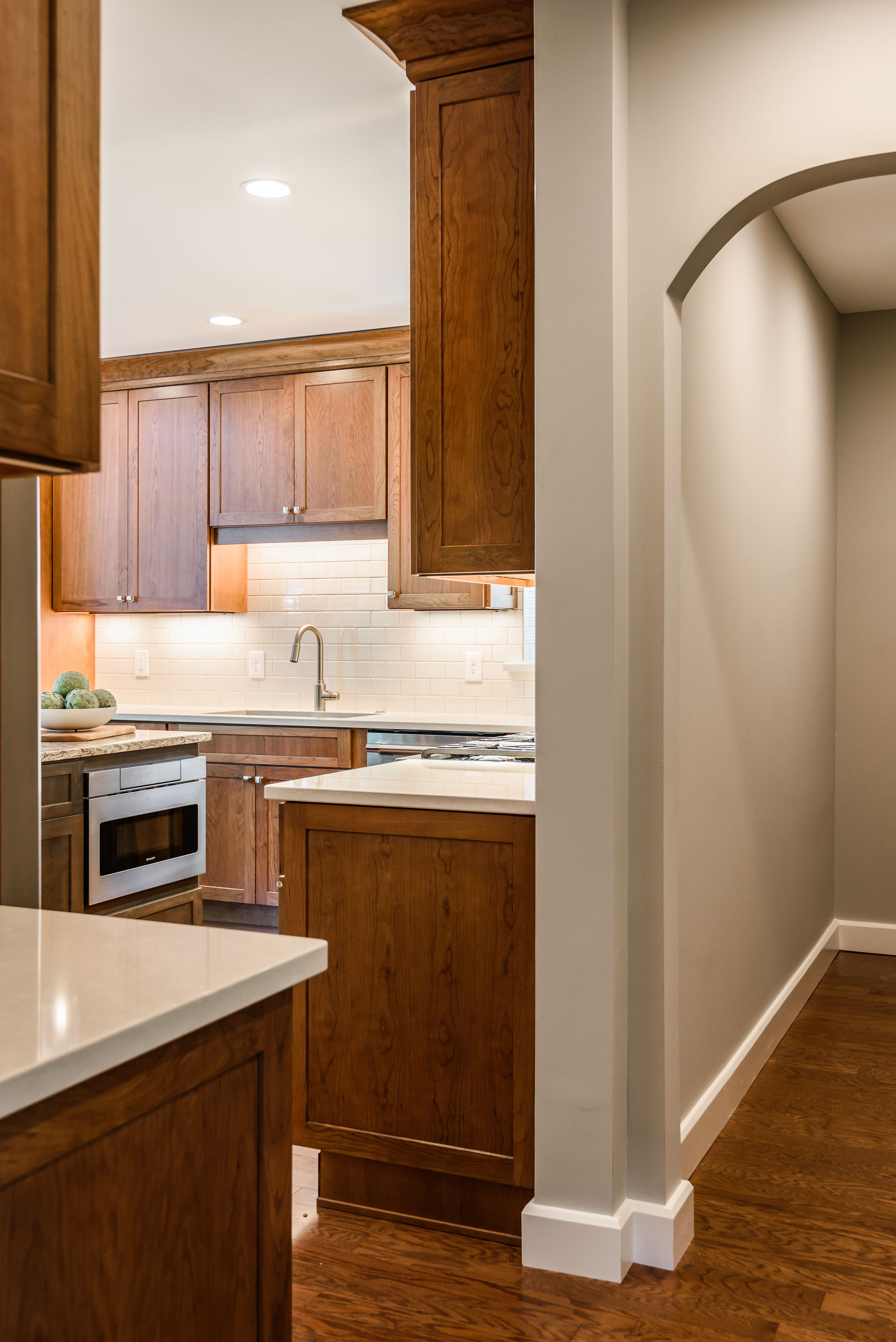
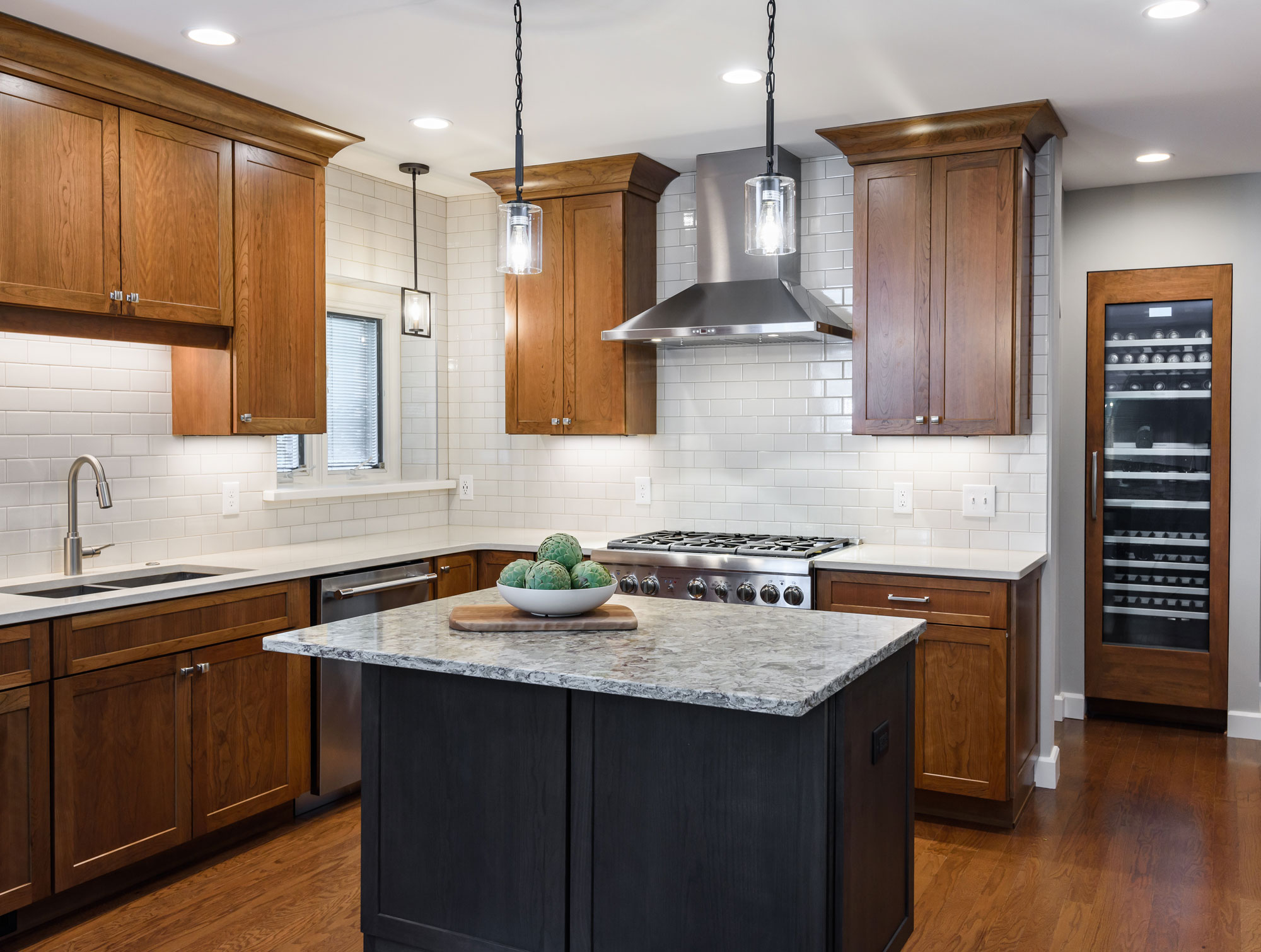
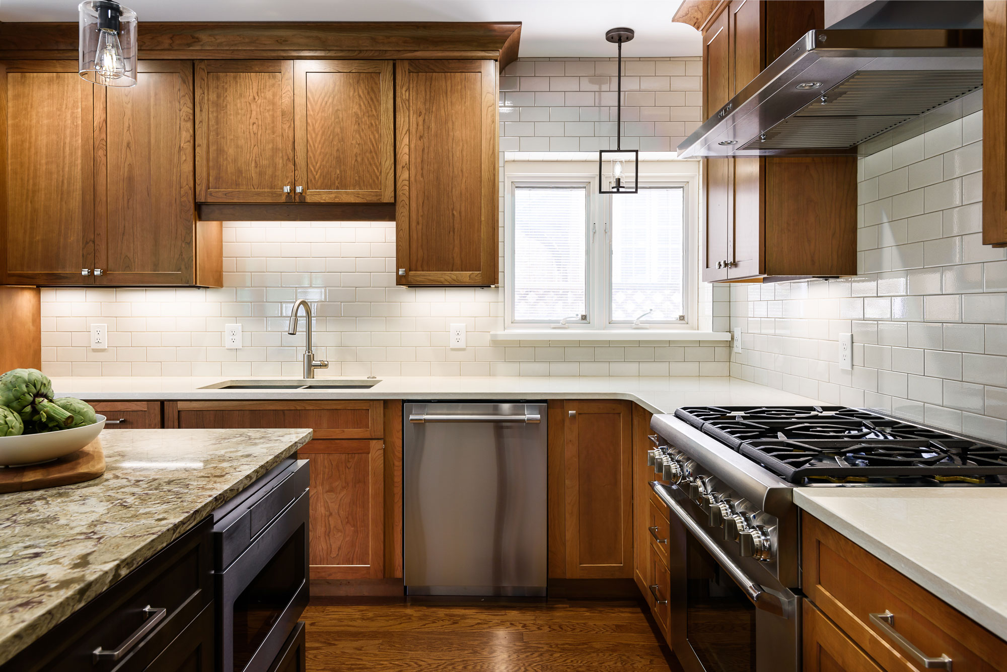
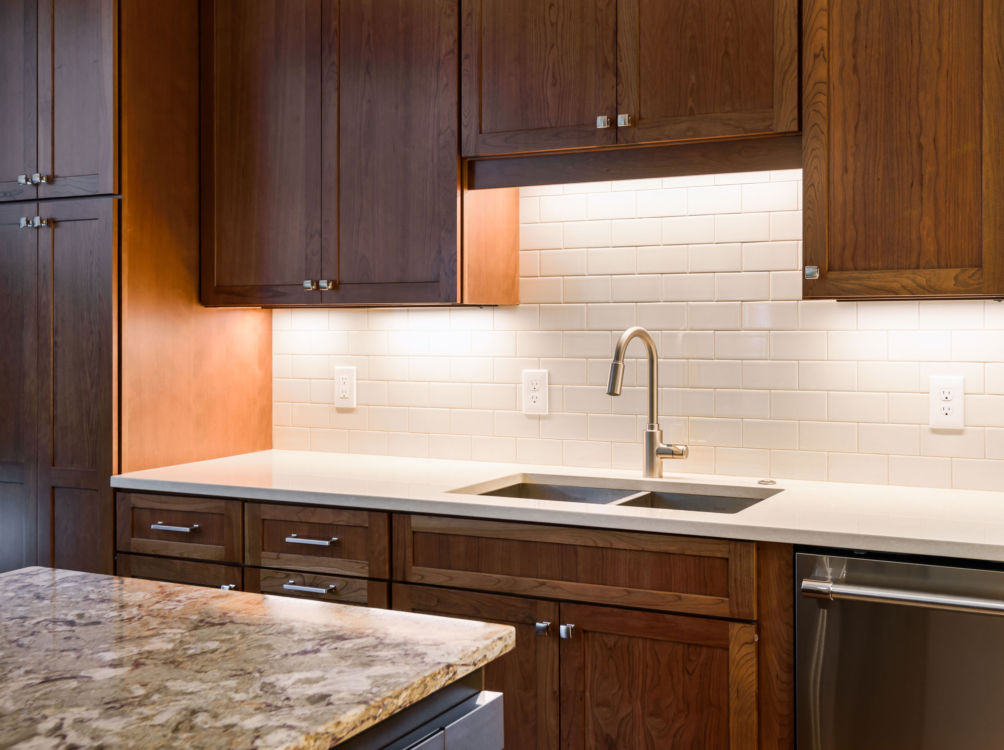
A small island is great for conversation and prep space, also hiding the microwave drawer. The built in wine storage peeks around the corner holding an impressive 92 bottles of wine. We added new hardwood flooring to match the entire first floor bringing together the old and the new. The result is a warm and inviting kitchen!
2019
DESIGNER:
Rochelle McAvin
PHOTOGRAPHER:
Karen Palmer Photography
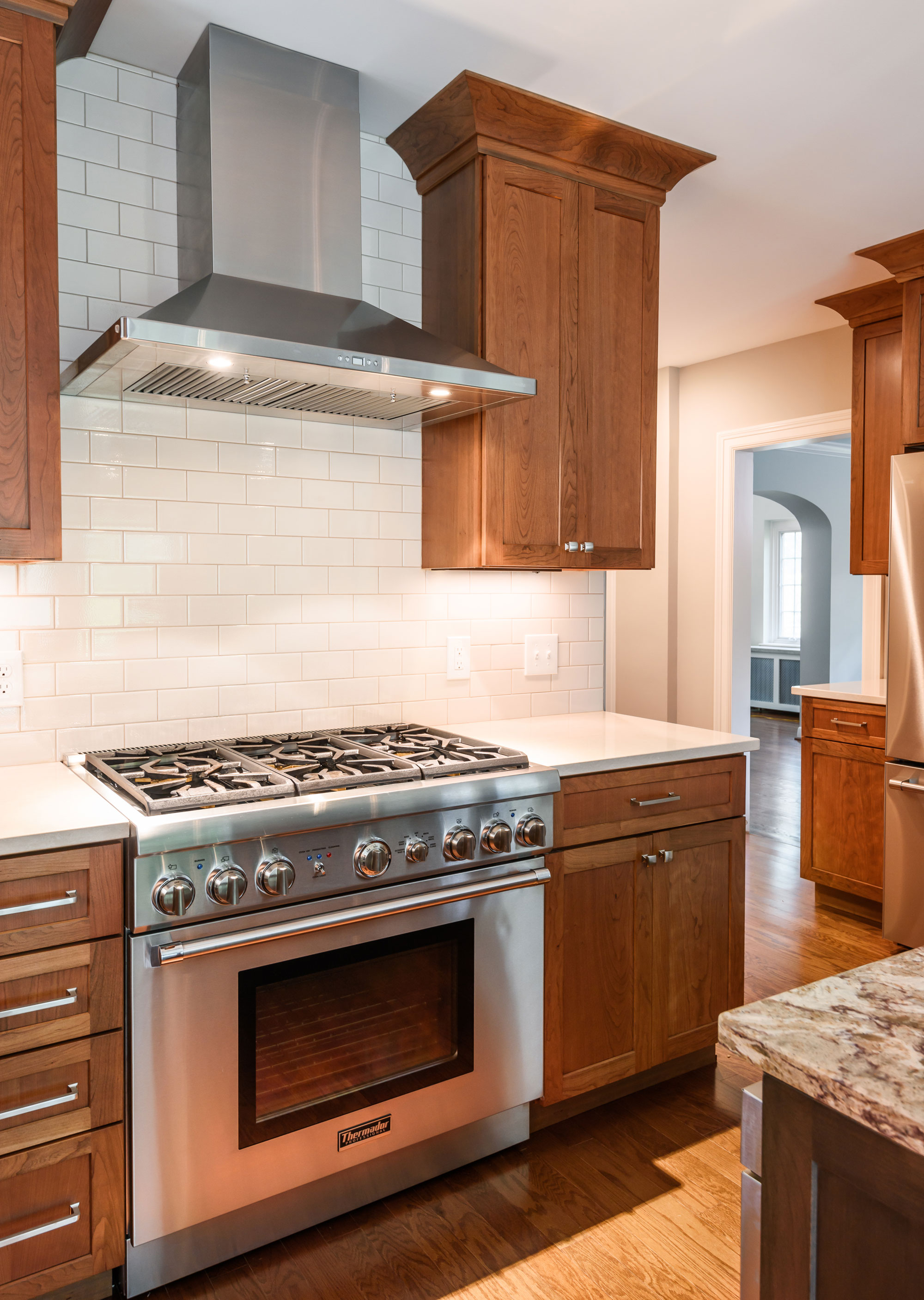
Our client wanted to remodel his outdated kitchen as soon as he moved in. The classic U City Tudor needed an update that was true to the history of the home. The existing kitchen had a bathroom right next to the island. We added a wall to create a hallway and offer privacy, that now feels like a natural extension of the home.
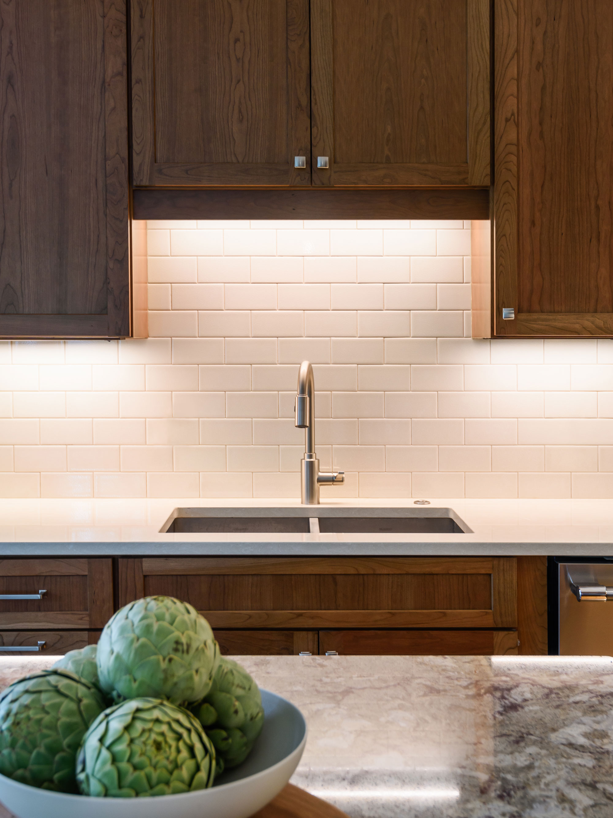
Our client loves to cook and the wall provided us a new place to incorporate a professional range and hood. A small island is great for conversation and prep space, also hiding the microwave drawer. The built in wine storage peeks around the corner holding an impressive 92 bottles of wine. We added new hardwood flooring to match the entire first floor bringing together the old and the new. The result is a warm and inviting kitchen!
Clean and Contemporary Kitchen
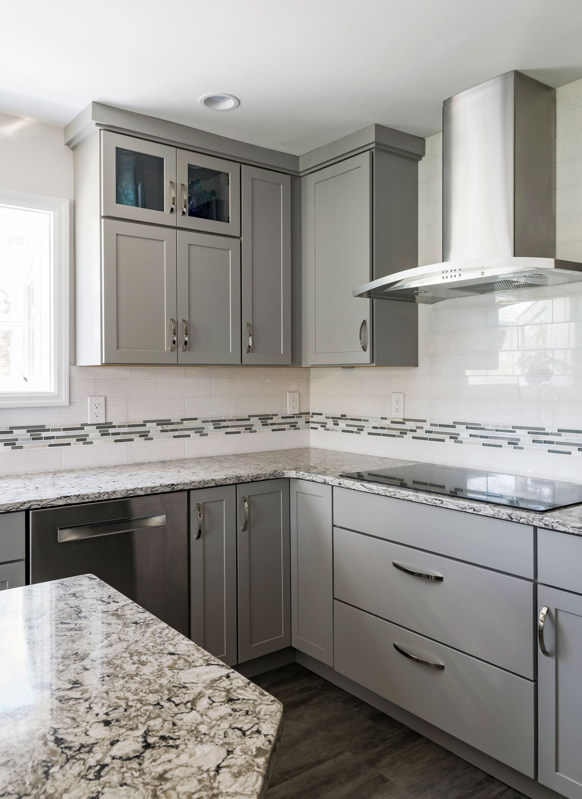
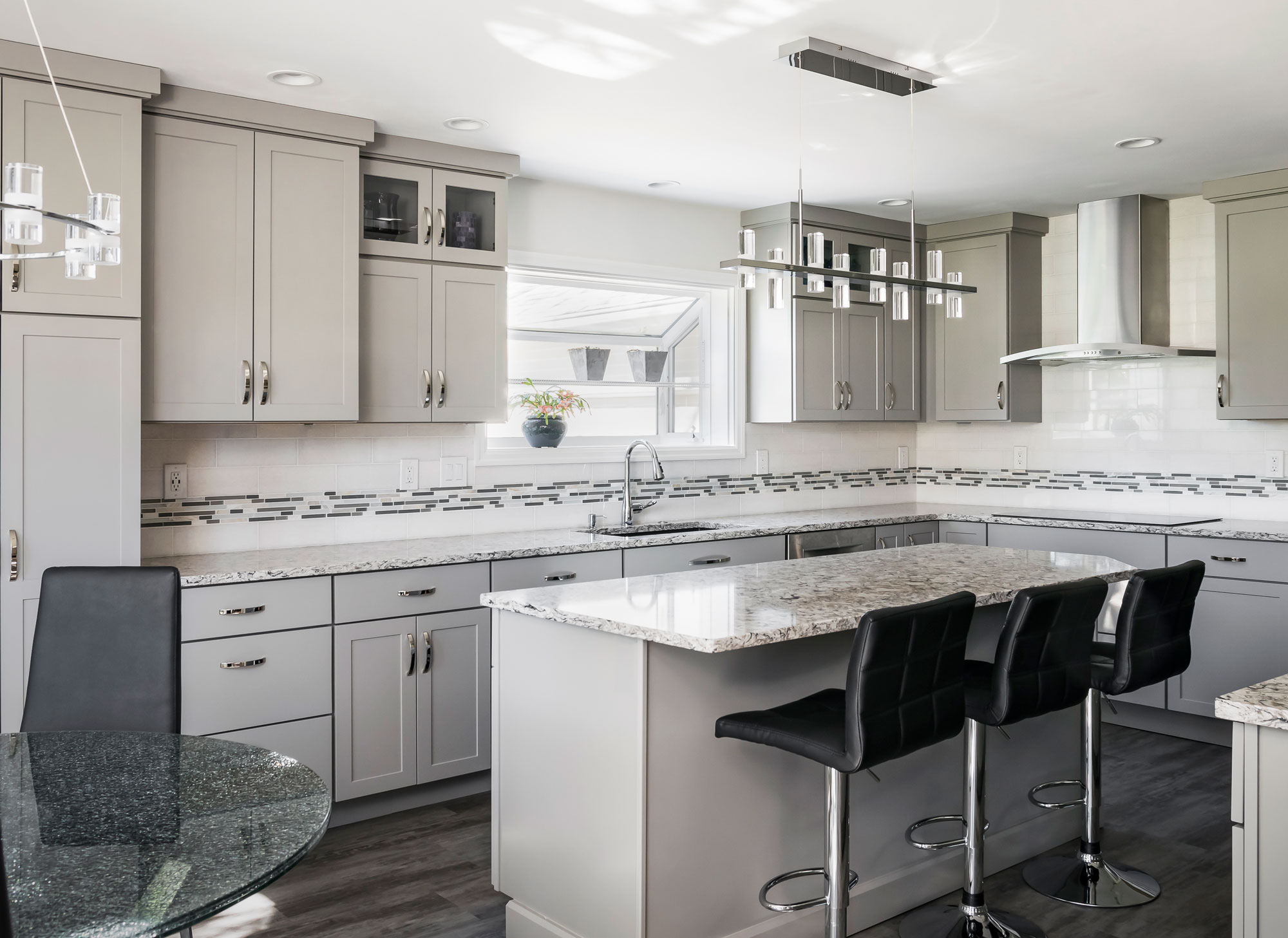
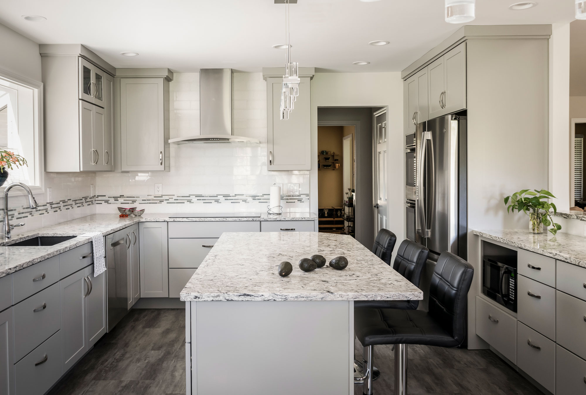
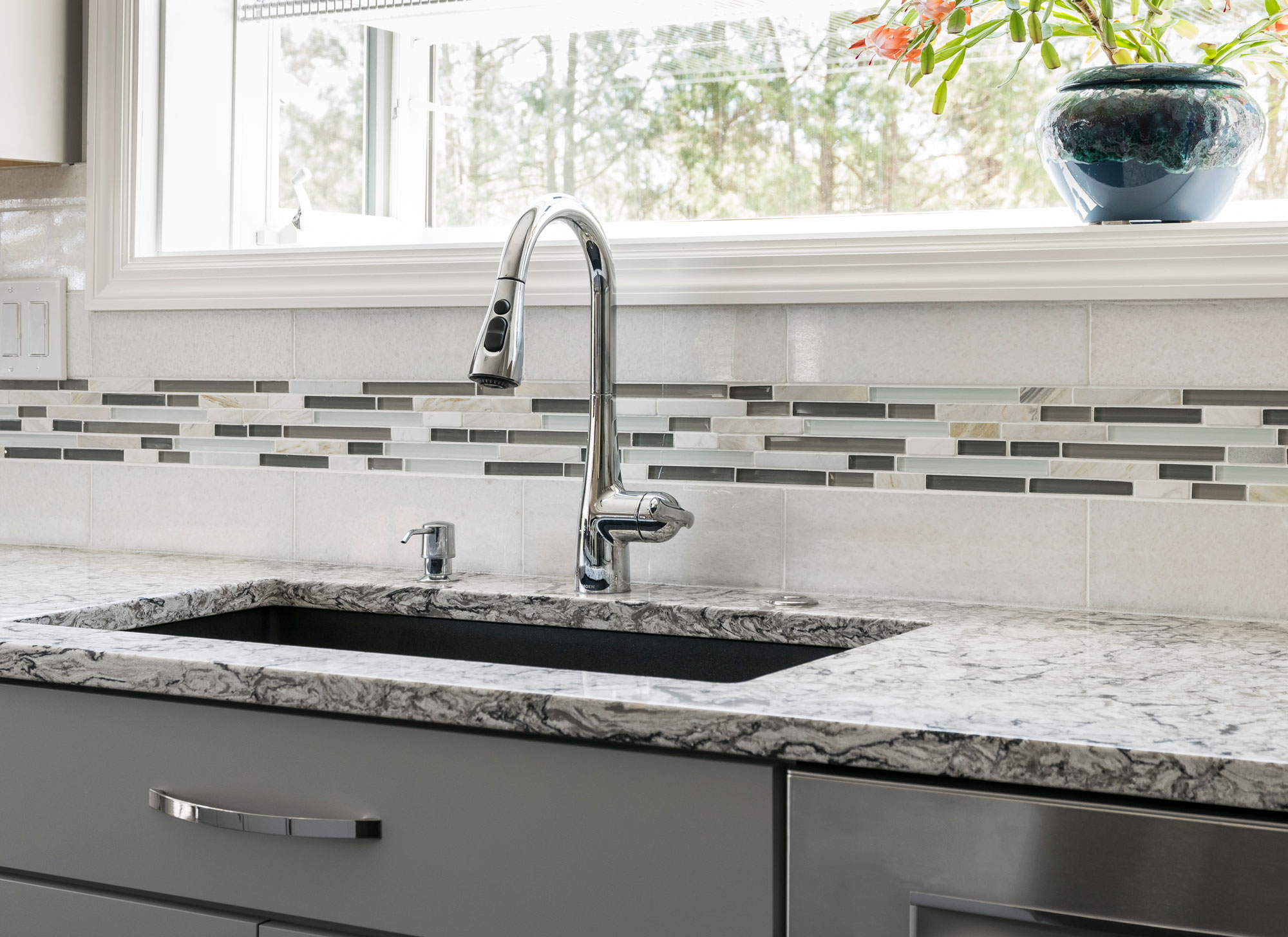
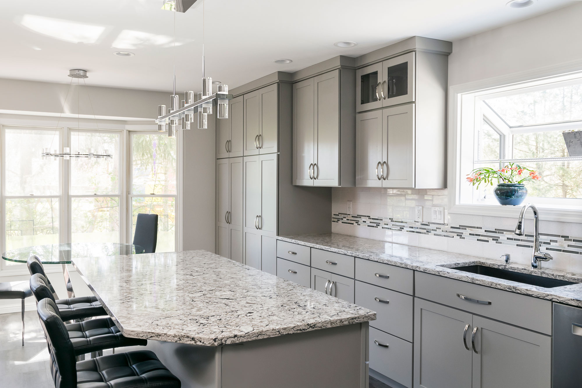
The flooring is a family proof luxury vinyl tile and the counter tops are Cambria quartz. We love how this kitchen is bright, open and modern!
2019
DESIGNER:
Rochelle McAvin
PHOTOGRAPHER:
Karen Palmer Photography
Our client loved the idea of a clean, contemporary kitchen. We opened up the wall to the living space to connect the two spaces and replaced a pantry for storage that blends seamlessly with the kitchen cabinets. She chose a neutral color palette with a mix of grays, whites and neutrals; ensuring a timeless look. The flooring is a family proof luxury vinyl tile and the counter tops are Cambria quartz. We love how this kitchen is bright, open and modern!
Custom Contemporary Craftsman-Kitchen
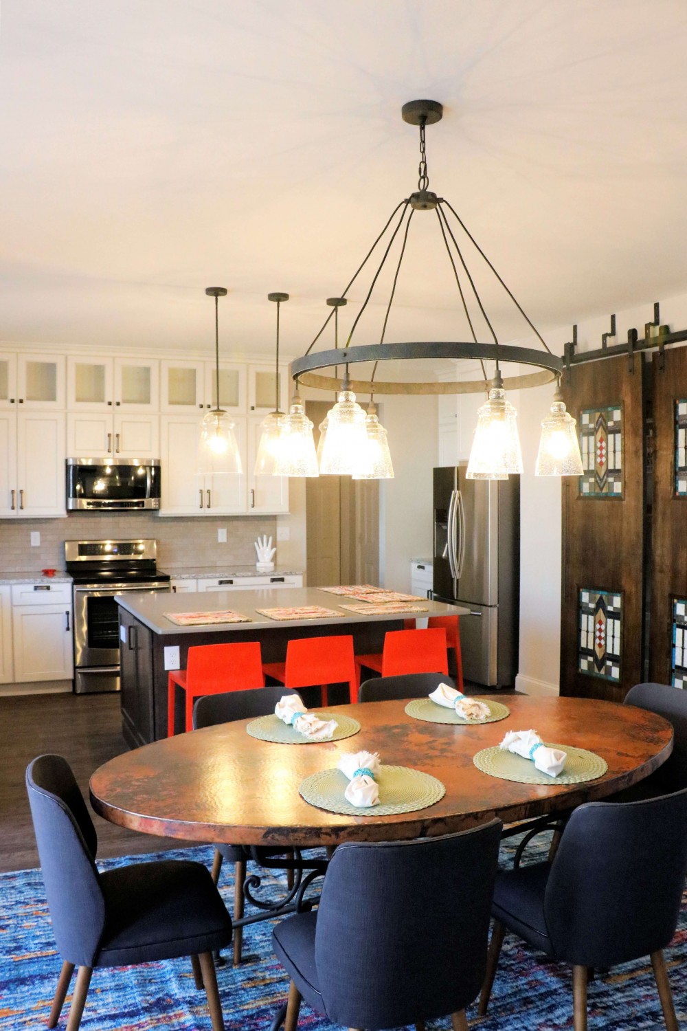
We recently did a project with Sara Luigs and Melanie Christoff with CURE Design Group, featuring a craftsman style, with barn doors and stained glass accents.
Custom Contemporary Craftsman-Kitchen

DESIGNER:
Melanie Christoff
PHOTOGRAPHER:
CURE Design Group
We recently did a project with Sara Luigs and Melanie Christoff with CURE Design Group.
The Article Below is by Melanie Christoff at Cure Design Group
This client started off just being curious about our services – what we could do, and if we could even help her update her kitchen. She and her husband with their two teenage kids have lived in their home for several years without updating anything since the house was originally built. They didn’t quite have a budget in mind yet. They didn’t know their style, or even if they had one. Their timeline was simple, “as fast as you can so we’re not without a kitchen for very long” (usually what we hear for kitchen updates).
After a very productive consultation: determining the scope of work and zeroing in on a budget, I was very excited to update this underwhelming space to something that is modern but timeless, something that is theirs. And, it was easy to see what type of design style they gravitated toward looking at the pieces they already own: Craftsman/Prairie Style. I left the meeting so excited to weave in yet another genre of design to my CDG portfolio! We circled in our contractor design-build expert LU Design Build to discuss the changes they were looking to make and the scope of work that would be theirs. Then I was off to get designing:
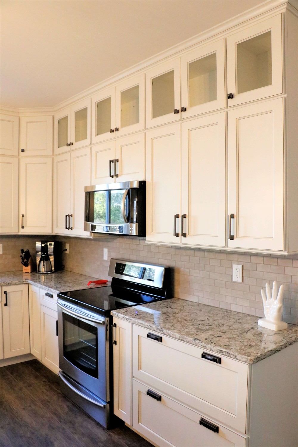
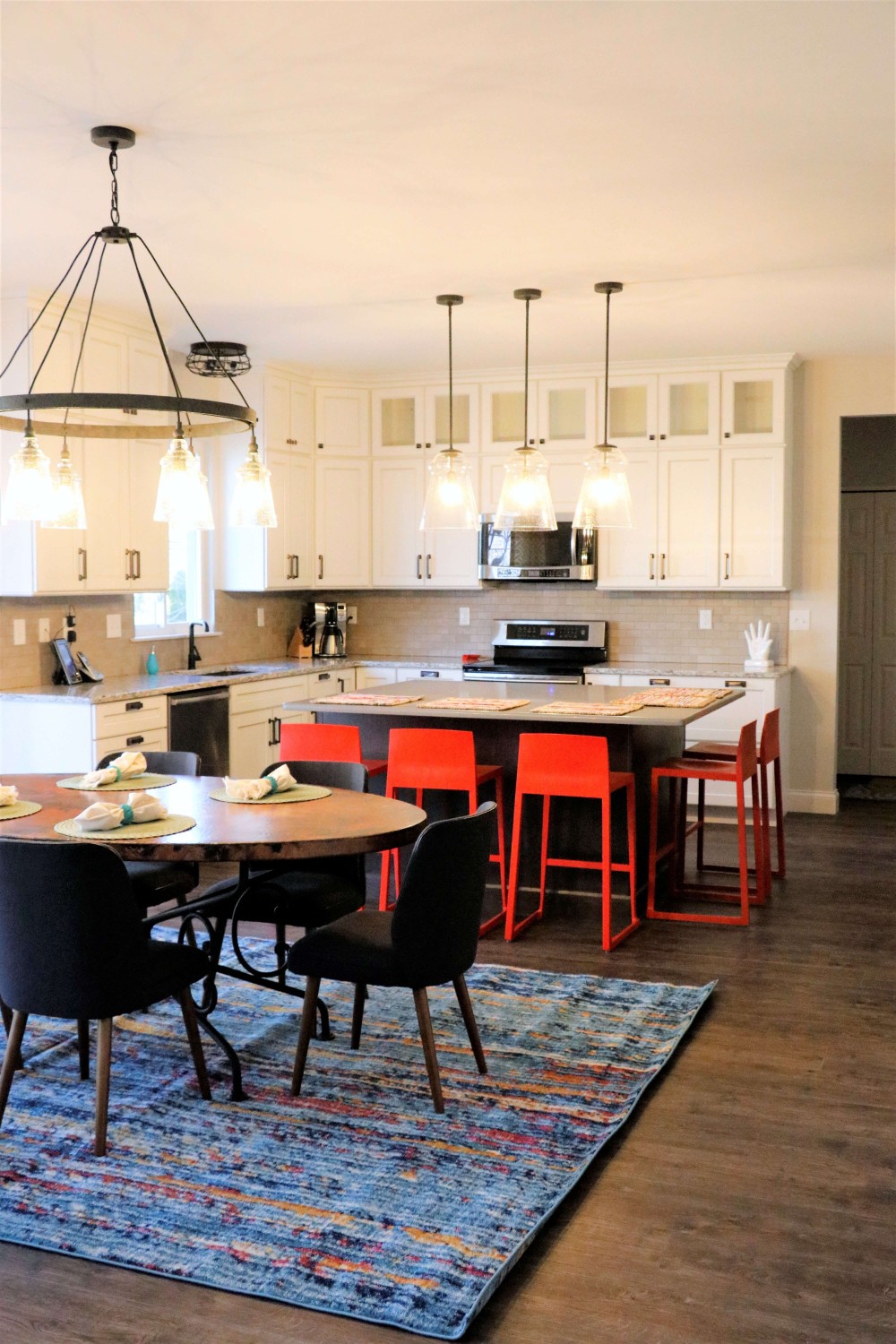
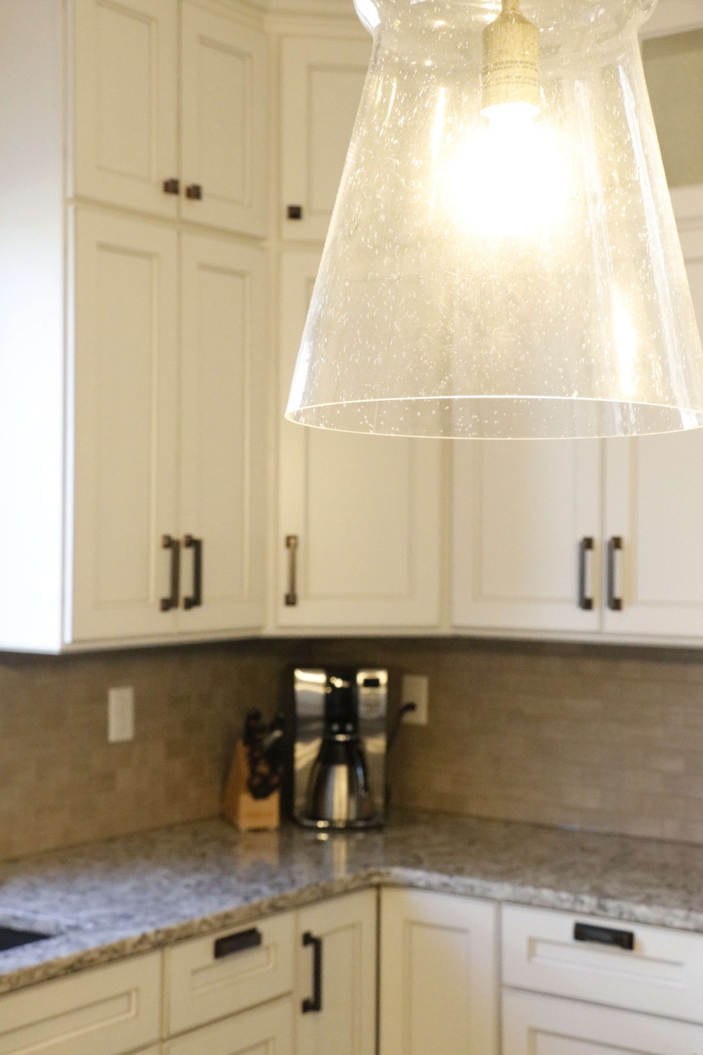
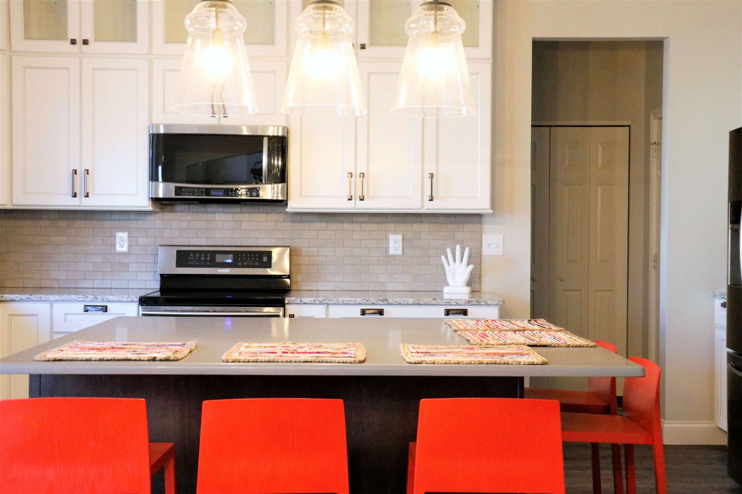
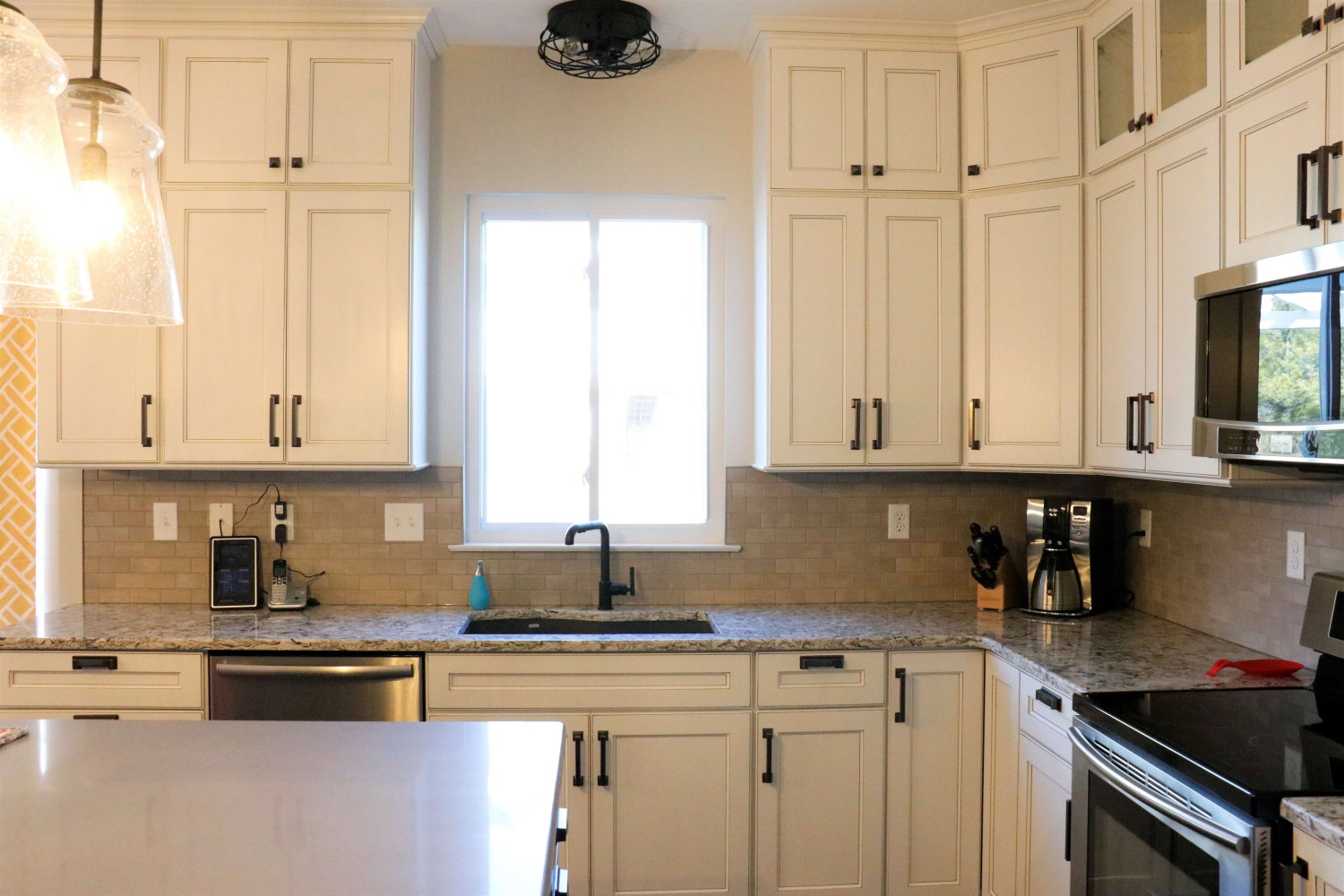
Because the kitchen’s footprint and the defined breakfast space delineated by the bay, we kept the perimeter cabinetry as it was originally laid out. We updated these cabinets to a beautiful soft Alabaster White with a Barn Wood Glaze to highlight the simplicity of the shaker style doors. We added transom cabinets above the uppers, with only the back wall having seeded glass inserts to highlight some of their collectibles.
The original shaped island was counter-productive (See what I did there?) in functionality and design. We squared this off to reduce some of the angles and gain more storage. We highlighted the new island with a contrasting oak cabinet in a dark finish, to pay our respects to the craftsman style, and topped with a concrete-like countertop as a nod to the Prairie Style, allowing the homeowners to gain two extra seats and a massive -uninterrupted- work surface.
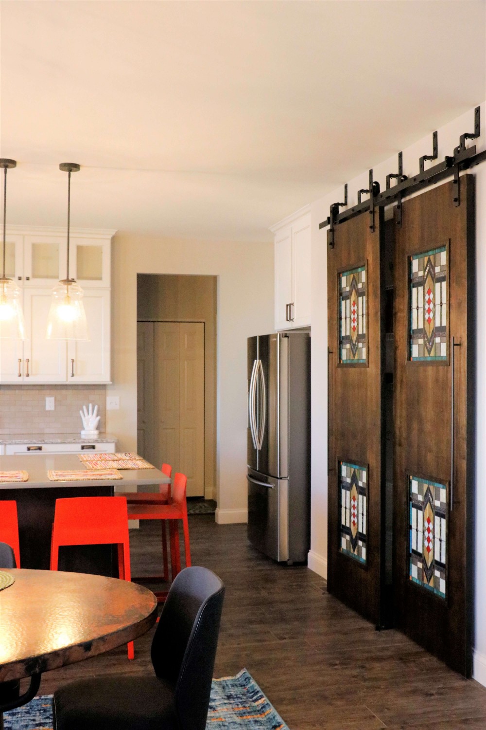
The small section of cabinetry between the garage entry and fridge now is the perfect dump-station for mail, electronics, whatever is in their hands when they come into the house; and completely hidden by the refrigerator.
The disconnected cabinetry in the breakfast area makes for a great place to have a working office. Accessible from the kitchen or the adjacent great room, this is the perfect place for the kids to do their homework while mom and dad are putting together dinner. The base cabinets are built out for office-type storage: paper and pencil drawers, filing systems, and cord management. Additionally, the long counter provides a ton of worksurface to spread out.
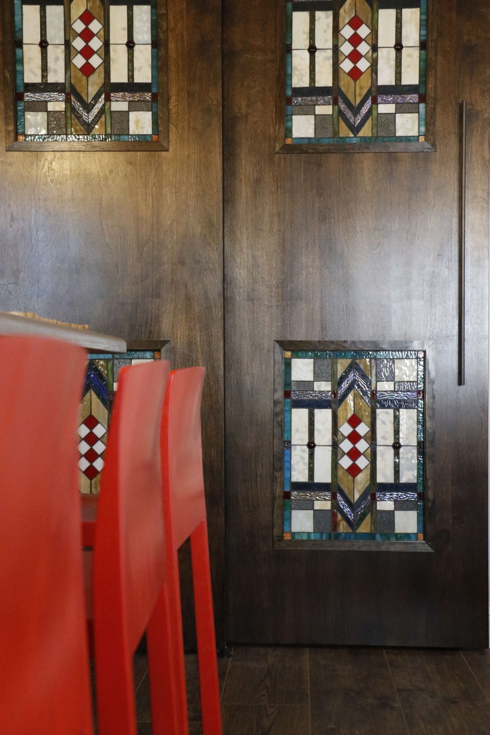
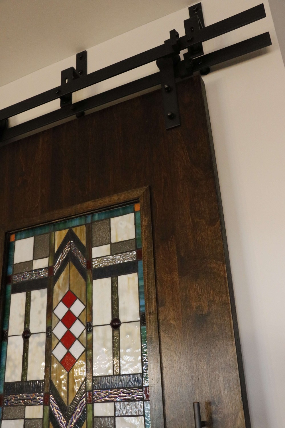
The largest transformation was the pantry. We raised the height of the doorway and added huge custom designed bypass sliding barndoors. Finished with a dark stain to compliment the island and cut to inset 4 stained glass windows, typical of this style of design, and driving home the concept for the whole space.
They were desperate to replace their flooring with something extremely durable to flow throughout the kitchen and the whole main level. This beautiful new flooring is actually a textured LVT(!) Which allowed them to save on overall cost and extend the life of their new flooring purchase.
They loved their copper table, so we kept it and added new simple, mid-century modern chairs around it and a shiny new craftsman-style chandelier above. We added bright barstools in a burnt orange-red accent, and a bright woven rug to tie it all together.
As every designer knows, a room isn’t finished until there’s something on the windows. Now that the new flooring was installed and every other room on the main level ‘seemed’ to be updated, we needed to update the window treatments in the dining, and great rooms to reflect their new design concept.
Elegant Kirkwood Kitchen
The homeowners loved the idea of a bright and airy kitchen that would function well for their young family. Plenty of storage and an efficient layout make this kitchen a workhorse for meals and family time.
Elegant Kirkwood Kitchen
The homeowners loved the idea of a bright and airy kitchen that would function well for their young family. Plenty of storage and an efficient layout make this kitchen a workhorse for meals and family time. The wavy subway tile creates a watery, elegant backdrop for the Quartzite counter tops and we scaled the sophisticated light fixture to match the size of the custom built island. Window treatments are the final layer, softening the space above the sink and highlighting the windows that overlook the back yard. A perfect family space!
2016
Kirkwood, Missouri
DESIGNER:
Rochelle McAvin
Cabinetry:
Niche Workshops
Photographer:
Karen Palmer Photography
Collected Condo in the Central West End
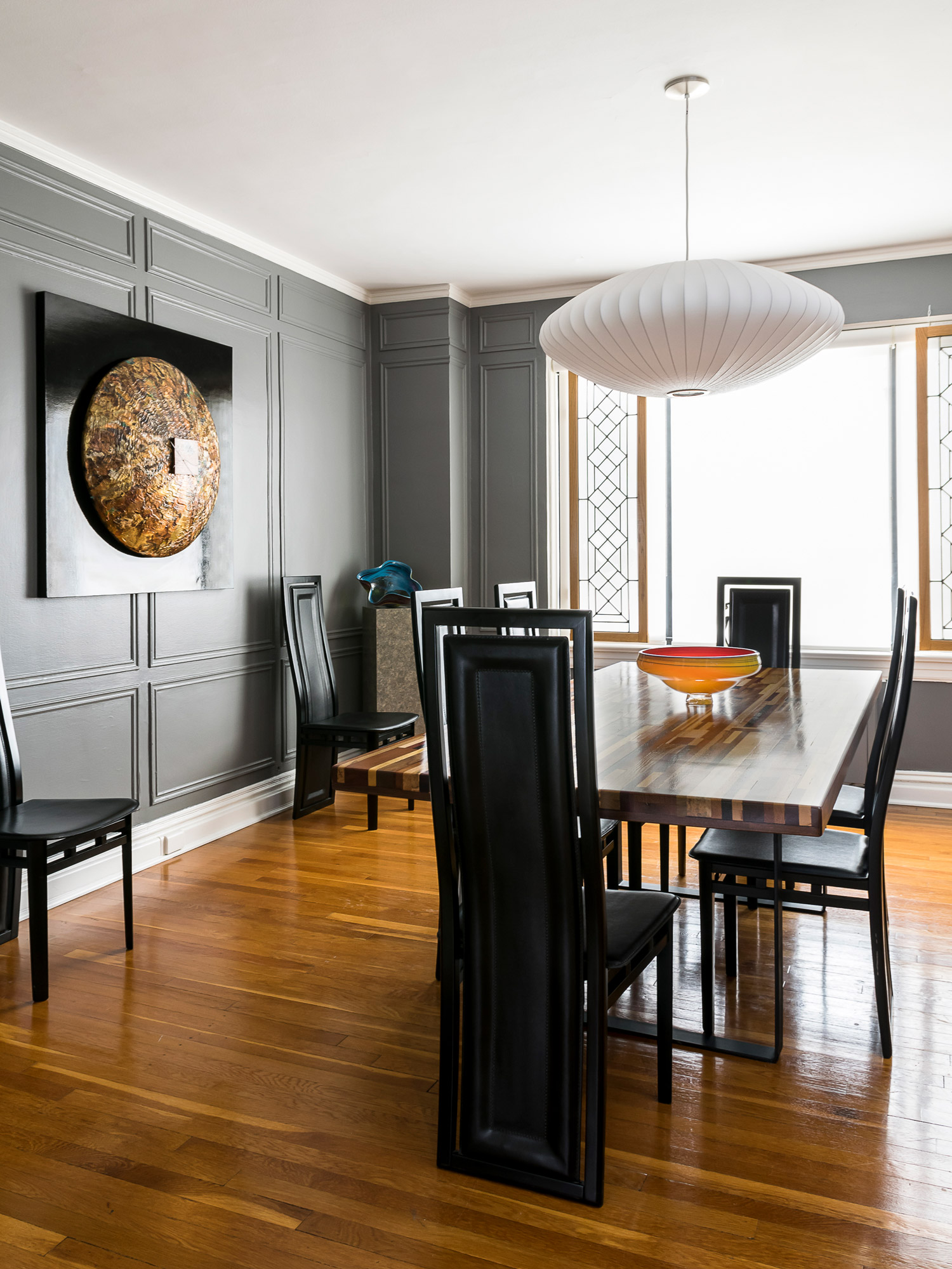
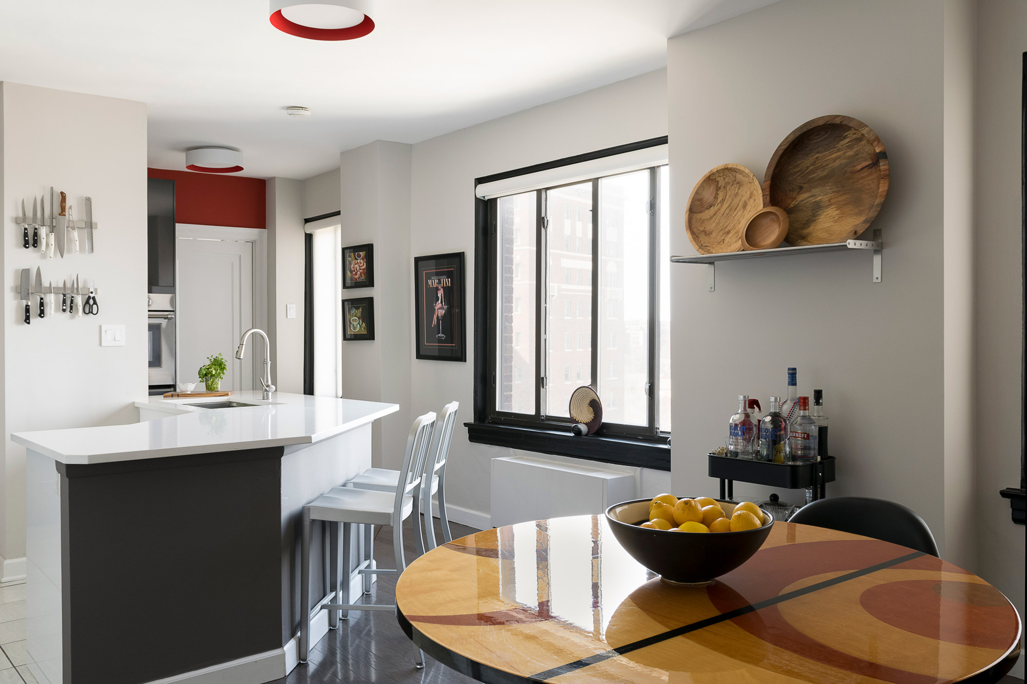
The architecture of the building serves as the perfect backdrop for the homeowner's extensive collections.
Collected Condo in the Central West End
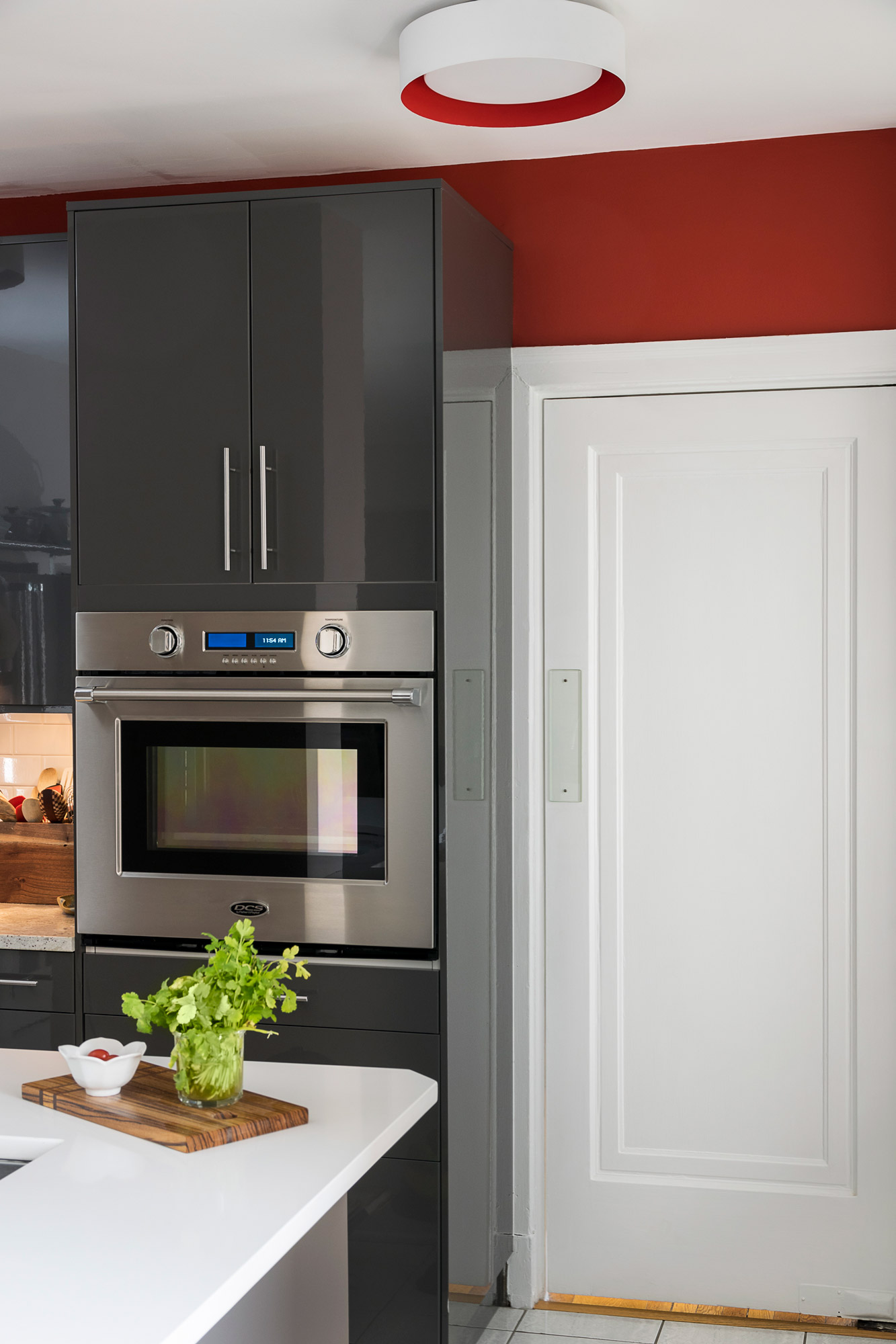
The architecture of the building serves as the perfect backdrop for the homeowner's extensive collections. The paint colors highlight the herringbone tiled floors in the main foyer and the original applied moldings in the dining room create the perfect amount of tension with the modern fixtures and furnishings. A dose of bold color in the kitchen plays perfectly with the grey cabinetry and snow white quartz counter tops.
2016
Central West End, St. Louis, Missouri
DESIGNER:
Rochelle McAvin
Photographer:
Karen Palmer Photography

