Oakwood
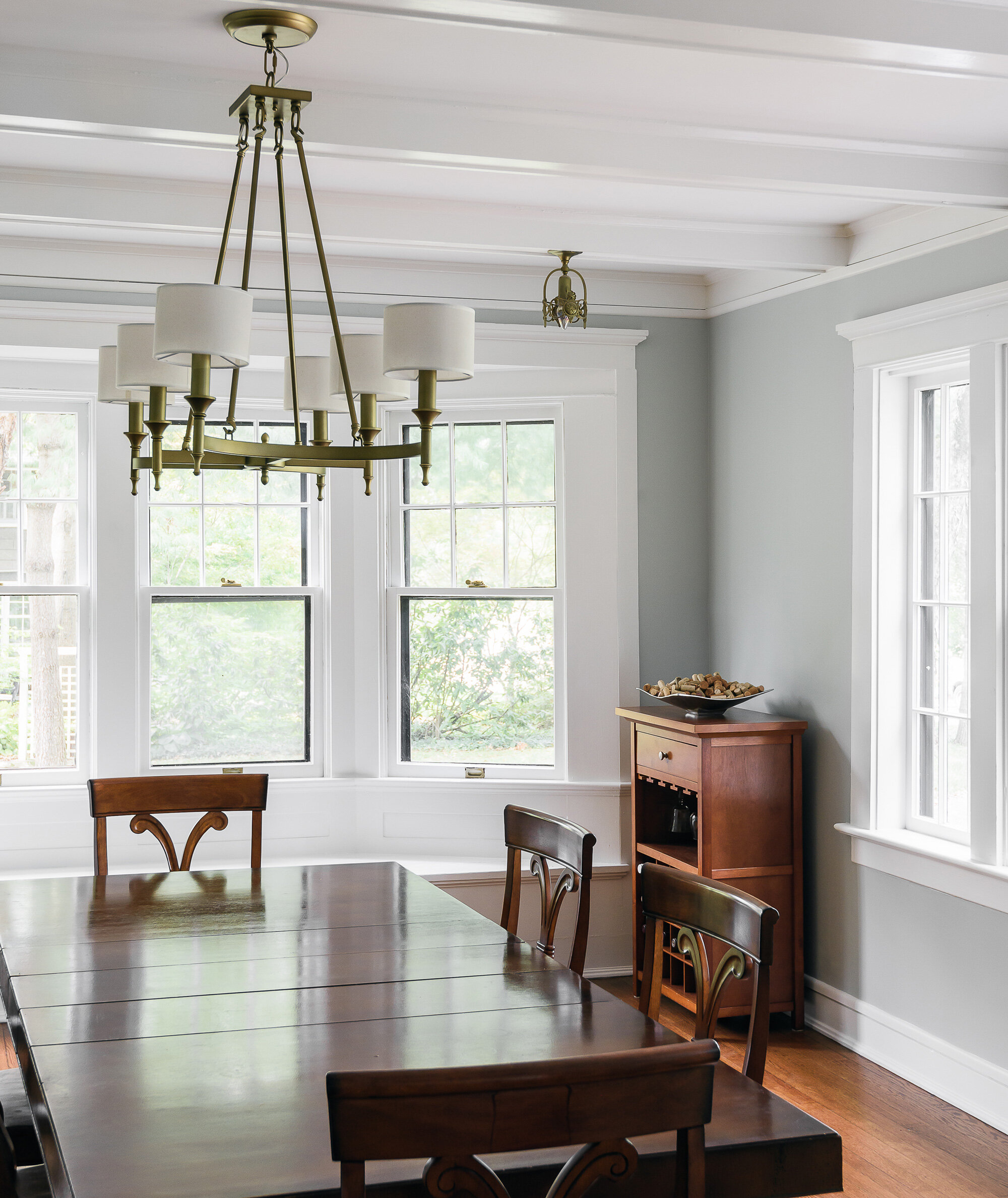
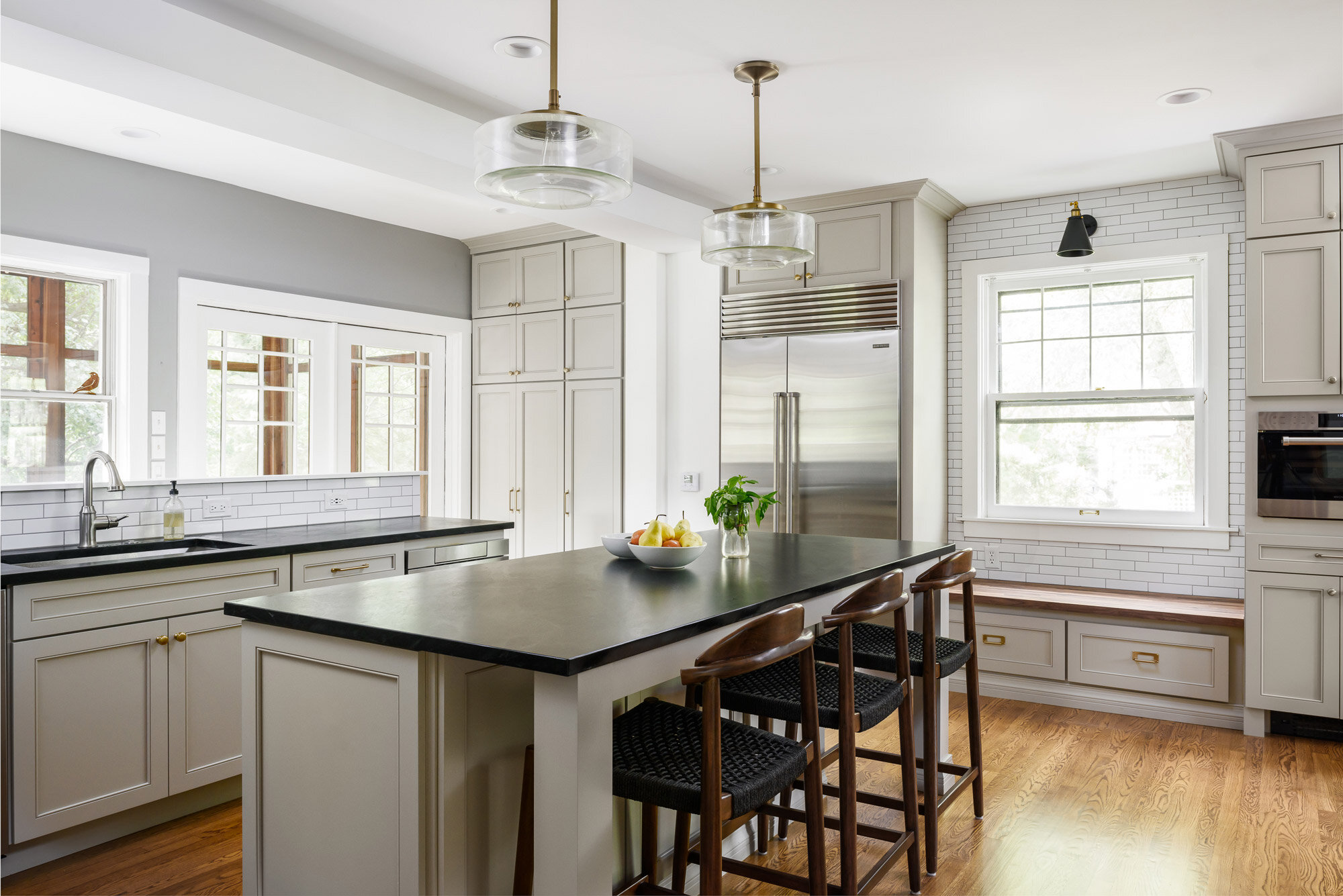
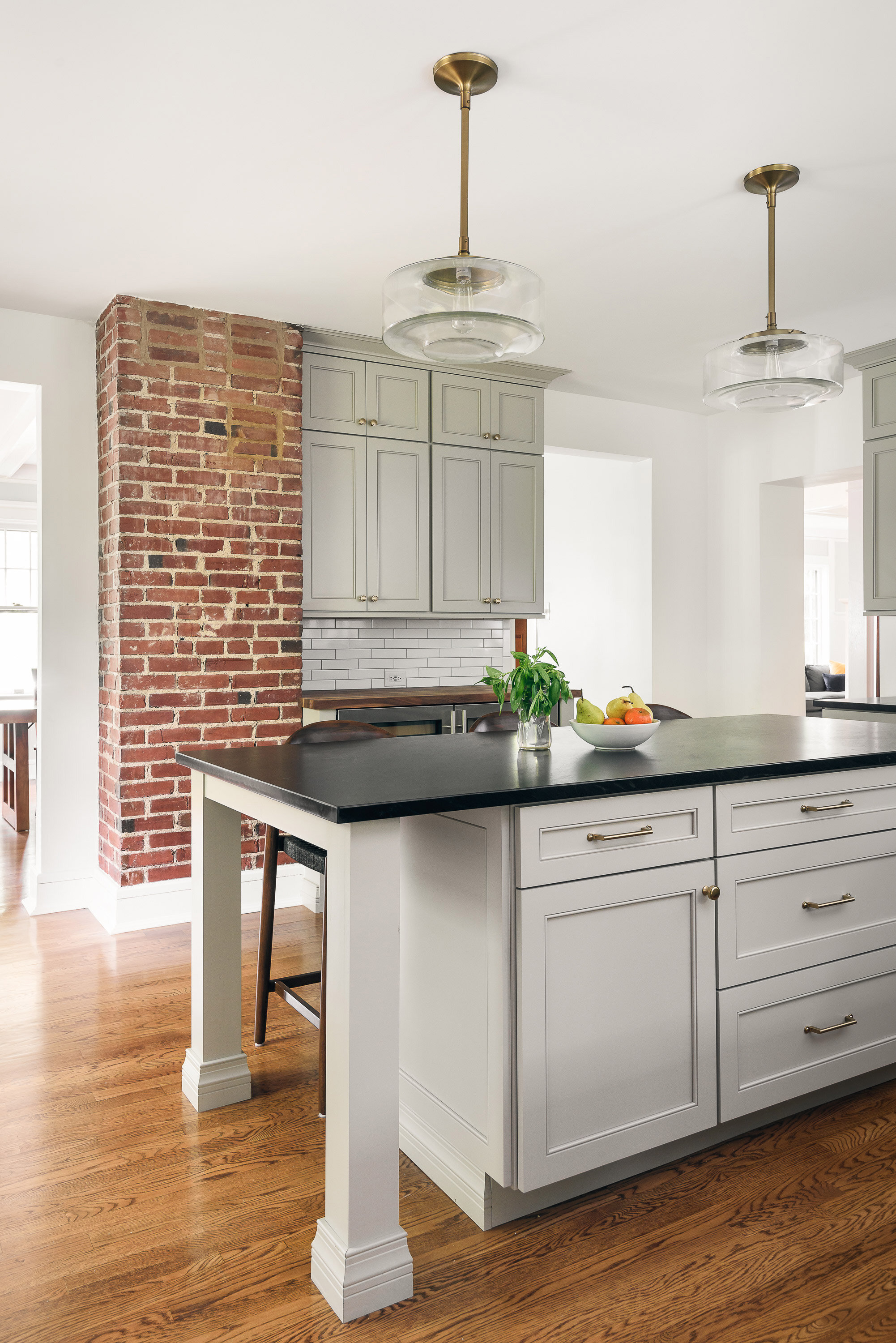
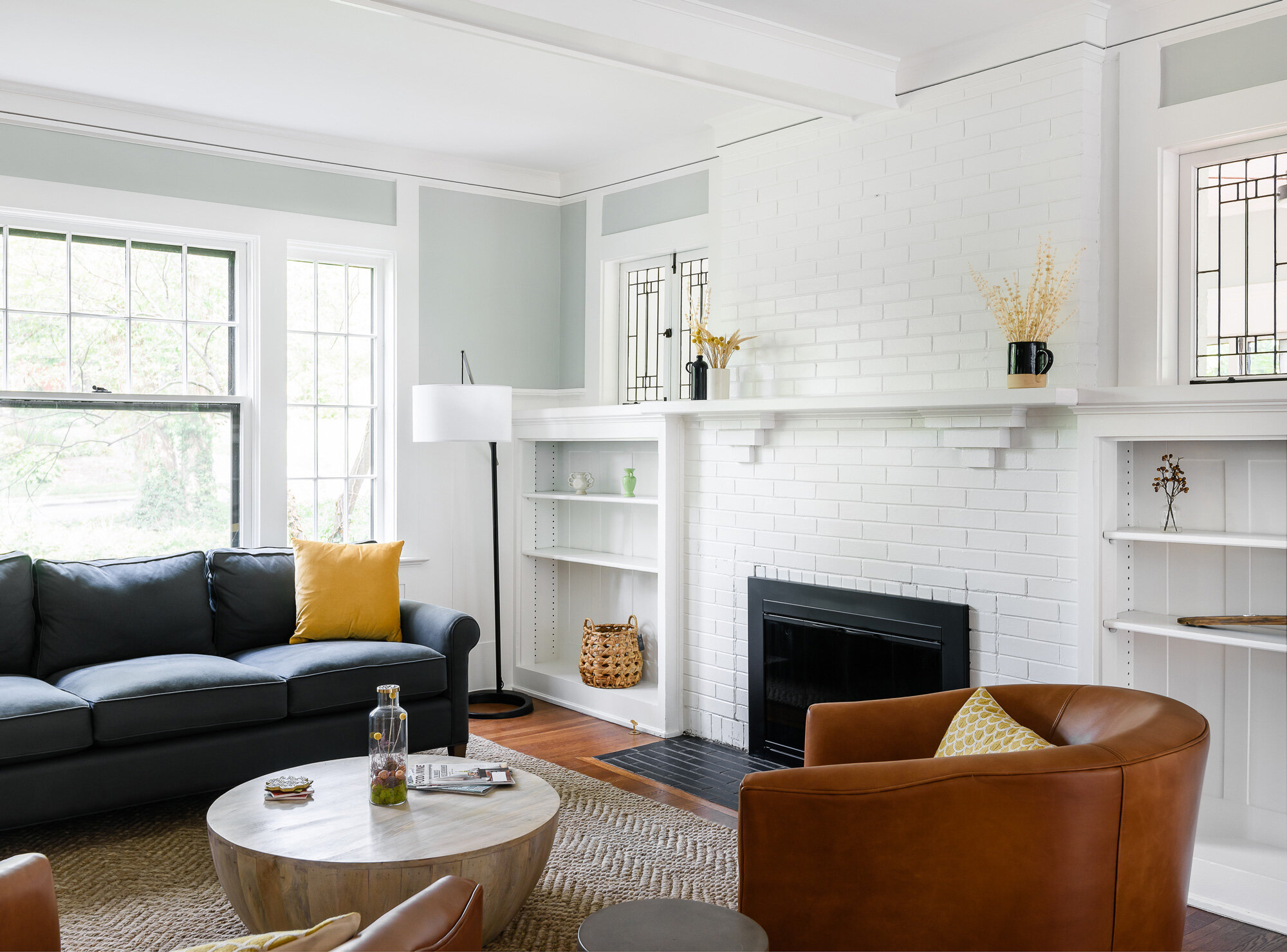
A sunroom with baseboard heaters, a bright kitchen with white subway tiles, and a living room with large fireplace.


Webster Groves, MO
Designer
Rochelle McAvin
Photographer
Karen Palmer
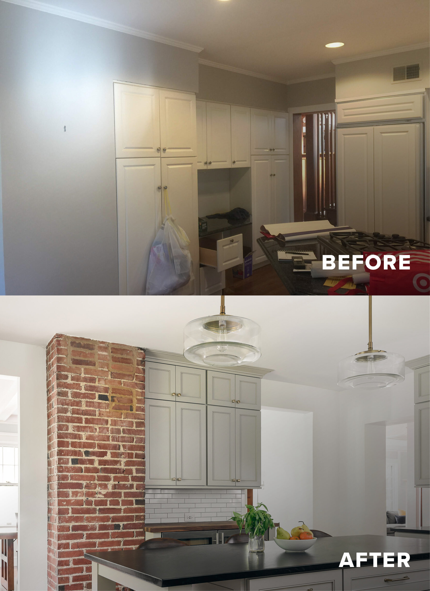
Our clients bought a beautiful century home in Historical Webster Groves, but it was in need of a modern day facelift. We took down dated walls in the kitchen and let the light in.
This family loves to cook and the old kitchen layout was closed in and choppy. The new layout is stocked with storage, professional appliances and plenty of sunlit workspace.
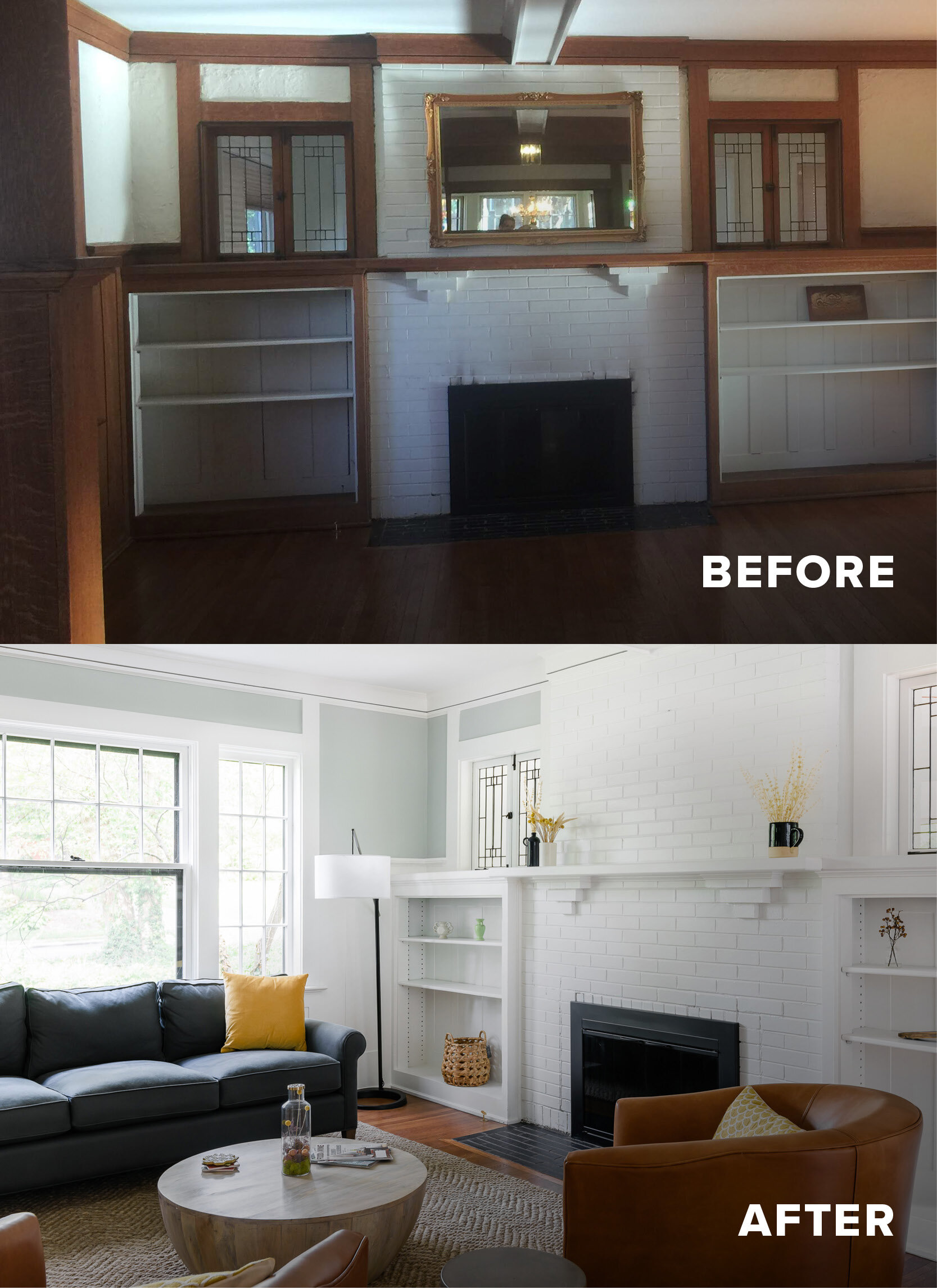
In the family room, the wood wainscotting was original and dark. We lightened up the room by painting everything a clean, clear white. The hardwood floors warm up the room and now it feels welcoming, bright and inviting.
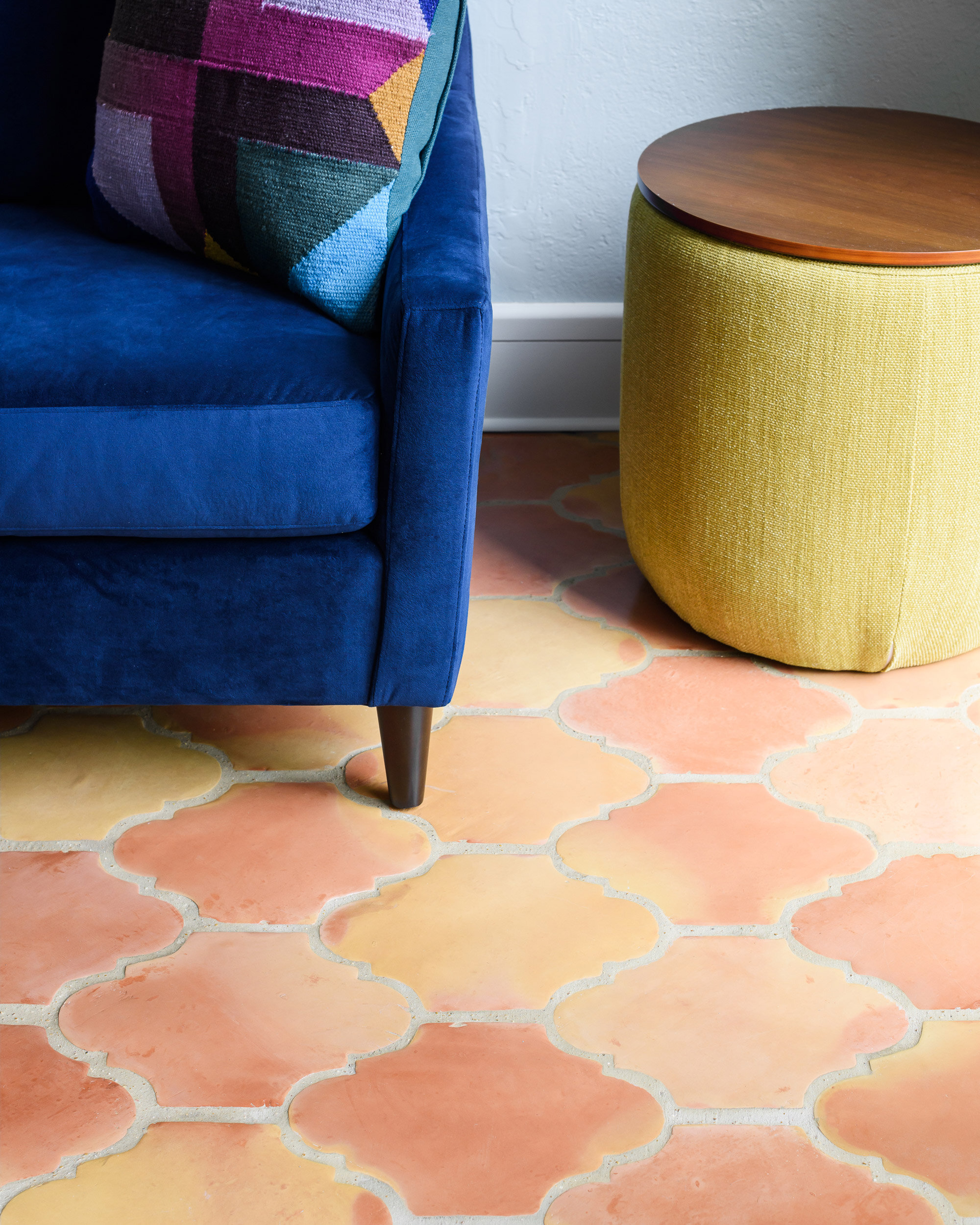
Our last stop was the sunroom. It had baseboard heaters, old blue carpet and did not feel cozy and inviting! We replaced the carpet with spanish clay tile that brings back the character of the old home - but includes a modern update - in floor heat.
We love how it turned out!
This project was recently featured in Ladue News. Check out the details here.
Mission Ct Kitchen
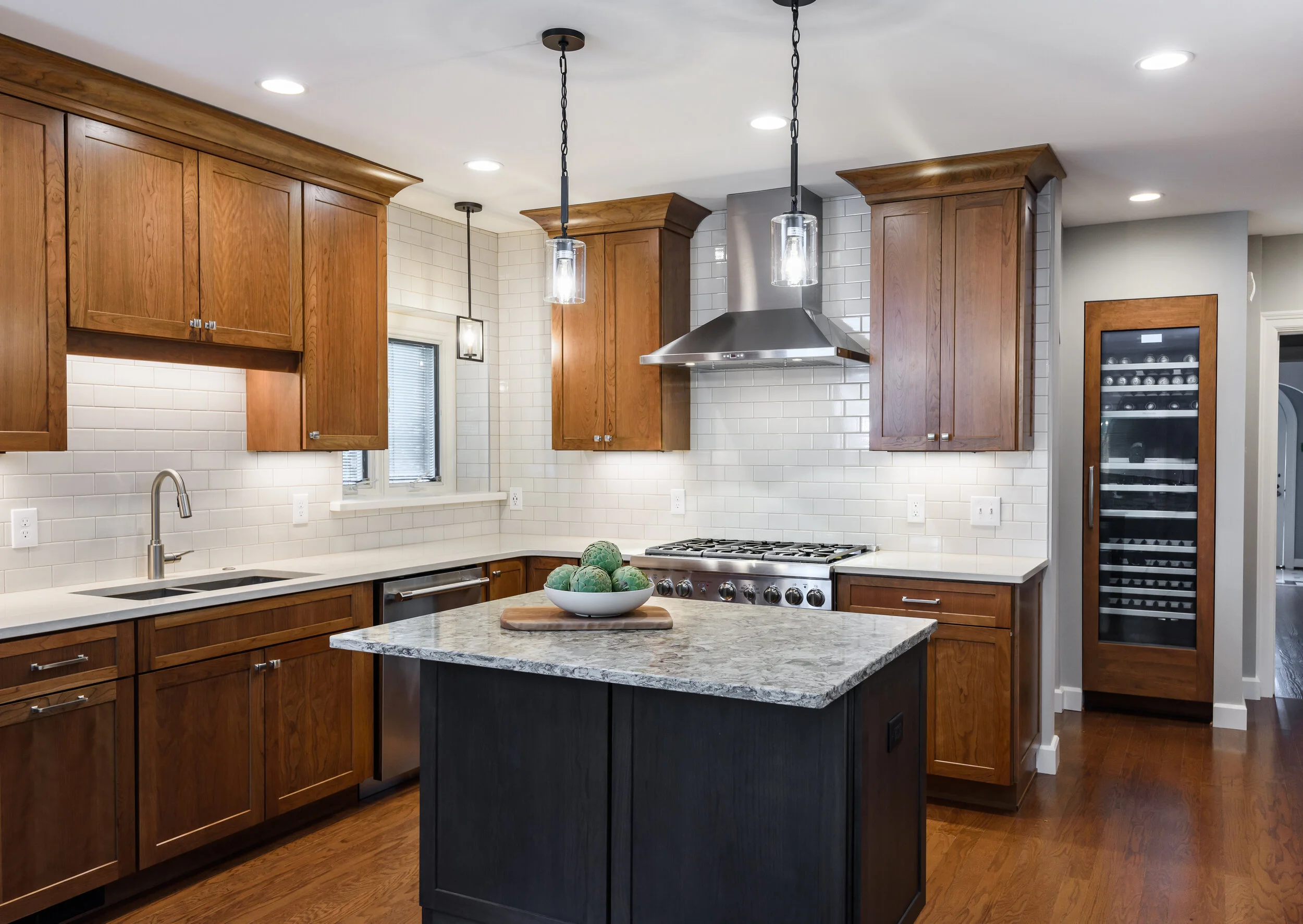
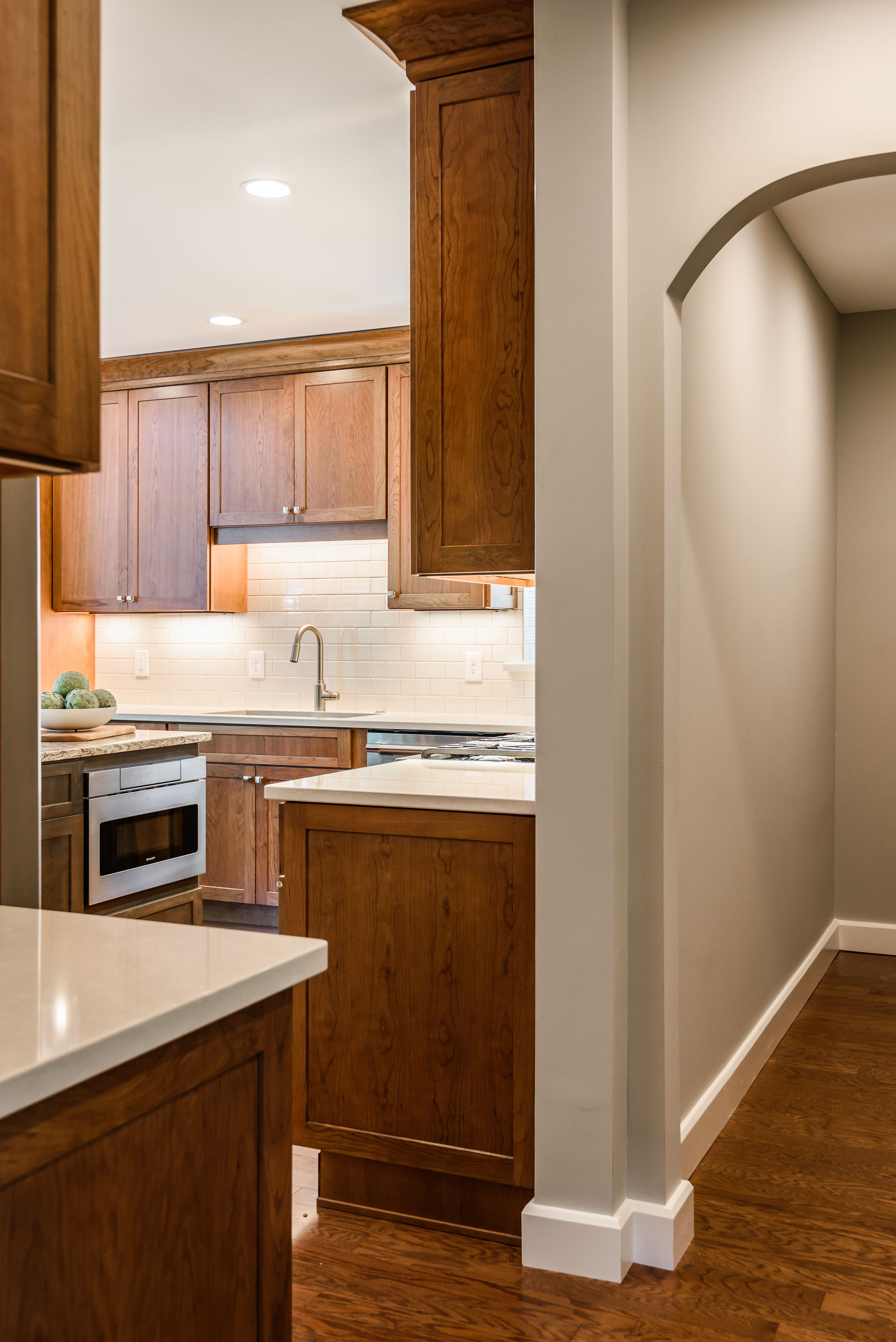
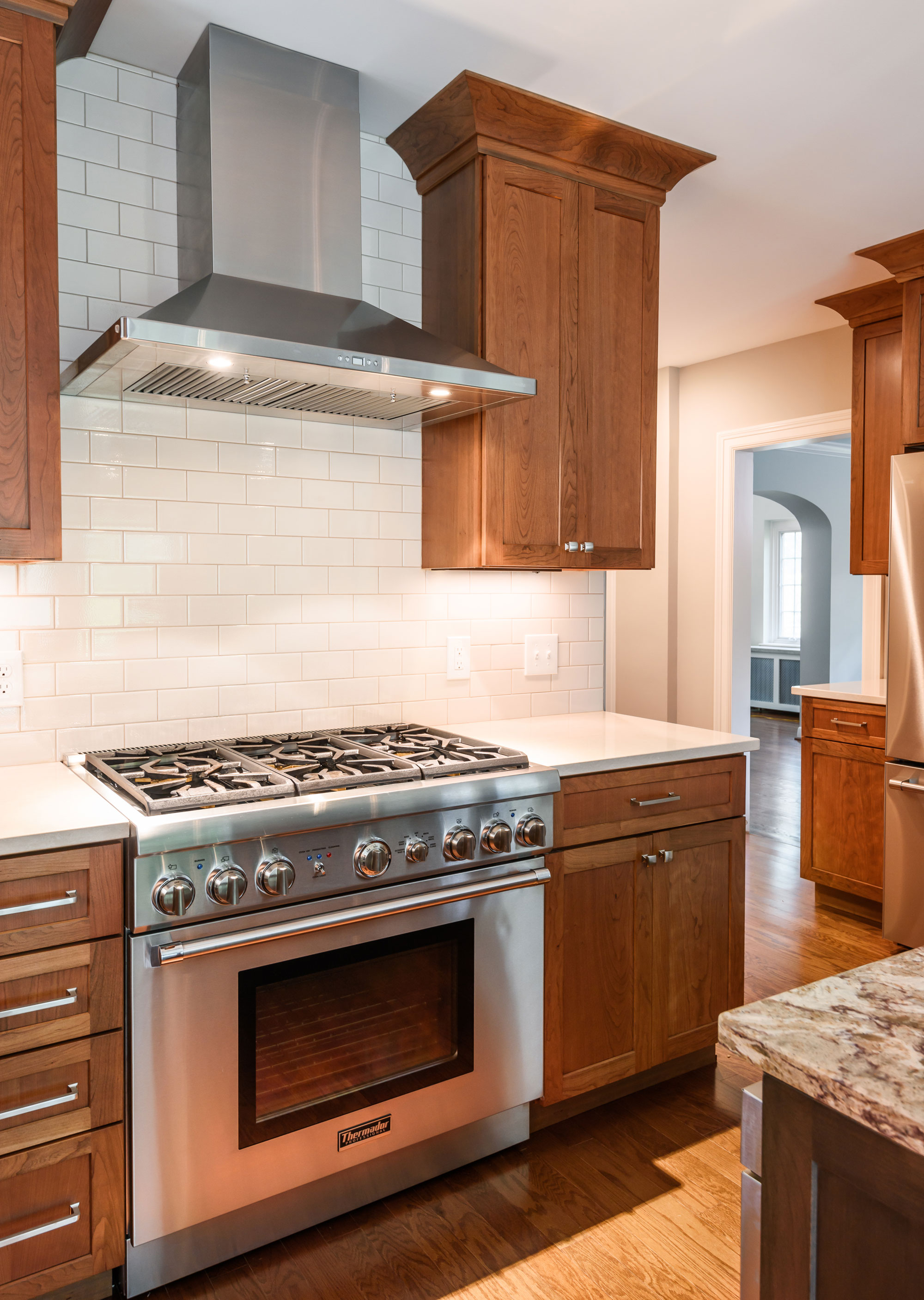
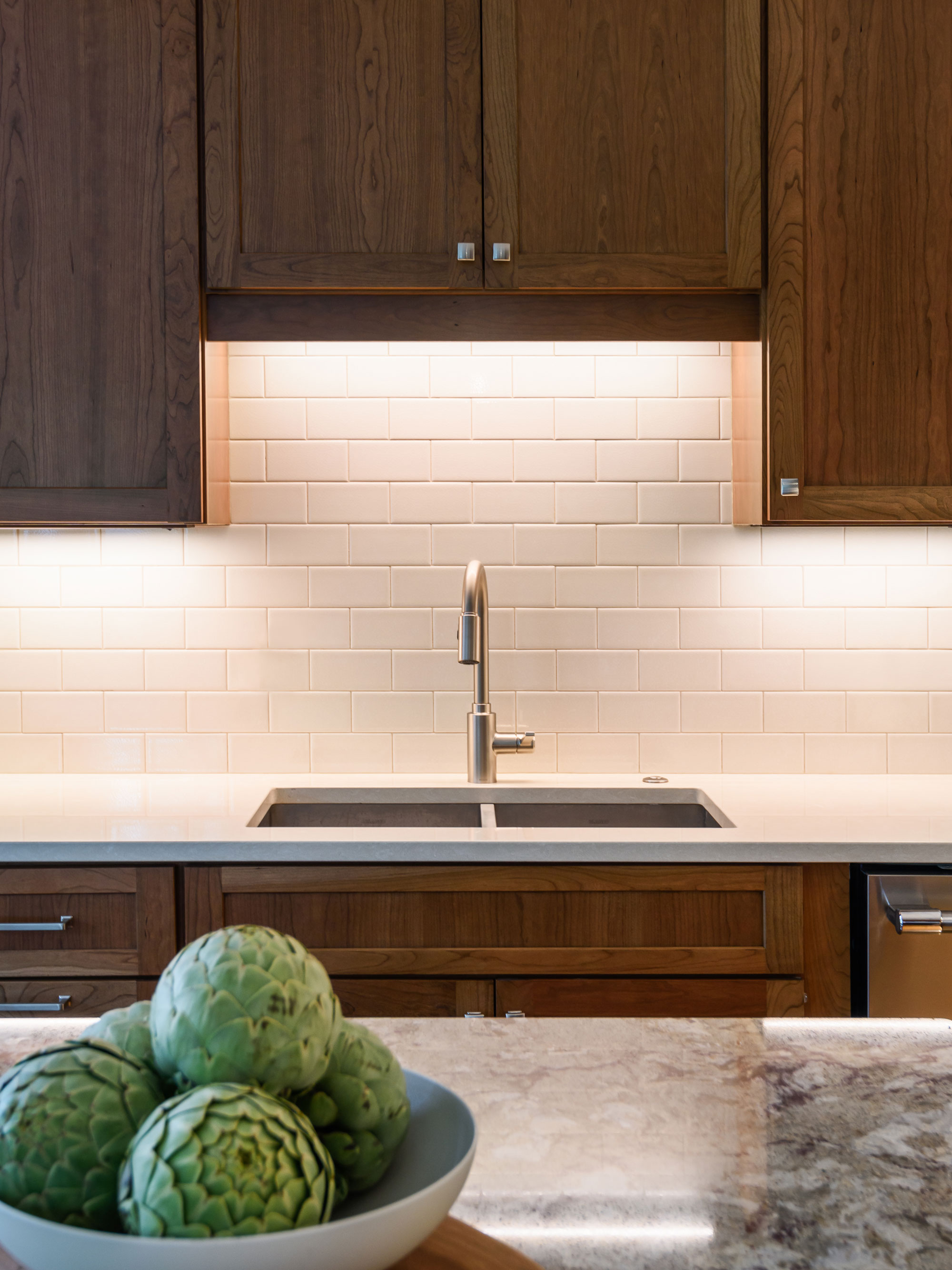
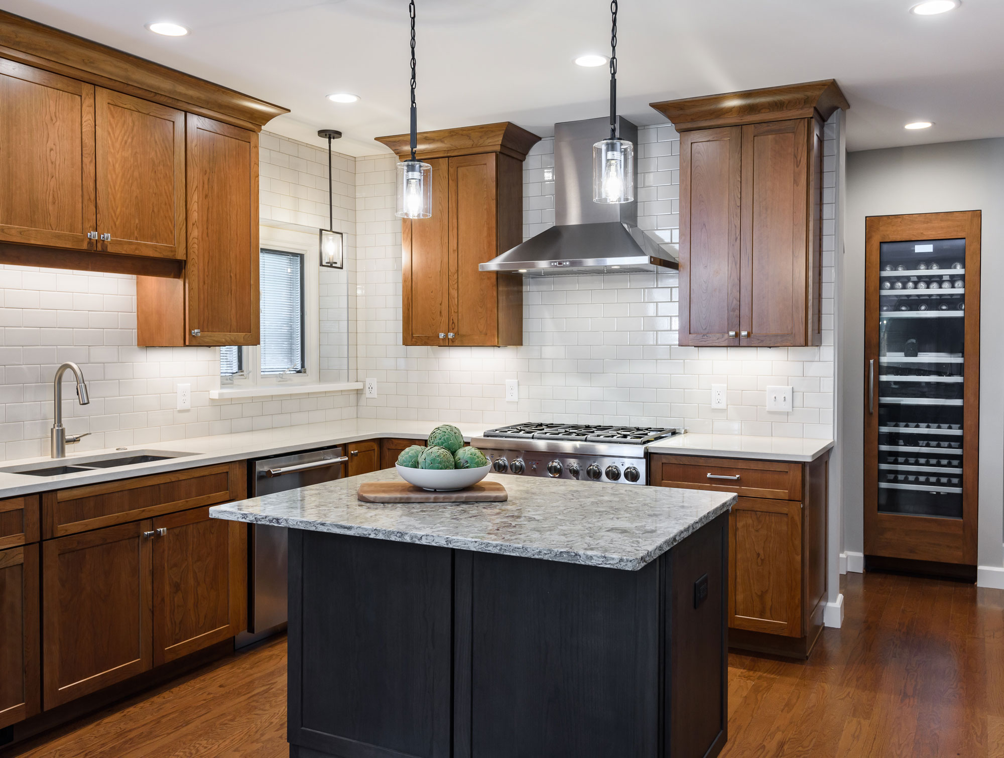
A small island is great for conversation and prep space, also hiding the microwave drawer. The built in wine storage peeks around the corner holding an impressive 92 bottles of wine. We added new hardwood flooring to match the entire first floor bringing together the old and the new. The result is a warm and inviting kitchen!
2019
DESIGNER:
Rochelle McAvin
PHOTOGRAPHER:
Karen Palmer Photography
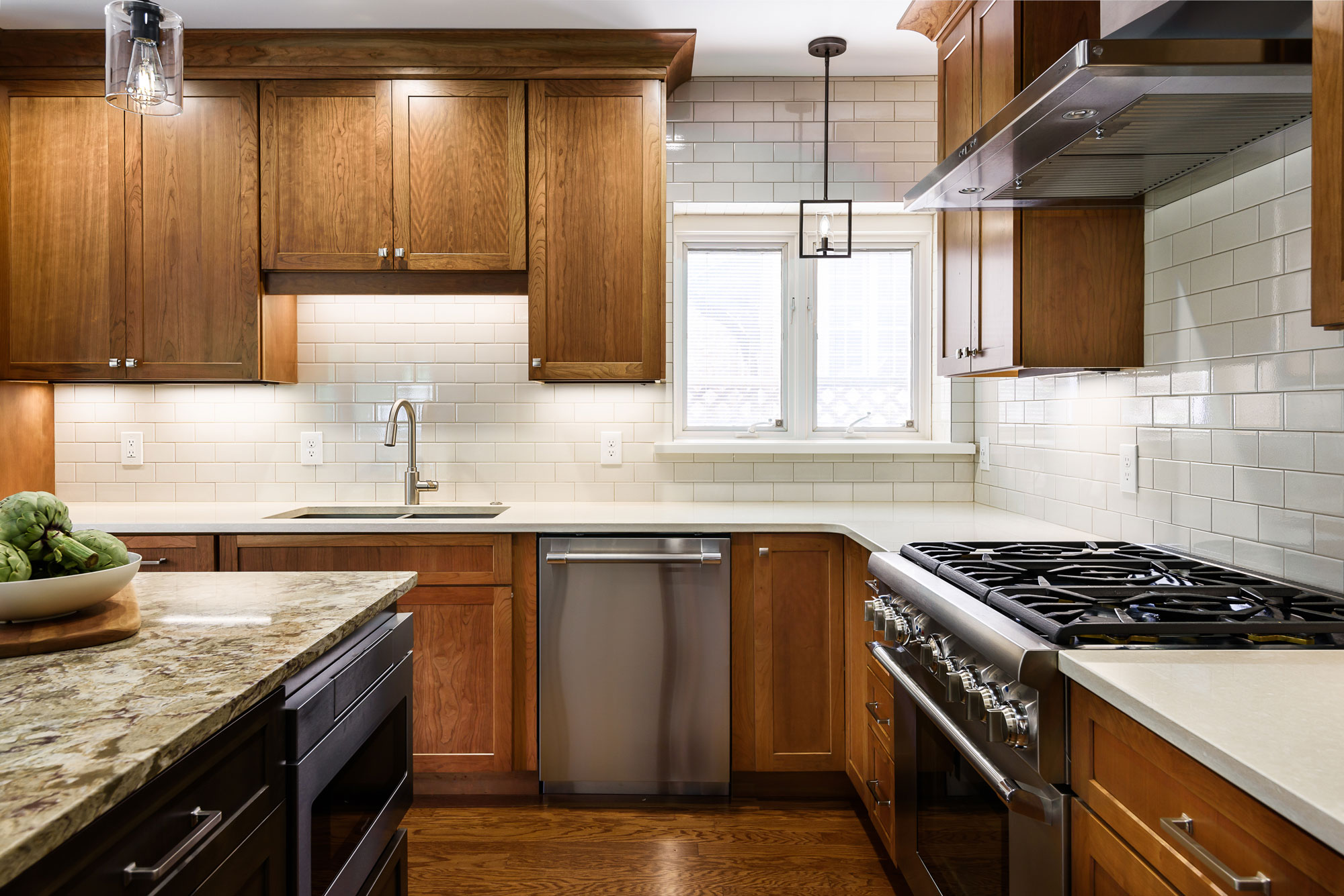
Our client wanted to remodel his outdated kitchen as soon as he moved in. The classic U City Tudor needed an update that was true to the history of the home. The existing kitchen had a bathroom right next to the island. We added a wall to create a hallway and offer privacy, that now feels like a natural extension of the home.
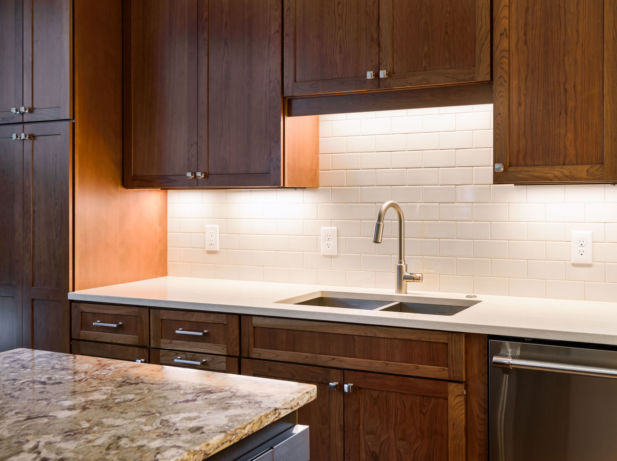
Our client loves to cook and the wall provided us a new place to incorporate a professional range and hood. A small island is great for conversation and prep space, also hiding the microwave drawer. The built in wine storage peeks around the corner holding an impressive 92 bottles of wine. We added new hardwood flooring to match the entire first floor bringing together the old and the new. The result is a warm and inviting kitchen!
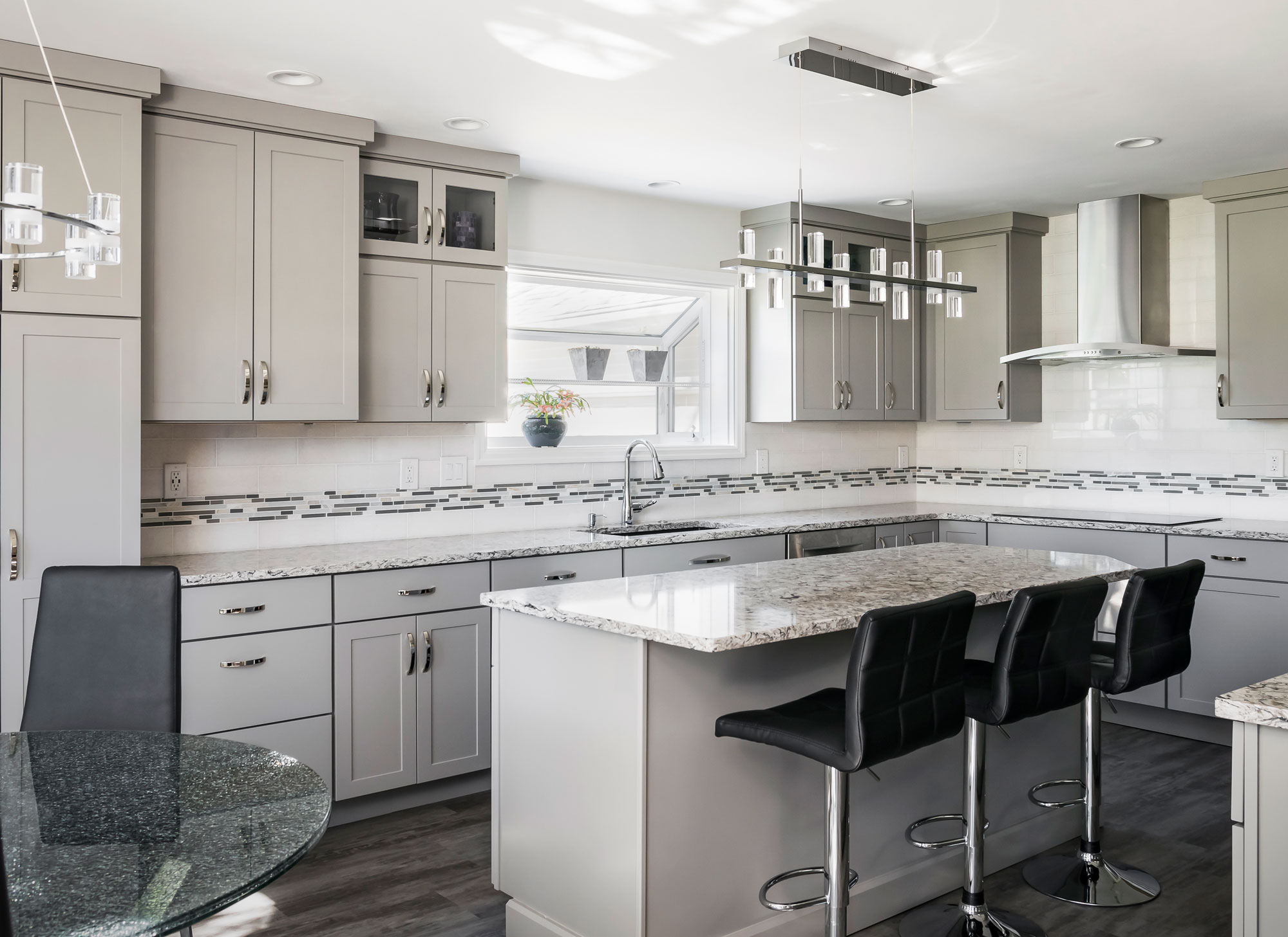
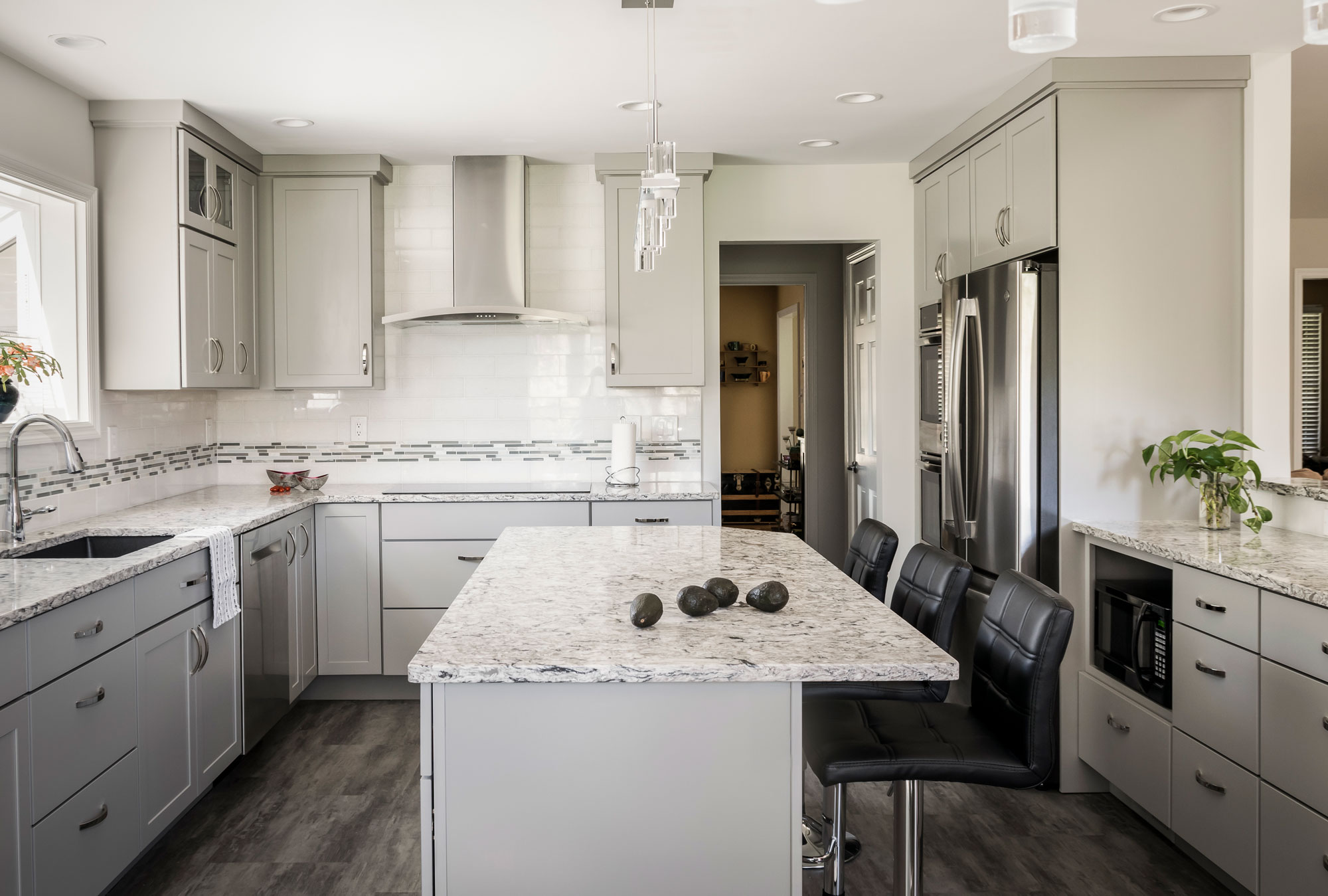
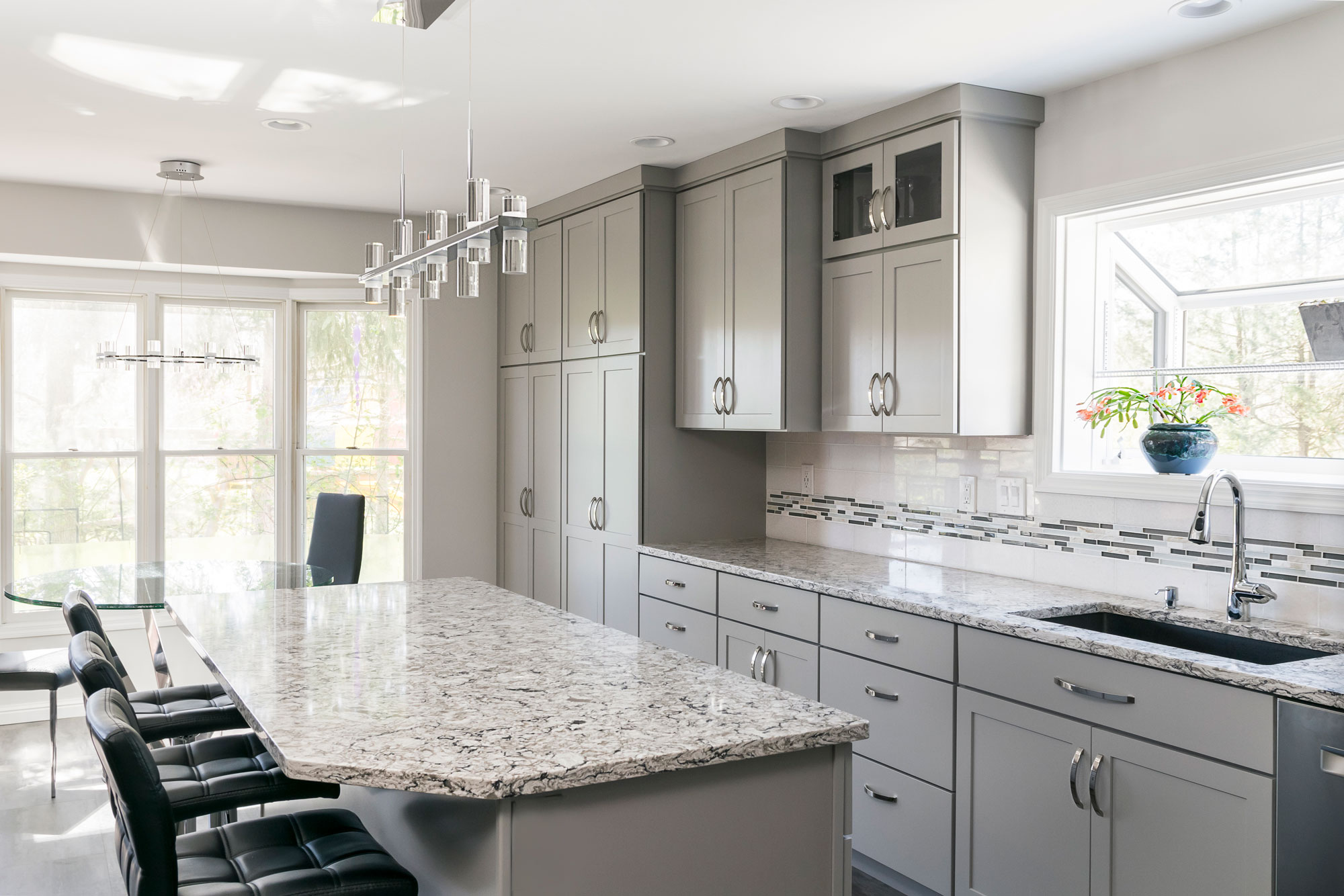
Clean and Contemporary Kitchen
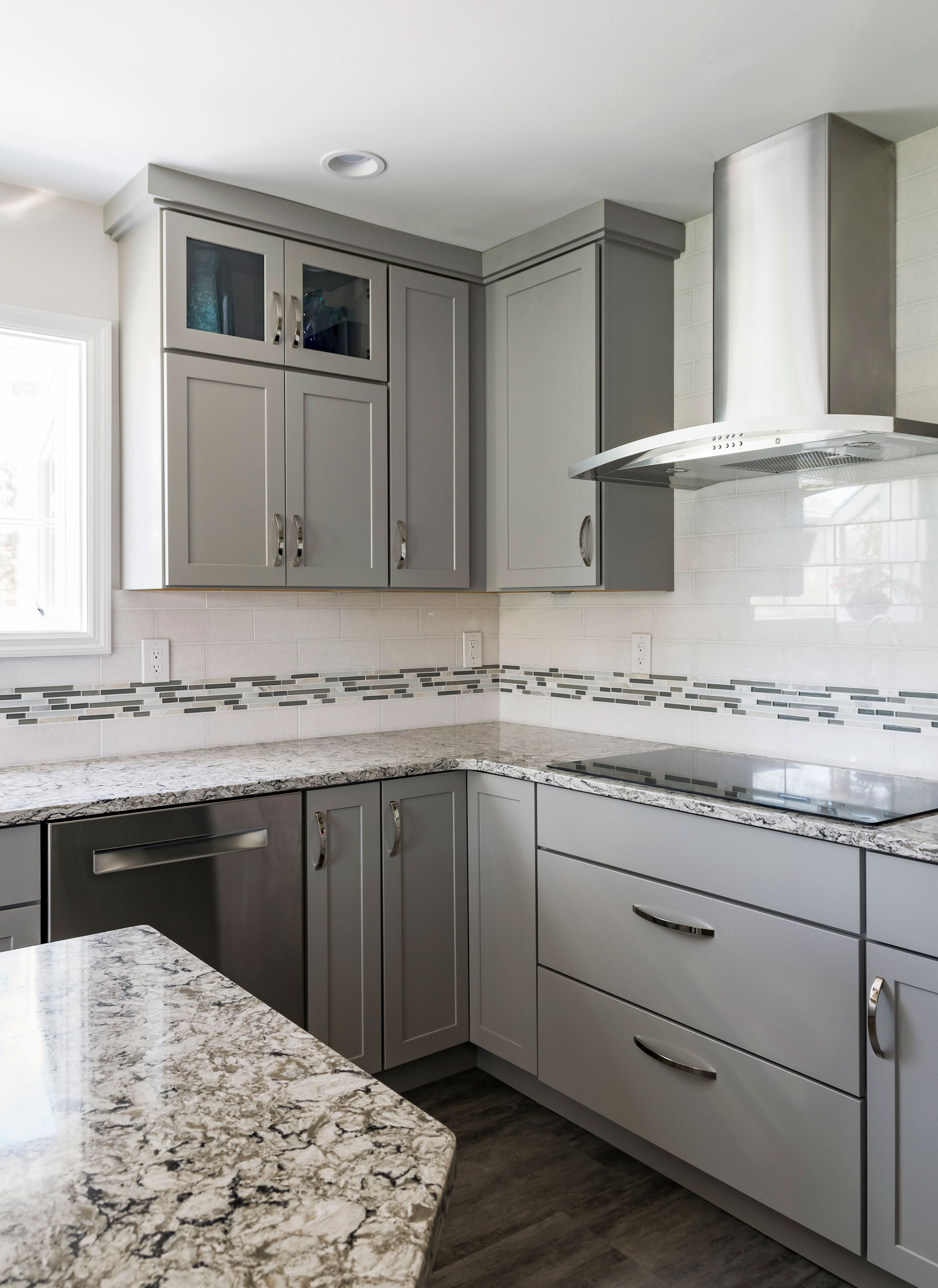
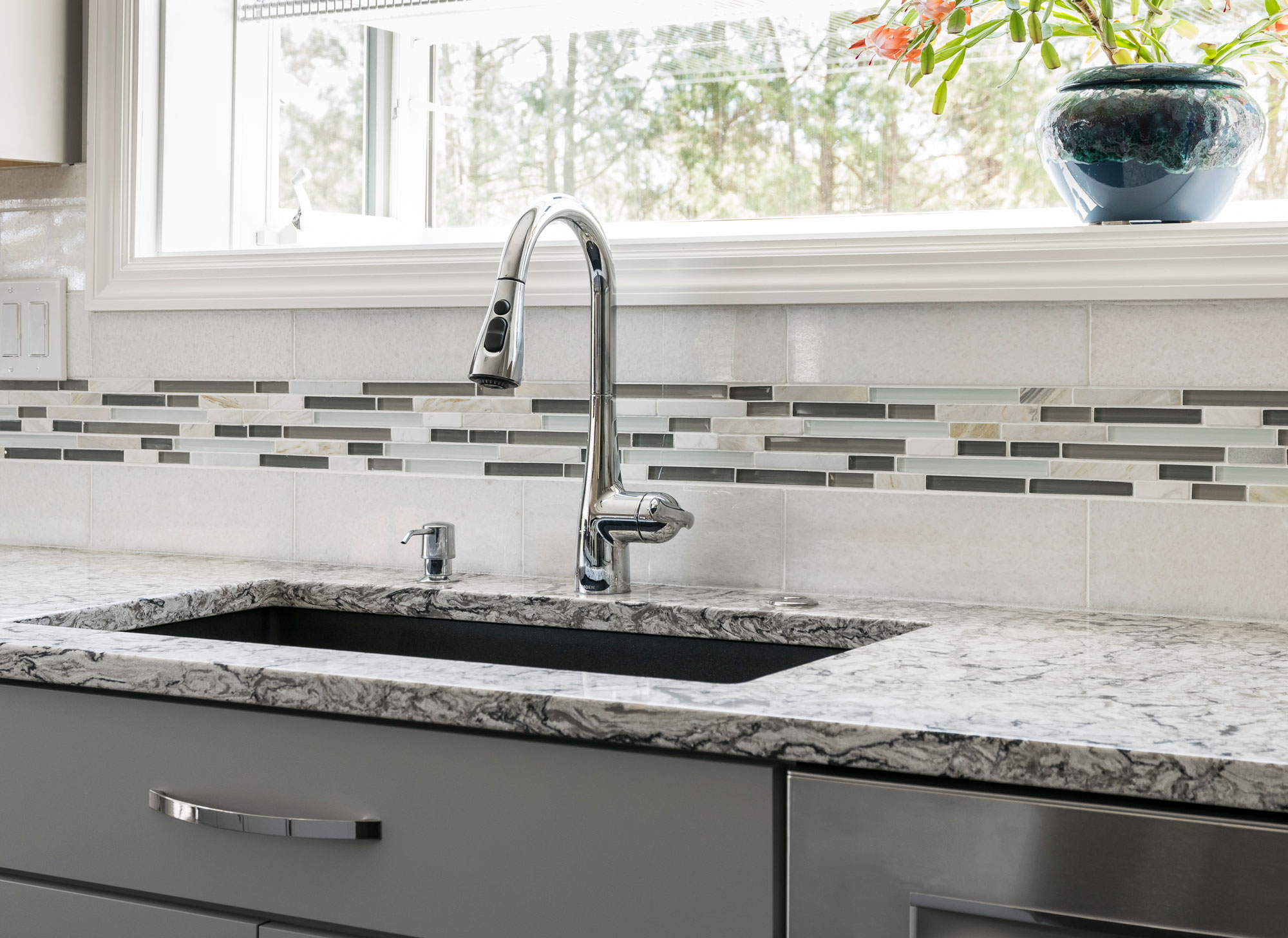
The flooring is a family proof luxury vinyl tile and the counter tops are Cambria quartz. We love how this kitchen is bright, open and modern!
2019
DESIGNER:
Rochelle McAvin
PHOTOGRAPHER:
Karen Palmer Photography
Our client loved the idea of a clean, contemporary kitchen. We opened up the wall to the living space to connect the two spaces and replaced a pantry for storage that blends seamlessly with the kitchen cabinets. She chose a neutral color palette with a mix of grays, whites and neutrals; ensuring a timeless look. The flooring is a family proof luxury vinyl tile and the counter tops are Cambria quartz. We love how this kitchen is bright, open and modern!
Cedar Springs
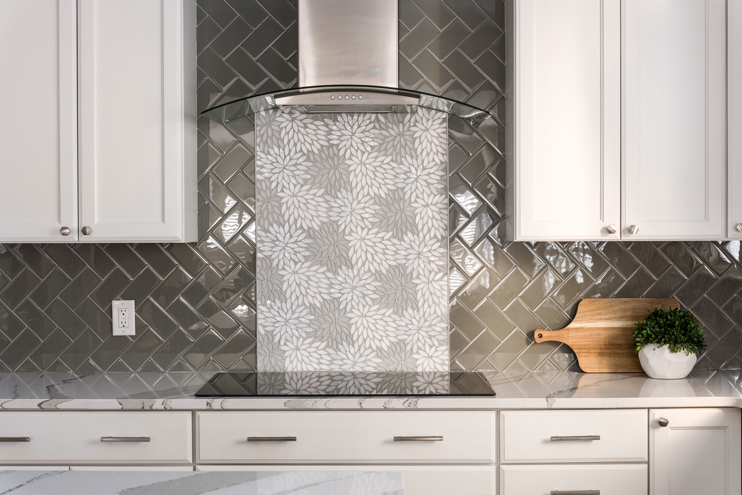
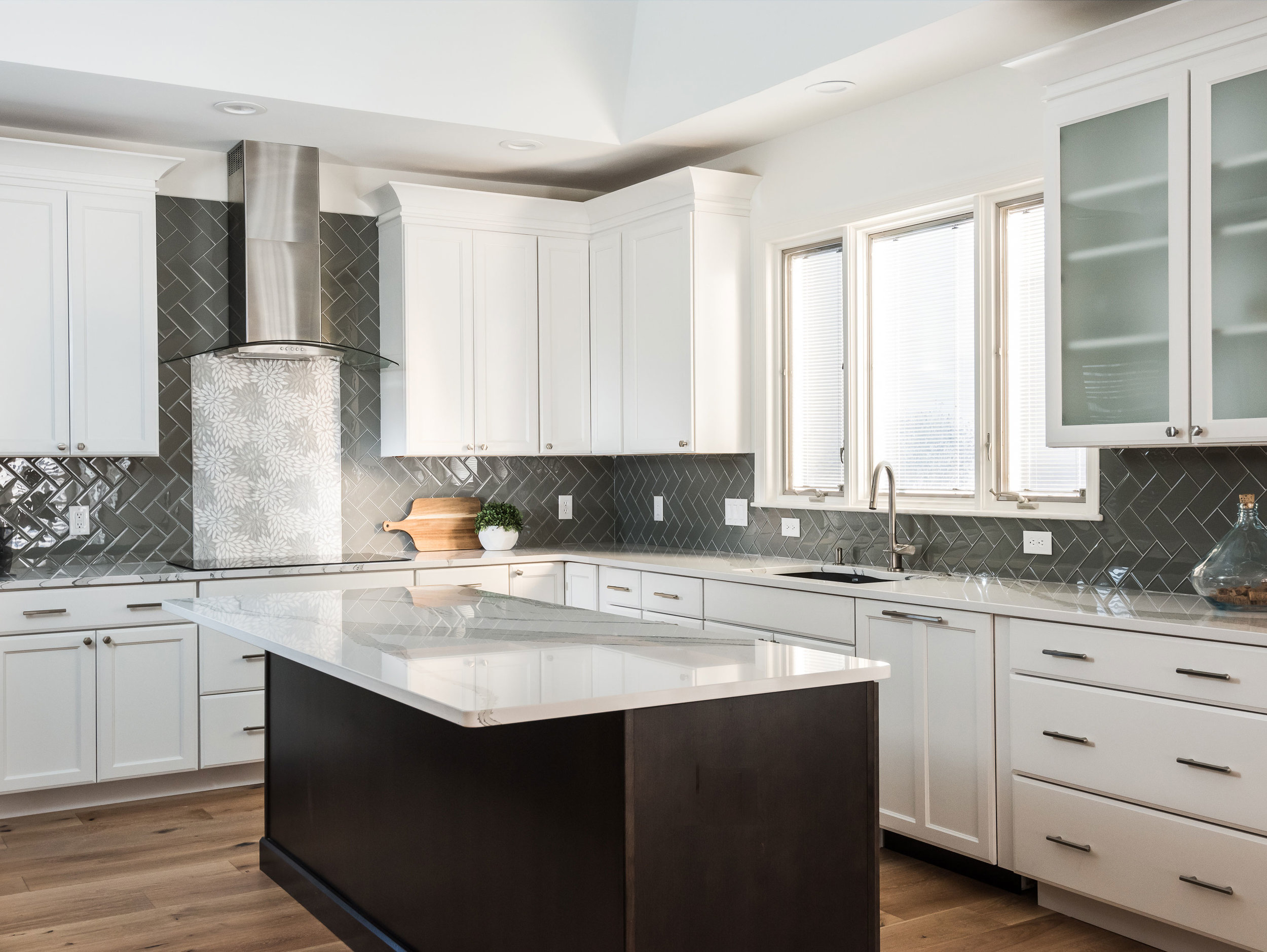
The client wanted a bright and clean but welcoming look for her kitchen. We started with a dark island that grounds the space and kept everything bright and focused on the floral back splash tile that my client fell in love with from the start.
Missouri, 2019
DESIGNER:
Rochelle McAvin
PHOTOGRAPHER:
Karen Palmer Photography
The client wanted a bright and clean but welcoming look for her kitchen. We started with a dark island that grounds the space and kept everything bright and focused on the floral back splash tile that my client fell in love with from the start.
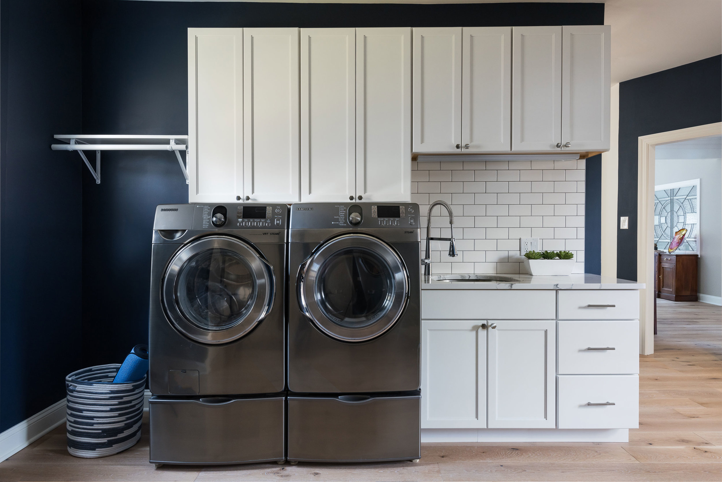
The laundry room is Sherwin Williams Naval and the white cabinets and subway tile keep the look clean and fresh!
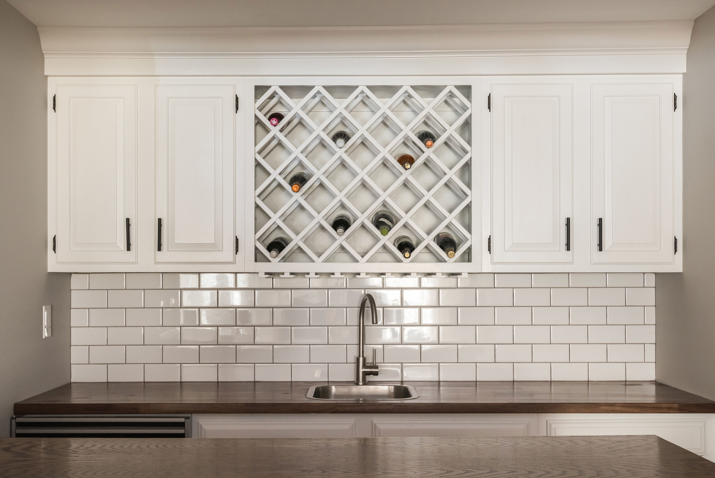
Downstairs in the bar, we freshened up the cabinetry and added a butcher block counter top to cozy up the relaxed space.
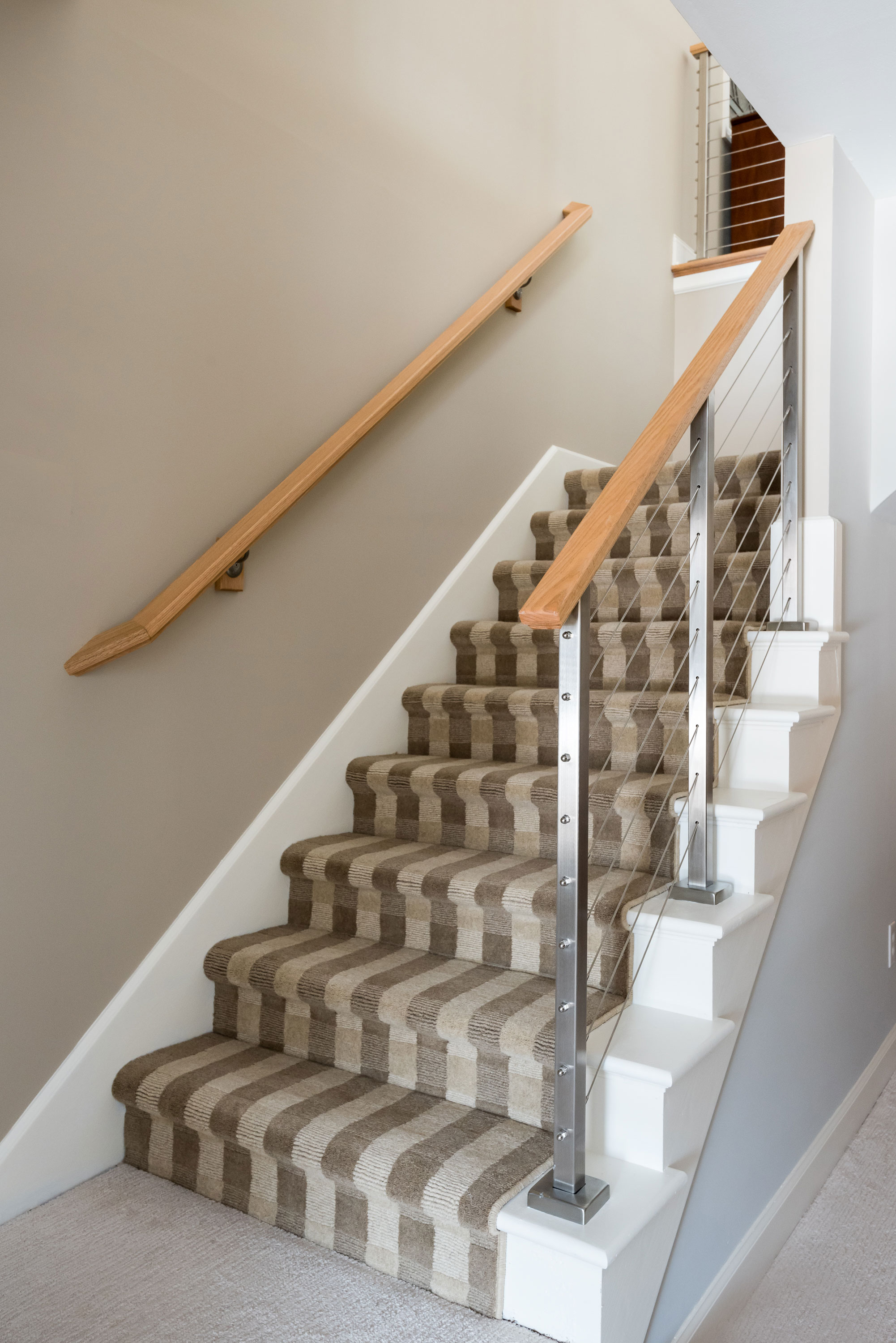
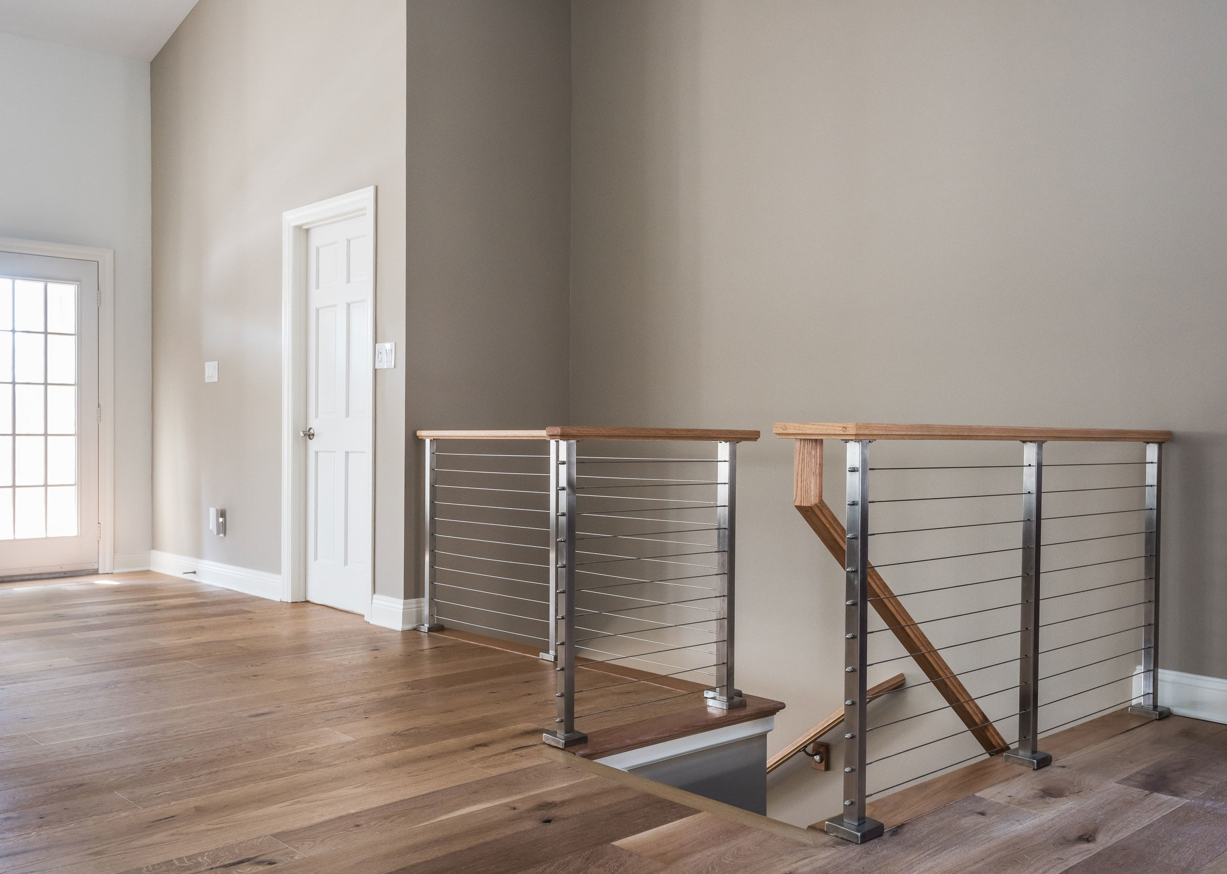
The handrail to the basement originally was a dark and dated wood. We replaced it with a cable rail system that lets the light filter down the steps onto the new textured carpeting. The light, bright space is welcoming and open!


