Radcliffe Place First Floor Remodel
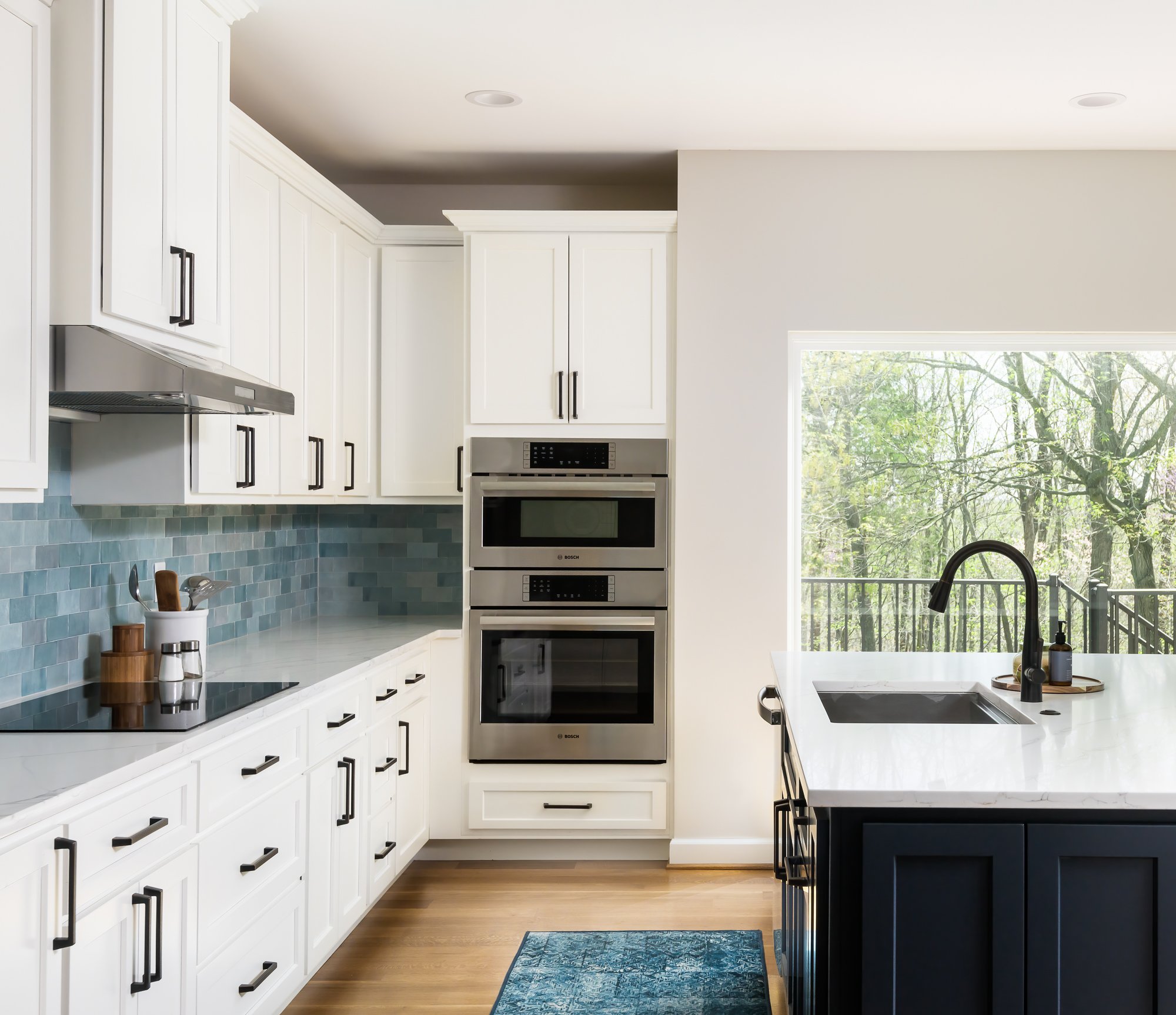
Our clients decided to embark on a full home update to their 1990's home. We completely reconfigured the kitchen and laundry with two main purposes- the first one was to provide them with access to a new covered deck and the second was to expand the footprint of their laundry room.

Wildwood, MO
Designer: Jennifer Chapman
Photographer: Karen Palmer Photography
2022
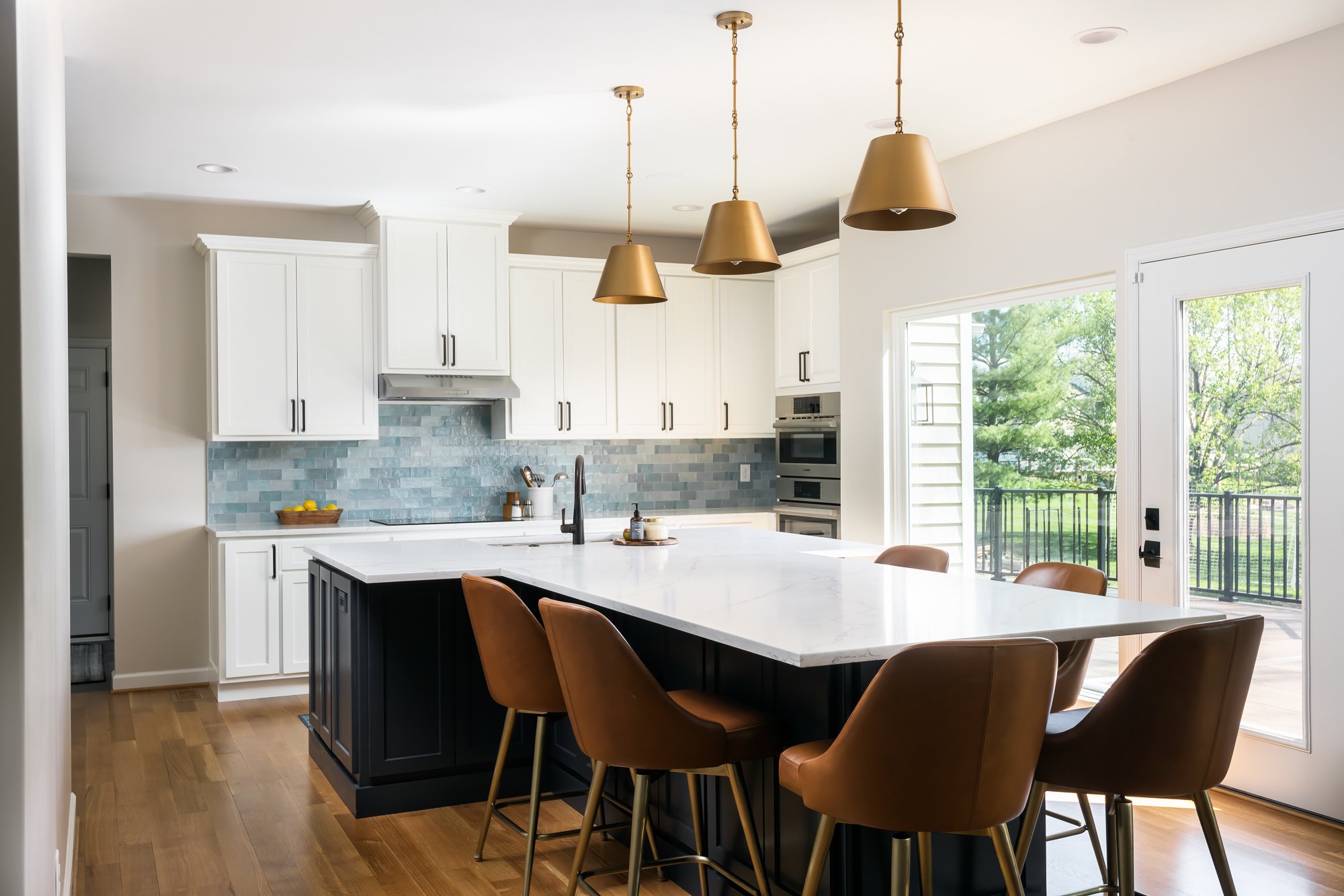
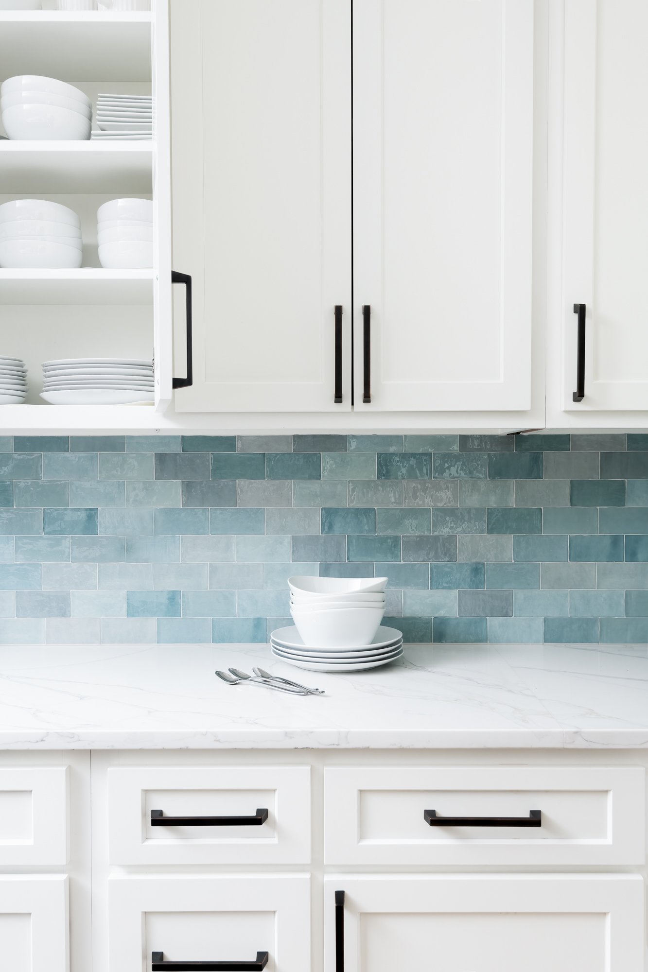
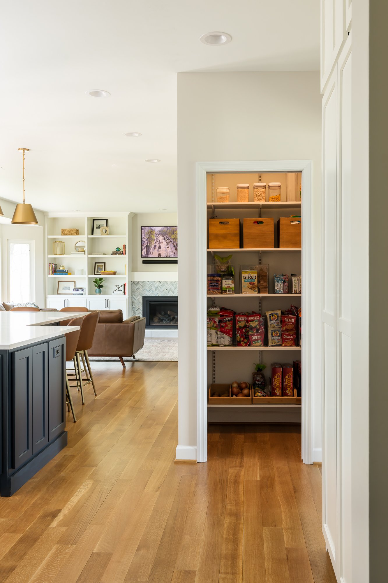
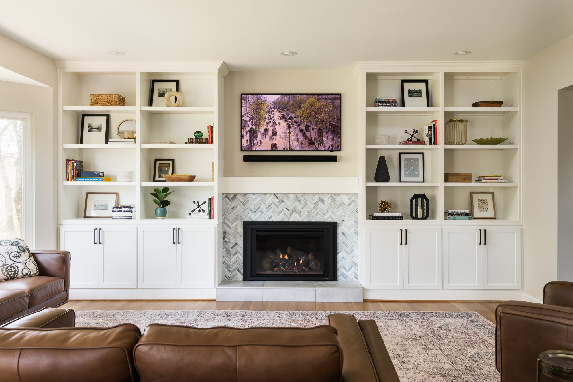
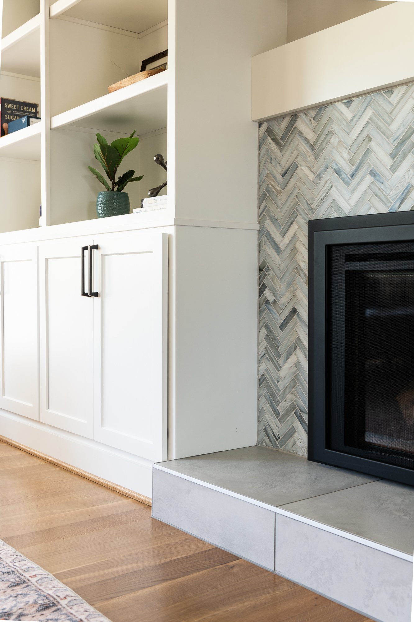
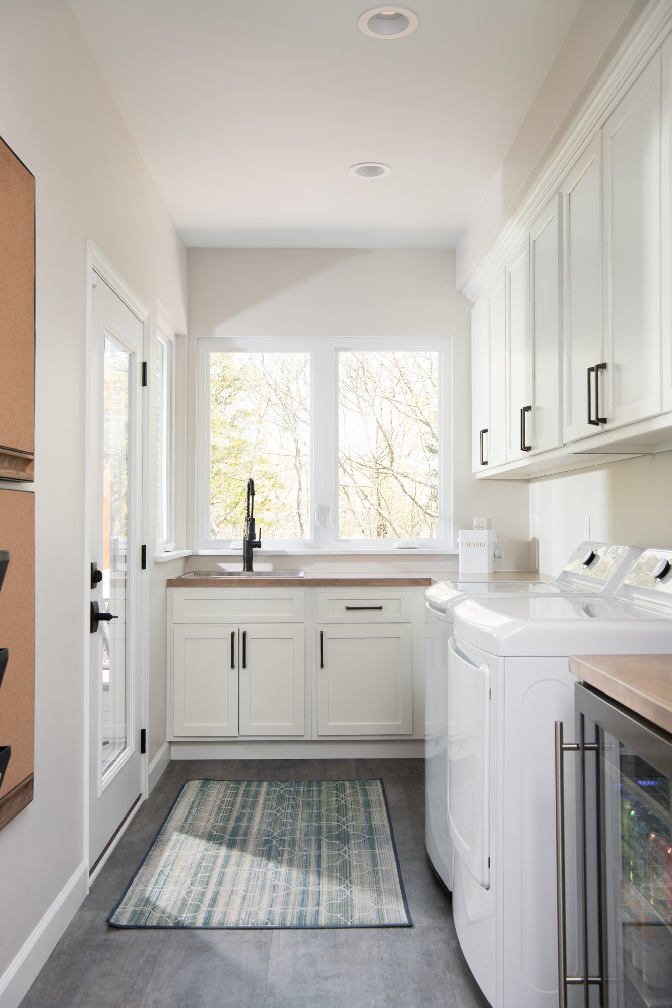
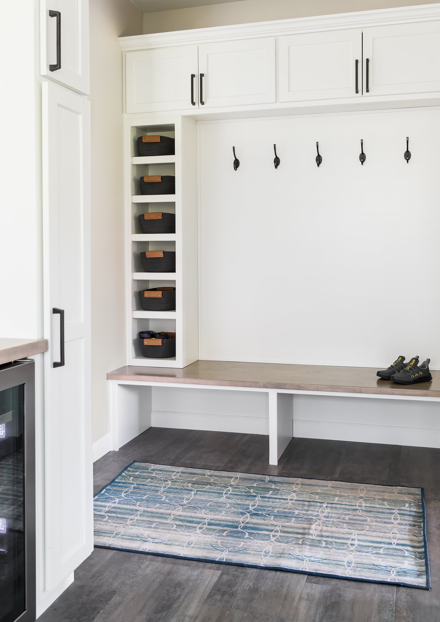
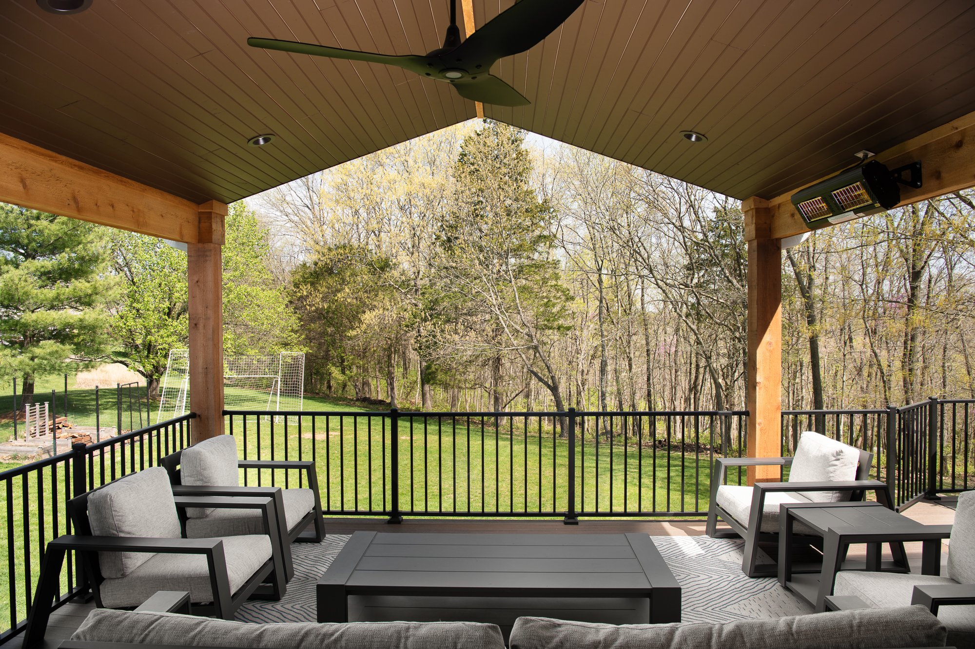
Our clients decided to embark on a full home update to their 1990's home. We completely reconfigured the kitchen and laundry with two main purposes- the first one was to provide them with access to a new covered deck and the second was to expand the footprint of their laundry room. We pushed the entire kitchen towards the family room and made the laundry room the entire width of the kitchen. We closed up the portion of their split staircase into the kitchen and created a pantry in the landing space. Creating a large island with tons of seating, eliminated the need for a dining table in the kitchen. We found the small varied blue subway tile that has a handmade appearance and it became the inspiration for our design. We wanted to keep everything light and timeless so we went with white cabinets on most everything. We used Hale Navy for the island to add some contrast and interest. The quartz countertops in the kitchen have beautiful gray veining with some streaks of gold so we complimented that by using brass pendant lighting. This also adds warmth to the cool color pallette. We mixed up the metal finishes by using oil rubbed bronze on the cabinet hardware and kitchen faucet. We added a huge picture window in the kitchen for an unobstructed view of the outdoors that adds a ton of light into the space. In the family room, we added built-ins next to the fireplace and a custom mantel to connect the cabinetry. The tile on the fireplace surround is a beautiful blue glass herringbone and we used a very large scale porcelain tile on the hearth. We updated the powder room by adding a new vanity with a gorgeous quartzite top and added brushed brass finishes. The same porcelain tile from the fireplace hearth was used on the floor. The new wood flooring throughout most of the first floor is quarter sawn white oak that we left natural. In the laundry room, we used a vinyl tile that is easy to clean and maintain. The countertops are stained wood custom made by our cabinetmaker. Their new covered deck is a big crowd pleaser. We did a solid stain on the wood ceiling and kept everything very natural to complement the cedar posts and allow the surrounding landscape to be the real focal point. Infrared heaters allow our clients to enjoy the space even on chilly days. Overall, we created an updated and clean design that functions much better for their family and they will enjoy entertaining their family and friends here for many years to come.
Glendale Primary Bath and Laundry
Our clients wanted to gain space in their small master bathroom to make it more usable and functional for their lives.
Webster Groves, MO
Designer
Jennifer Chapman
Photographer
Karen Palmer Photography
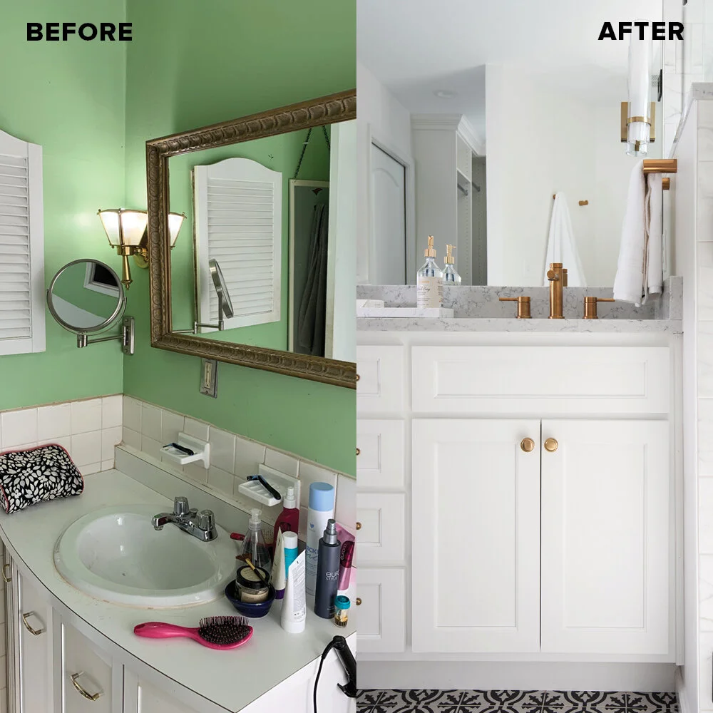
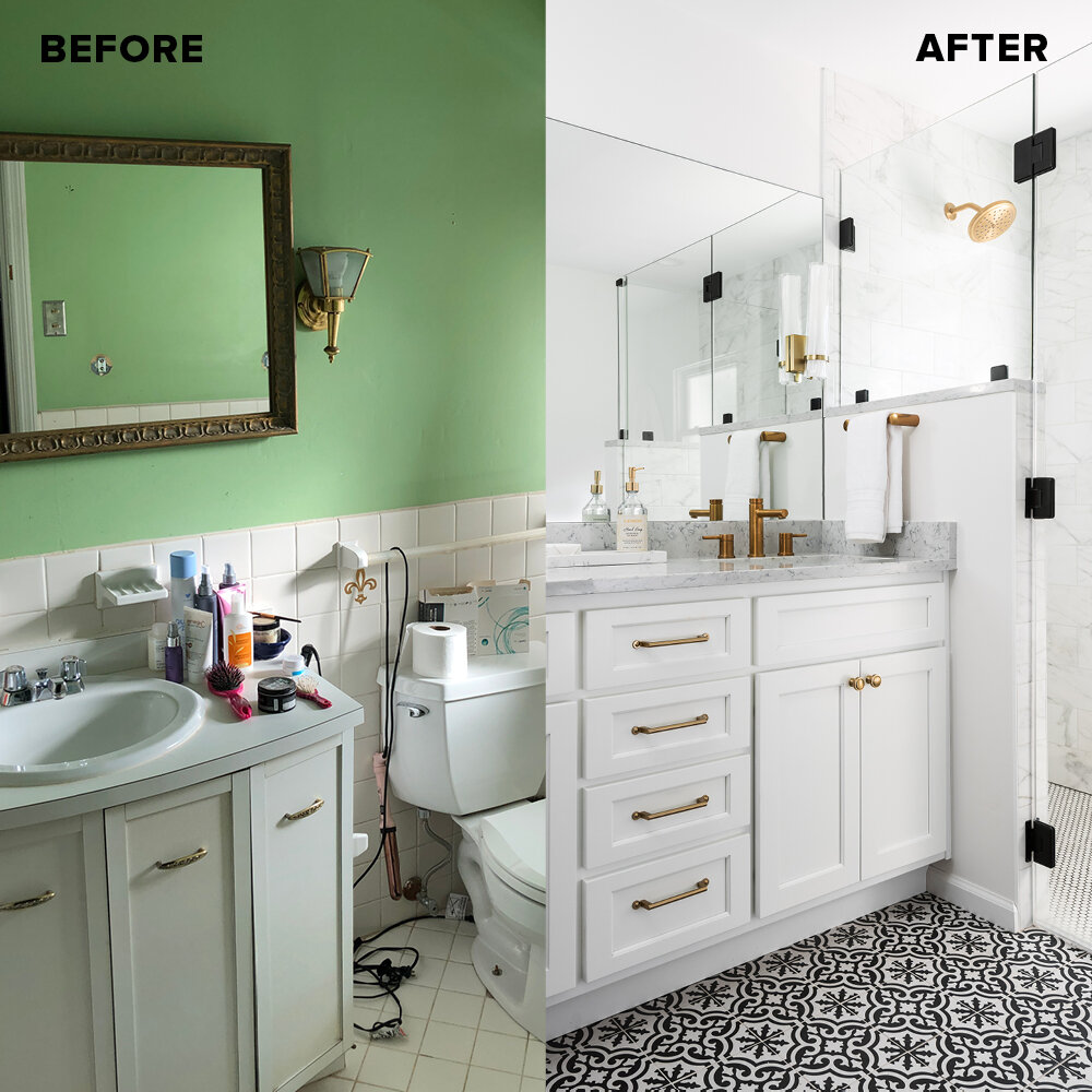
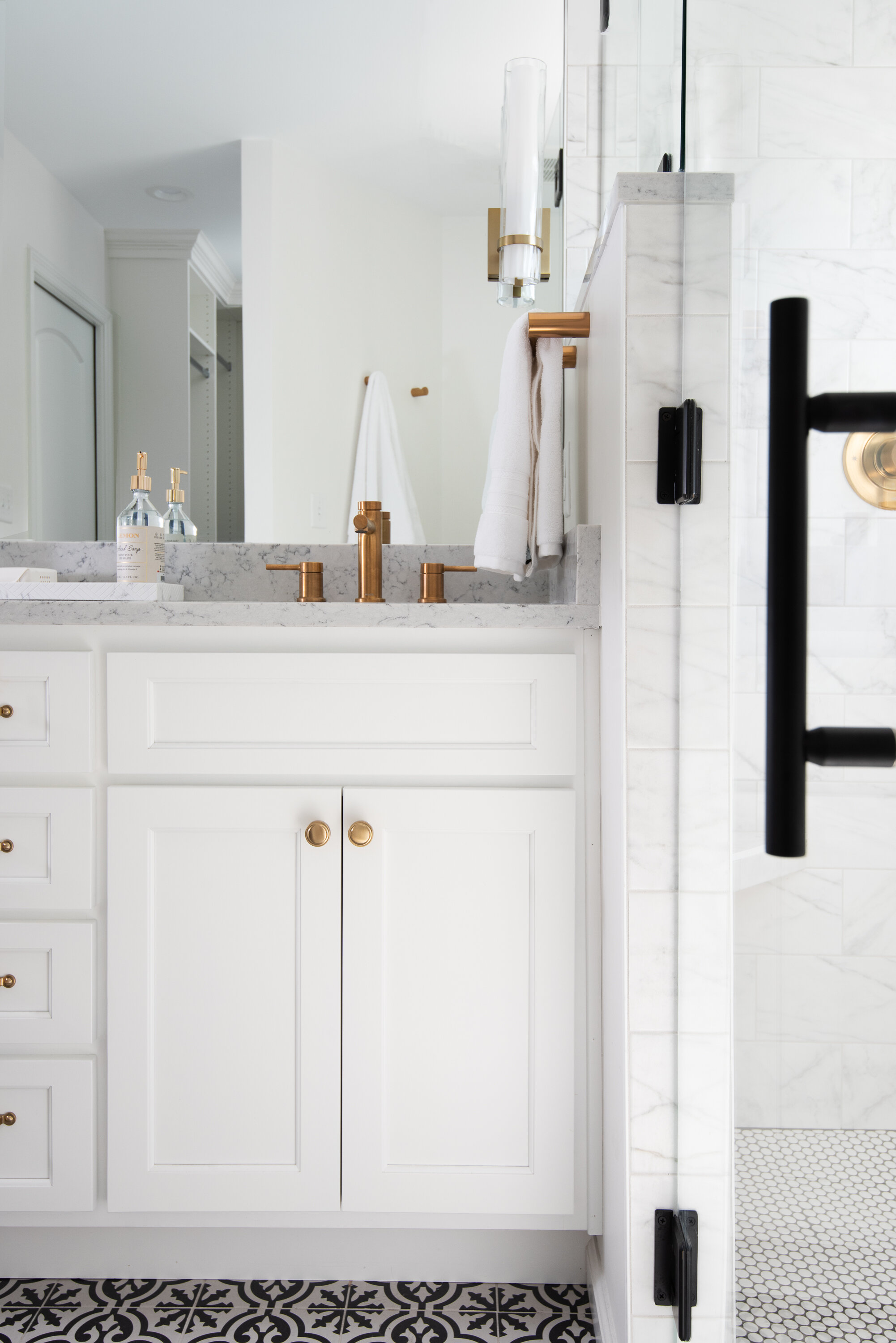
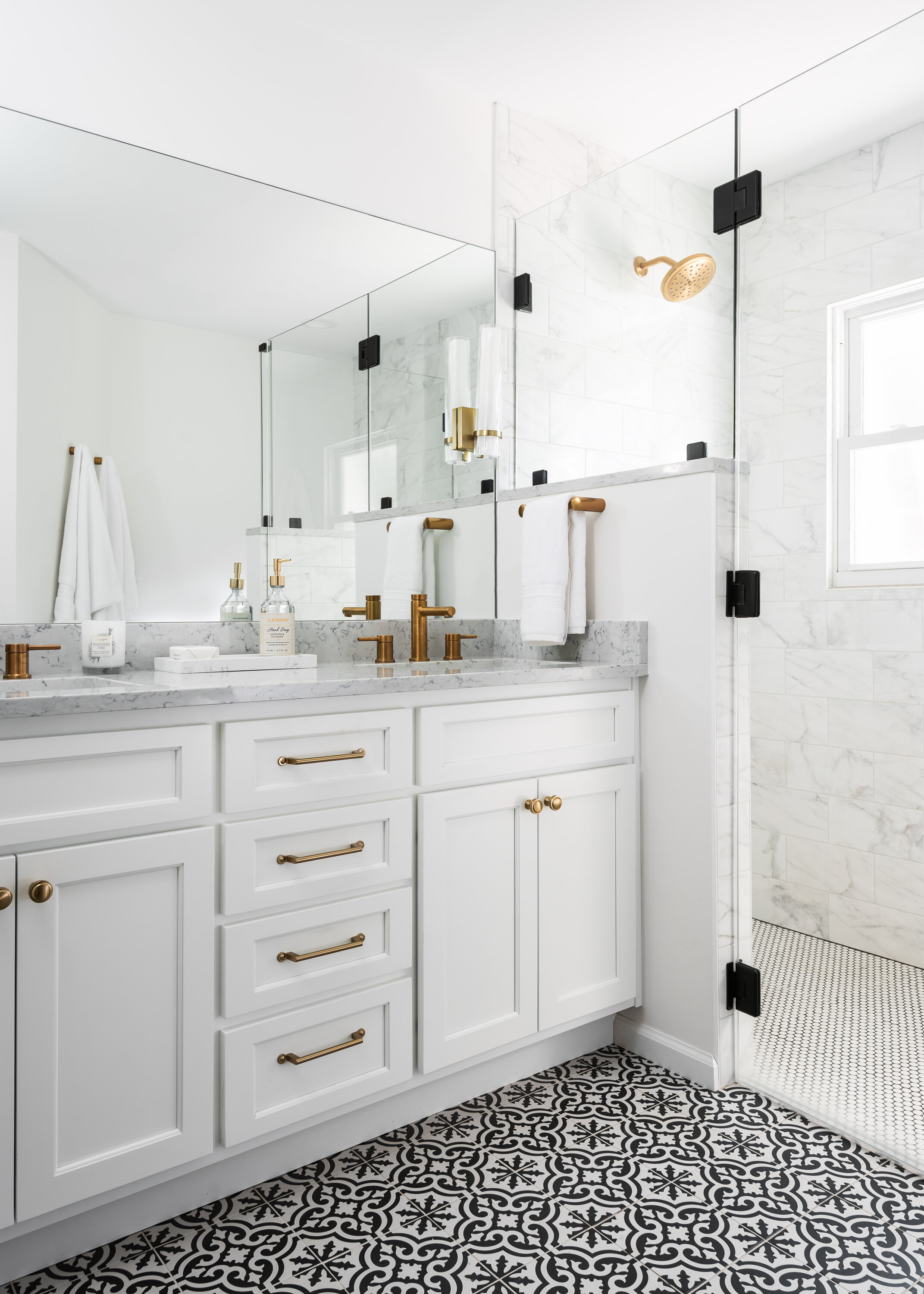
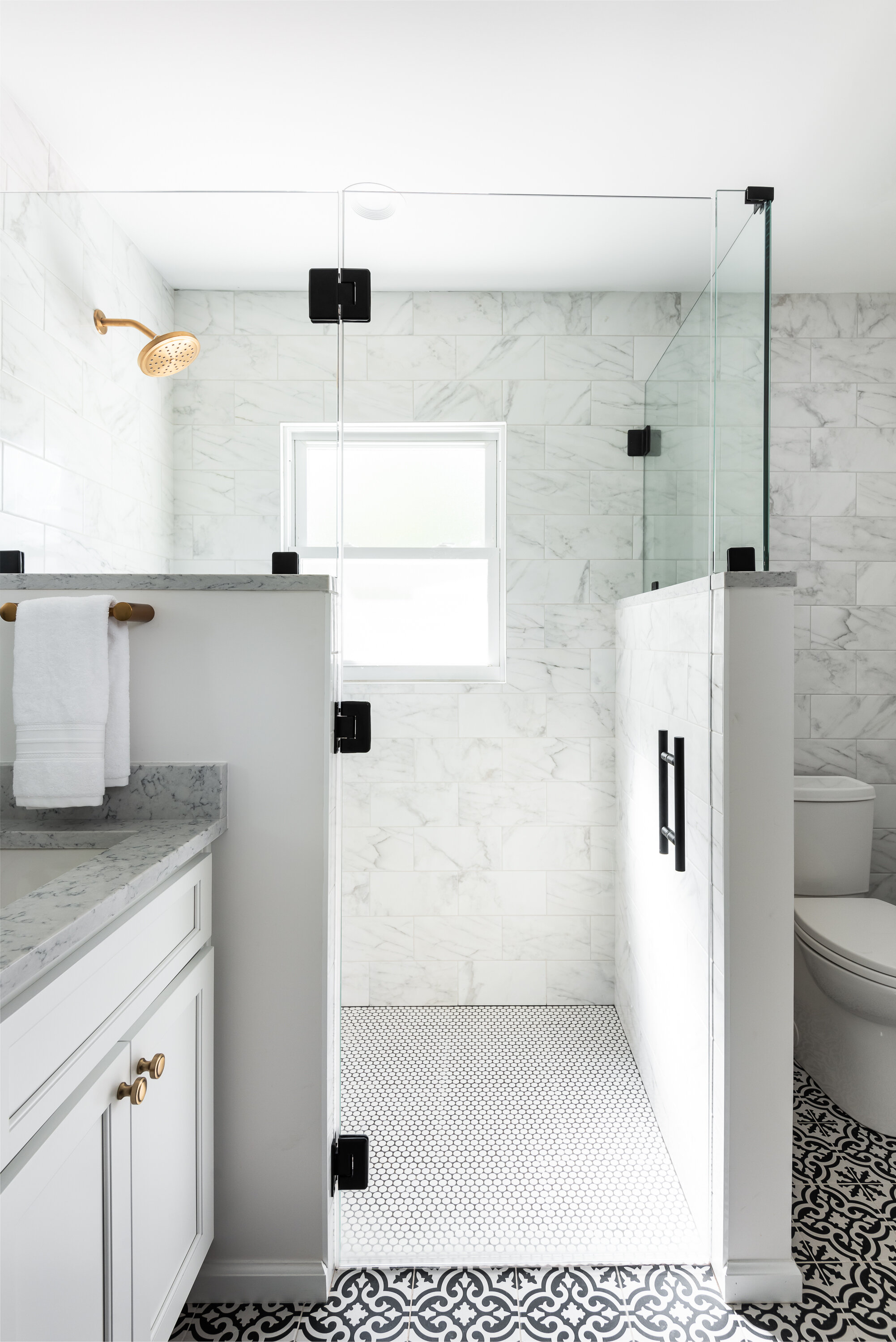
Our clients wanted to gain space in their small primary bathroom to make it more usable and functional for their lives. The bathroom had not been touched since it was built in the 1960's and was in need of a major facelift as well. We stole some space from the adjacent master closet so we could make room for a double vanity and a larger shower. We used a fun black and white black patterned tile for the main part of the bathroom and used a white penny tile on the shower floor with dark gray grout. The wall tile is a marble look 3 x 12 porcelain subway tile. We went with brass plumbing fixtures, lighting, and hardware, which warm up the white cabinets & marble look quartz countertops. The large frameless mirror and frameless custom shower glass makes the room feel much larger and more open than it actually is.
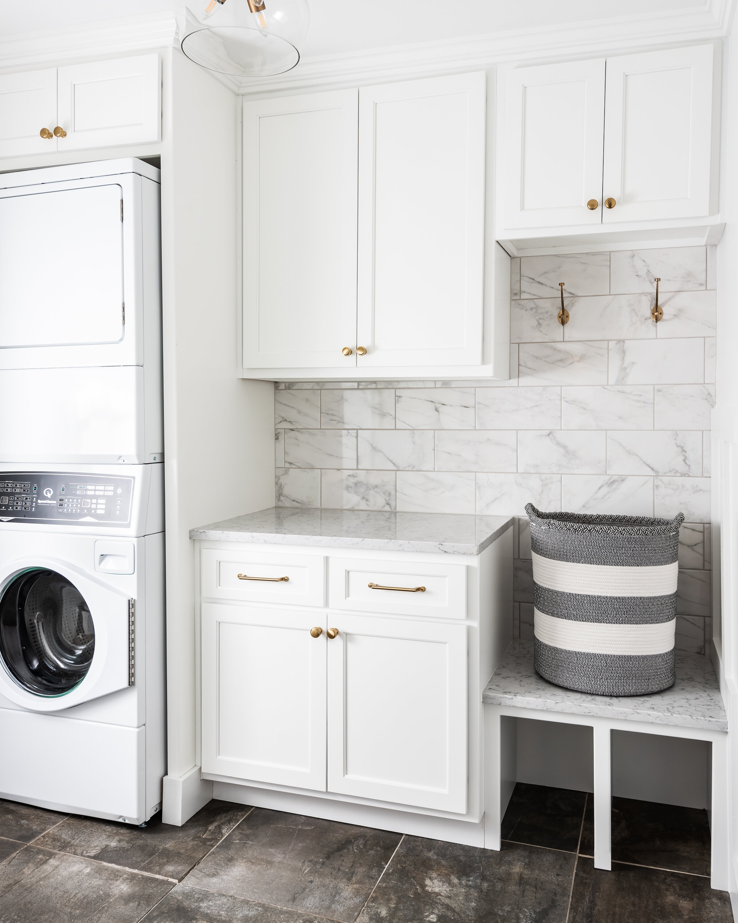
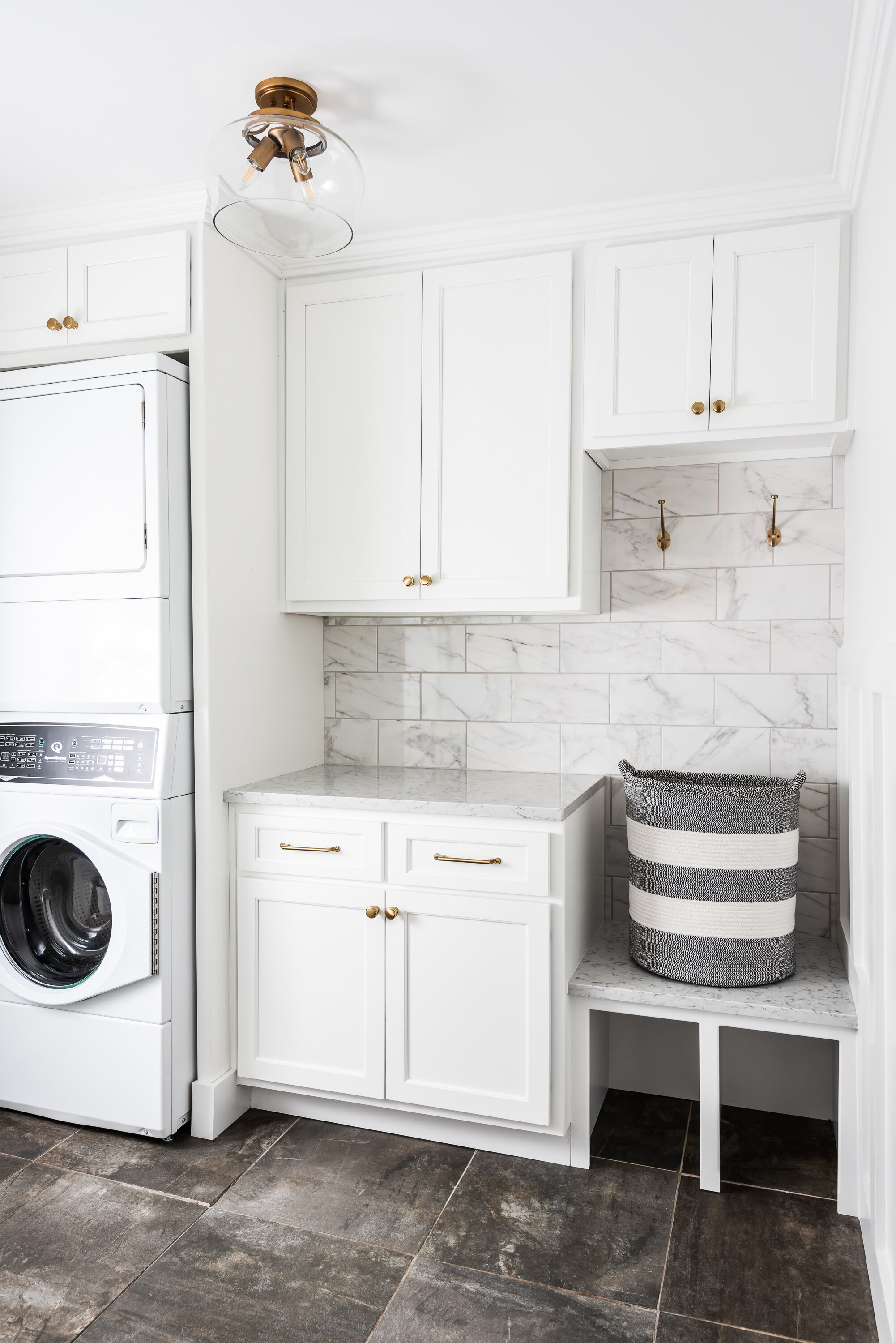
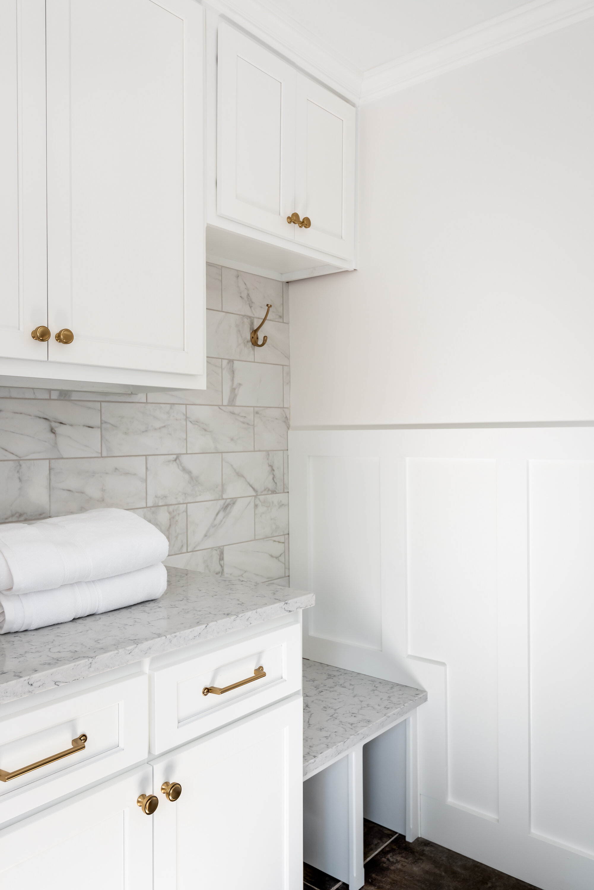
The existing laundry room was bare bones- just a washer and dryer with no storage. The clients wanted to be an extension of the rest of their home design wise and also be much more functional for them. We added cabinetry and a small bench with hooks, which allows this room to both function as a laundry room and mudroom. We added wainscotting throughout the laundry space as well.
Overall we achieved two bright, classic, functional spaces that our clients can enjoy for years to come!
Cedar Springs
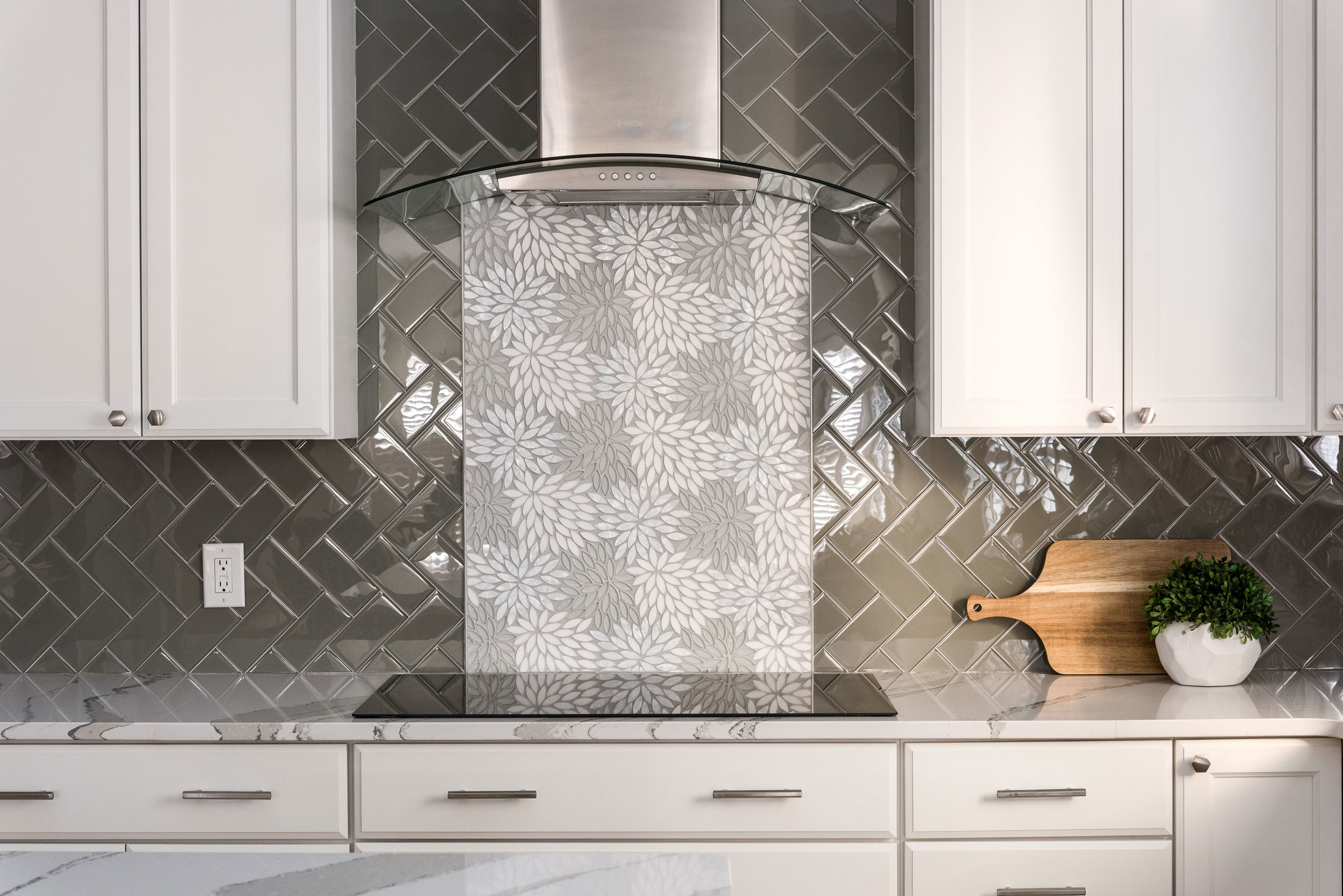
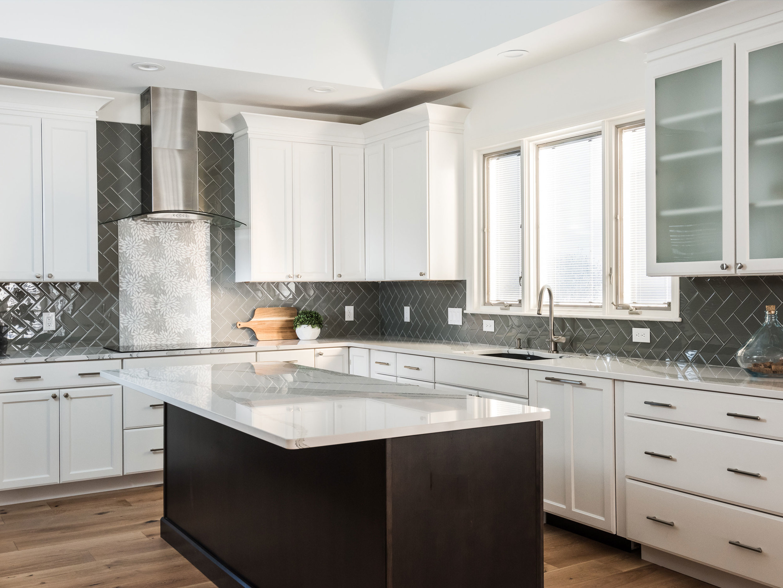
The client wanted a bright and clean but welcoming look for her kitchen. We started with a dark island that grounds the space and kept everything bright and focused on the floral back splash tile that my client fell in love with from the start.
Missouri, 2019
DESIGNER:
Rochelle McAvin
PHOTOGRAPHER:
Karen Palmer Photography
The client wanted a bright and clean but welcoming look for her kitchen. We started with a dark island that grounds the space and kept everything bright and focused on the floral back splash tile that my client fell in love with from the start.
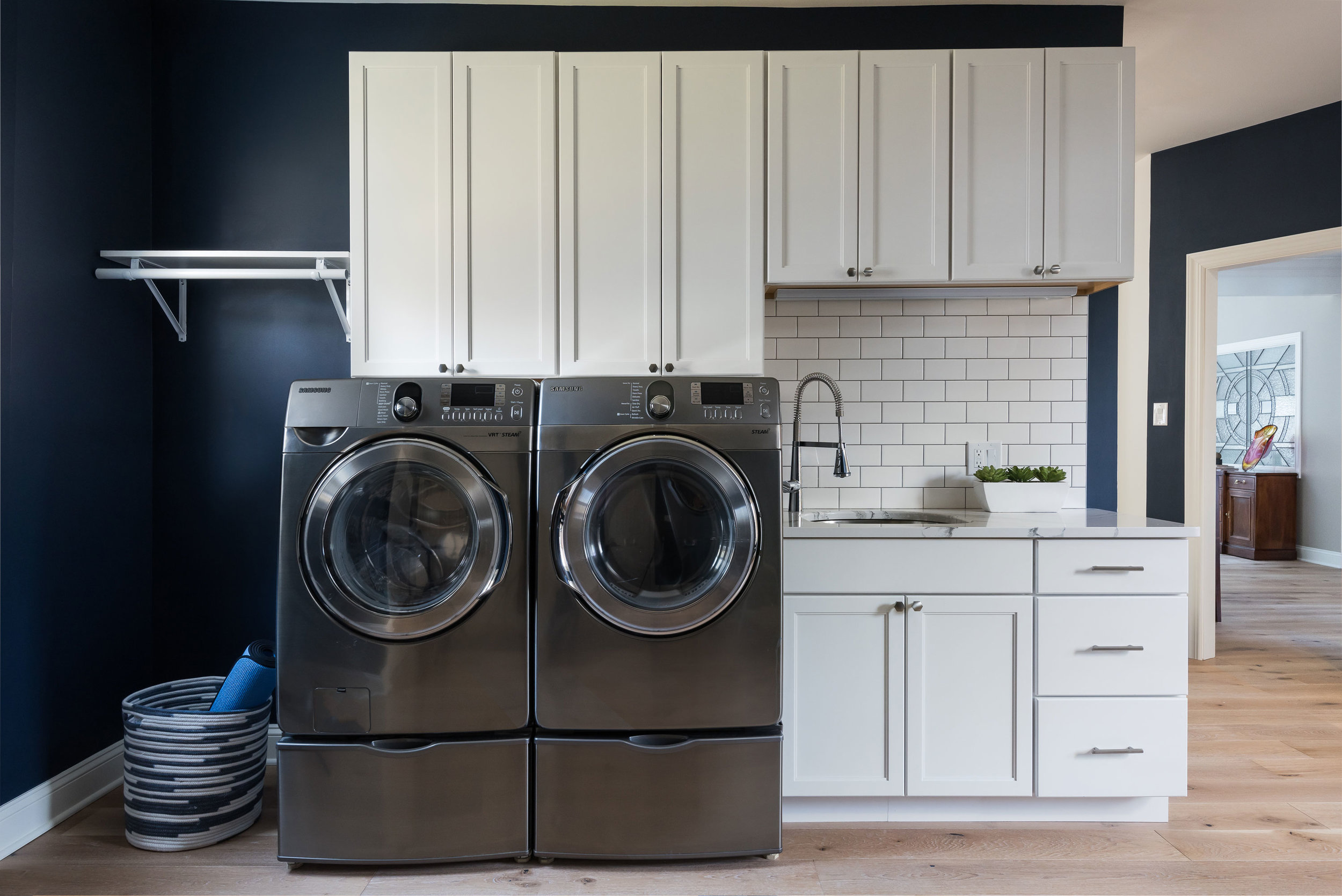
The laundry room is Sherwin Williams Naval and the white cabinets and subway tile keep the look clean and fresh!
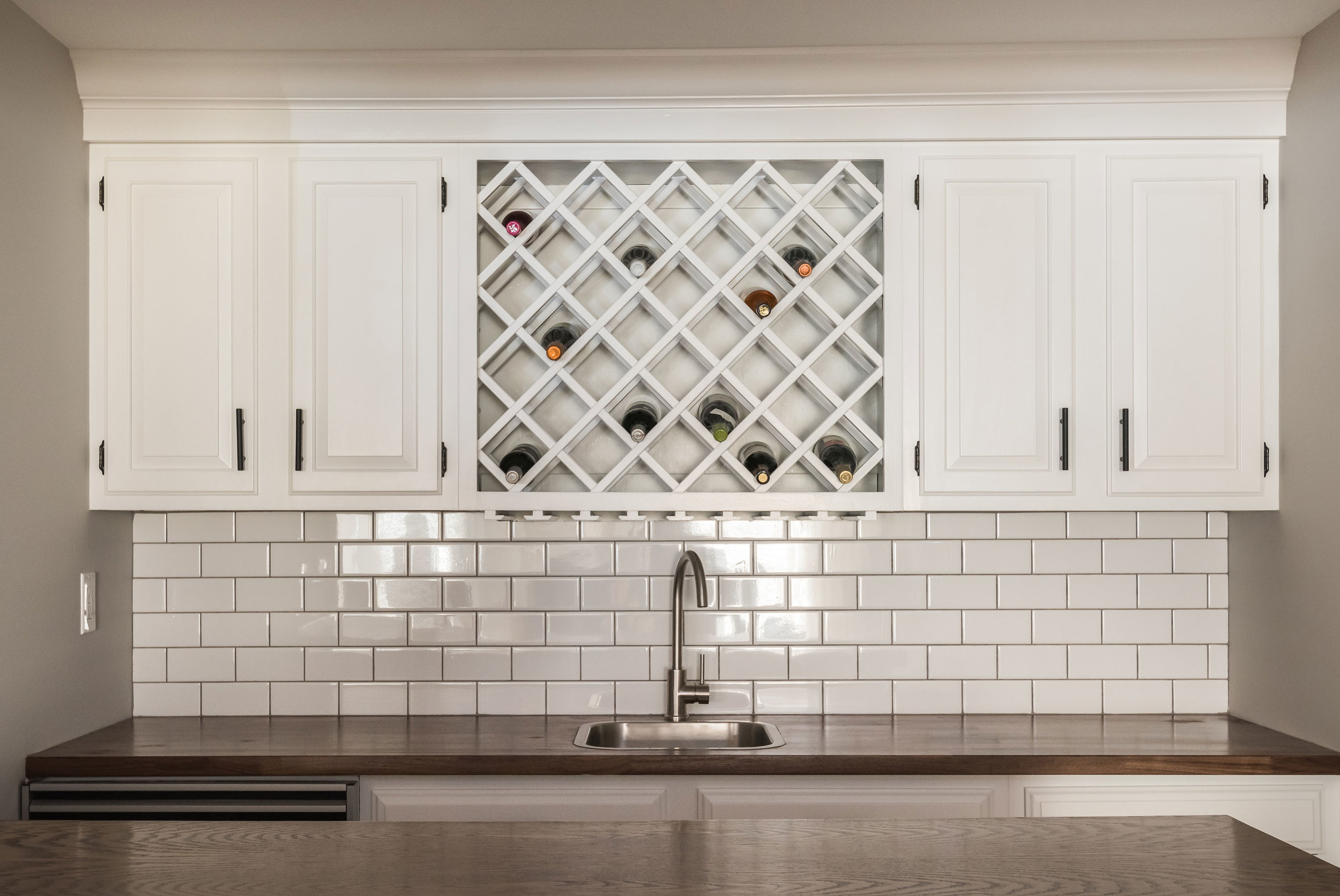
Downstairs in the bar, we freshened up the cabinetry and added a butcher block counter top to cozy up the relaxed space.
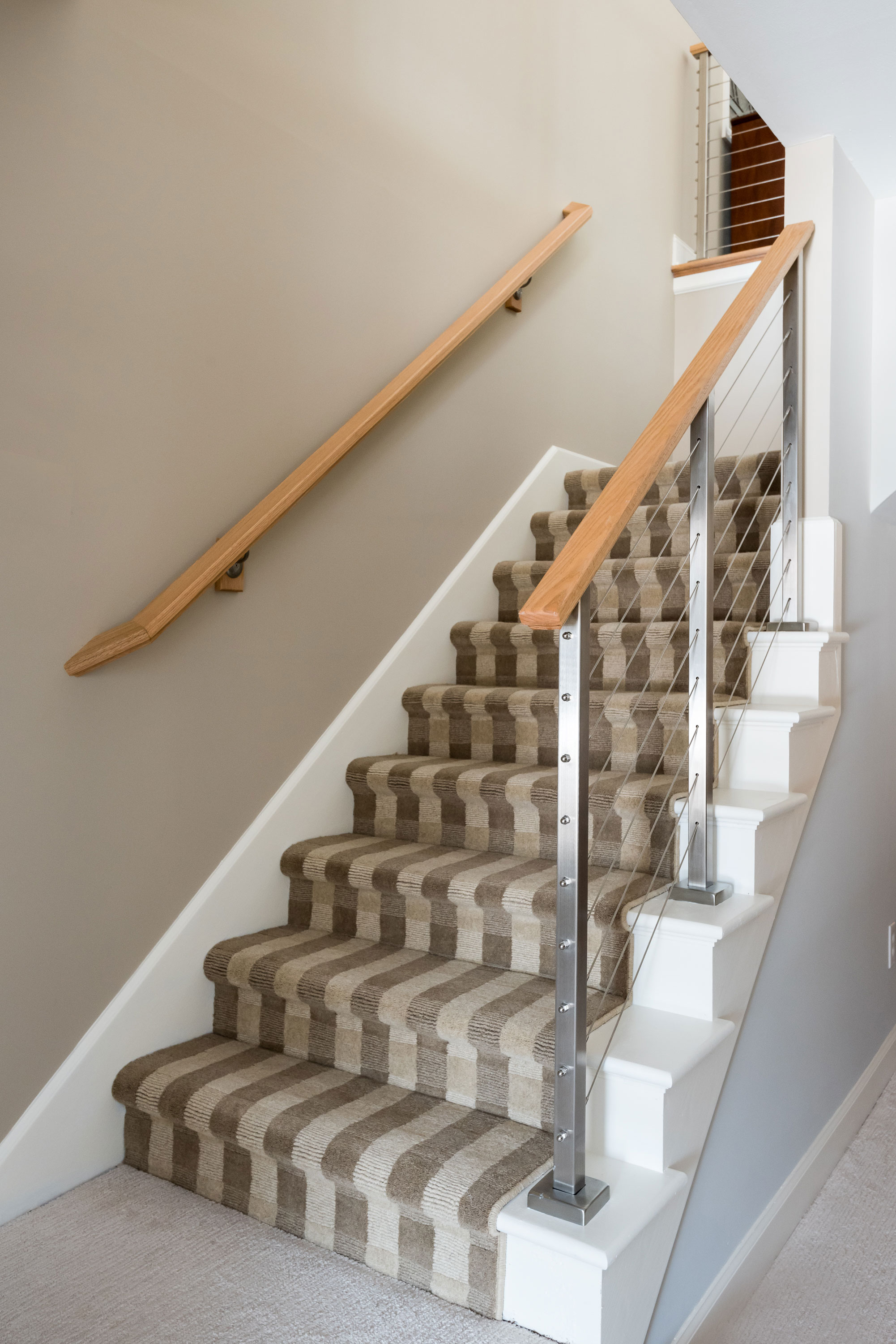
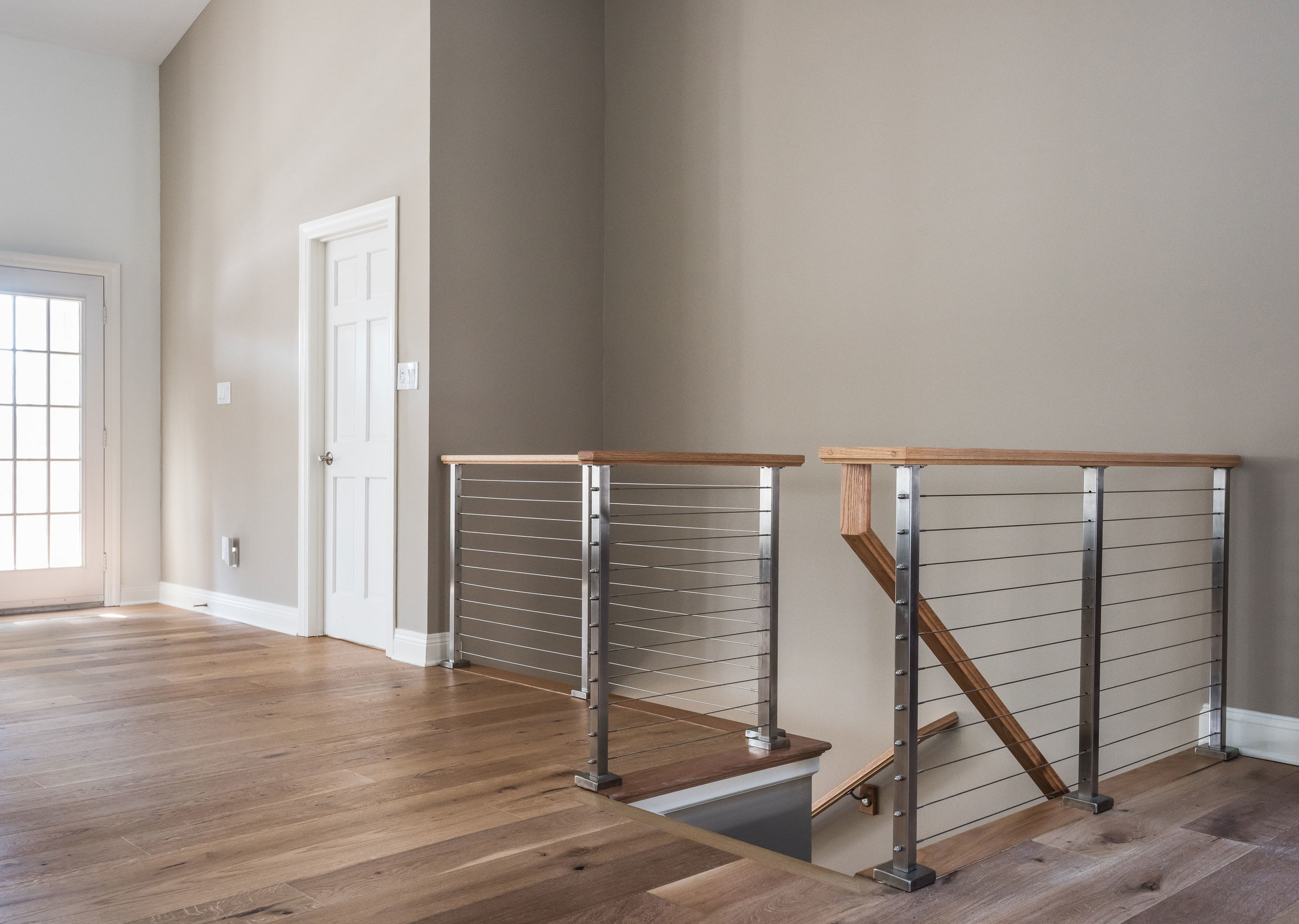
The handrail to the basement originally was a dark and dated wood. We replaced it with a cable rail system that lets the light filter down the steps onto the new textured carpeting. The light, bright space is welcoming and open!


