Kehrswood Basement
Chesterfield, MO
August, 2018
DESIGNER:
Jennifer Chapman
PHOTOGRAPHER:
Karen Palmer Photography
Our clients' finished basement needed to be brought to life! A bar made out of glass block, lack of overhead lighting, dark finishes and an old drop ceiling made for a really uninviting space. Not only did the basement need to be updated, but they really wanted to make it a family entertaining space — somewhere they could hang out with the kids everyday and also somewhere they could easily entertain friends and family. This family is well-traveled and has collected many items from all over the world. They wanted to incorporate that global vibe and marry it with a nautical theme to remind them of their lakehouse in Michigan.
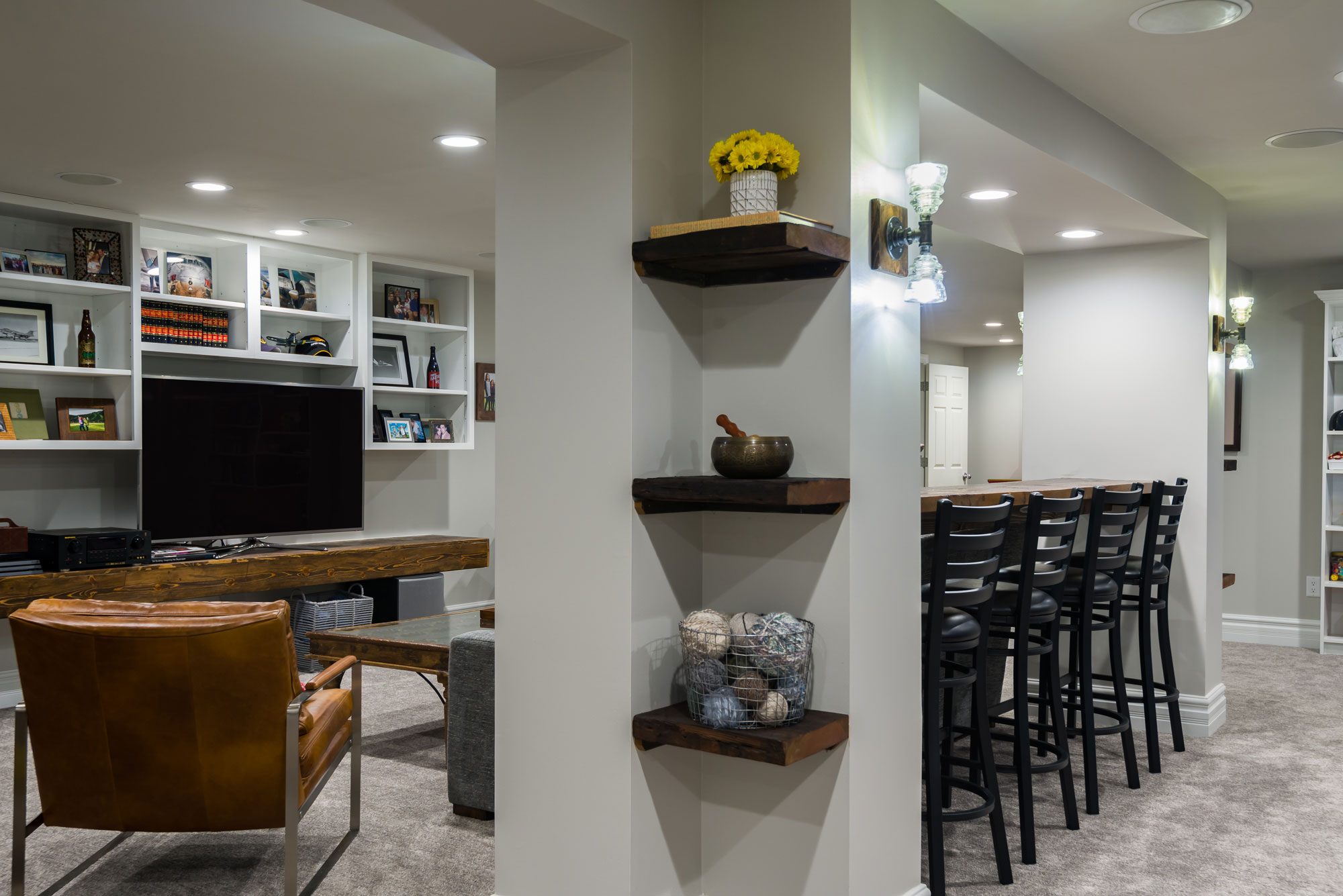
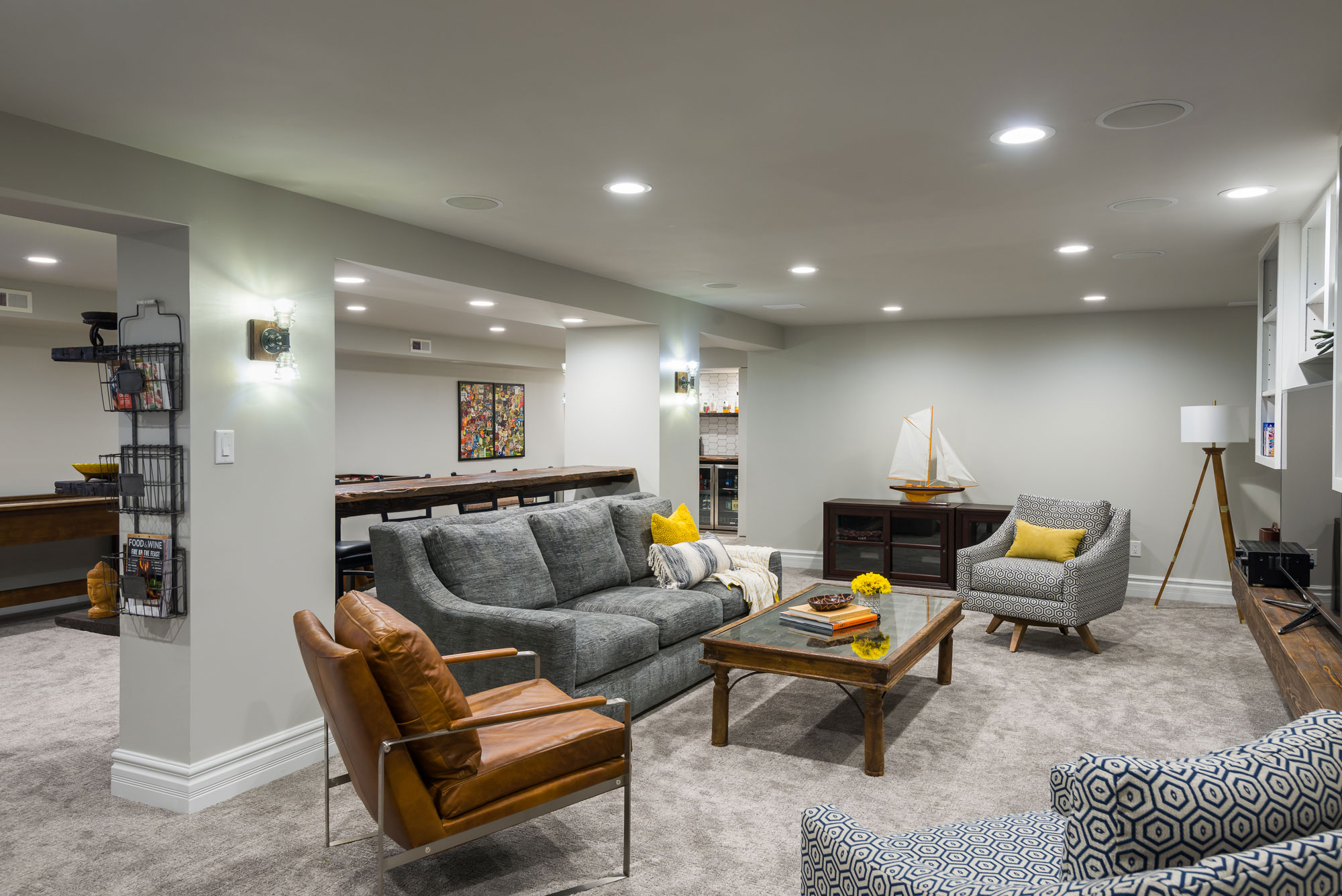
We started by drywalling the ceiling and adding a lot more light! We increased the number of recessed can ceiling lights and added vintage looking handmade sconces at the posts. We painted the walls and ceilings all of the same light gray color to make the ceilings seem taller and the room lighter. We removed the dark, outdated carpeting and replaced it with a neutral colored carpeting with a modern texture.
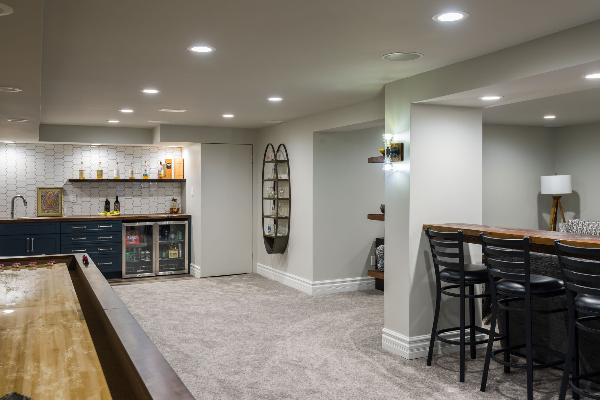
This basement has a soffit and post structure running down the center of the living space. It is a natural divider, but the space was not being utilized to its full potential. We added a bar height reclaimed wood countertop in between the large posts to create more seating for entertaining. The posts at each end created an "L" shape that did not seem to have any purpose. We added floating reclaimed shelves in this space to make it look purposeful and add an opportunity to display the items they have collected in their travels. The entertainment unit was all black and it made the space seem smaller and darker.
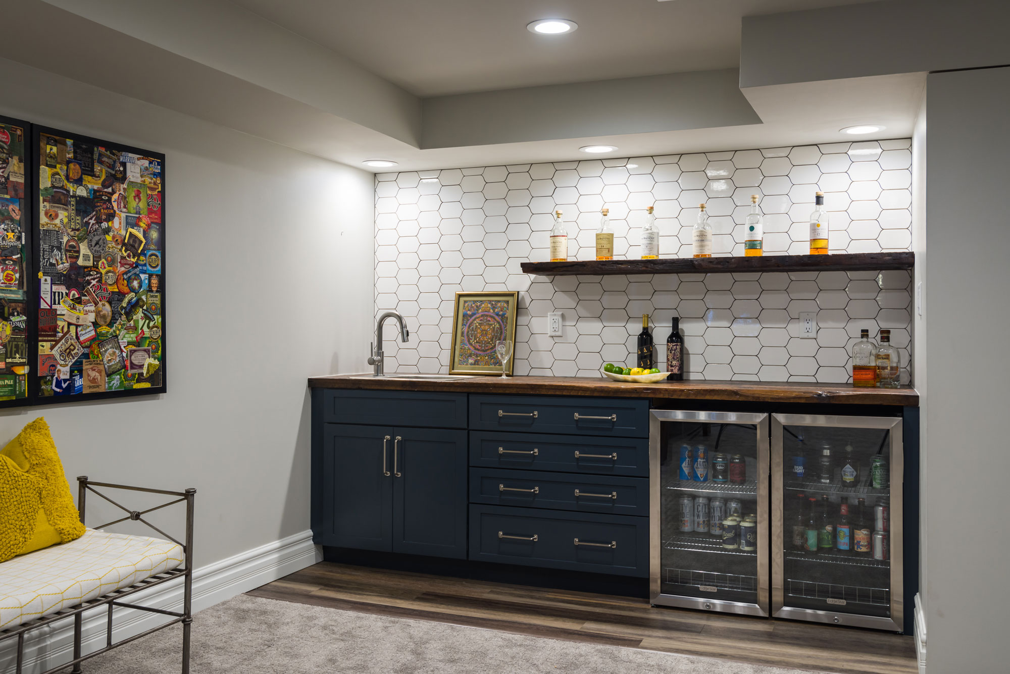
We painted the upper cabinets white and wrapped the TV shelf in wood to match the reclaimed wood at the bar seating and the wet bar. We reduced the footprint of the wet bar to add more space for kids to play and make the room feel bigger.
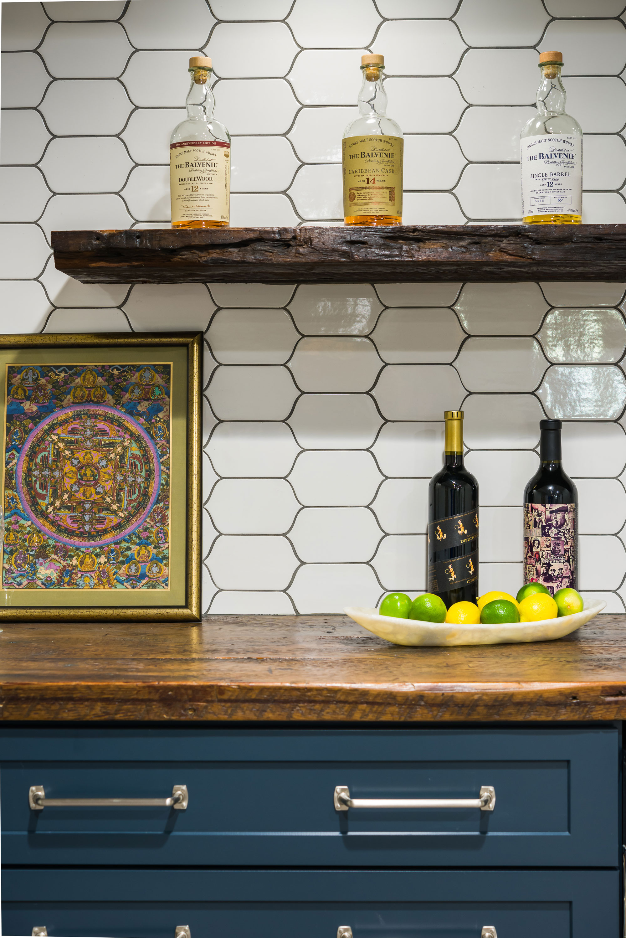
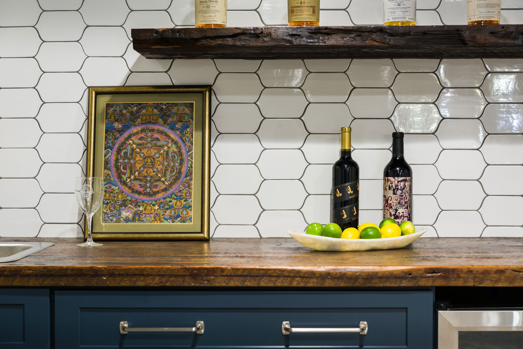
The clients really loved the idea of doing navy blue cabinets at the wet bar, which tied into the nautical theme of the space. We fell in love with the uniquely shaped white tile and used a medium gray grout to make the shape stand out even more. We used reclaimed wood countertops and a floating shelf above to display bottles or glassware. The brushed nickel pulls with exposed screws look like jewelry against the pretty navy cabinets! Our clients now use this space all of the time and love having friends and family over to enjoy it with them!

