Bright, Elegant Bathroom
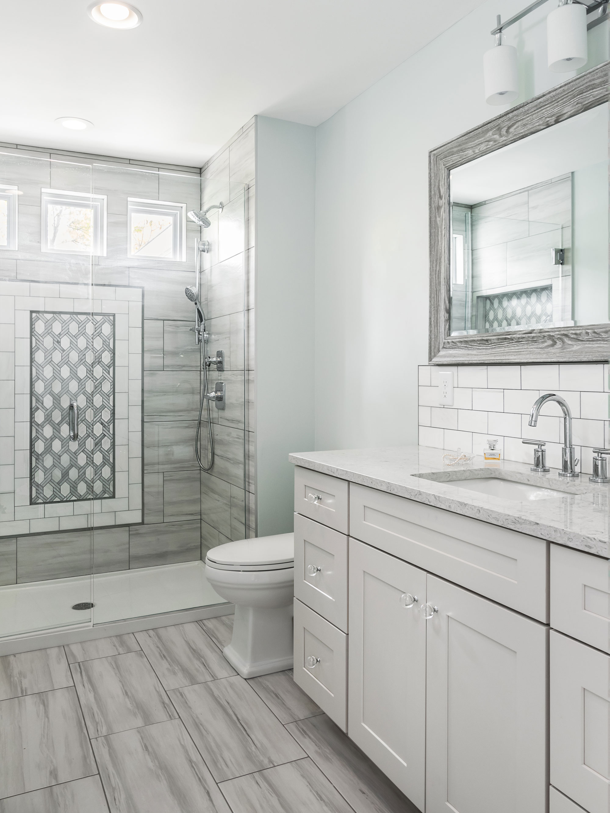
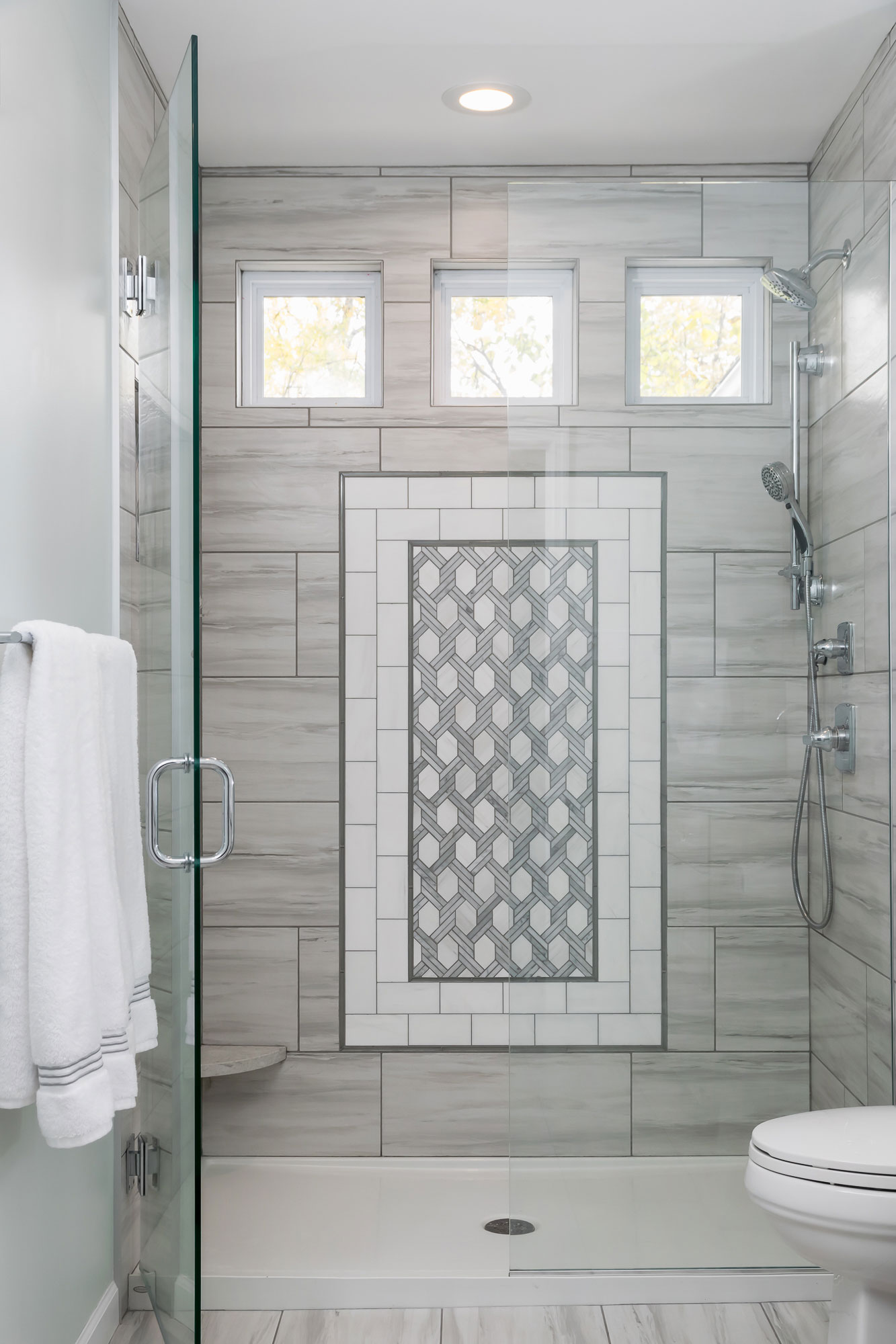
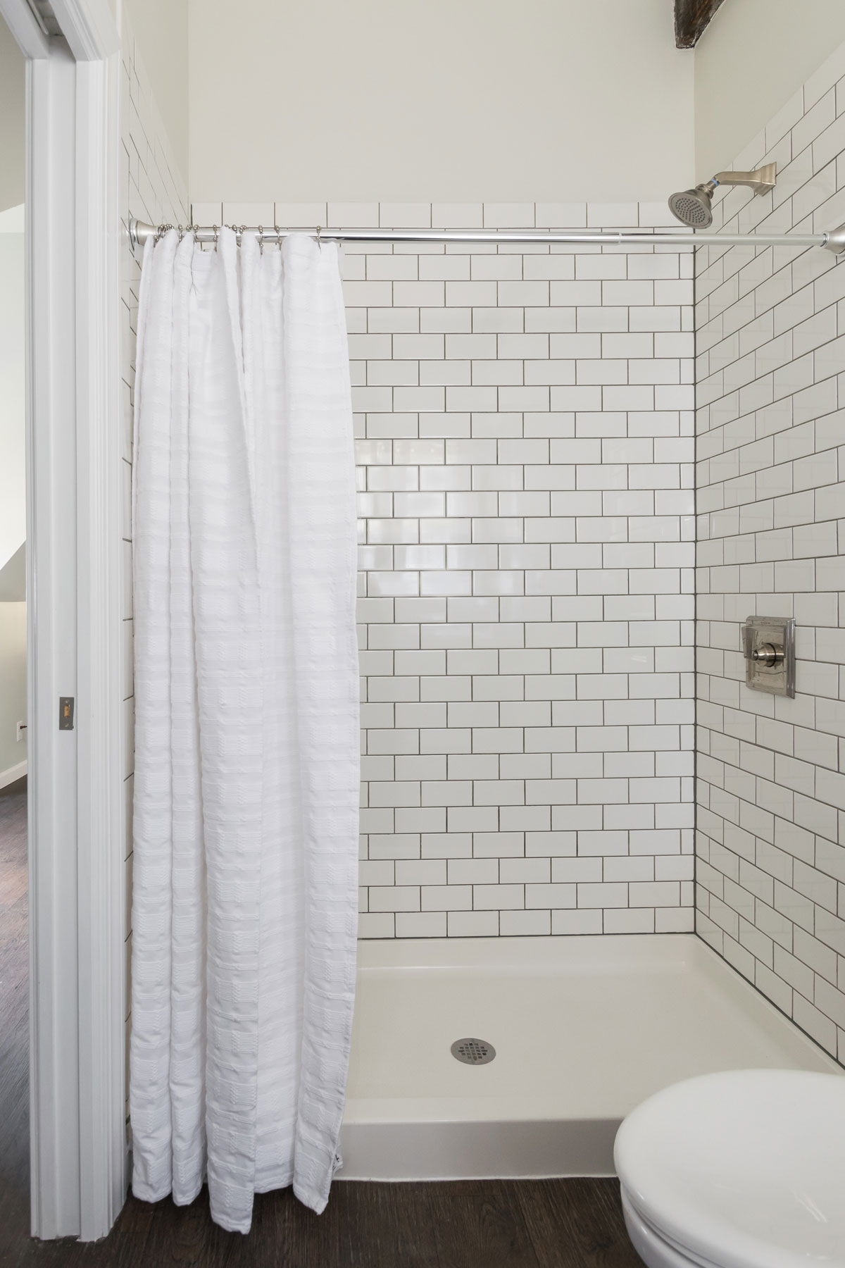
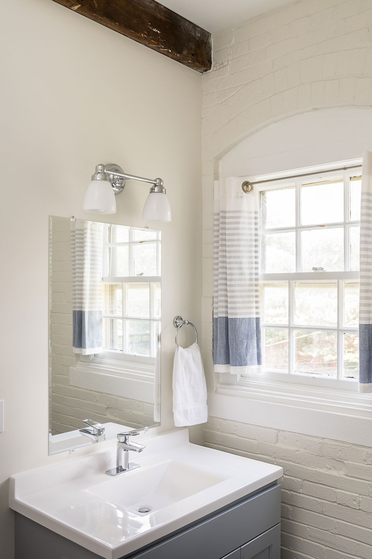
Custom tile and new windows brightened this dark bathroom. Our client's bathroom was the right size, but they were looking for an updated elegance.
Bright, Elegant Bathroom
Missouri, 2018
DESIGNER:
Rochelle McAvin
PHOTOGRAPHER:
Karen Palmer Photography
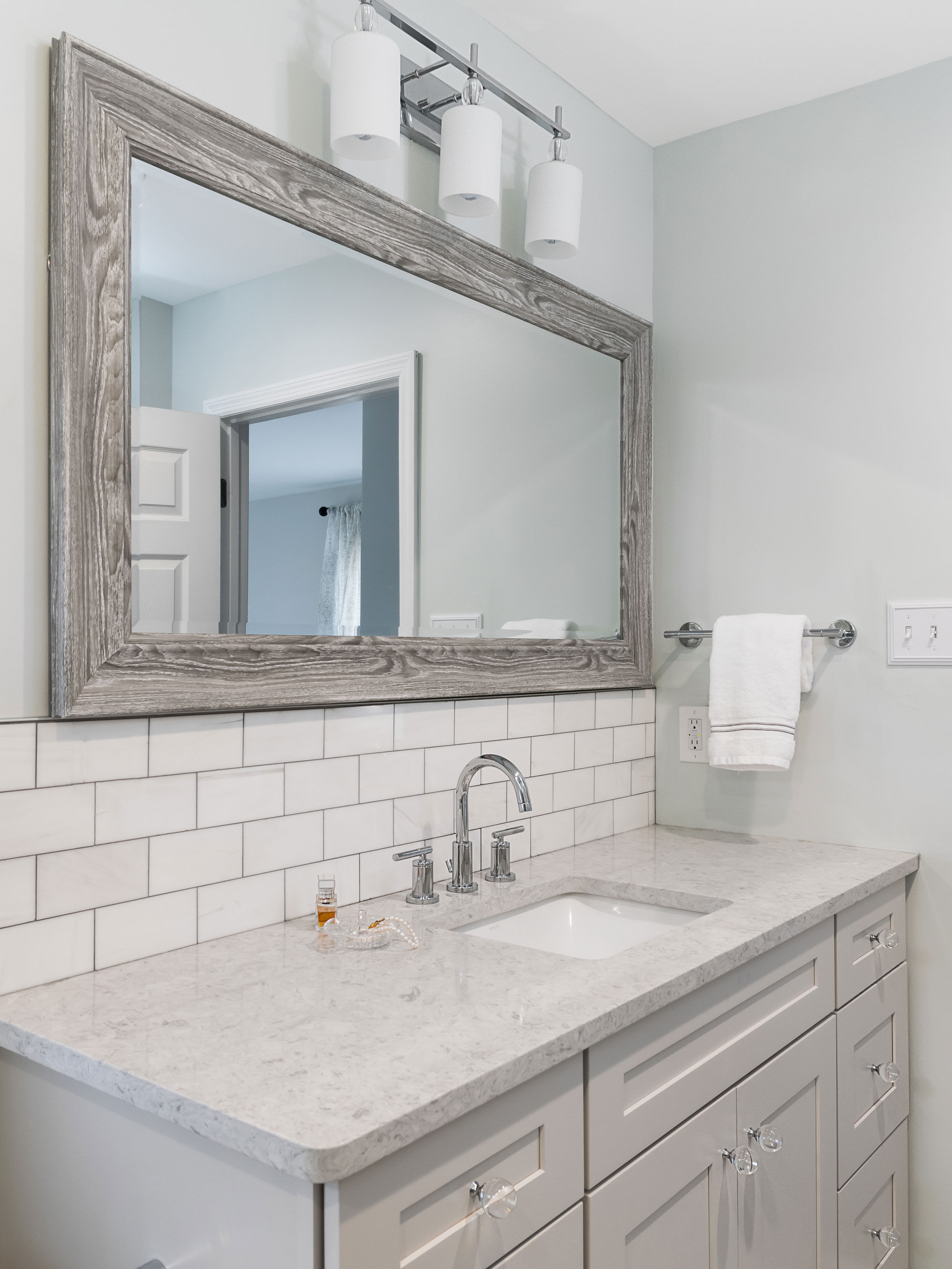
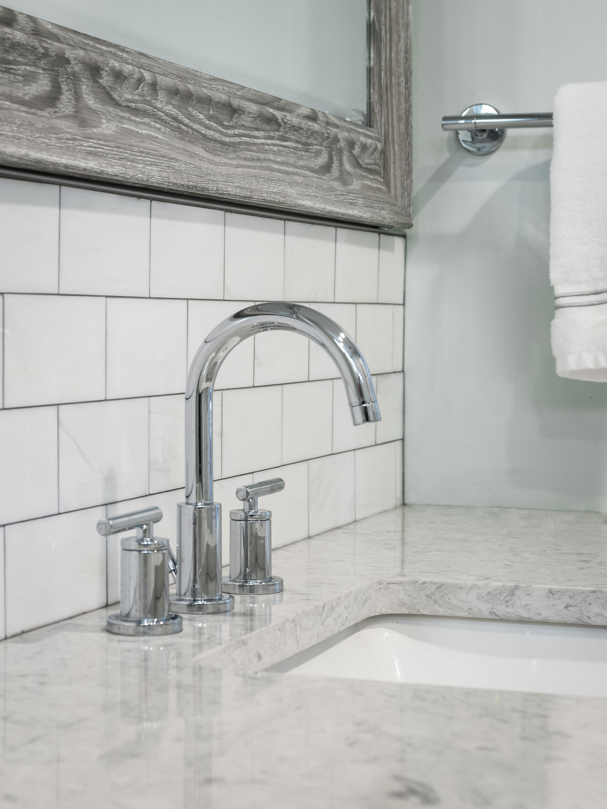
Custom tile and new windows brightened this dark bathroom. Our client's bathroom was the right size, but they were looking for an updated elegance. By incorporating marble tile, a painted vanity and the barn wood mirror - we were able to give classic materials an updated twist. Chrome fixtures and glass knobs add the right amount of shine to the neutral palette.
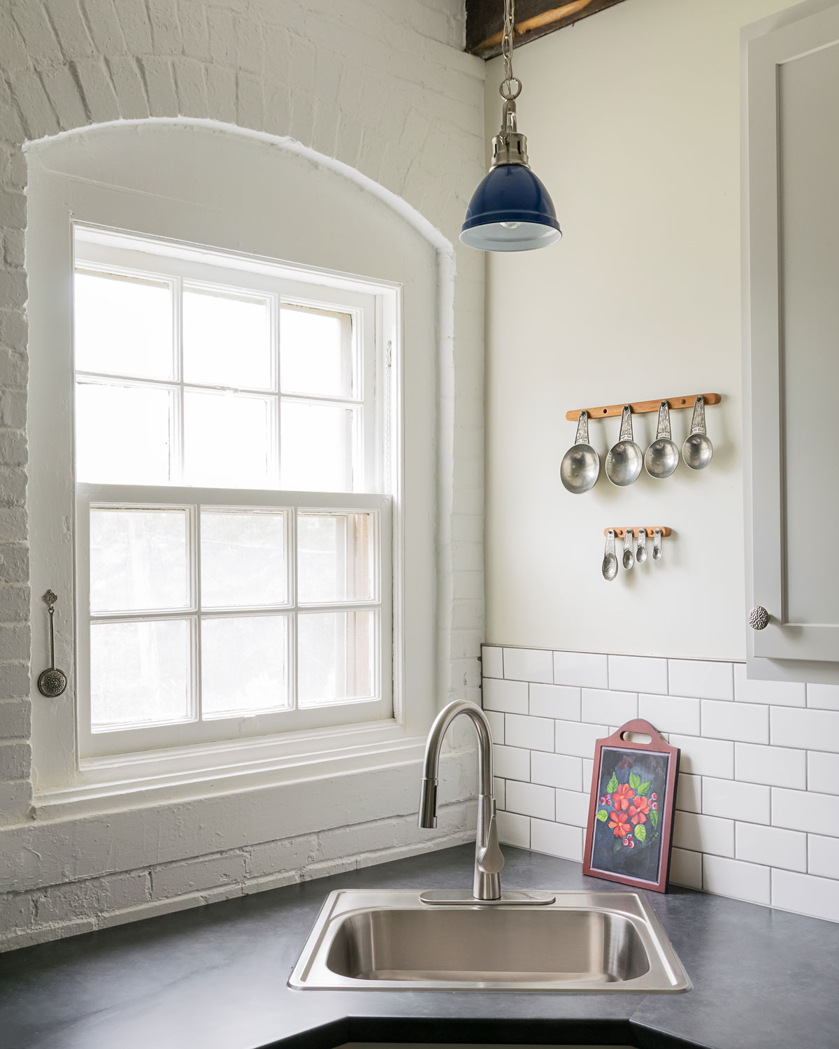
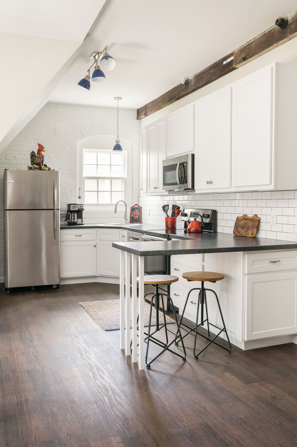
Renovated Carriage House
This home and the accompanying classic carriage house are true snapshots into Saint Louis history. We consider it a privilege to work with the homeowners and preserve this piece of the past!
Renovated Carriage House
Missouri, 2018
DESIGNER:
Rochelle McAvin
PHOTOGRAPHER:
Karen Palmer Photography
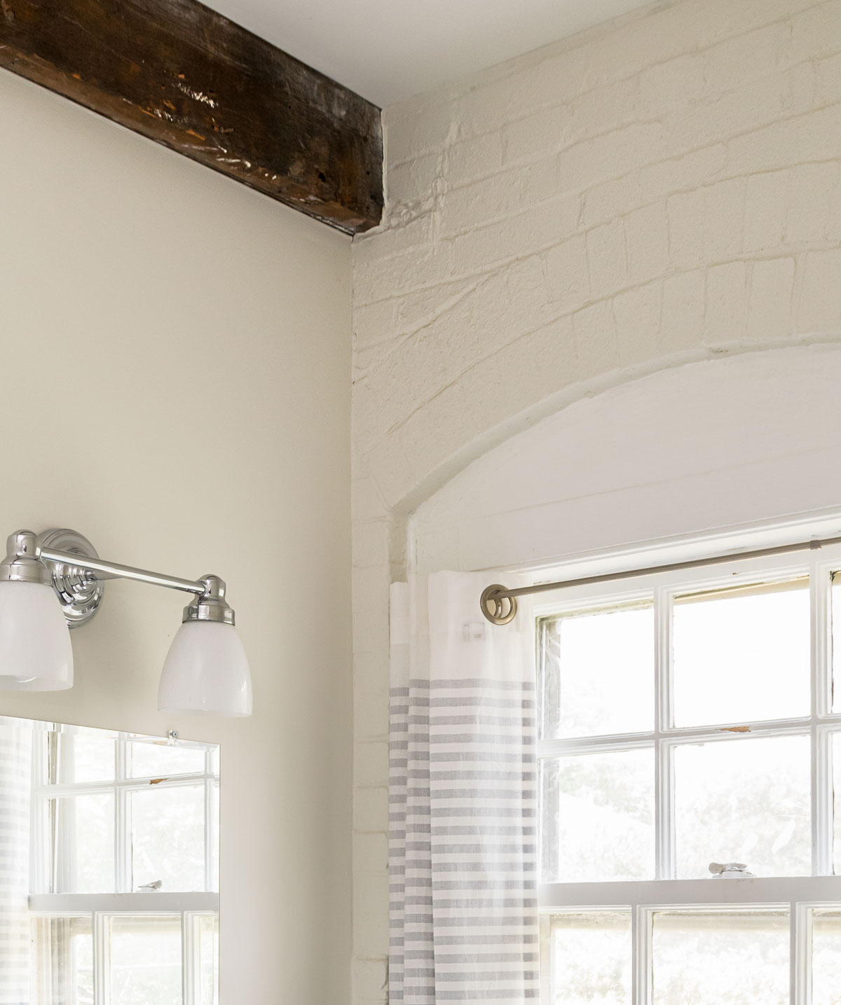
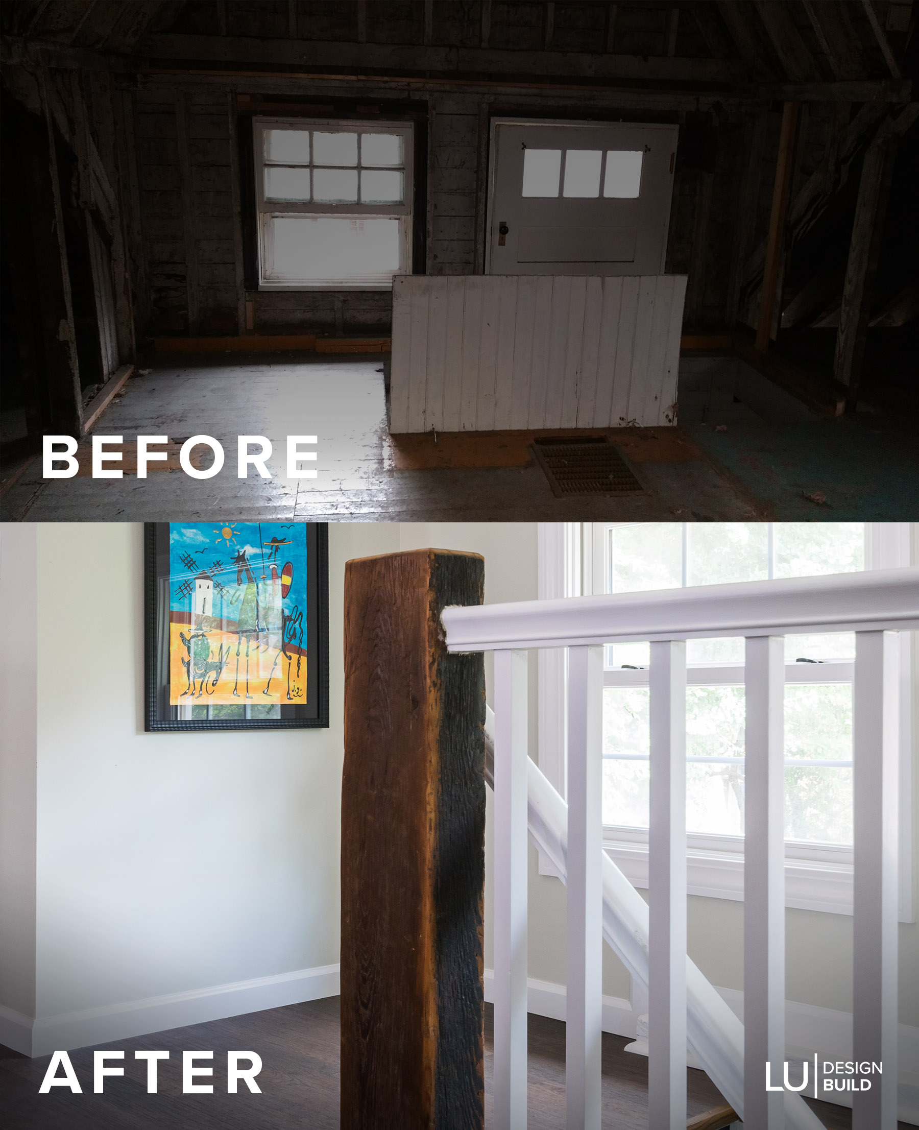
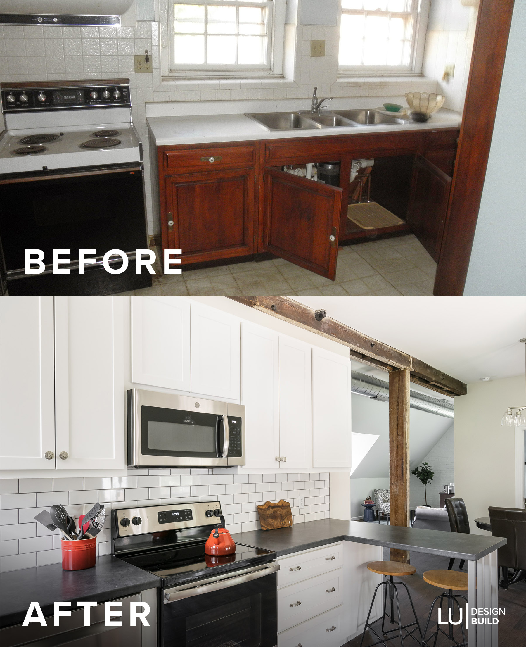
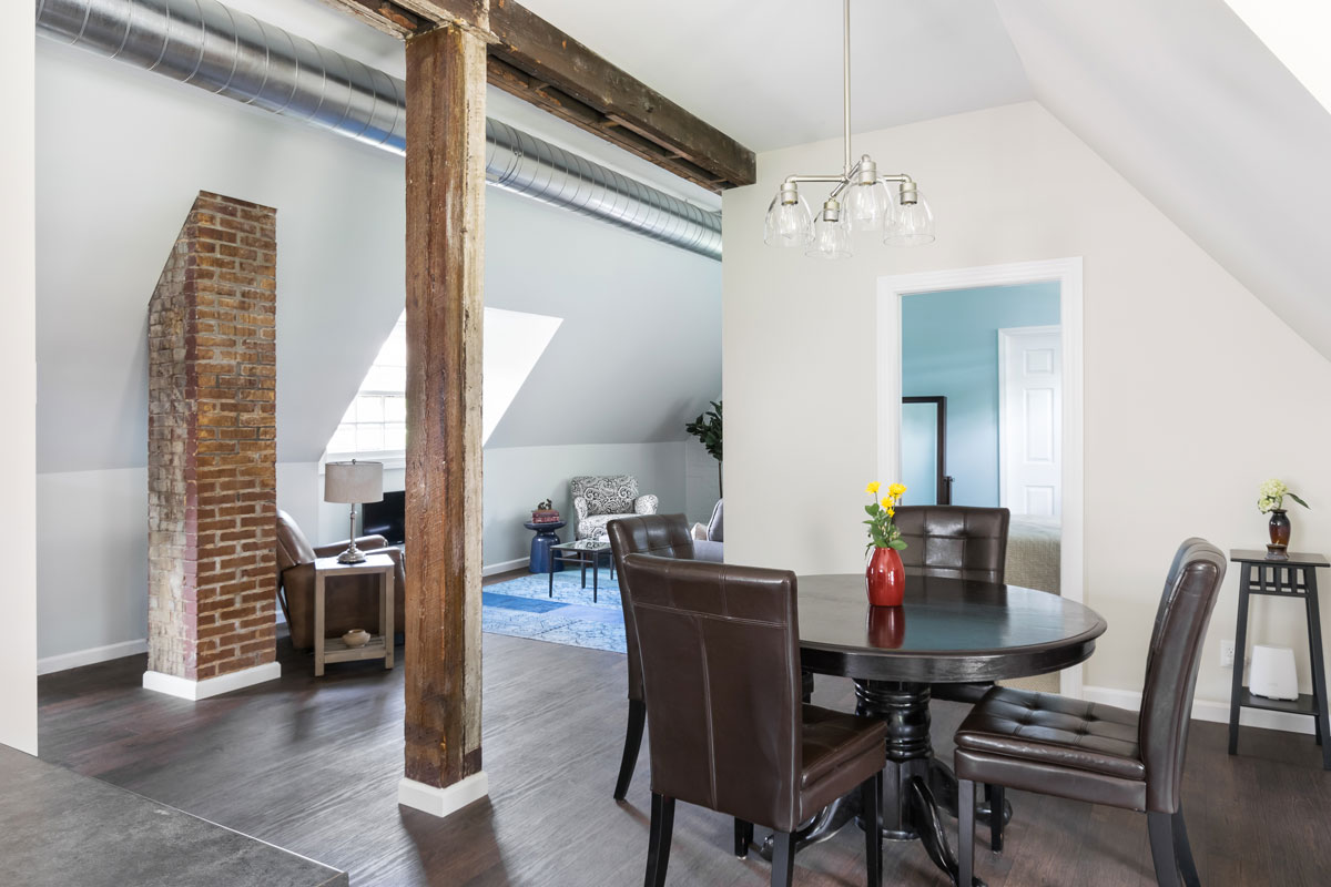
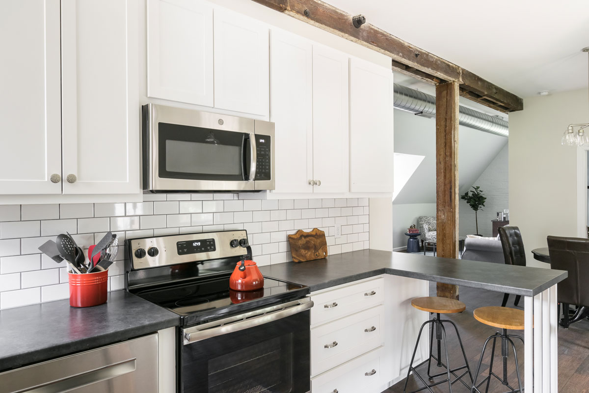
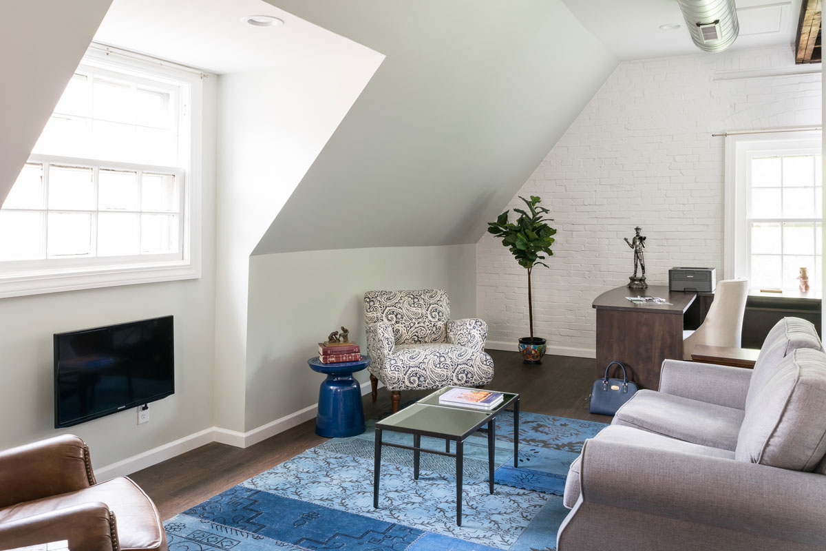
Our client recently retired and moved to Saint Louis to be closer to her family. We transformed a forgotten about second floor into a cozy, carriage house retreat. Prior to remodeling, the space captured no natural light. We gutted the existing floor plan and started from scratch to let the natural light in and preserve the original, 125 years old, windows. The brick was covered in layers of dilapidated paneling; we exposed the original building materials and they added an enchanting texture and authentic character to the space.
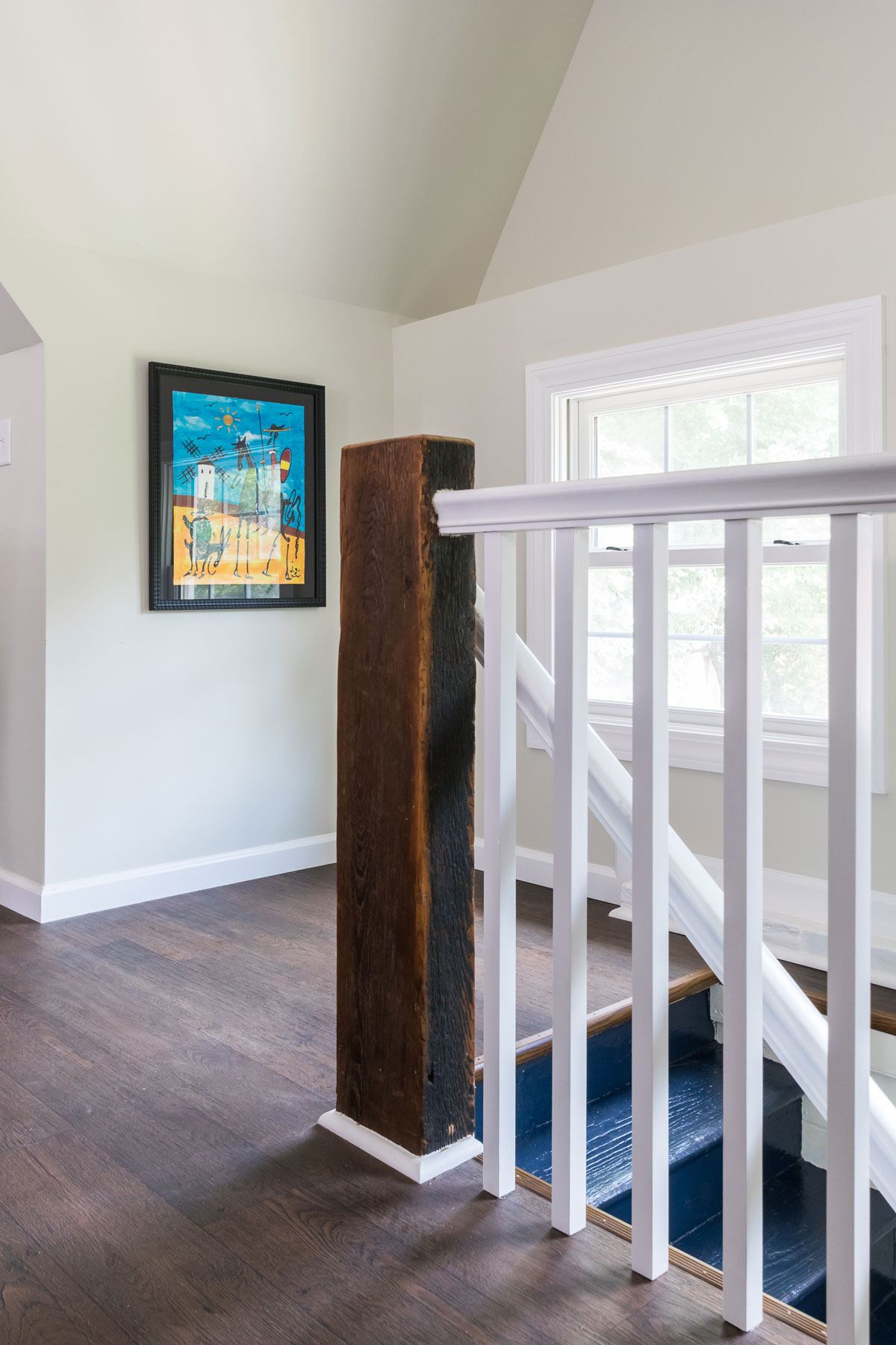
The newel post on the staircase was a find! It was attached to the pulley that would bring the hay up to the loft in the 1800's. We kept all the existing beams to highlight the era and exposed the new duct work to bring in the vintage vibe.
We were able to add every modern amenity including a second floor laundry and a master bedroom complete with a walk in closet!
This home and the accompanying classic carriage house are true snapshots into Saint Louis history. We consider it a privilege to work with the homeowners and preserve this piece of the past!
Ballas Bathroom
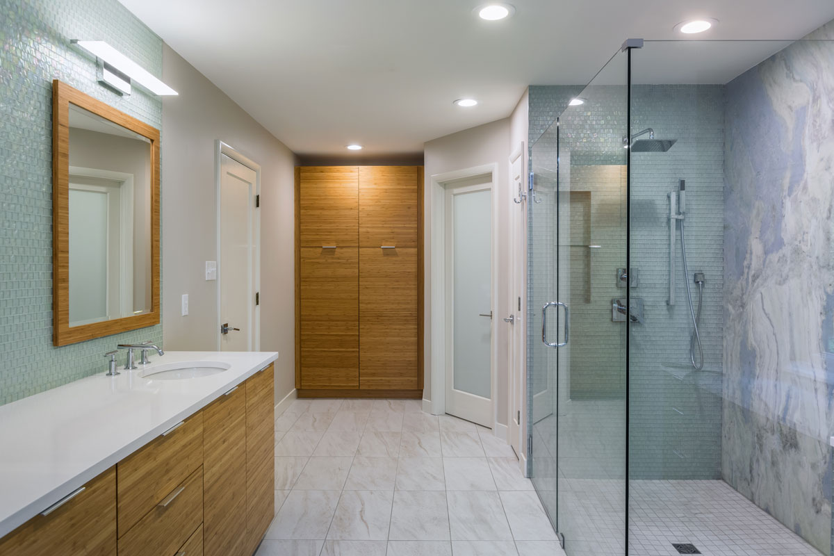
Inspired by the view, we brought the outside in by using reflective, natural materials and a full slab of quartzite is the focal point of the shower.
Ballas Bathroom
Missouri, 2018
DESIGNER:
Rochelle McAvin
PHOTOGRAPHER:
Karen Palmer Photography
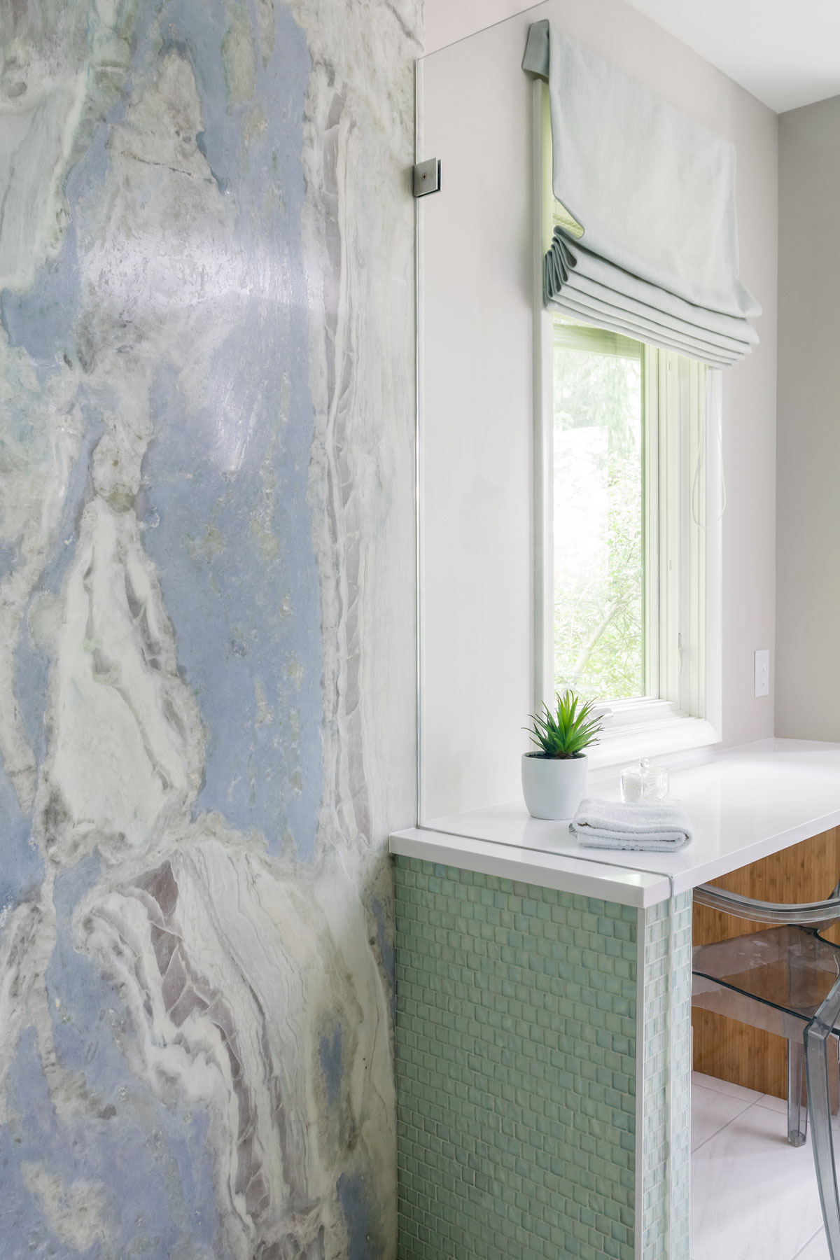
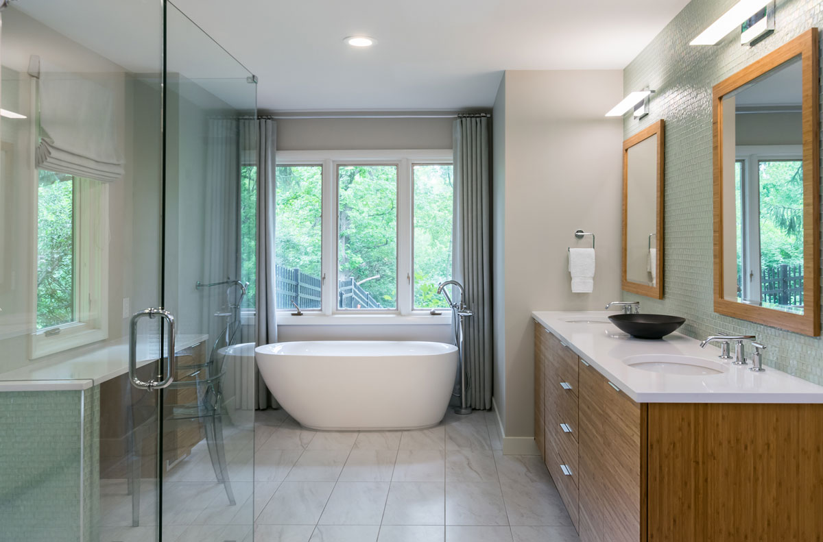
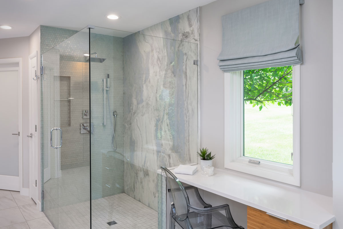
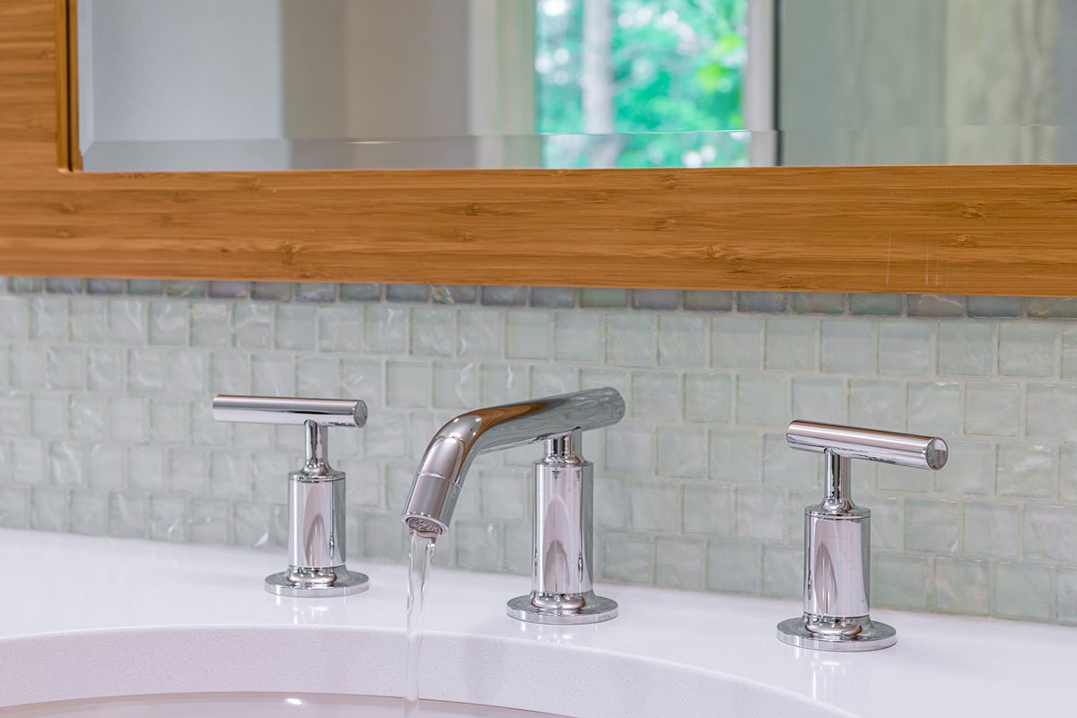
Our client had a bathroom that was in need of an update. We wanted to bring a modern, organic, aesthetic to the homeowners space. Inspired by the view, we brought the outside in by using reflective, natural materials and a full slab of marble is the focal point of the shower. The glass tile provides a soft glow that highlights the natural stone wall. Bamboo cabinets add a warmth to the room while maximizing storage. The overall feeling is warm, calm and serene.
Accessible Master Suite Bathroom
Our clients have loved their 86 year old home for nearly half a century. Unfortunately, older homes were not built with aging in place or universal design in mind. That's where we come in!
Accessible Primary Suite Bathroom
Missouri, 2018
DESIGNER:
Jennifer Chapman
PHOTOGRAPHER:
Karen Palmer Photography
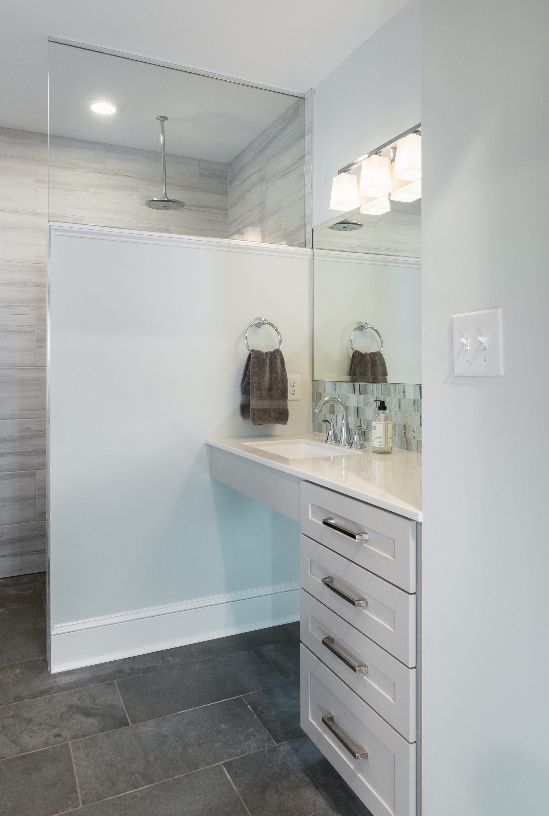
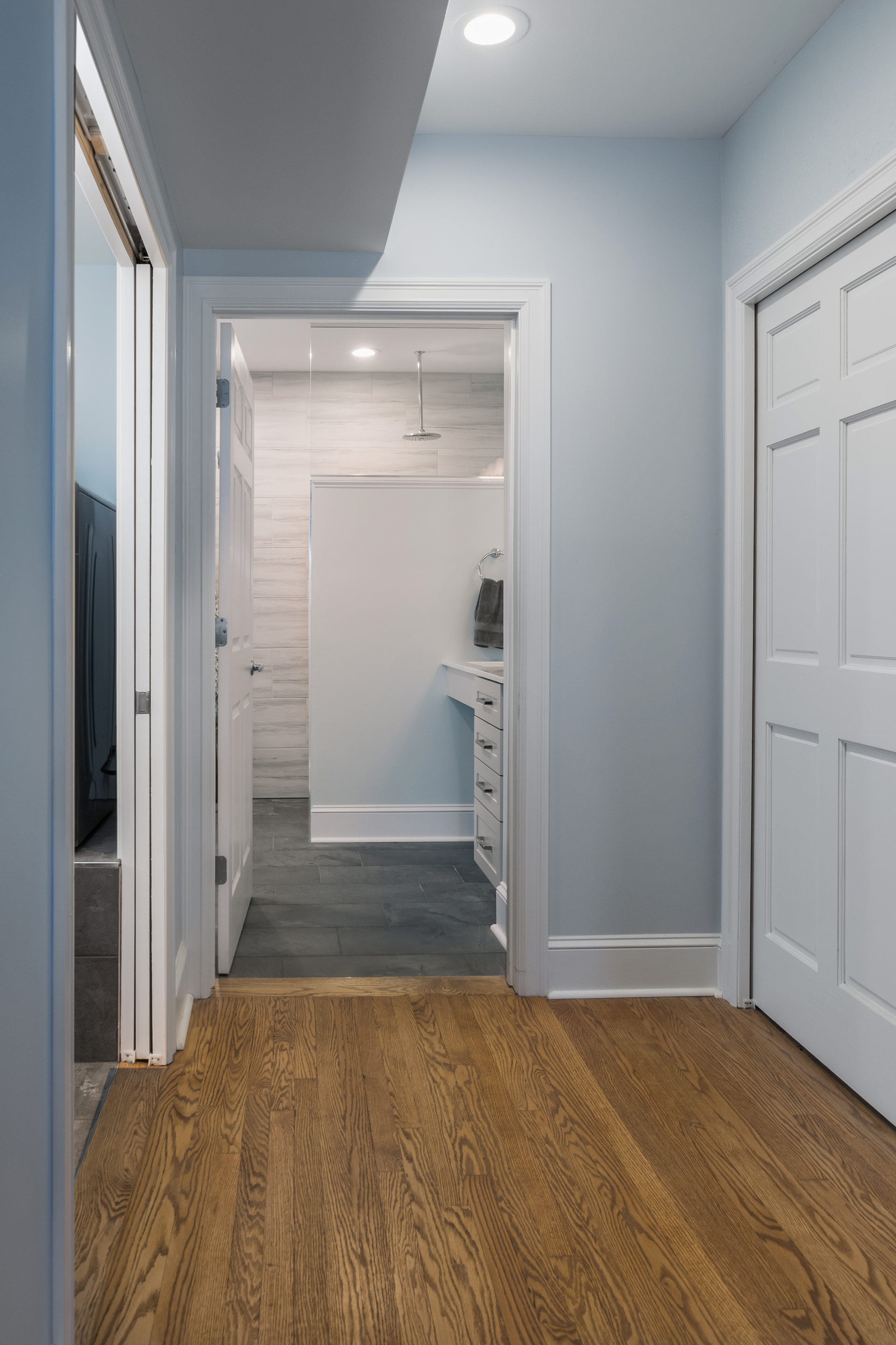
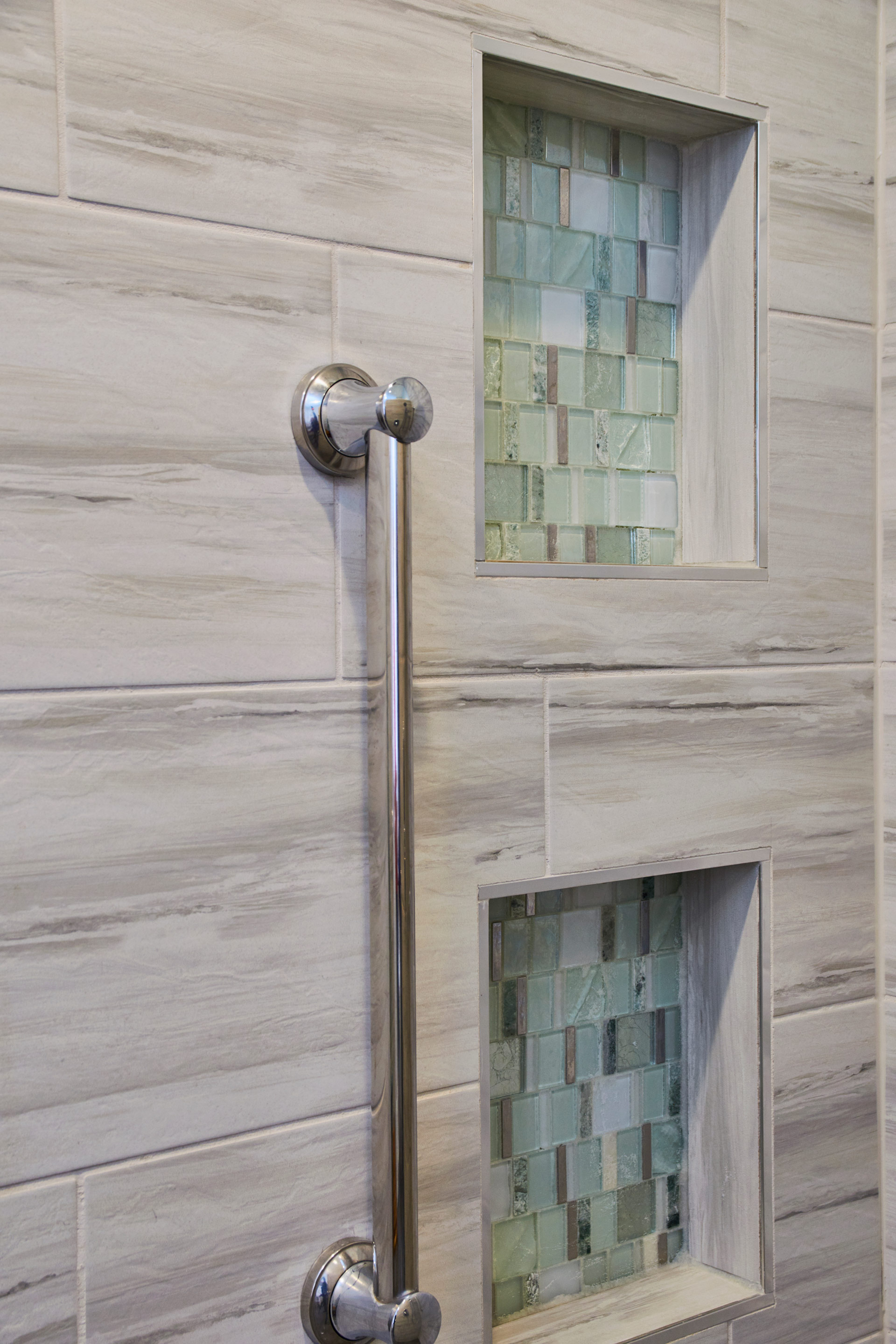
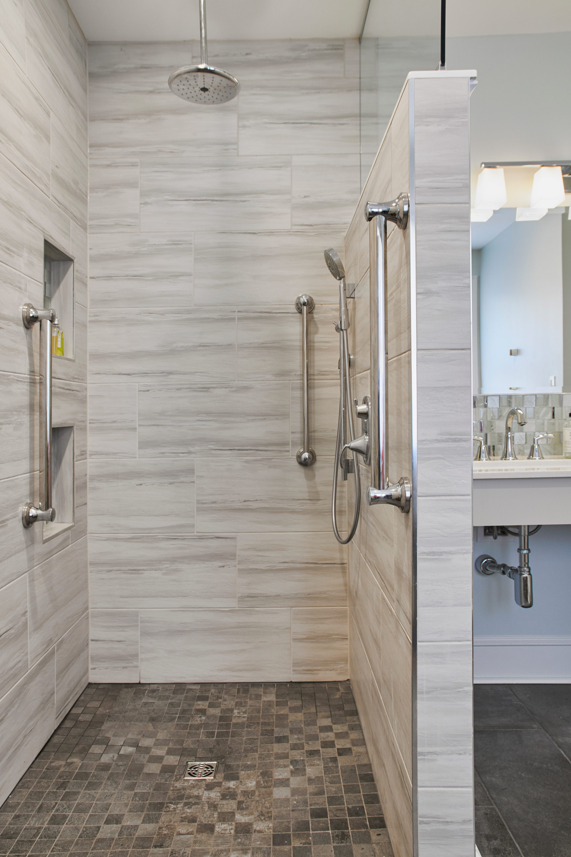
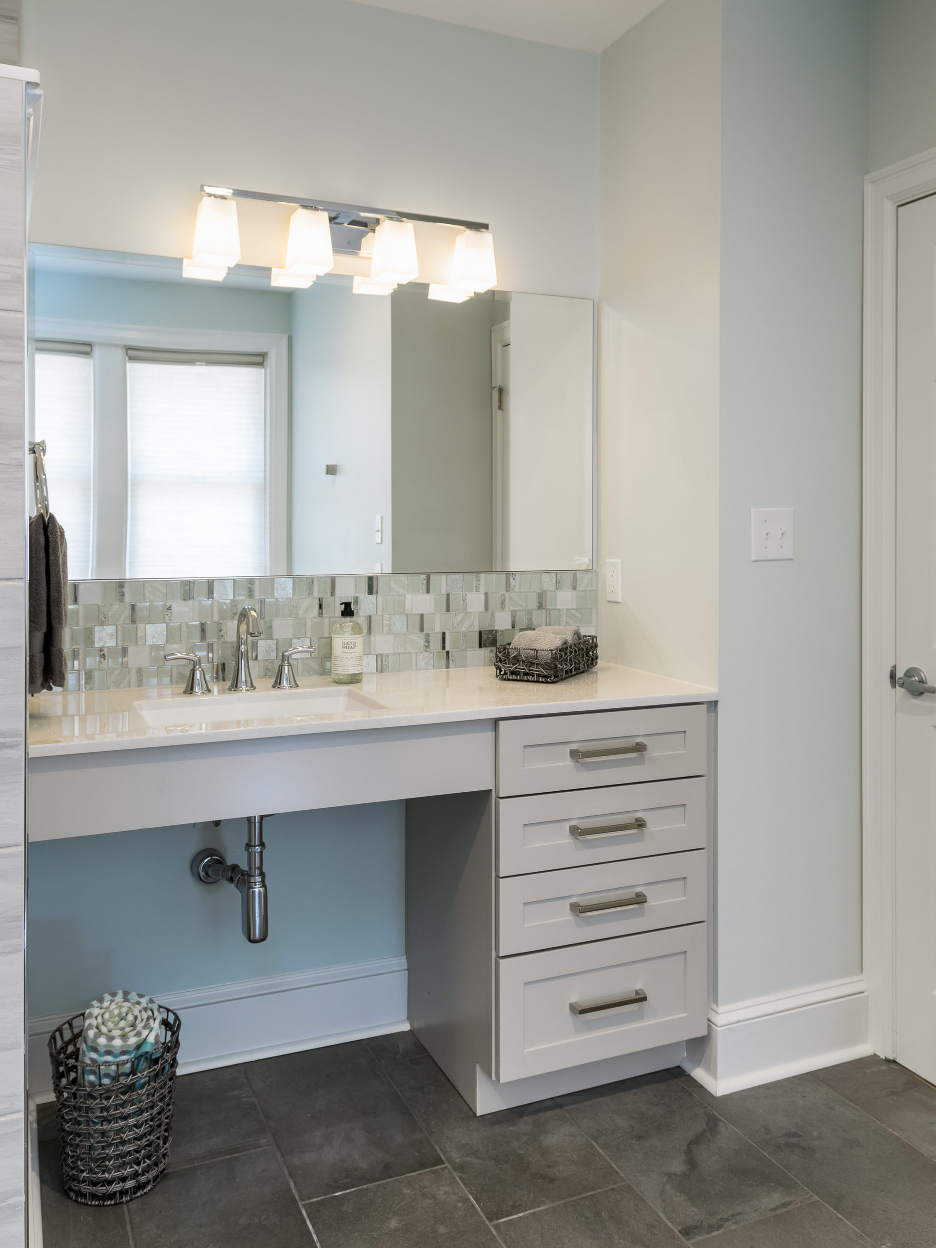
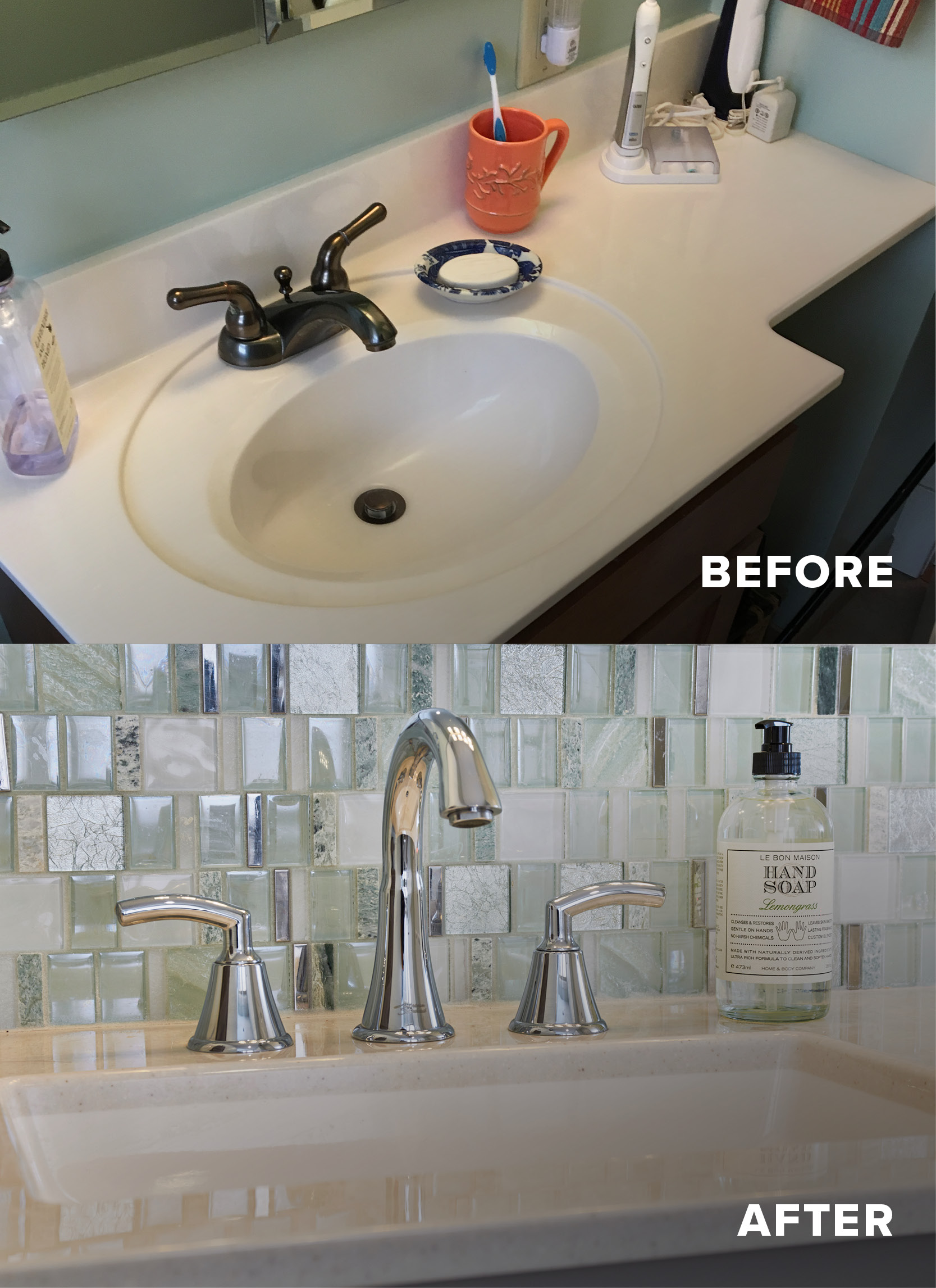
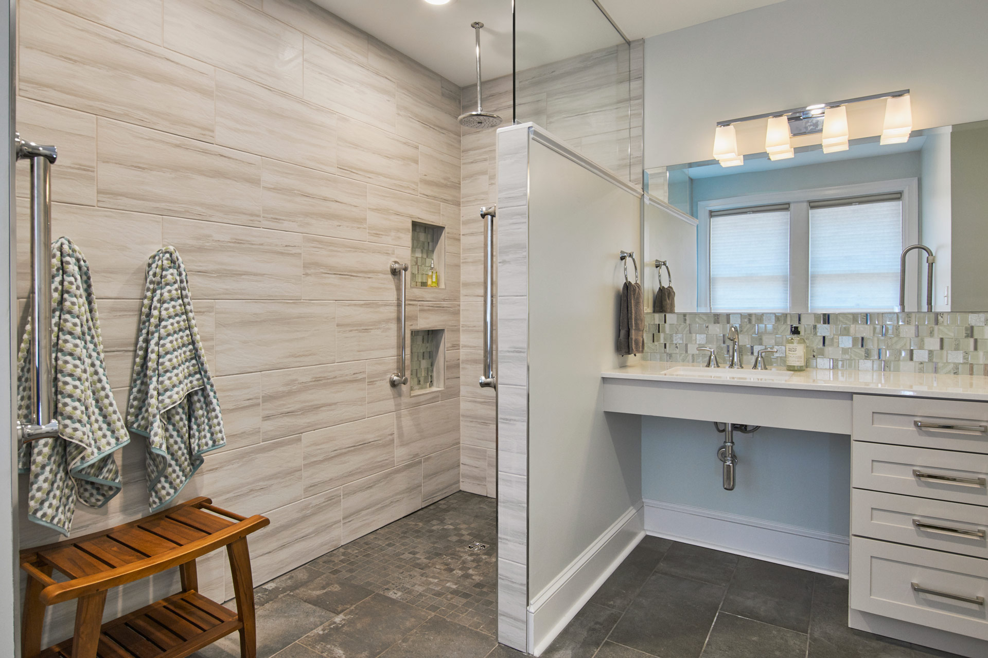
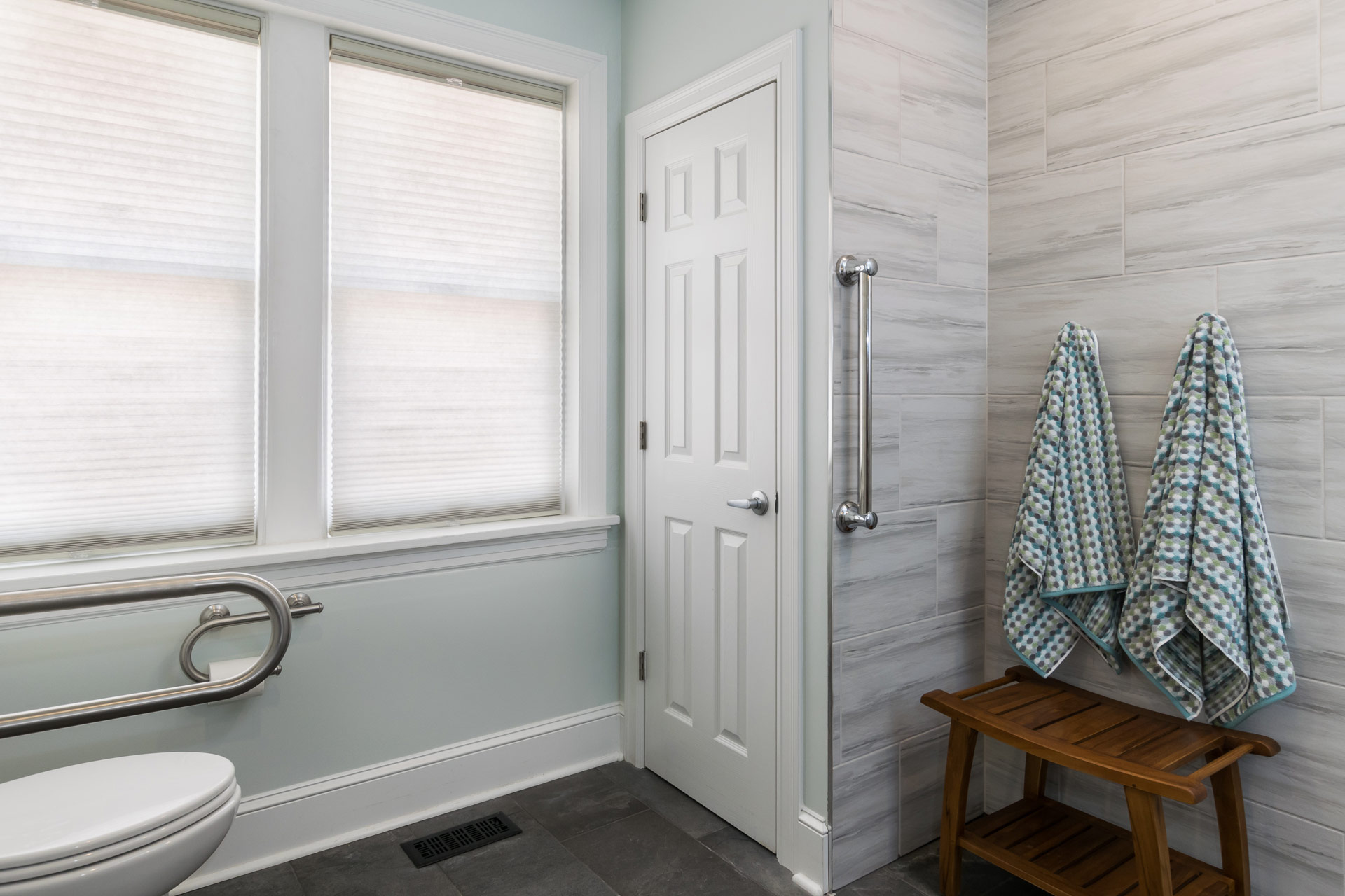
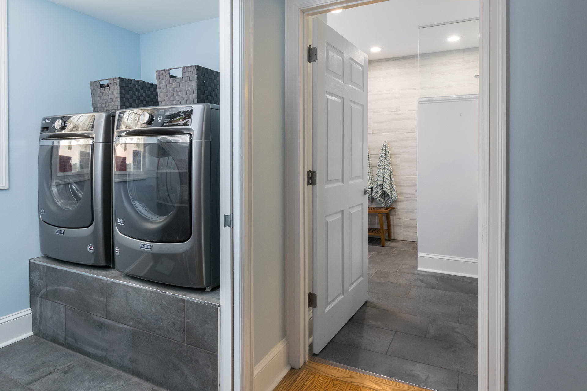
Our clients have loved their 86 year old home for nearly half a century. Unfortunately, older homes were not built with aging in place or universal design in mind. The homeowners were facing the sad reality that they may have to move somewhere that offered more accessible living. Their two story home had two bedrooms, separated by a small bathroom and hallway, on the first floor. We came up with a plan to convert this entire space into an one accessible ensuite. It was important to design a primary bathroom that allowed for different levels of accessibility as they age. We started the design by creating an open shower that allowed for standing or sitting and placed grab bars in key places for both functions. We kept the space beneath the sink open to accommodate a wheelchair if needed in the future. At the toilet area, we wanted to provide grab bars on both sides of the toilet, but we also needed to keep clearance to one side so that someone could transfer from a wheelchair if they needed to. A flip down grab bar was the perfect solution! It completely folds up and flattens against the wall. On the other side of the toilet we used a grab bar/ toilet paper holder combo to keep it less cluttered on the wall below the window. One of the must haves in this suite was to bring the laundry up to the main floor from the basement so we created a laundry room/closet in the master suite.We elevated their front loading washer and dryer on a tiled platform so that they do not have to bend down to do laundry.
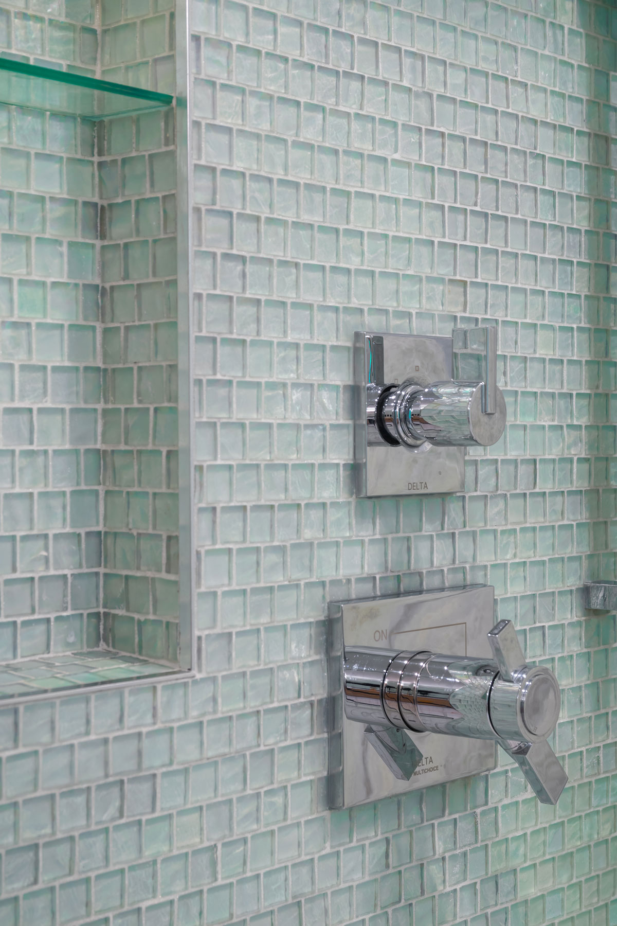
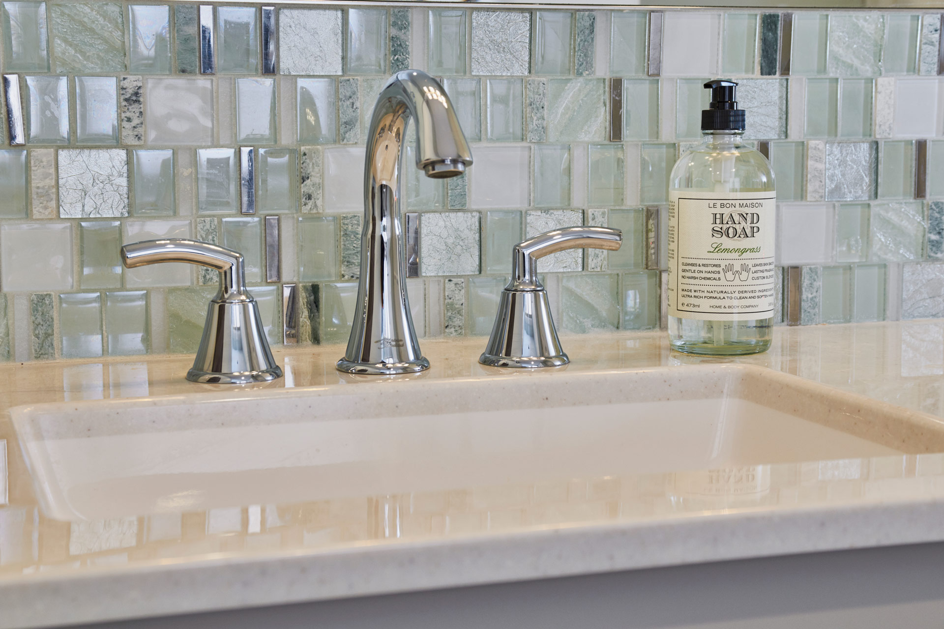
The clients wanted the space to feel clean and bright and modern. When we found the the sea green glass tile mosaic we knew we had to use it! We kept the shower walls light and the floor darker. The onyx vanity top is easy to clean and looks beautiful on the light gray vanity. We used chrome fixtures to match the chrome in the accent tile mosaic. The overall look we achieved is reminiscent of a modern spa and our clients can join their family home for years to come!
Beautiful Master Bathroom
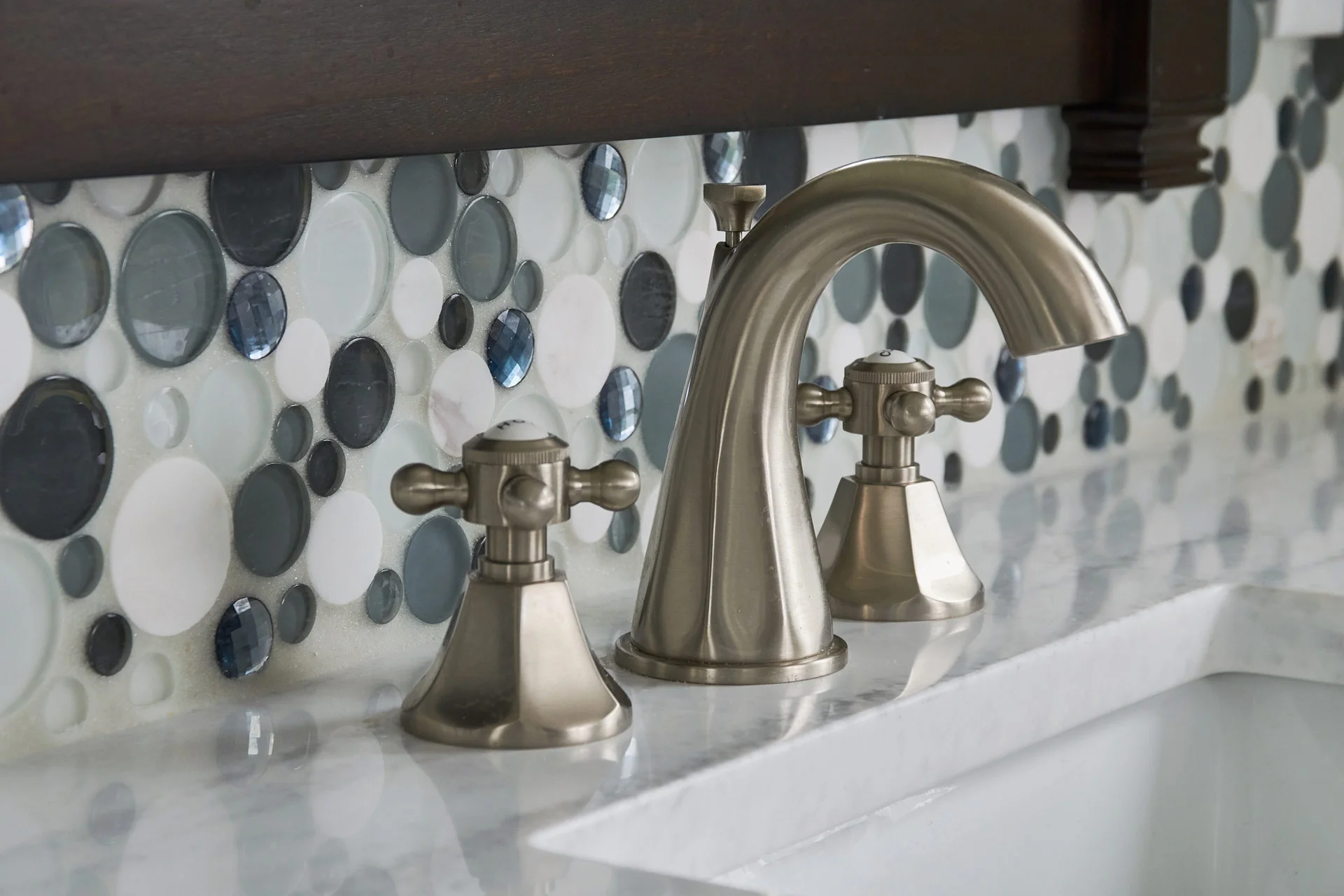
Our client was looking for something different with a touch of whimsy! We added dark, masculine, cabinetry for him and bubble tile for her.
Beautiful Primary Bathroom


Missouri, 2018
DESIGNER:
Rochelle McAvin
PHOTOGRAPHER:
Karen Palmer Photography
Our clients were looking for more space for their growing family. We added a master suite addition complete with home office, master bedroom, his and her closets, and a beautiful master bathroom.
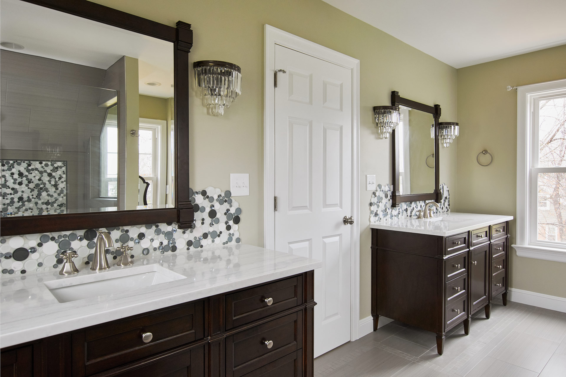
She was looking for something different with a touch of whimsy! We added dark, masculine, cabinetry for him and bubble tile for her.
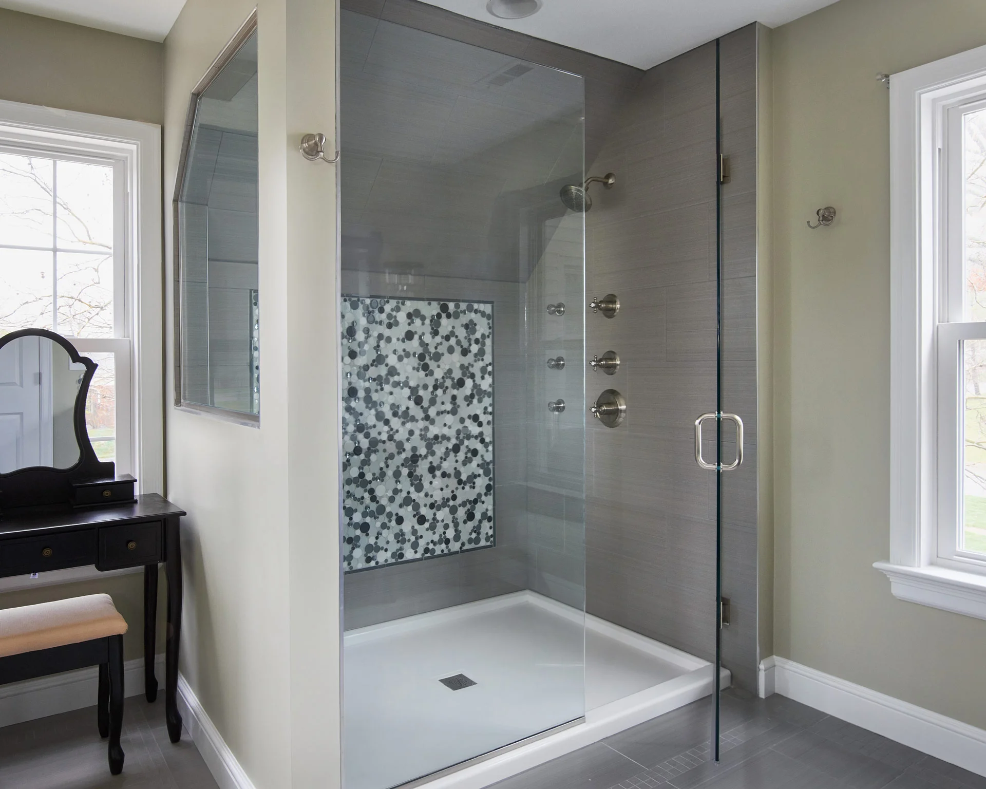
The floor tile includes an inlay and the shower is complete with three massaging body sprays.
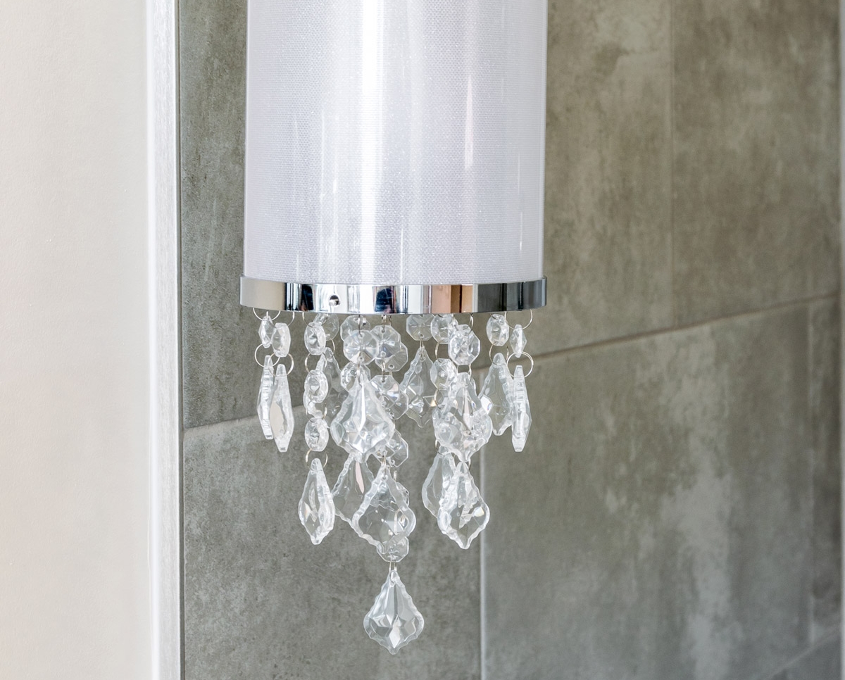
The ceiling fan has retractable blades that disappear when the fan is off, leaving a crystal chandelier overhead.
We thought of every detail in the new space including custom closets.
Efficient Design Maximizes Small Bathroom in Historic Home
Our client had a tiny bathroom that had been carved out of the kitchen in their 100 year old home.
Efficient Design Maximizes Small Bathroom in Historic Home
2017
DESIGNER:
Rochelle McAvin
PHOTOGRAPHER:
Karen Palmer Photography
Our client had a tiny bathroom that had been carved out of the kitchen in their 100 year old home. They had modern updates throughout and when their mother in law moved in - they updated the first floor bathroom just for her.
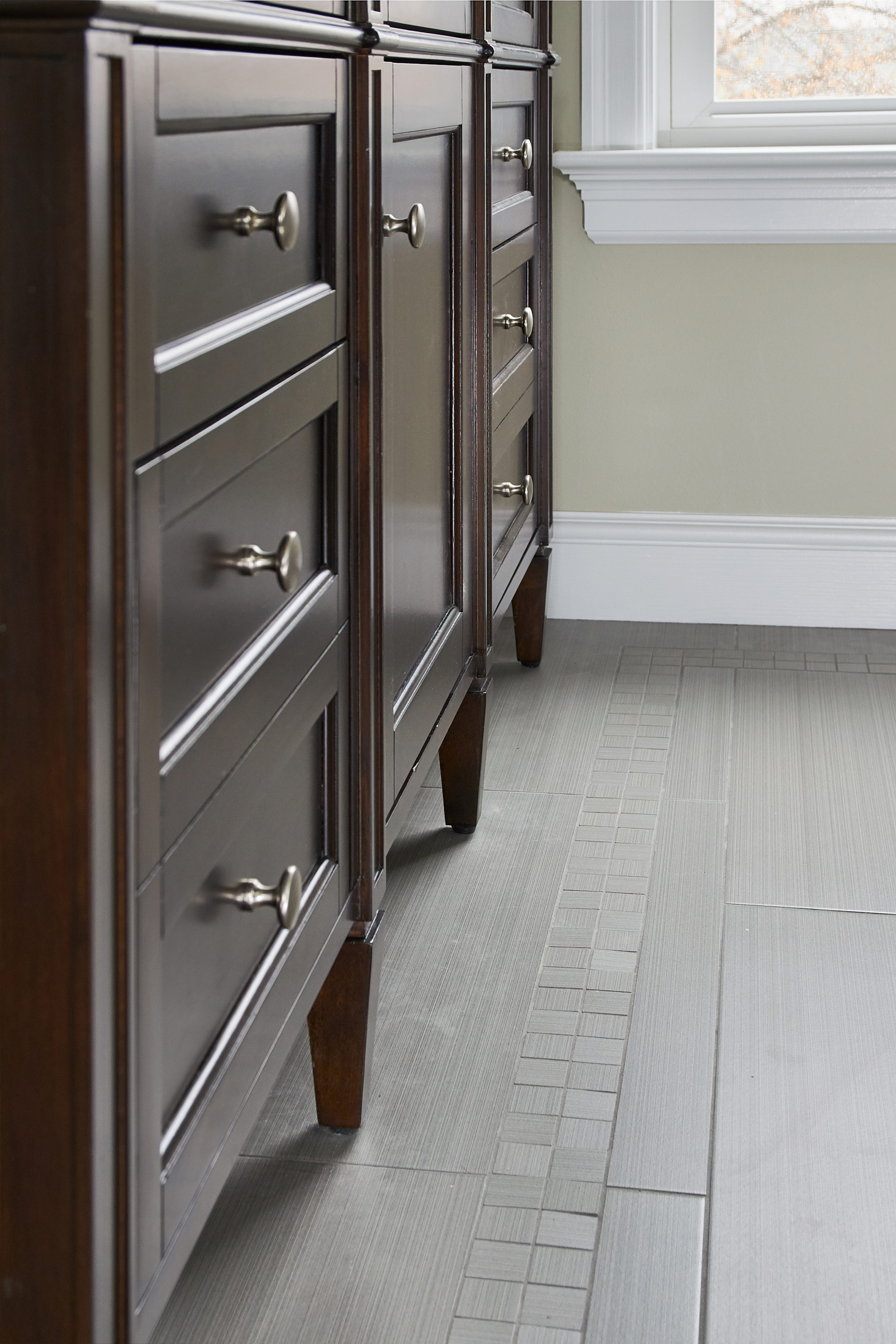
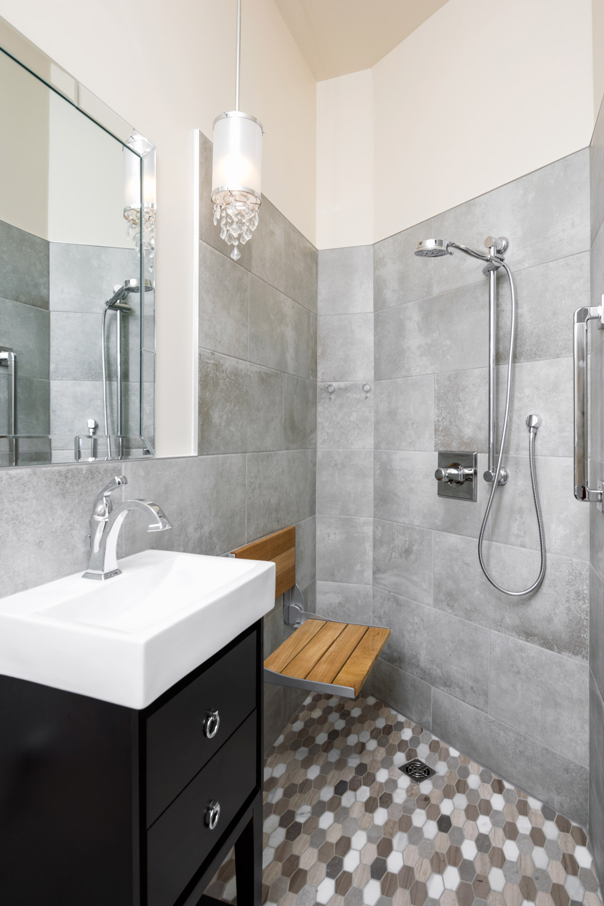
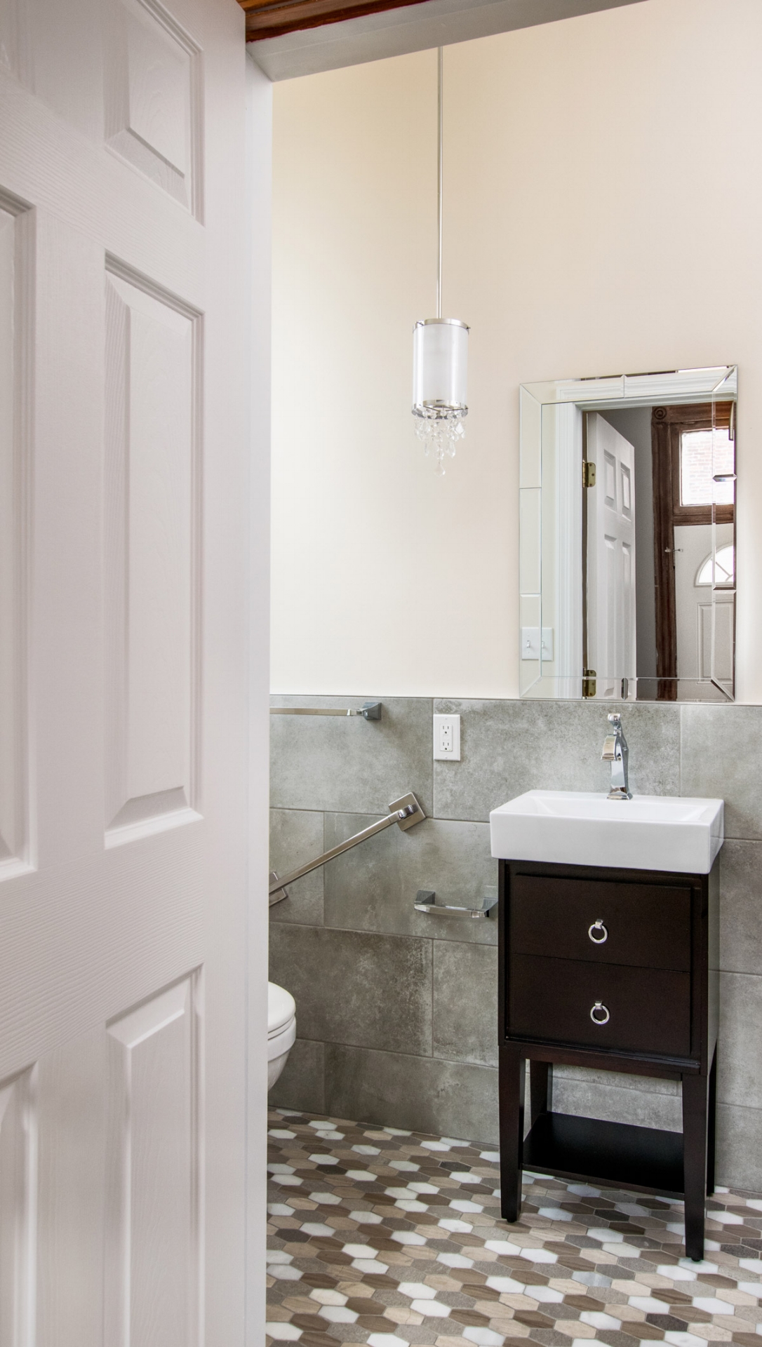
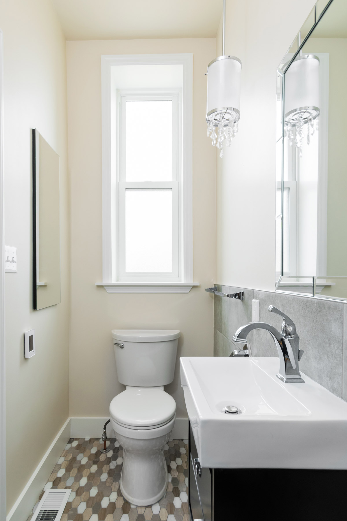
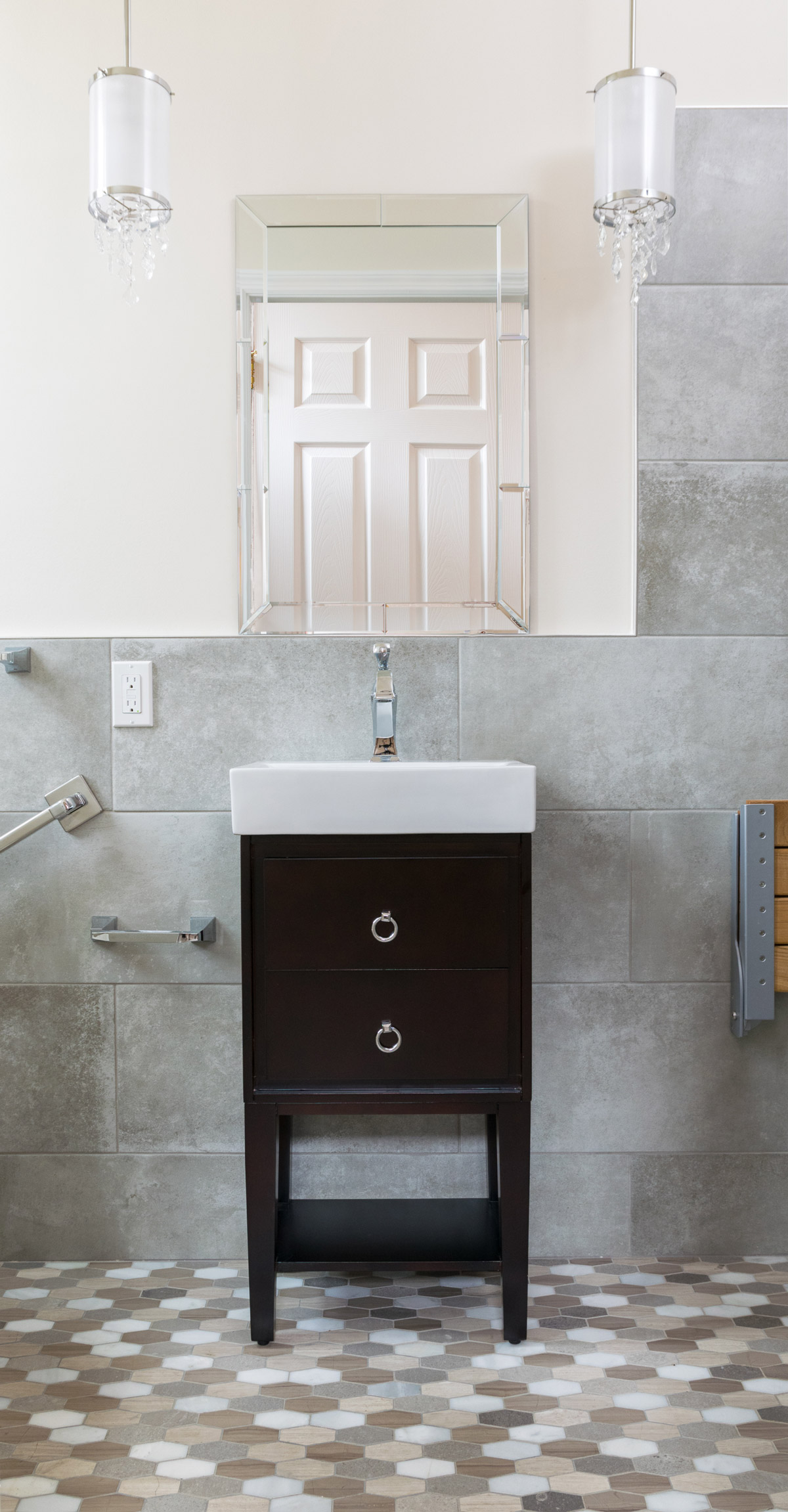
She loved the modern, elongated hex floor tile that featured multiple shades of natural stone. We built the color palette from the ground up using a concrete wall tile to keep with the on trend look flowing through the rest of the home.
This bathroom had two primary needs: storage and to assist with aging in place. We have multiple grab bars, coordinating with the plumbing, a teak fold down shower seat and a zero entry shower floor. The 15" wide vanity has two functioning drawers that are perfect for additional, everyday storage.
The best part is what you cannot see; storage recessed into the walls and as an added bonus, we have heated floors.
The result is a neutral, warm and efficient space built into 32 square feet
Calming Bathroom Retreat Influenced By Nature
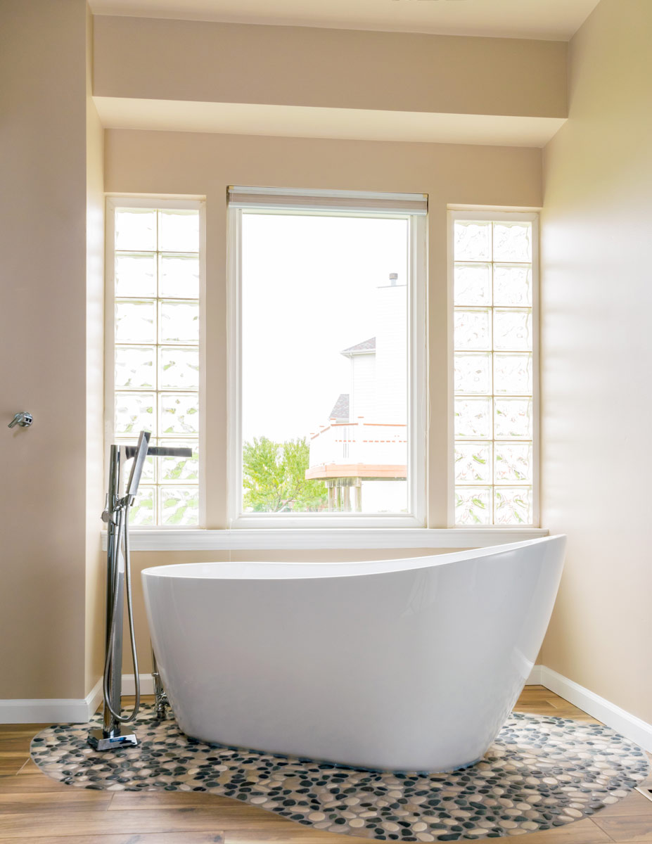
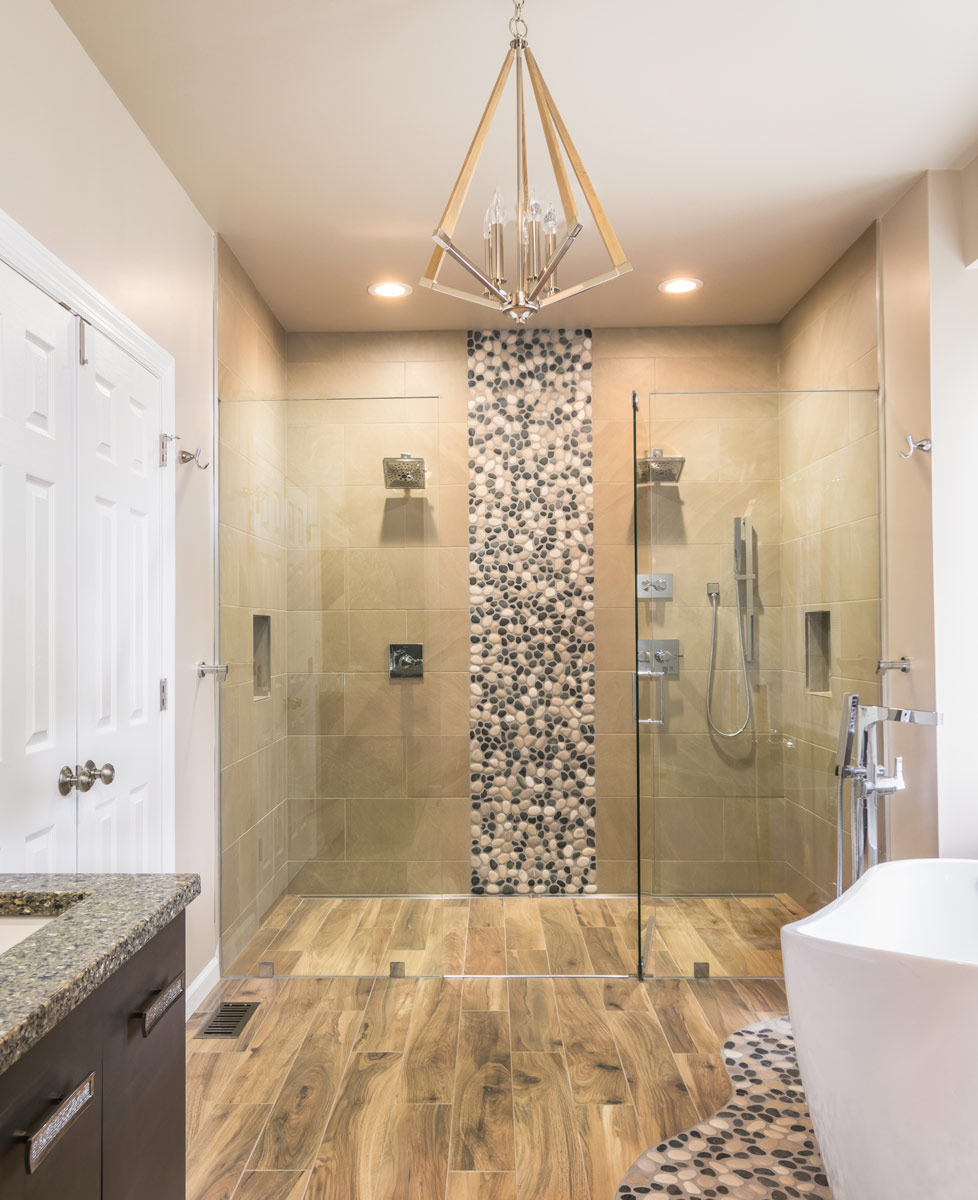
My client loved the idea of a large shower and a warm, natural setting. Inspired by her travels we brought in river rock and soft, neutral tones on the walls and floors.
Calming Bathroom Retreat Influenced By Nature
2017
Chesterfield, MO 63005
DESIGNER:
Rochelle McAvin
PHOTOGRAPHER:
Karen Palmer Photography
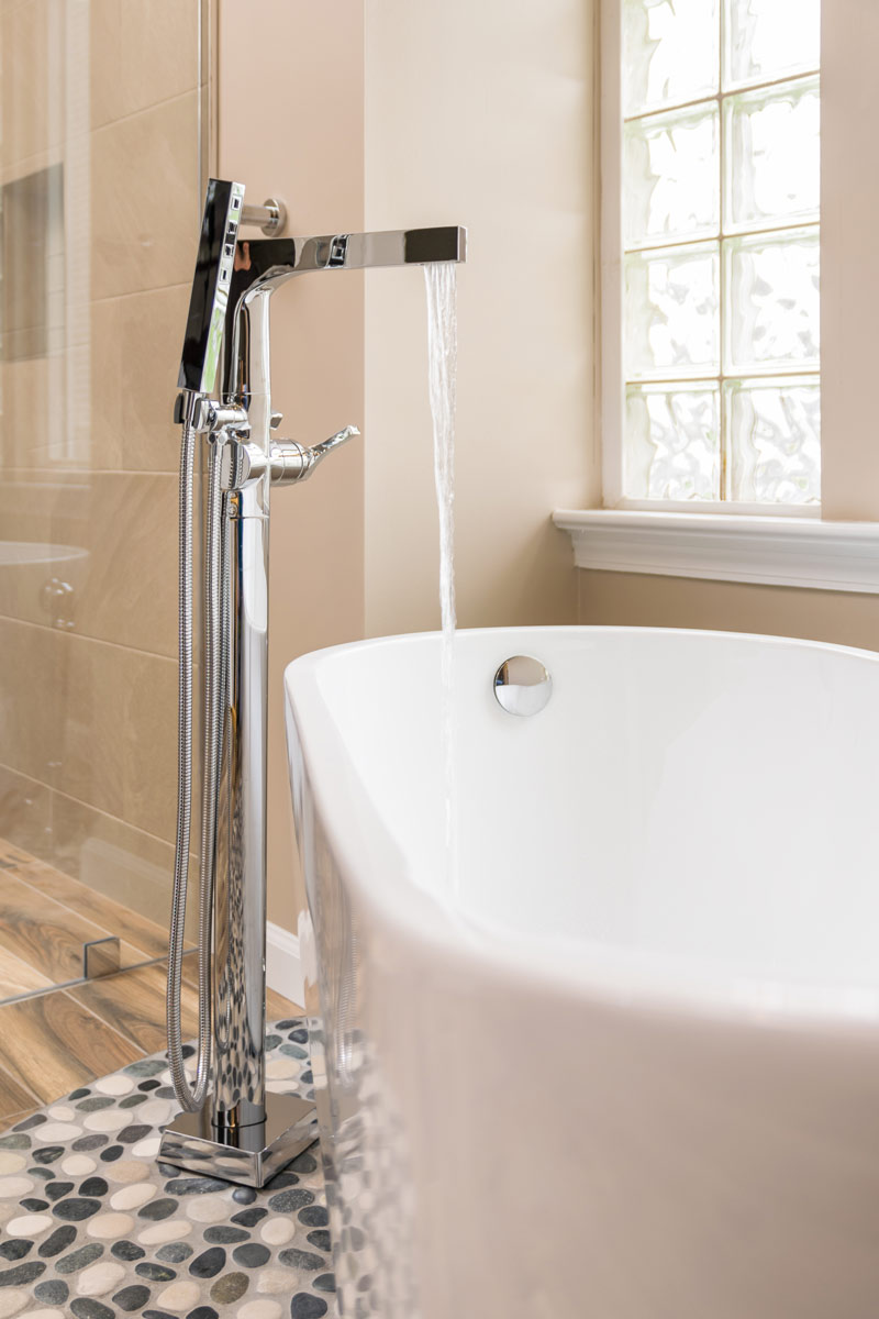
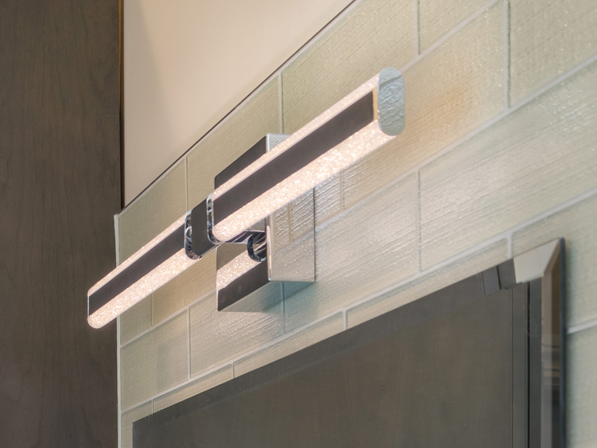
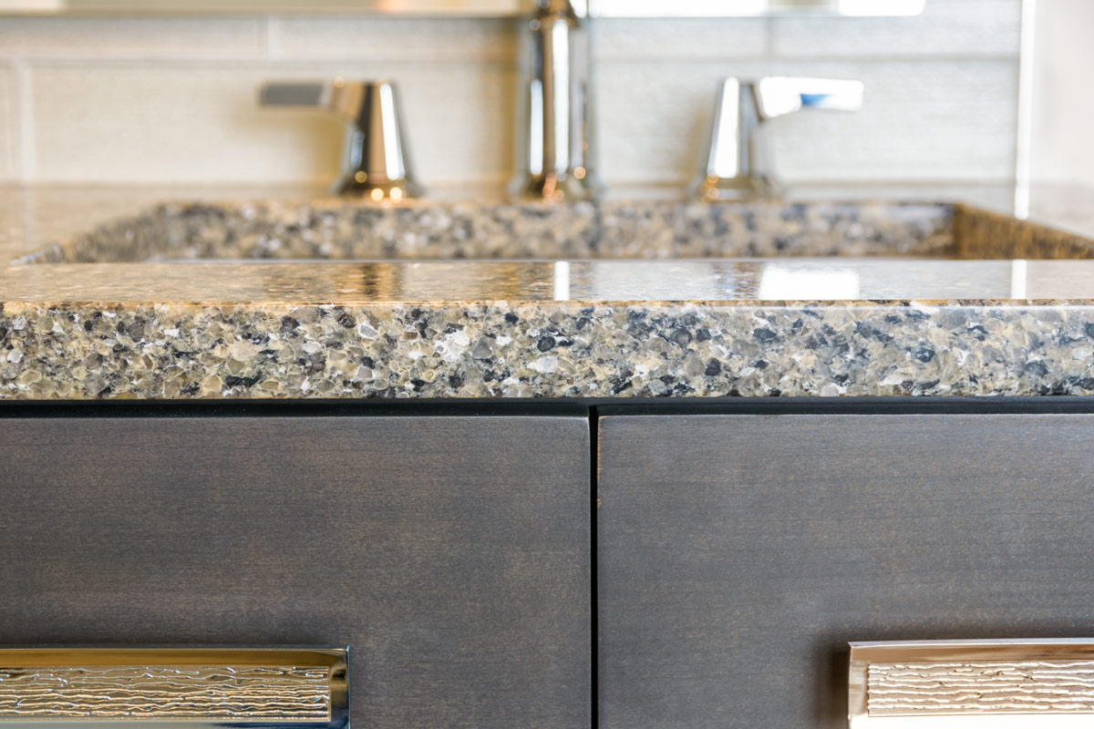
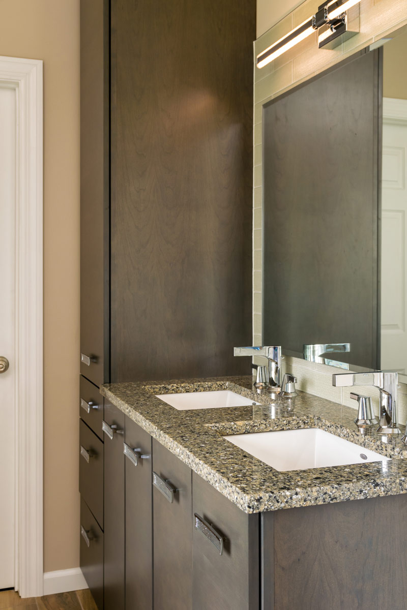
My client loved the idea of a large shower and a warm, natural setting. Inspired by her travels we brought in river rock and soft, neutral tones on the walls and floors. Tile designed to mimic a rustic hardwood floor; runs the length of the sizable bathroom and flows directly into the shower. Bright Chrome fixtures and LED lighting add shine to the space making the glass shower panels gleam in the light. The sculpted bathtub at the window is a perfect place to stop and relax.


