Bright, Elegant Bathroom
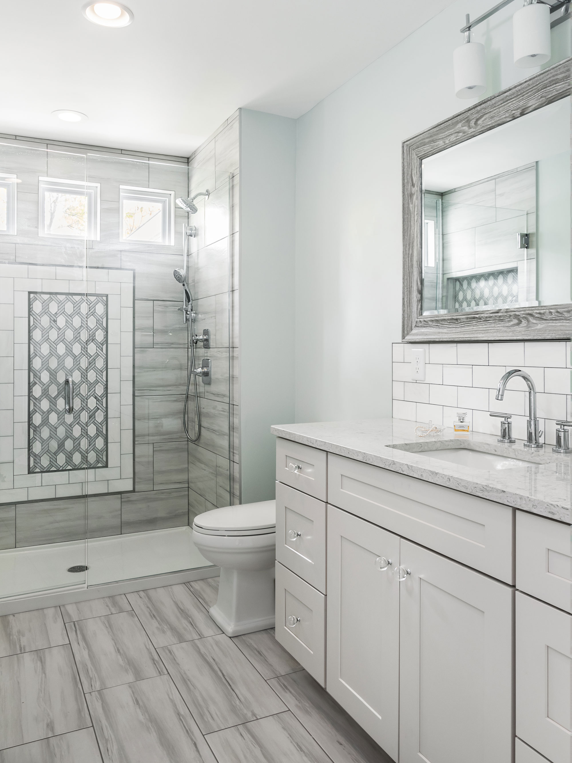
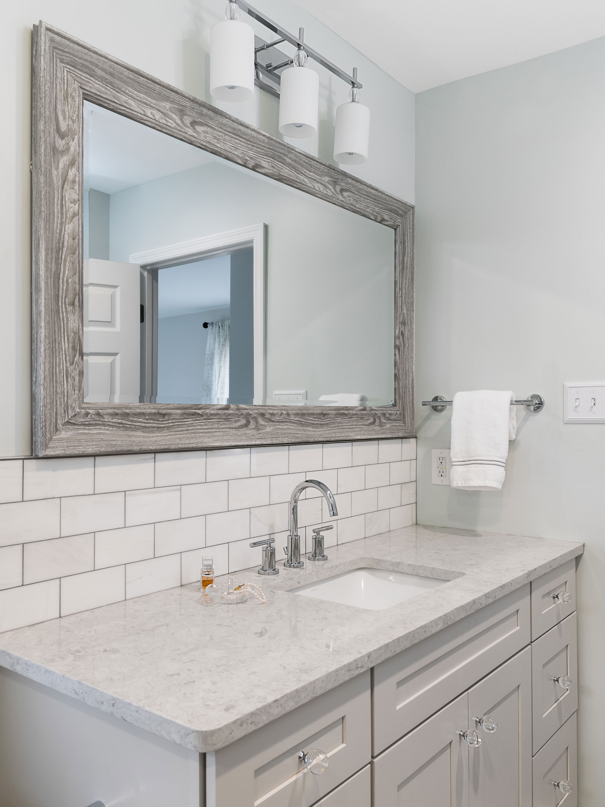
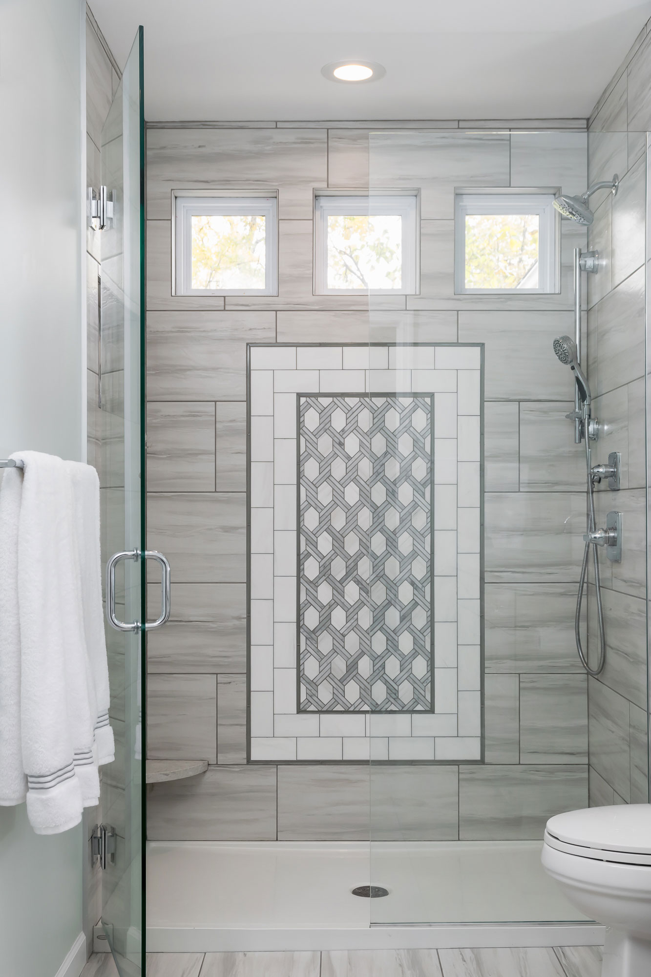
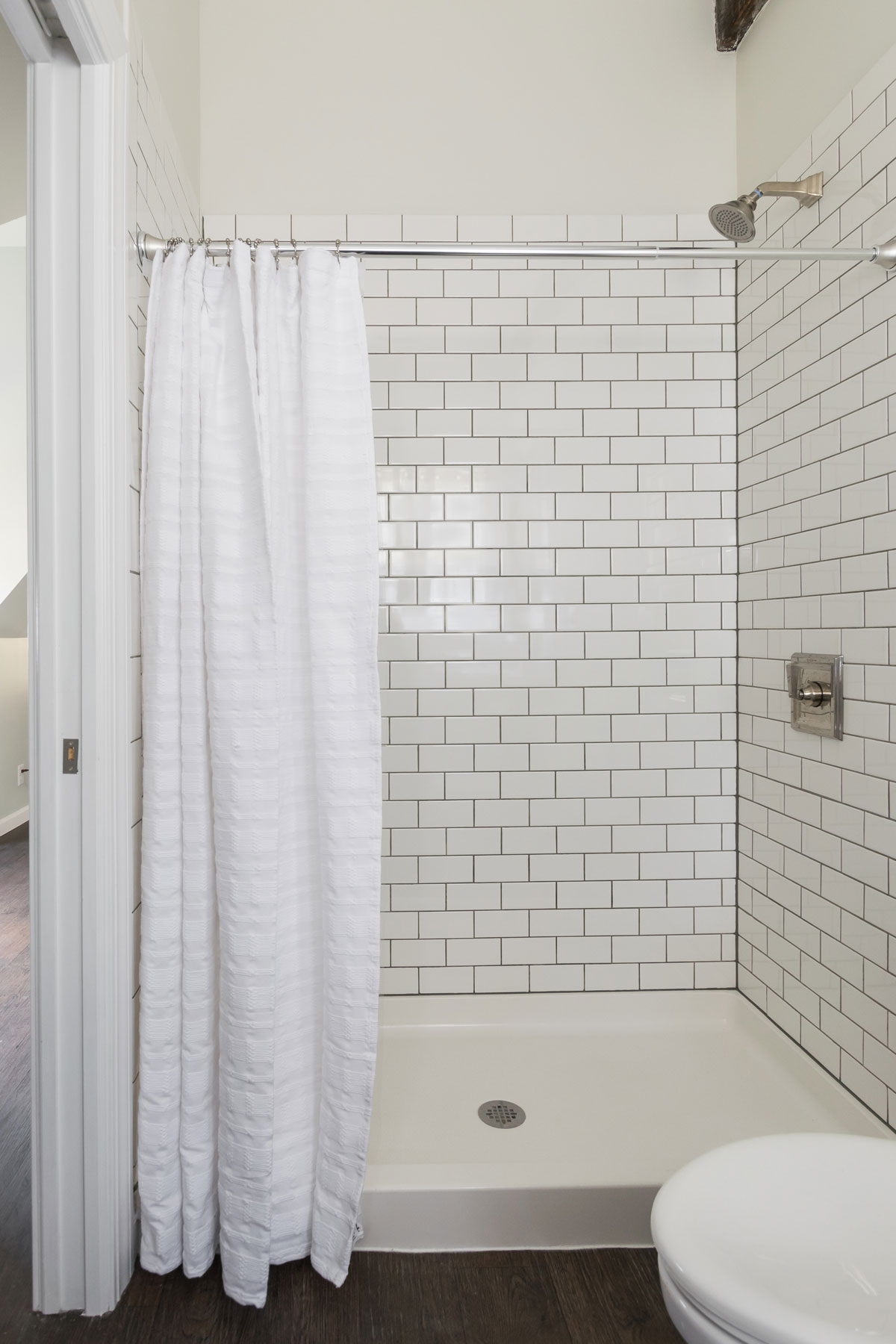
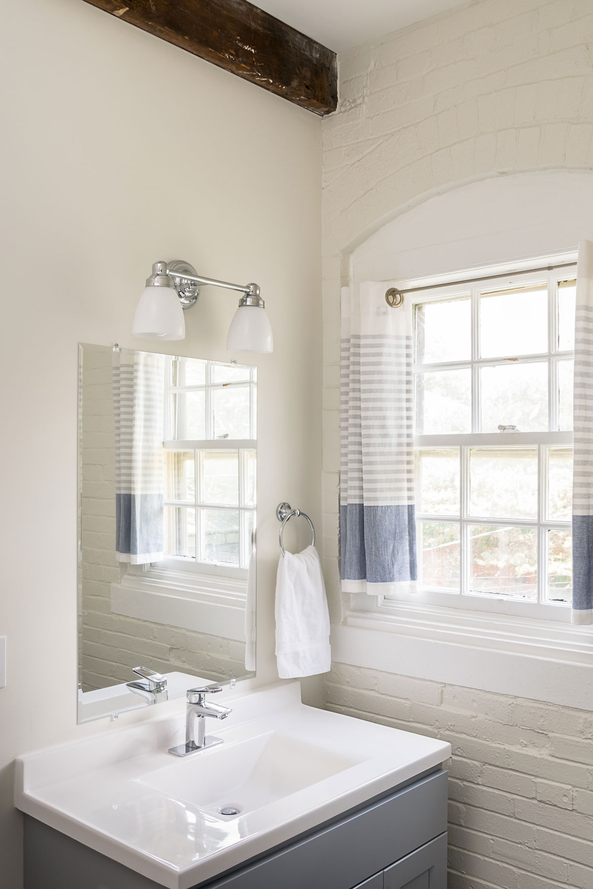
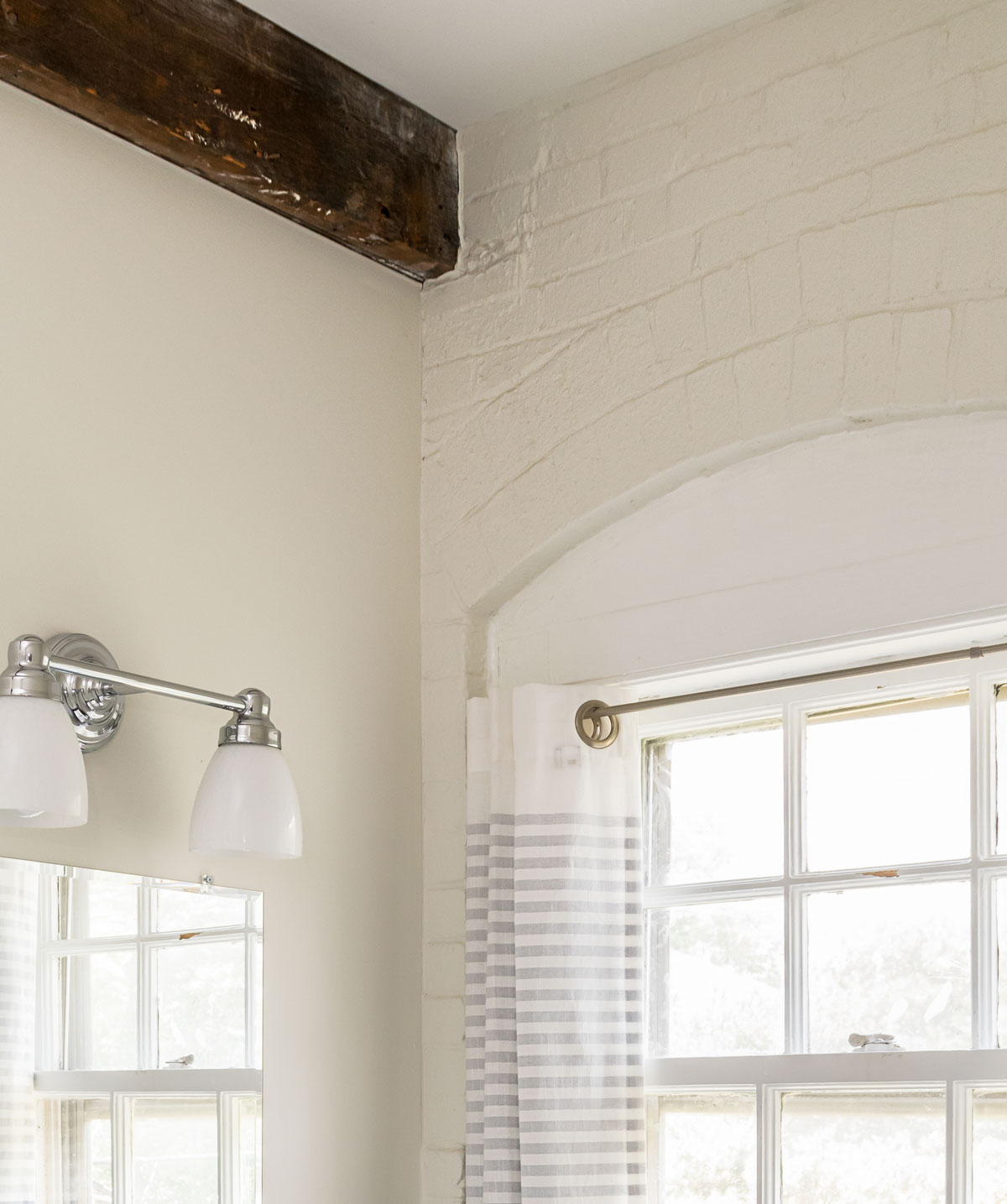
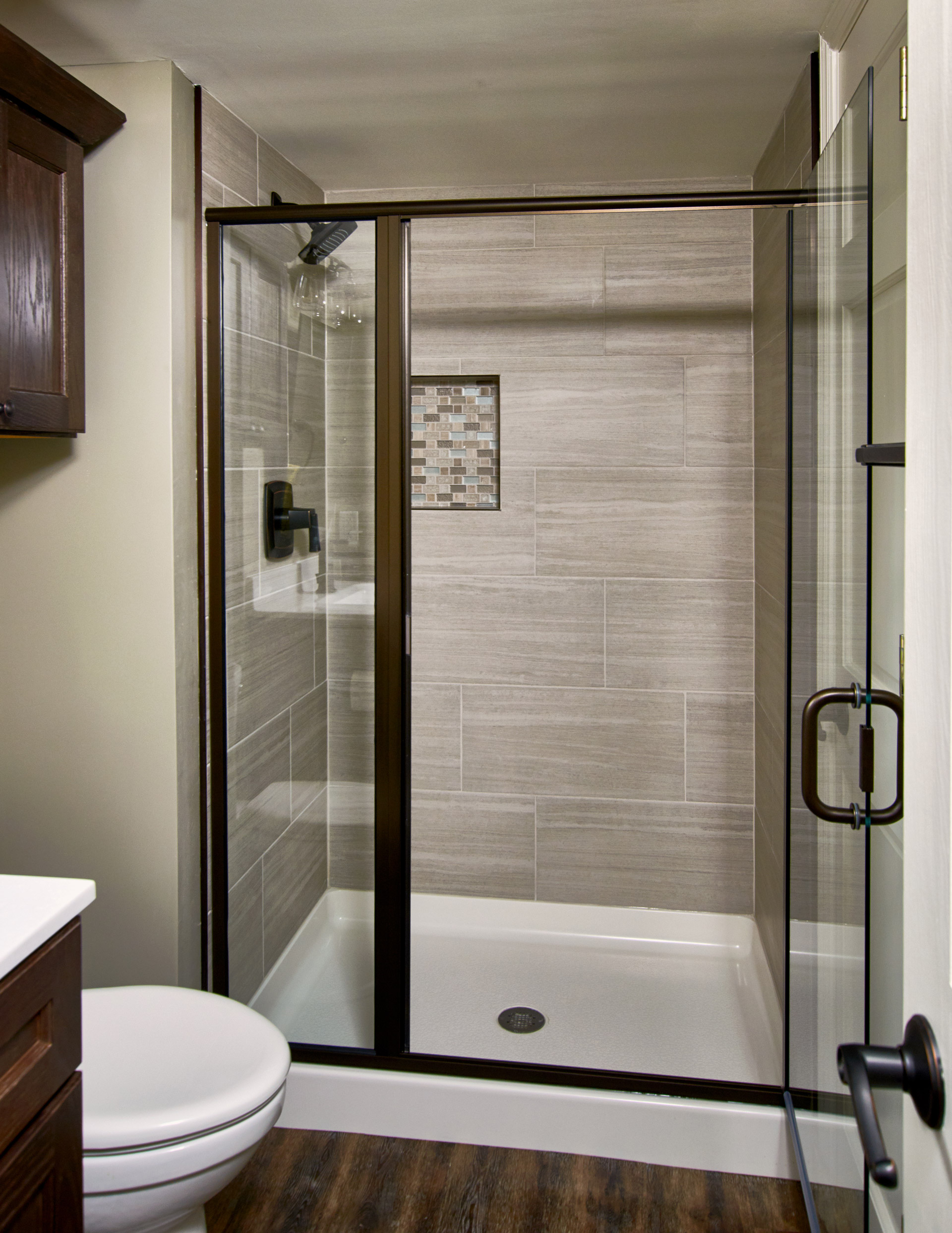
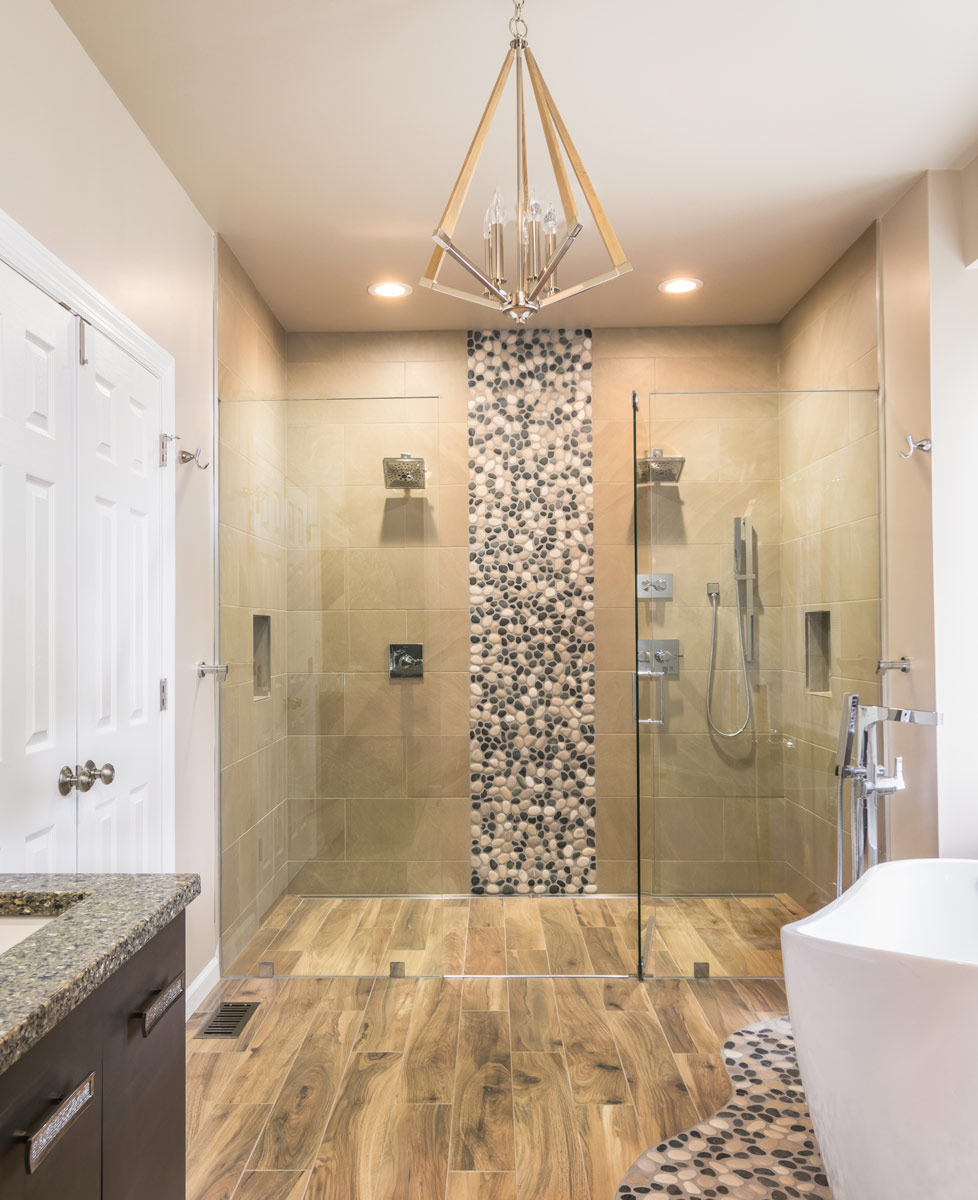
Custom tile and new windows brightened this dark bathroom. Our client's bathroom was the right size, but they were looking for an updated elegance.
Bright, Elegant Bathroom
Missouri, 2018
DESIGNER:
Rochelle McAvin
PHOTOGRAPHER:
Karen Palmer Photography
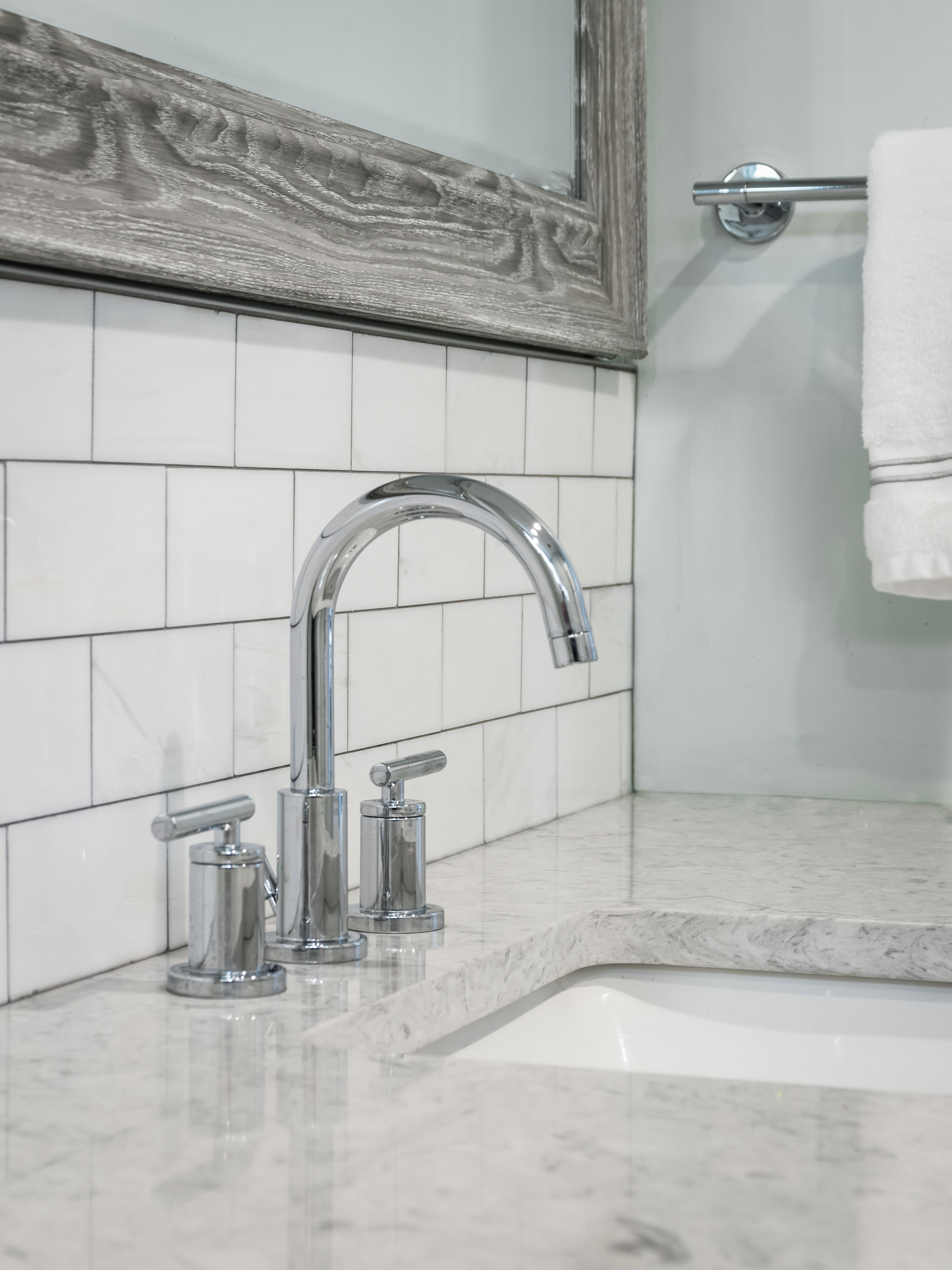
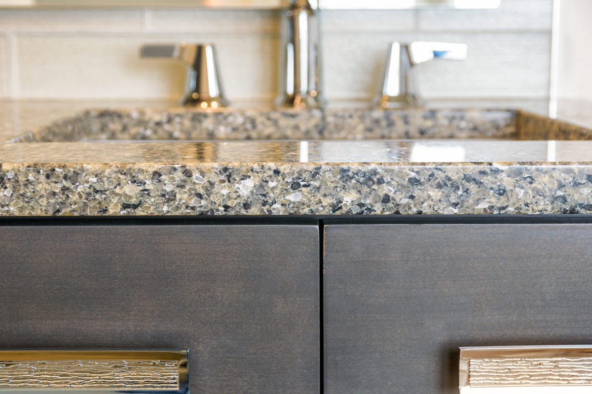
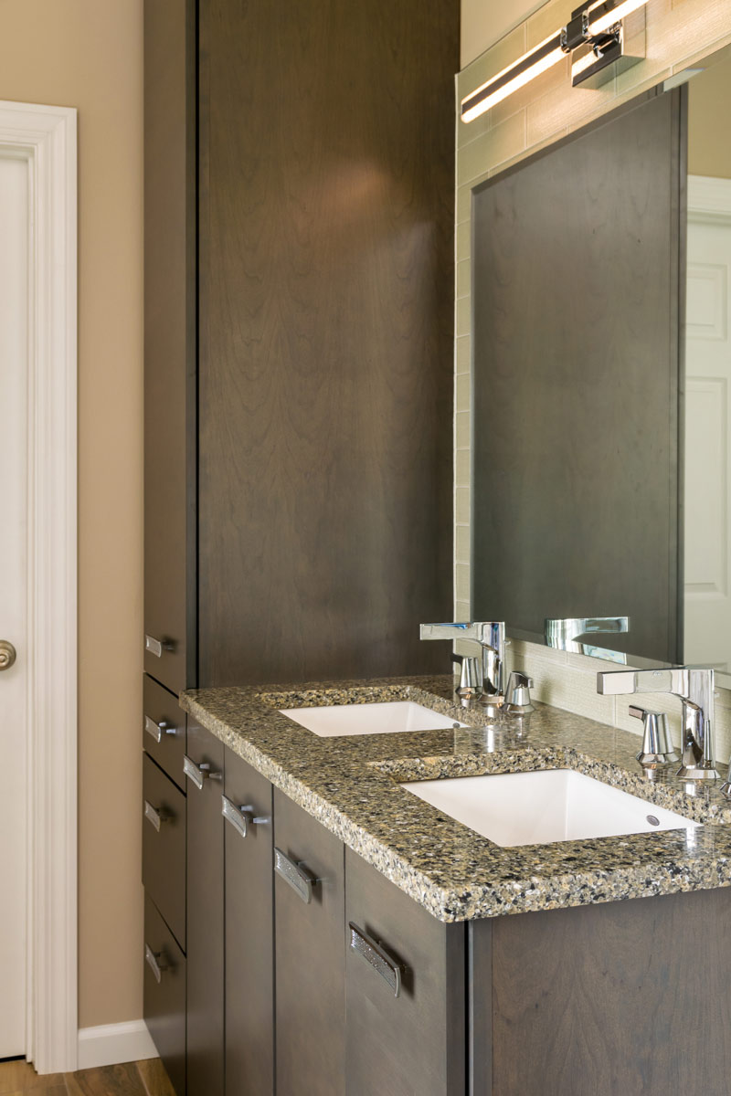
Custom tile and new windows brightened this dark bathroom. Our client's bathroom was the right size, but they were looking for an updated elegance. By incorporating marble tile, a painted vanity and the barn wood mirror - we were able to give classic materials an updated twist. Chrome fixtures and glass knobs add the right amount of shine to the neutral palette.
Modern Kitchen in Century Home
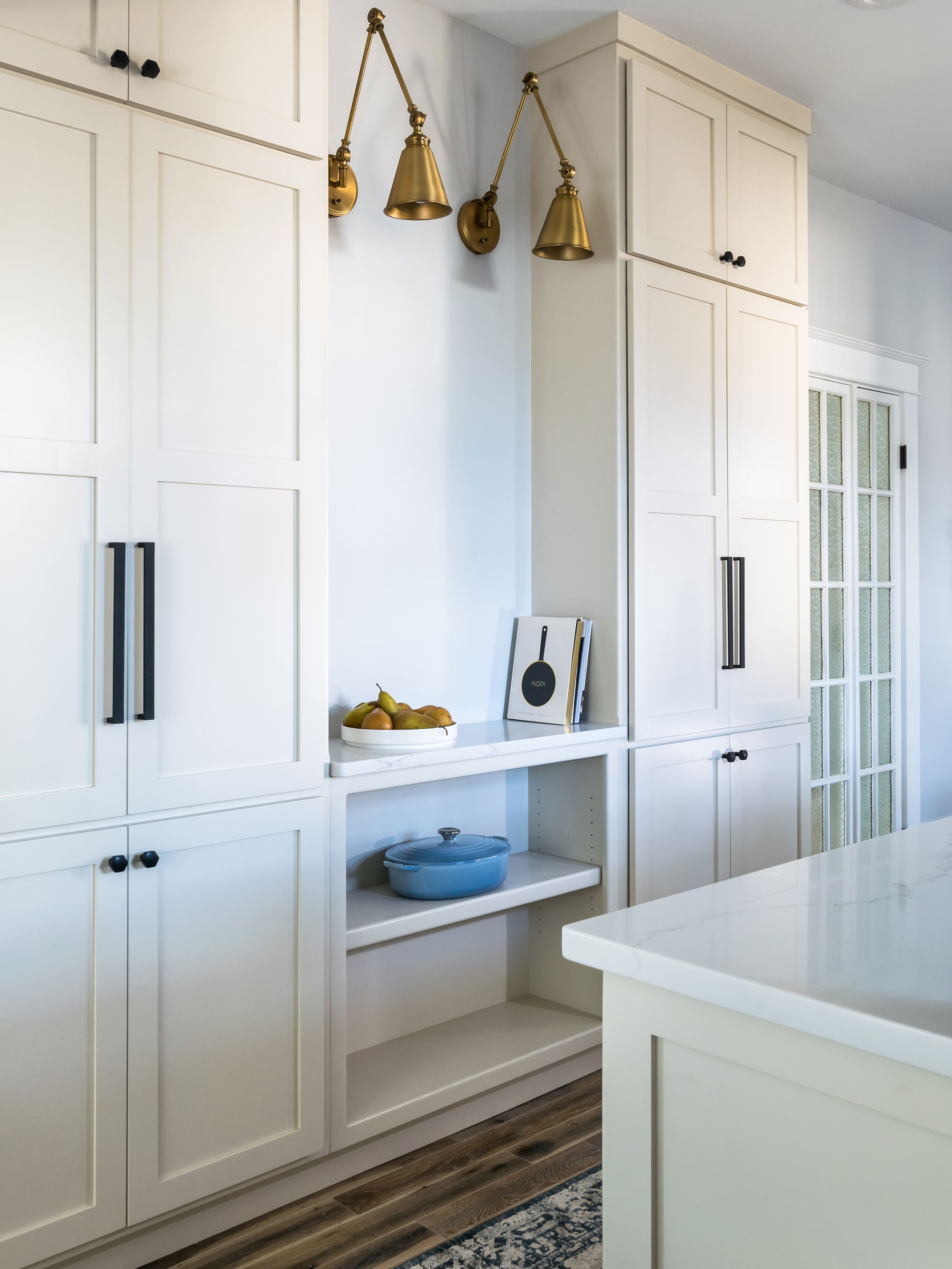
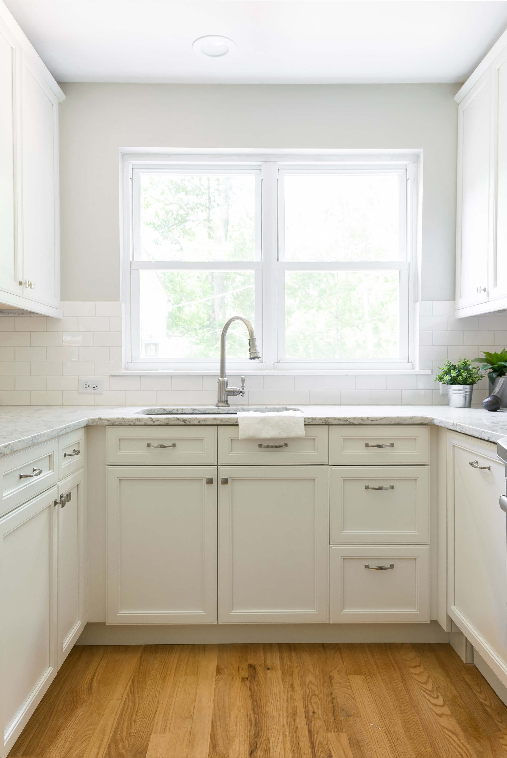
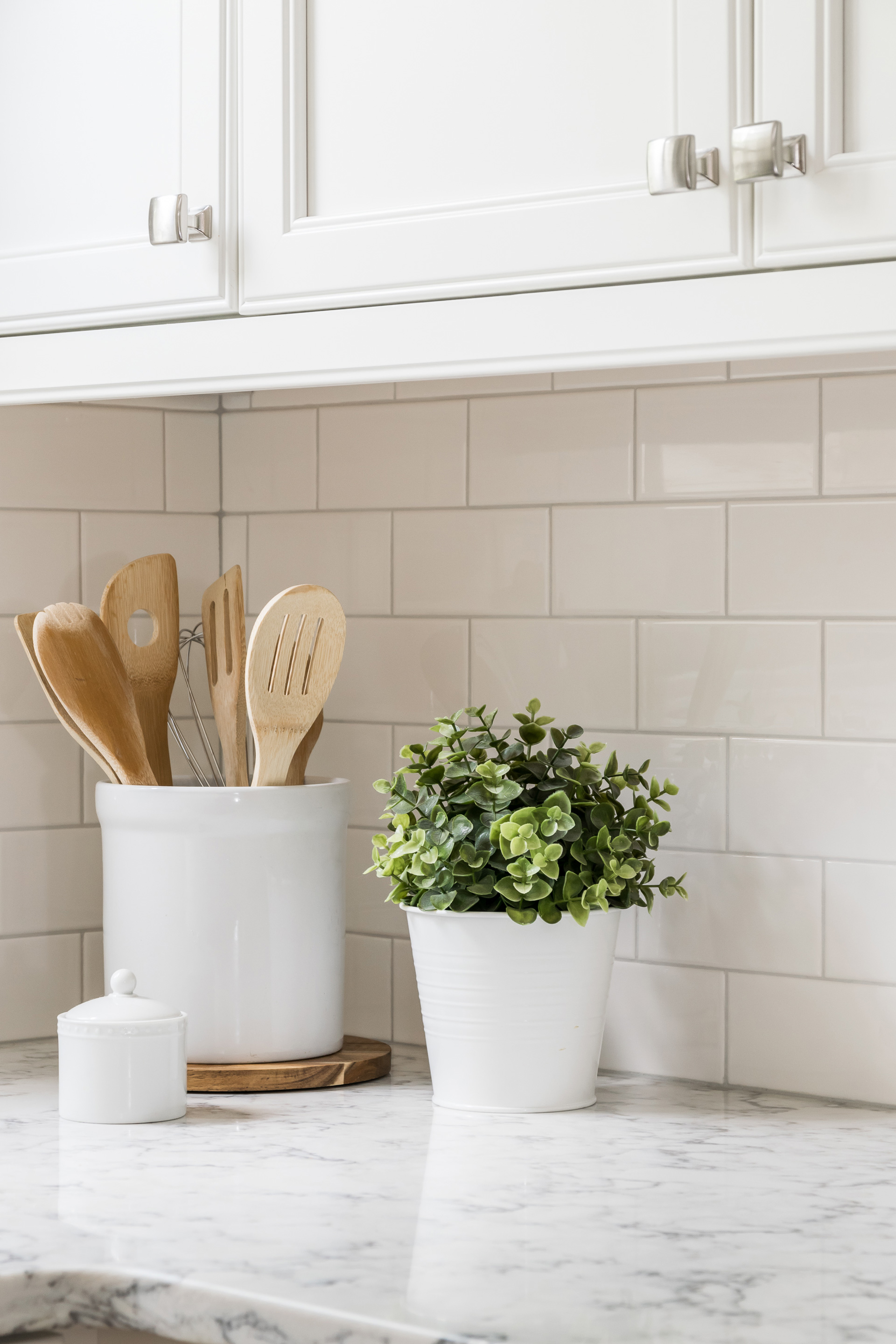
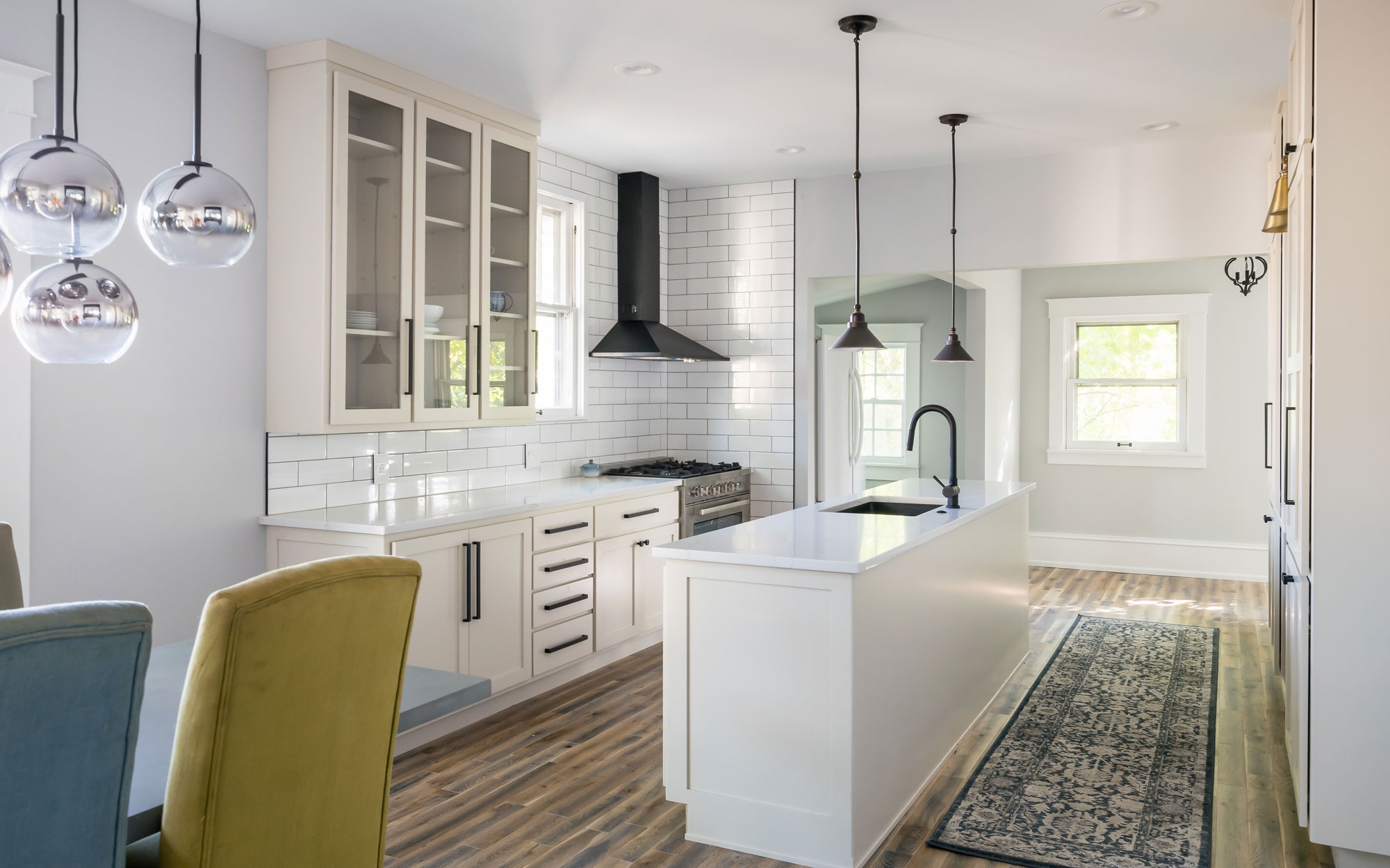
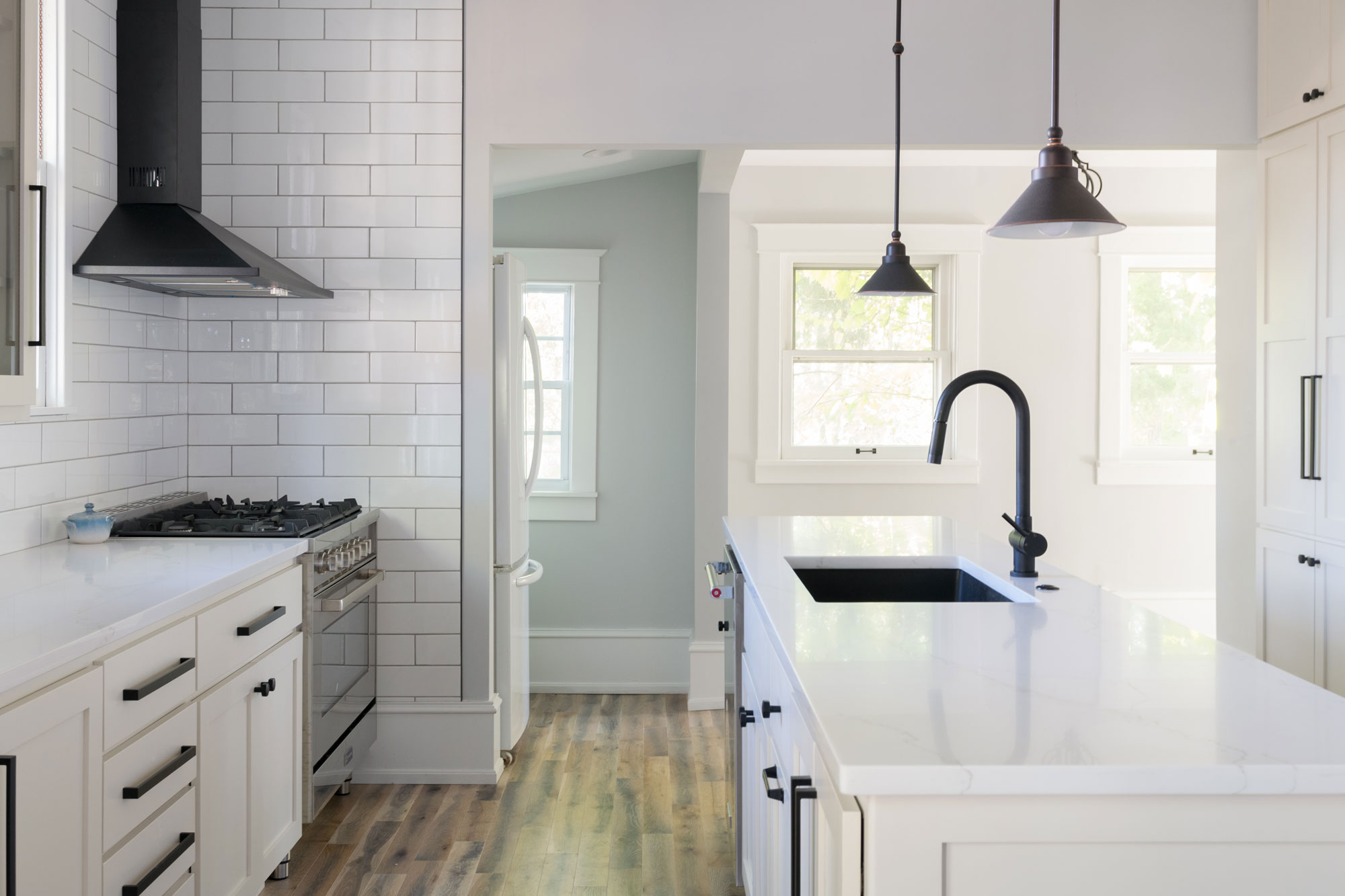
The cabinets are a muted, warm grey with a white, veined quartz designed to mimic Calcutta marble.
Modern Kitchen in Century Home
2018
DESIGNER:
Rochelle McAvin
PHOTOGRAPHER:
Karen Palmer Photography
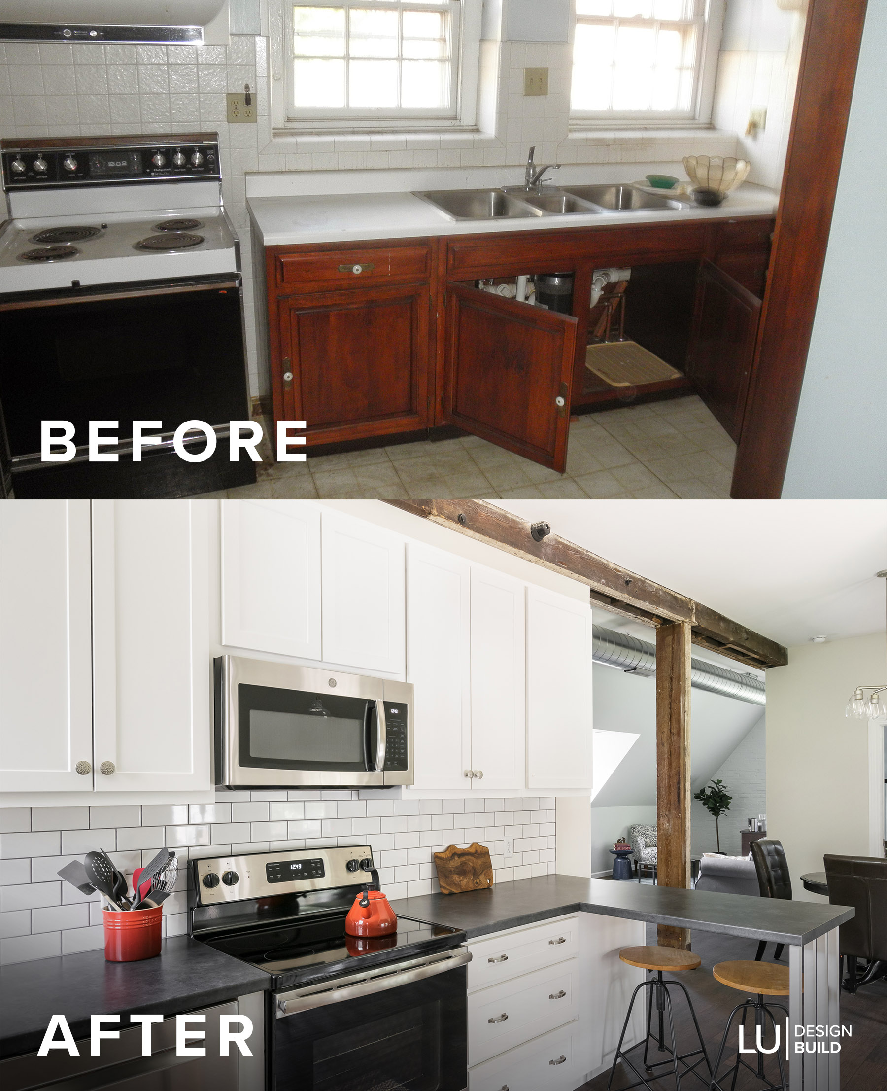
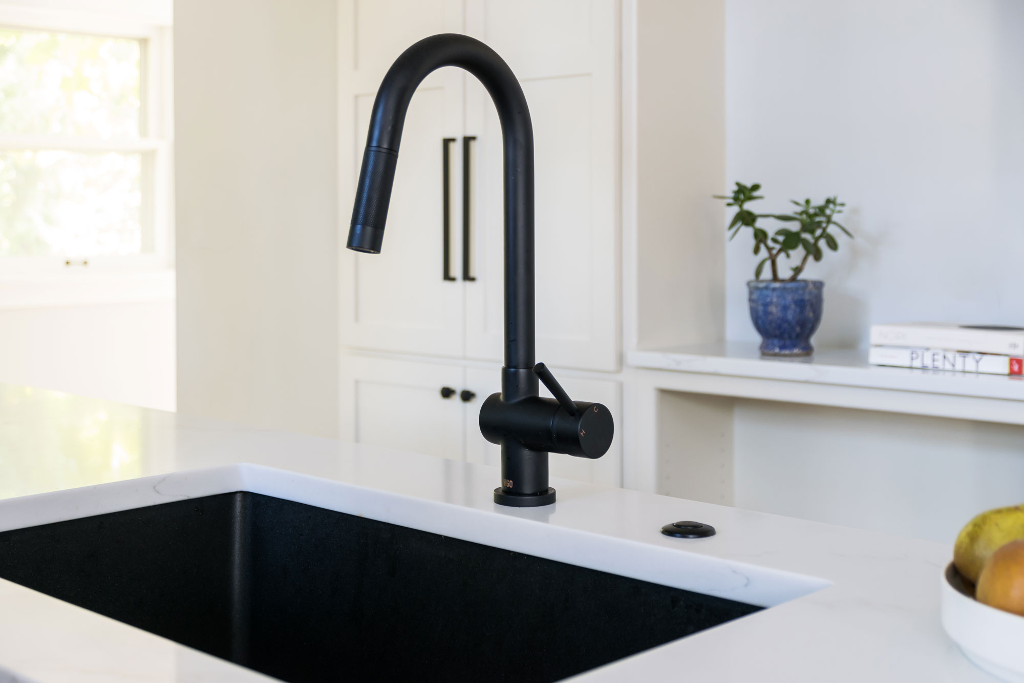
Our client already had great taste and knew what direction she wanted for her kitchen. We designed a clean, modern kitchen, but kept elements that were a nod to her 100 year old home. We kept the pallete soft and used black, modern elements to update the space. The cabinets are a muted, warm grey with a white, veined quartz designed to mimic Calcutta marble. Even though the kitchen has a small footprint; We have a 10 foot island and over 5 feet of countertop next to the six burner range. The natural light filters into the kitchen creating a tranquil vibe that is perfect for this family of five.
Classic Modern Kitchen
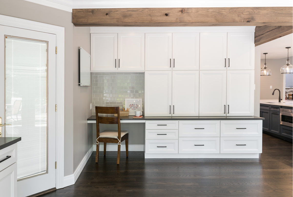
This charming 77 year old home in Glendale has so much character and many beautiful features. However, it was lacking a kitchen that functioned well and appealed to the homeowners' tastes. We started by re-configuring some of the back hallway to allow us to open up the kitchen into the sunroom and create more functional space and better flow.
Classic Modern Kitchen




Glendale, MO, 2018
DESIGNER:
Jennifer Chapman
PHOTOGRAPHER:
Karen Palmer Photography
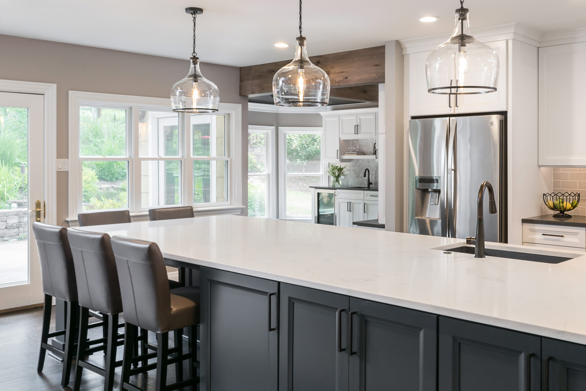
This charming 77 year old home in Glendale has so much character and many beautiful features. However, it was lacking a kitchen that functioned well and appealed to the homeowners' tastes. There were two islands in the center of the room that made it awkward for entertaining and moving around in their daily lives. The room was cut off from the back sunroom and as a result, the homeowners never used it or even knew what to do with it.
We started by re-configuring some of the back hallway to allow us to open up the kitchen into the sunroom and create more functional space and better flow. The homeowners knew they wanted a large island that acted as a workhorse with sink, microwave drawer, and dishwasher and also had enough seating for their family of four. They wanted the kitchen to work well for entertaining, as well, and feel more connected to their adjoining family room. We decided that the back sunroom would now function as game room and bar and we added office space there as well. Our clients really wanted a style that withstood the test of time, but wanted it to be different than every other white, shaker style kitchen. We used dark blue cabinets at the island to really ground it and provide contrast to the other white cabinetry in the space. (Fun fact! The island is 186" long! It is definitely a showpiece!) We chose a shaker style cabinet with a bevel that added a modern twist to the traditional shaker style shape. They love subway tile, but instead of white, we went with a soft gray and we chose oil rubbed bronze hardware and accents to provide even more contrast. We wanted to make the bar a little more sophisticated so we went with a 2" marble hexagon backsplash. The ceiling in the new game room needed some love- it has a unique shape, but it was painted white, which made it feel dated. By painting it dark gray, it makes the room feel warmer and more cozy. We had to keep structural headers when we opened up the kitchen into the sunroom so we wrapped them with reclaimed wood to add some warmth and character to the space. It's the perfect amount of rustic!
The homeowners' love their new space and we had so much fun with this transformation!
Renovated Carriage House
This home and the accompanying classic carriage house are true snapshots into Saint Louis history. We consider it a privilege to work with the homeowners and preserve this piece of the past!
Renovated Carriage House
Missouri, 2018
DESIGNER:
Rochelle McAvin
PHOTOGRAPHER:
Karen Palmer Photography
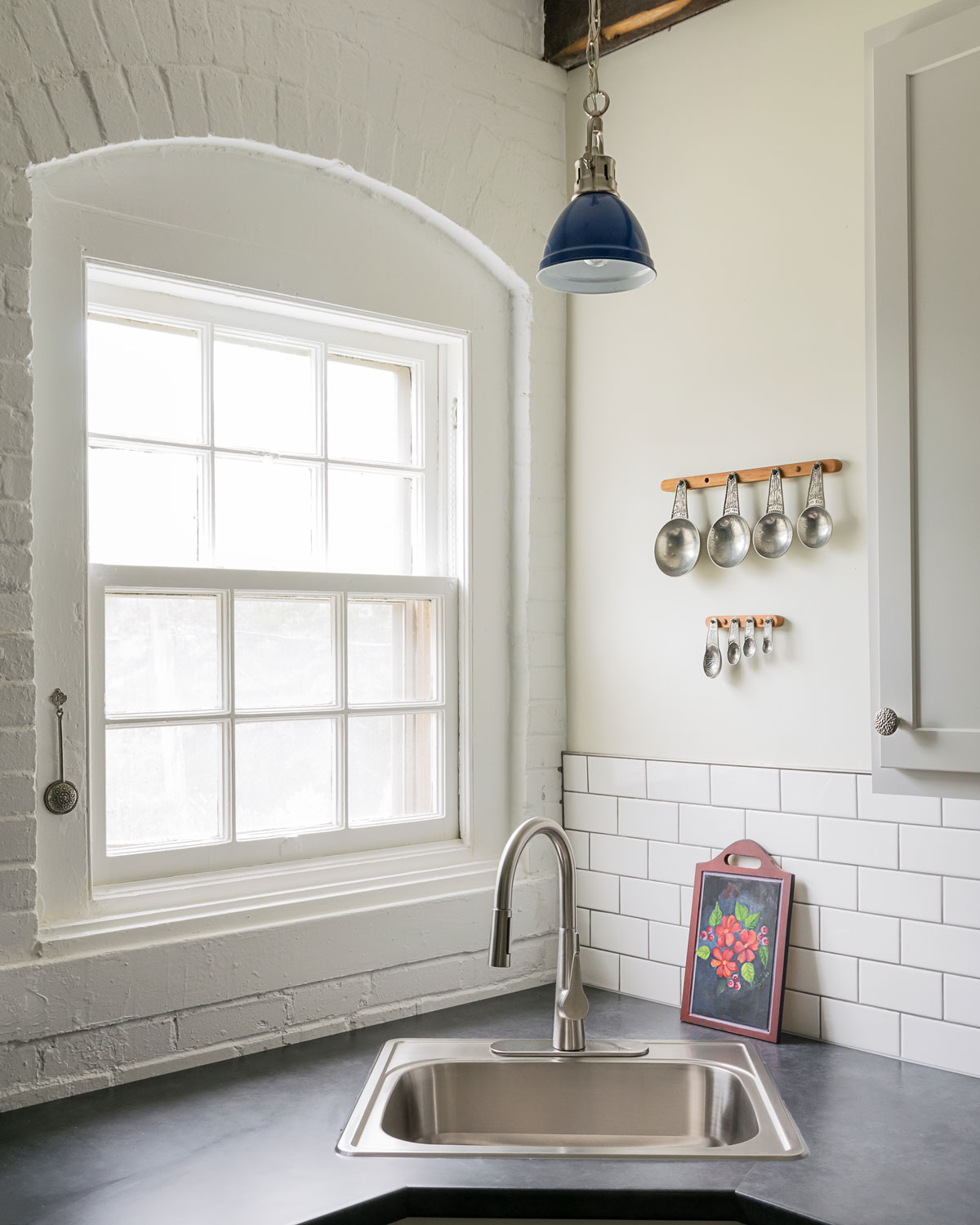
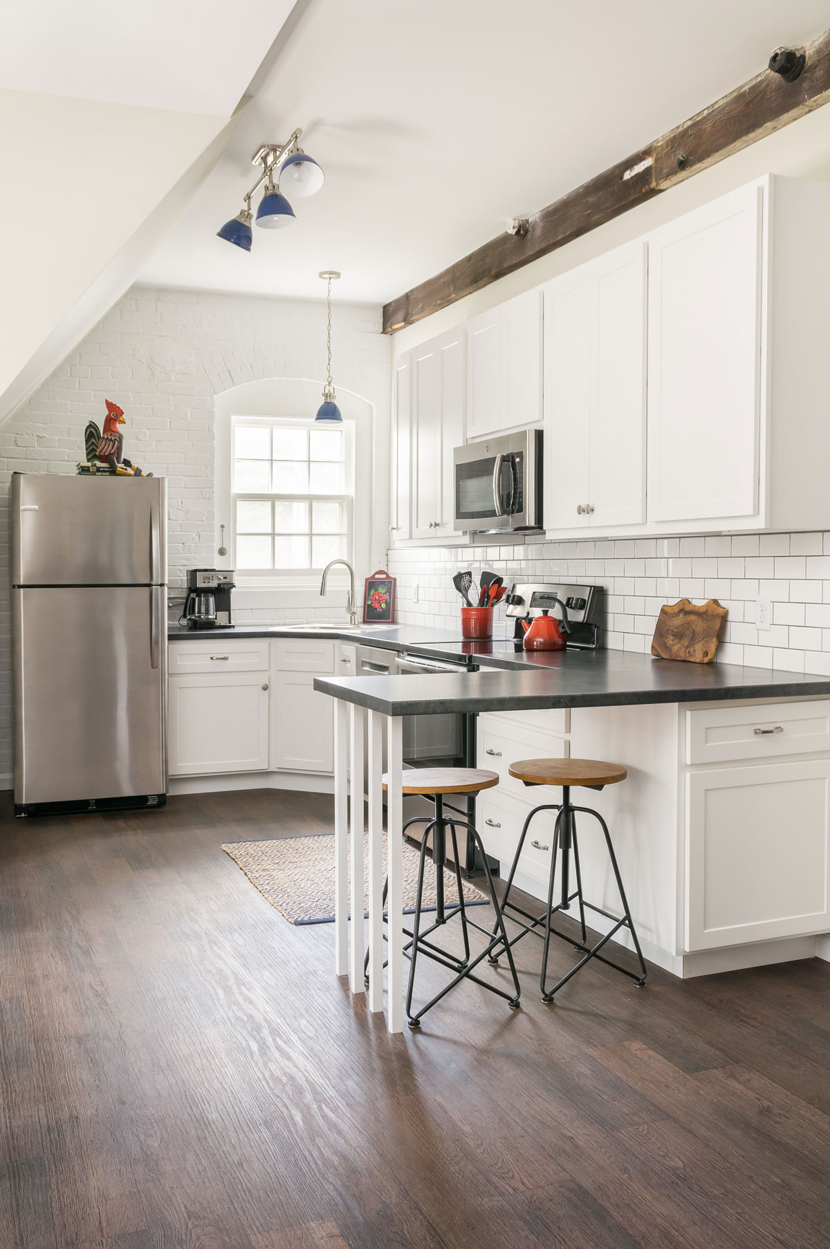
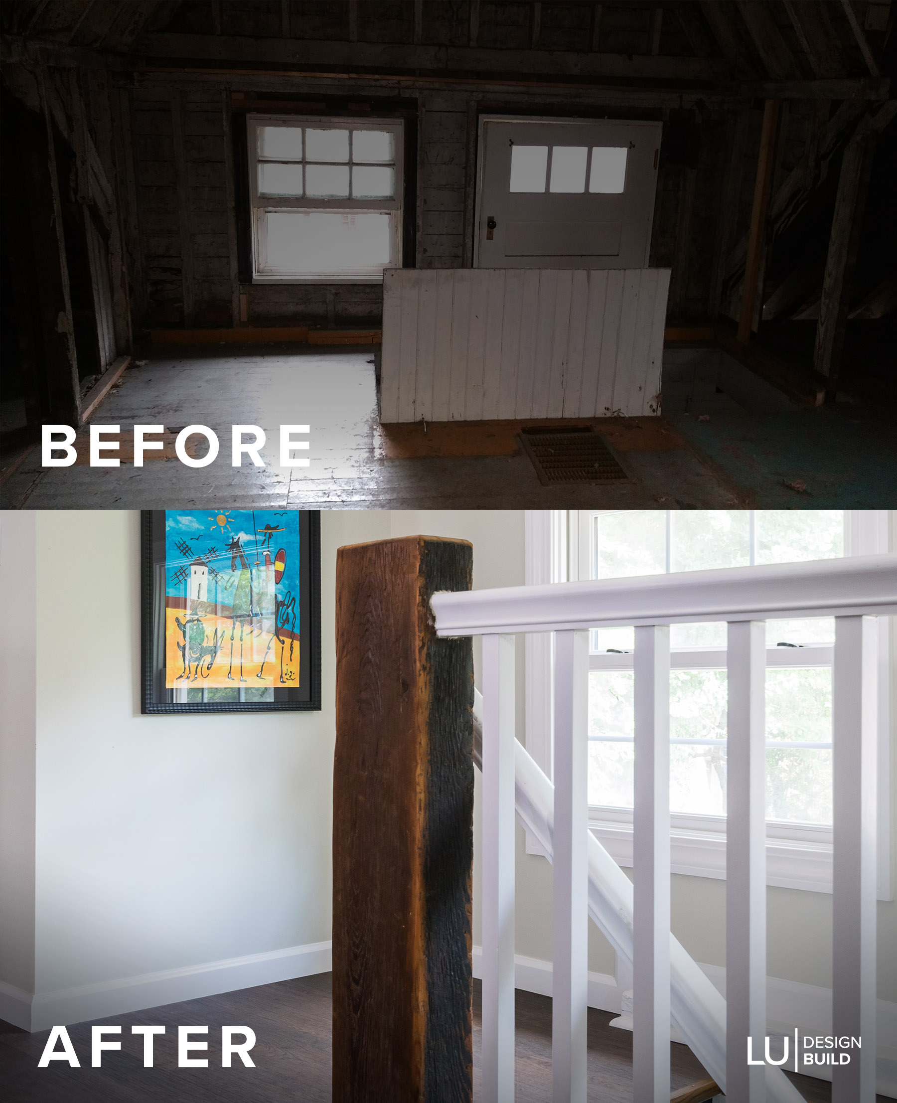
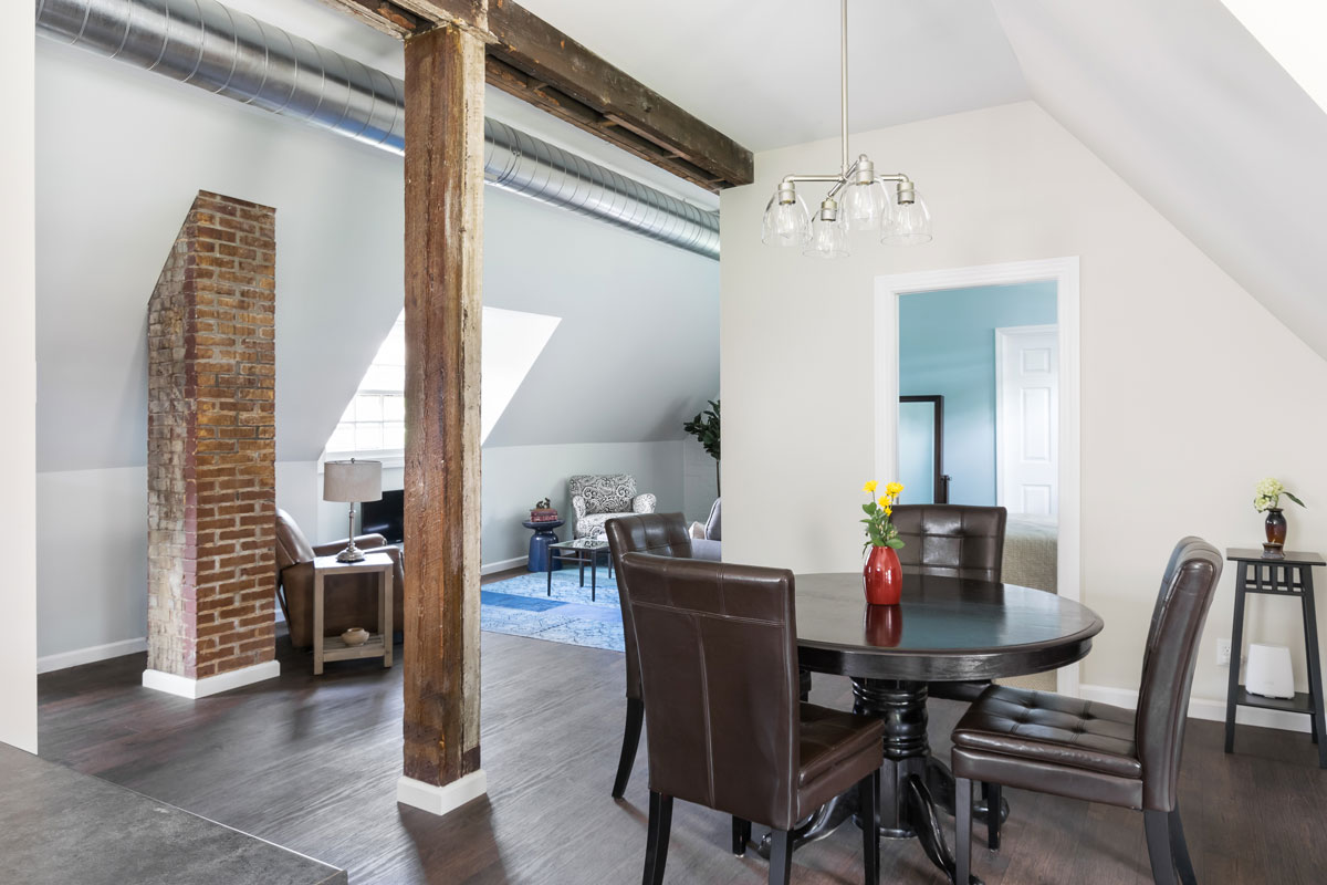
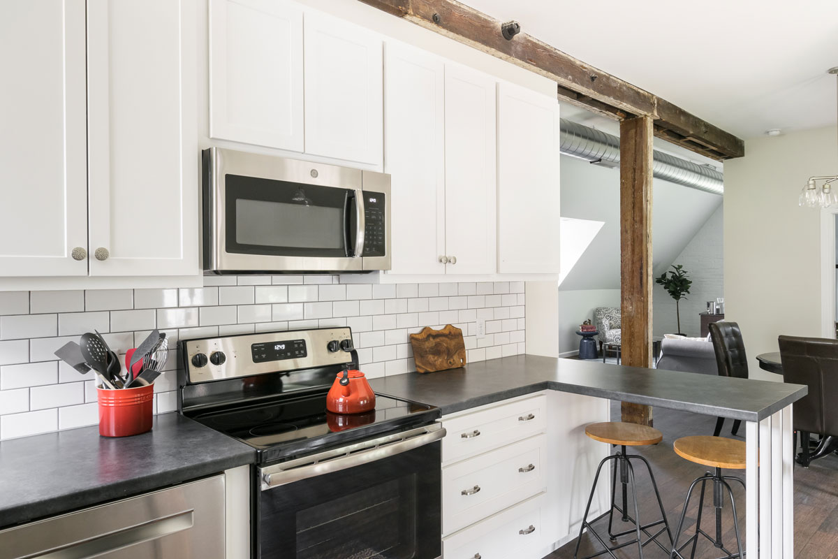
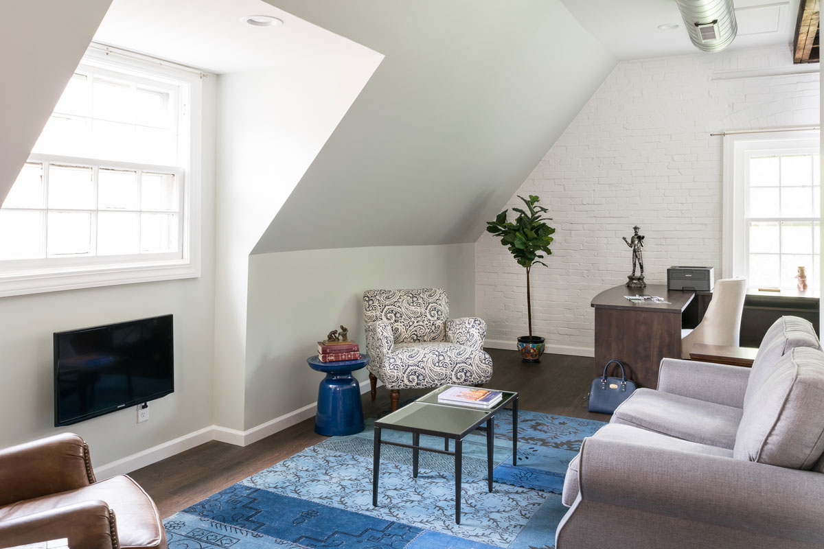
Our client recently retired and moved to Saint Louis to be closer to her family. We transformed a forgotten about second floor into a cozy, carriage house retreat. Prior to remodeling, the space captured no natural light. We gutted the existing floor plan and started from scratch to let the natural light in and preserve the original, 125 years old, windows. The brick was covered in layers of dilapidated paneling; we exposed the original building materials and they added an enchanting texture and authentic character to the space.
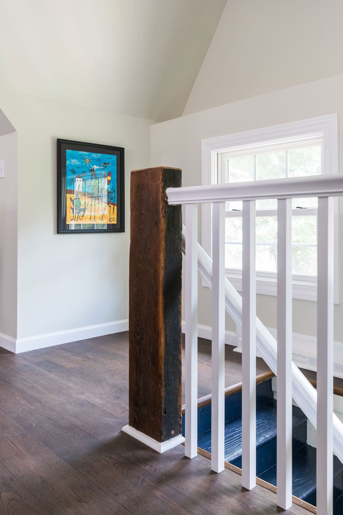
The newel post on the staircase was a find! It was attached to the pulley that would bring the hay up to the loft in the 1800's. We kept all the existing beams to highlight the era and exposed the new duct work to bring in the vintage vibe.
We were able to add every modern amenity including a second floor laundry and a master bedroom complete with a walk in closet!
This home and the accompanying classic carriage house are true snapshots into Saint Louis history. We consider it a privilege to work with the homeowners and preserve this piece of the past!
Ballas Bathroom
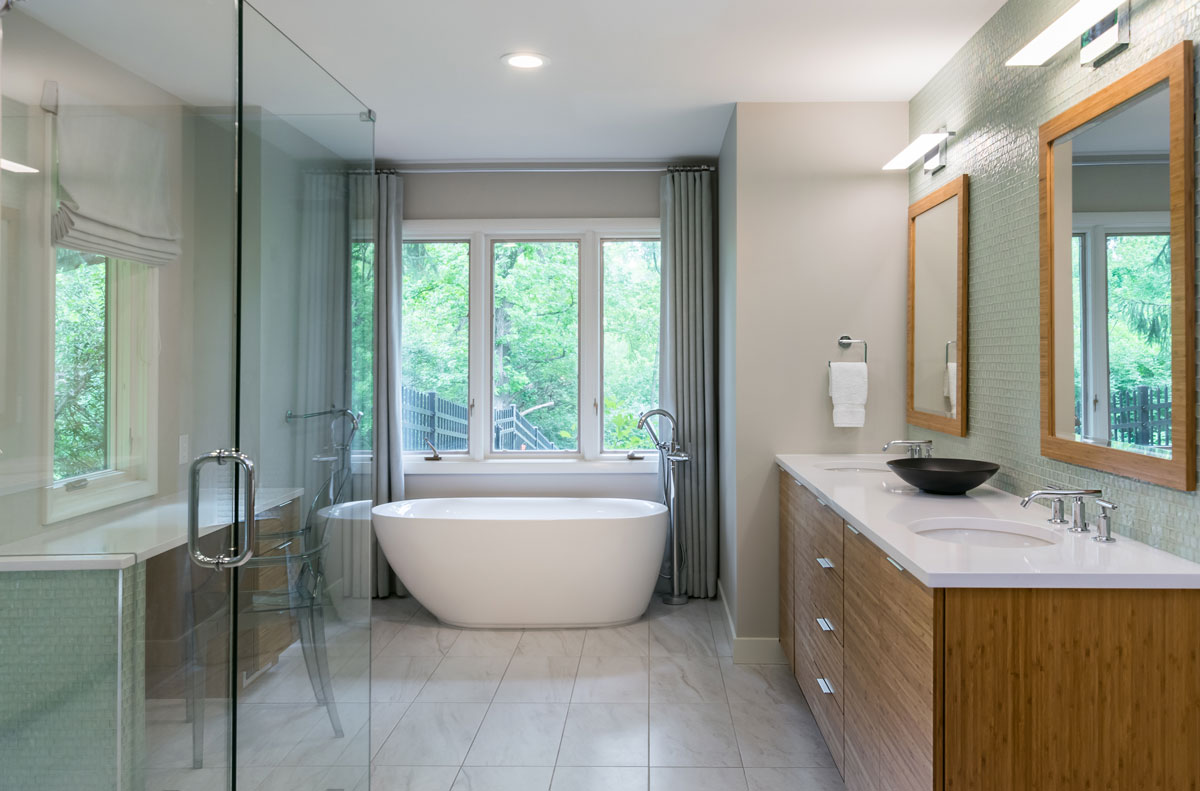
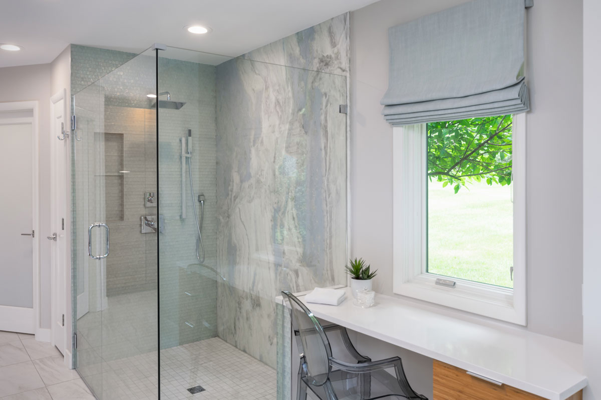
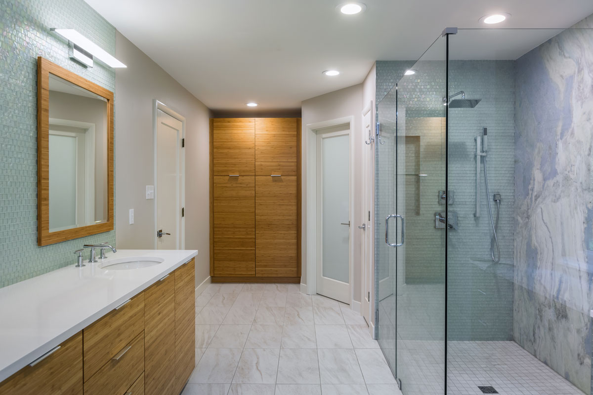
Inspired by the view, we brought the outside in by using reflective, natural materials and a full slab of quartzite is the focal point of the shower.
Ballas Bathroom
Missouri, 2018
DESIGNER:
Rochelle McAvin
PHOTOGRAPHER:
Karen Palmer Photography
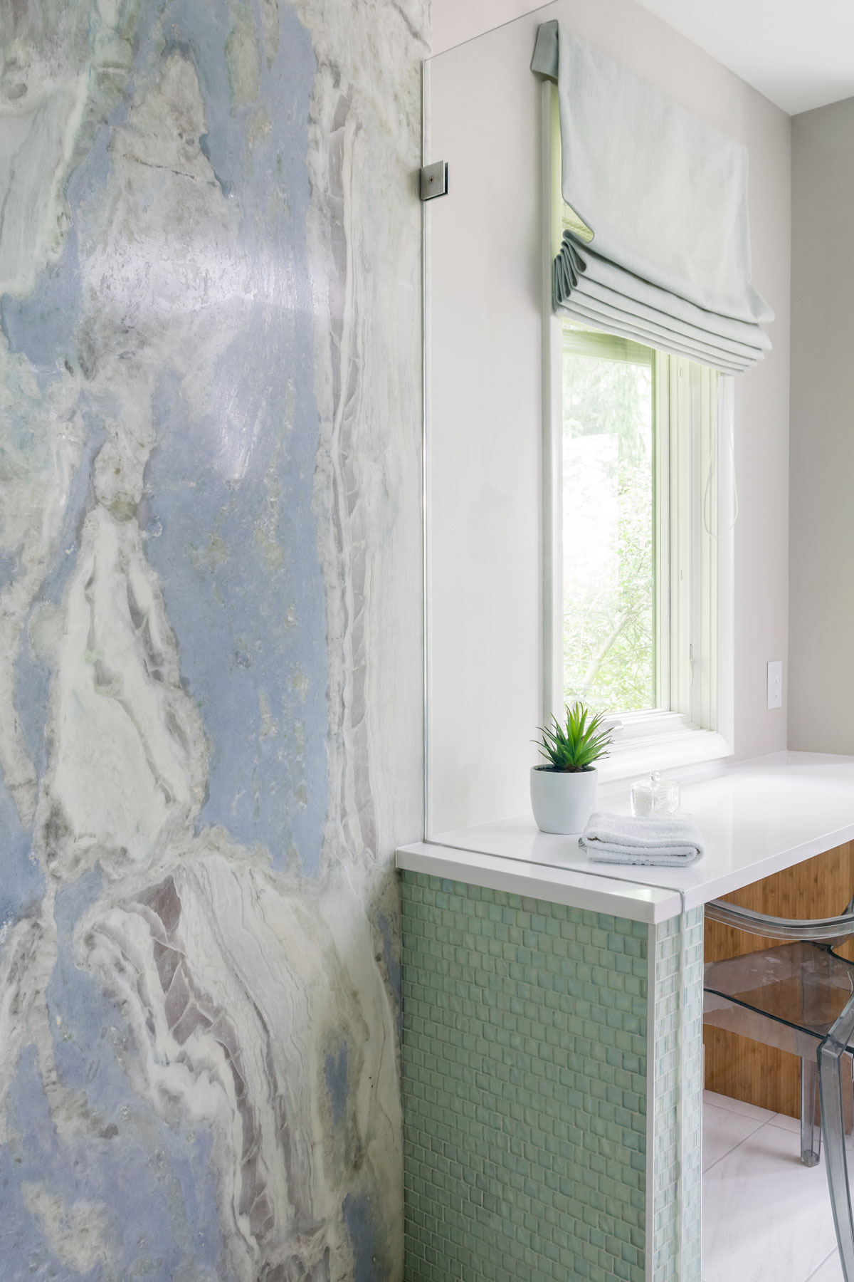
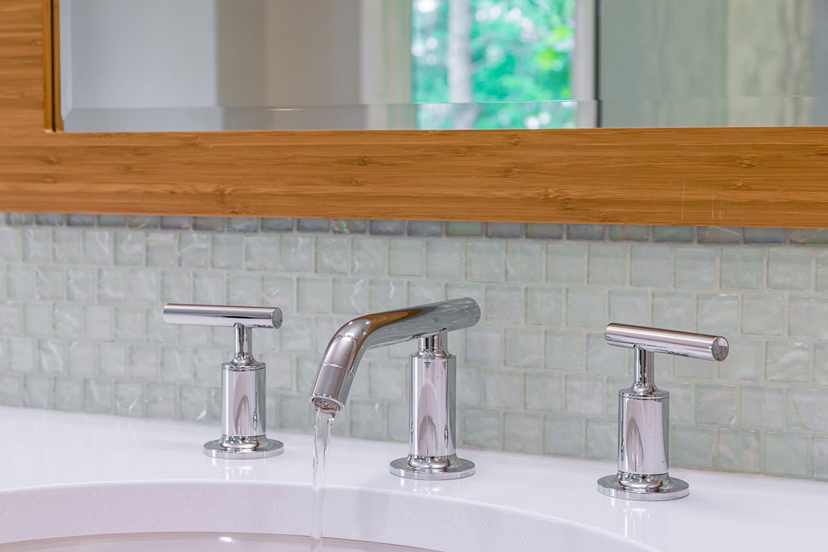
Our client had a bathroom that was in need of an update. We wanted to bring a modern, organic, aesthetic to the homeowners space. Inspired by the view, we brought the outside in by using reflective, natural materials and a full slab of marble is the focal point of the shower. The glass tile provides a soft glow that highlights the natural stone wall. Bamboo cabinets add a warmth to the room while maximizing storage. The overall feeling is warm, calm and serene.
Custom Contemporary Craftsman-Kitchen
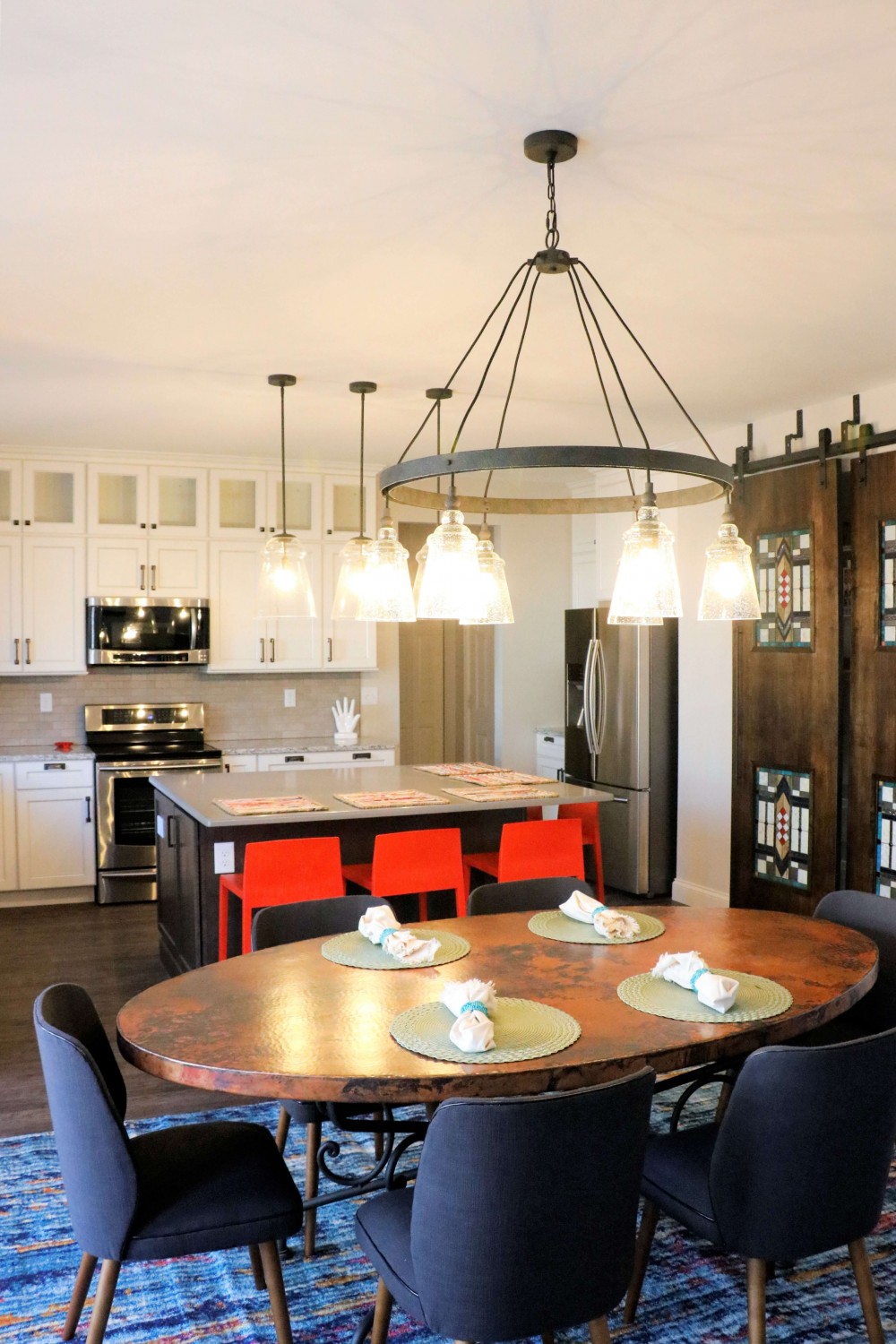
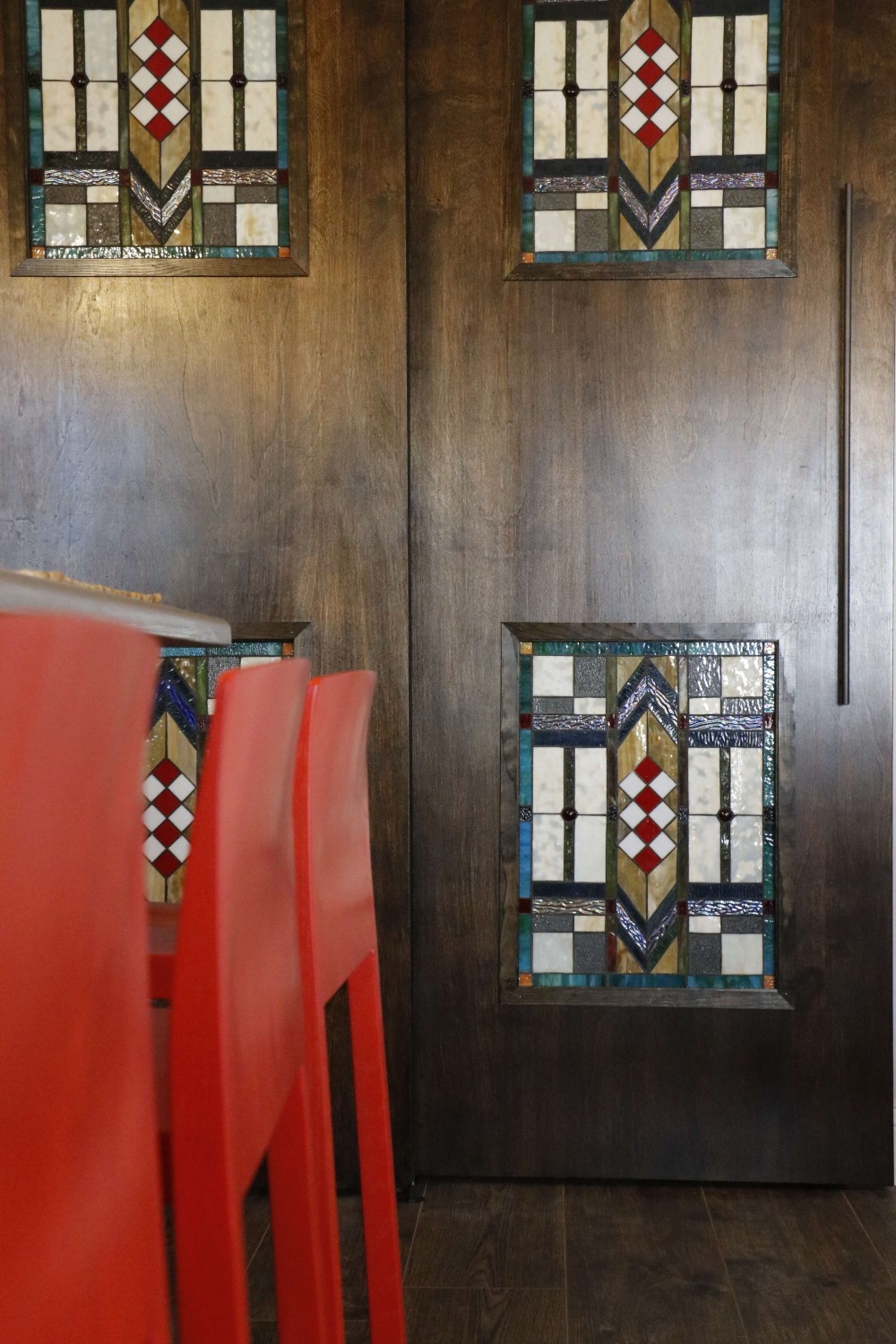
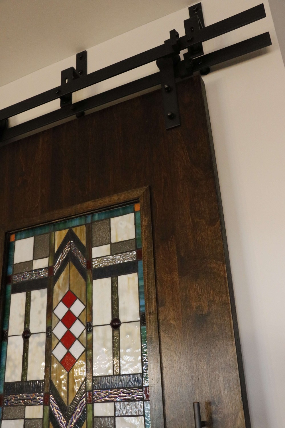
We recently did a project with Sara Luigs and Melanie Christoff with CURE Design Group, featuring a craftsman style, with barn doors and stained glass accents.
Custom Contemporary Craftsman-Kitchen

DESIGNER:
Melanie Christoff
PHOTOGRAPHER:
CURE Design Group
We recently did a project with Sara Luigs and Melanie Christoff with CURE Design Group.
The Article Below is by Melanie Christoff at Cure Design Group
This client started off just being curious about our services – what we could do, and if we could even help her update her kitchen. She and her husband with their two teenage kids have lived in their home for several years without updating anything since the house was originally built. They didn’t quite have a budget in mind yet. They didn’t know their style, or even if they had one. Their timeline was simple, “as fast as you can so we’re not without a kitchen for very long” (usually what we hear for kitchen updates).
After a very productive consultation: determining the scope of work and zeroing in on a budget, I was very excited to update this underwhelming space to something that is modern but timeless, something that is theirs. And, it was easy to see what type of design style they gravitated toward looking at the pieces they already own: Craftsman/Prairie Style. I left the meeting so excited to weave in yet another genre of design to my CDG portfolio! We circled in our contractor design-build expert LU Design Build to discuss the changes they were looking to make and the scope of work that would be theirs. Then I was off to get designing:
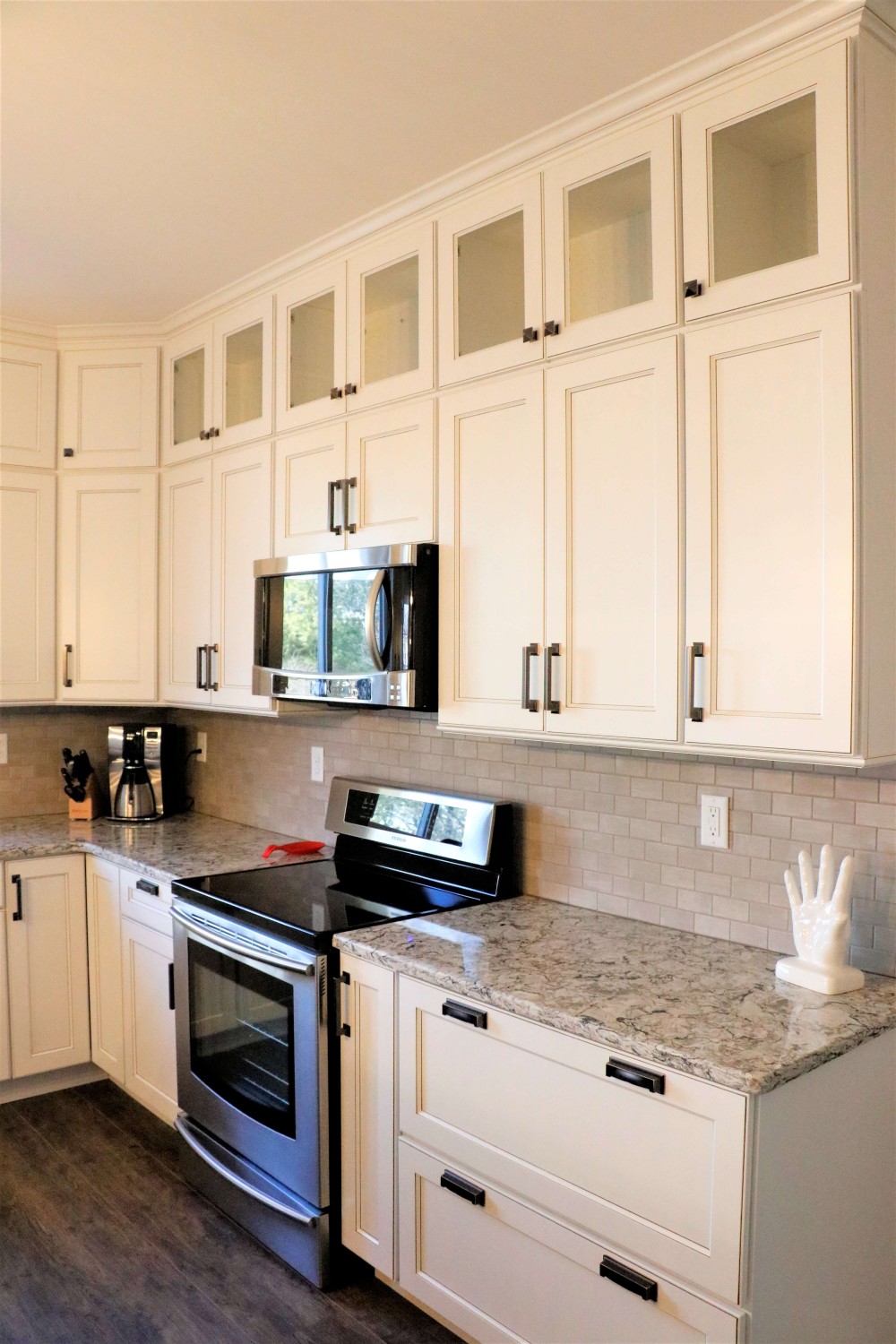
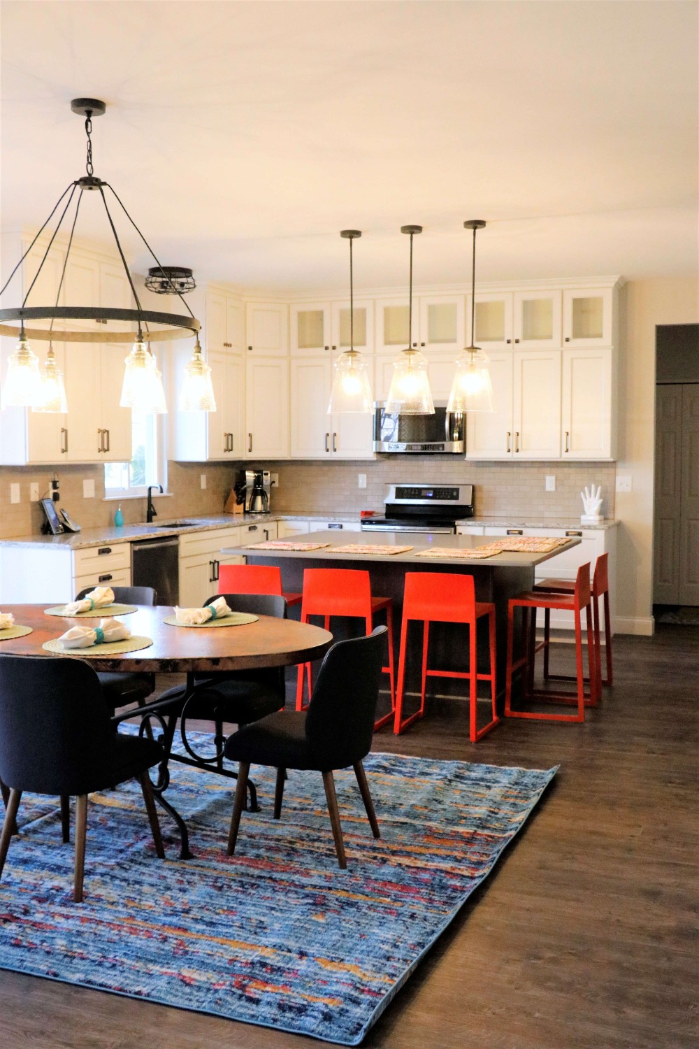
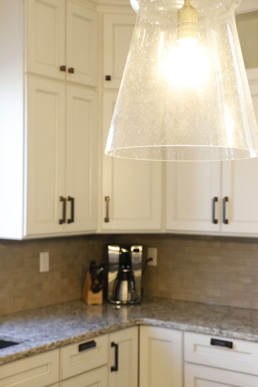
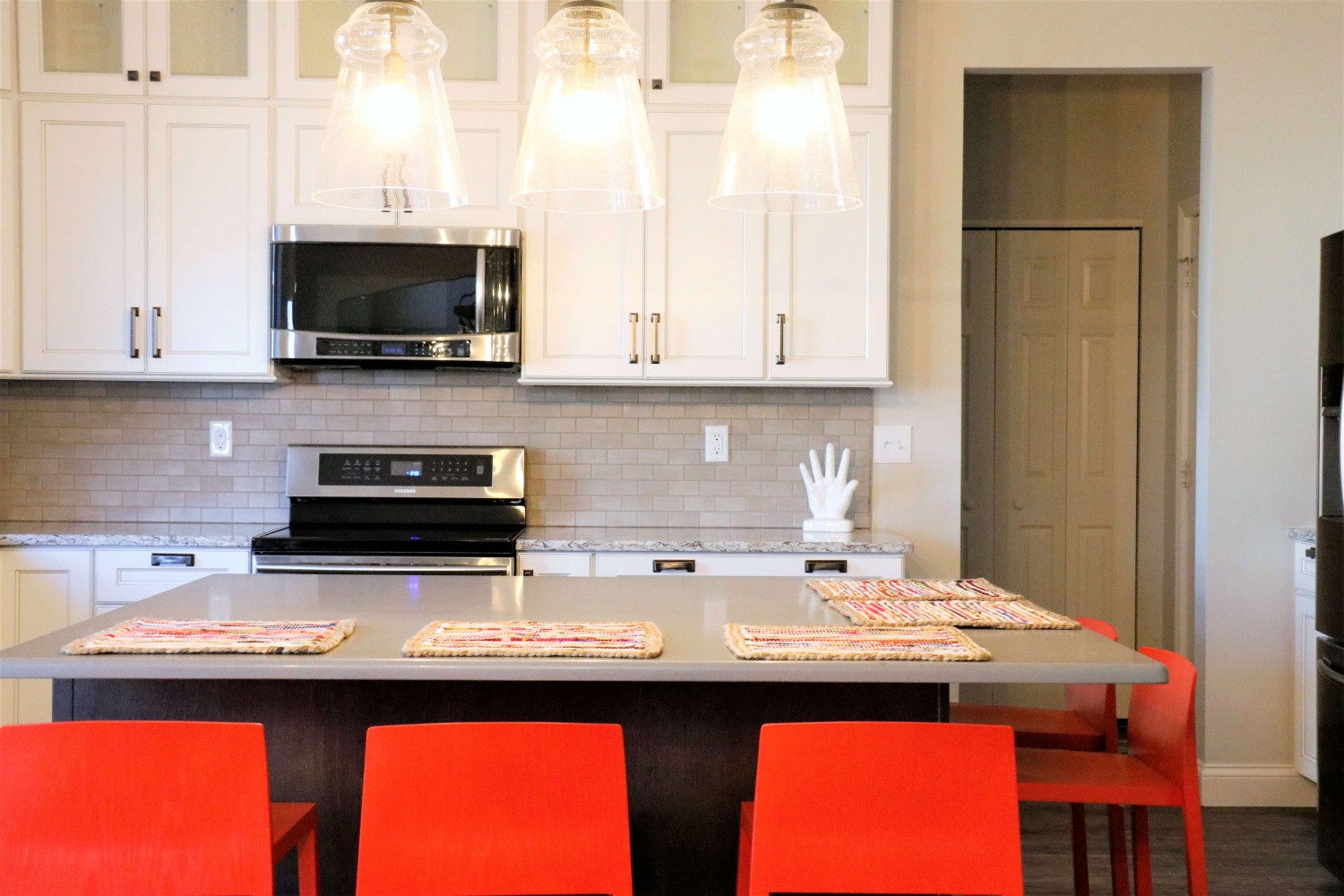
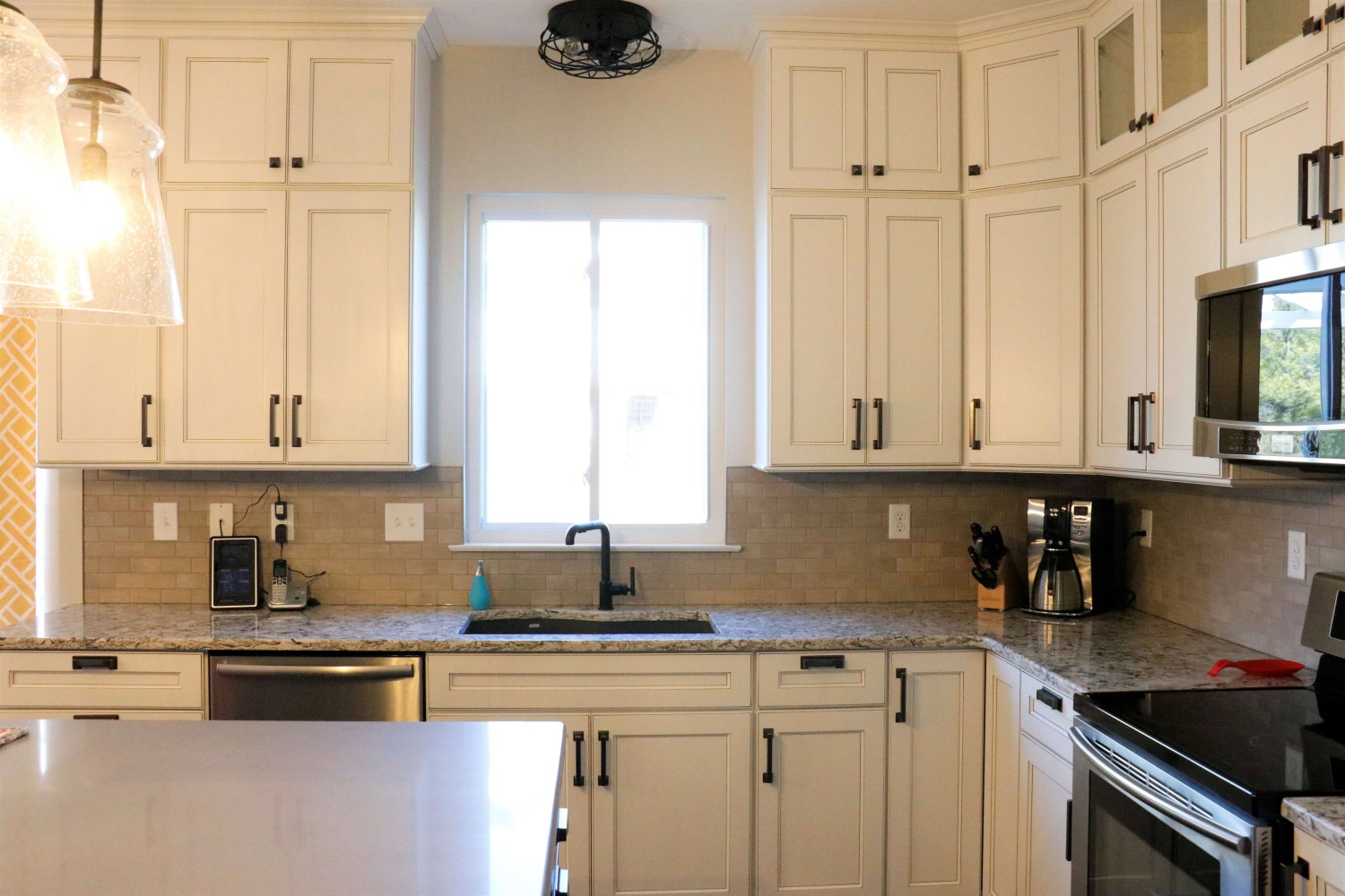
Because the kitchen’s footprint and the defined breakfast space delineated by the bay, we kept the perimeter cabinetry as it was originally laid out. We updated these cabinets to a beautiful soft Alabaster White with a Barn Wood Glaze to highlight the simplicity of the shaker style doors. We added transom cabinets above the uppers, with only the back wall having seeded glass inserts to highlight some of their collectibles.
The original shaped island was counter-productive (See what I did there?) in functionality and design. We squared this off to reduce some of the angles and gain more storage. We highlighted the new island with a contrasting oak cabinet in a dark finish, to pay our respects to the craftsman style, and topped with a concrete-like countertop as a nod to the Prairie Style, allowing the homeowners to gain two extra seats and a massive -uninterrupted- work surface.
The small section of cabinetry between the garage entry and fridge now is the perfect dump-station for mail, electronics, whatever is in their hands when they come into the house; and completely hidden by the refrigerator.
The disconnected cabinetry in the breakfast area makes for a great place to have a working office. Accessible from the kitchen or the adjacent great room, this is the perfect place for the kids to do their homework while mom and dad are putting together dinner. The base cabinets are built out for office-type storage: paper and pencil drawers, filing systems, and cord management. Additionally, the long counter provides a ton of worksurface to spread out.
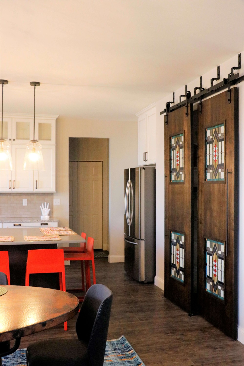
The largest transformation was the pantry. We raised the height of the doorway and added huge custom designed bypass sliding barndoors. Finished with a dark stain to compliment the island and cut to inset 4 stained glass windows, typical of this style of design, and driving home the concept for the whole space.
They were desperate to replace their flooring with something extremely durable to flow throughout the kitchen and the whole main level. This beautiful new flooring is actually a textured LVT(!) Which allowed them to save on overall cost and extend the life of their new flooring purchase.
They loved their copper table, so we kept it and added new simple, mid-century modern chairs around it and a shiny new craftsman-style chandelier above. We added bright barstools in a burnt orange-red accent, and a bright woven rug to tie it all together.
As every designer knows, a room isn’t finished until there’s something on the windows. Now that the new flooring was installed and every other room on the main level ‘seemed’ to be updated, we needed to update the window treatments in the dining, and great rooms to reflect their new design concept.
Eclectic Kitchen and Living Space
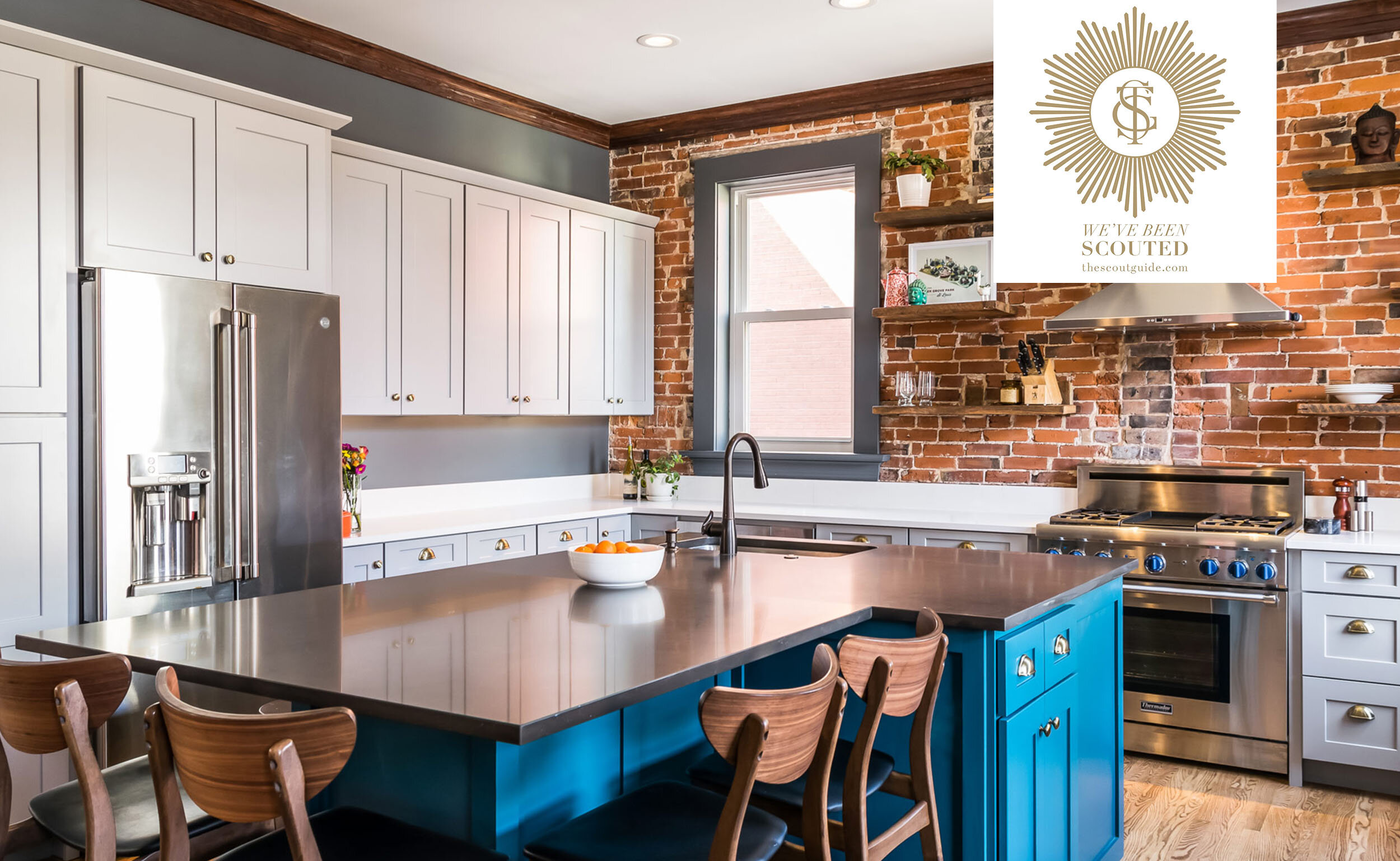
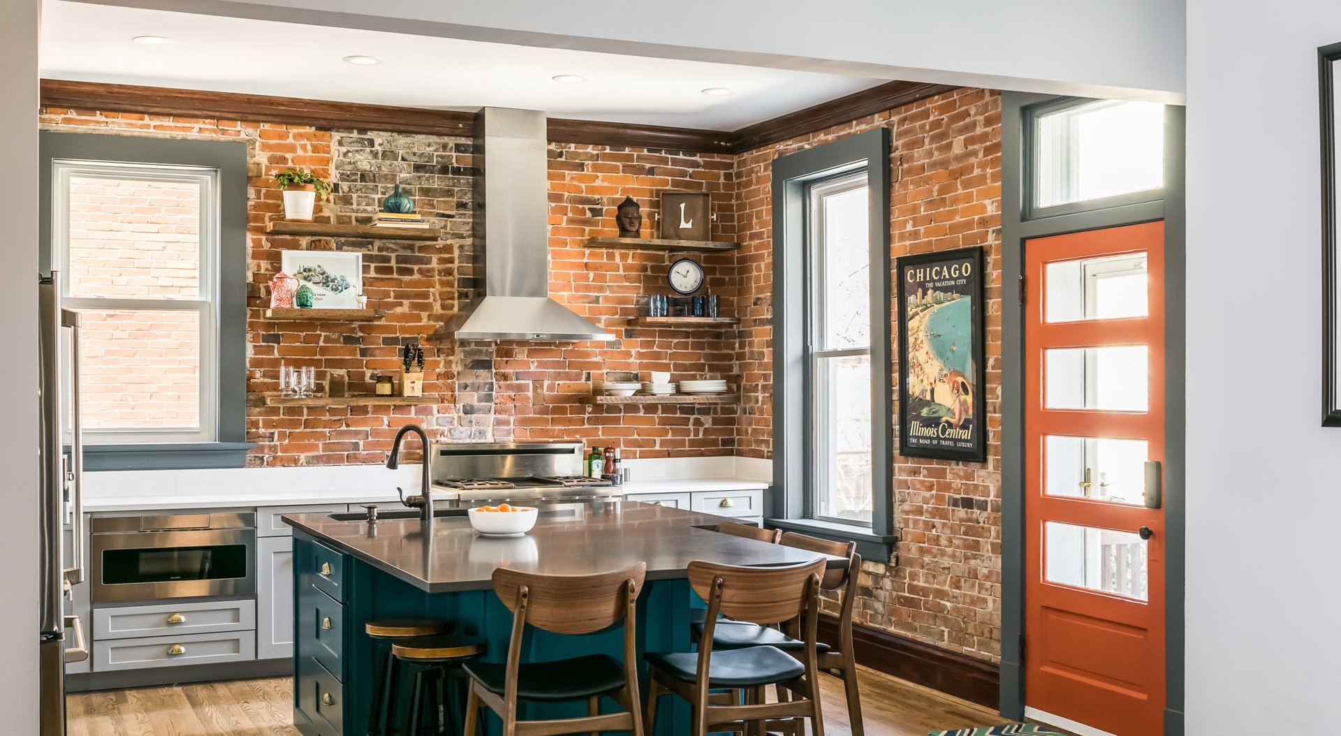
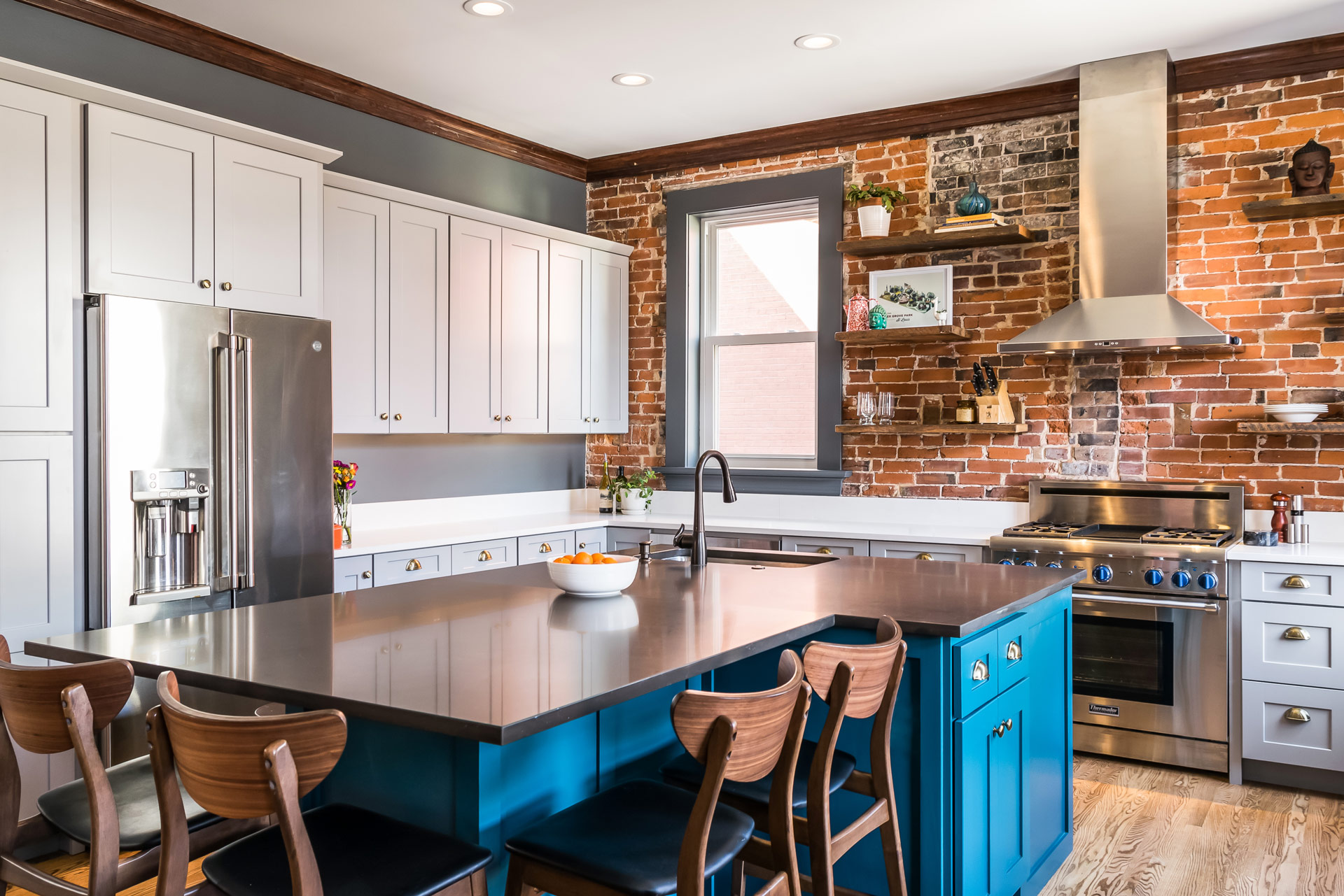
This 120 year old home has beautiful exposed brick walls that we felt necessary to leave as a design element in the space. The homeowners wanted a relaxed, eclectic design that didn't feel too formal or too trendy.
Eclectic Kitchen and Living Space
St. Louis Missouri, 2018
DESIGNER:
Jennifer Chapman
PHOTOGRAPHER:
Karen Palmer Photography
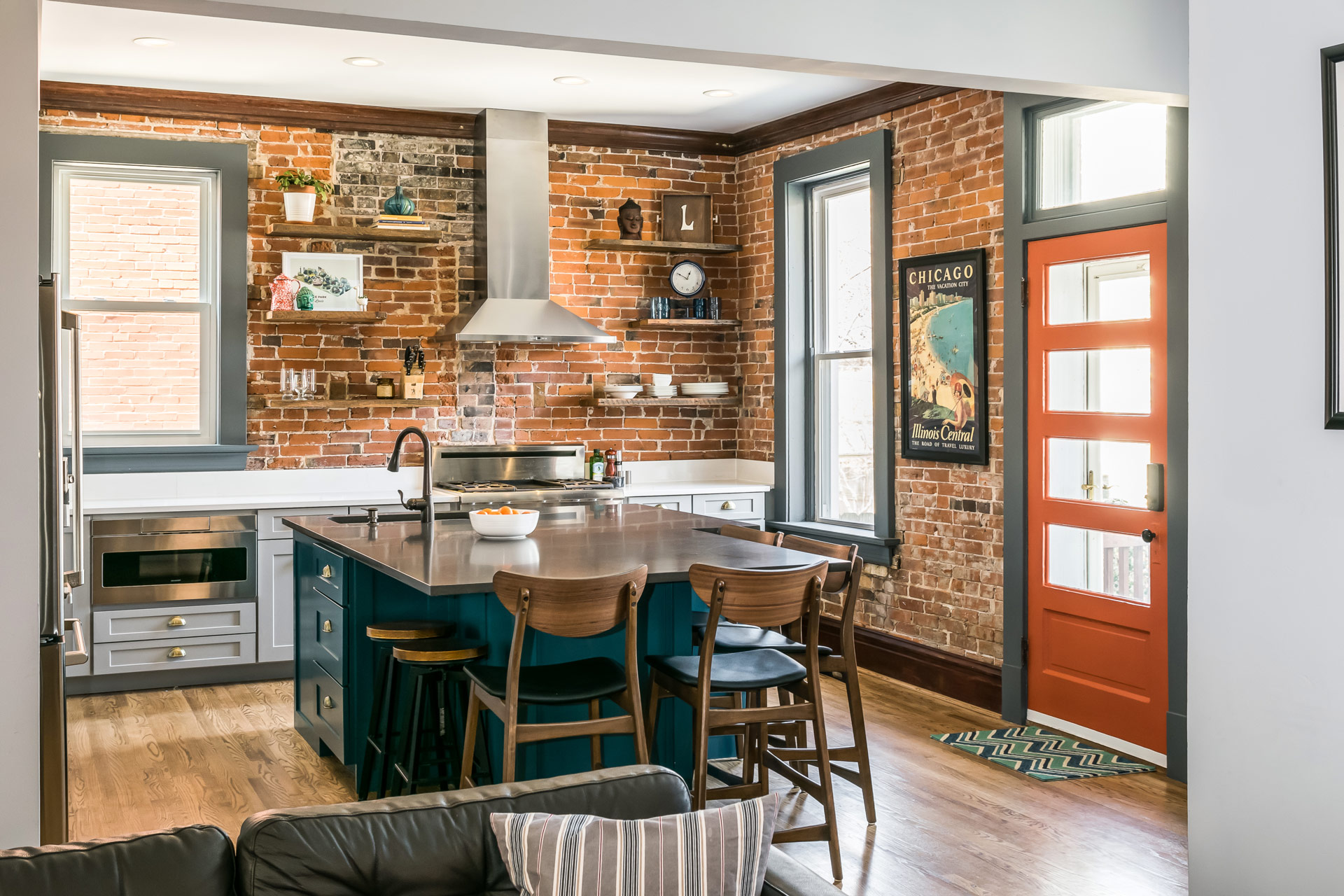
Our clients wanted their outdated kitchen gone! It did not function well at all for their family of four — there was limited counter space, a tiny dishwasher, small sink, and the design was a mix of hodge podge of materials that did not really go well together. We worked together to create a plan that was well thought-out and provided them with a place where family and friends could gather. We started by creating a large island that provided seating for six and allowed for a better connection between the living room and the kitchen. We closed up the doorway to their back hallway in order to add even more storage and counter space. The quartz countertops will will be durable enough to withstand their kids' homework and art projects and are easily cleaned after family meals.
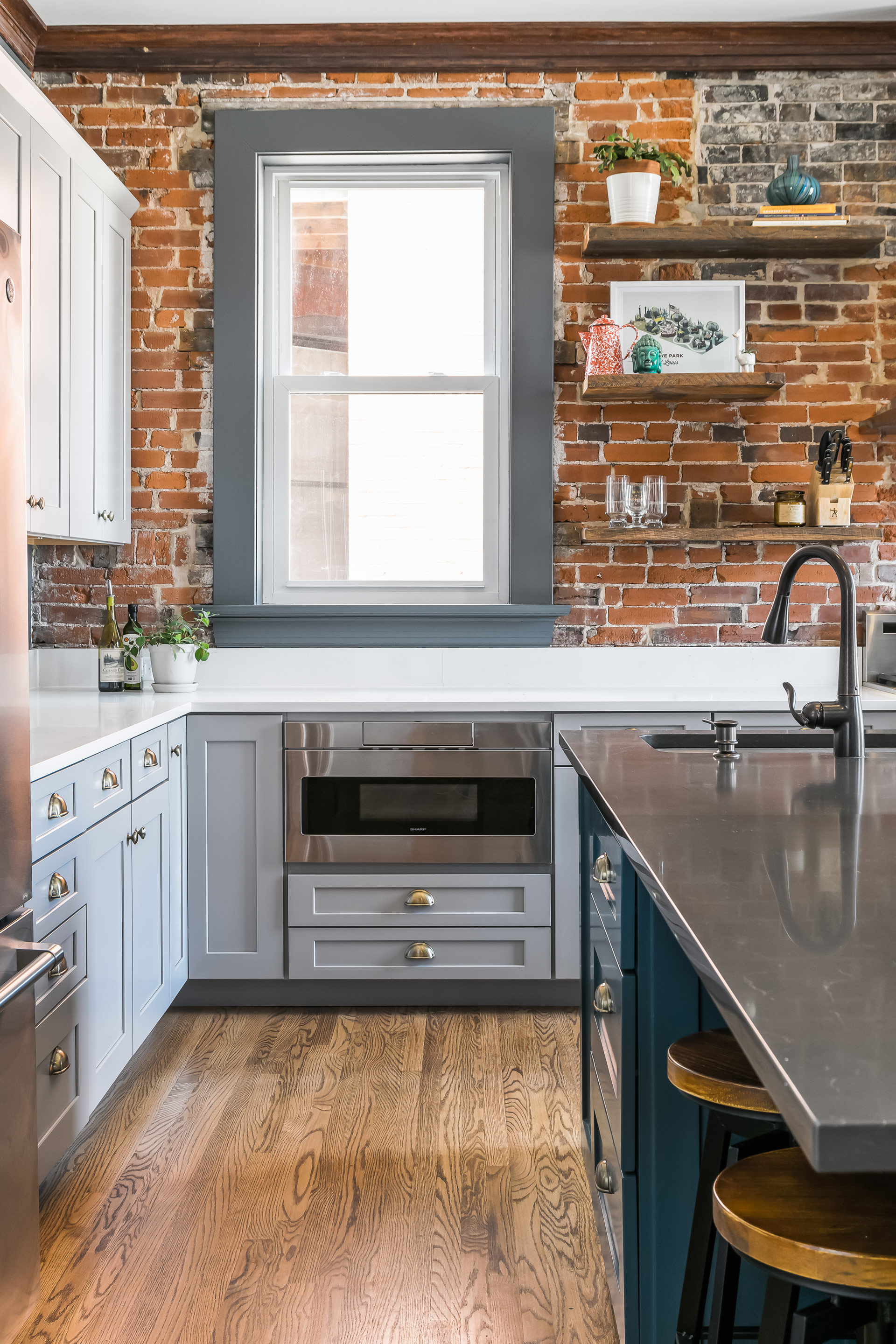
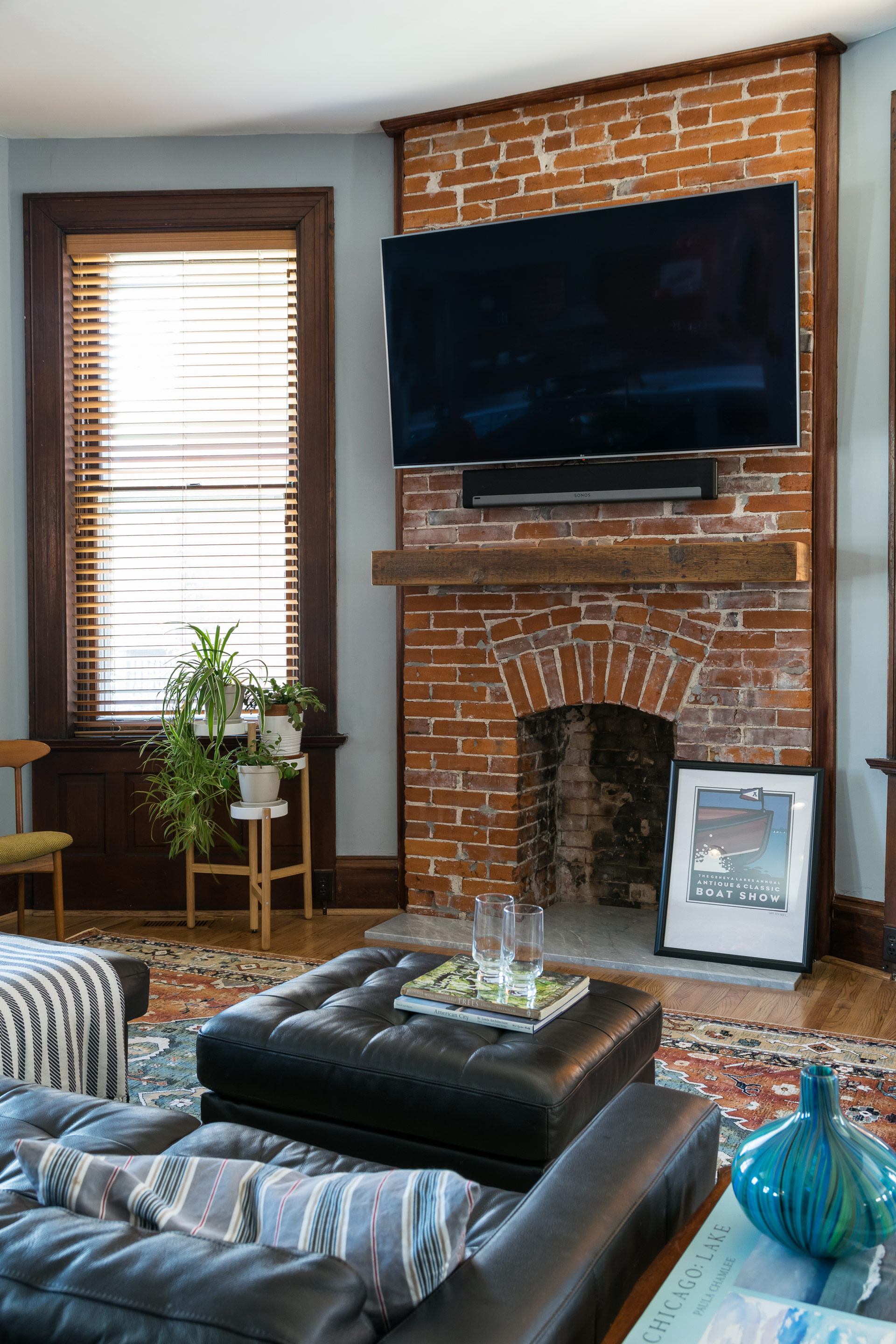
This 120 year old home has beautiful exposed brick walls that we felt necessary to leave as a design element in the space. The homeowners wanted a relaxed, eclectic design that didn't feel too formal or too trendy. They wanted the island to be different than the rest of the cabinetry and our homeowner fell in love with deep teal for the island. We used a traditional cup pull on the drawers, but we selected a brushed brass finish to make it a bit more modern and warm up the cool gray and teal. Our clients were determined to uncover the old fireplace that had been plastered over so they did exploratory work to discover it was, in fact, still there. We removed all of the plaster, did a bit of repair work on the brick, and added a marble hearth and a reclaimed wood mantel. The brick and the reclaimed wood help connect the living room and kitchen. We used matching reclaimed wood floating shelves on the range wall as well. Overall, the space feels relaxed and comfortable and is now a great place for entertaining.
Accessible Master Suite Bathroom
Our clients have loved their 86 year old home for nearly half a century. Unfortunately, older homes were not built with aging in place or universal design in mind. That's where we come in!
Accessible Primary Suite Bathroom
Missouri, 2018
DESIGNER:
Jennifer Chapman
PHOTOGRAPHER:
Karen Palmer Photography
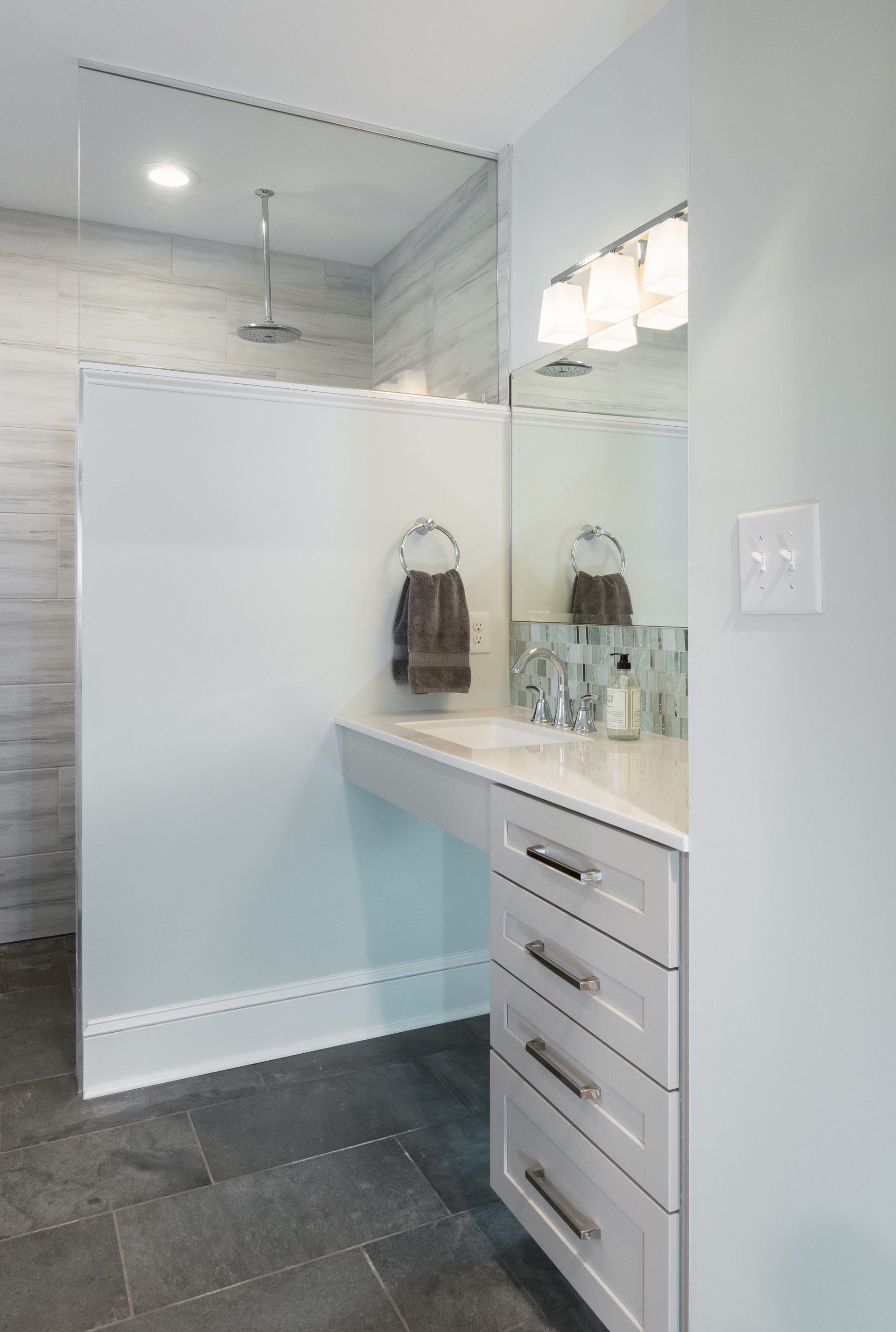
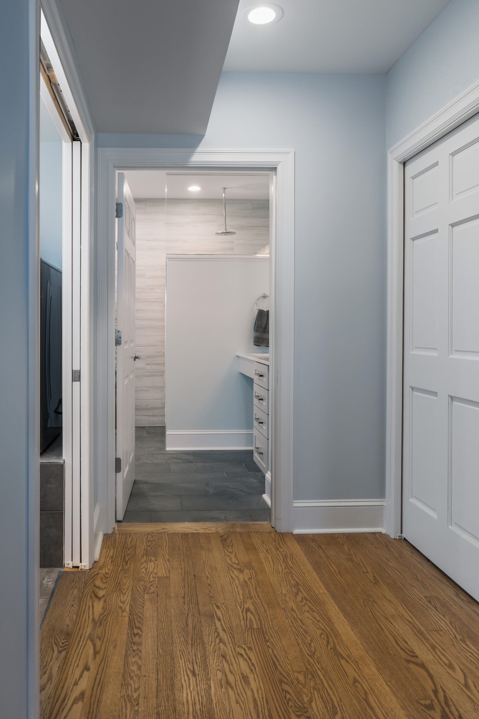
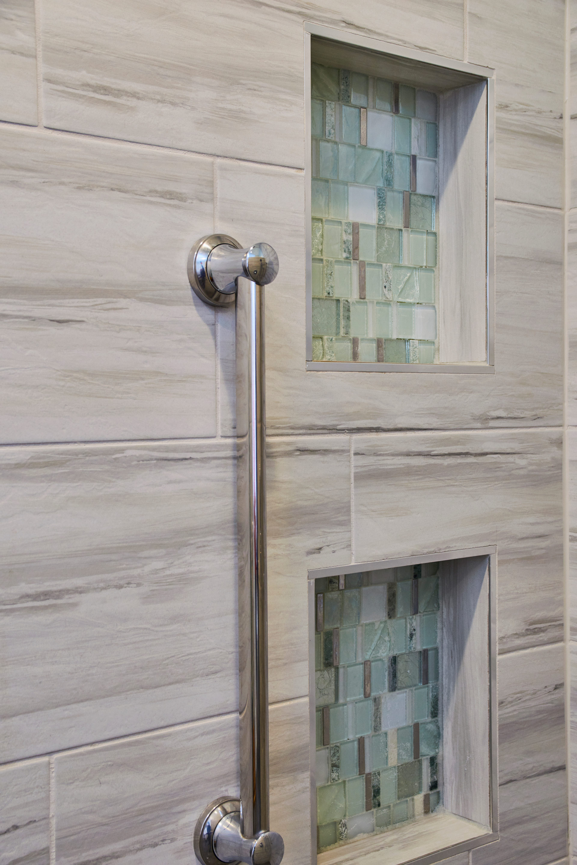
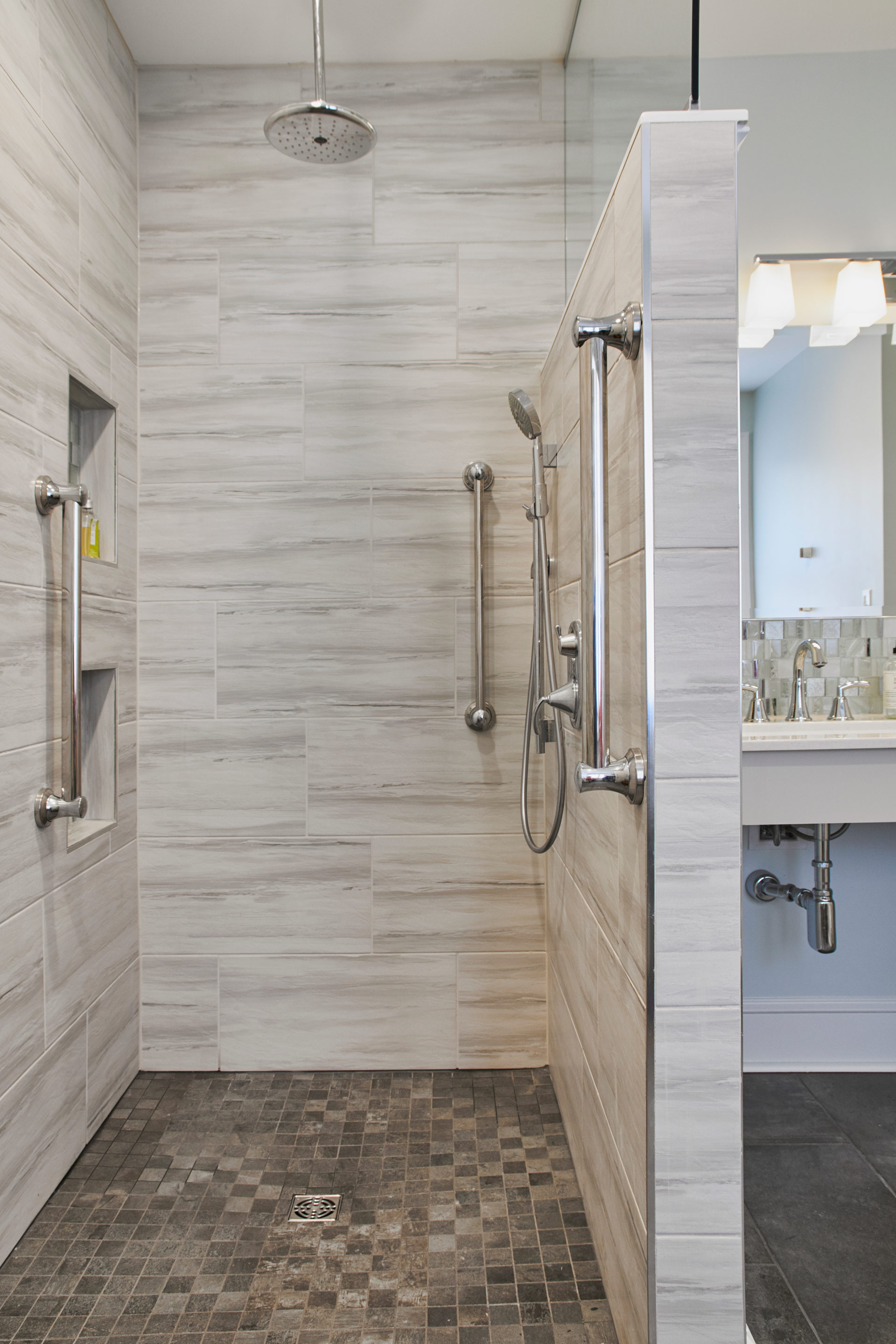
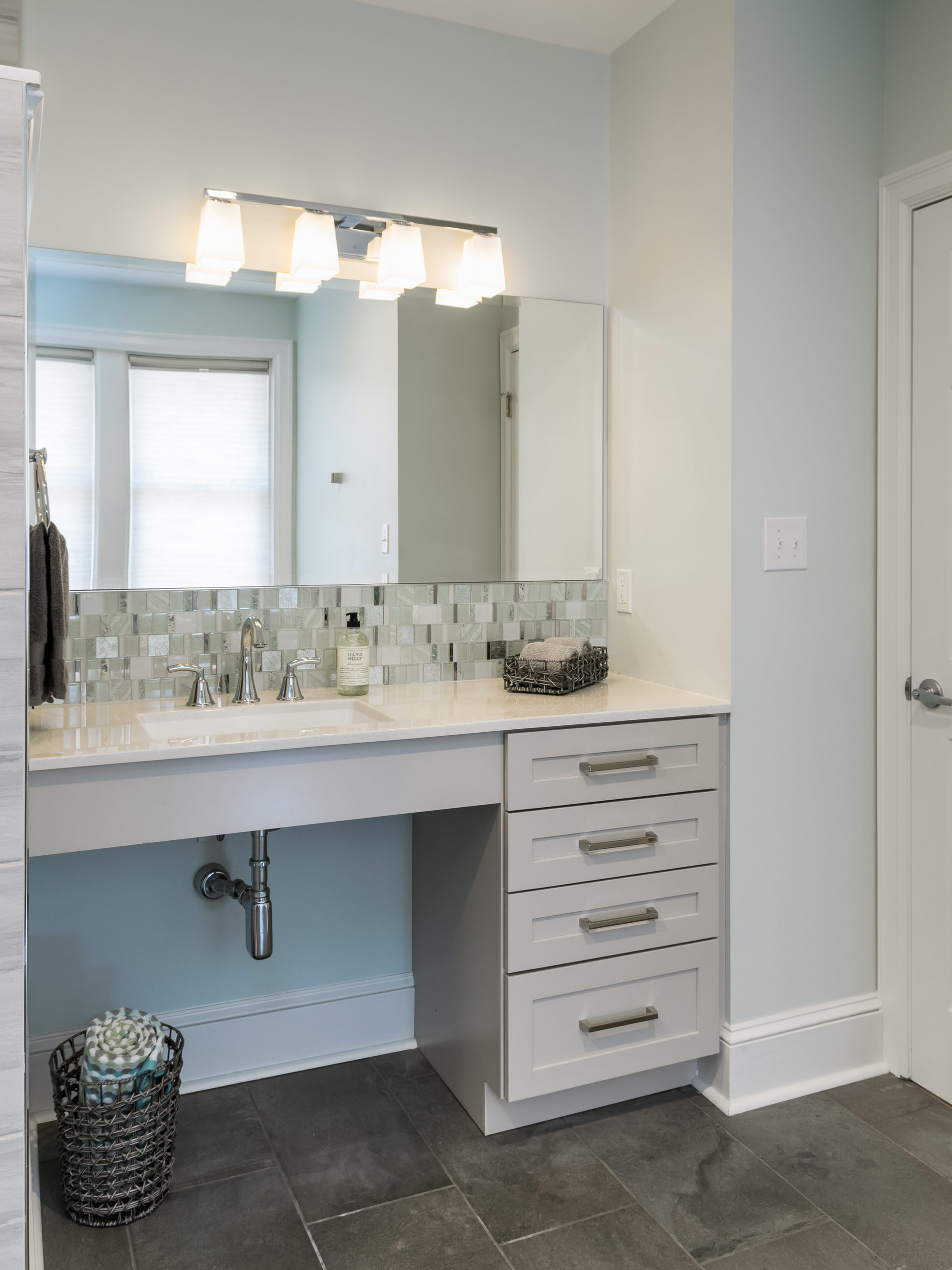
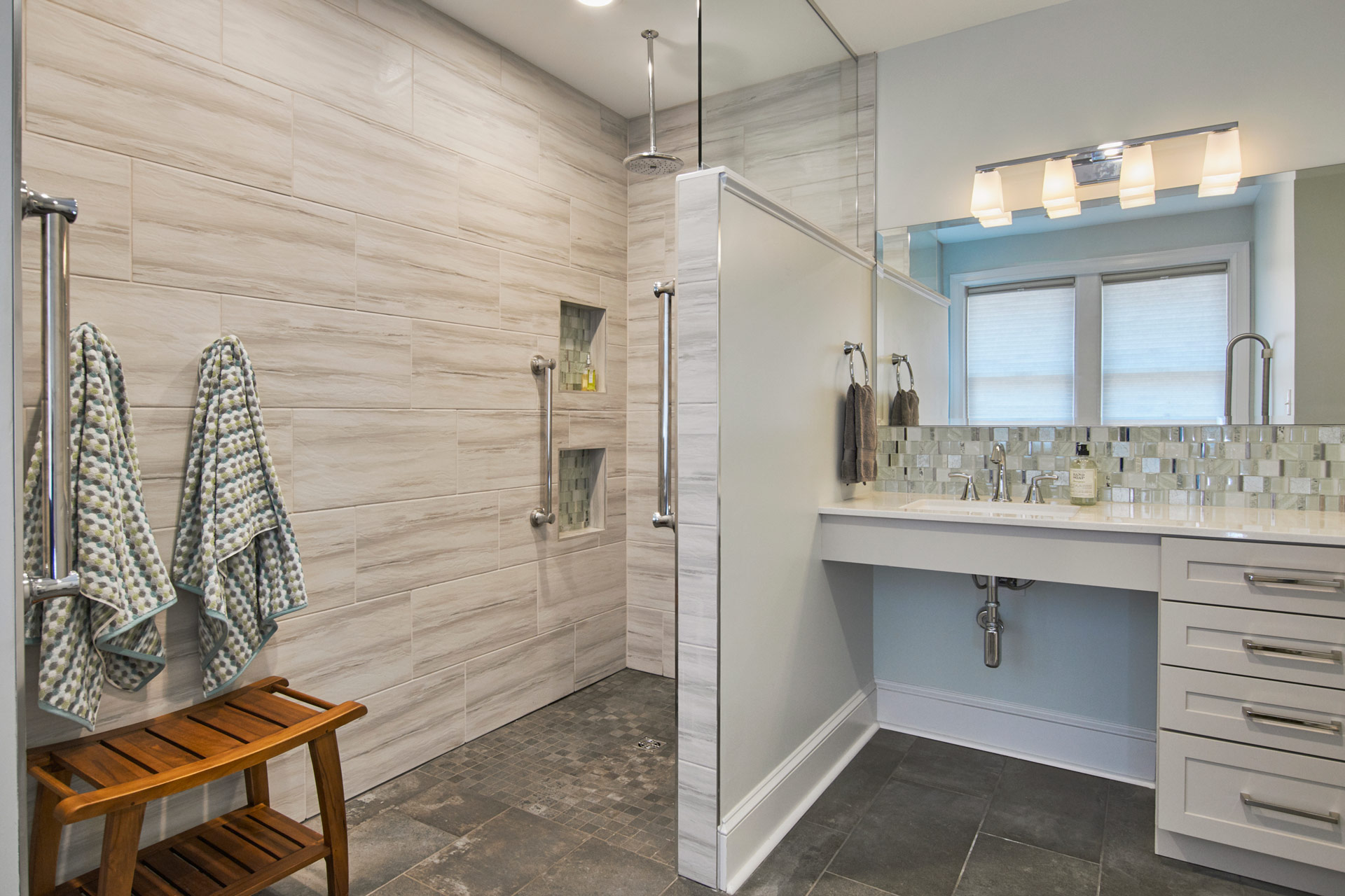
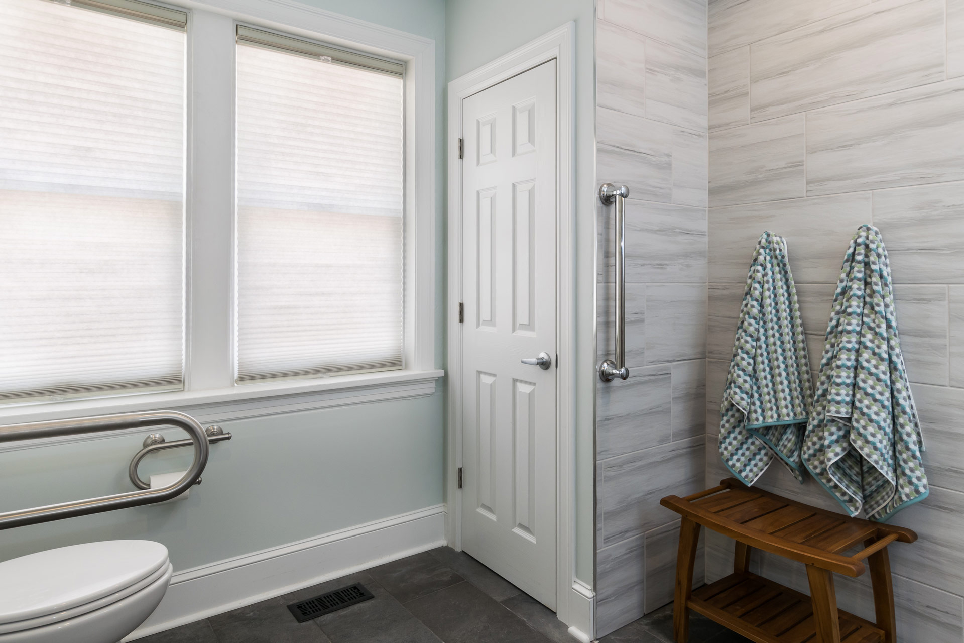
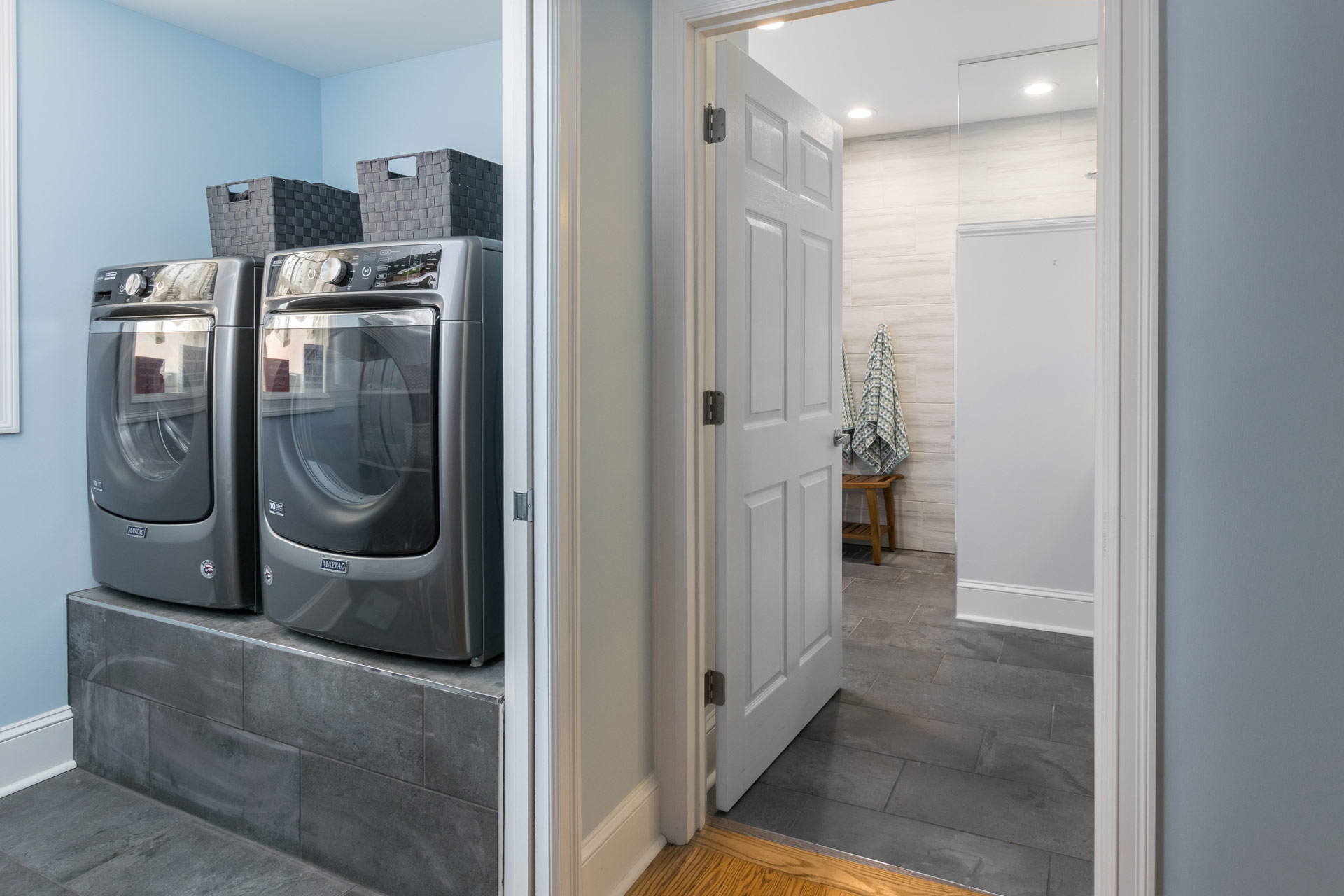
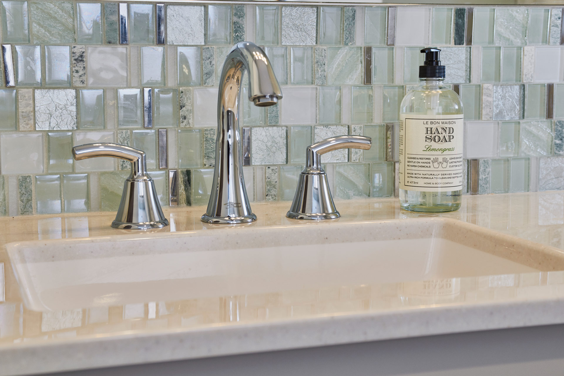
Our clients have loved their 86 year old home for nearly half a century. Unfortunately, older homes were not built with aging in place or universal design in mind. The homeowners were facing the sad reality that they may have to move somewhere that offered more accessible living. Their two story home had two bedrooms, separated by a small bathroom and hallway, on the first floor. We came up with a plan to convert this entire space into an one accessible ensuite. It was important to design a primary bathroom that allowed for different levels of accessibility as they age. We started the design by creating an open shower that allowed for standing or sitting and placed grab bars in key places for both functions. We kept the space beneath the sink open to accommodate a wheelchair if needed in the future. At the toilet area, we wanted to provide grab bars on both sides of the toilet, but we also needed to keep clearance to one side so that someone could transfer from a wheelchair if they needed to. A flip down grab bar was the perfect solution! It completely folds up and flattens against the wall. On the other side of the toilet we used a grab bar/ toilet paper holder combo to keep it less cluttered on the wall below the window. One of the must haves in this suite was to bring the laundry up to the main floor from the basement so we created a laundry room/closet in the master suite.We elevated their front loading washer and dryer on a tiled platform so that they do not have to bend down to do laundry.
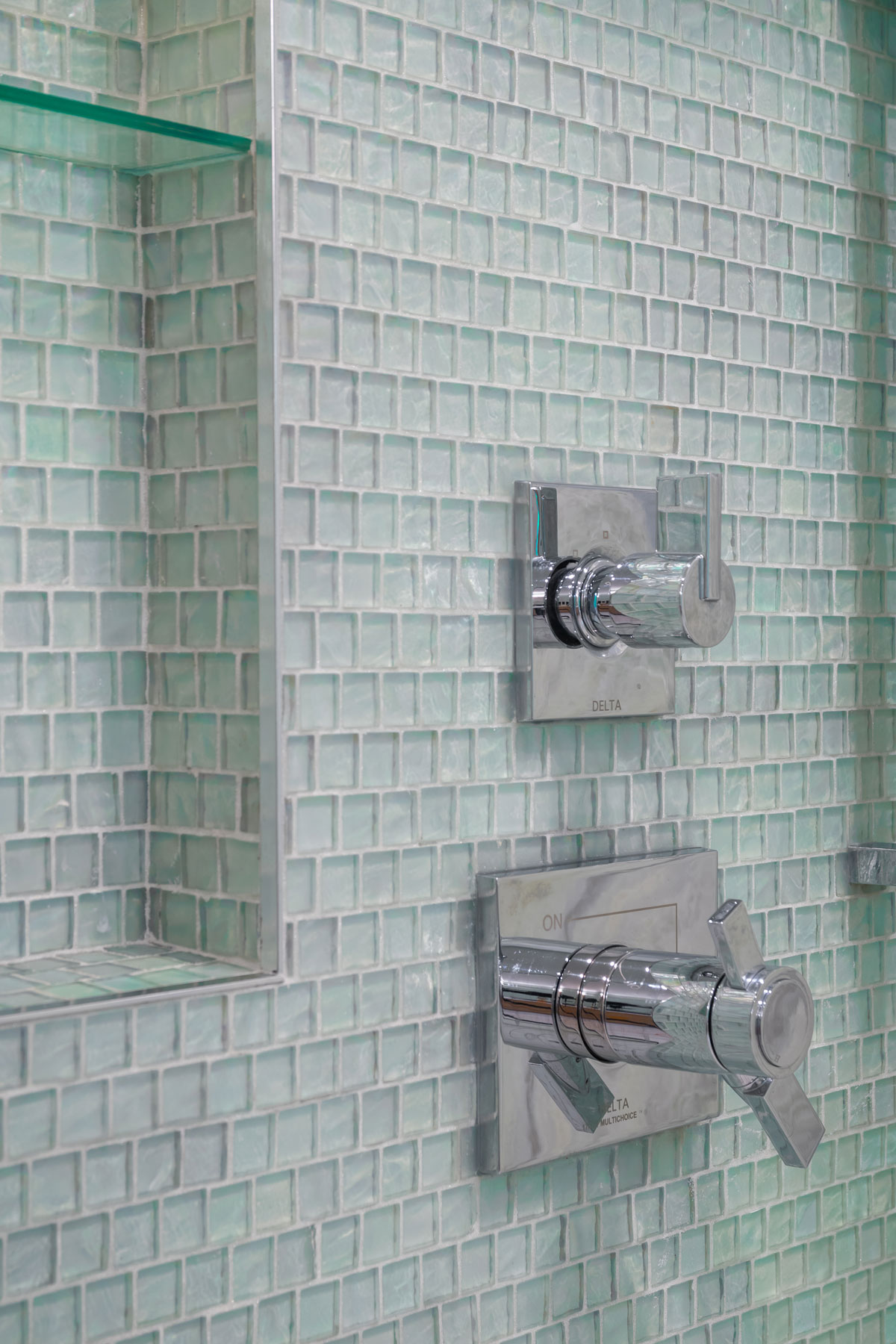
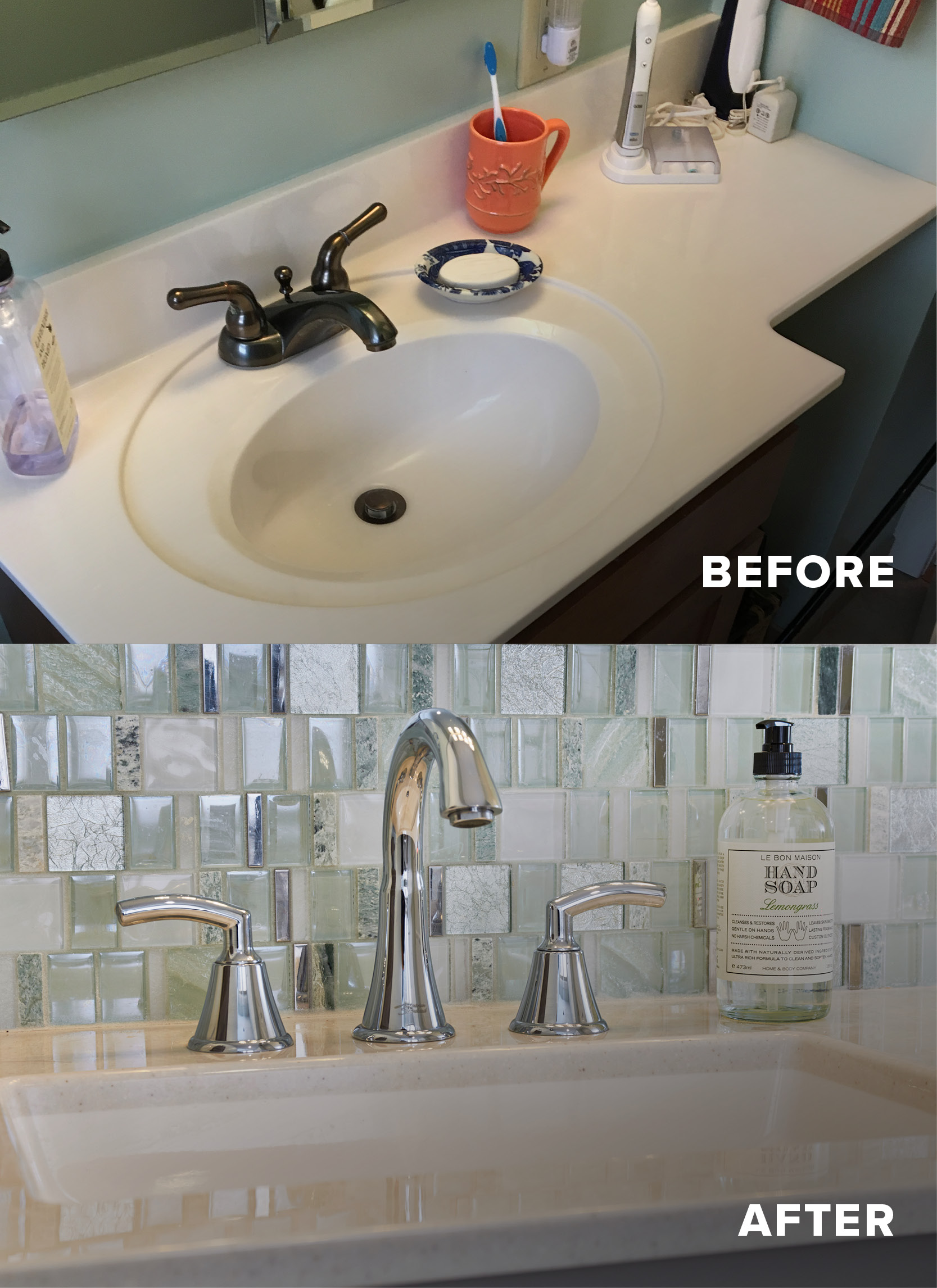
The clients wanted the space to feel clean and bright and modern. When we found the the sea green glass tile mosaic we knew we had to use it! We kept the shower walls light and the floor darker. The onyx vanity top is easy to clean and looks beautiful on the light gray vanity. We used chrome fixtures to match the chrome in the accent tile mosaic. The overall look we achieved is reminiscent of a modern spa and our clients can join their family home for years to come!
Beautiful Master Bathroom
Our client was looking for something different with a touch of whimsy! We added dark, masculine, cabinetry for him and bubble tile for her.
Beautiful Primary Bathroom


Missouri, 2018
DESIGNER:
Rochelle McAvin
PHOTOGRAPHER:
Karen Palmer Photography
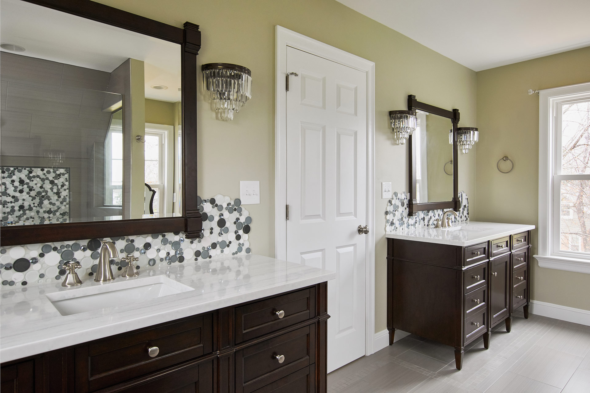
Our clients were looking for more space for their growing family. We added a master suite addition complete with home office, master bedroom, his and her closets, and a beautiful master bathroom.
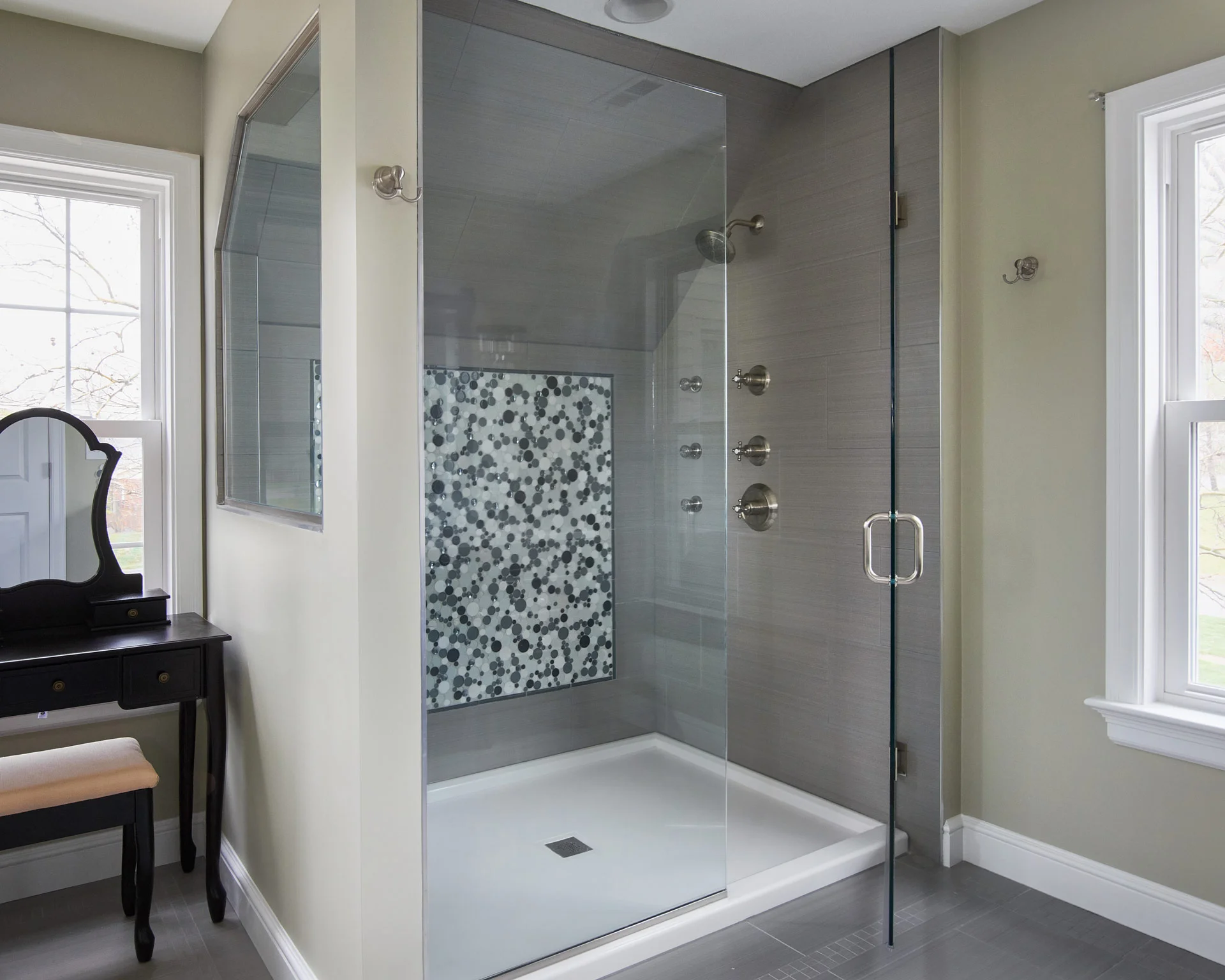
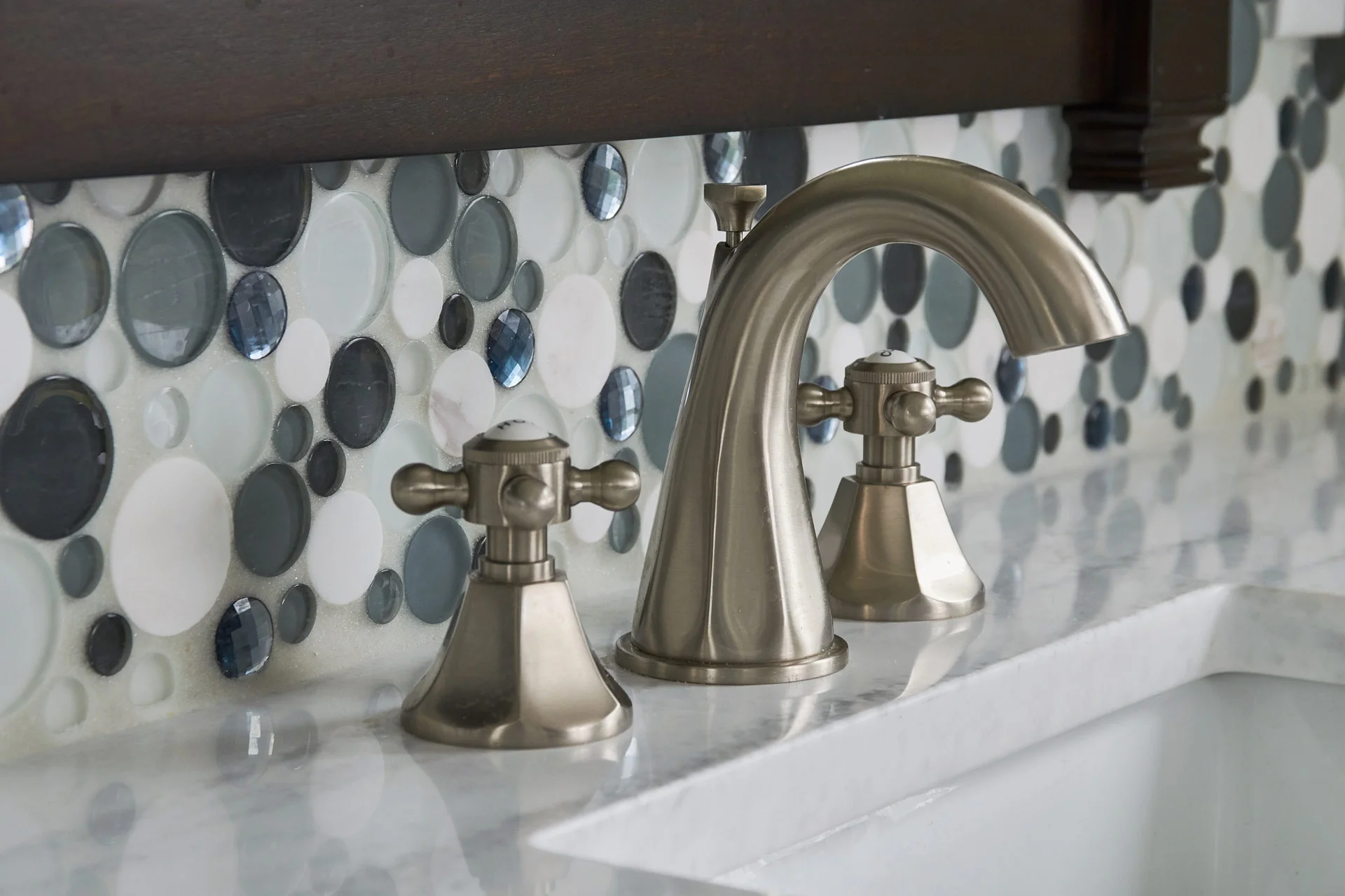
She was looking for something different with a touch of whimsy! We added dark, masculine, cabinetry for him and bubble tile for her.
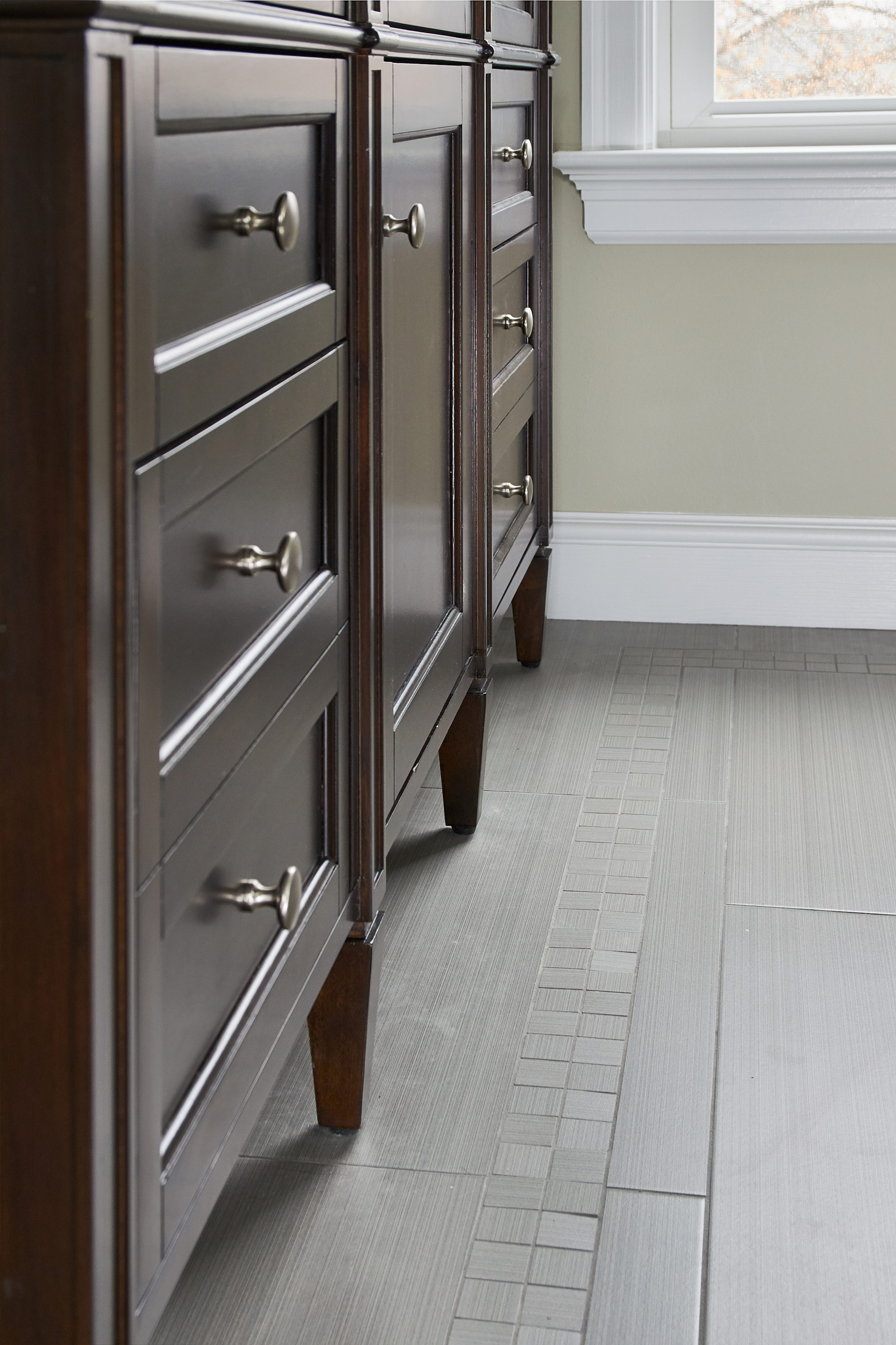
The floor tile includes an inlay and the shower is complete with three massaging body sprays.
The ceiling fan has retractable blades that disappear when the fan is off, leaving a crystal chandelier overhead.
We thought of every detail in the new space including custom closets.
Rustic Entertaining Space
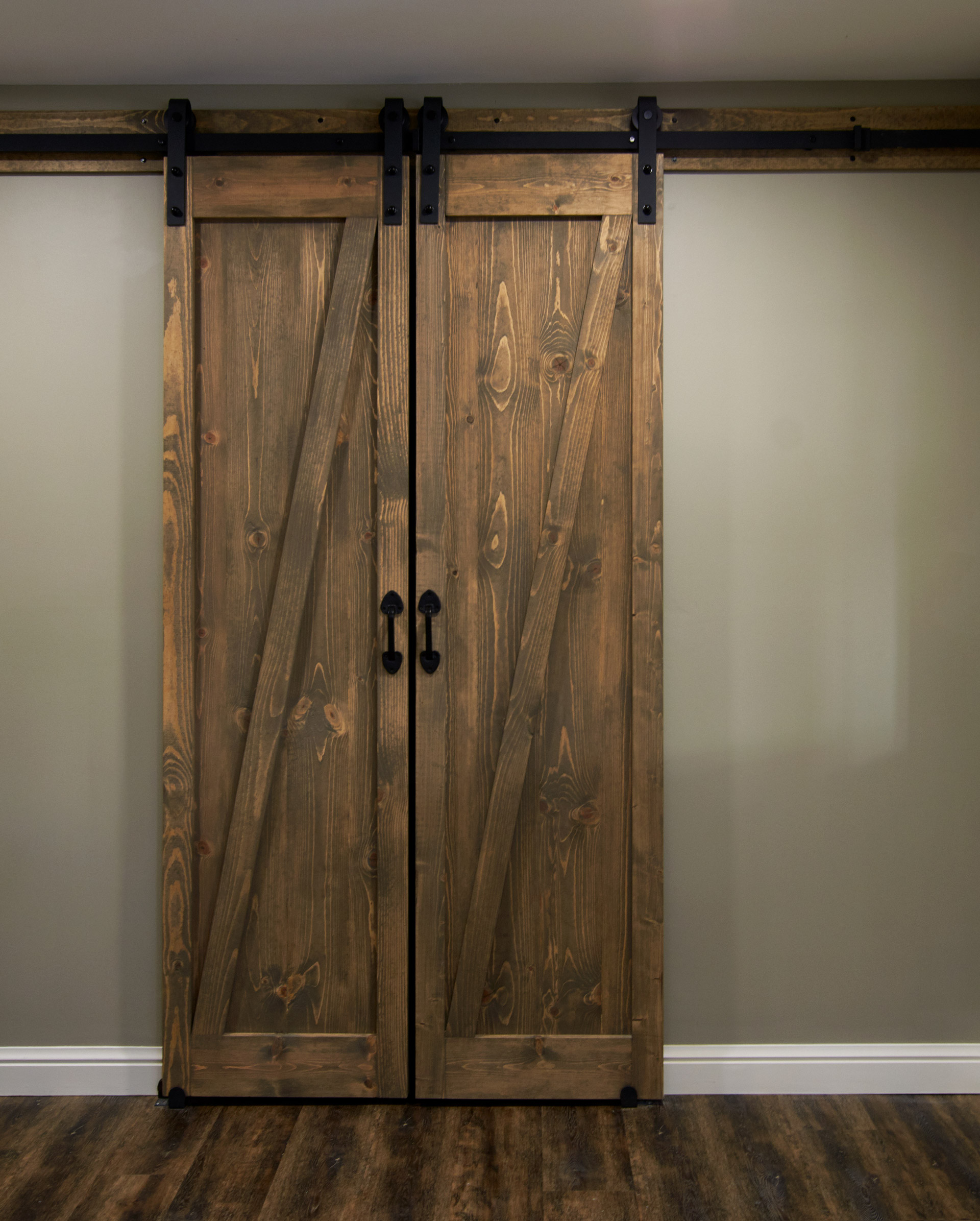
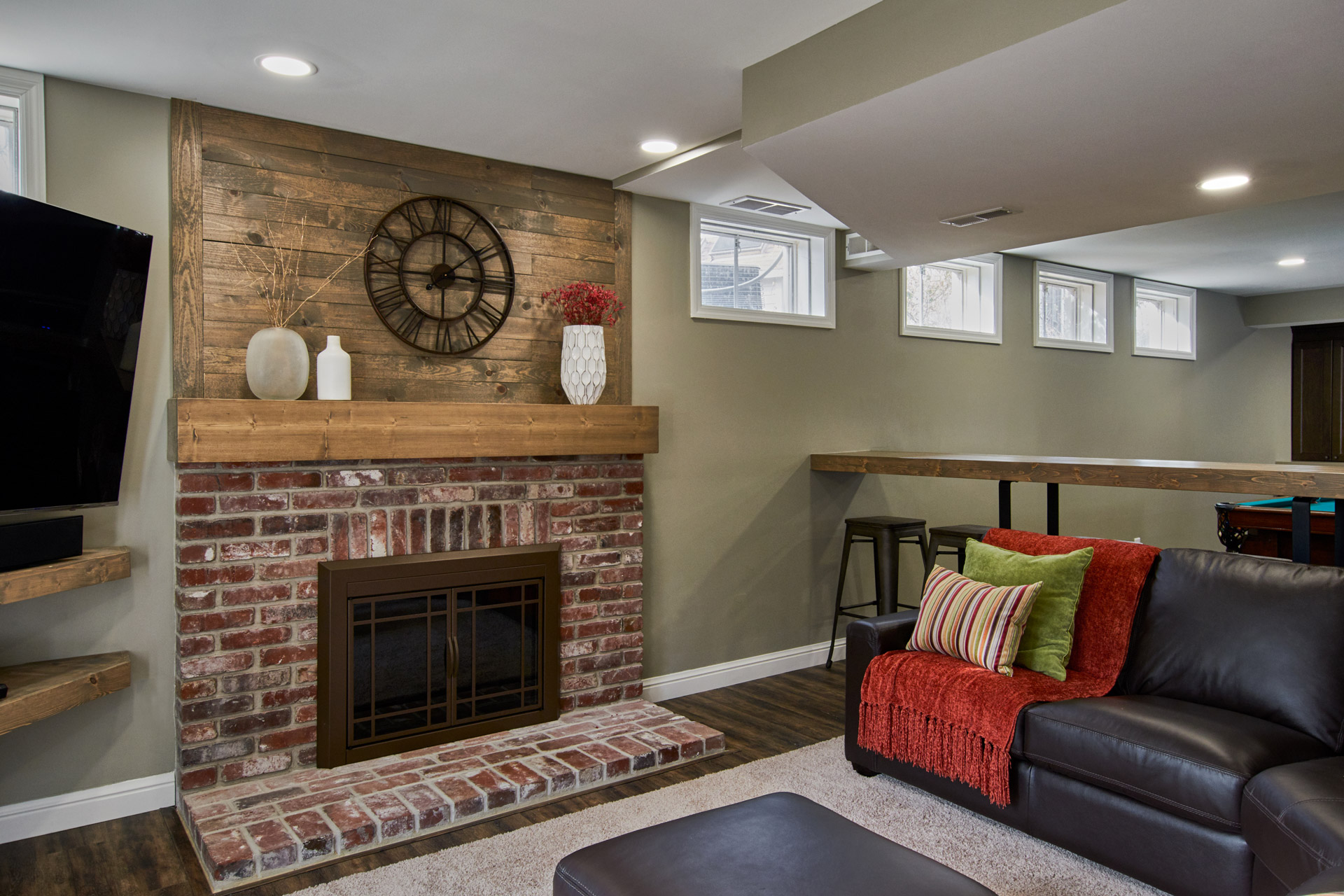
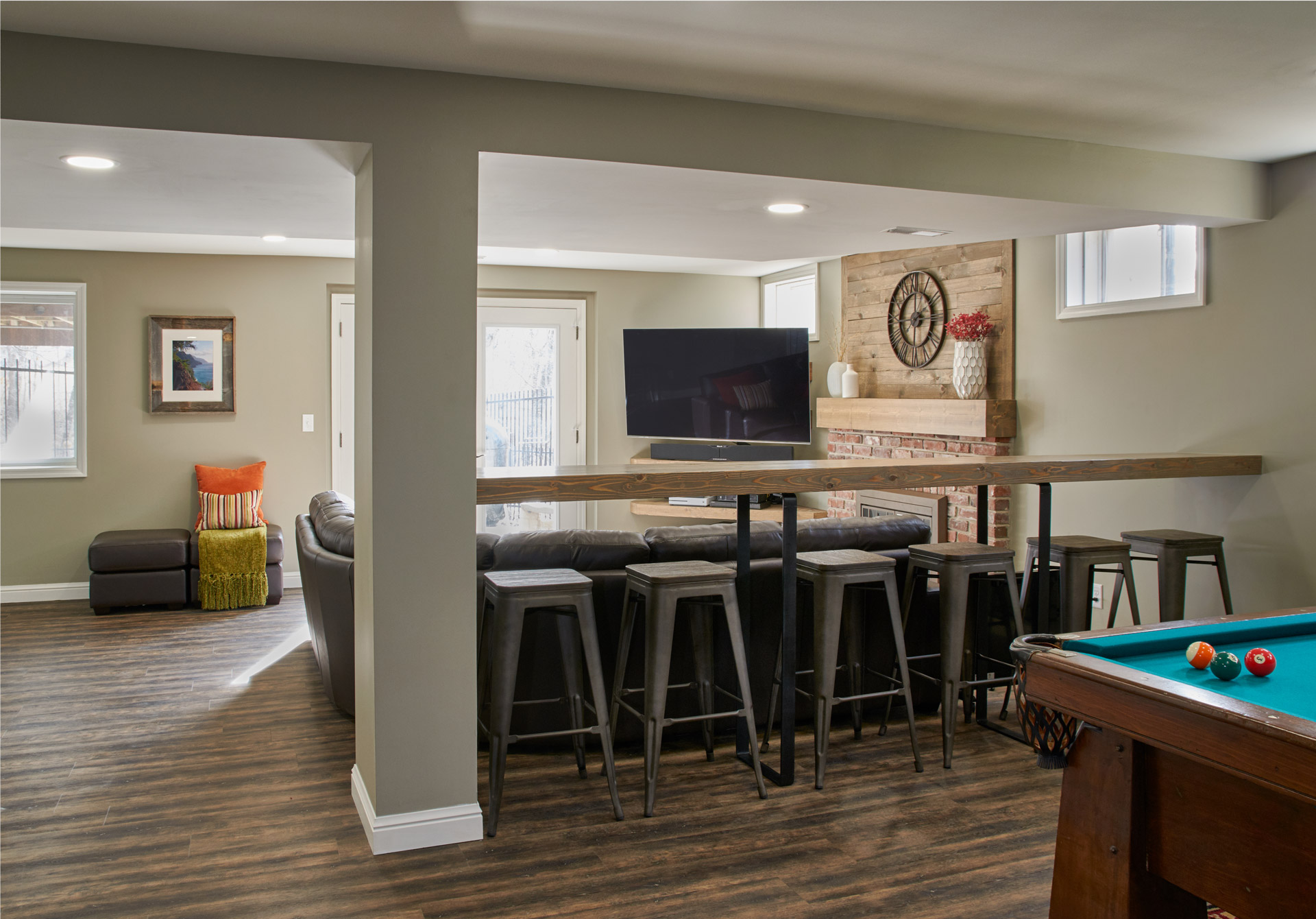
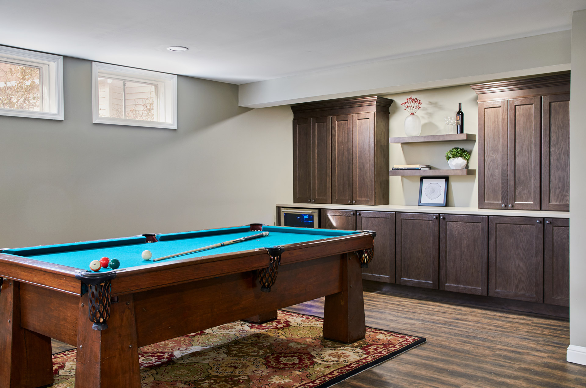
We added more storage by adding two new closets, one of which we closed off with a set of custom wood barn doors. The white built-in cabinetry was replaced with dark wood cabinets , floating shelves, and a quartz top. We added a beverage cooler beneath the countertops - ideal for entertaining! The homeowners can now enjoy the space as a family or when spending time with friends!
Rustic Entertaining Space
Missouri, 2018
DESIGNER:
Jennifer Chapman
PHOTOGRAPHER:
Karen Palmer Photography
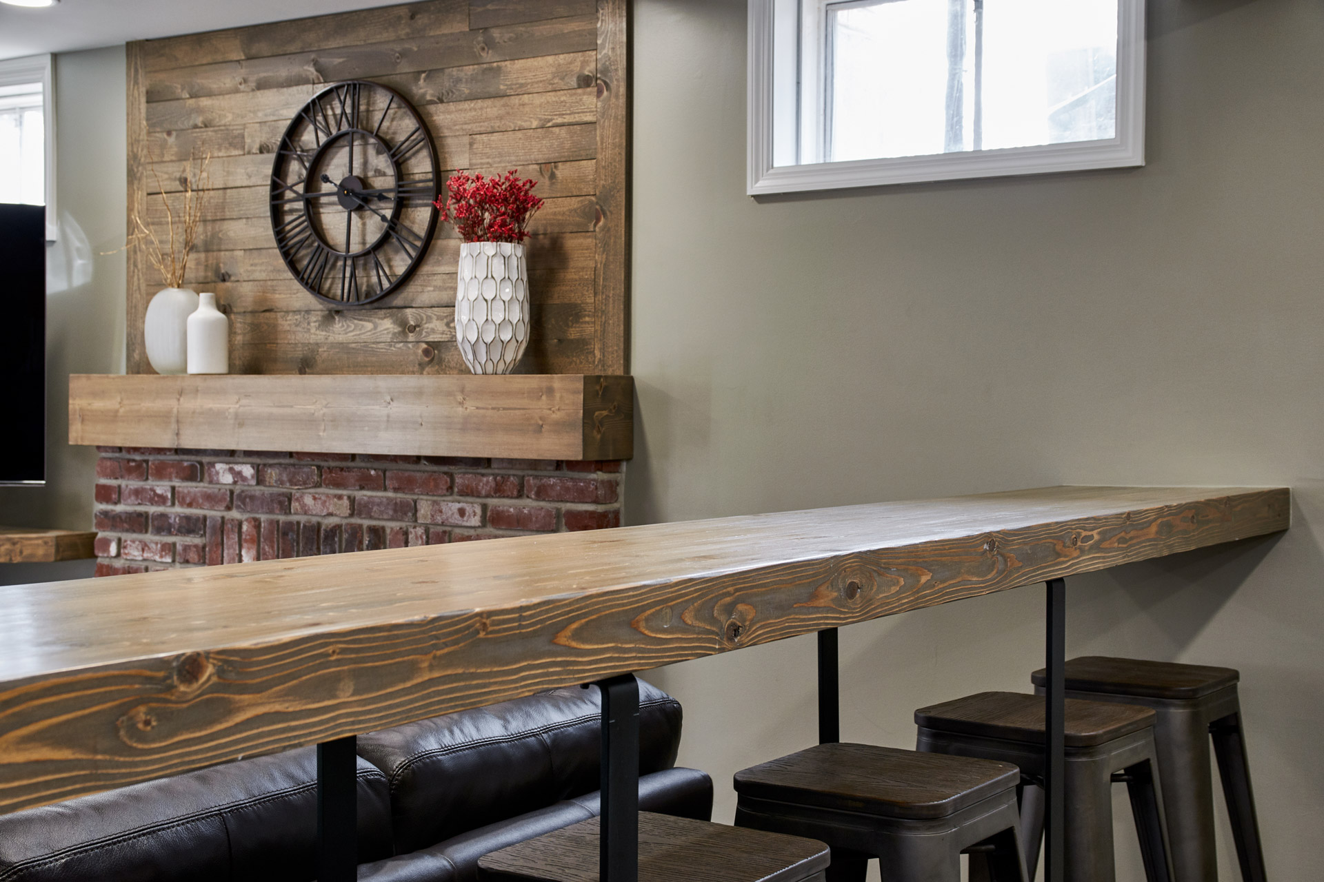
Our clients were ready for a complete transformation of their 1980's basement. Not only were they ready for an updated look to match the rest of their home, but also a change in the way the space functioned. It was time to get rid of kids' toys and make way for a more inviting space to entertain friends and family of all ages. We replaced the existing dated berber carpet with a beautiful, rustic wood-look Luxury Vinyl Tile. One of our carpenters fabricated all of the custom wood pieces in the space, including a long bar top for people to perch, set a drink and either watch tv or enjoy a game of pool. We gave the fireplace a facelift by changing out the shiny brass fireplace doors with a modern rustic set of doors in oil rubbed bronze. We replaced the traditional, white mantel with a wood beam and added rustic wood wall cladding above as a design feature. We added more storage by adding two new closets, one of which we closed off with a set of custom wood barn doors. The white built-in cabinetry was replaced with dark wood cabinets, floating shelves, and a quartz top. We added a beverage cooler beneath the countertops - ideal for entertaining! The homeowners can now enjoy the space as a family or when spending time with friends!
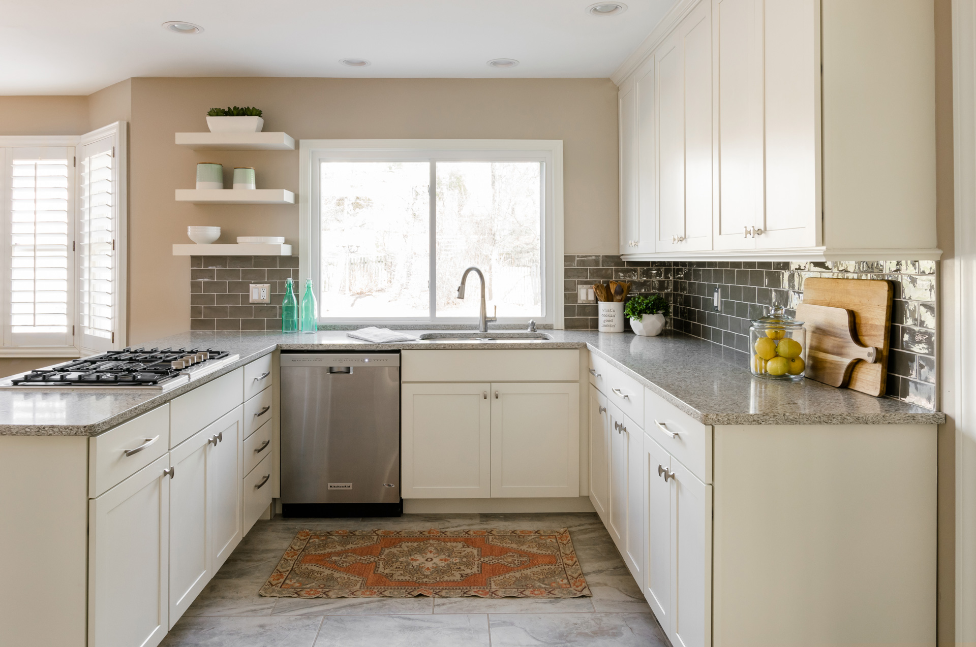
Traditional Modern Kitchen
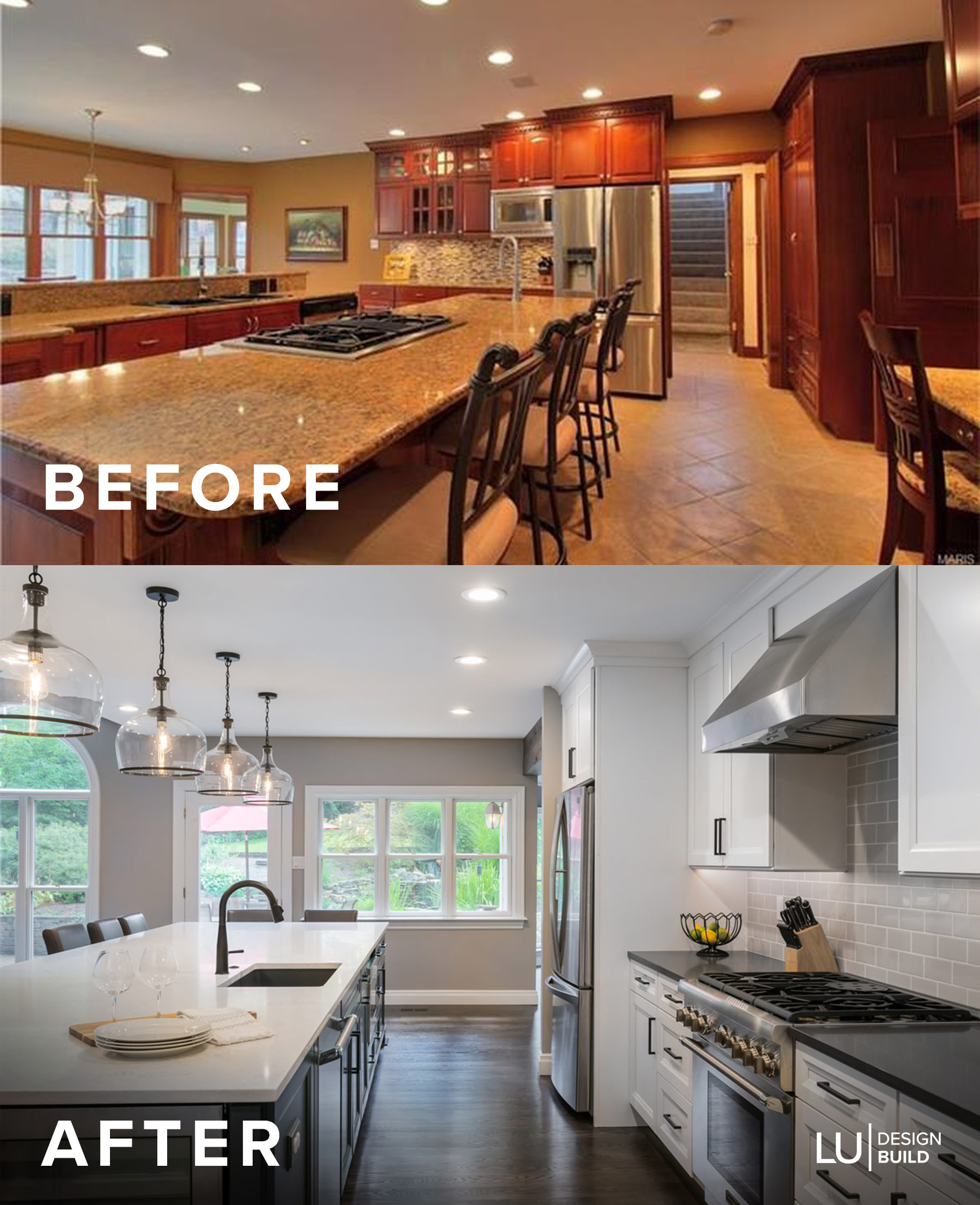
The homeowner's could no longer live with their 1980's tile and its pinkish hue and the only way to replace it was to replace the whole kitchen.
Traditional Modern Kitchen
Chesterfield, Missouri, 2018
DESIGNER:
Jennifer Chapman
PHOTOGRAPHER:
Karen Palmer Photography
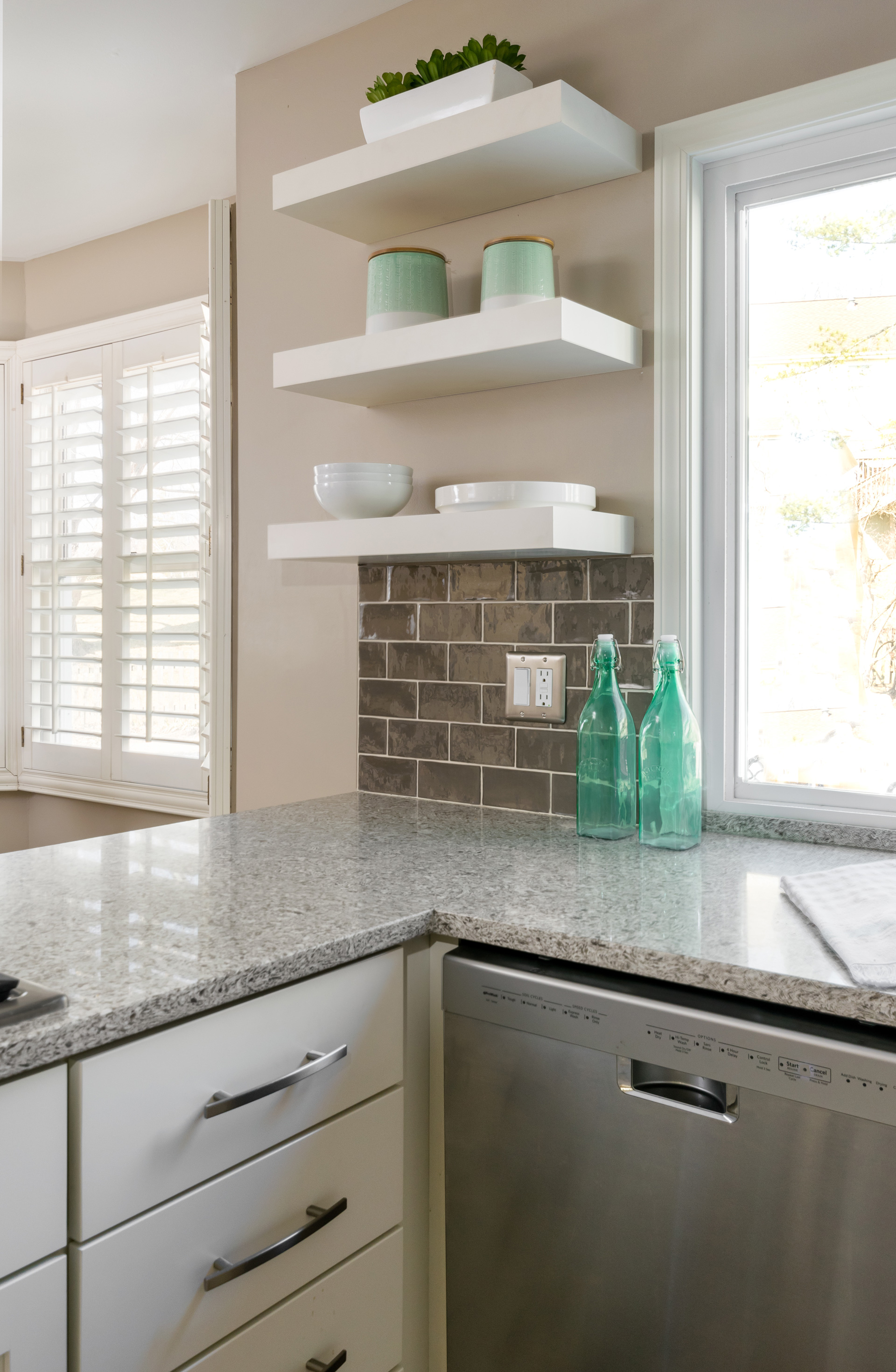
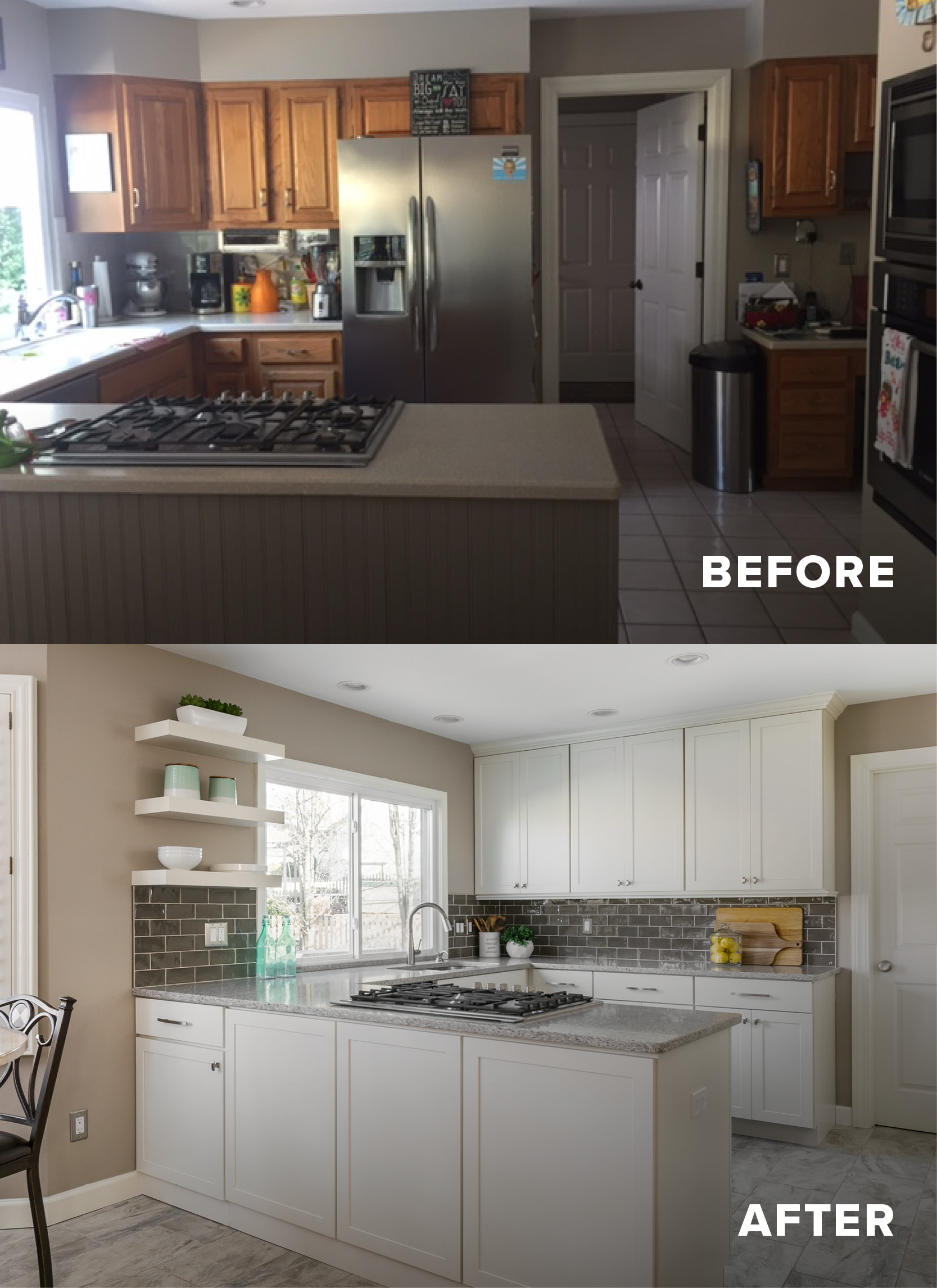
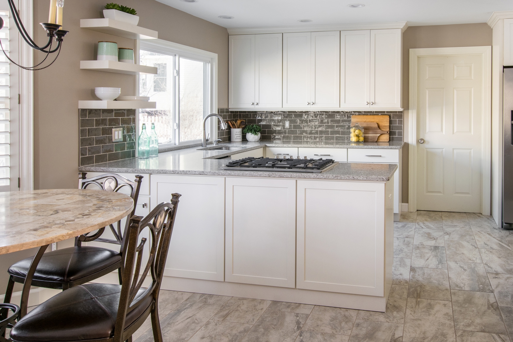
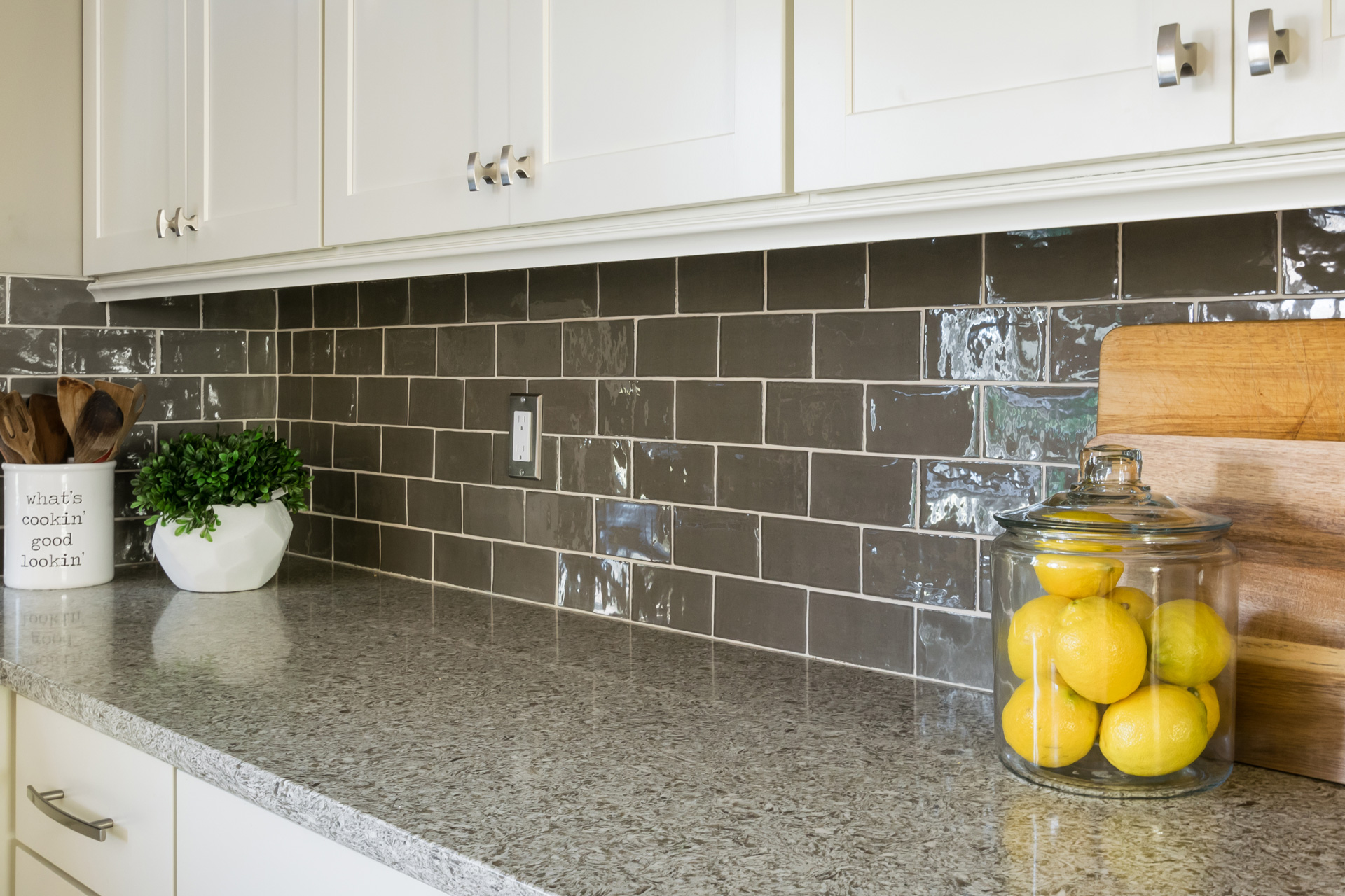
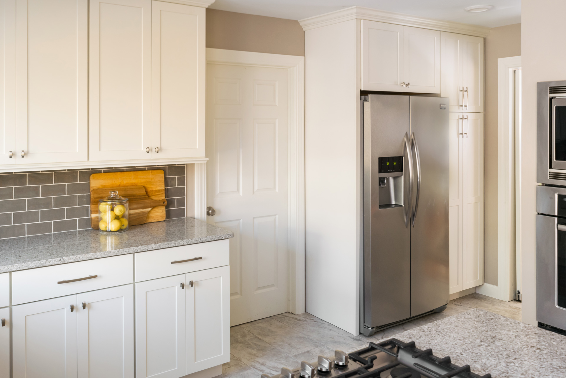
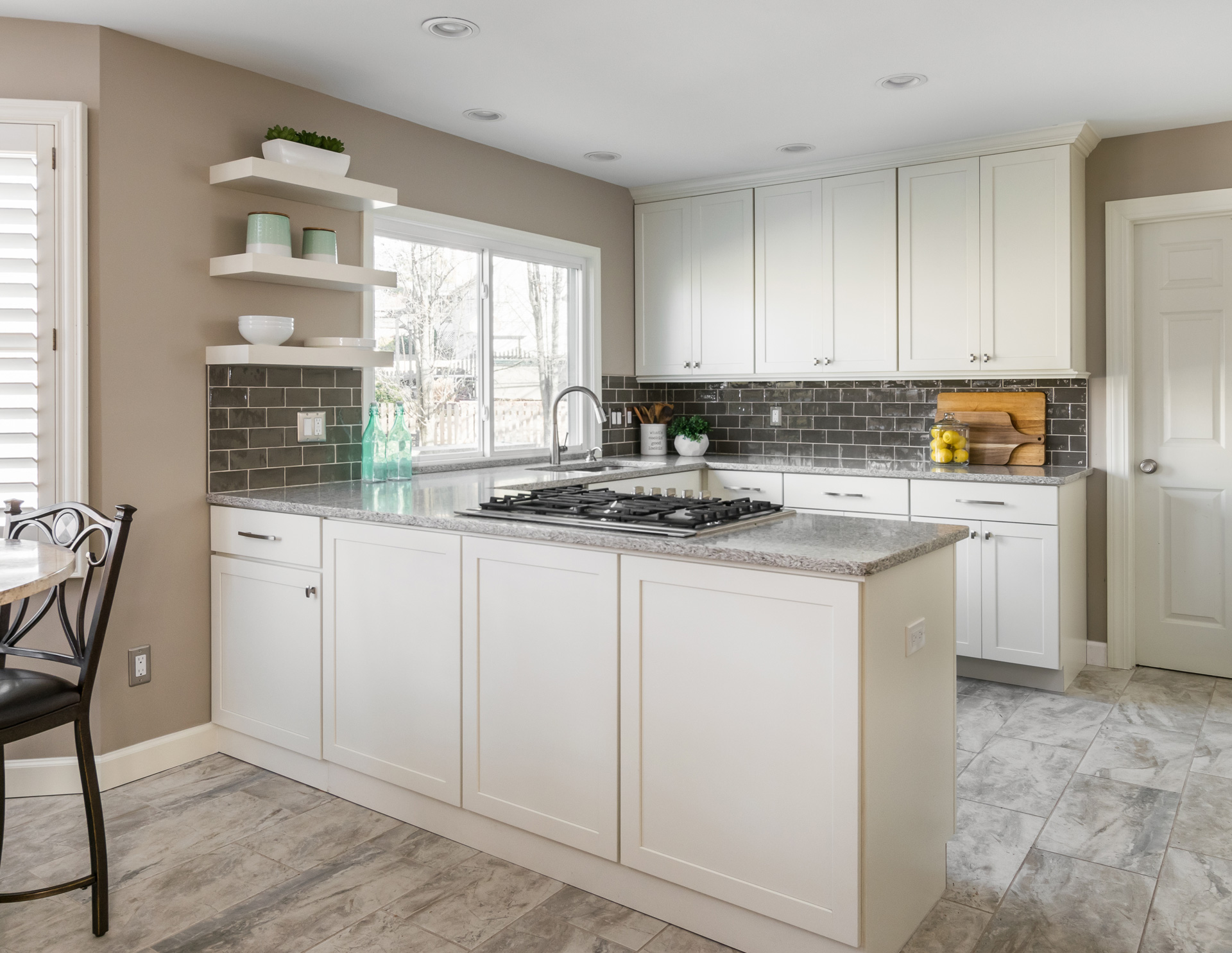
This project was all about the floor! The homeowner's could no longer live with their 1980's tile and its pinkish hue and the only way to replace it was to replace the whole kitchen. The kitchen felt small before- there were soffits above the upper cabinets and the placement of the refrigerator restricted counter space. My clients wanted more storage, more work space, and for it to feel bright and fresh. We removed the soffits and took the cabinets to the ceiling, which instantly makes the room feel larger and allows for more storage. We moved the refrigerator to the other side of the mudroom door to free up space for more cabinets and countertop space and paired it with a pantry cabinet for even more added storage. We wanted to keep the traditional feel of the rest of their home, but incorporate cleaner, more modern lines, so we chose a shaker style cabinet, but in a warmer white, and paired it with a rich taupe subway tile that has a handmade look to it. The clients are now in love with their floor! We chose a porcelain tile that has a more traditional texture and pattern, but in a light color so that it still feels light and updated. Our clients can now love entertaining family in friends even more in their new updated kitchen!
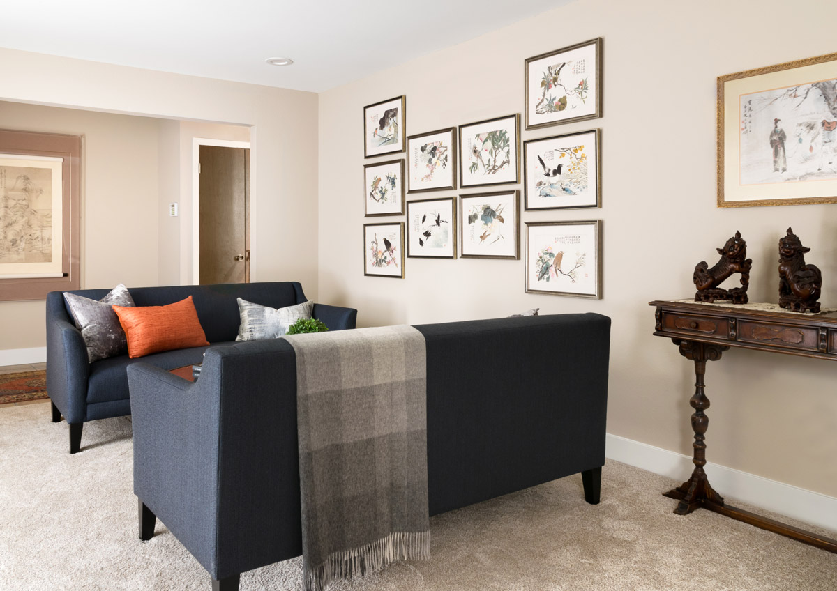
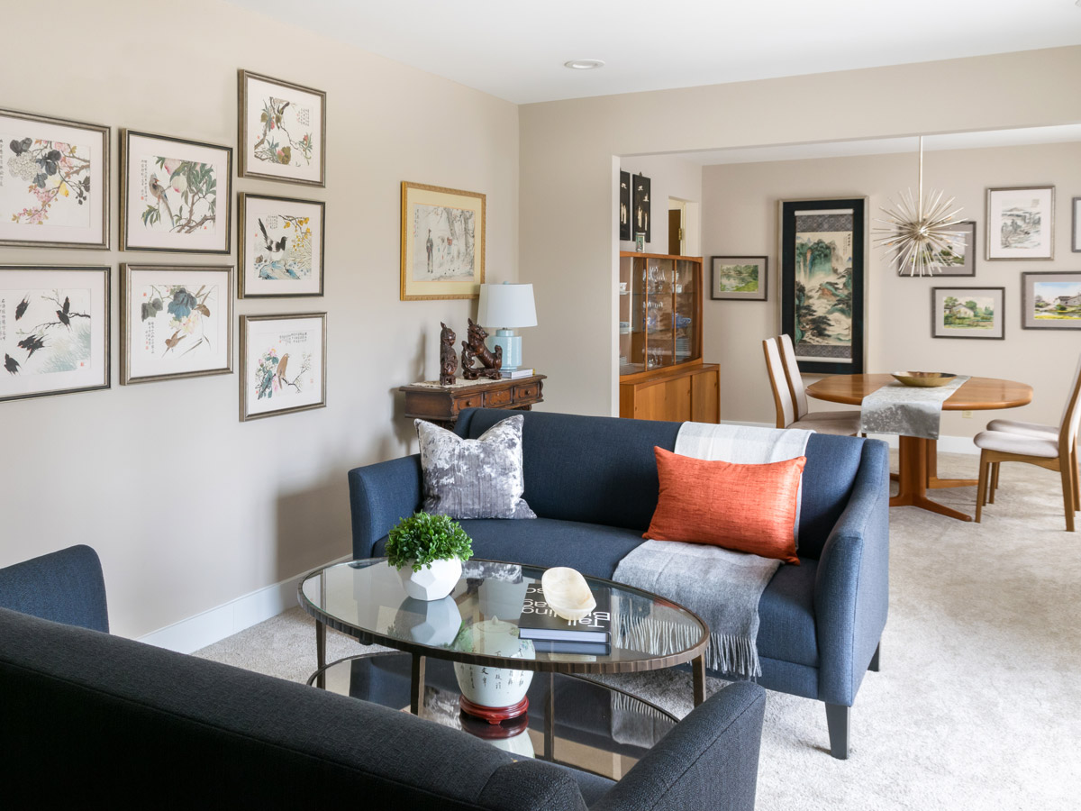
Watercolor Collection Influences Curated Living and Dining Room Spaces
A bright, cozy, interesting space for our homeowners to entertain guests or just curl up and read a book.
Watercolor Collection Influences Curated Living and Dining Room Spaces
St. Louis, Missouri, 2017
DESIGNERS:
Rochelle McAvin
Jennifer Chapman
PHOTOGRAPHER:
Karen Palmer Photography
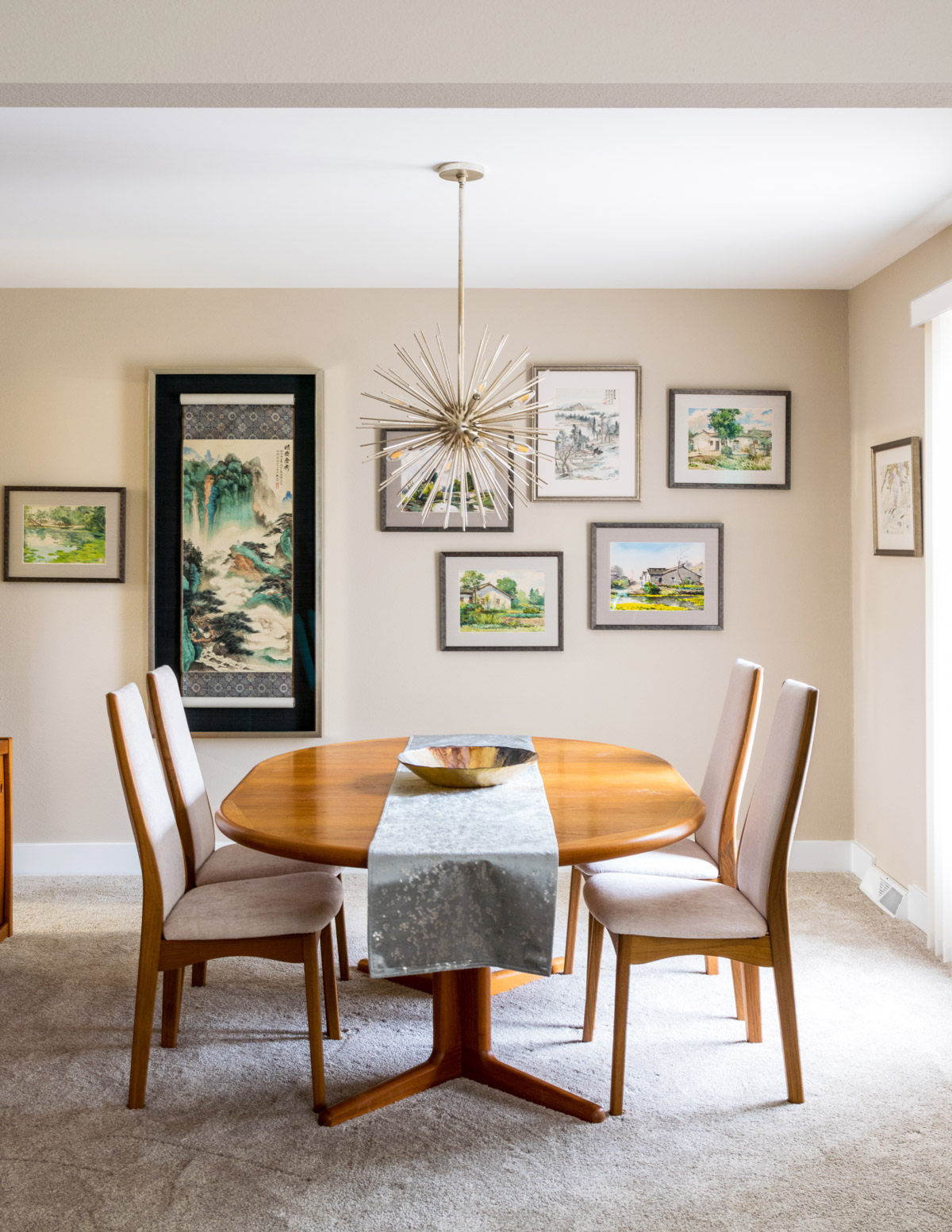
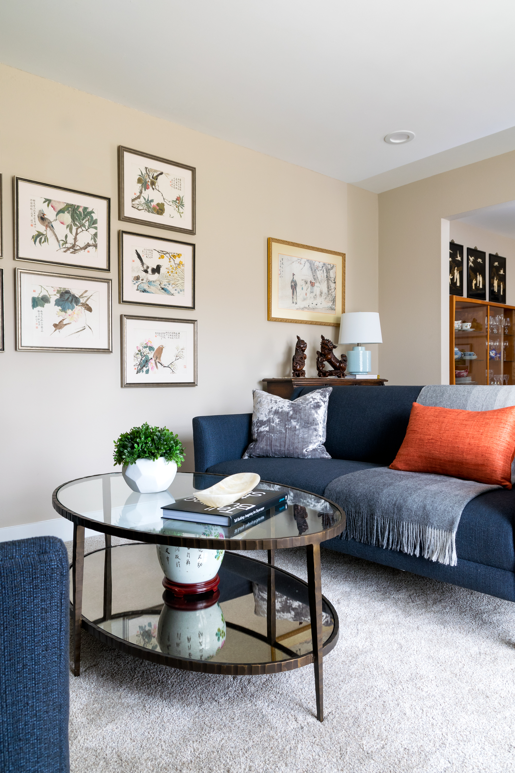
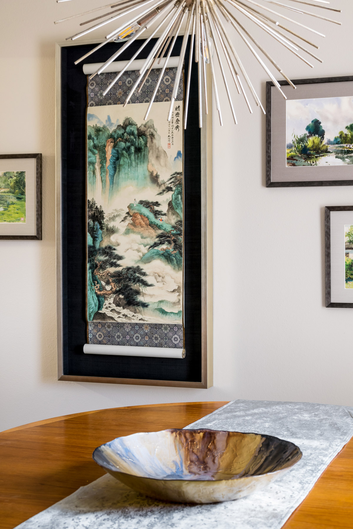
Our clients wanted to address several things in their formal living and dining room. They needed new furniture to mix with their existing pieces for an instant update, they wanted the two spaces to connect and allow for entertaining friends and family and most importantly they wanted to showcase their spectacular artwork.
The goal was to marry their mid century modern style with the Asian influence in some of their existing furniture and artwork. We wanted each artwork display to feel like a curated collection so we had the idea to create two focal gallery walls. We worked with a local framing company to help us be creative with the framing and preservation of the pieces. We rearranged the seating in the living room and chose sofas with clean lines so as to not distract from the artwork. The new coffee table, updated chandelier, and accessories complement the vibrant colors in the watercolors. The result is a bright, cozy, interesting space for our homeowners to entertain guests or just curl up and read a book.
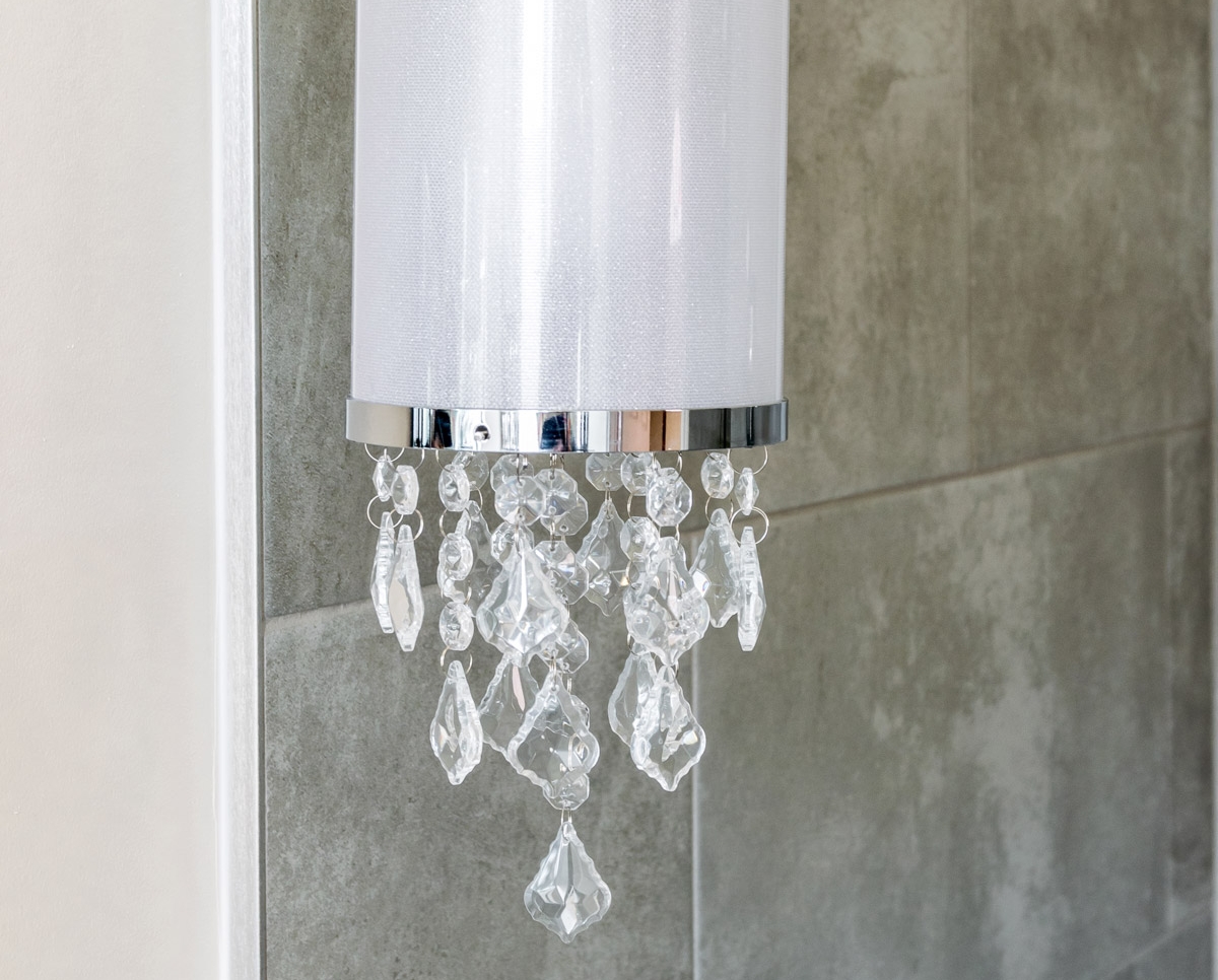
Efficient Design Maximizes Small Bathroom in Historic Home
Our client had a tiny bathroom that had been carved out of the kitchen in their 100 year old home.
Efficient Design Maximizes Small Bathroom in Historic Home
2017
DESIGNER:
Rochelle McAvin
PHOTOGRAPHER:
Karen Palmer Photography
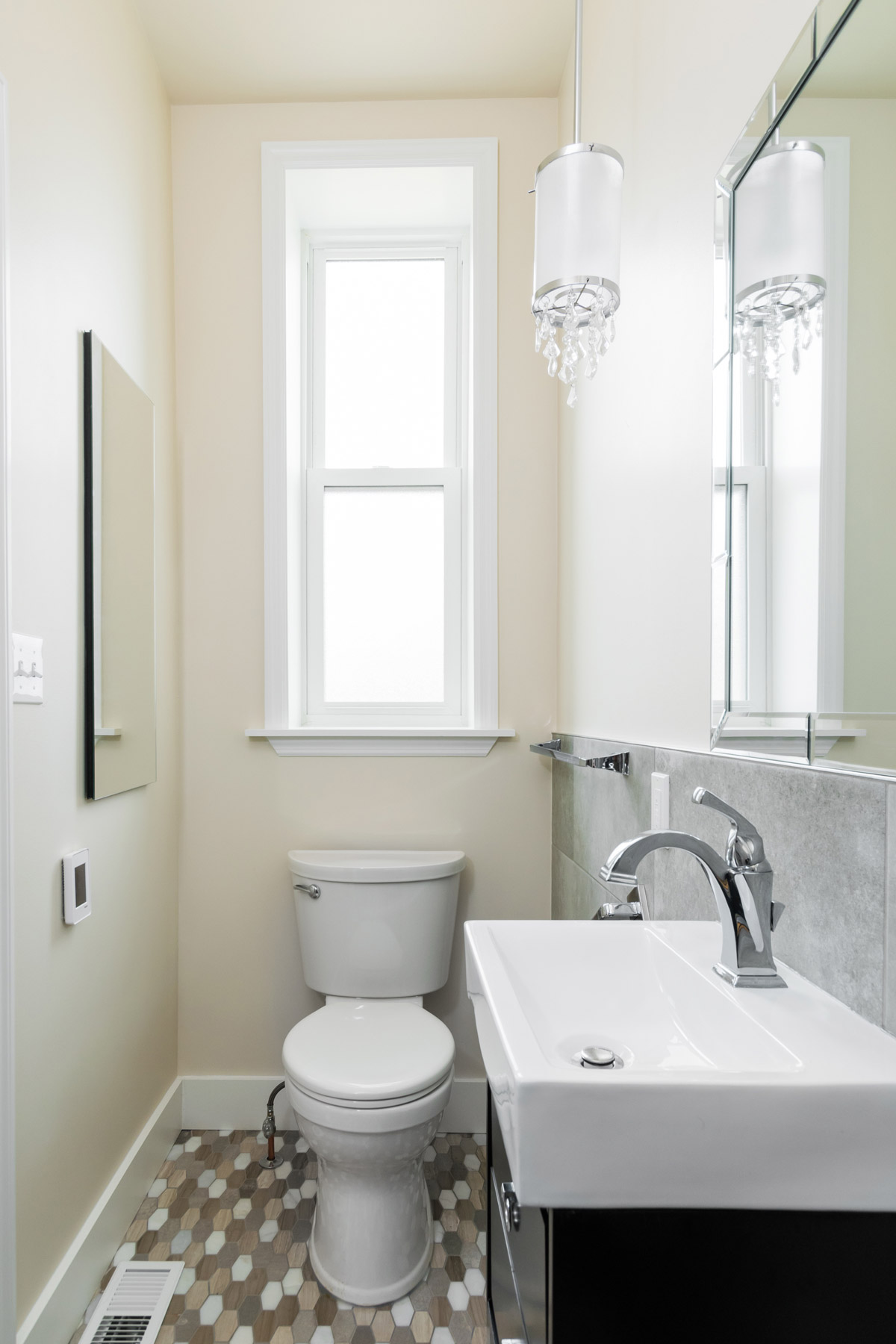
Our client had a tiny bathroom that had been carved out of the kitchen in their 100 year old home. They had modern updates throughout and when their mother in law moved in - they updated the first floor bathroom just for her.
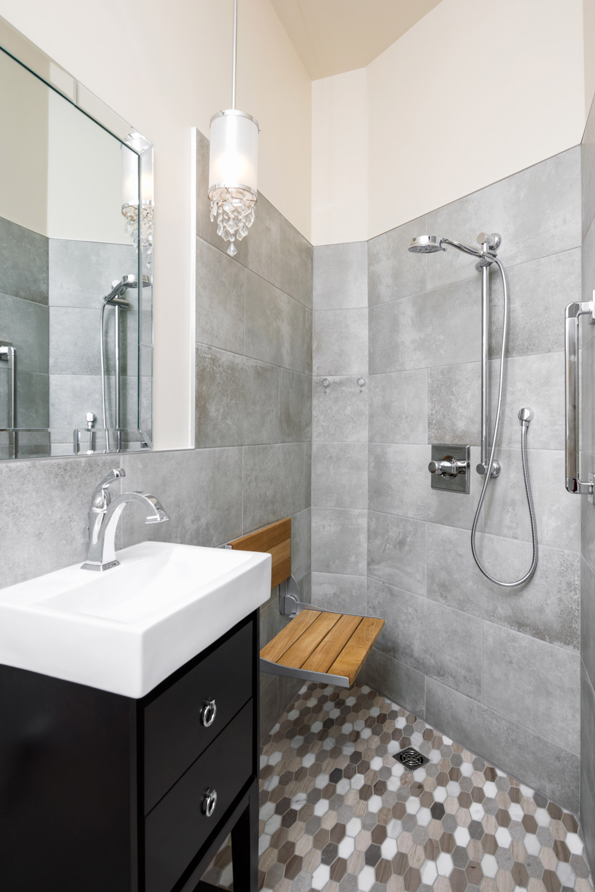
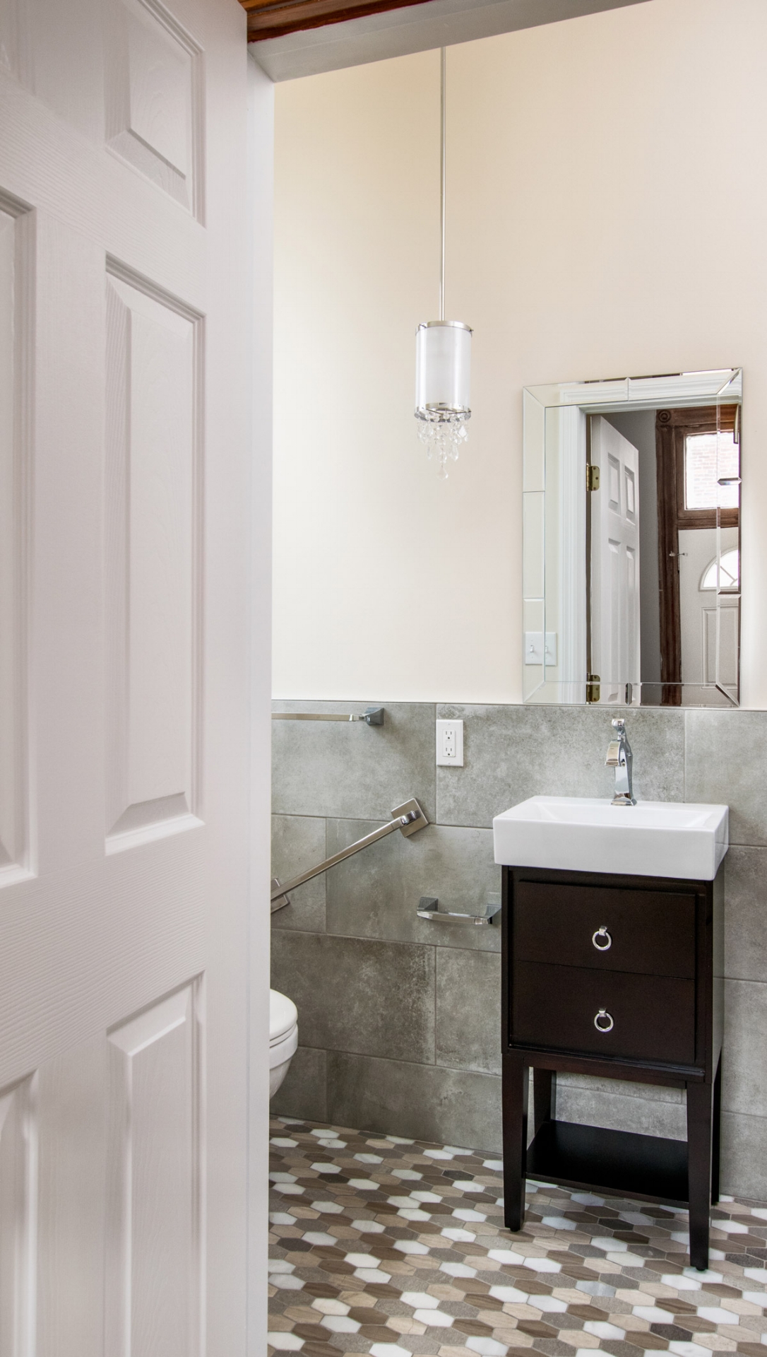
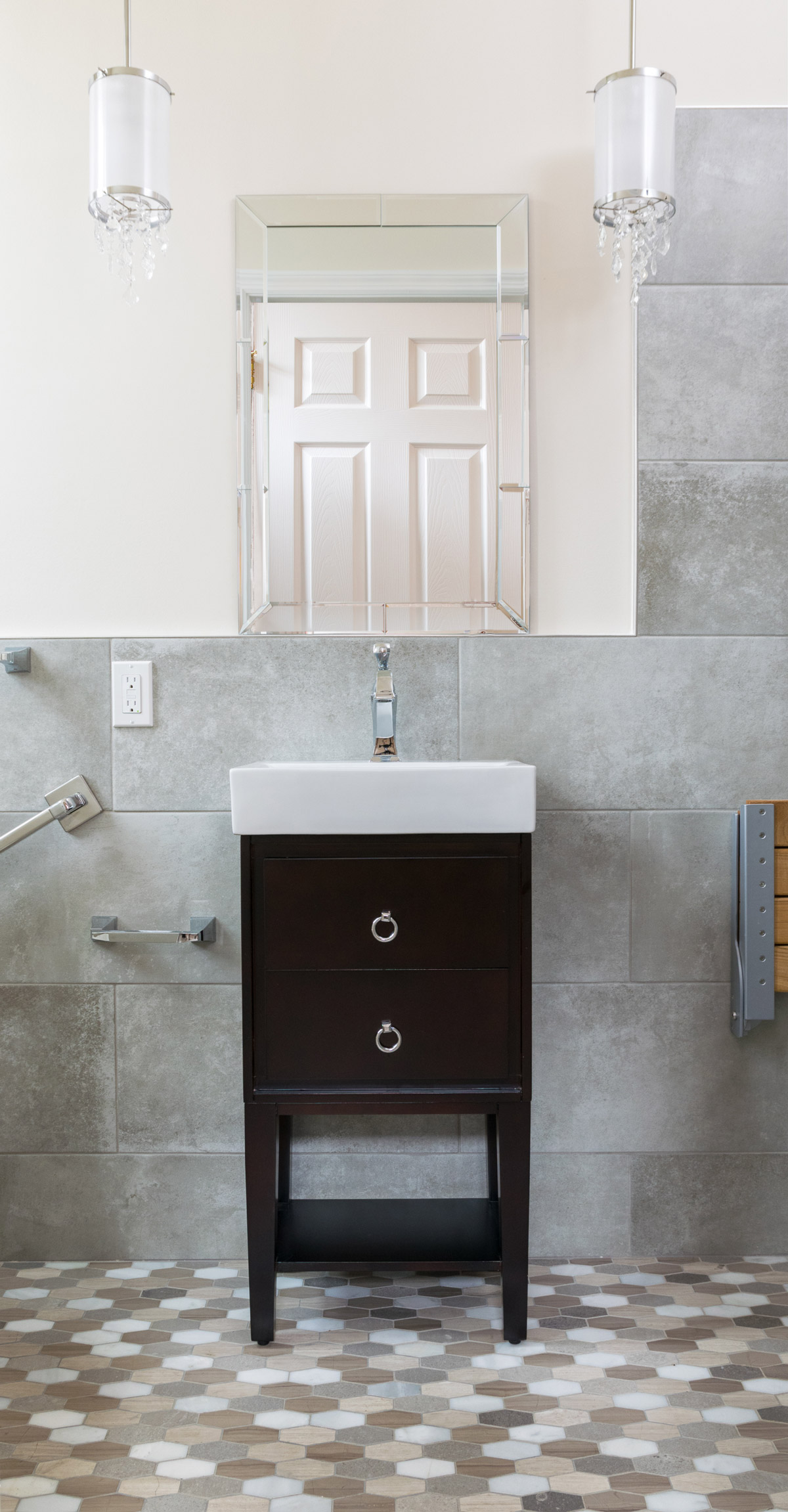
She loved the modern, elongated hex floor tile that featured multiple shades of natural stone. We built the color palette from the ground up using a concrete wall tile to keep with the on trend look flowing through the rest of the home.
This bathroom had two primary needs: storage and to assist with aging in place. We have multiple grab bars, coordinating with the plumbing, a teak fold down shower seat and a zero entry shower floor. The 15" wide vanity has two functioning drawers that are perfect for additional, everyday storage.
The best part is what you cannot see; storage recessed into the walls and as an added bonus, we have heated floors.
The result is a neutral, warm and efficient space built into 32 square feet
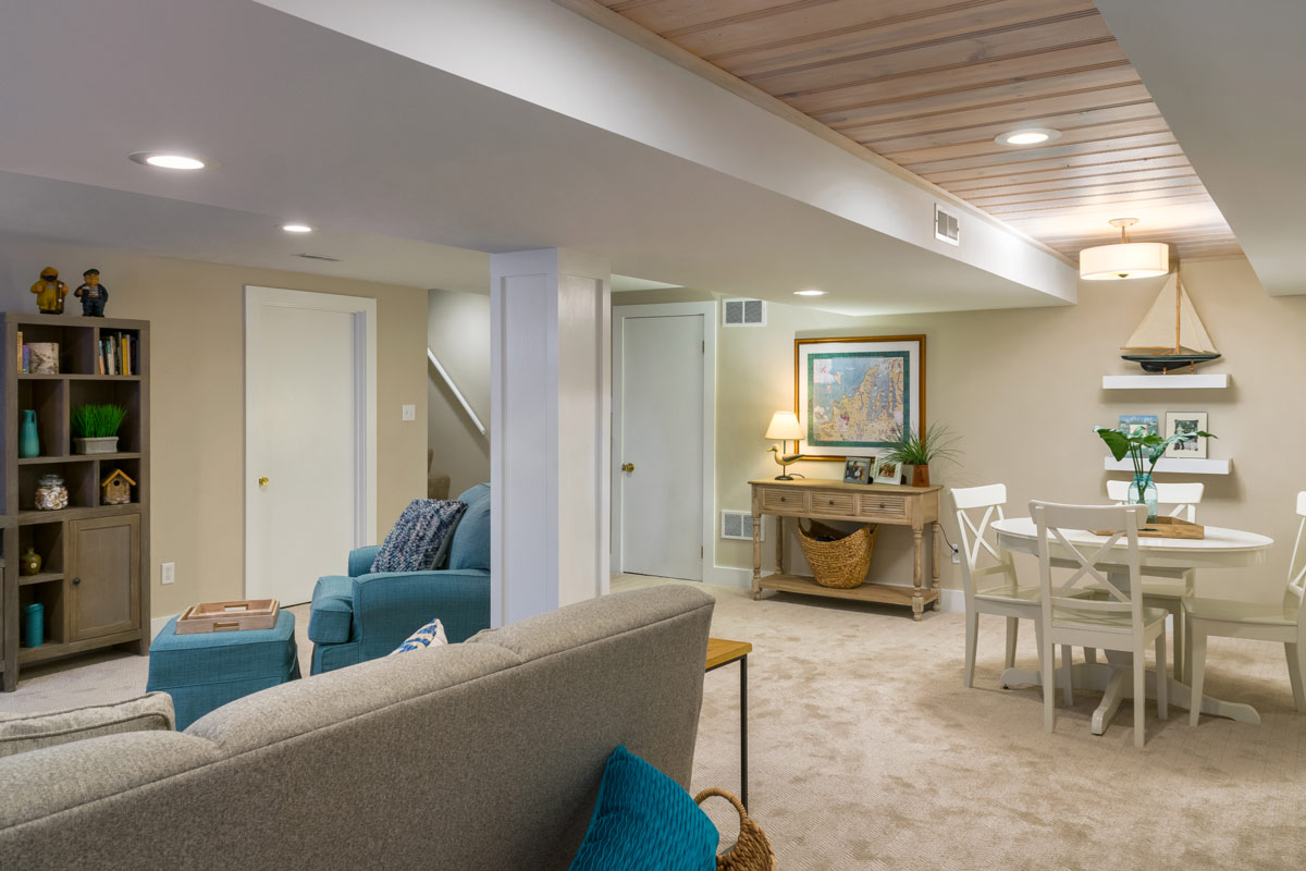
Lake Michigan Inspired Basement
Our client recently moved back from Lake Michigan and we wanted to bring some of that feeling to the remodeled basement.
It went from a dark and dated space to a family friendly room.
Lake Michigan Inspired Basement
2017
DESIGNER:
Rochelle McAvin
PHOTOGRAPHER:
Karen Palmer Photography
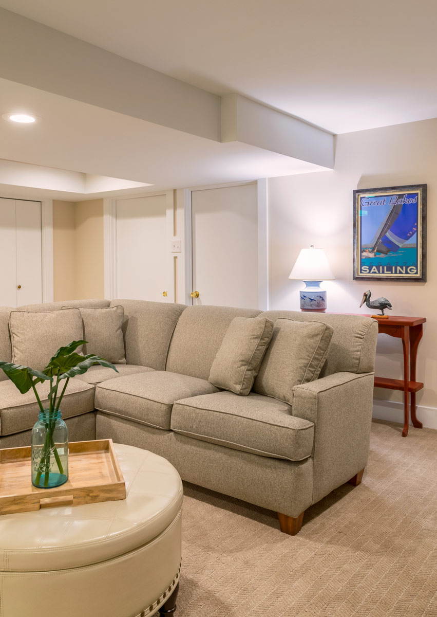
Our client recently moved back from Lake Michigan and we wanted to bring some of that feeling to the remodeled basement.
We removed the original paneling from the walls and saved a piece of it for the ceiling! We painted it with a white wash for a beachy vibe.
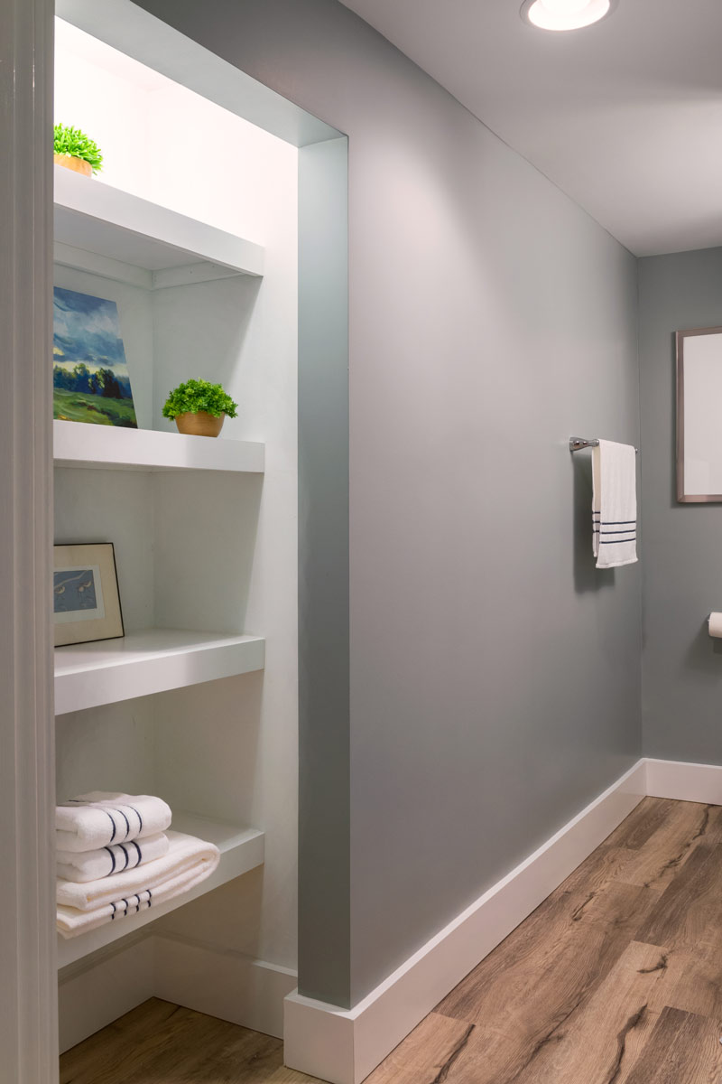
We kept the basement light and bright I adding recessed lighting. In the bathroom we use reclaimed wood on the floor.
It went from a dark and dated space to a family friendly room.
Calming Bathroom Retreat Influenced By Nature
My client loved the idea of a large shower and a warm, natural setting. Inspired by her travels we brought in river rock and soft, neutral tones on the walls and floors.
Calming Bathroom Retreat Influenced By Nature
2017
Chesterfield, MO 63005
DESIGNER:
Rochelle McAvin
PHOTOGRAPHER:
Karen Palmer Photography
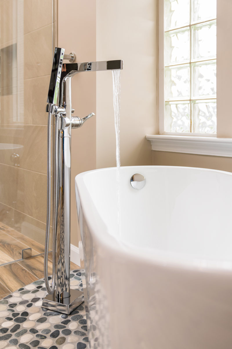
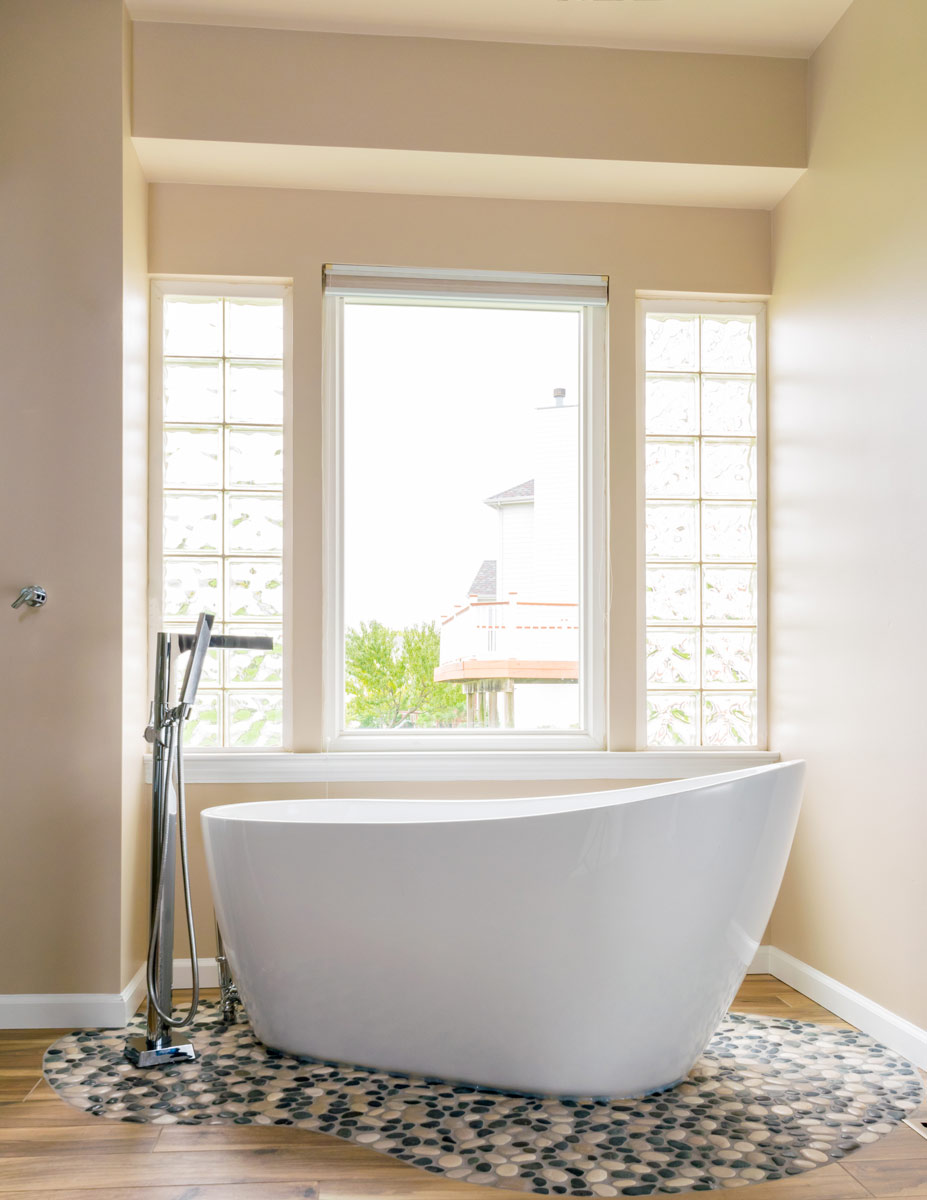
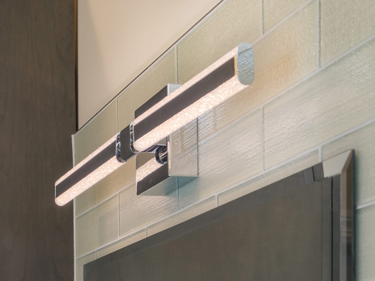
My client loved the idea of a large shower and a warm, natural setting. Inspired by her travels we brought in river rock and soft, neutral tones on the walls and floors. Tile designed to mimic a rustic hardwood floor; runs the length of the sizable bathroom and flows directly into the shower. Bright Chrome fixtures and LED lighting add shine to the space making the glass shower panels gleam in the light. The sculpted bathtub at the window is a perfect place to stop and relax.
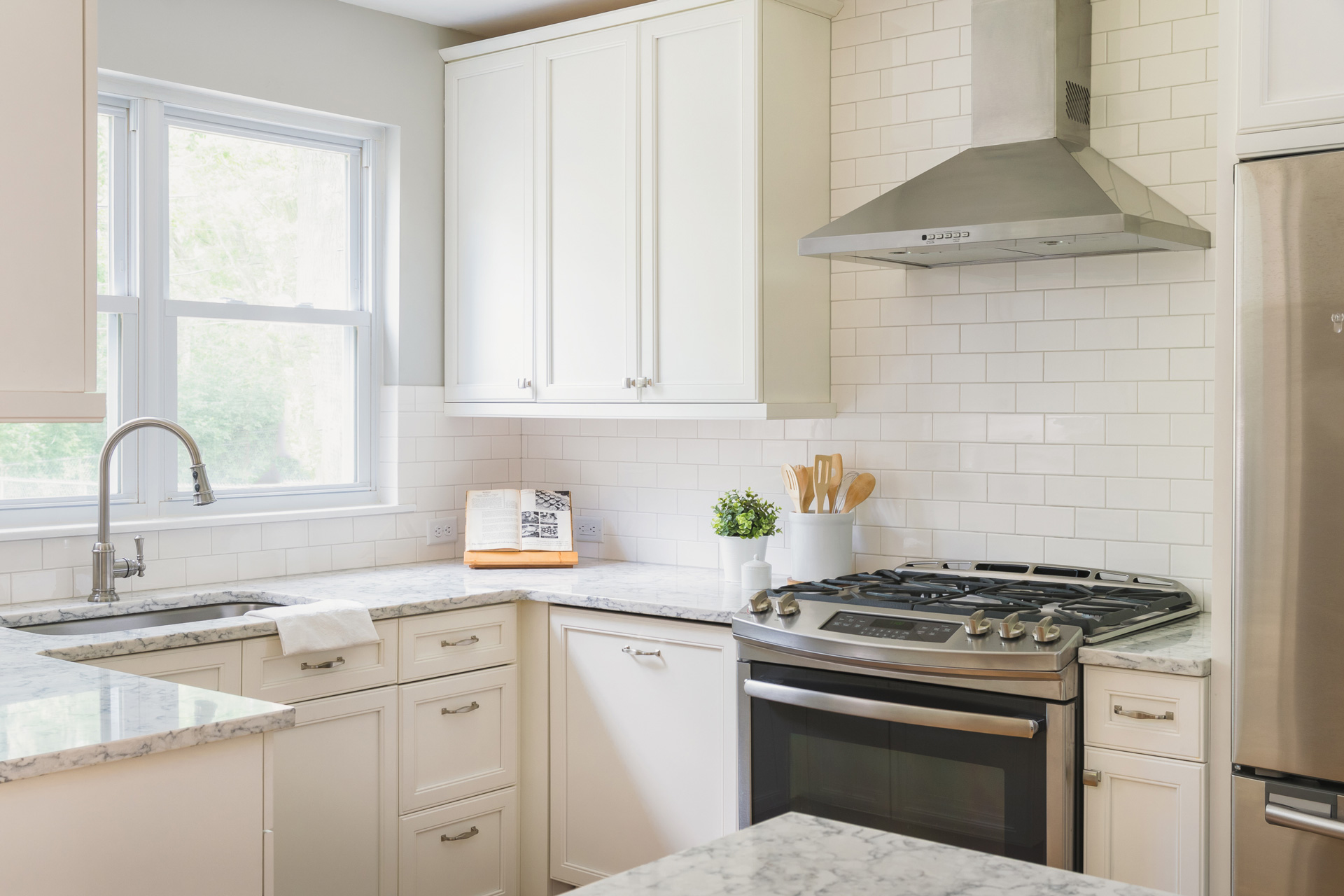
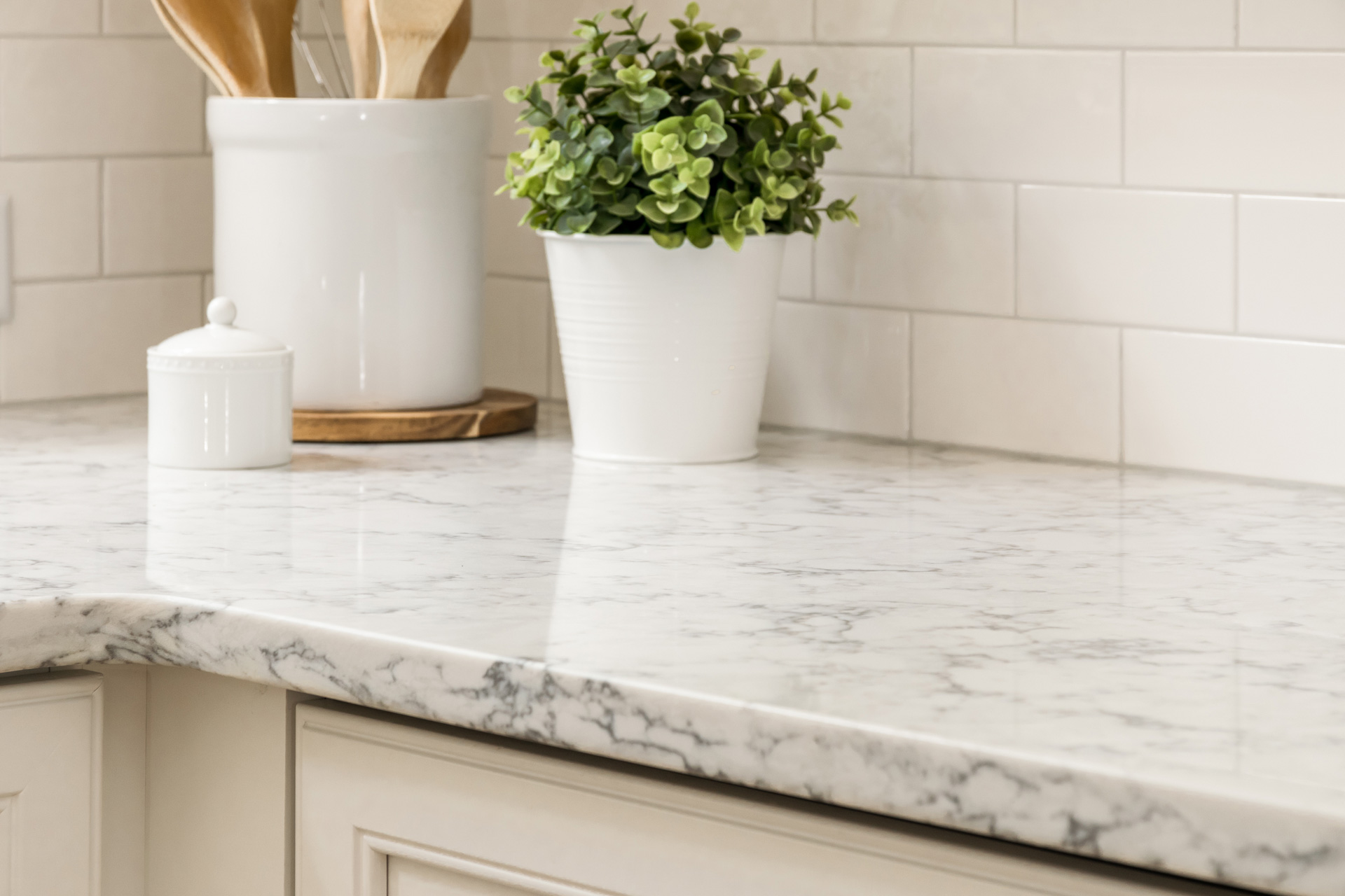
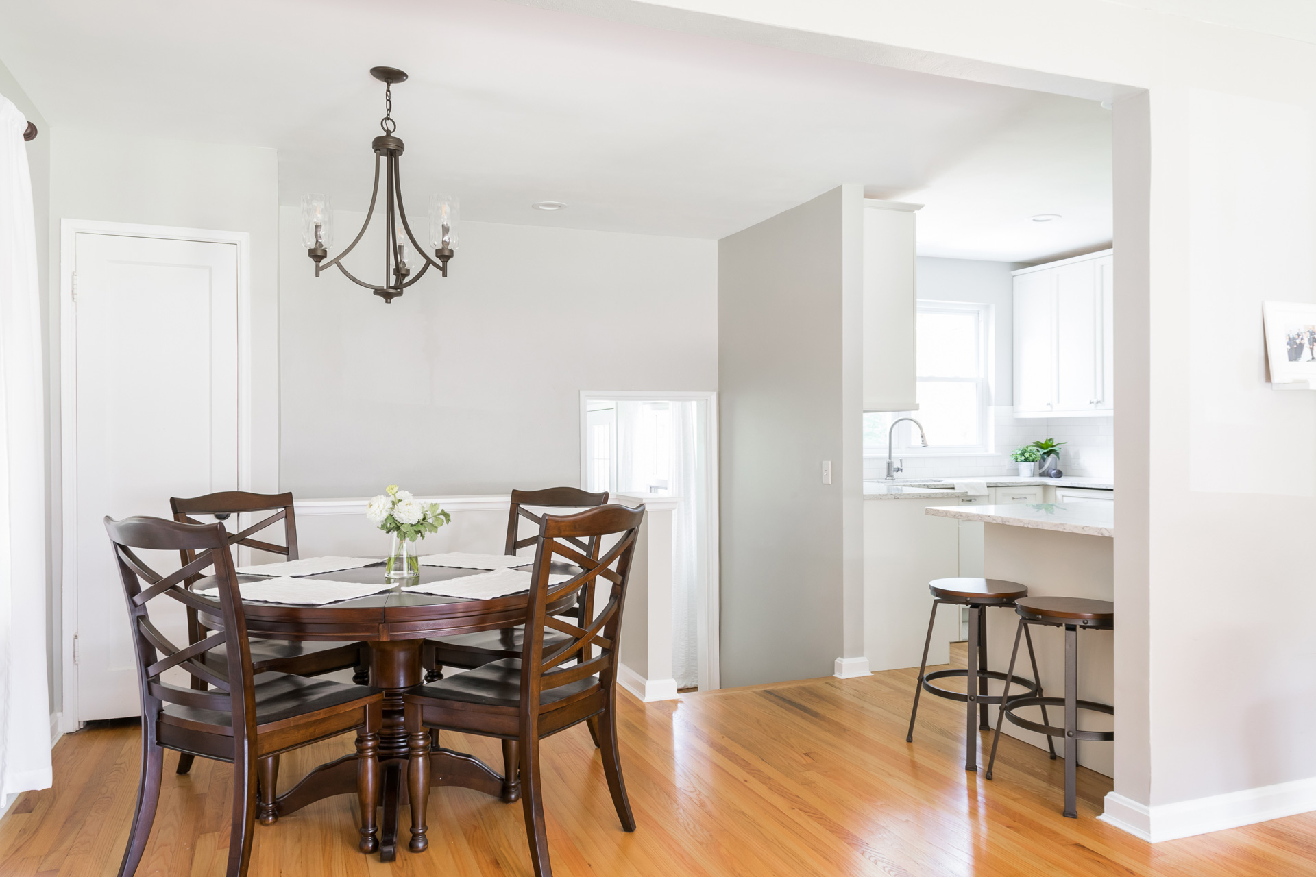
Beautiful and Bright Kitchen Update
Our client had a tight kitchen that was a challenge to update!
We were able to design the kitchen around a bright window that overlooked the patio and backyard. By relocating a door to the basement we were able to double the counterspace and cabinetry.
Beautiful and Bright Kitchen Update
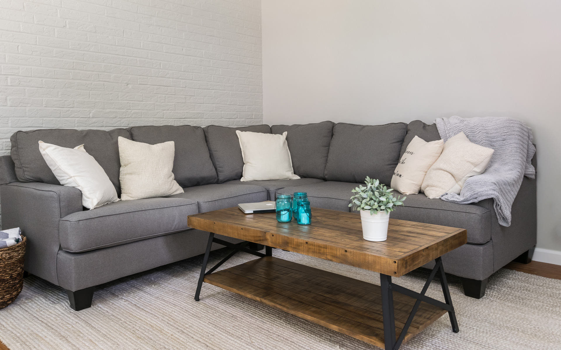
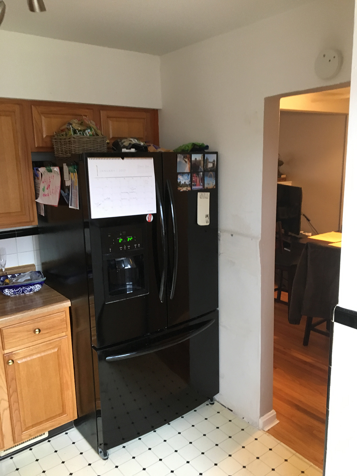
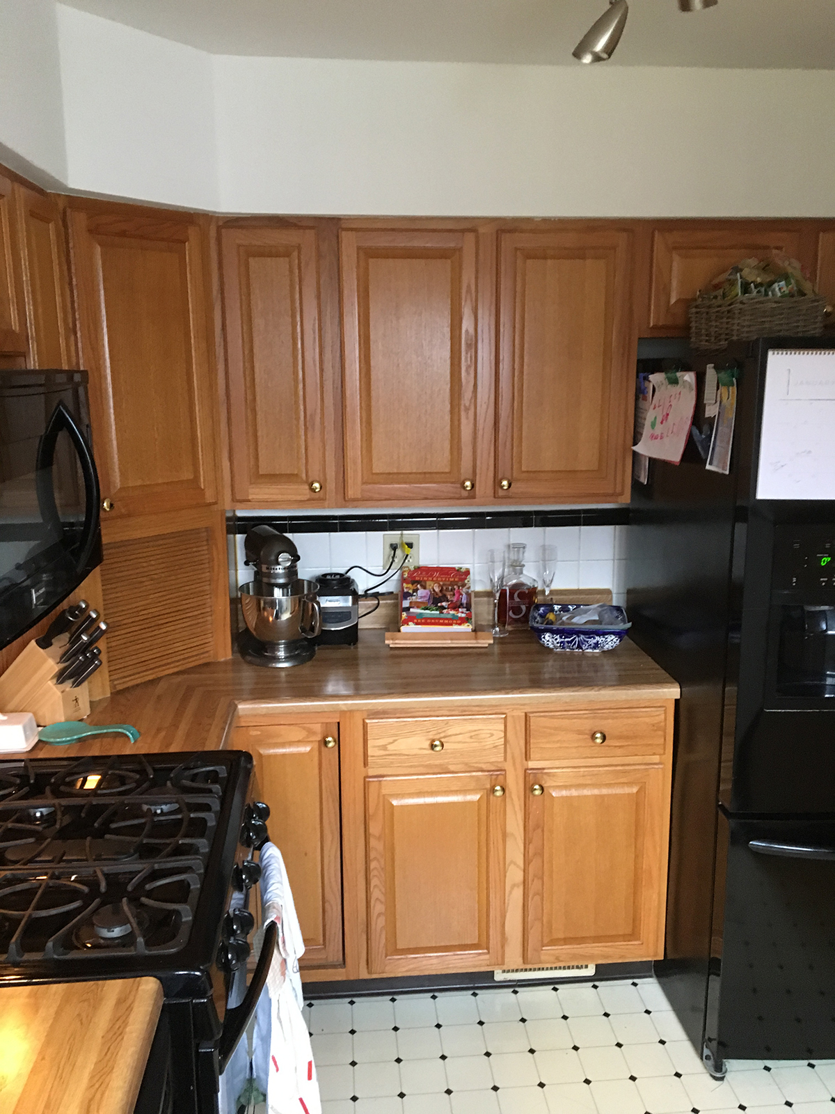
Before
Our client had a tight kitchen that was a challenge to update!
We were able to design the kitchen around a bright window that overlooked the patio and backyard. By relocating a door to the basement we were able to double the counterspace and cabinetry.
This kitchen is now the center of the home! The design is timeless and flooded with natural light.
2017
Webster Groves, MO 63119
DESIGNER:
Rochelle McAvin
PHOTOGRAPHER:
Karen Palmer Photography
Modern Farmhouse Kitchen
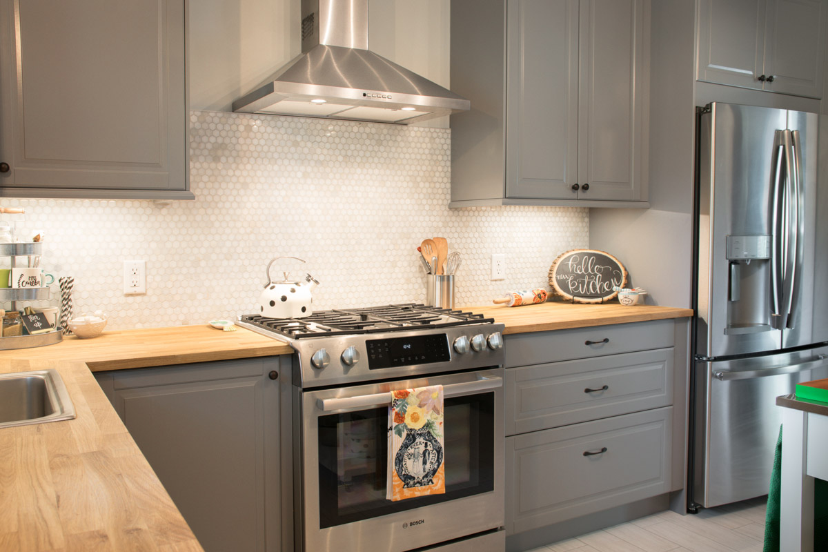
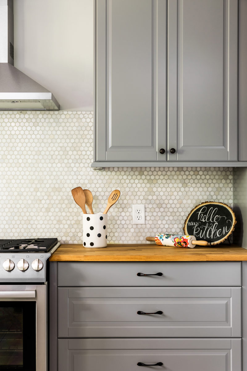
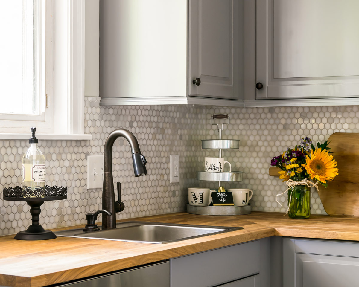
The homeowners were looking to bring their kitchen out of the 1970's and into the 21st century.
Modern Farmhouse Kitchen
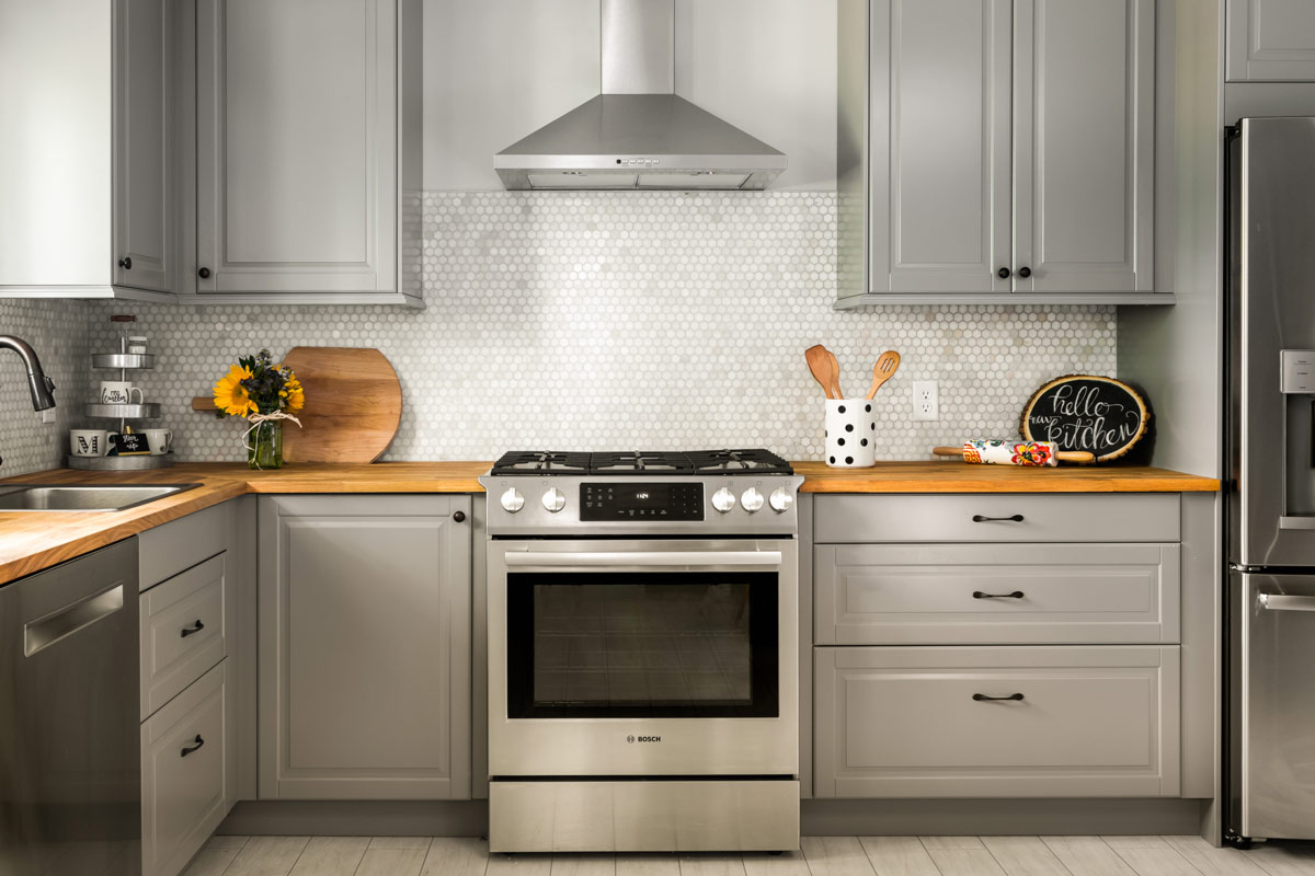
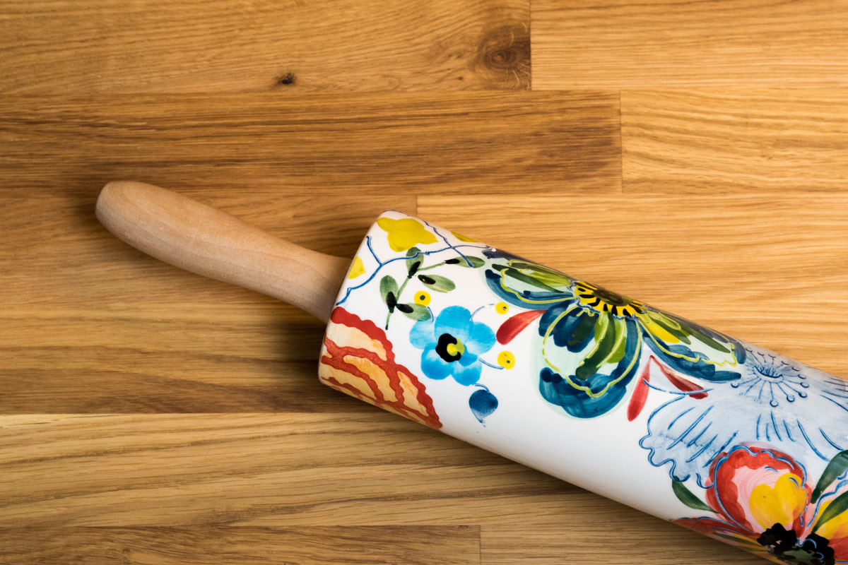
The homeowners were looking to bring their kitchen out of the 1970's and into the 21st century. We removed the soffits and brought the cabinetry to the ceiling, which instantly enlarged the space. The combination of the beautiful marble hexagon backsplash, gray cabinetry, and the warmth of the butcher block countertops gives this kitchen a modern farmhouse vibe.
2017
South St. Louis County
Designer:
Jennifer Chapman
Photographer:
Karen Palmer
Elegant Kirkwood Kitchen
The homeowners loved the idea of a bright and airy kitchen that would function well for their young family. Plenty of storage and an efficient layout make this kitchen a workhorse for meals and family time.
Elegant Kirkwood Kitchen
The homeowners loved the idea of a bright and airy kitchen that would function well for their young family. Plenty of storage and an efficient layout make this kitchen a workhorse for meals and family time. The wavy subway tile creates a watery, elegant backdrop for the Quartzite counter tops and we scaled the sophisticated light fixture to match the size of the custom built island. Window treatments are the final layer, softening the space above the sink and highlighting the windows that overlook the back yard. A perfect family space!
2016
Kirkwood, Missouri
DESIGNER:
Rochelle McAvin
Cabinetry:
Niche Workshops
Photographer:
Karen Palmer Photography
Collected Condo in the Central West End
The architecture of the building serves as the perfect backdrop for the homeowner's extensive collections.
Collected Condo in the Central West End
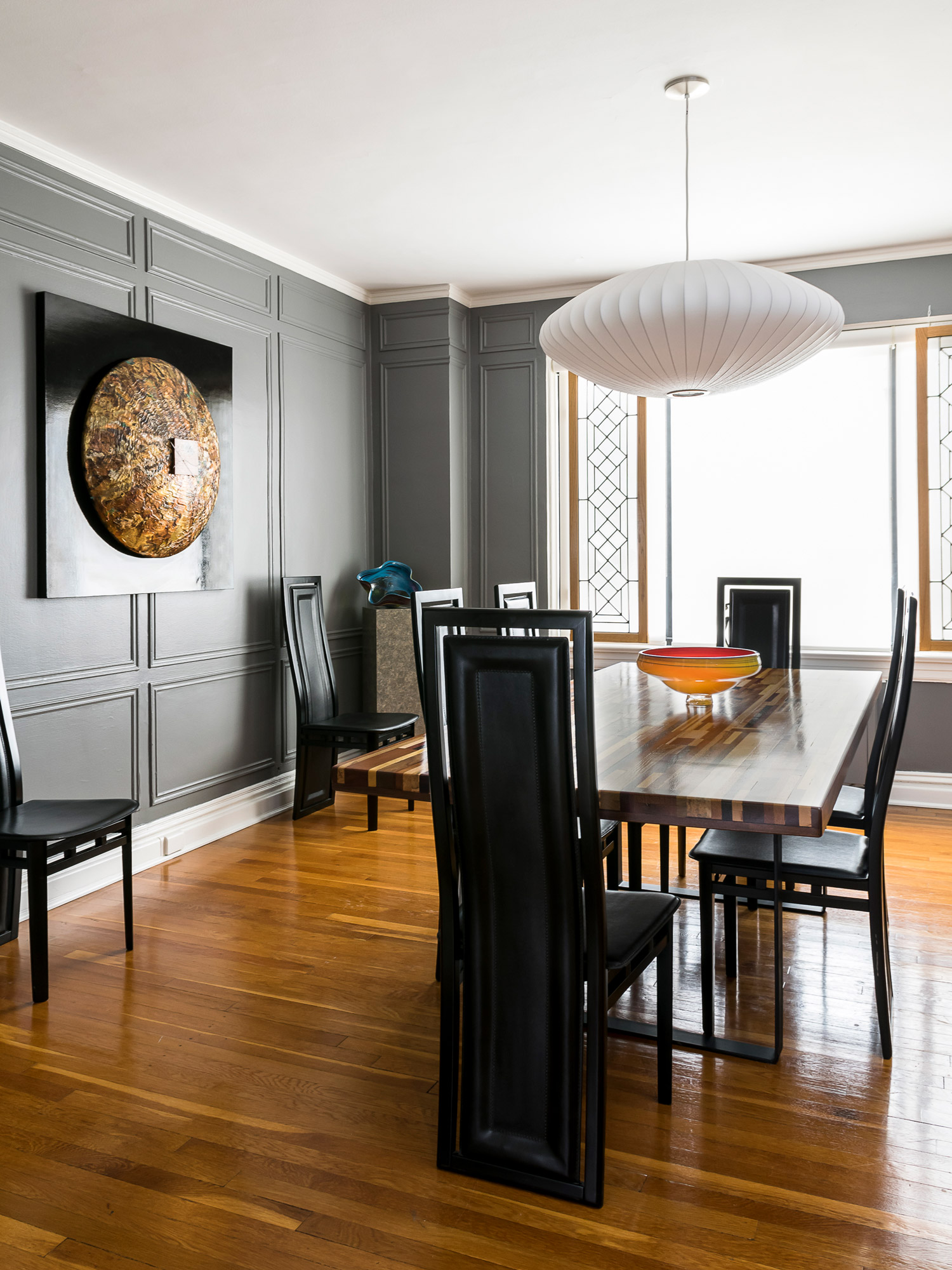
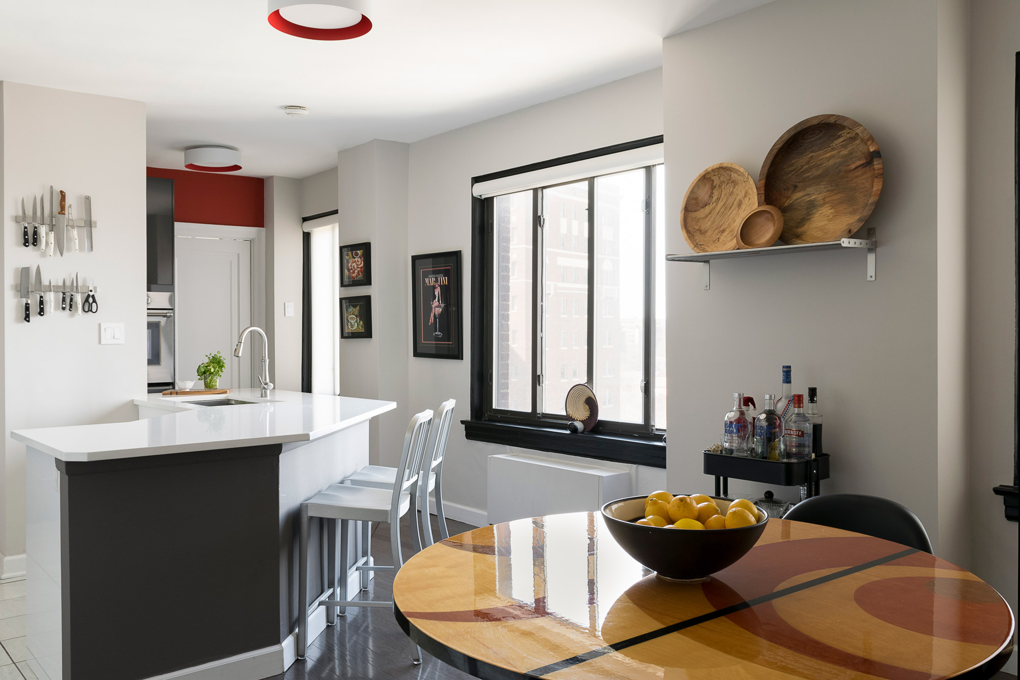
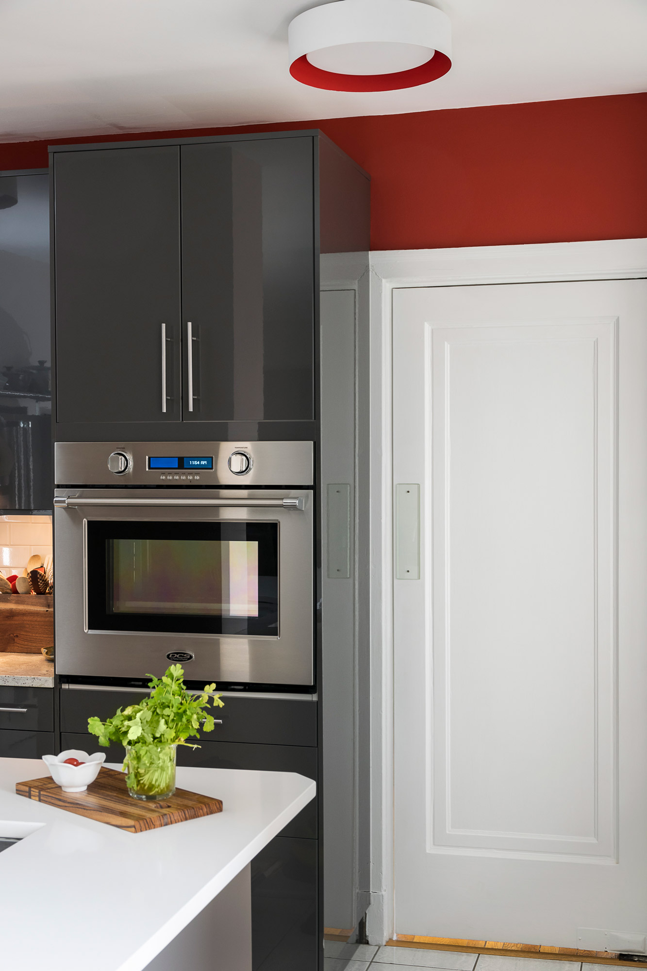
The architecture of the building serves as the perfect backdrop for the homeowner's extensive collections. The paint colors highlight the herringbone tiled floors in the main foyer and the original applied moldings in the dining room create the perfect amount of tension with the modern fixtures and furnishings. A dose of bold color in the kitchen plays perfectly with the grey cabinetry and snow white quartz counter tops.
2016
Central West End, St. Louis, Missouri
DESIGNER:
Rochelle McAvin
Photographer:
Karen Palmer Photography
Cheerful Family Kitchen
Our client fell in love with the cabinetry and quartz counter tops. We built the design from her inspiration.
Cheerful Family Kitchen
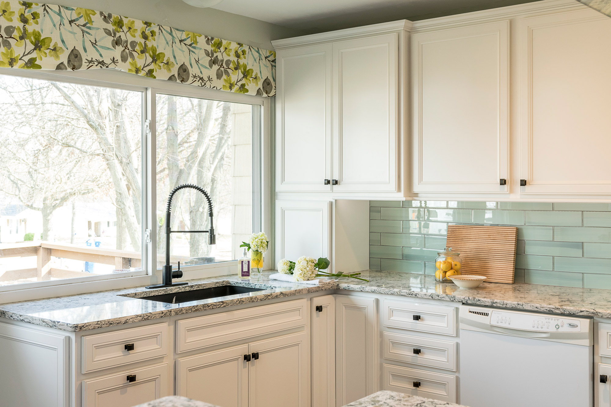
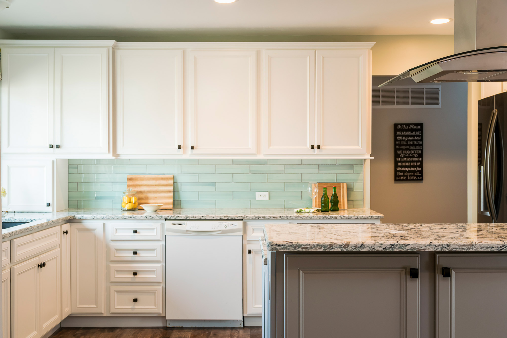
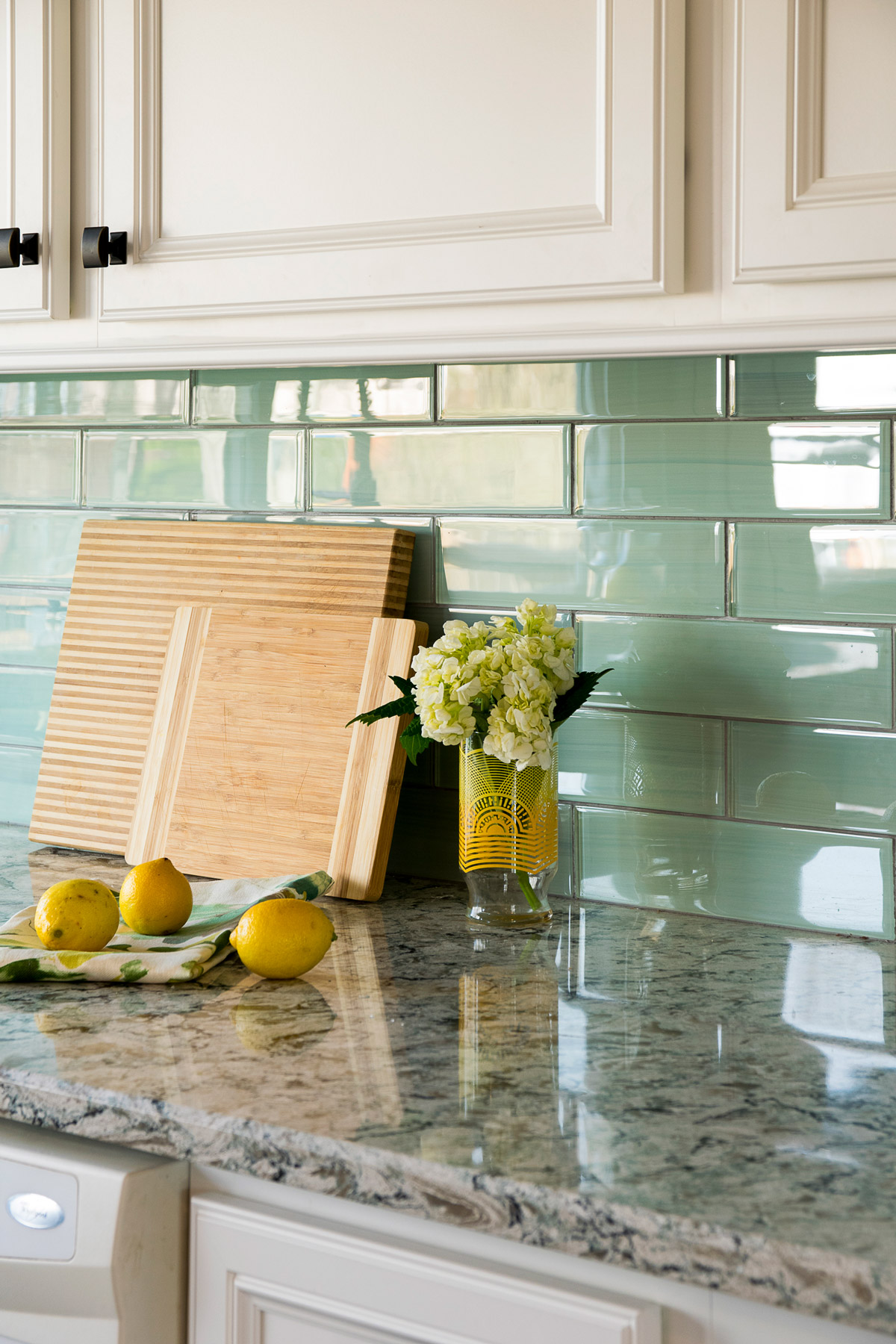
Our client fell in love with the cabinetry and quartz counter tops. We built the design from her inspiration. Light colors and a minty, glass backsplash make the space! Built in storage throughout and expansive counter tops make this kitchen truly efficient.
2016
Ballwin, Missouri
Designer:
Rochelle McAvin
Photographer:
Karen Palmer Photography


