Nashville Workshop & Pool Deck
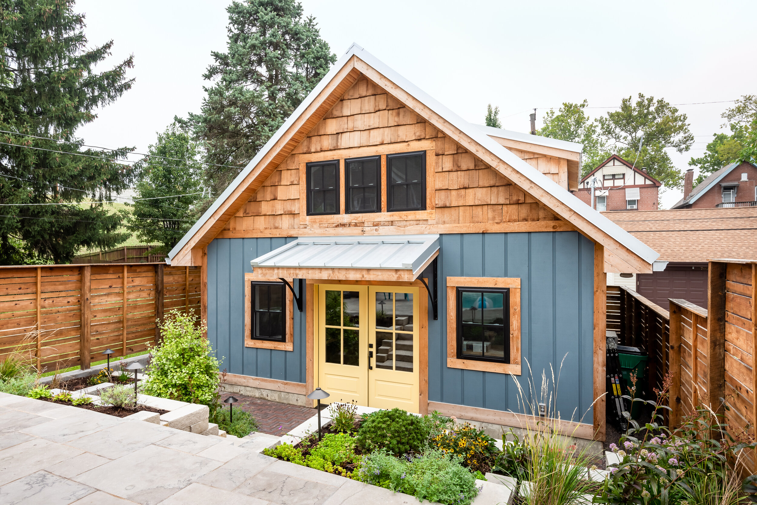
John & Kim contacted LU Design Build to help them design, create and build a custom workshop. They enjoy building, crafting and designing ornaments and furniture of all sorts.

St. Louis, MO
Designer
LU Design Build
Photographer
Karen Palmer Photography
John & Kim contacted LU Design Build to help them design, create and build a custom workshop. They enjoy building, crafting and designing ornaments and furniture of all sorts.
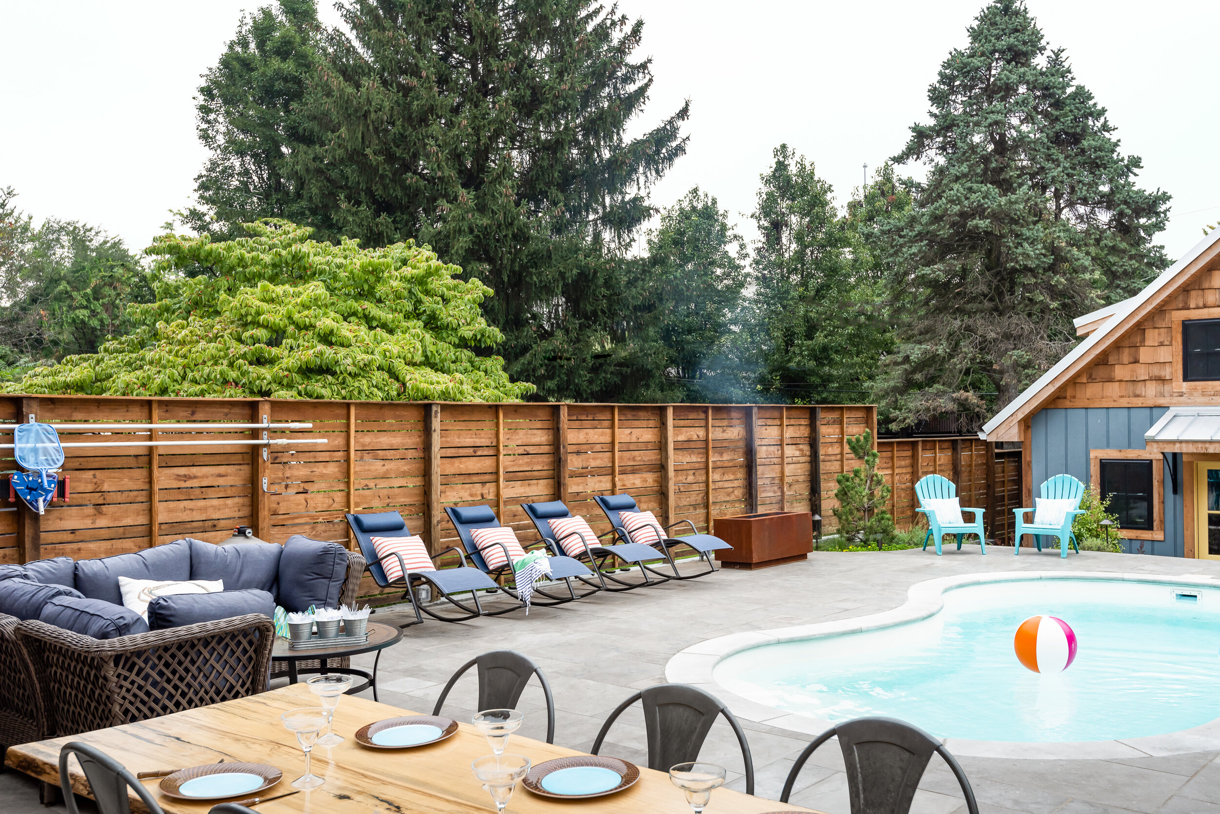
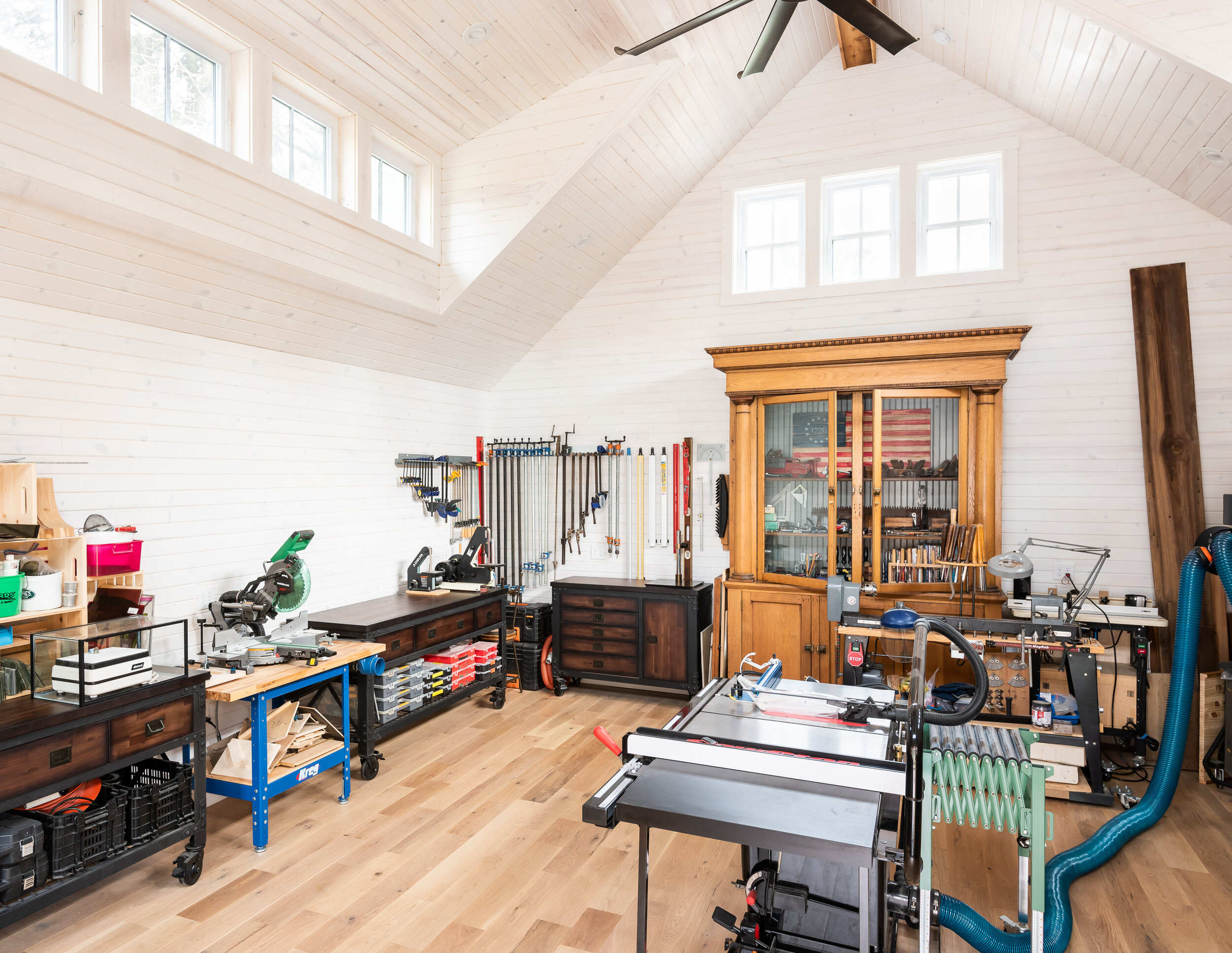
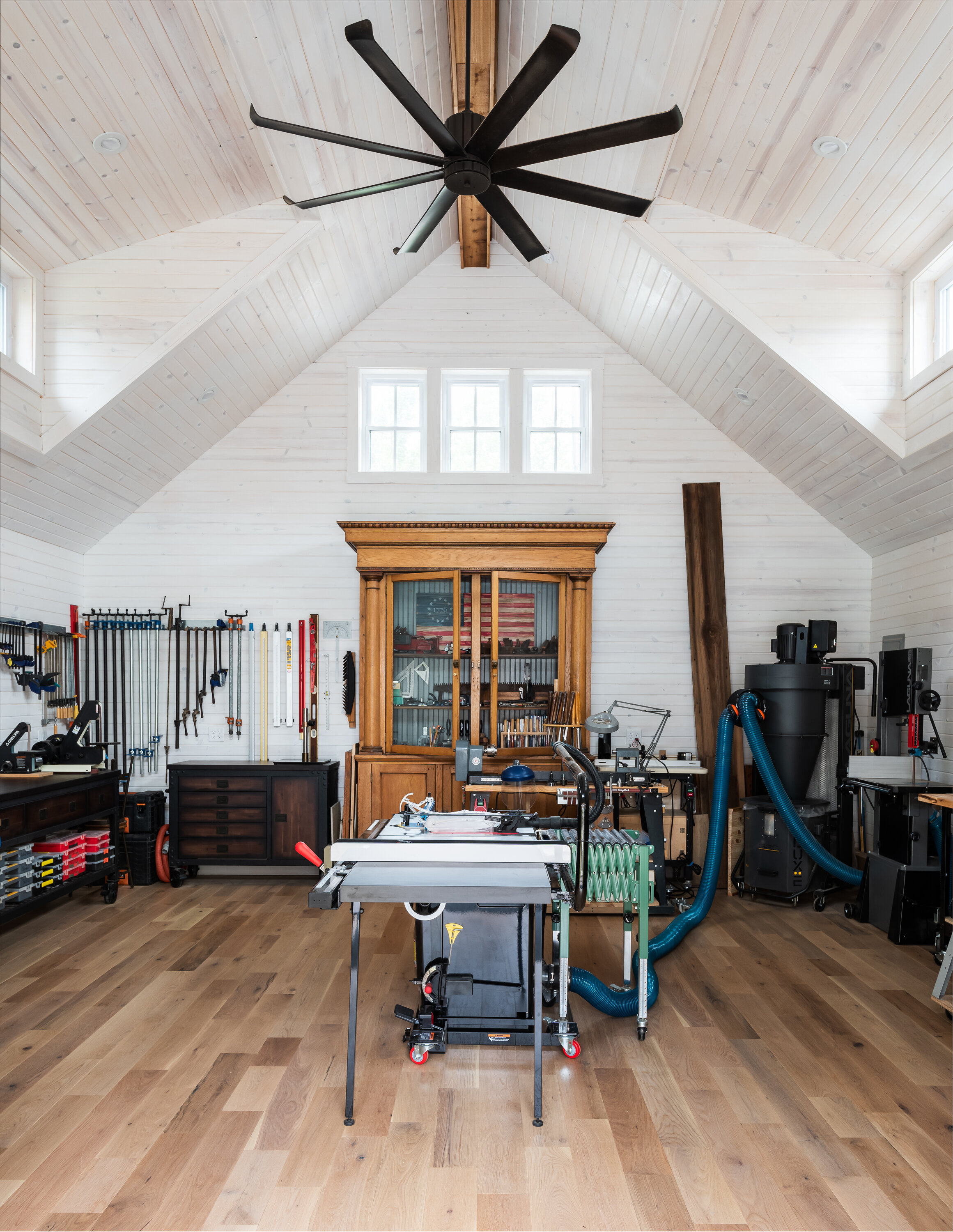
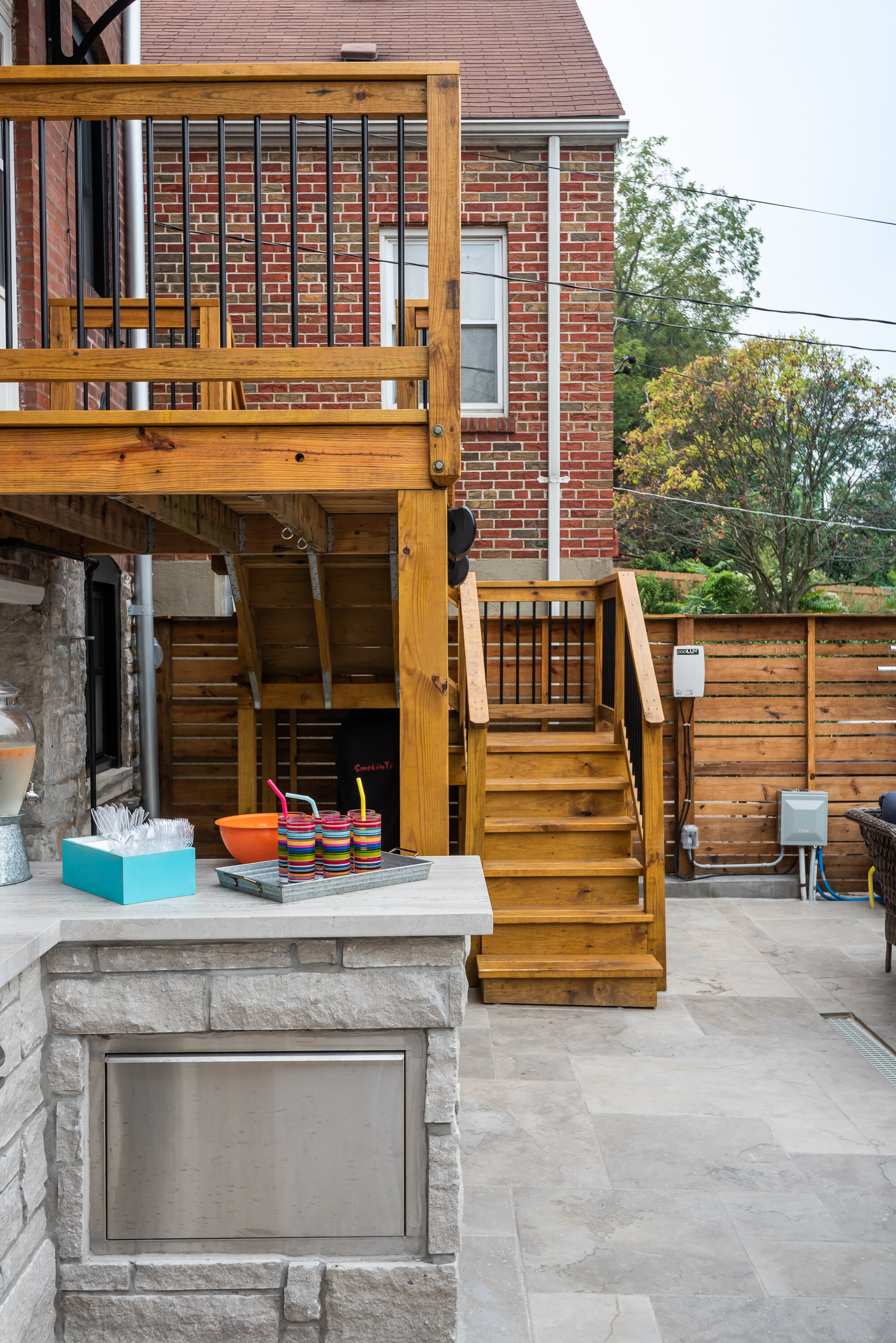
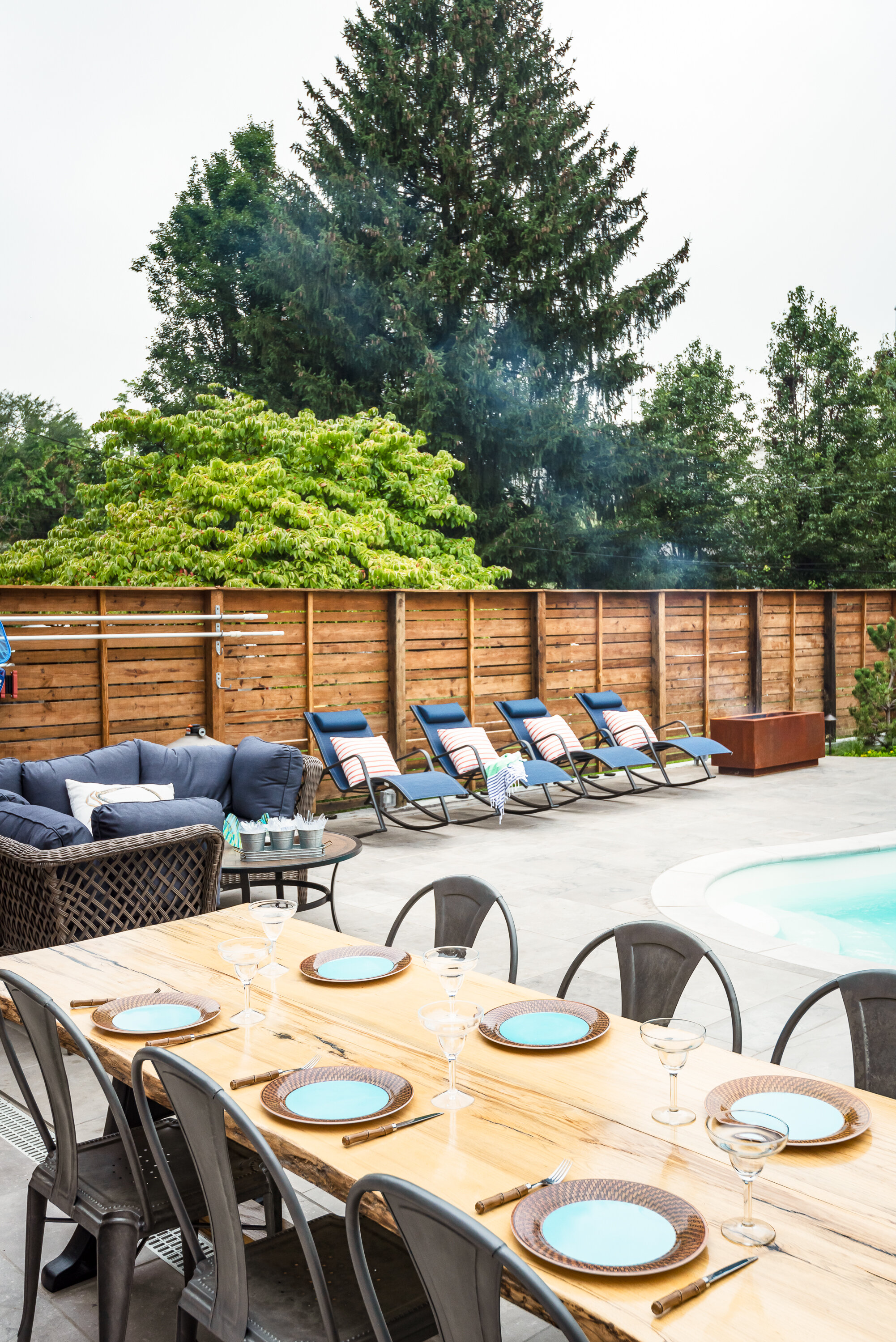
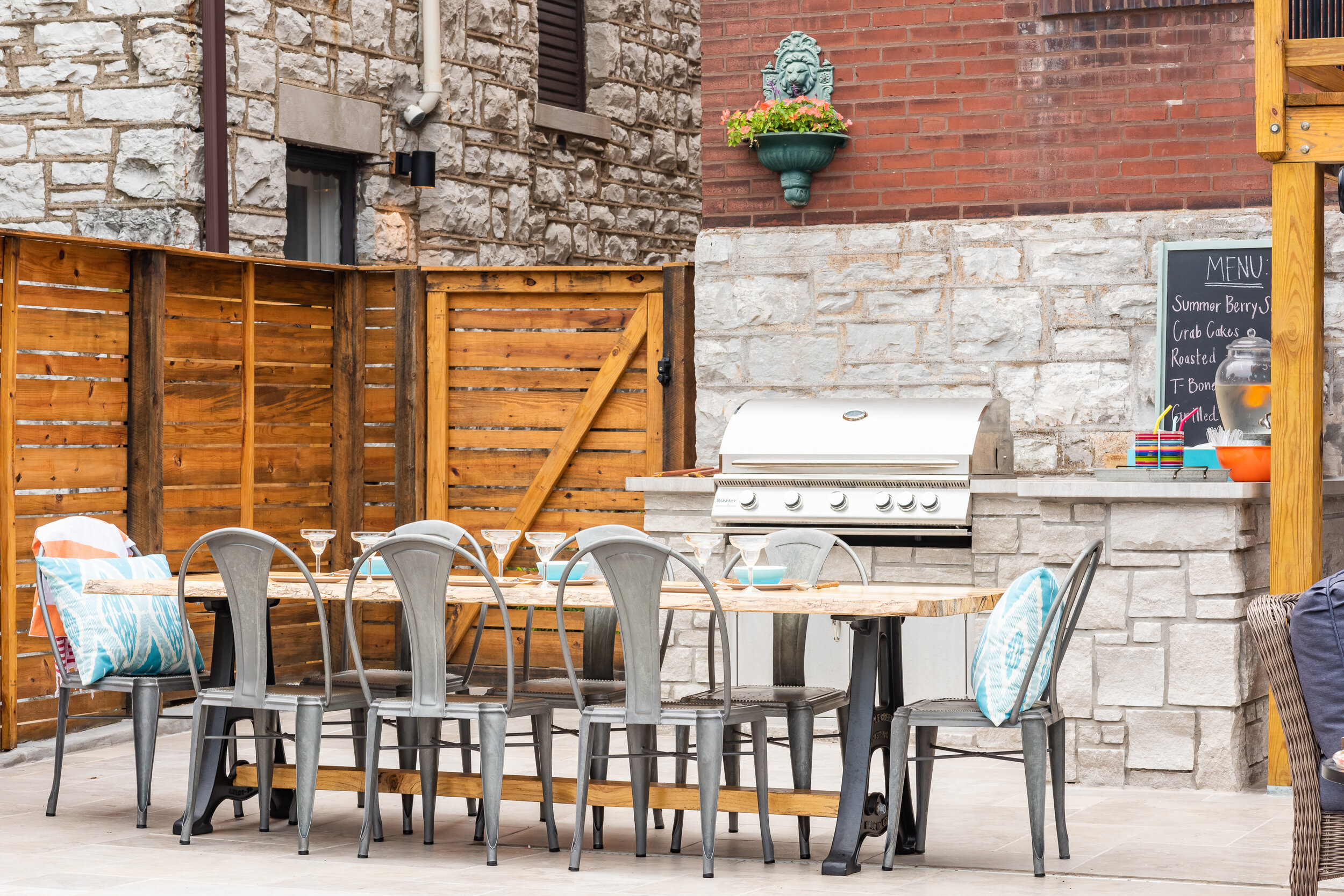
They wanted a nice customized workshop to expand their tools and their abilities to build different and larger type projects. They also wanted to enhance the area around their in-ground pool because this is a favorite part of their home.
For this project, we met with John & Kim and went over their desires for their space and functionality for their workshop and pool area. LU Design Build pulled in a partner architect to help draft the workshop concept.
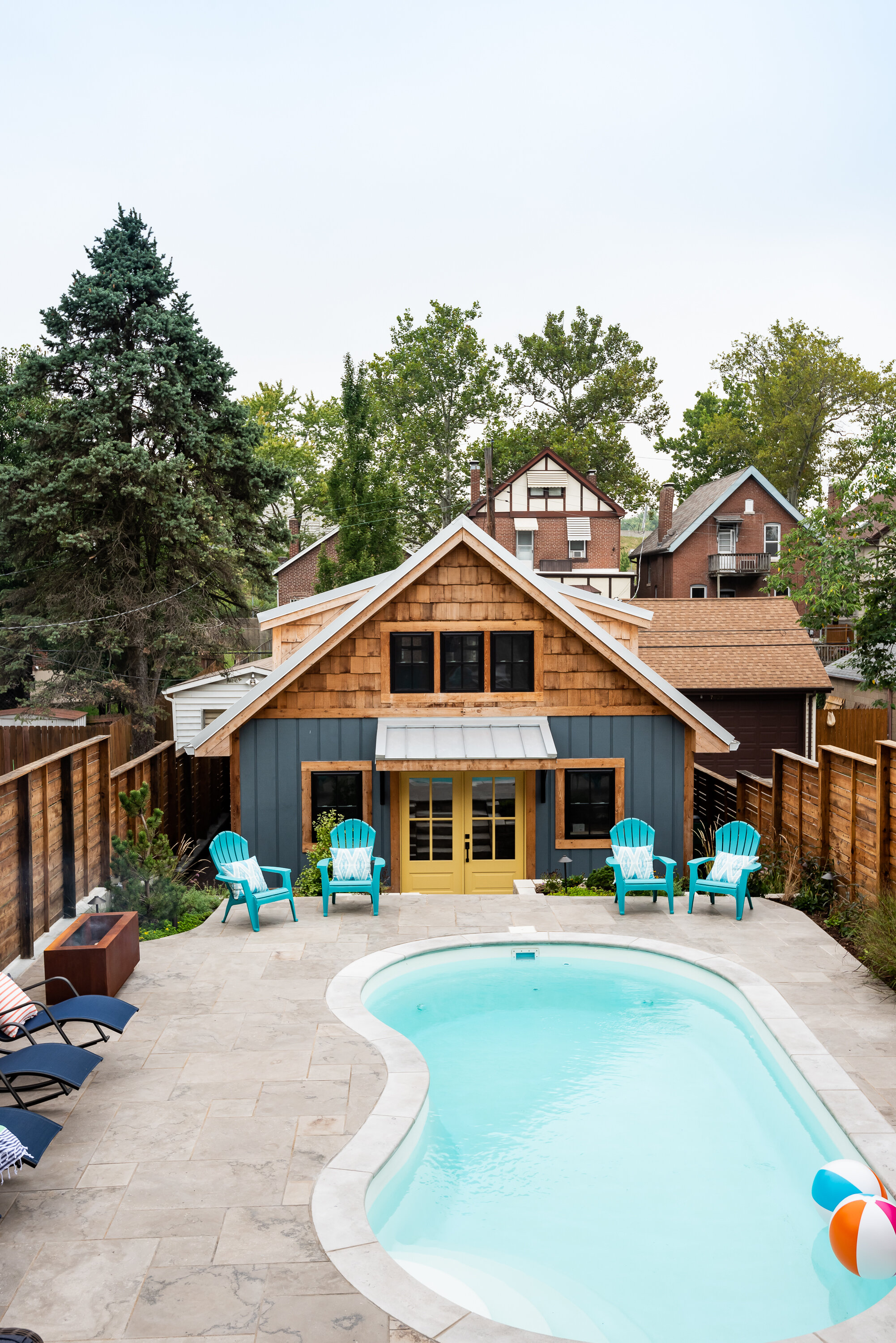
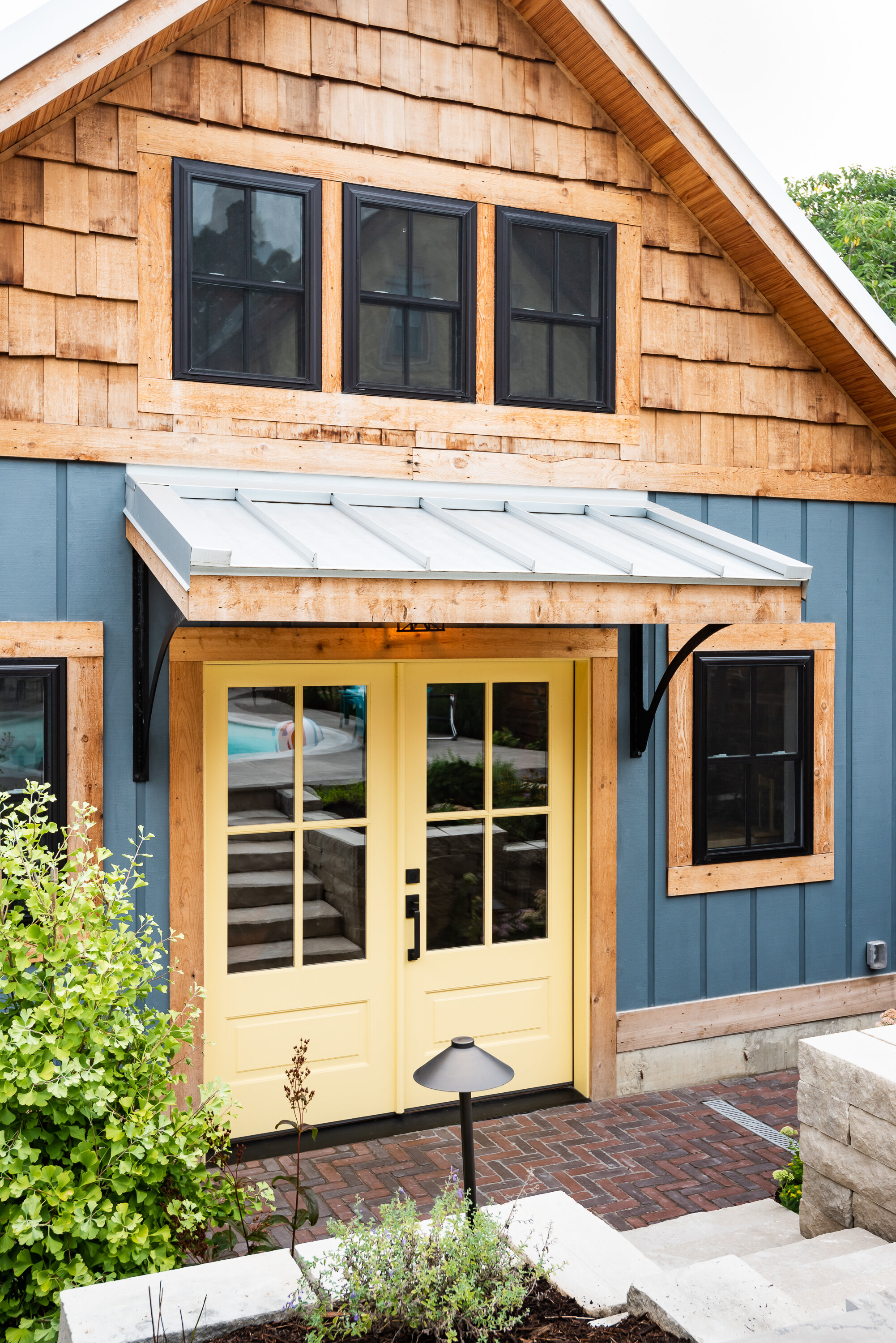
In the custom workshop area, we added metal roofing, custom gutters, and custom awning brackets that John actually built. It had custom dormers to let in lots of natural light. The workshop was also designed with vaulted ceilings to allow adequate air space and circulation. We chose a white washed shiplap to keep the space bright and open.
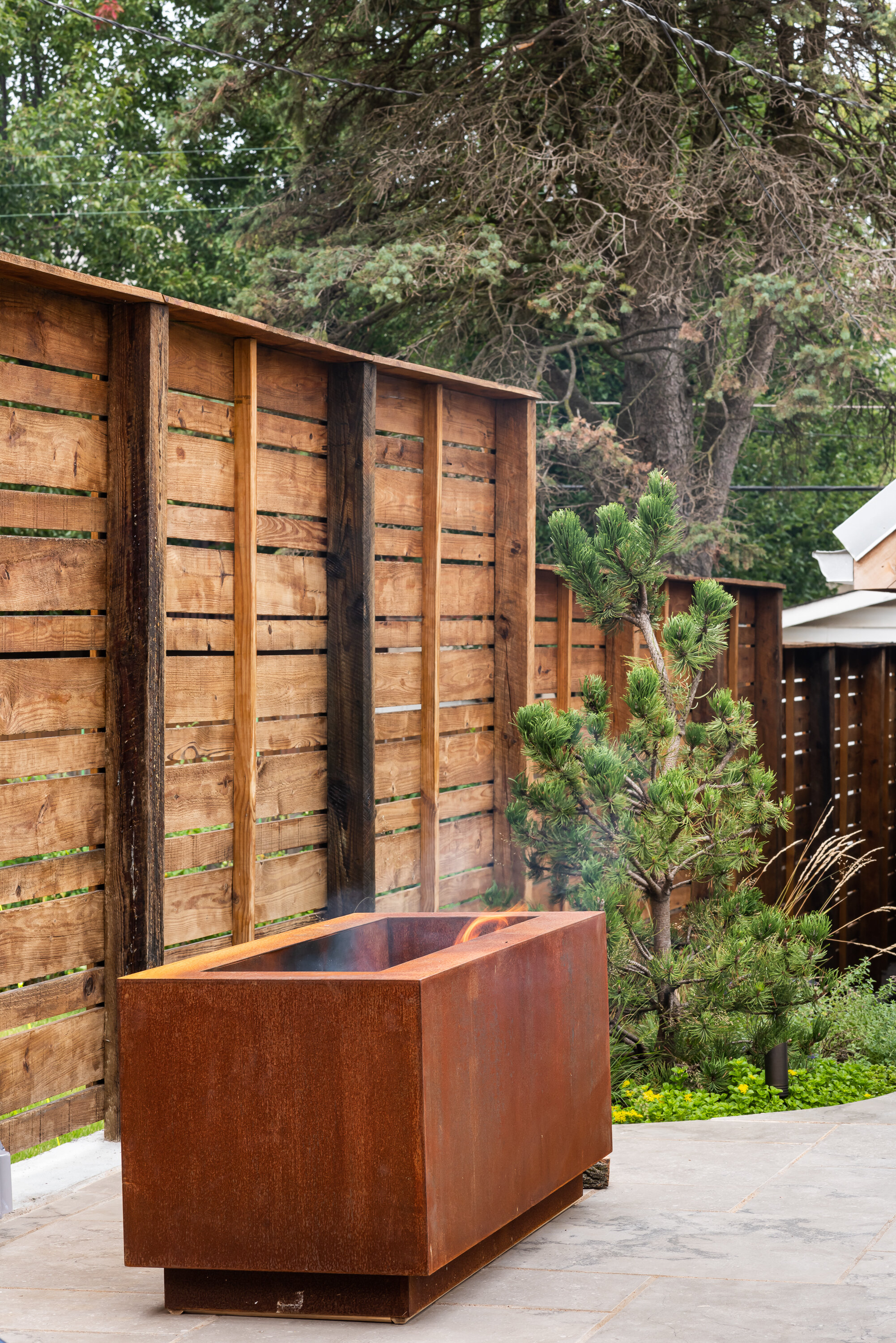
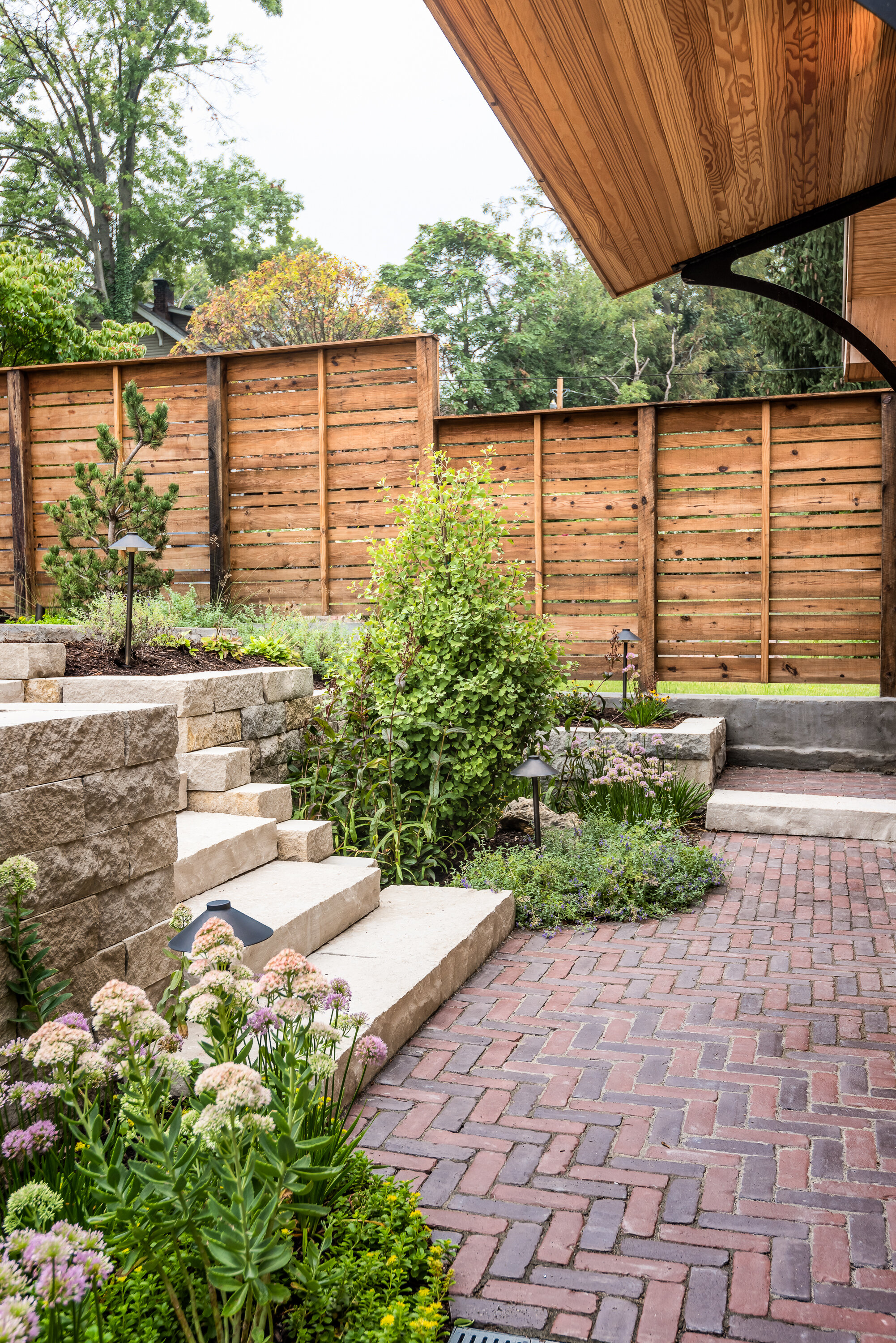
In the pool area, we relocated the stairs coming off the deck and a landing area to create a better flow. LU Design Build also partnered with Frisella Outdoor Lighting. Frisella helped source and install the pool deck hardscape, retaining walls & soft landscaping.
Since these two spaces were a long time dream of John and Kim, LU Design Build wanted to fit their design style and functionality so that they can stay for a long time and truly love their backyard and workshop.
Bellevue Bungalow
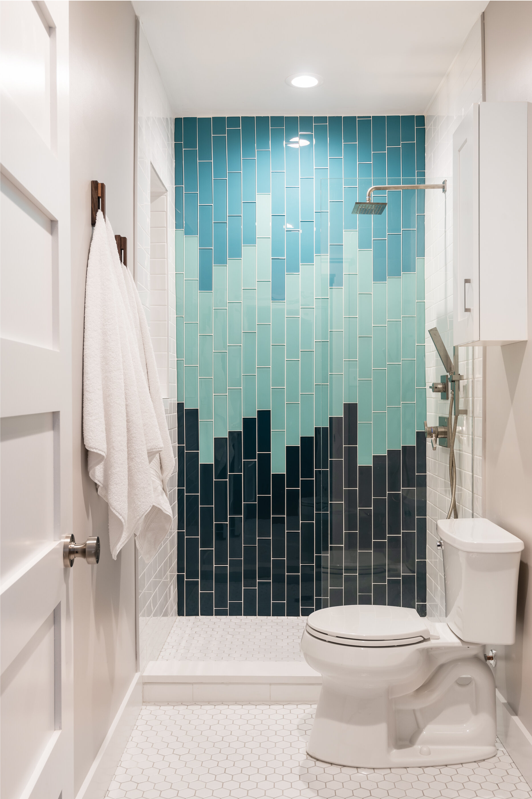
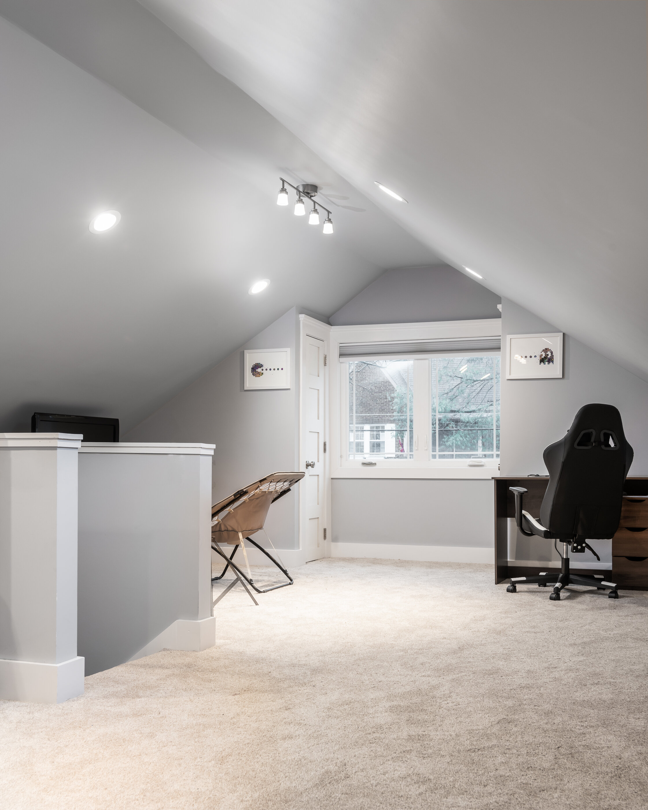
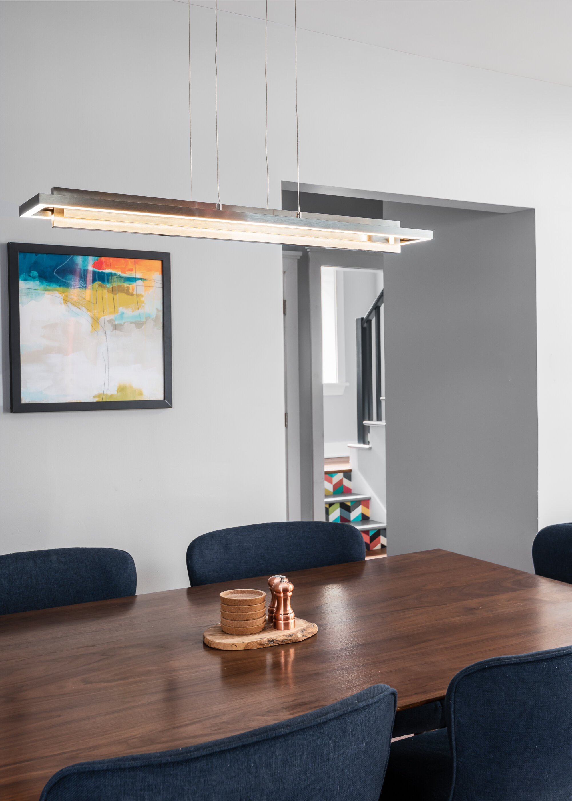
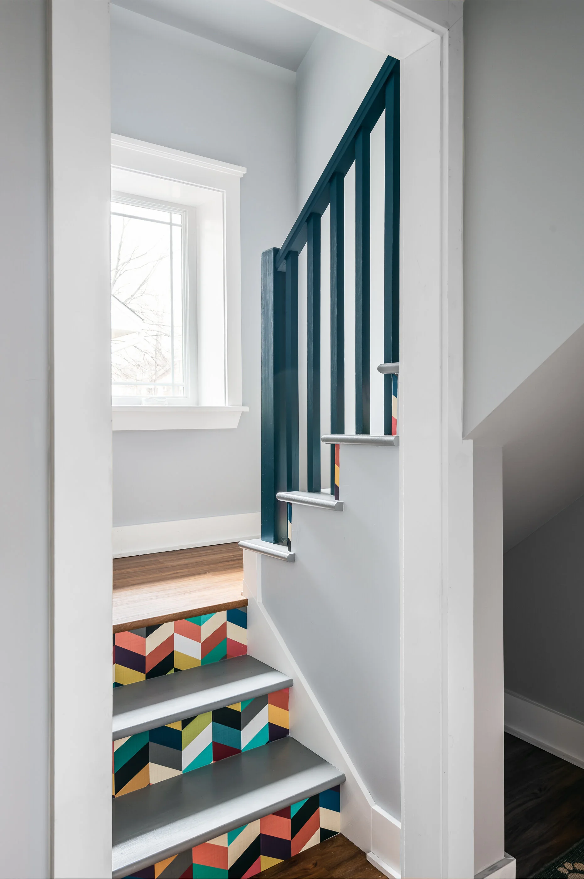
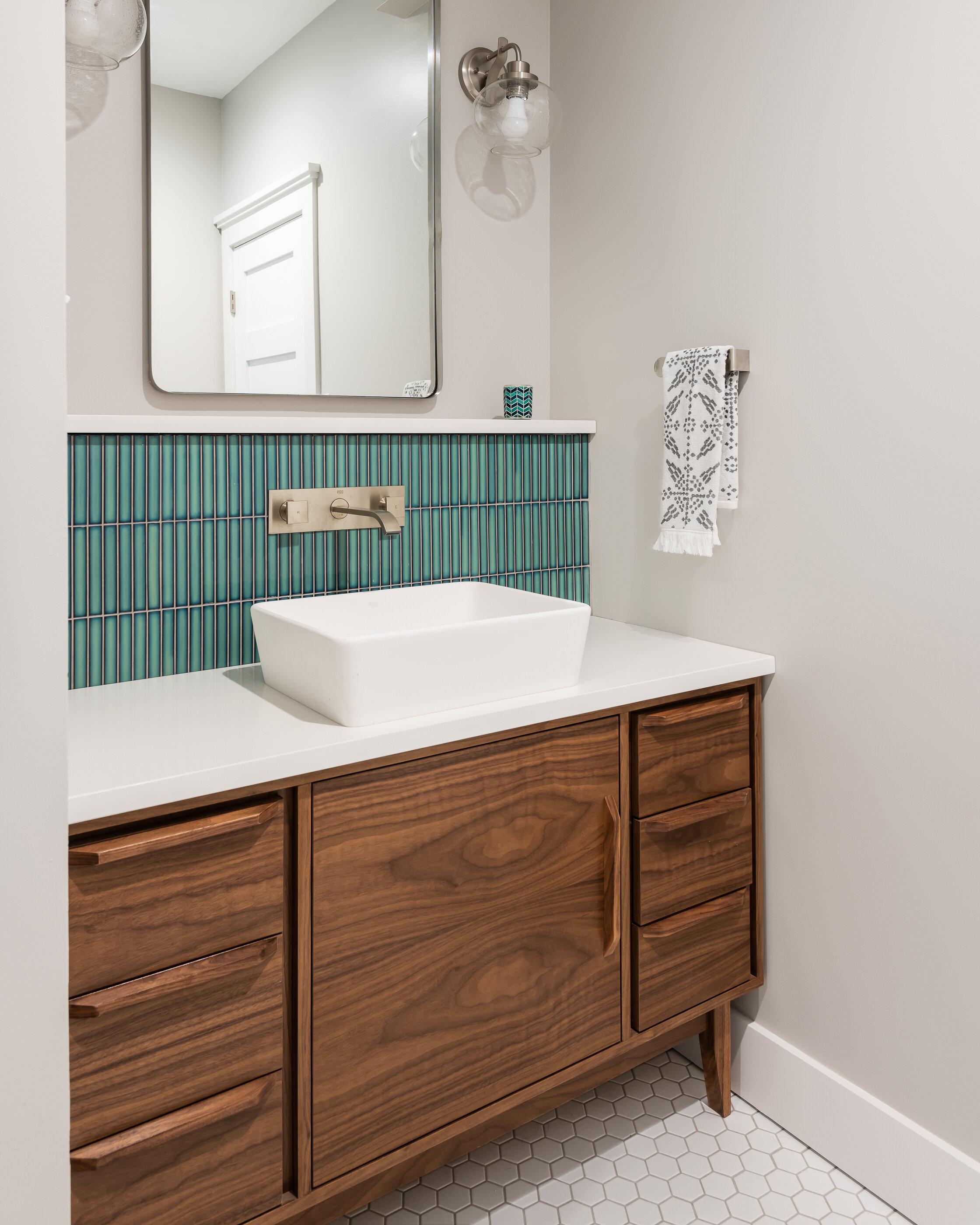
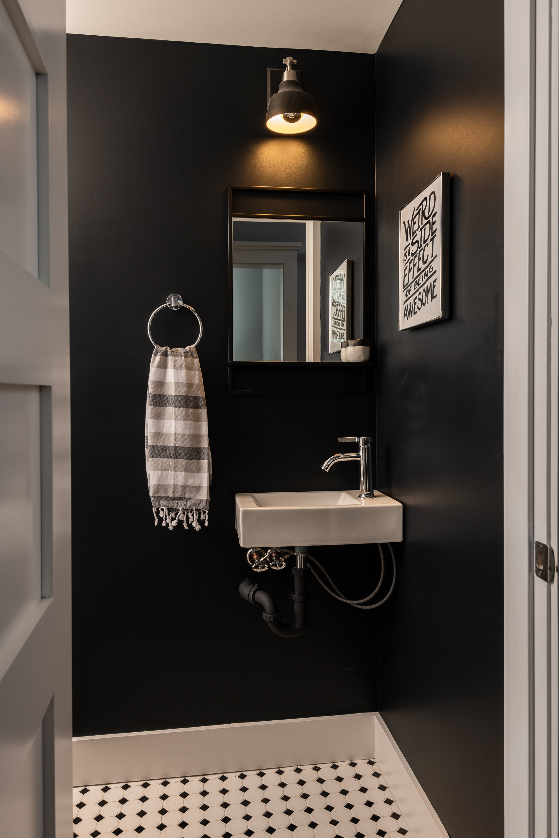
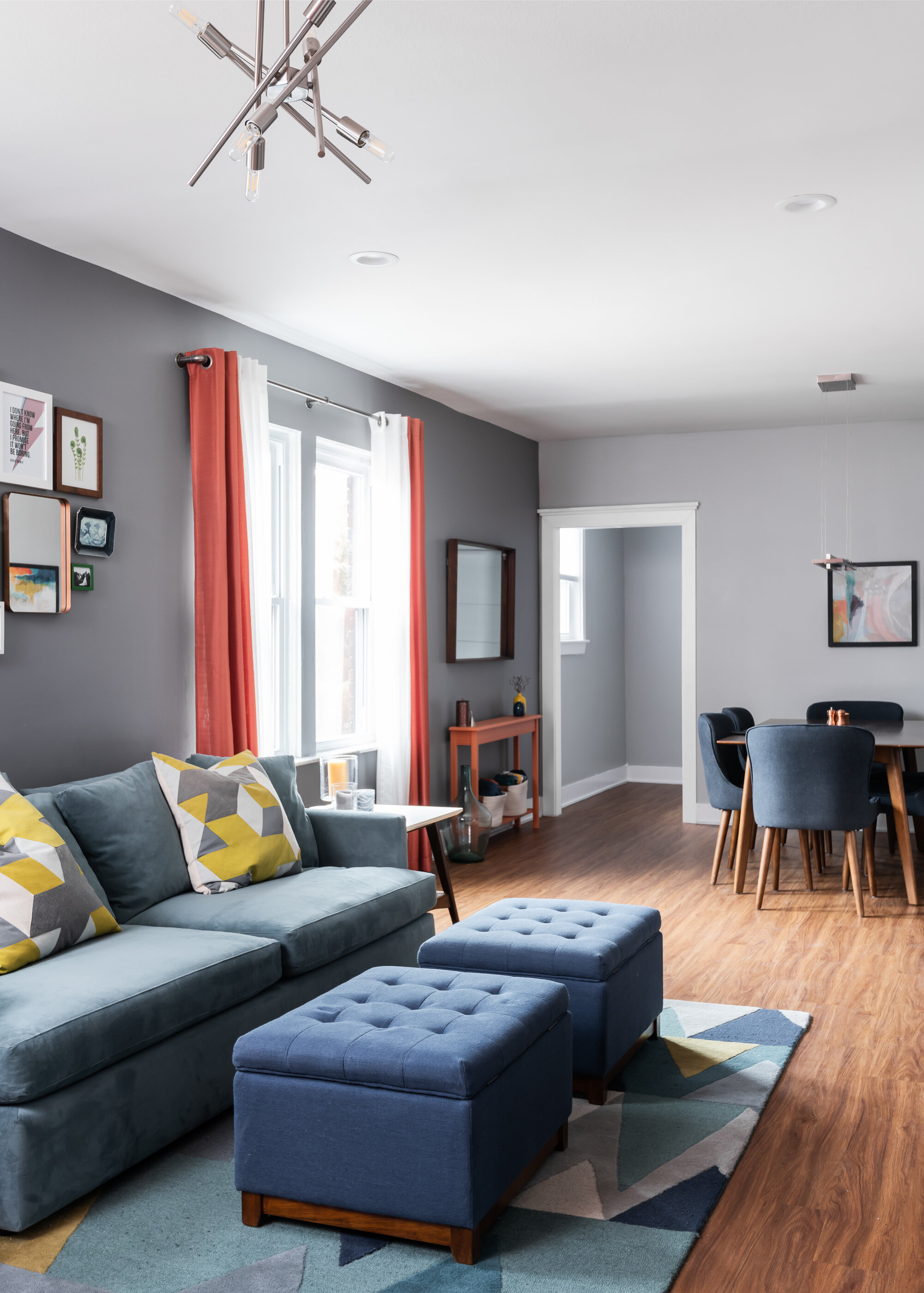
When our clients told us they wanted to finish their cottage bungalow's attic - we jumped on board.
St. Louis, MO
Designer
Rochelle McAvin
Photographer
Karen Palmer Photography
When our clients told us they wanted to finish their cottage bungalow's attic - we jumped on board.
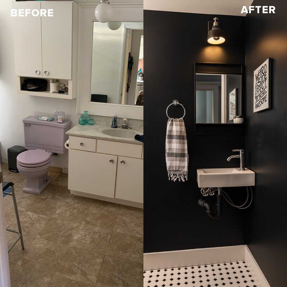
We found that the homeowners were outgrowing their two bedrooms, one bath house, and had an unfinished attic that was begging to be remodeled for their teenage son.
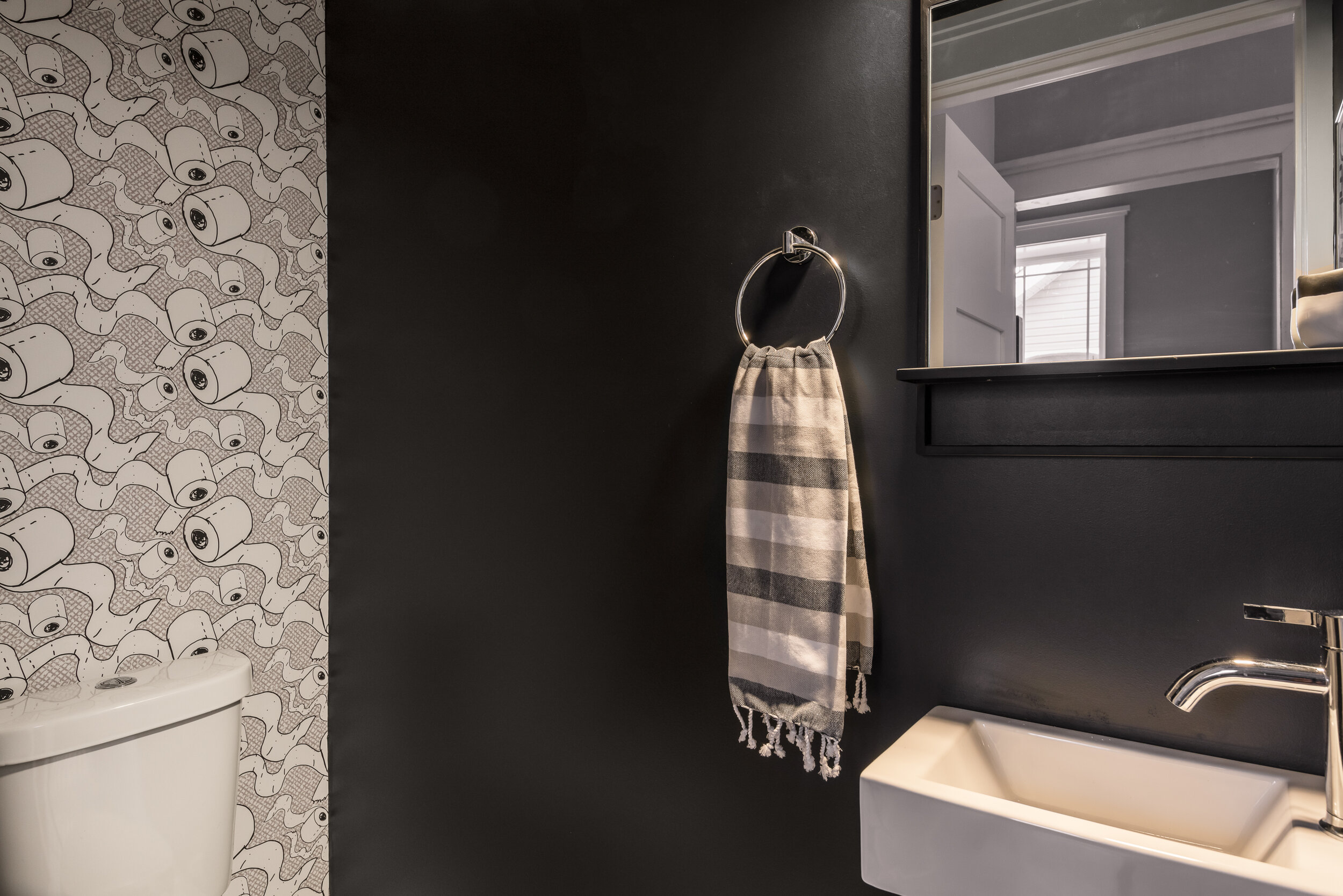
We rendered the design multiple ways, until we were able to land on a design that incorporated space for everyone, three new bathrooms, one new staircase, one more bedroom, and the finished attic.
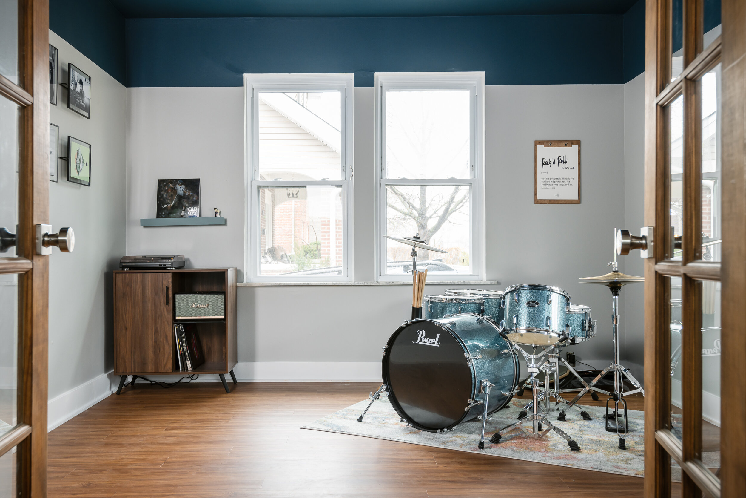
Our client had a great eye and loved color - working together we brought their vision to life and loved the process every step of the way.
We hope they enjoy the space as much as we do!
Arsenal Basement
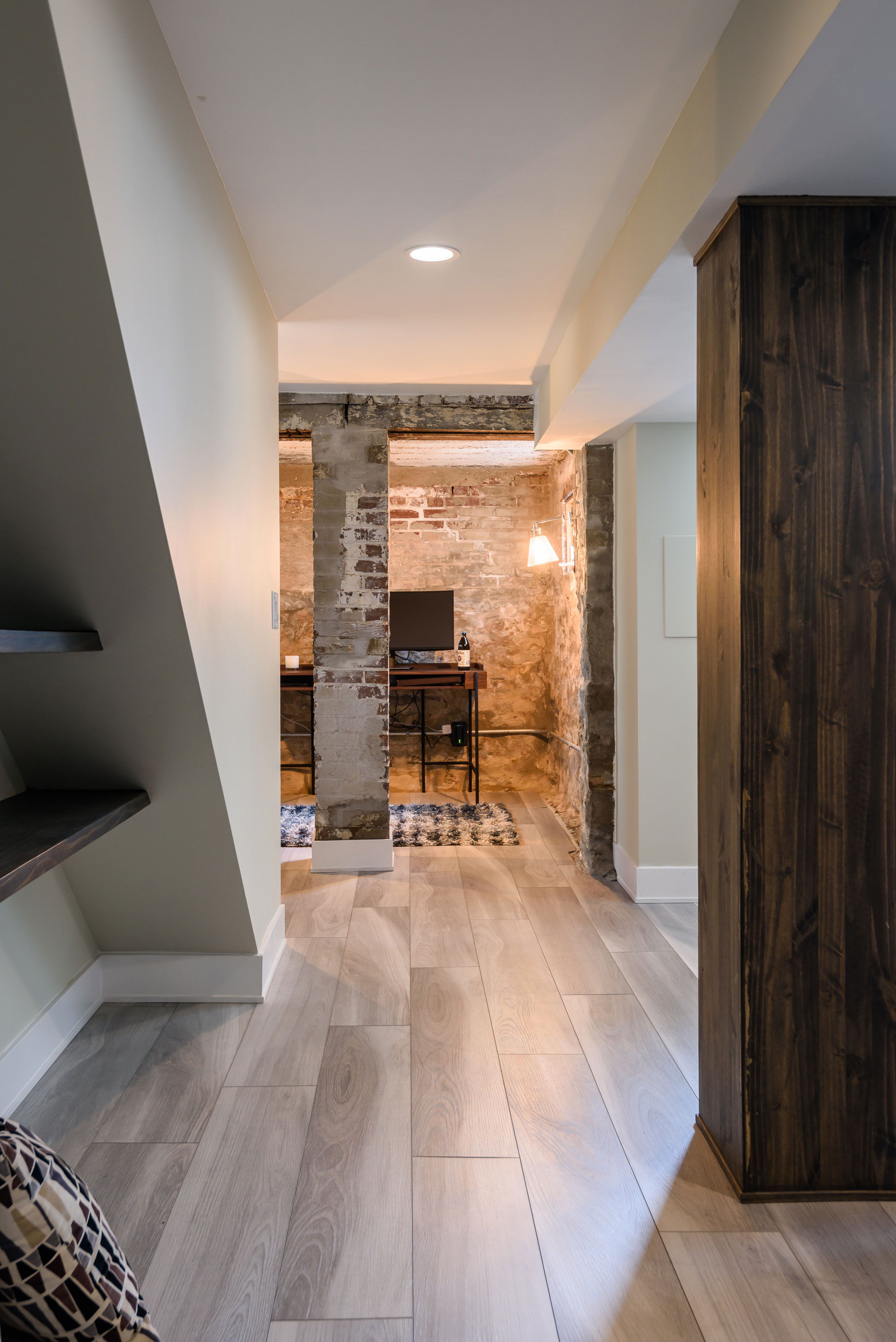
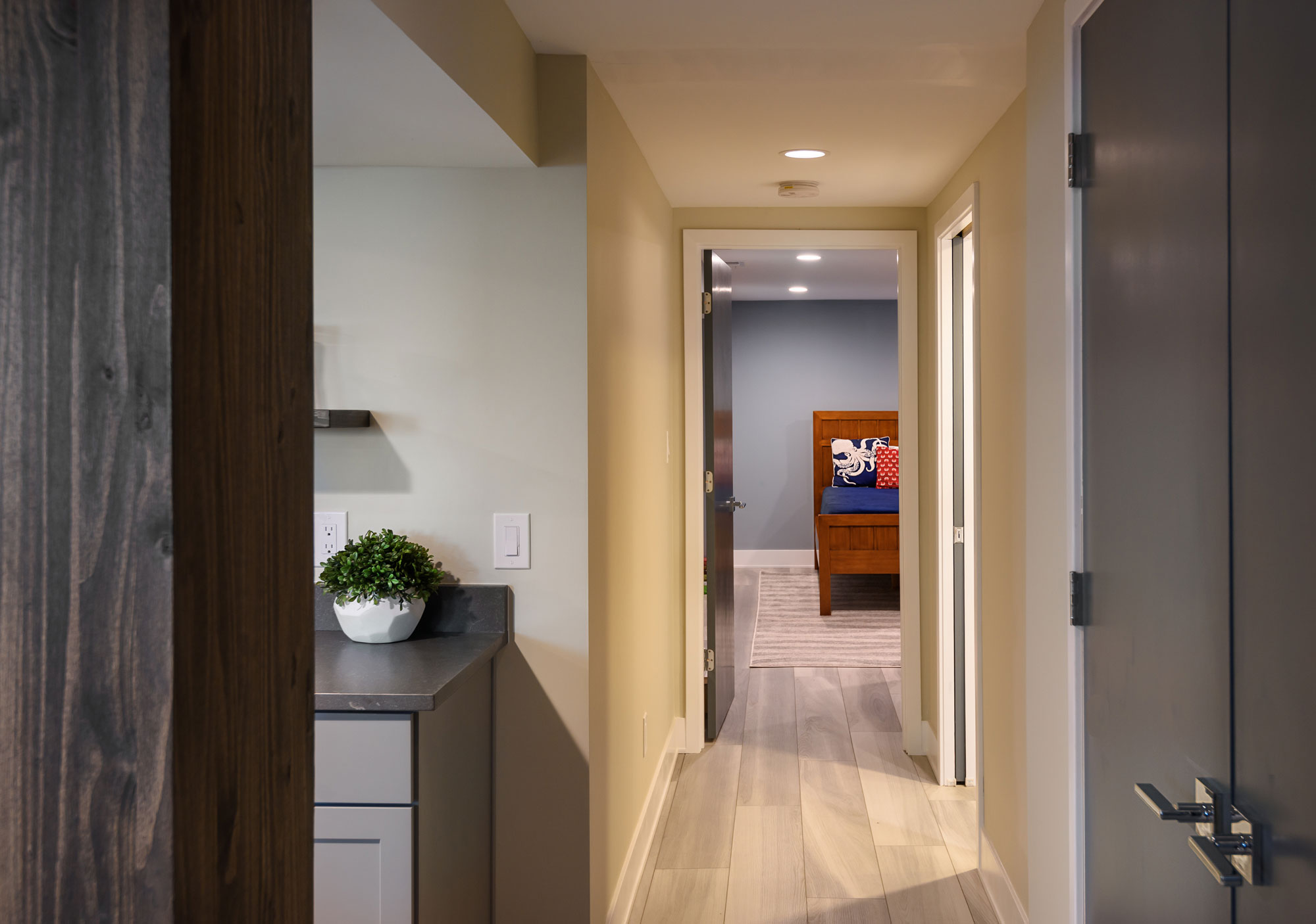
Our clients wanted to turn their century old, unfinished basement into a living space the whole family could enjoy. There is a little room under the porch that had exposed, original masonry. We wanted to leave the masonry exposed so we cleaned it up a bit — it is a cozy space for an office and it is a reminder of the home's 100 year history.

Arsenal St., MO
April, 2019
DESIGNER:
Jennifer Chapman & Rochelle McAvin
PHOTOGRAPHER:
Karen Palmer Photography
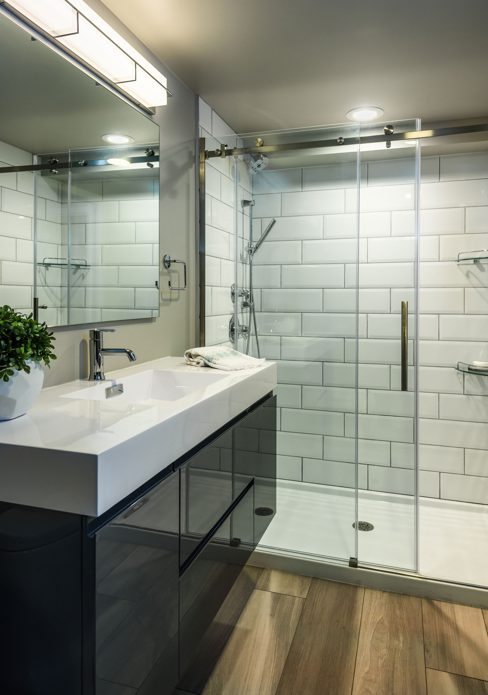
Our clients wanted to turn their century old, unfinished basement into a living space the whole family could enjoy. We set out to create a family area where they could play games, watch tv, and hang out with family and friends as well as a separate bedroom and bathroom. They love clean, modern lines and cool, serene colors.We started by selecting a luxury vinyl tile that had a very linear pattern with cool gray tones. This helped to keep the basement feel light and bright and the LVT is a durable material for an old leaky basement. We wanted to take advantage of some of the architectural elements in the space. There is a little room under the porch that had exposed, original masonry. We wanted to leave the masonry exposed so we cleaned it up a bit- it is a cozy space for an office and it is a reminder of the home's 100 year history. We didn't want to lose the space under the stairs to dark, never used storage so we created a niche with open reclaimed wood shelving. We wrapped the posts with matching wood to add warmth and character to the space. We used the same wood for the floating shelf at the bar area, as well. In the bathroom we used a sleek gray, high gloss floating vanity & oversized white subway tile. It feels fresh and bright and keeps with the clean and modern aesthetic we set out to create.

