Sophie Kitchen
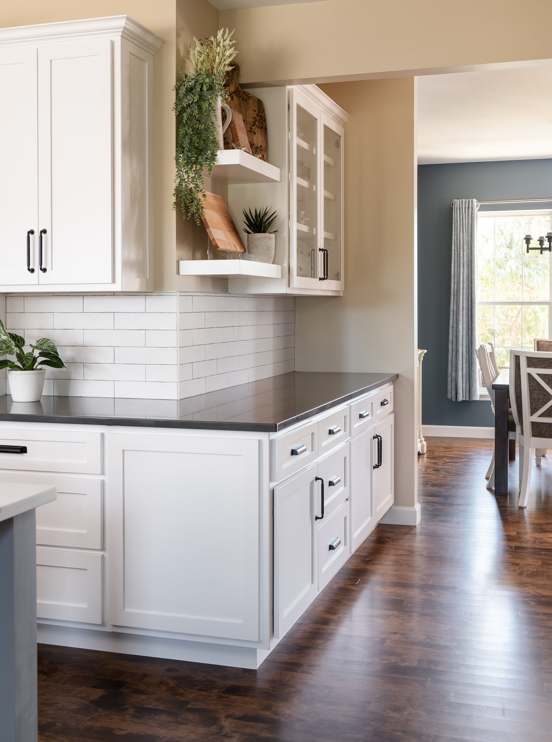
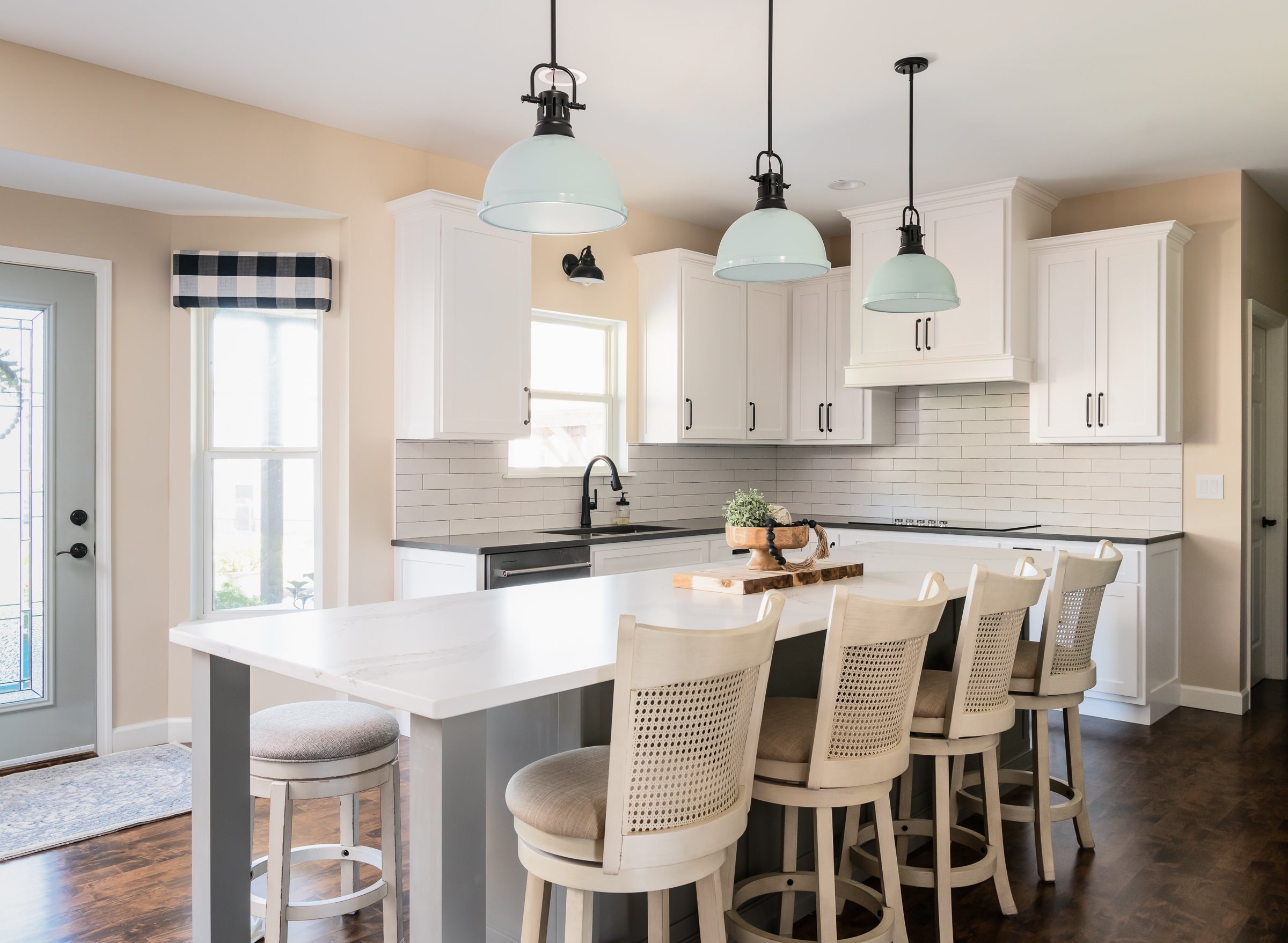
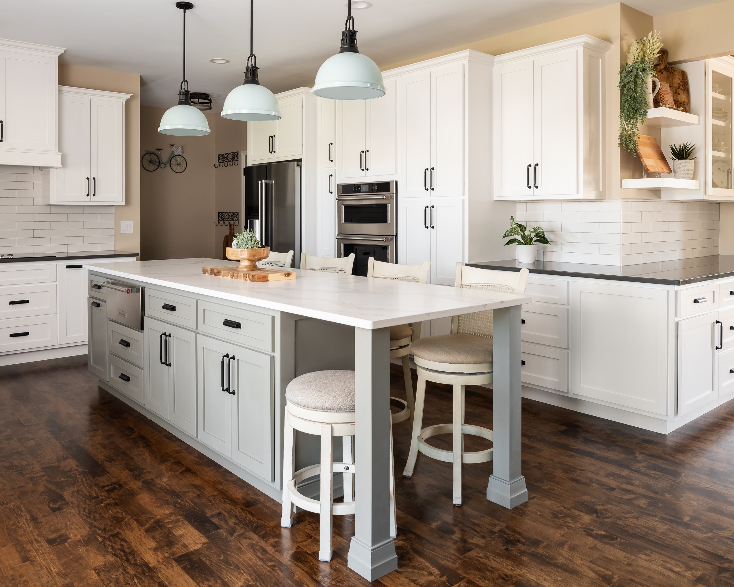
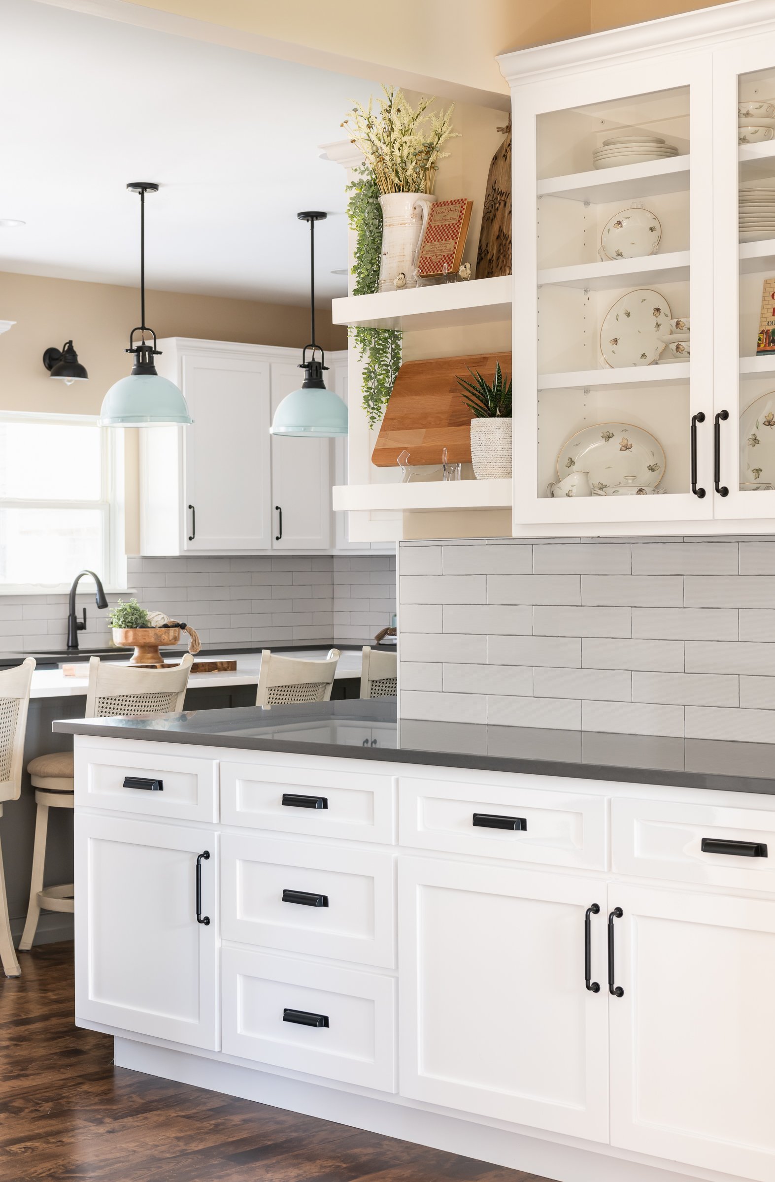
Our clients wanted to bring their kitchen out of the early 2000's and make it more functional for their family. They love to entertain so enlarging the island and opening up the kitchen to the surrounding spaces was a priority.
KITCHEN PROJECT
Sophie Kitchen
Location: Barnhart, MO
Designer: Jennifer Chapman
Photographer: Karen Palmer Photography
Our clients wanted to bring their kitchen out of the early 2000's and make it more functional for their family. They love to entertain so enlarging the island and opening up the kitchen to the surrounding spaces was a priority. We started by opening up the small doorway to the hallway and dining room in order to wrap the cabinets and countertops around the corner. This allows for a lot more storage as well as the perfect place to serve food when entertaining. It better connects the dining room to the kitchen as well. The clients really love the farmhouse feel and they love color. We wanted to keep the core of the kitchen clean and classic by going with white cabinets and a gray island, but we added a pop of color with the pendant lights. We added warmth by using a wheat paint color on the walls and refinishing their existing maple flooring. The maple floor finish provides a unique texture and style to the space. This kitchen is now the true heart of the home and is the perfect place for hosting celebrations with family and friends.
Mid-Century Kitchen & En Suite Addition
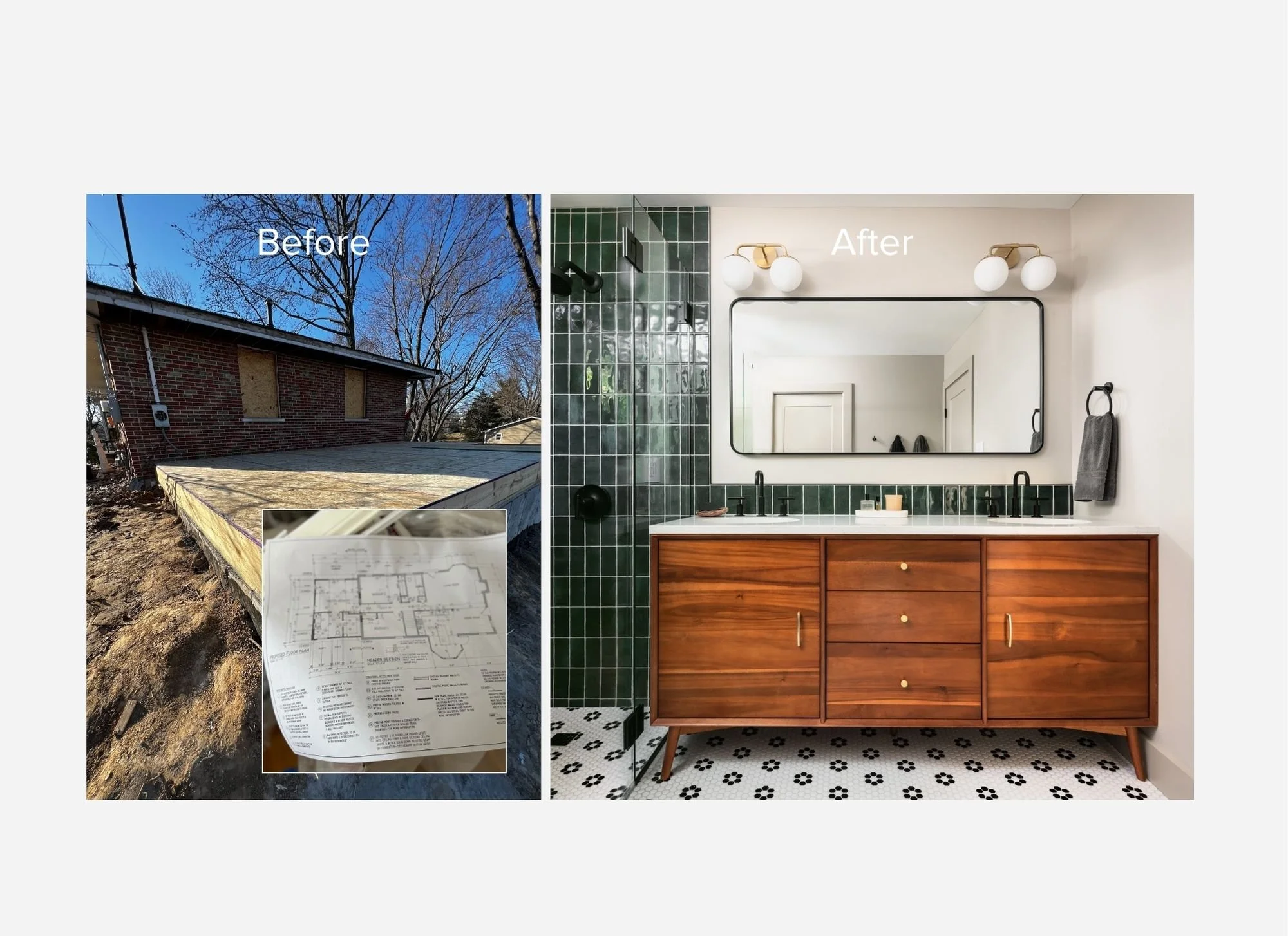
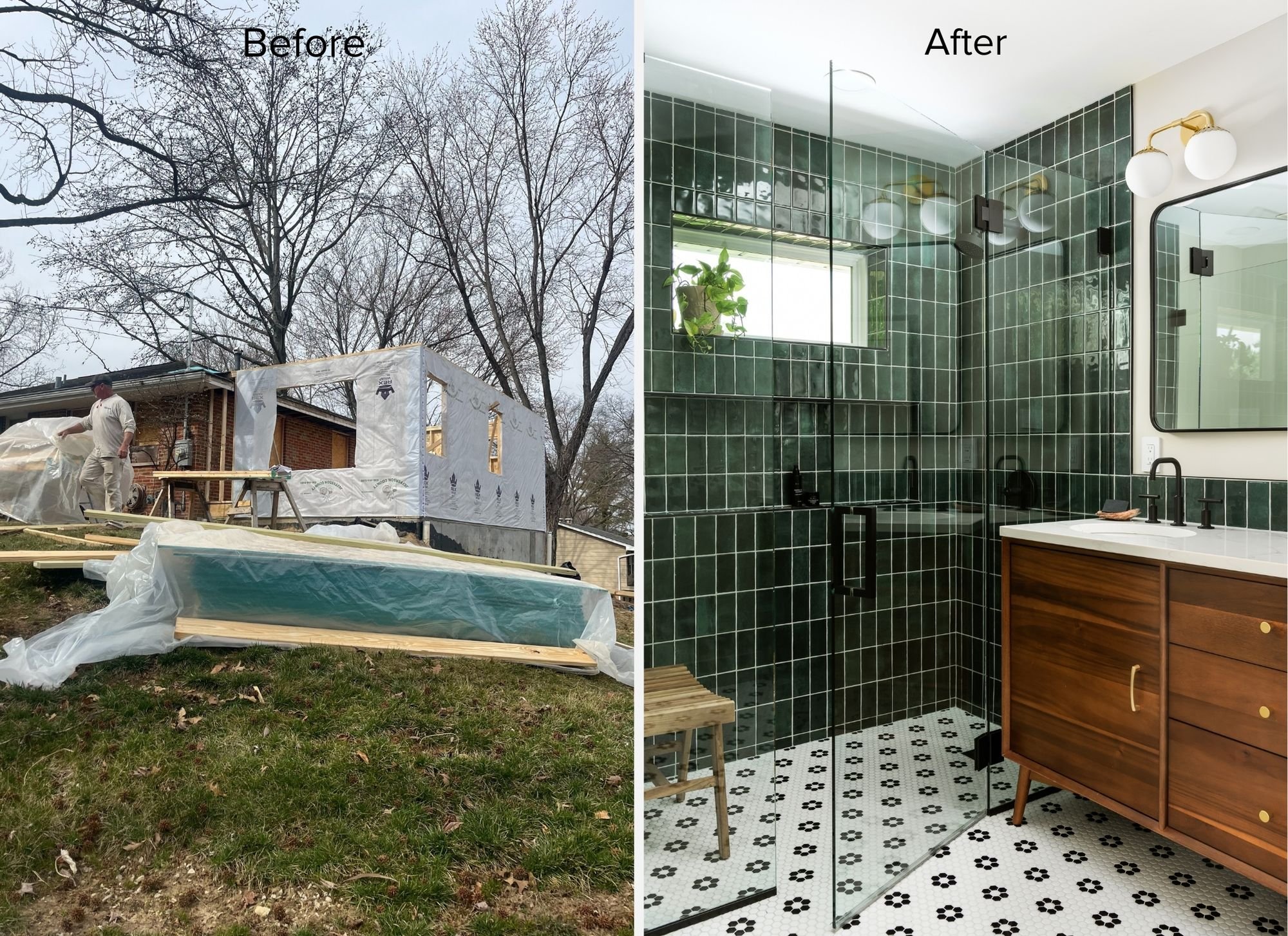
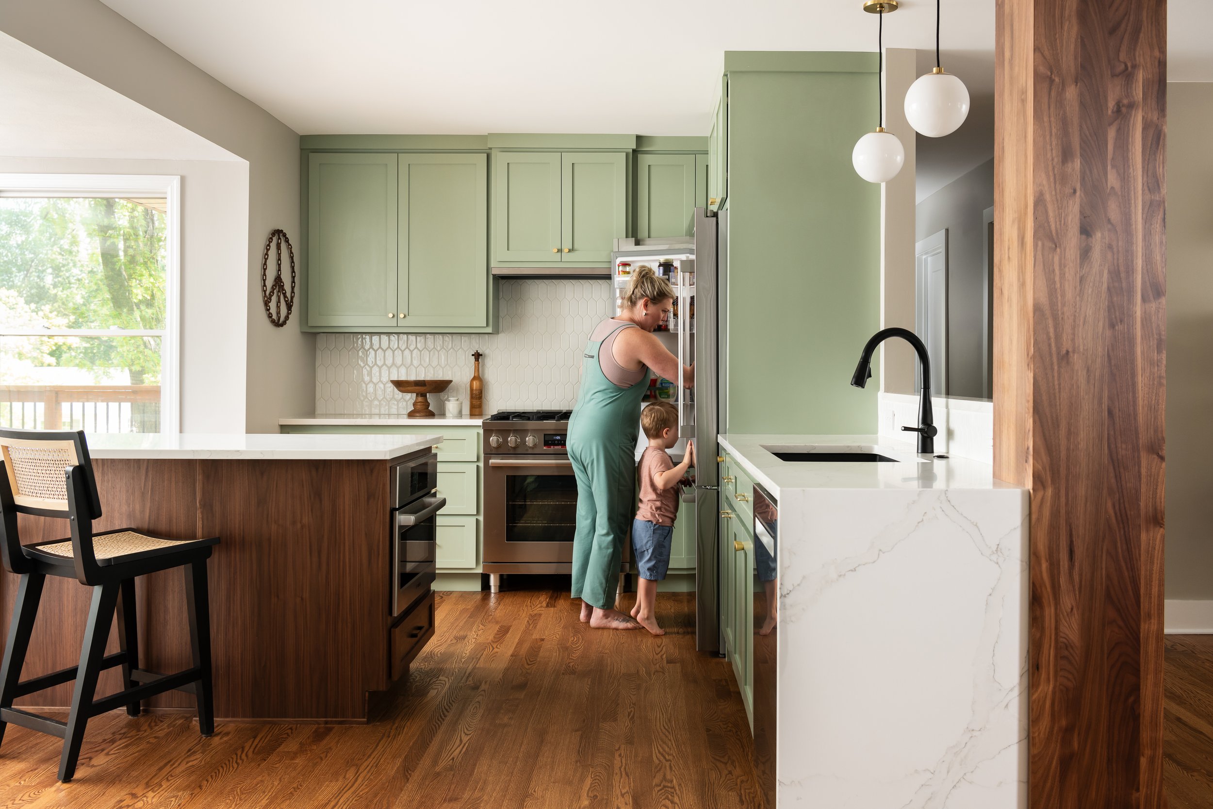
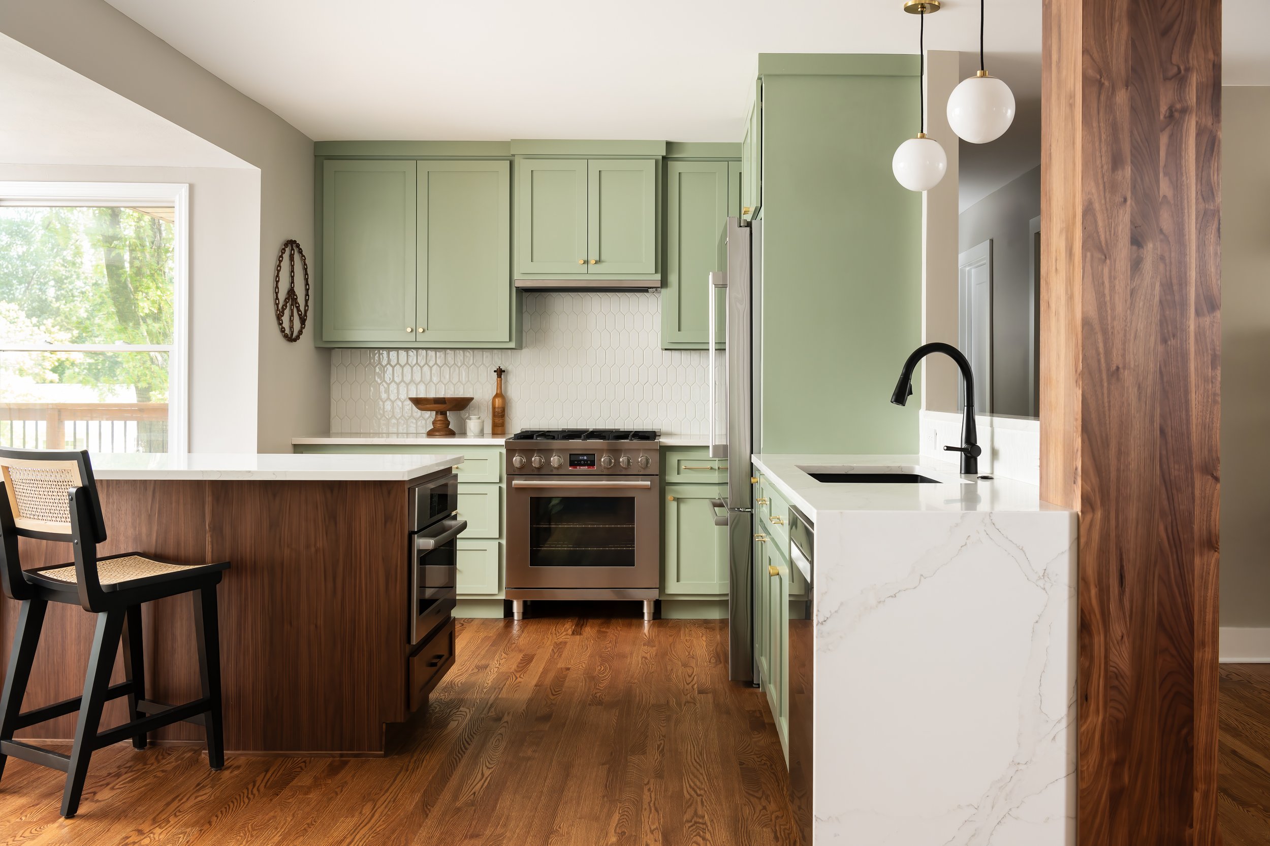
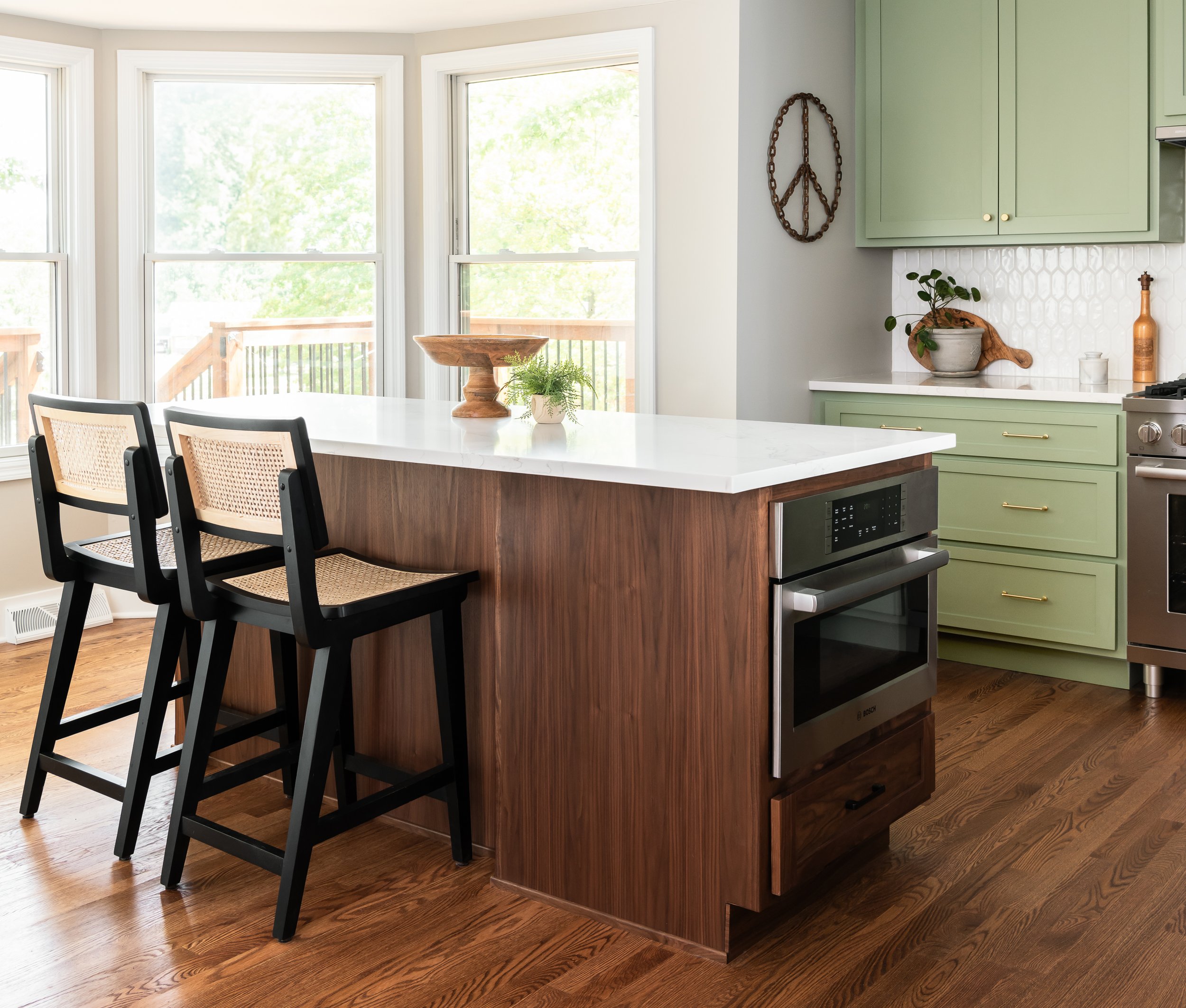
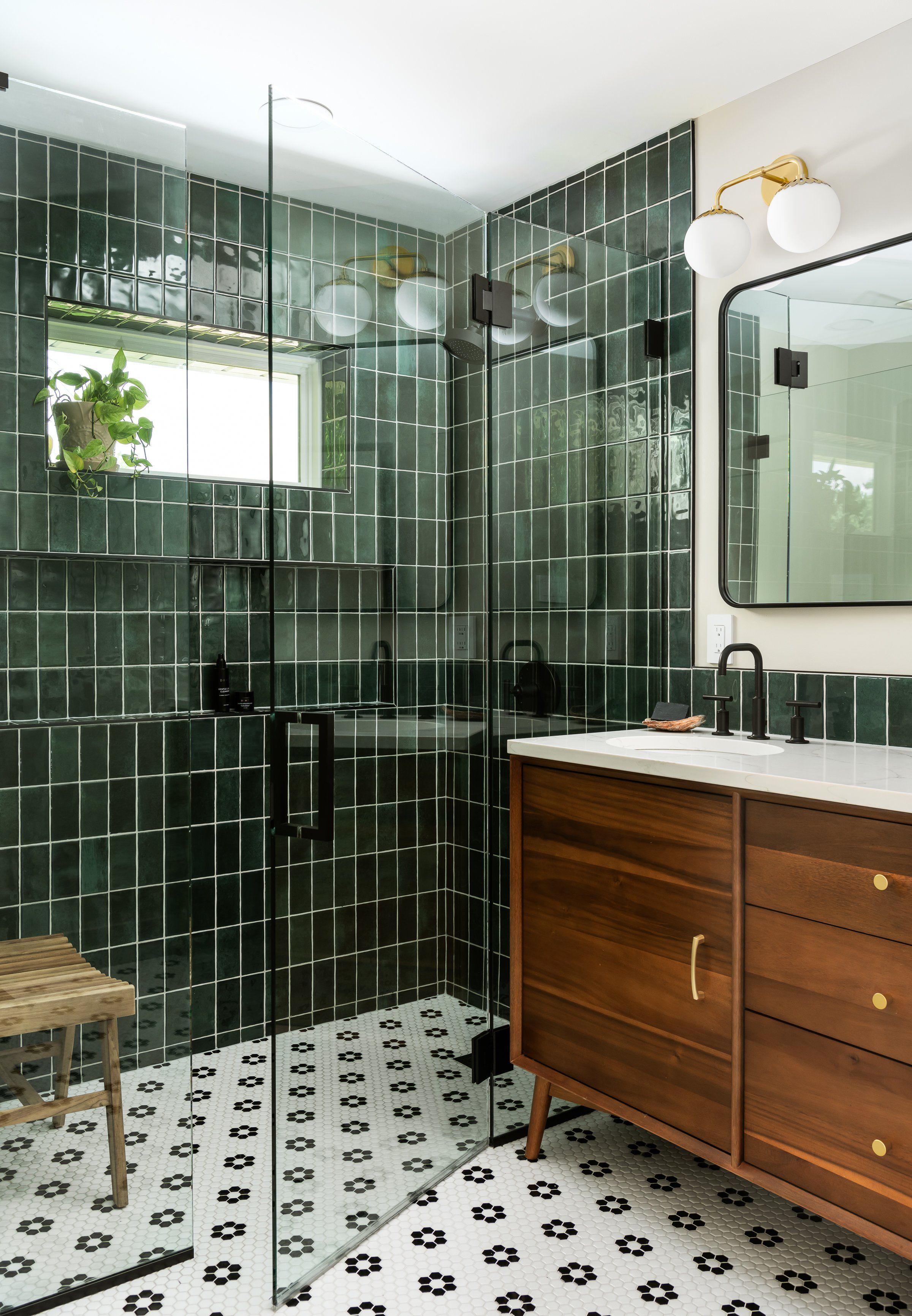
Welcome to our stunning mid-century kitchen and bath makeover, designed with function and color. This home renovation seamlessly combines the timeless charm of mid-century modern aesthetics with the practicality and functionality required by a busy family. Step into a home where classic meets contemporary and every detail has been carefully curated to enhance both style and convenience.

Designer: Rochelle McAvin
Photographer: Karen Palmer
Welcome to our stunning mid-century kitchen and bath makeover, designed with function and color. This home renovation seamlessly combines the timeless charm of mid-century modern aesthetics with the practicality and functionality required by a busy family. Step into a home where classic meets contemporary and every detail has been carefully curated to enhance both style and convenience.
Kitchen Transformation:
The heart of the home has been revitalized with a fresh, open-concept design.
Sleek Cabinetry: Crisp, clean lines dominate the kitchen's custom-made cabinets, offering ample storage space while maintaining cozy vibes. Rich, warm wood tones complement the overall aesthetic.
Quartz Countertops: Durable and visually stunning, the quartz countertops bring a touch of luxury to the space. They provide ample room for food preparation and family gatherings.
Statement Lighting: 2 central pendant light fixtures, inspired by mid-century design, illuminates the kitchen with a warm, inviting glow.
Bath Oasis:
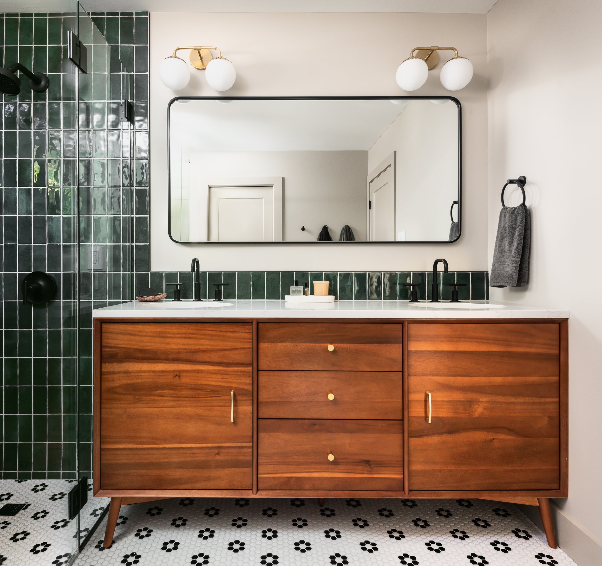
Our mid-century bath makeover offers a tranquil retreat for the primary suite. It combines retro-inspired design elements with contemporary comforts.
Patterned Tiles: Vibrant, geometric floor tiles create a playful yet sophisticated atmosphere. The black and white motif exudes mid-century charm and timeless elegance.
Floating Vanity: A sleek, vanity with clean lines maximizes floor space and provides ample storage for toiletries and linens.
Frameless Glass Shower: The bath features a modern, frameless glass shower enclosure, offering a spa-like experience for relaxation and rejuvenation.
Natural Light: Large windows in the bathroom allow natural light to flood the space, creating a bright and airy atmosphere.
Storage Solutions: Thoughtful storage solutions, including built-in niches and shelving, keep the bathroom organized and clutter-free.
This mid-century kitchen and bath makeover is the perfect blend of style and functionality, designed to accommodate the needs of a young family. It celebrates the iconic design of the mid-century era while embracing the modern conveniences that make daily life a breeze.
Mermod Kitchen & Mudroom
Our clients' were in dire need of a larger kitchen that could function better for their family. They love to cook and entertain which was not very comfortable in their small, closed off kitchen

Kirkwood, MO
Designer: Jennifer Chapman
Photographer: Karen Palmer Photography
2023
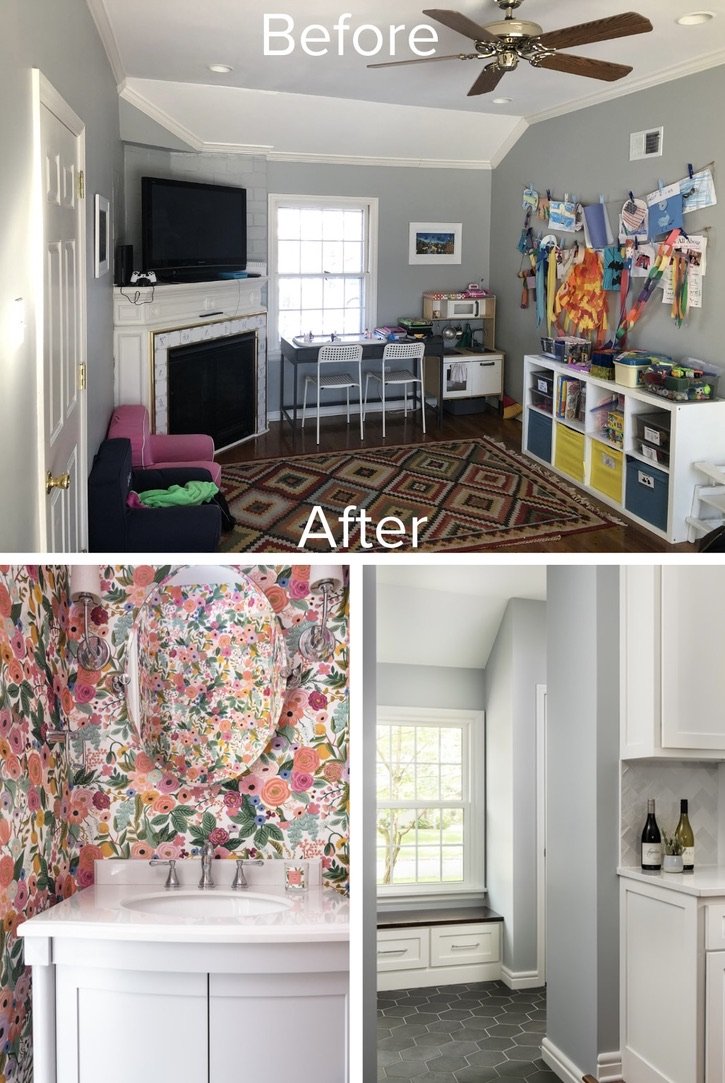
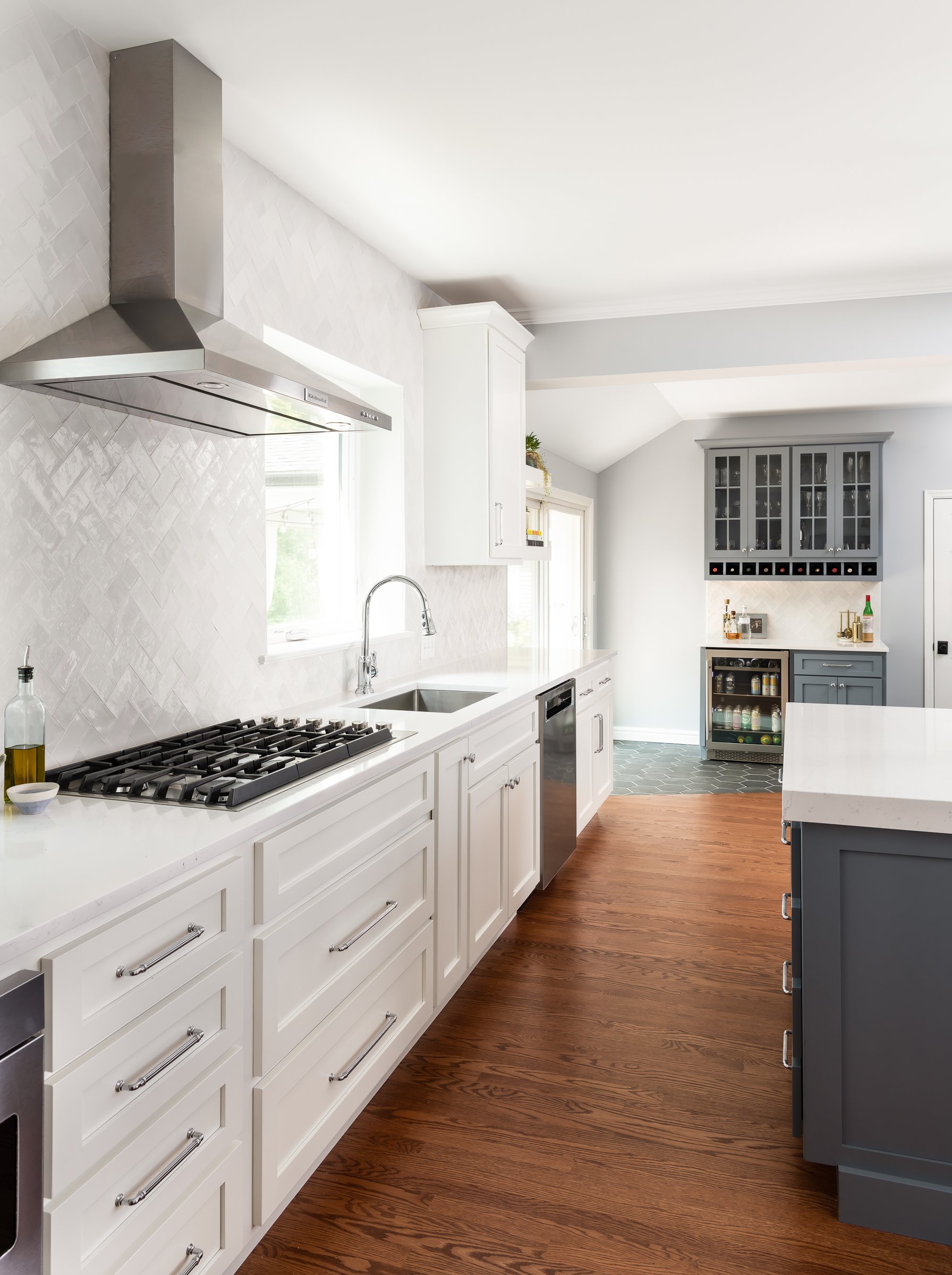
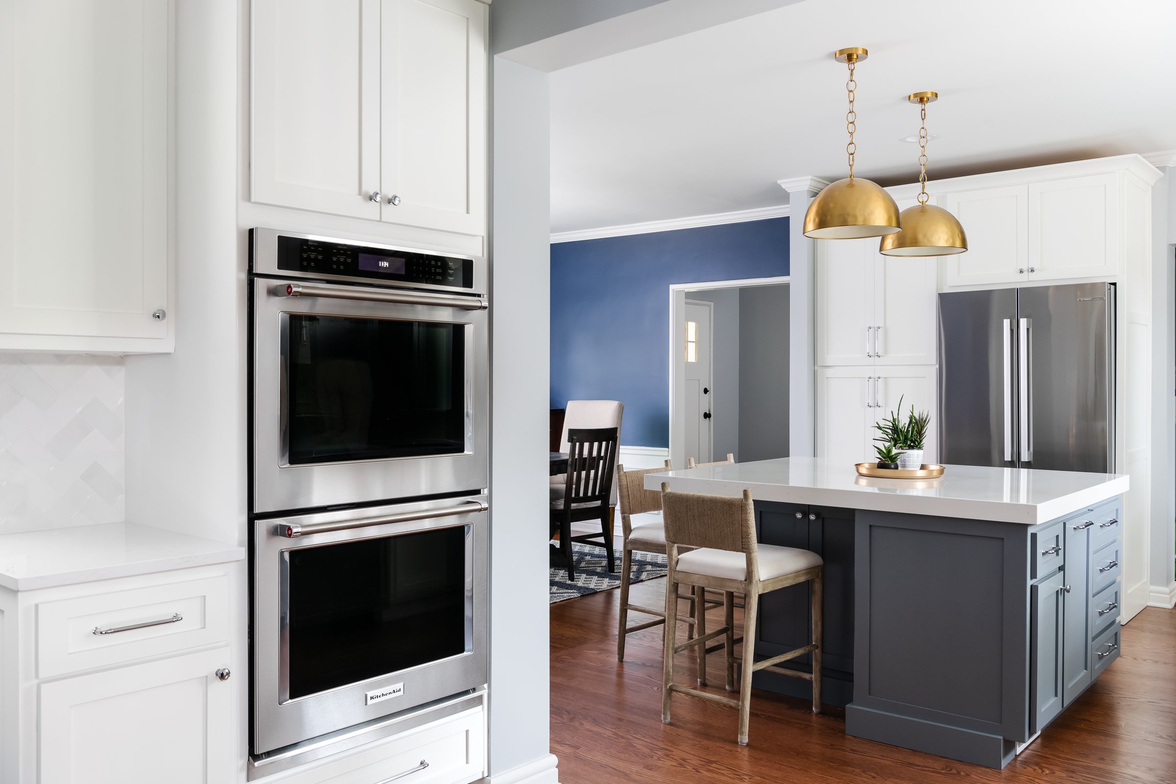
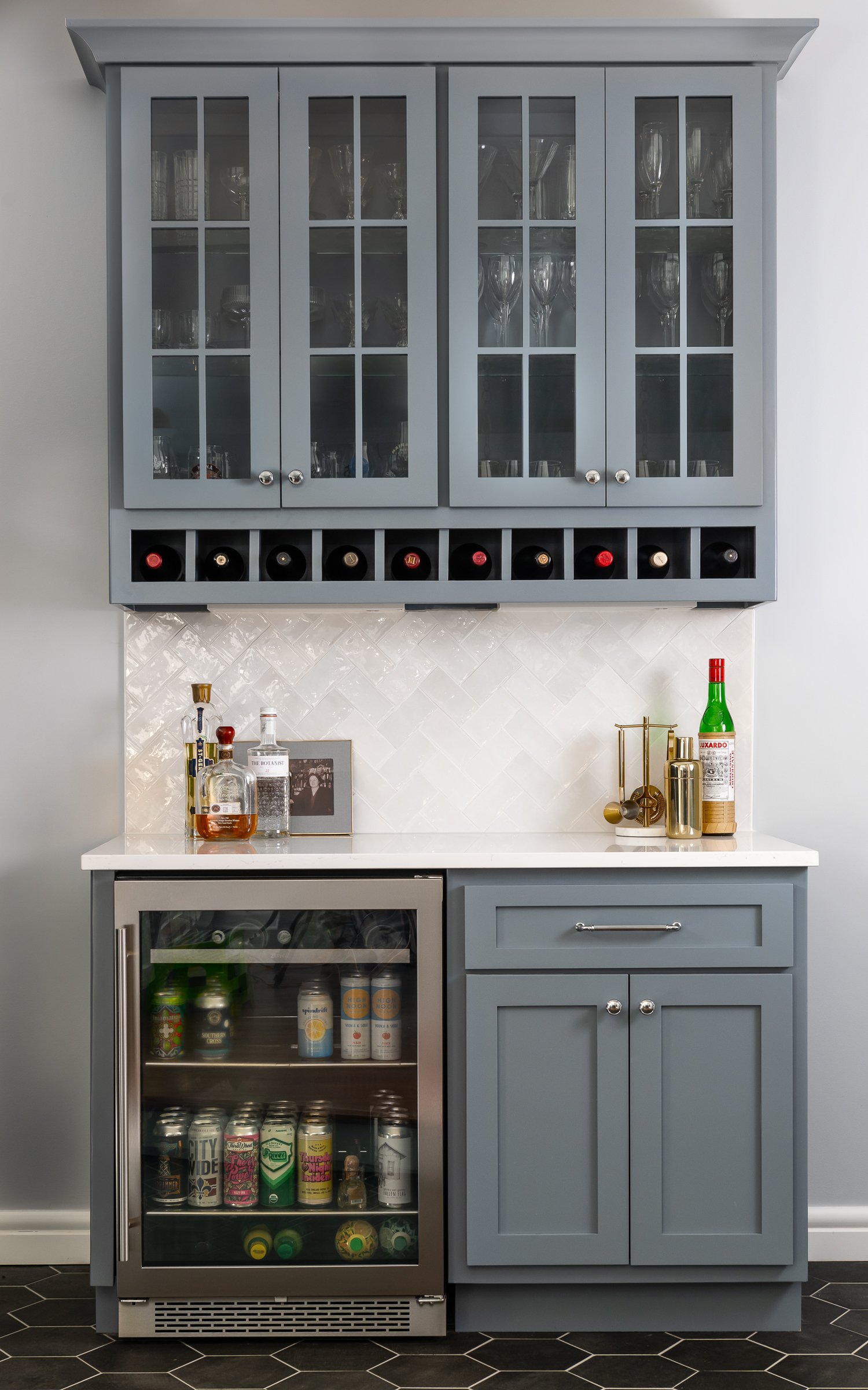
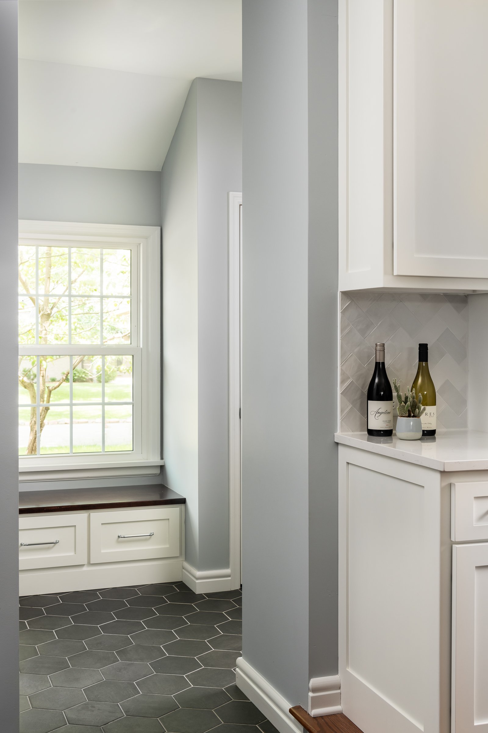
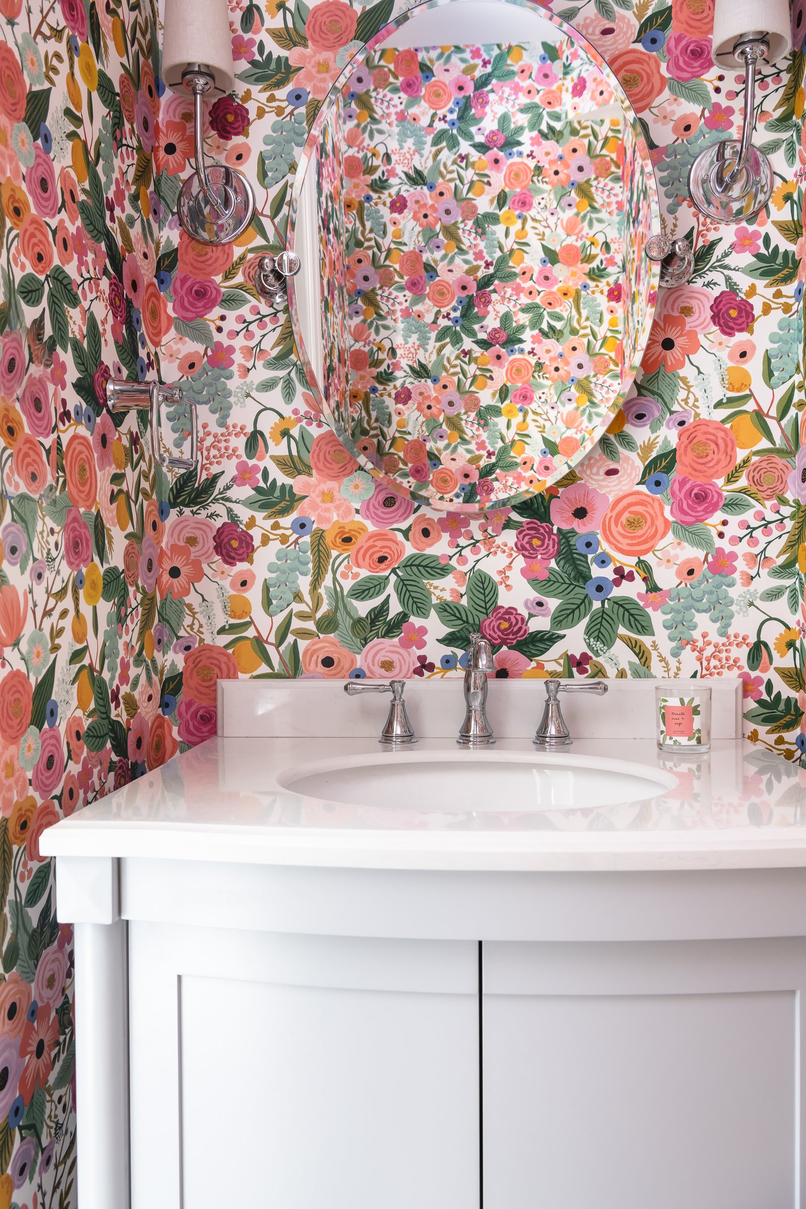
Our clients' were in dire need of a larger kitchen that could function better for their family. They love to cook and entertain which was not very comfortable in their small, closed off kitchen. We started by opening up the kitchen to the dining room, which added more connectivity and allowed us to add a good size island with seating. We stole space from the adjacent hallway and powder room and moved the powder room. We extended the step that was in their kitchen into the adjoining living space and converted the living space into a bar and mudroom. This is also where we put the new powder room. We kept a classic, yet modern style in this 1940 home. We used a small subway tile with a handmade look to it and laid it in a herringbone pattern for the backsplash. This is definitely a focal point, as it provides texture and the reflections off the tile create a beautiful sparkle. We went with white quartz countertops with gray veining and a mix of white and gray shaker style cabinets to add some contrast. We mixed up the metal finishes as well. The brushed brass lighting and accessories provide interest and warmth to the cool grays and chrome fixtures in the rest of the space. The client had some fun in the powder room by using a Rifle Paper Company wallpaper. Overall, we provided the clients with a really open and functional space to enjoy, whether it be for weeknight cooking and homework or for entertaining family and friends.
Radcliffe Place First Floor Remodel
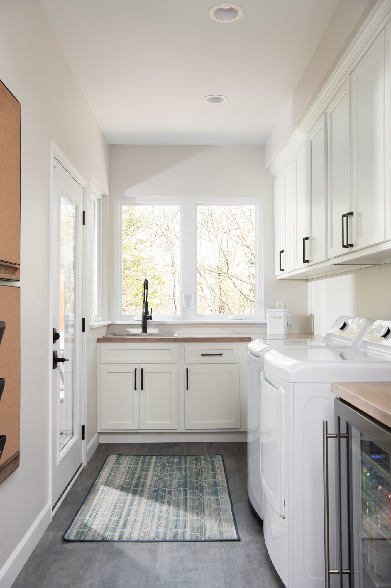
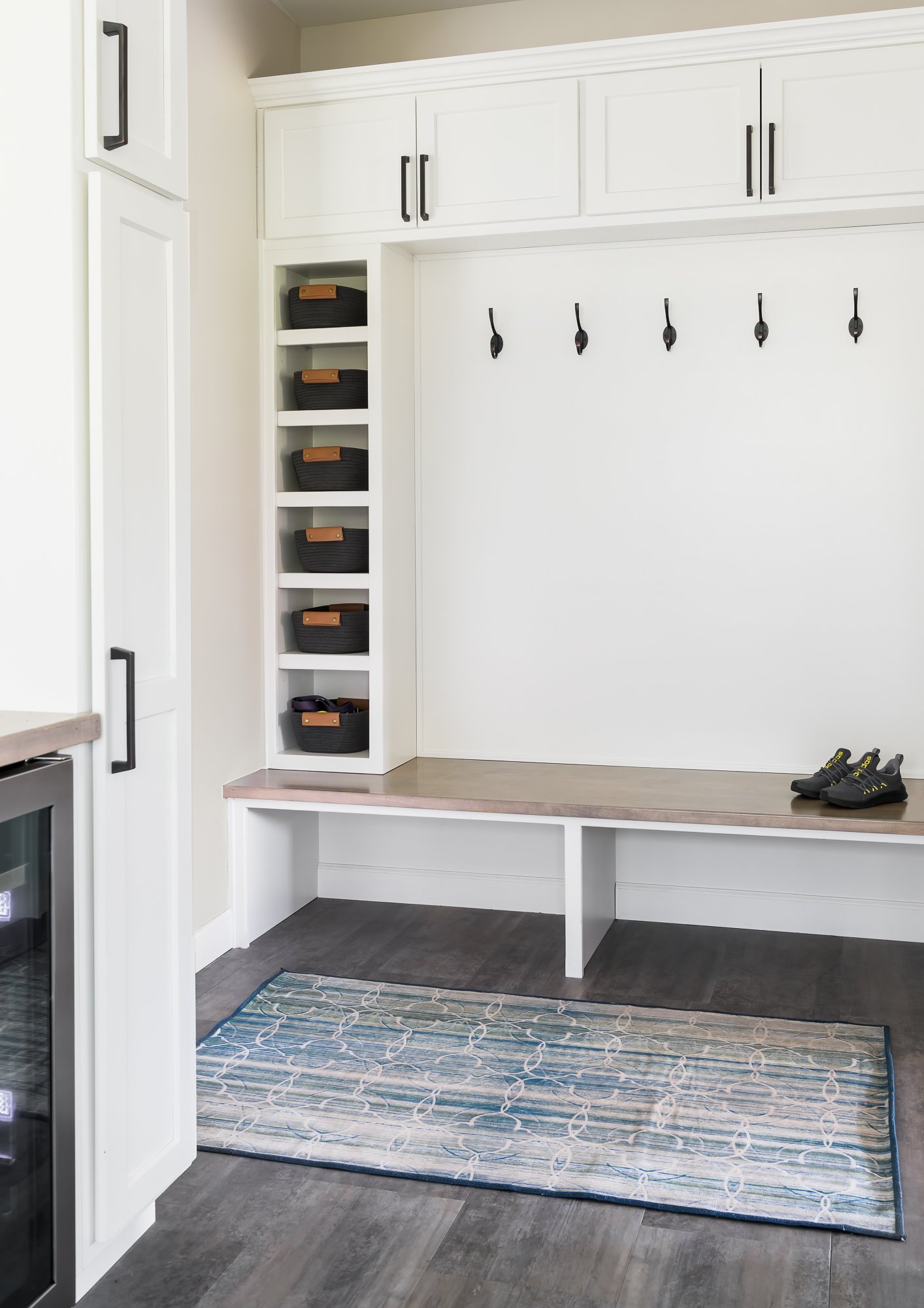
Our clients decided to embark on a full home update to their 1990's home. We completely reconfigured the kitchen and laundry with two main purposes- the first one was to provide them with access to a new covered deck and the second was to expand the footprint of their laundry room.

Wildwood, MO
Designer: Jennifer Chapman
Photographer: Karen Palmer Photography
2022
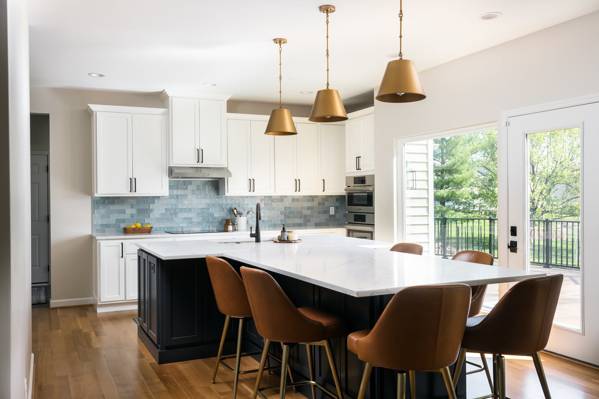
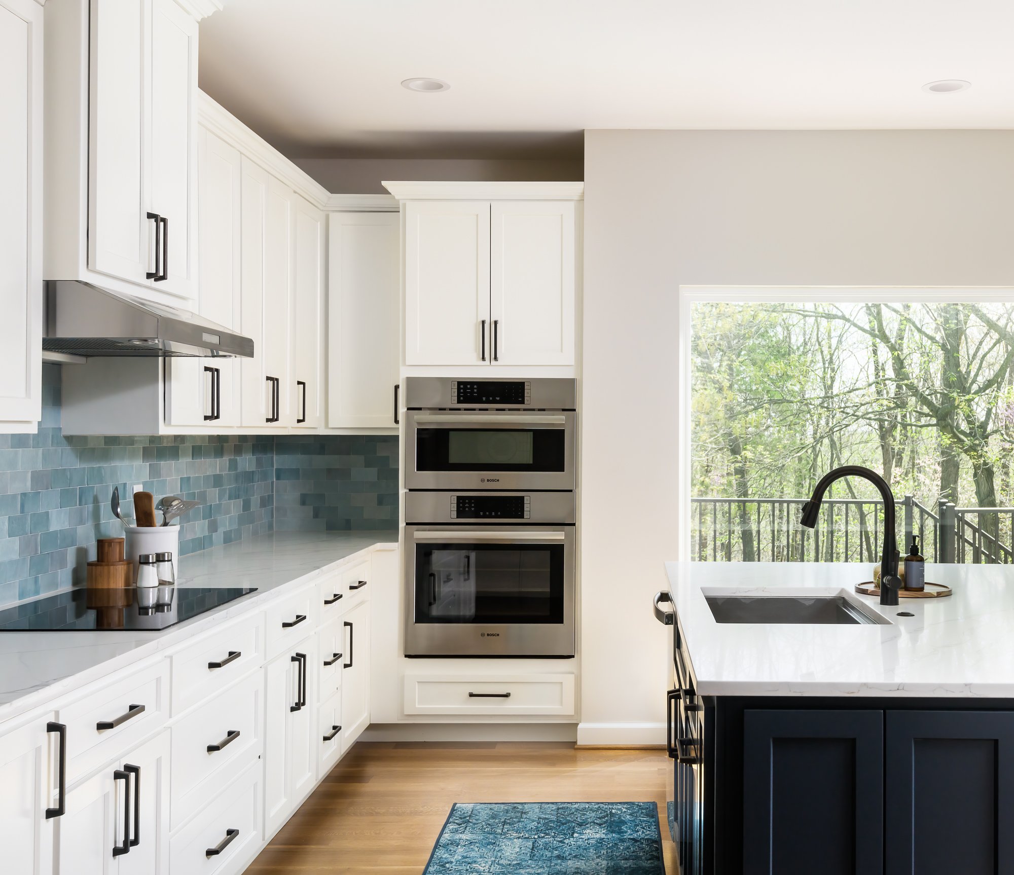
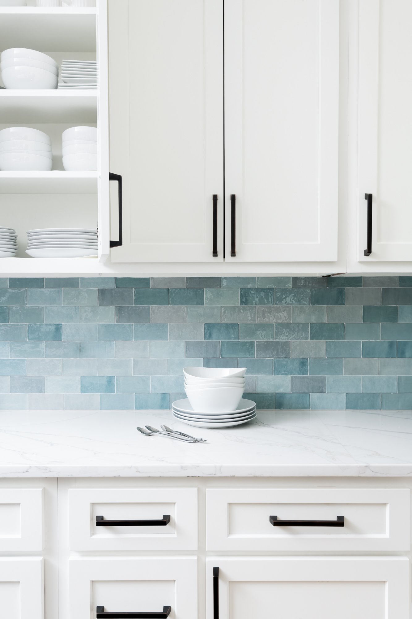
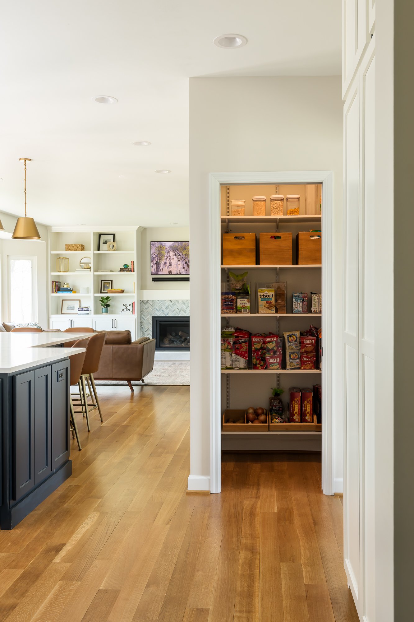
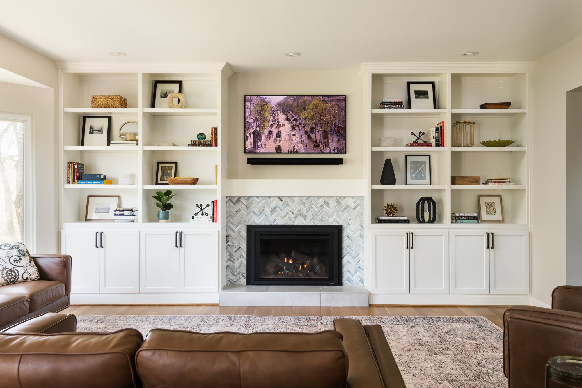
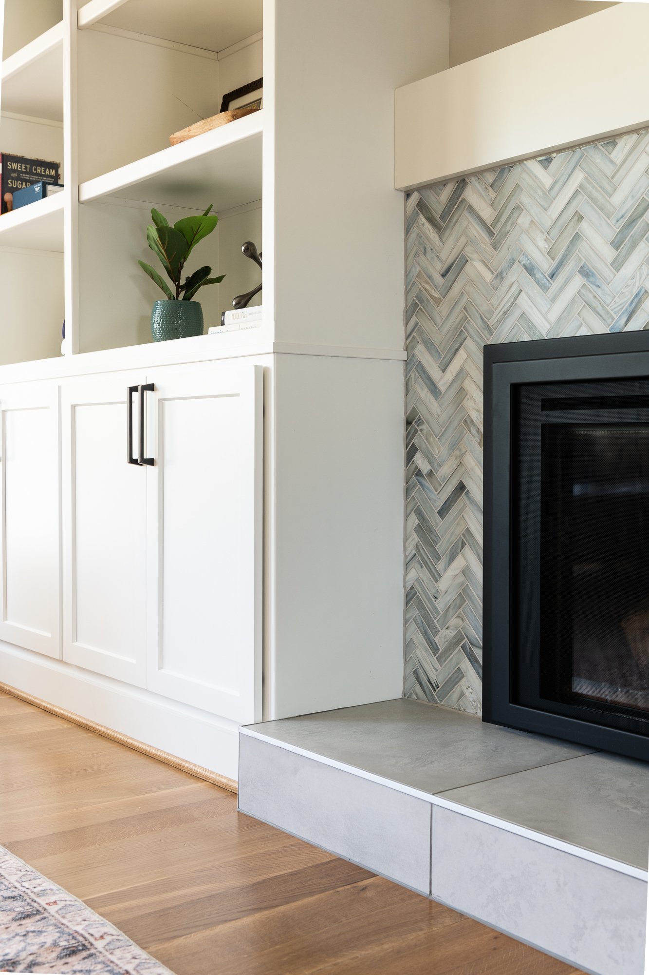
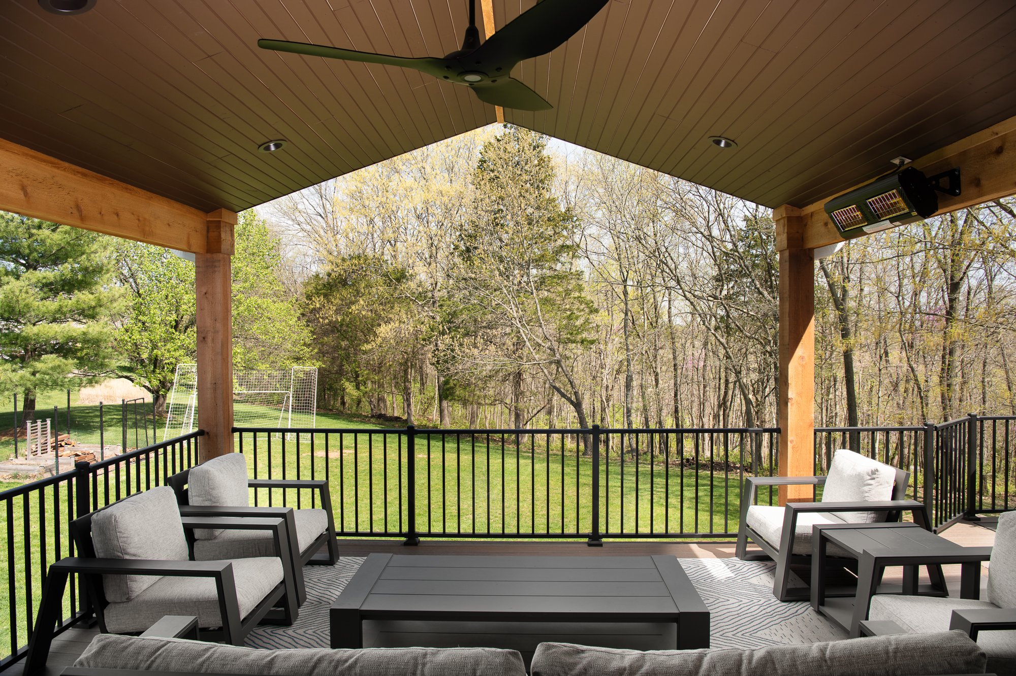
Our clients decided to embark on a full home update to their 1990's home. We completely reconfigured the kitchen and laundry with two main purposes- the first one was to provide them with access to a new covered deck and the second was to expand the footprint of their laundry room. We pushed the entire kitchen towards the family room and made the laundry room the entire width of the kitchen. We closed up the portion of their split staircase into the kitchen and created a pantry in the landing space. Creating a large island with tons of seating, eliminated the need for a dining table in the kitchen. We found the small varied blue subway tile that has a handmade appearance and it became the inspiration for our design. We wanted to keep everything light and timeless so we went with white cabinets on most everything. We used Hale Navy for the island to add some contrast and interest. The quartz countertops in the kitchen have beautiful gray veining with some streaks of gold so we complimented that by using brass pendant lighting. This also adds warmth to the cool color pallette. We mixed up the metal finishes by using oil rubbed bronze on the cabinet hardware and kitchen faucet. We added a huge picture window in the kitchen for an unobstructed view of the outdoors that adds a ton of light into the space. In the family room, we added built-ins next to the fireplace and a custom mantel to connect the cabinetry. The tile on the fireplace surround is a beautiful blue glass herringbone and we used a very large scale porcelain tile on the hearth. We updated the powder room by adding a new vanity with a gorgeous quartzite top and added brushed brass finishes. The same porcelain tile from the fireplace hearth was used on the floor. The new wood flooring throughout most of the first floor is quarter sawn white oak that we left natural. In the laundry room, we used a vinyl tile that is easy to clean and maintain. The countertops are stained wood custom made by our cabinetmaker. Their new covered deck is a big crowd pleaser. We did a solid stain on the wood ceiling and kept everything very natural to complement the cedar posts and allow the surrounding landscape to be the real focal point. Infrared heaters allow our clients to enjoy the space even on chilly days. Overall, we created an updated and clean design that functions much better for their family and they will enjoy entertaining their family and friends here for many years to come.
Gastman Kitchen
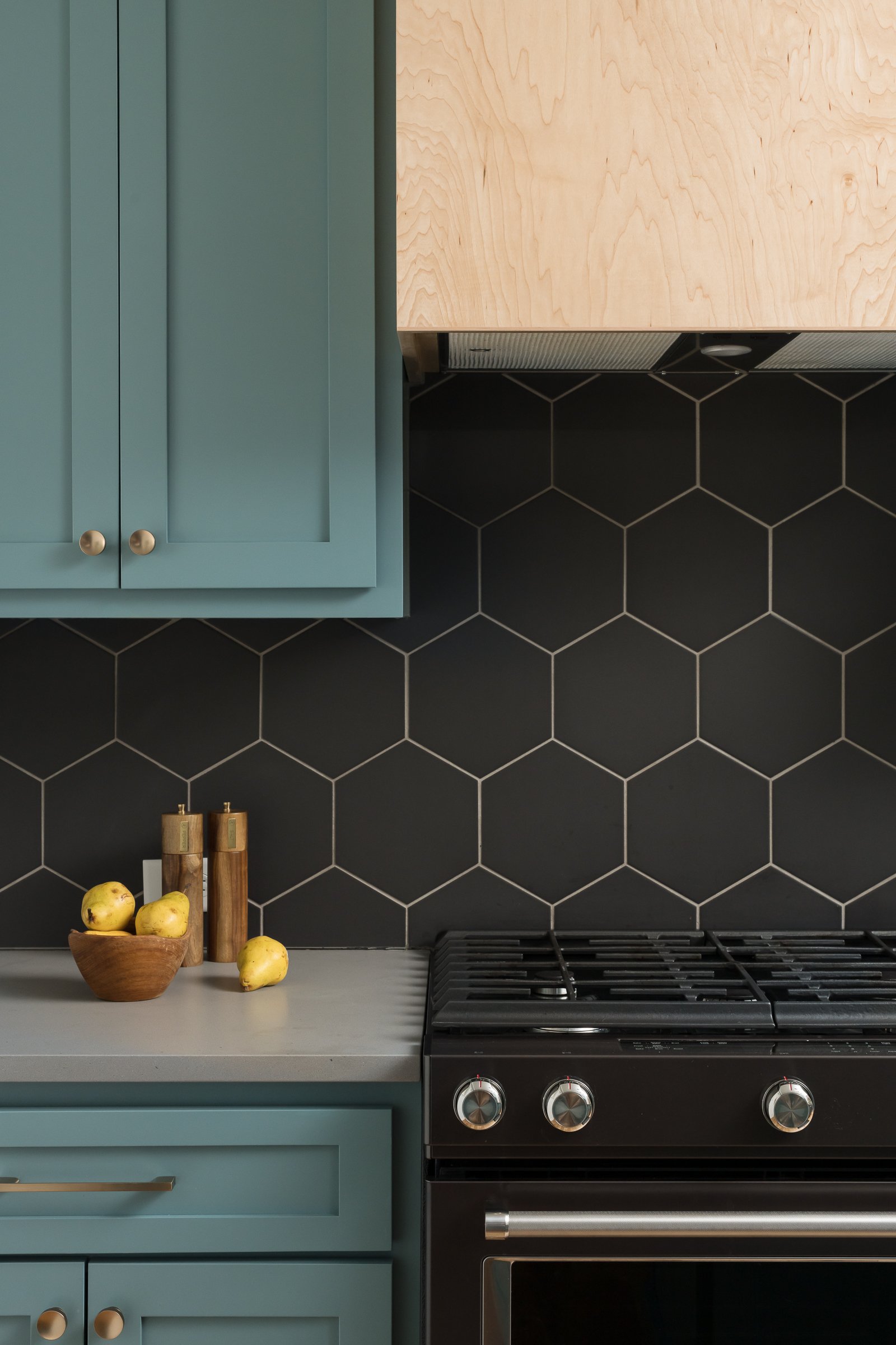
Our clients' kitchen had not been updated since sometime in the 80s. It was dated and did not make use of the space in a functional way. The goal was to give the clients more counter space, a more functional layout, and more connectivity to the living and dining room.

Maplewood, MO
2022
Designer: Jennifer Chapman
Photographer:
Karen Palmer Photography
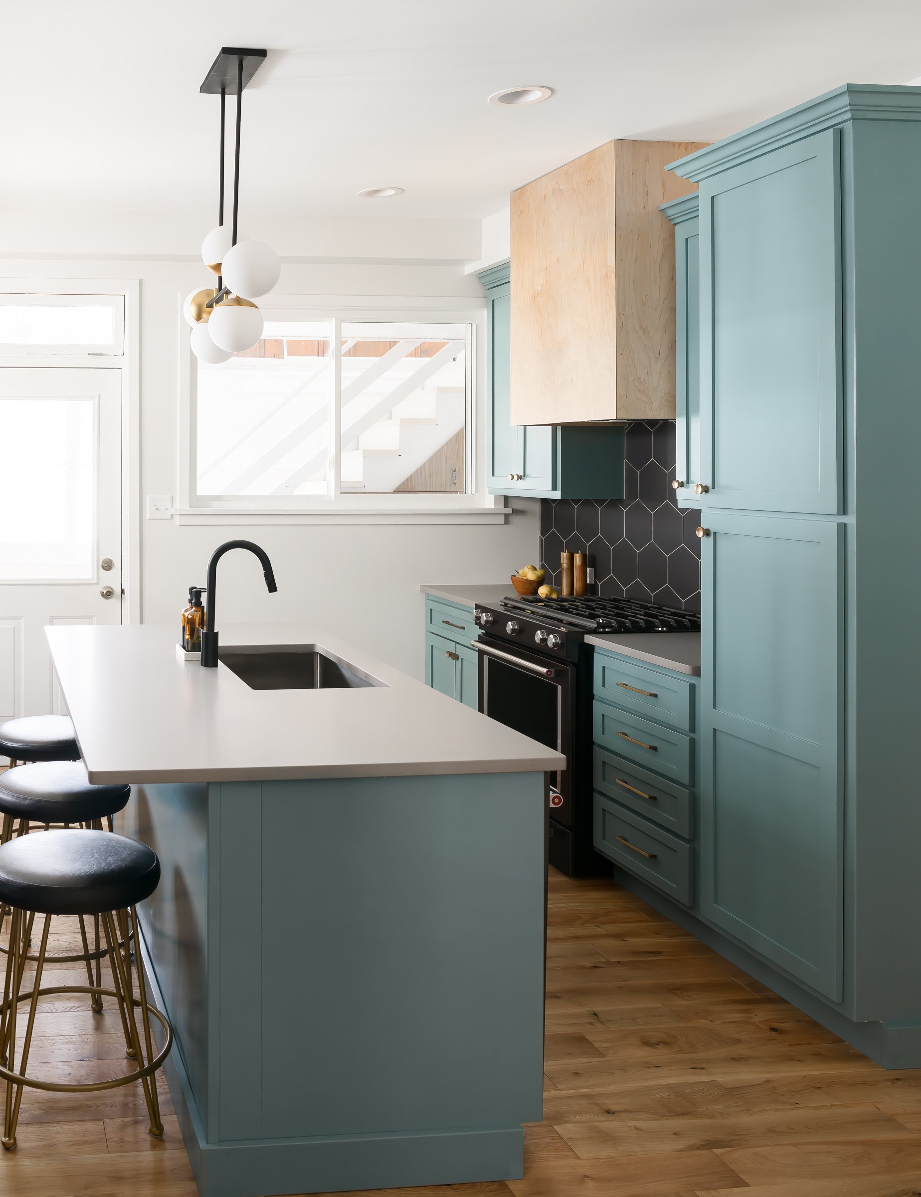
Our clients' kitchen had not been updated since sometime in the 80s. It was dated and did not make use of the space in a functional way. The goal was to give the clients more counter space, a more functional layout, and more connectivity to the living and dining room. We started by widening the open between the kitchen and dining room to create a more open floor plan. The kitchen design was inspired by the client's midcentury eclectic style and their desire for teal colored cabinets.The large scale hex backsplash creates a very graphic feel to the space and incorporates a textured layer to the kitchen. We went with honed gray quartz that looks a lot like concrete, but is very durable for everyday use. The custom maple hood and the brass lighting accents add warmth to the cool color palette. Overall, we achieved the goal of creating a much more open, functional space and creating a beautiful design that fits our clients' personal style.
Park Kitchen & Powder Room
This kitchen remodel was inspired by the clients' desire for a more open space & a large island. Their existing kitchen was closed off from the rest of the first floor and pretty tight on space. The powder room location caused a bottleneck between the living room and the kitchen as well.



Webster Groves, MO
Designer:
Jennifer Chapman
Photographer:
Karen Palmer
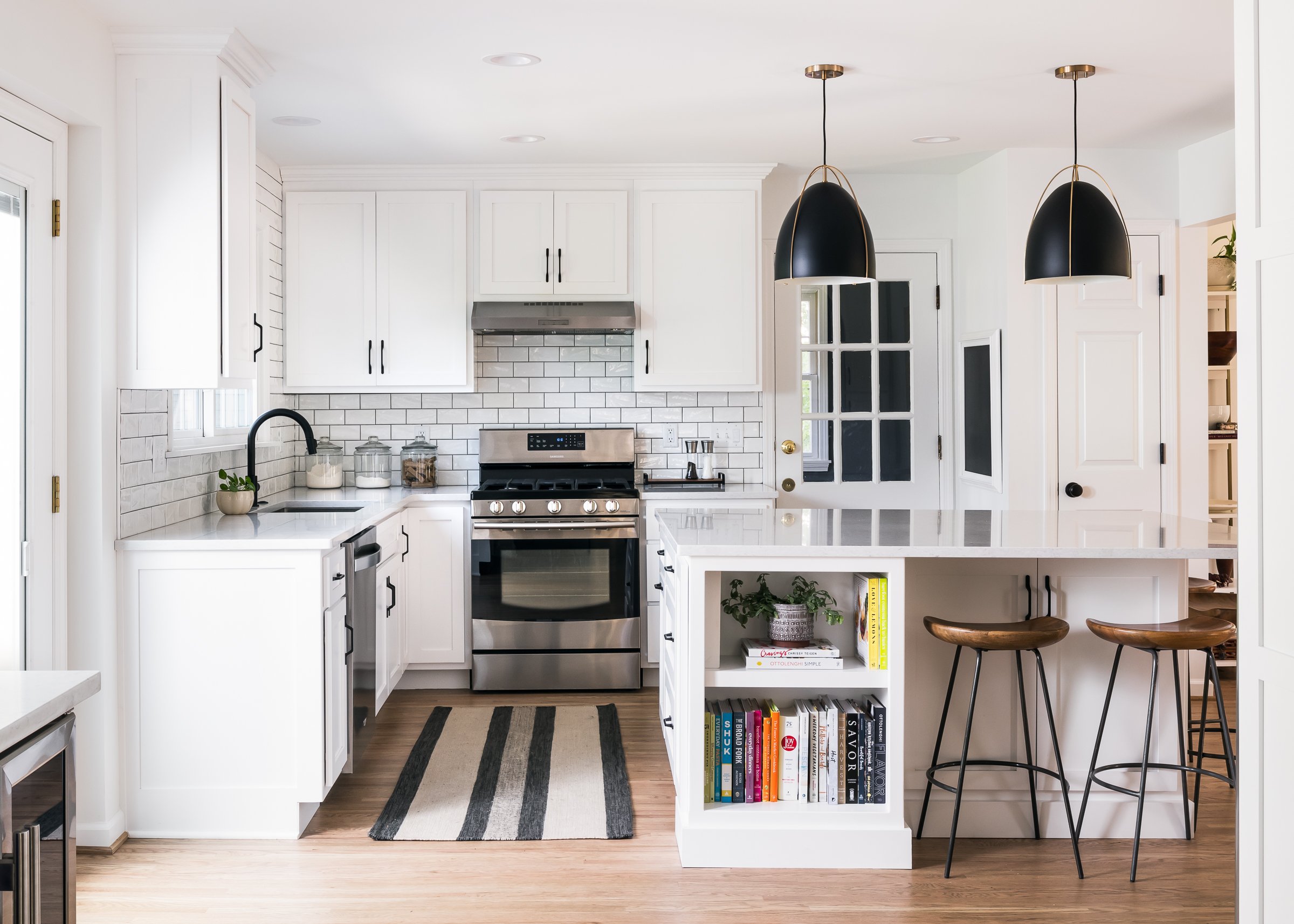
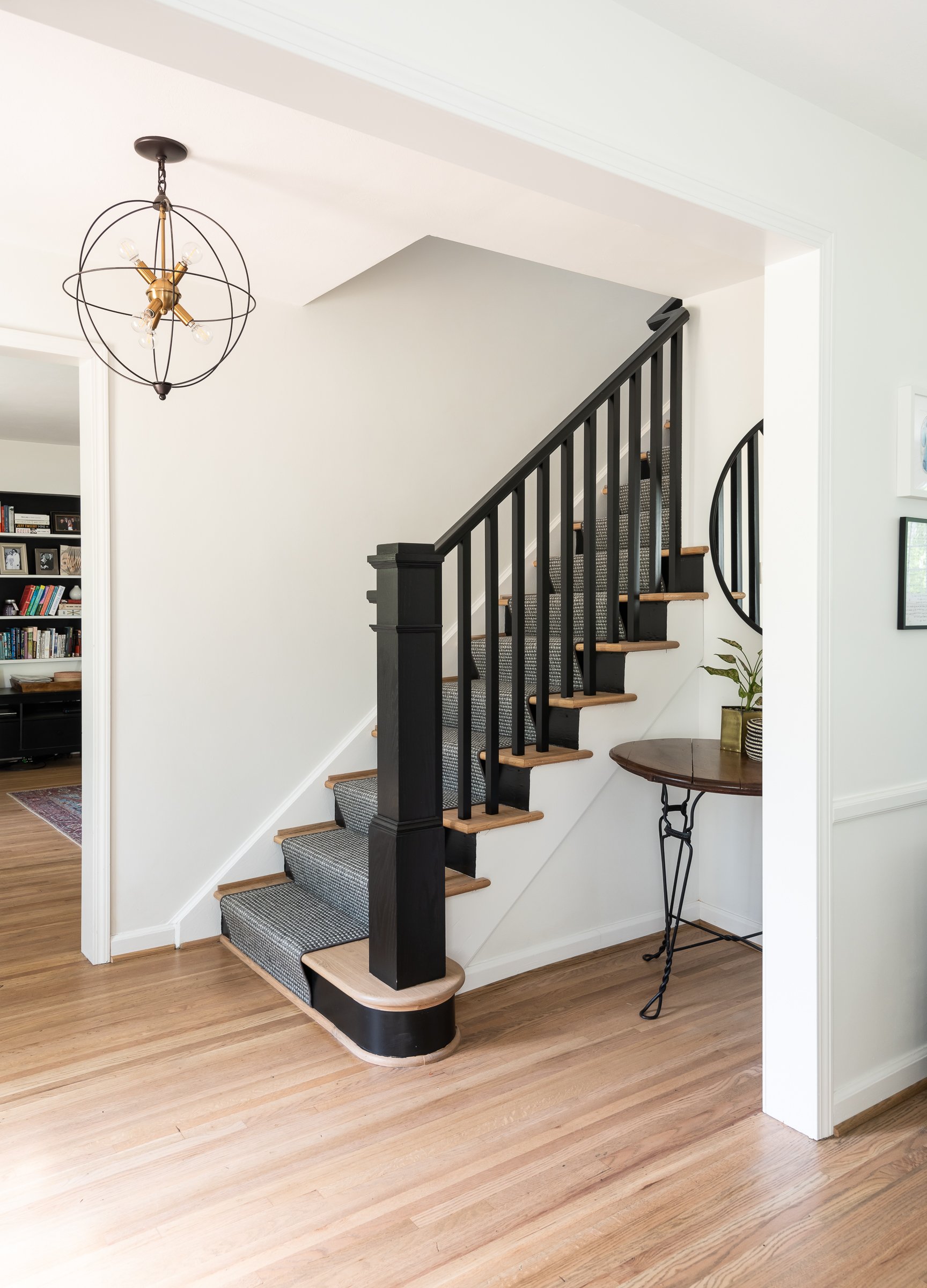
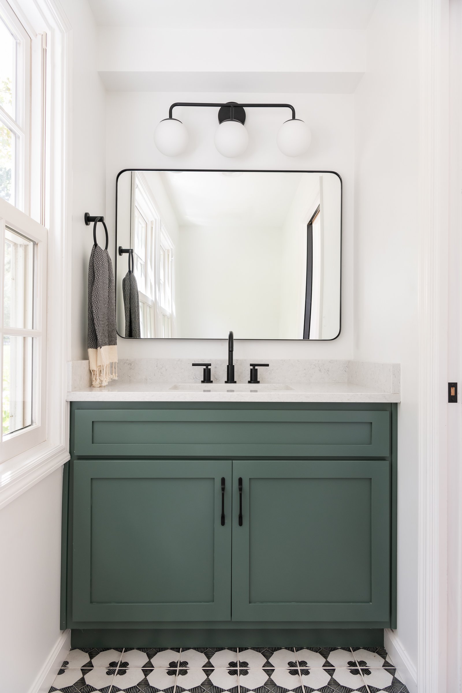
This kitchen remodel was inspired by the clients' desire for a more open space & a large island. Their existing kitchen was closed off from the rest of the first floor and pretty tight on space. The powder room location caused a bottleneck between the living room and the kitchen as well. We started by deciding to move the powder room to the back sunroom where it could still be easily accessed. This really opened up the traffic flow between the kitchen and the rest of the first floor and allowed us to add a small bar area. We removed the existing hallway between the foyer and the kitchen to allow for more space in the kitchen. We also widened the opening between the dining room and kitchen so the spaces would be more connected. We kept to a classic black and white color story by going with white cabinets, white marble look quartz countertops, and a white subway tile. The subway tile has a bit of a handmade feel to it, which adds interesting texture. We went with bold black and brass pendant lighting and matte black hardware and faucet. In the powder room, we had a little more fun with the finishes. We went with a black and white patterned tile floor and a beautiful green on the vanity. Whether it be entertaining family and friends, whipping up a fancy meal, or helping the kids with homework at their new large island, our clients now have a much more open and beauitful space for a variety of activities.
Crestwood First Floor Remodel
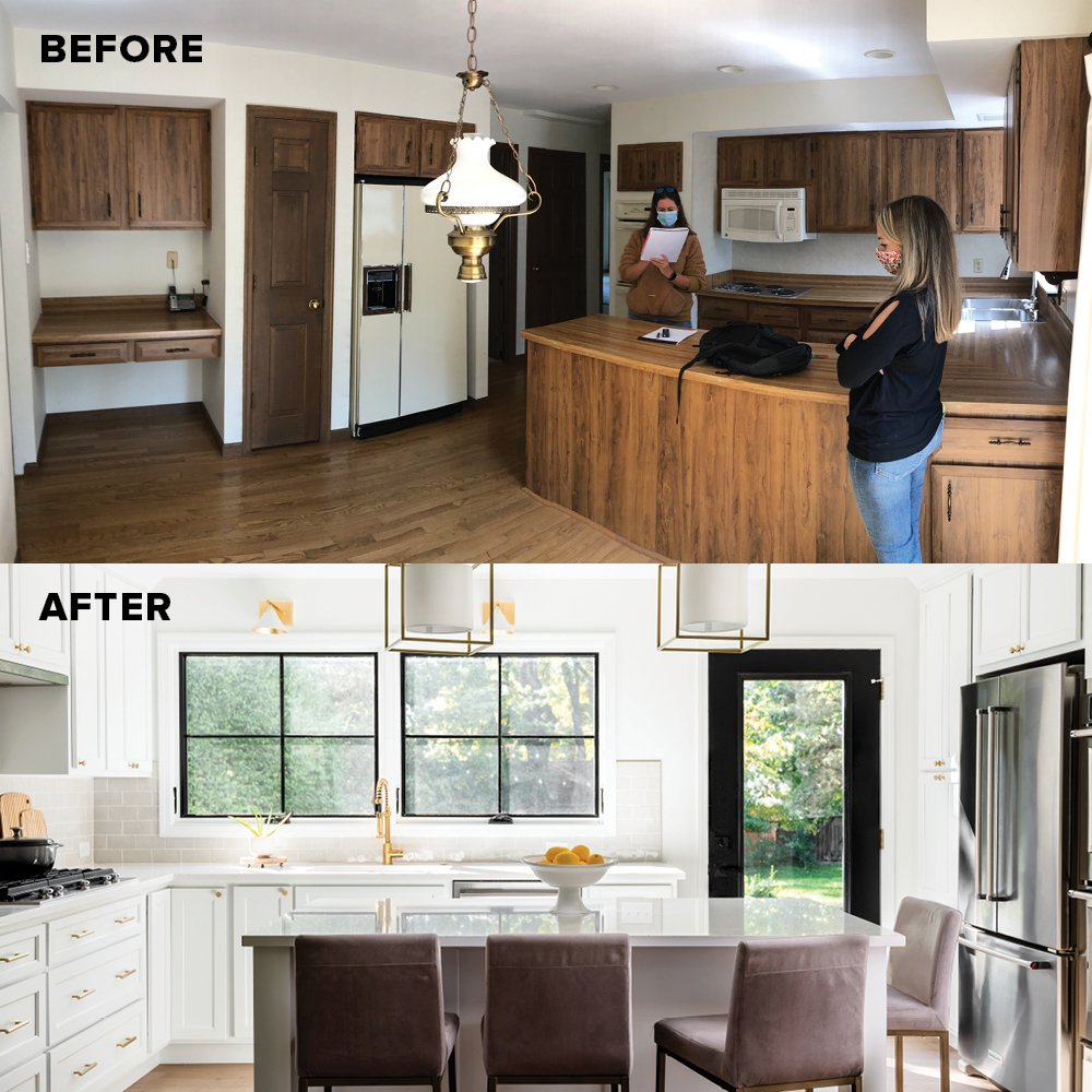
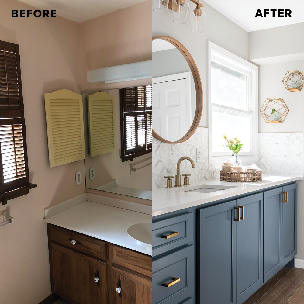
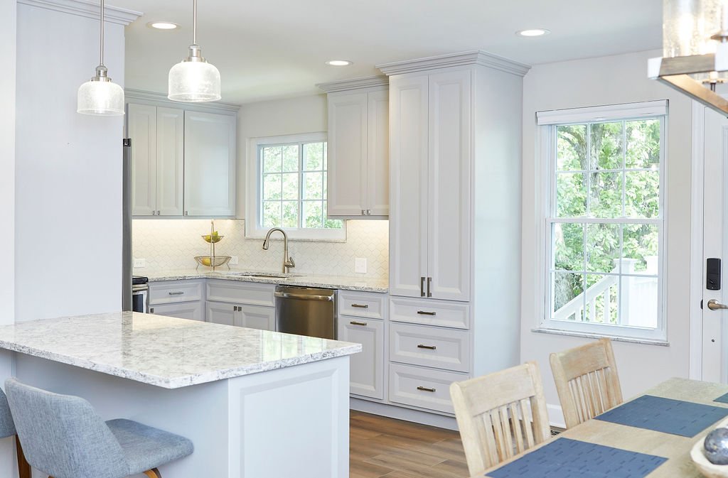
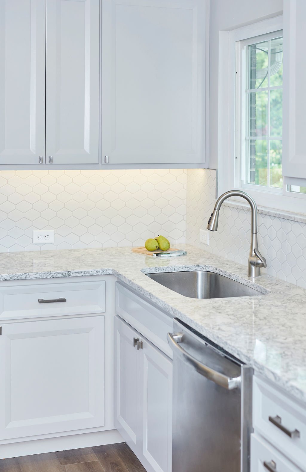
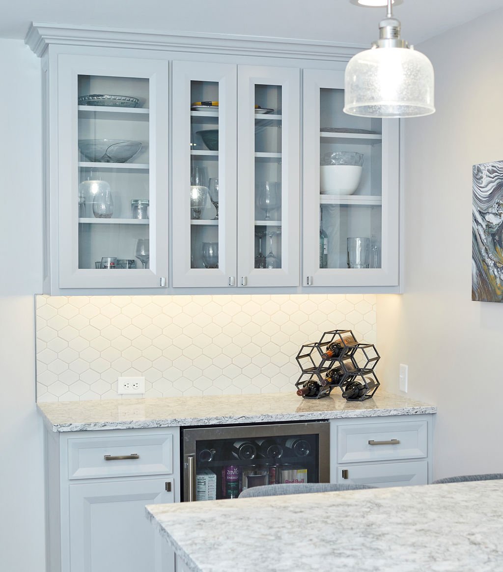
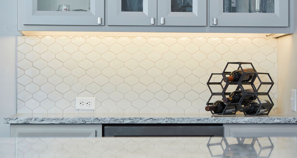
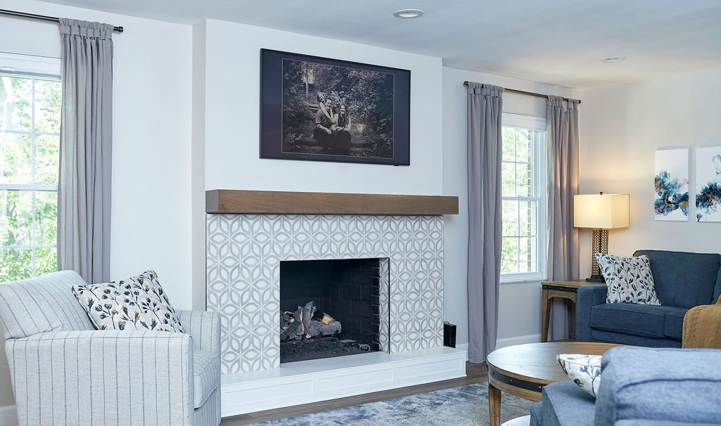
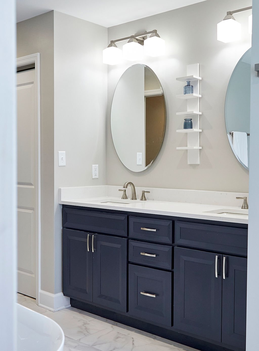
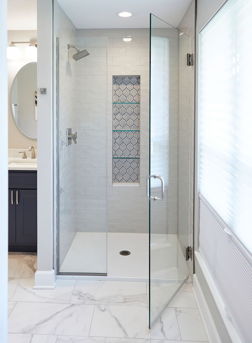
Our client found a great house on a great street. The main priorities were to open up the small rooms and dated floor plan, add a master suite, remodel the kitchen, add a powder room and a mudroom and all new flooring. We tackled the whole first floor and the results were perfect for today’s modern lifestyle!

Designer:
Rochelle McAvin
Photographer:
Amy Schromm
Our client found a great house on a great street. The main priorities were to open up the small rooms and dated floor plan, add a primary suite, remodel the kitchen, add a powder room and a mudroom and all new flooring. We tackled the whole first floor and the results were perfect for today’s modern lifestyle!
San Bonita Kitchen & Basement Remodel
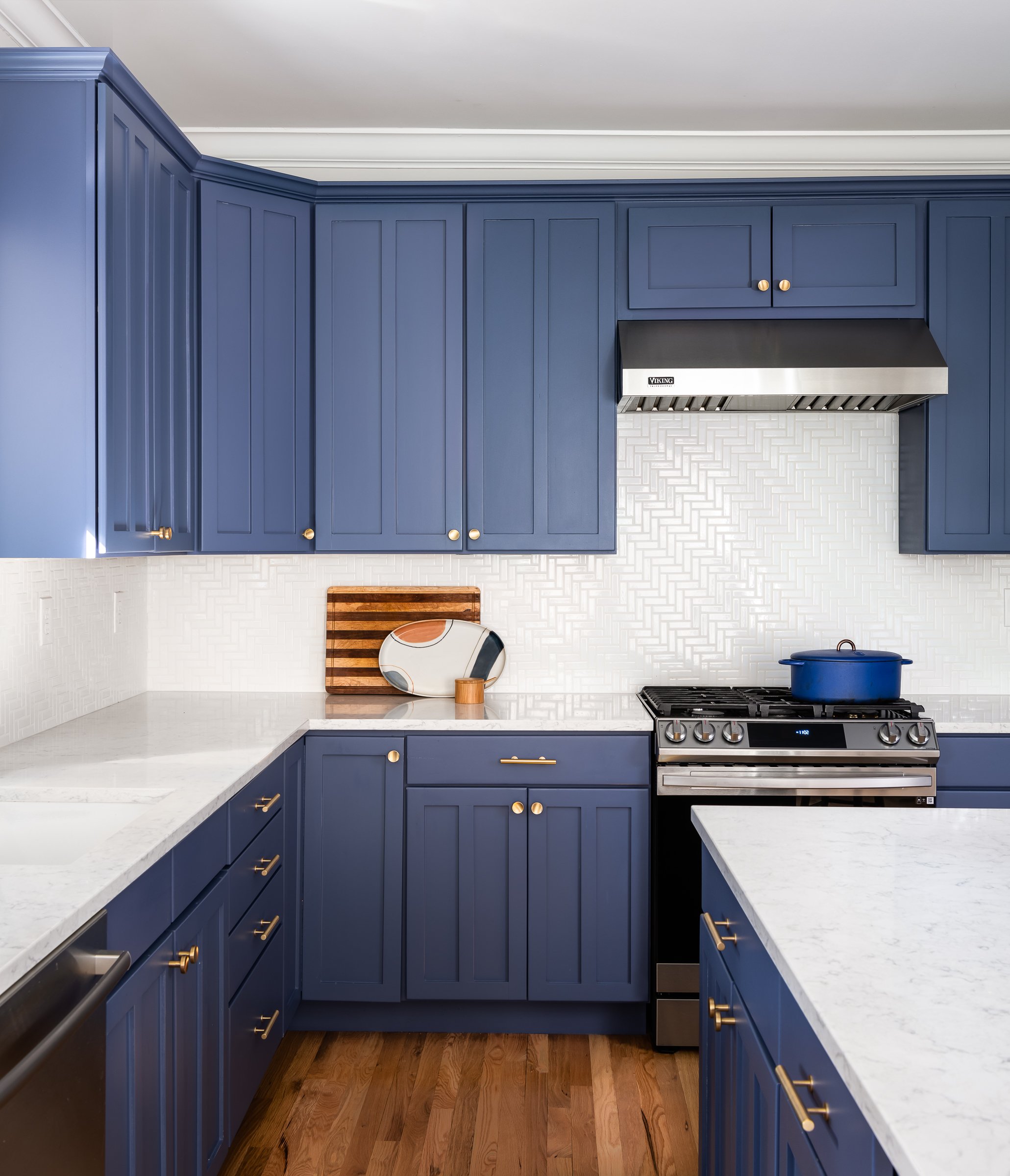
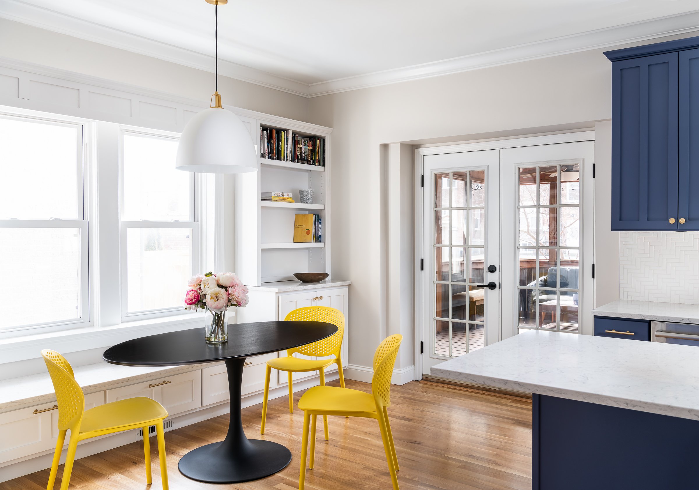
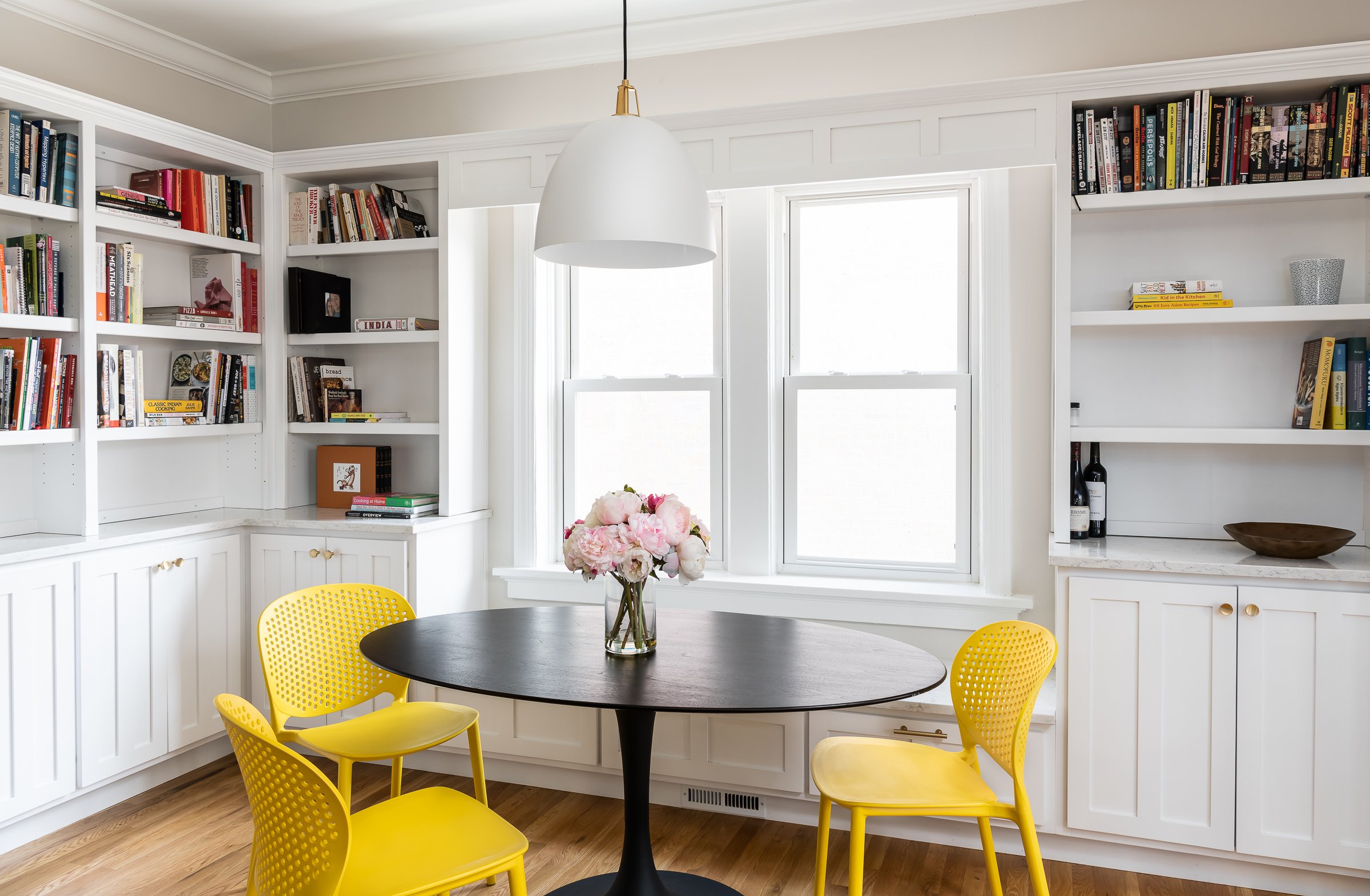
Our client is a young family who wanted to inject some storage and color into the outdated kitchen and capture the unused basement space for a fun playroom.
Designer
Rochelle McAvin
Photographer
Karen Palmer
Our client is a young family who wanted to inject some storage and color into the outdated kitchen and capture the unused basement space for a fun playroom.
We started by designing a set of built-ins around a bright and cheerful window and complementing the bright white with a cool blue cabinet color and herringbone backsplash.
The fun pendant light anchors the space with a bench seat for the kids.
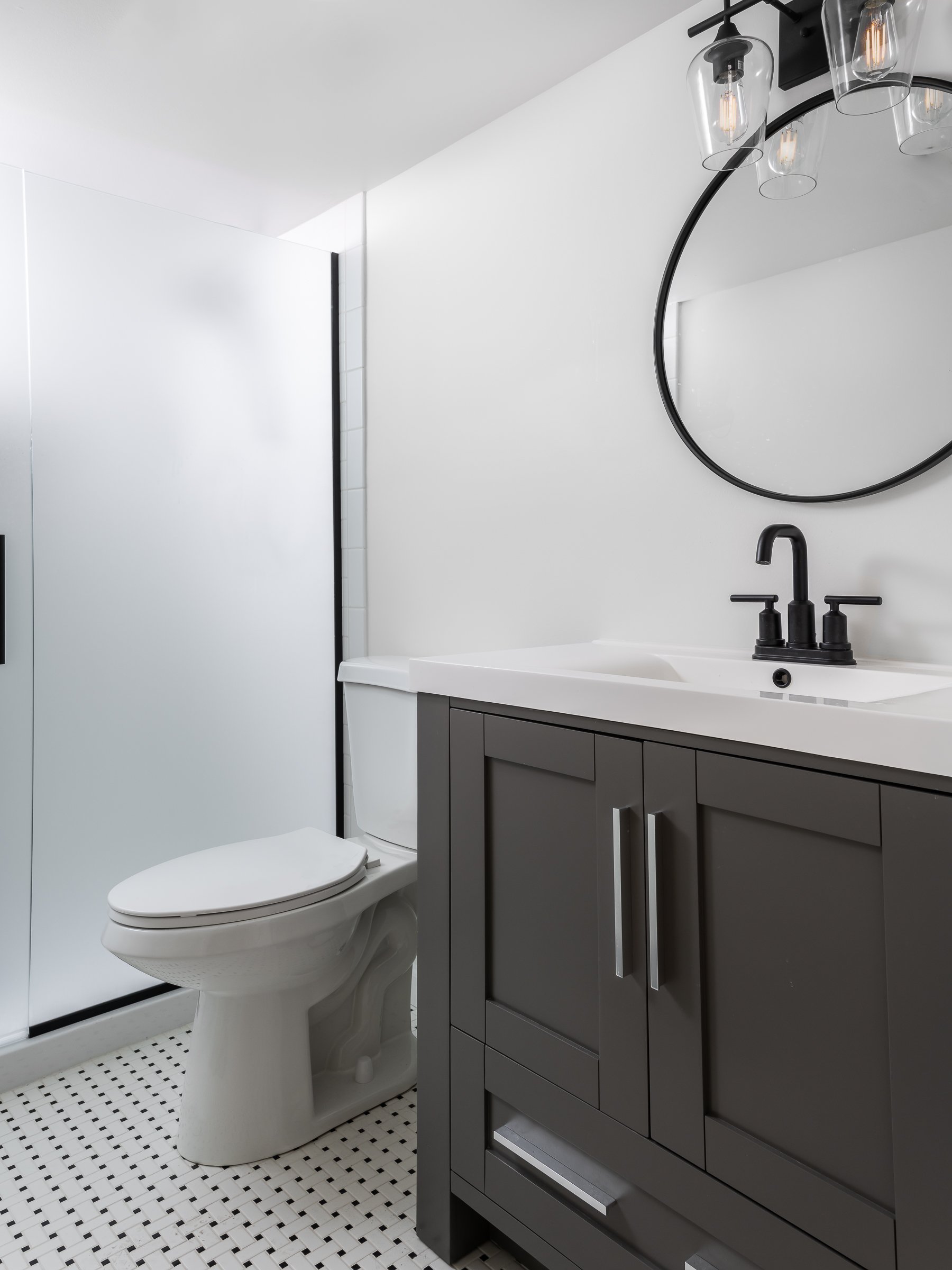
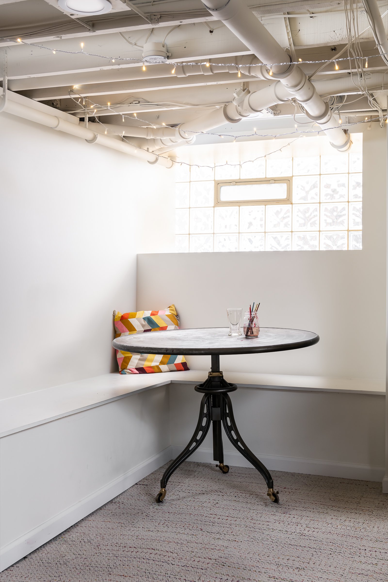
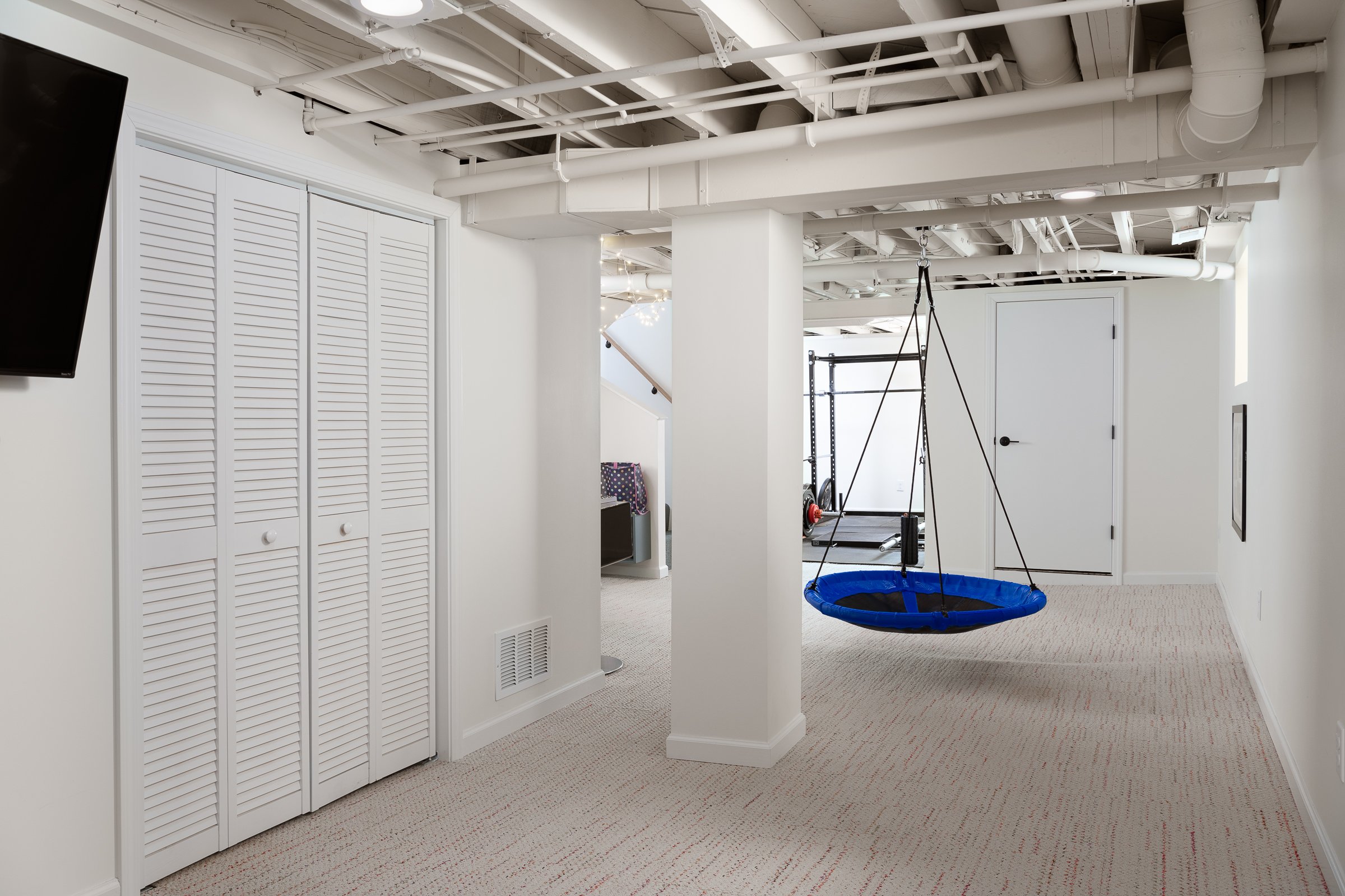
In the basement we added a spare bedroom and bath, The floor for the playroom is removable floor tiles and light white paint keeps the finished basement light and airy!
A perfect place for the kids to play and the family to hang out together!
Sunset Chase Drive
Referred to us by a past client, we were excited to take on their kitchen remodel. The homeowners had their home custom built 20 years ago and knew it was time for an update.


Ballwin, MO
Designer
Rochelle McAvin
Photographer
Karen Palmer Photography
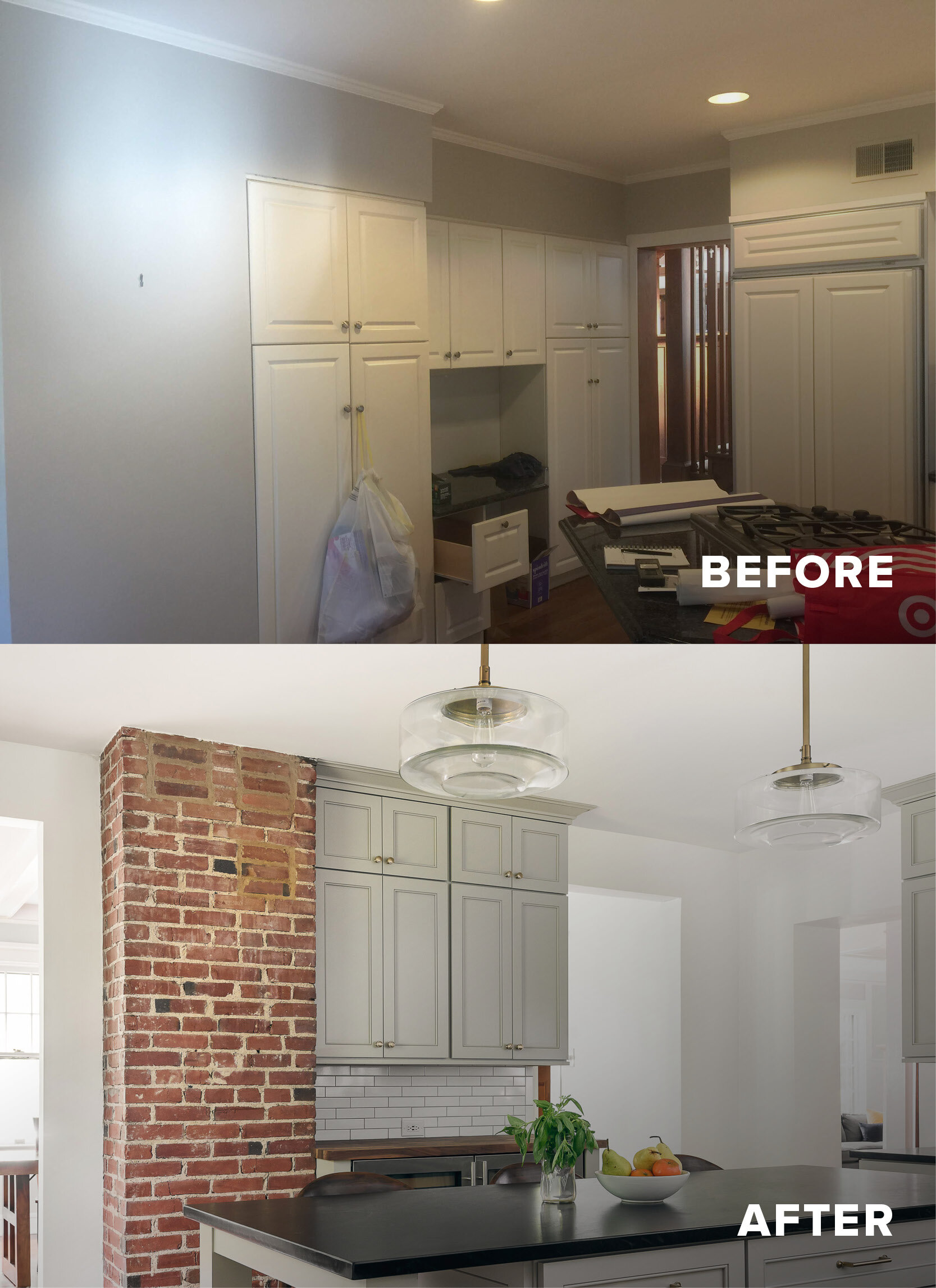
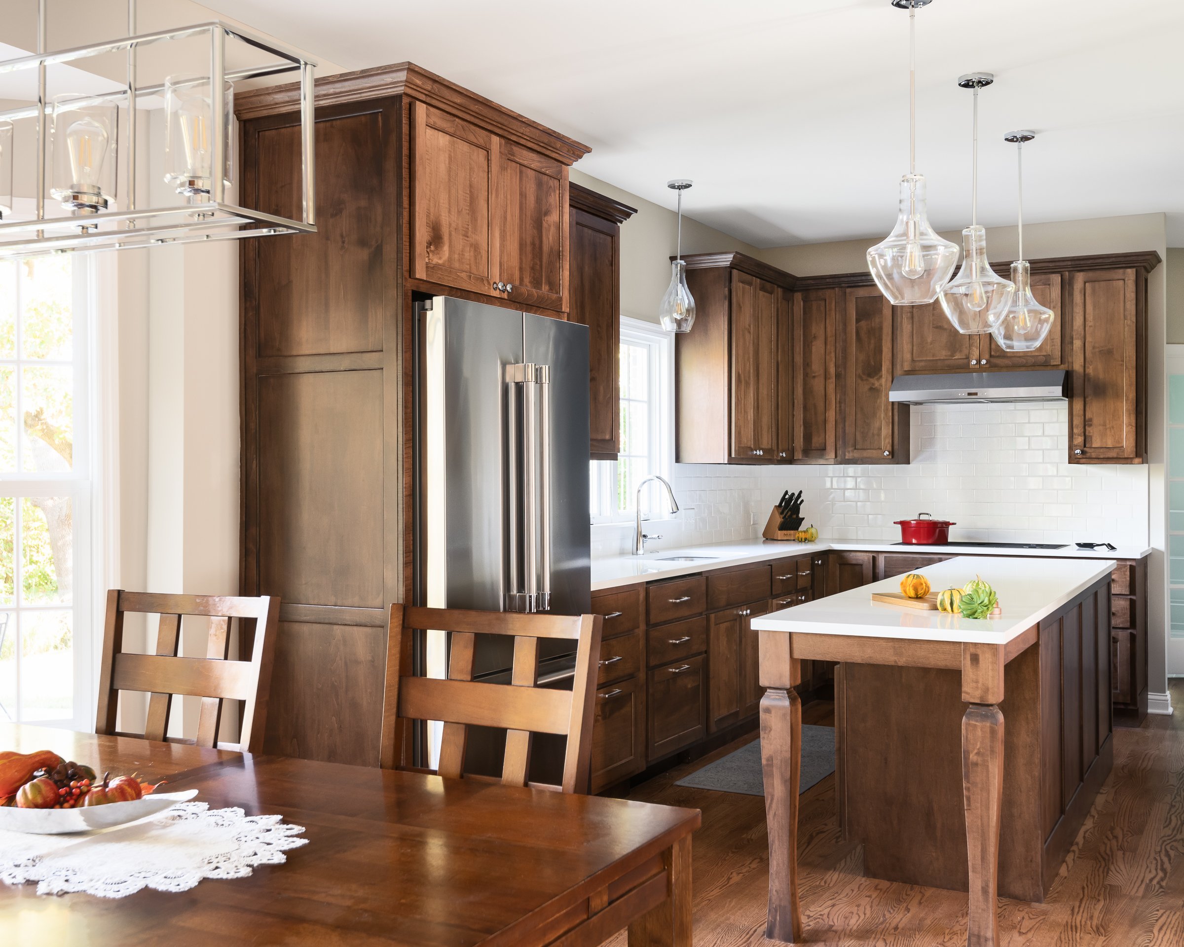
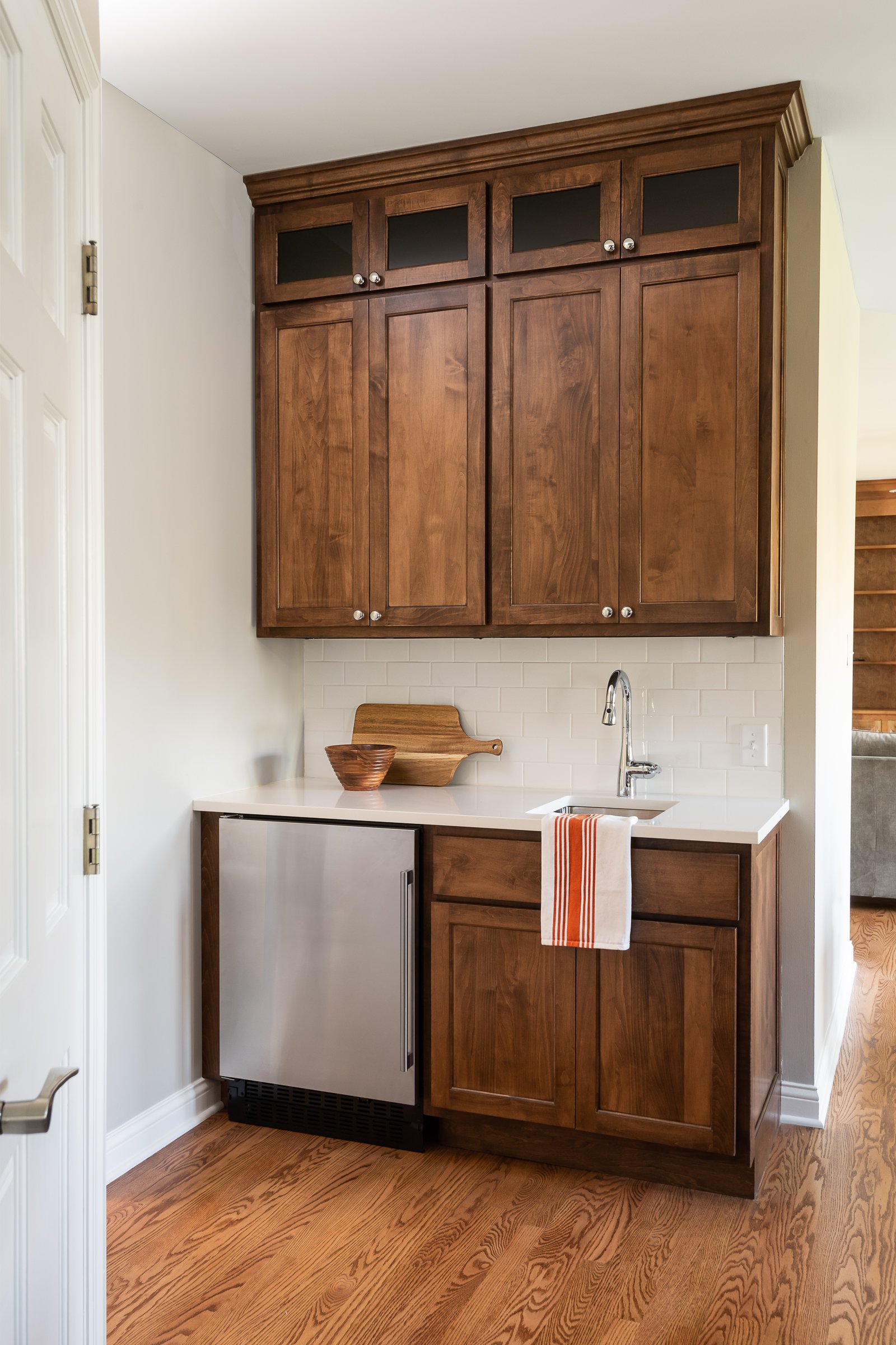
Referred to us by a past client, we were excited to take on their kitchen remodel. The homeowners had their home custom built 20 years ago and knew it was time for an update. They loved the warmth of the wood cabinets but were tired of the golden oak.
We expanded the length of the kitchen and brought in a rich maple wood, stained a warm coffee color to pull out the darker tones of the new hardwood floors. We kept the finishes bright and clean to add interest to the space but keep the look timeless. A modern Wolf stovetop and double-oven add to the ease of cooking in the new expansive island. Everything is finished off with a convenient bar for entertaining! Invite? Yes, please!
Drazen Home
Our clients relocated to an established neighborhood in Webster Groves, MO.Our challenge was to open up the floorplan for our family of four and bring in the light!
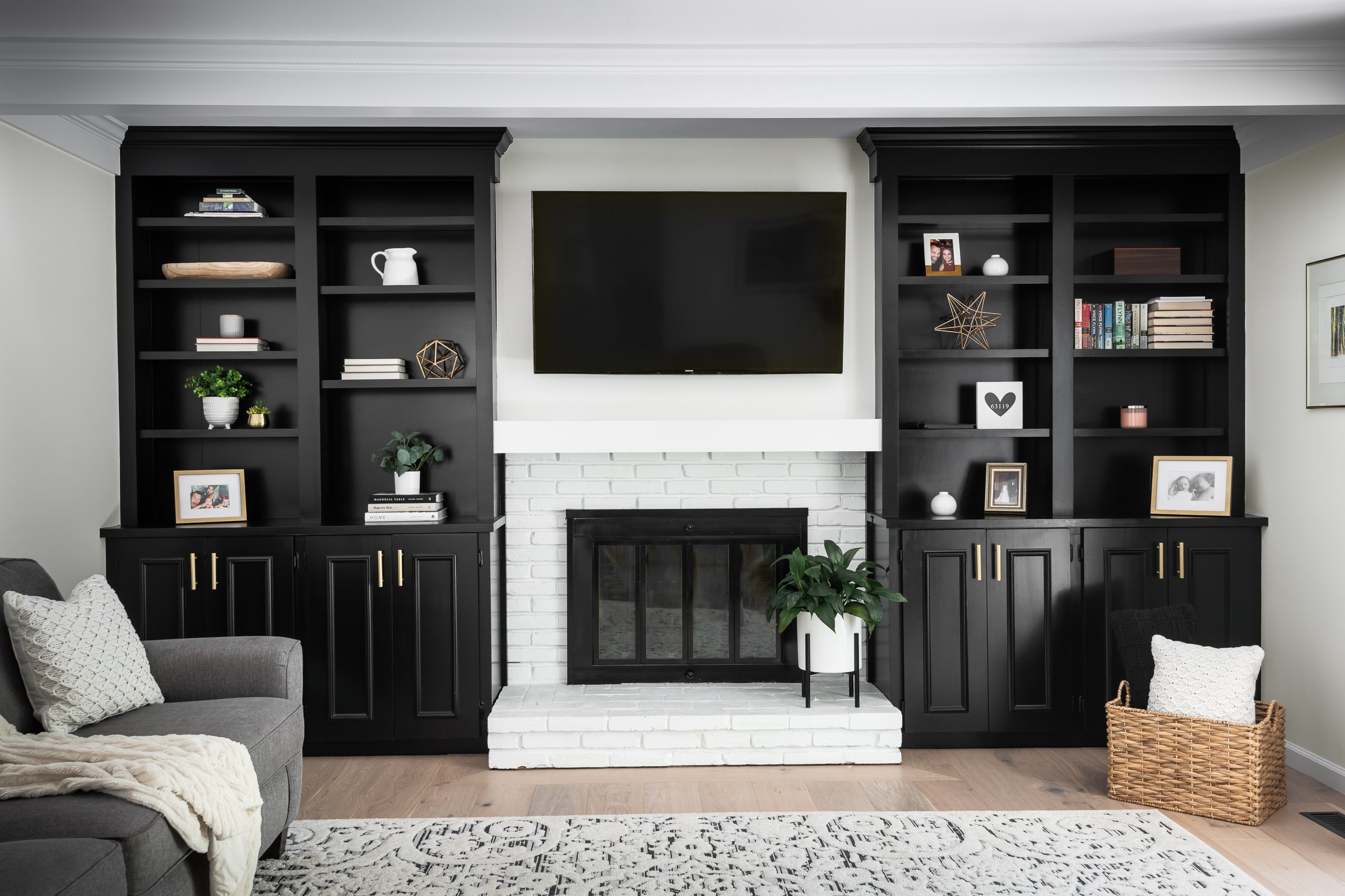
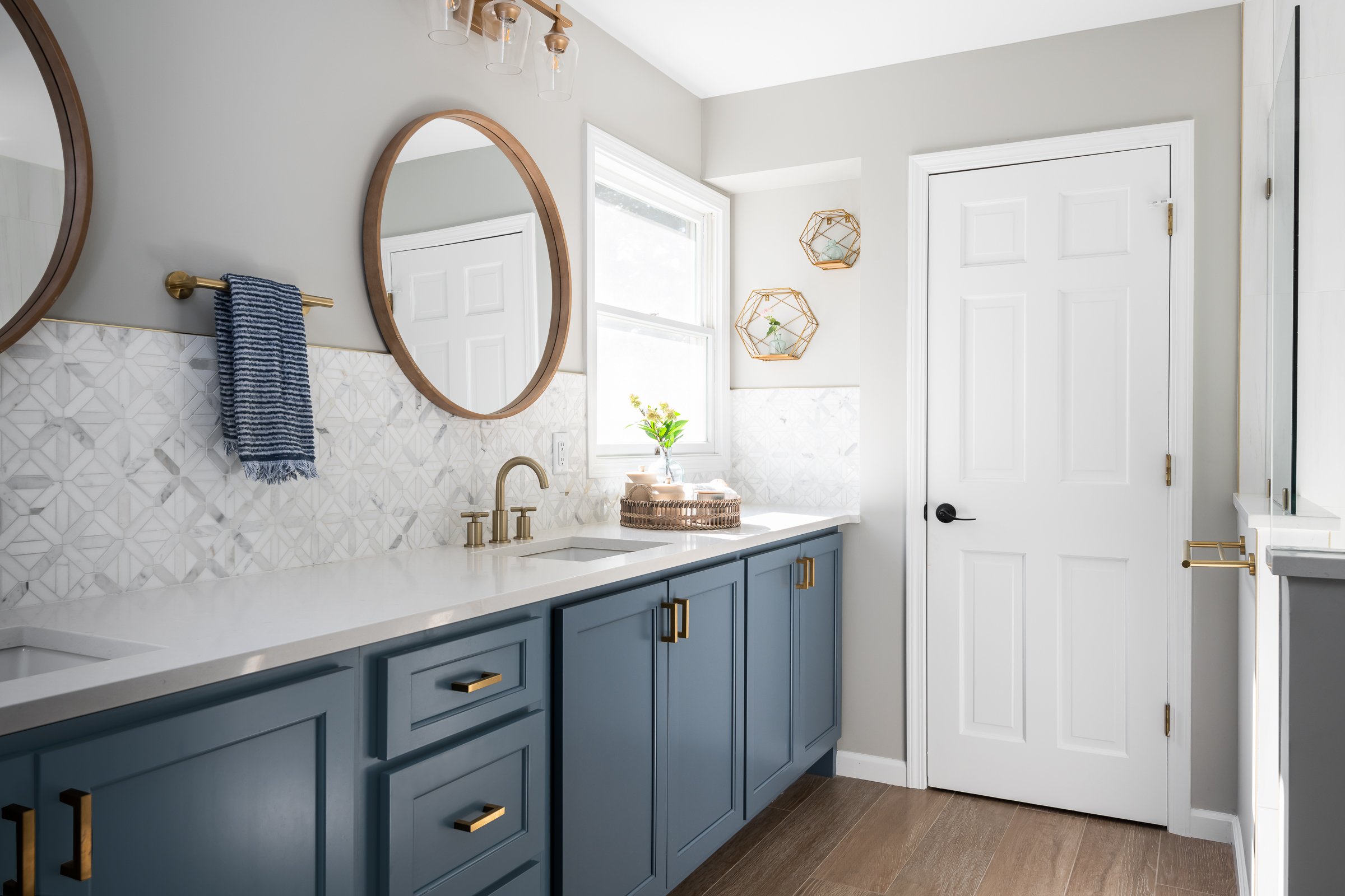
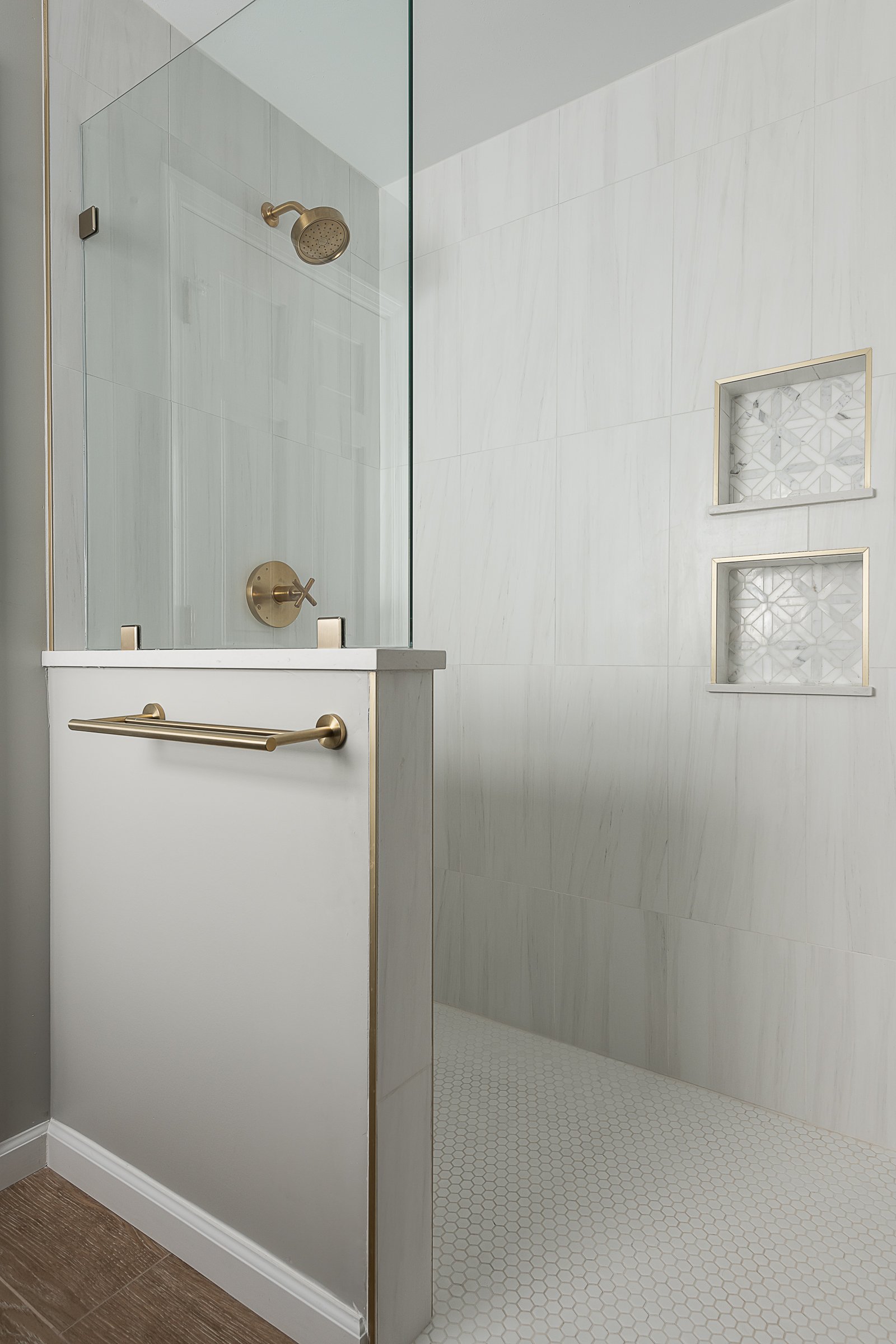
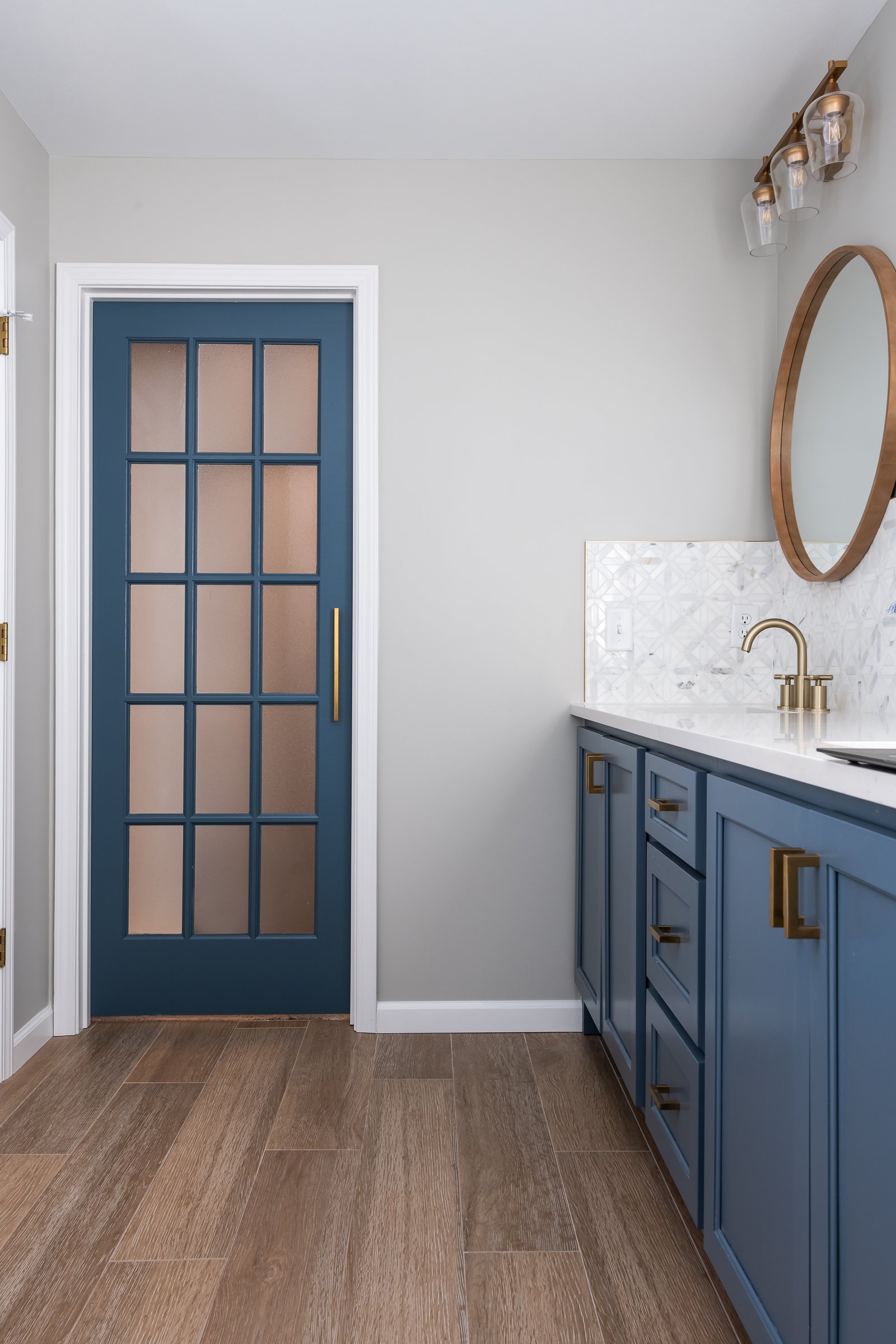
St. Louis, MO
Designer
Rochelle McAvin
Photographer
Karen Palmer Photography
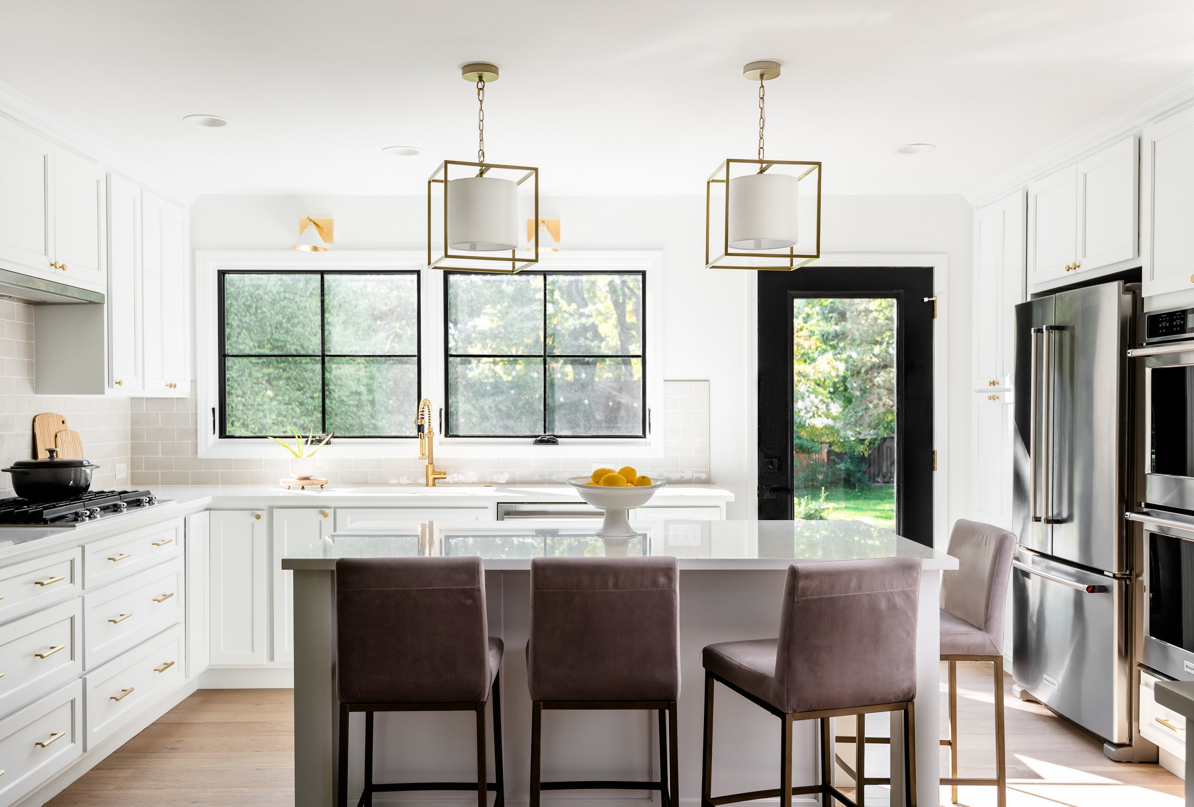
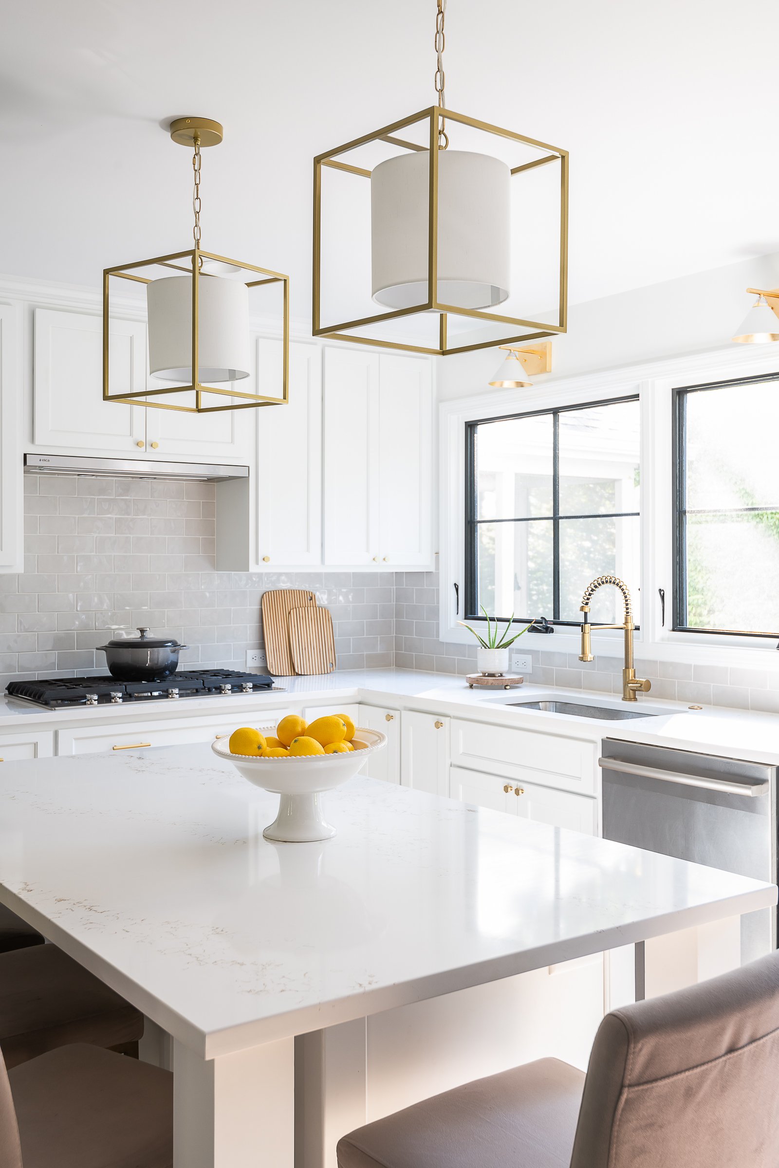
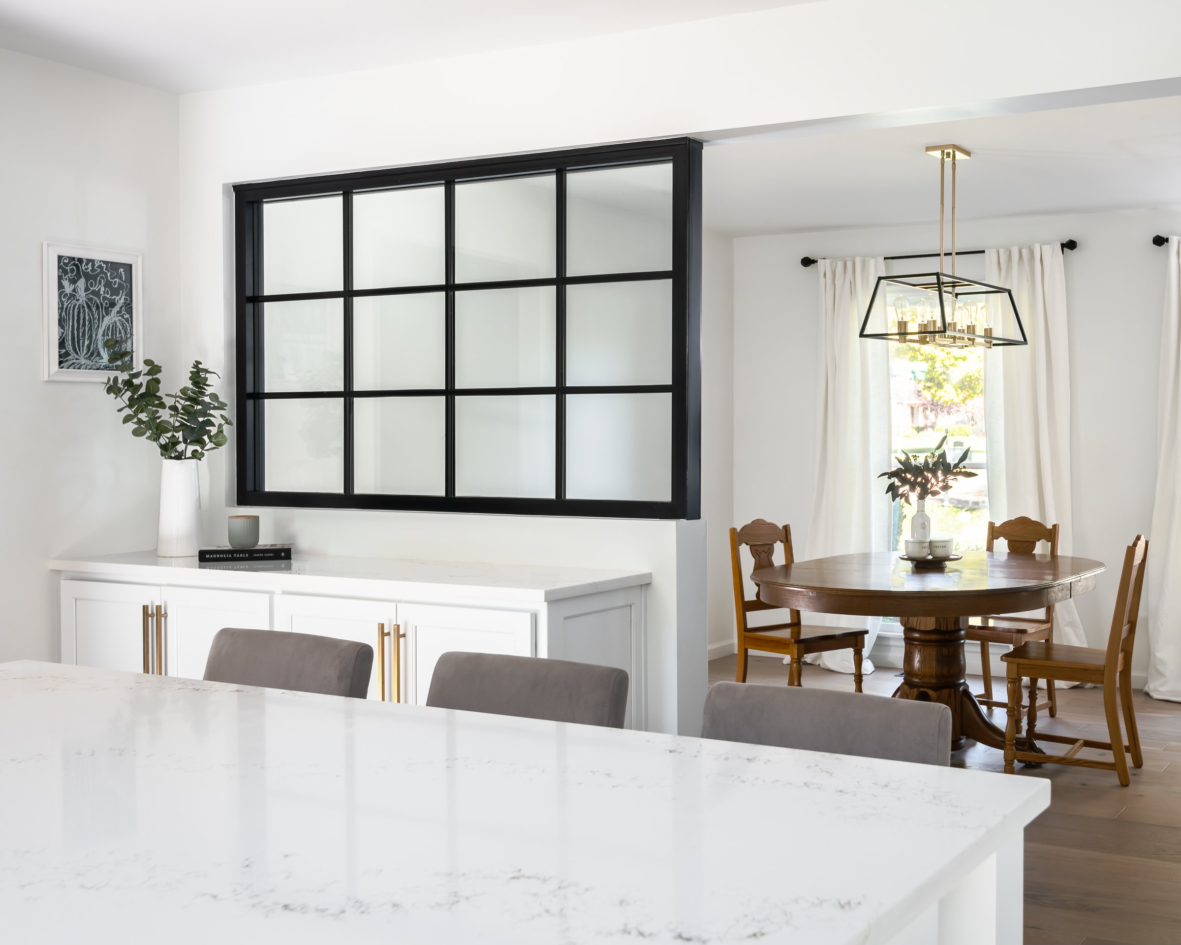
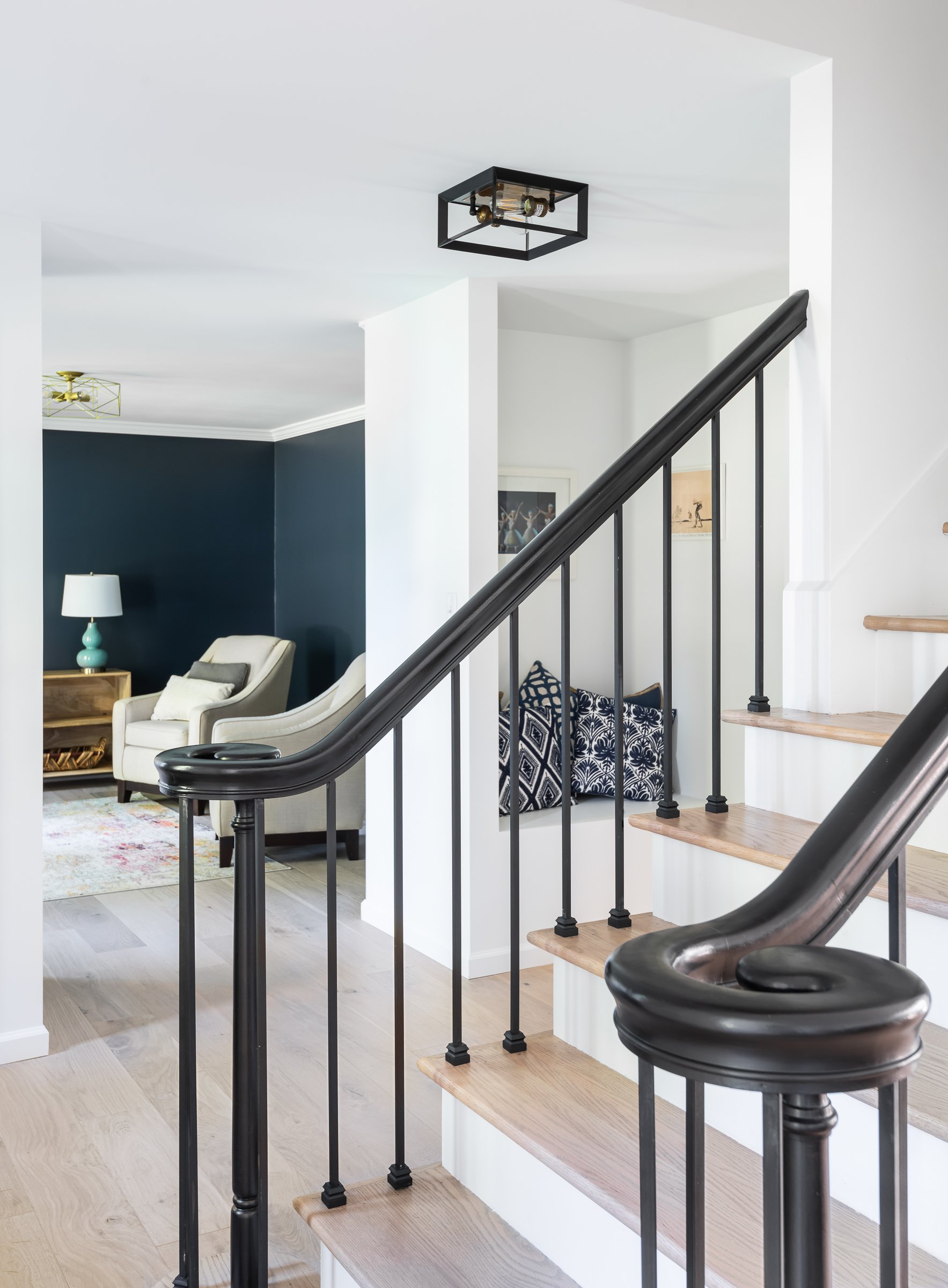
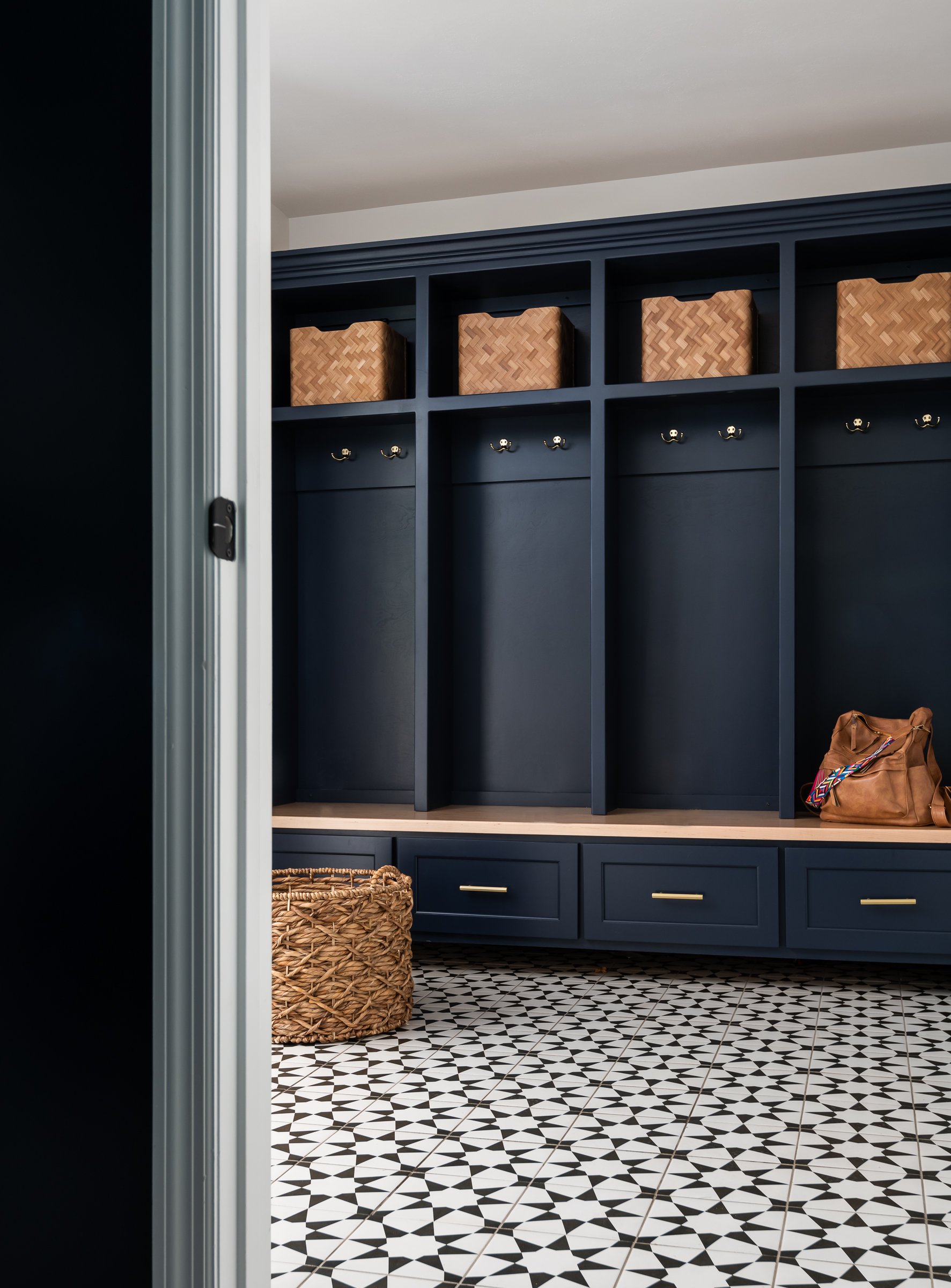
Our clients relocated to an established neighborhood in Webster Groves, MO. The only issue was the house hadn't been updated since 1982. Our challenge was to open up the floorplan for our family of four and bring in the light!
In the kitchen the classic layout with the division between the dining room and kitchen, provided us with structural challenges. By adding a steel window, we added architectural interest and support, and opened up the 2 rooms.
The formal living room has become the parents retreat and the family room is a place for everyone to gather.
The long narrow layout of the primary bath pushed us into a longer, elegant layout that includes a double vanity, walk in shower and primary walk-in closet.
Our clients have settled into their new home with room to breathe, relax and enjoy!
Organic Oasis
Homeowners looking to downsize create a nature-centric, cozy home tailored specially to them.


St. Louis, MO
Designer
LU Design Build
Photographer
Karen Palmer Photography
As Featured In:
St. Louis Home + Lifestyles
Homeowners looking to downsize create a nature-centric, cozy home tailored specially to them.
By Moe Godat
“I’ve tried to let my style evolve over time,” says the homeowner. “But it’s really a mixed bag. I like change.” Change is what she and her husband were looking for in their next house; as empty-nesters seeking a home to age in place, they knew they wanted a smaller space with more land and calming views of the outdoors.
Before their move, the family had always lived in subdivisions. “Our previous homes were a great place to raise our kids, and we always loved getting to know our neighbors,” she notes. However, she and her husband began looking for a home with a little extra outdoor space and a more manageable interior that would accommodate them as they grew older.
Though they’d toured many houses and even put contracts on a few, this Westwood ranch-style home spoke to them as soon as they stepped foot through the front door. “The house and the property just had the feeling I was looking for, even though it wasn’t in the best condition yet. It was just so peaceful.”
Peacefulness and a connection to nature were the main focuses for the renovation. The homeowners sought the help of Rochelle McAvin of LU Design Build to make their vision come to life.
“I needed a designer who understood my love for gently-used furniture, which I find more personal and interesting. They also needed to get the look I was going for; Mid-century modern with a twist. I felt that LU Design Build was creating the kind of projects I was looking for.”
Designer Rochelle McAvin has worked in the design build industry for over six years, and she focuses mainly on residential remodeling. For all projects, she believes in letting the clients’ priorities fuel the design. “Form follows function, and we wanted to make this house as efficient and comfortable as possible for the homeowners.”
The goal of the project was to create a personal oasis for the pair they could enjoy for years to come while leaving a minimal environmental footprint. They aimed to make the space feel calm, serene and interesting without making the entire house white.
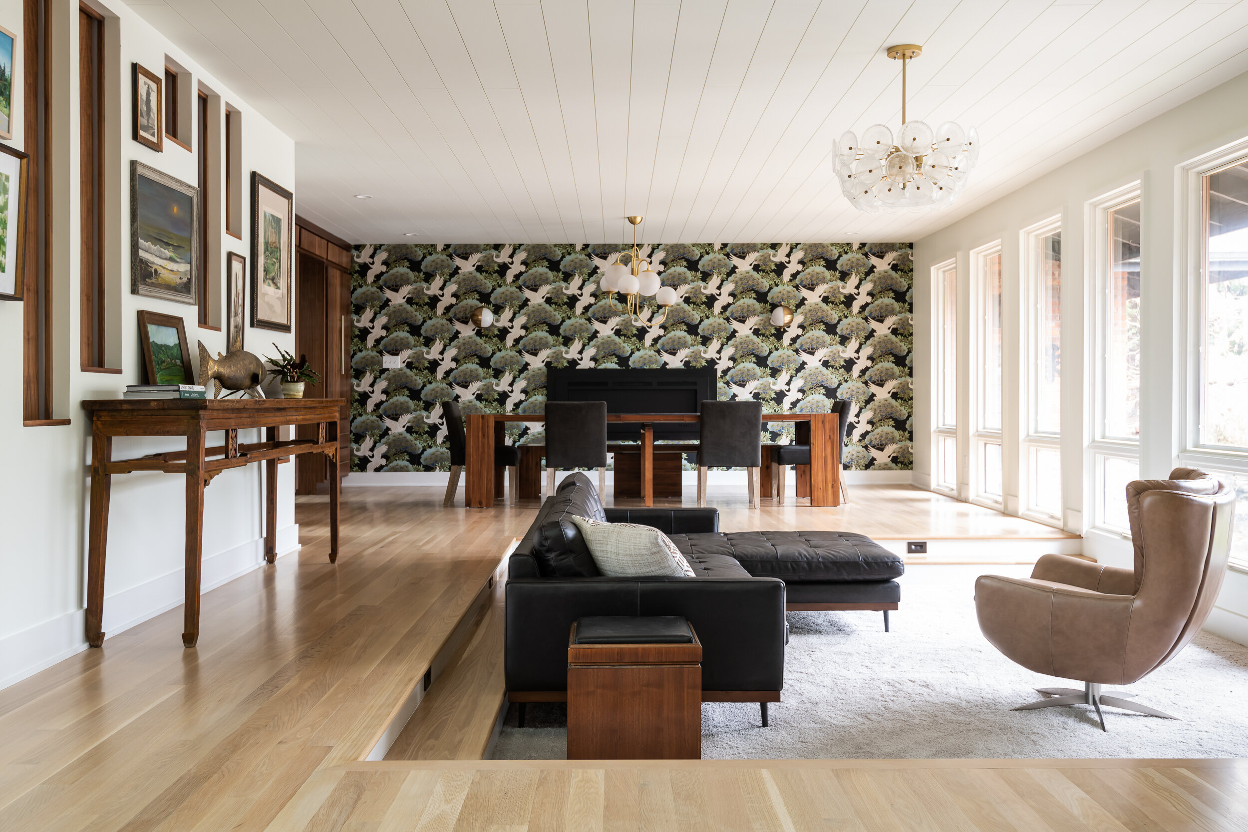
The home is interesting from the moment you enter. To the right of the front door is a sunken living room that the homeowners lovingly call “The Pit.” Built in 1967, the sunken living room was original to the home, but the previous owners leveled the space in a 1980s remodel. Both the new owners and Rochelle agreed that restoring the sunken floor plan gave the home character, though they made it smaller to increase coziness and intimacy.
Primarily used as a family gathering place and game room, “The Pit” needed ample seating and enough space for visitors to pull up a chair and enjoy each other’s company. The large couch was a find from Stash Home, and the gray swivel chair and roomy coffee table came from Pottery Barn. The homeowner finished off the space with vintage ottomans from an estate sale to act as side tables. Large windows at the front of the room give a perfect view of the pond just outside and let in plenty of natural light during the day. Dimmable light fixtures from West Elm give the room a warm glow once the sun sets.
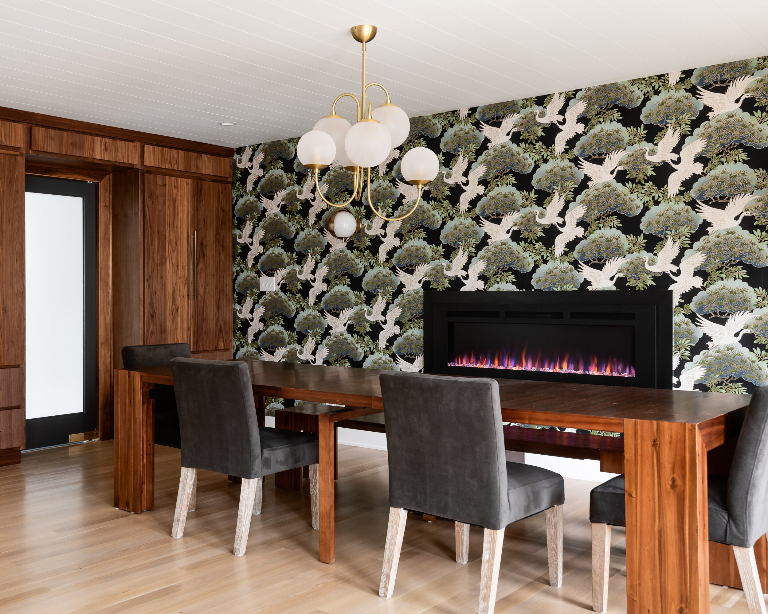
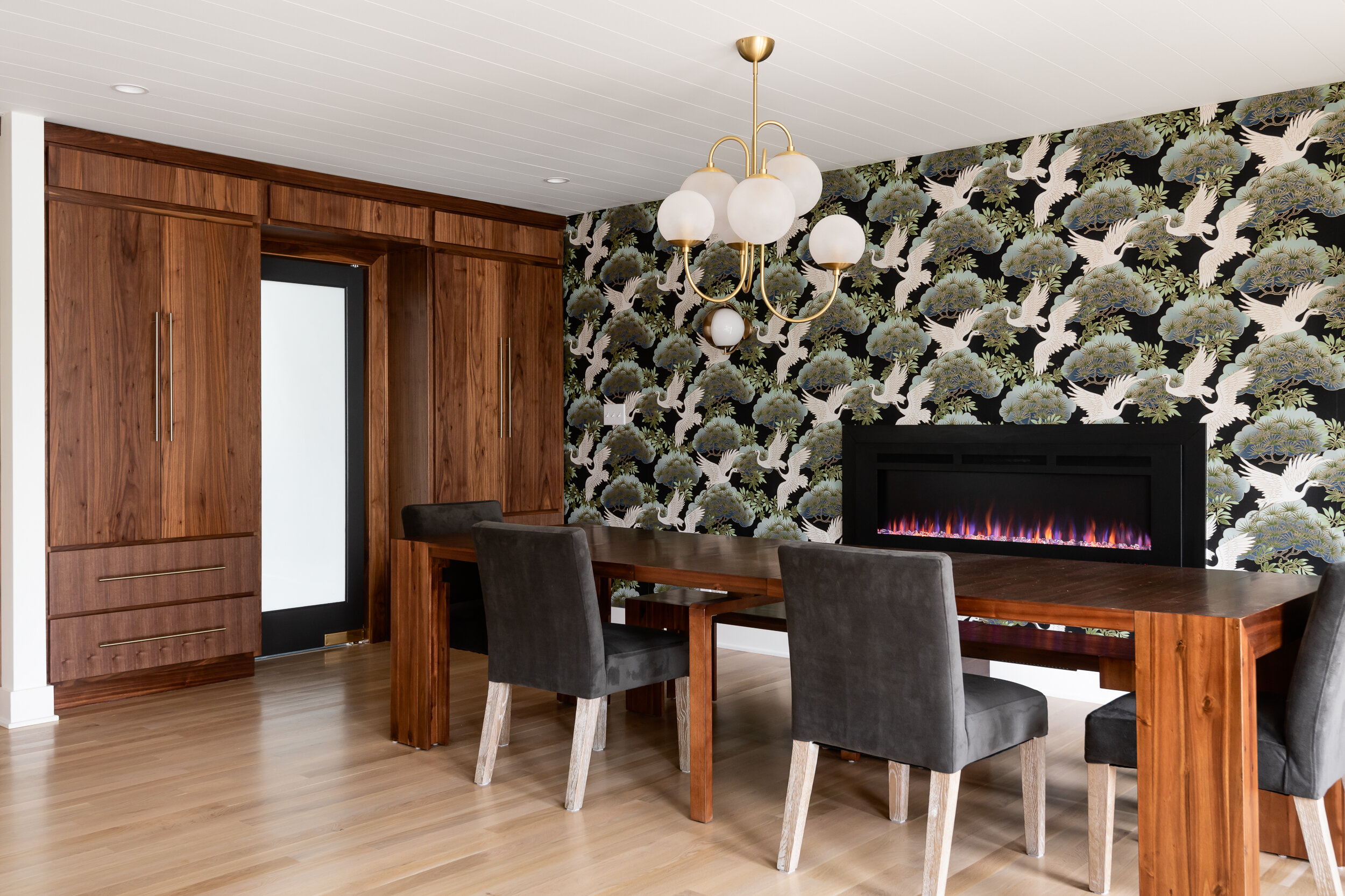
Because the homeowners don’t always require a lot of seating, they opted for a table in their dining room with many removable leaves, allowing it to shrink down to the size of a desk. A Napoleon electric fireplace adds to the warm ambience at dinners, gently lighting the striking wallpaper.
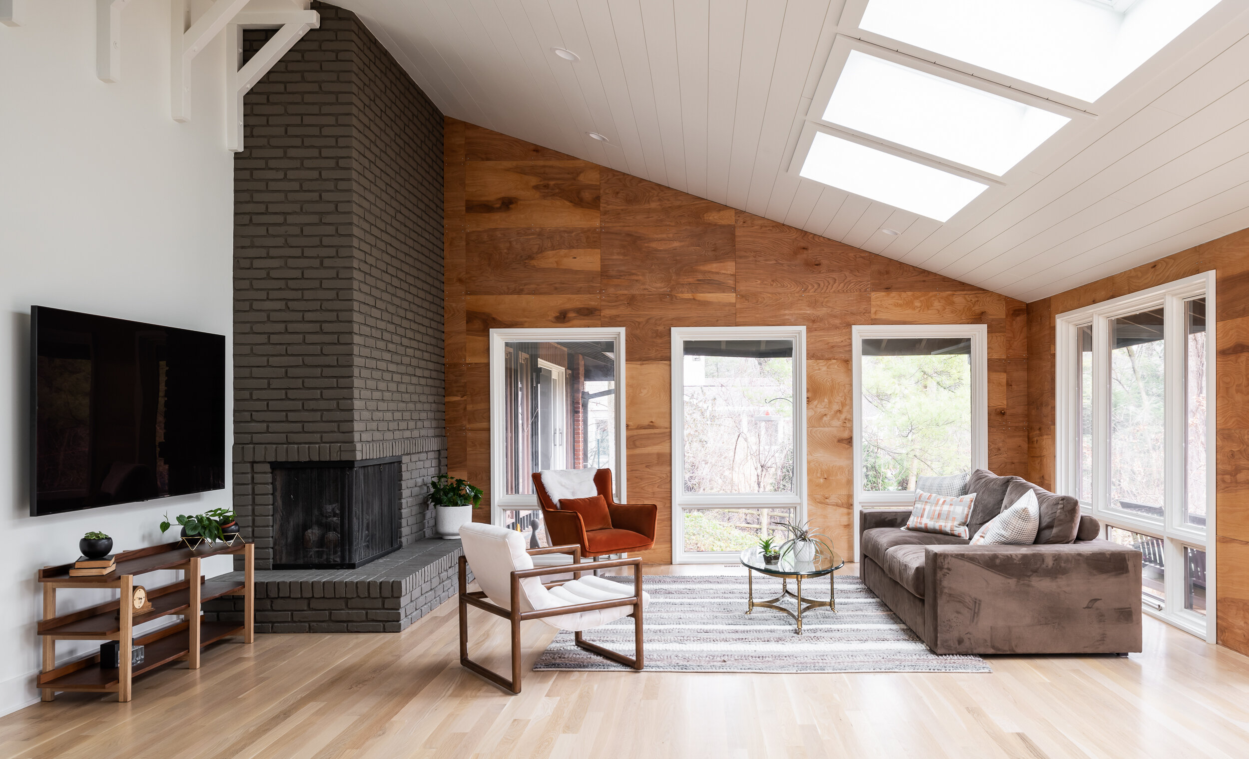
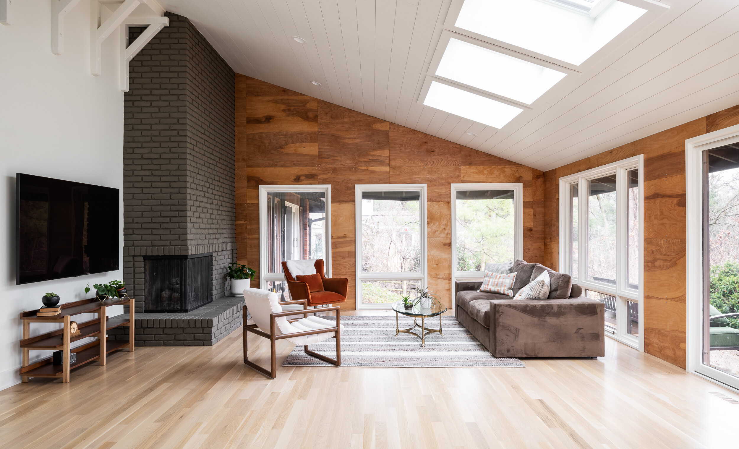
White oak floors and tongue-and-groove white ceilings lead from the front of the home back into the main living space. The living room has vaulted ceilings and an original brick fireplace. The homeowners wanted to find a perfect balance between bright and cozy; the windows and the added skylights gave the room great natural light, but the team added an oiled plywood wall to warm up the color scheme. The fireplace, painted beige in a previous remodel, received a fresh coat of gray paint to act as the room’s anchor.
The homeowner found the majority of the home’s furniture from Facebook marketplace. Buying furniture second-hand is a great way to recycle interesting pieces and minimize one’s environmental footprint in the remodeling process. “She has such a good eye bringing in earthy, vintage pieces that made every space more personal and cozy,” says Rochelle. “I think she nailed it!”
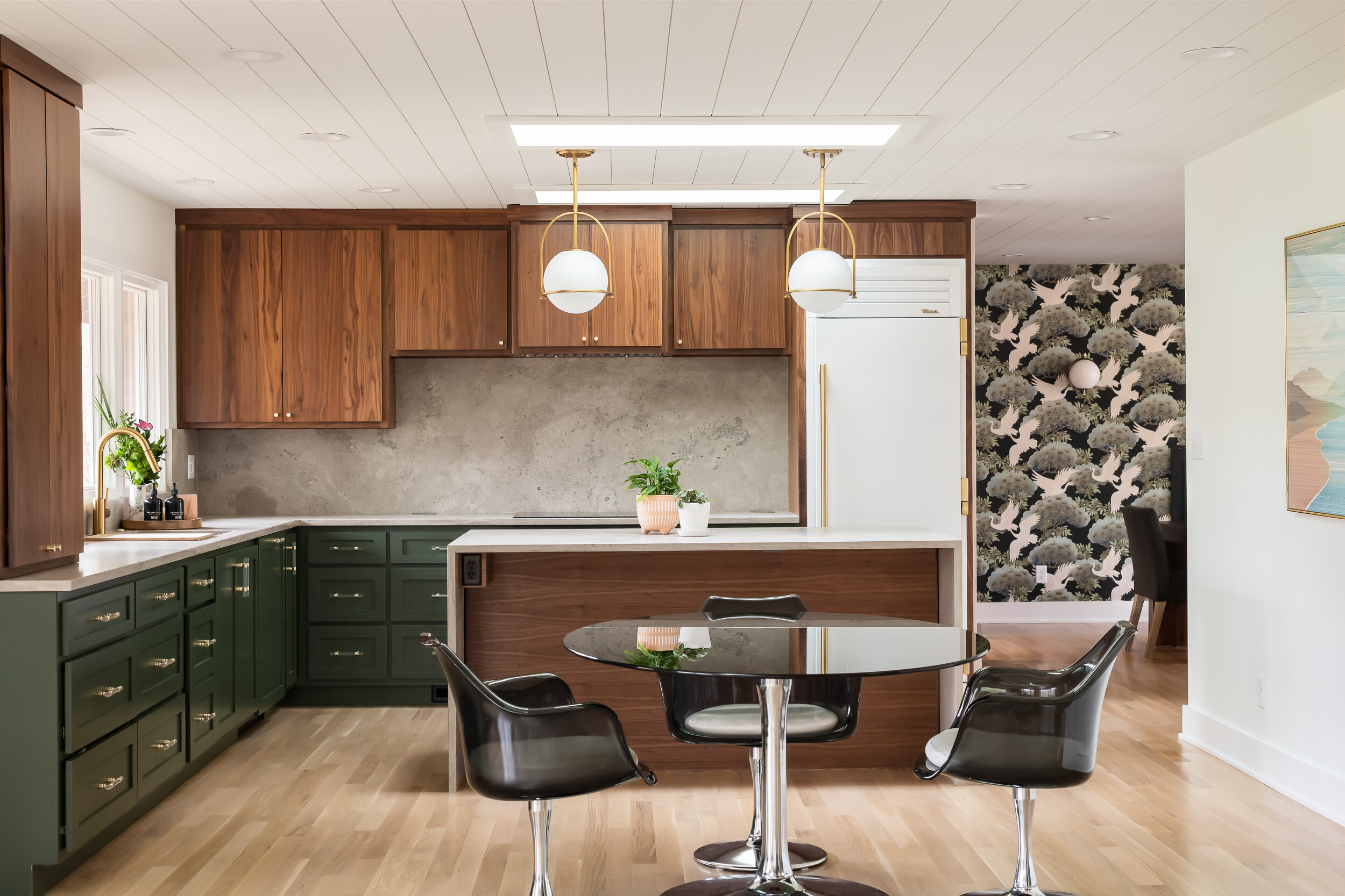
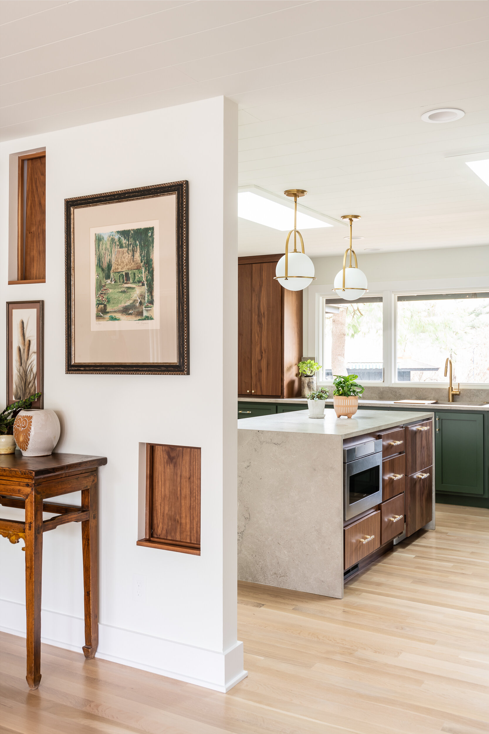
In the kitchen, the homeowner desired a space that “felt like any other room. I didn’t want it to scream ‘kitchen.’” To achieve this look, the team chose natural Missouri limestone from SFI for the island and countertops. The walnut cabinets are custom-made from Hulls Cabinetry; the bottom cabinets are painted evergreen to match the lush trees shown through the large windows. Lucite hardware with brass accents from CB2 add interest and ease. The Facebook marketplace table keeps the space light and fun.
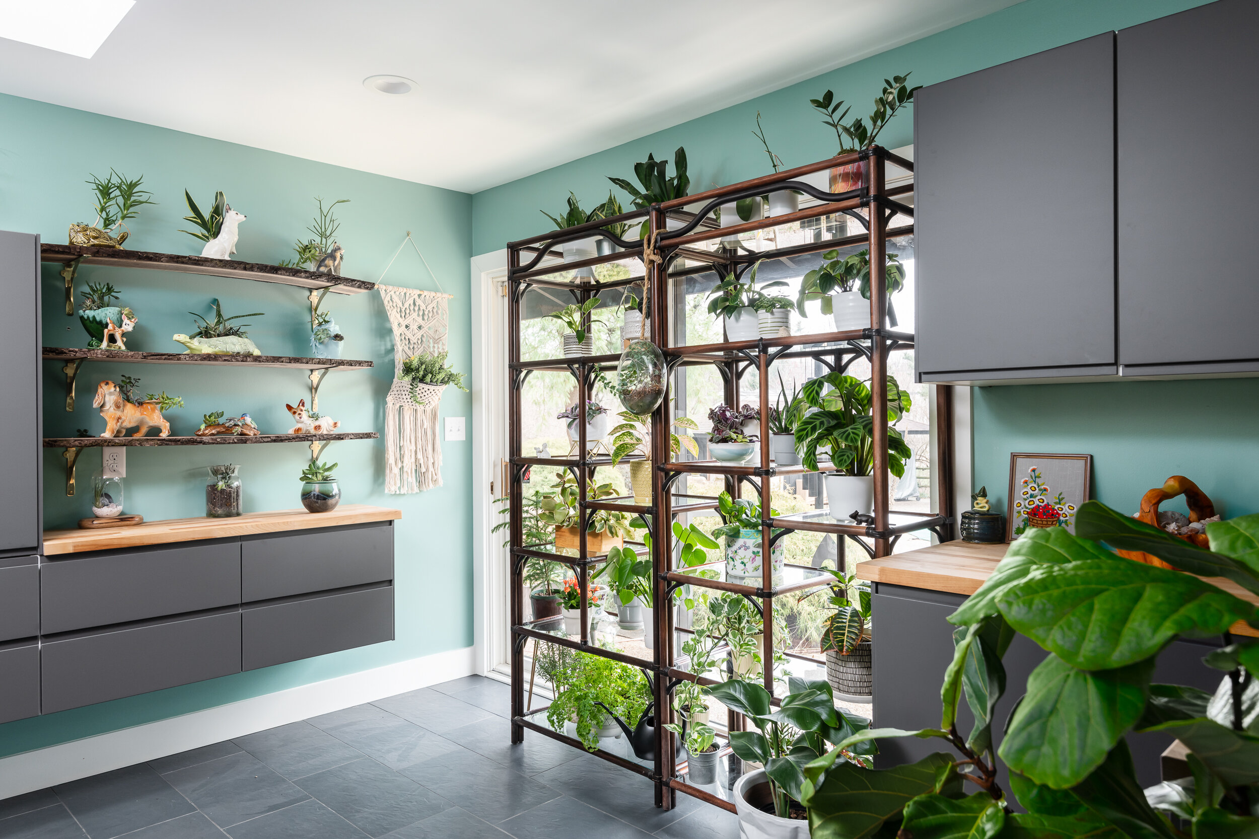
To avoid clutter, the team created a butler’s pantry off the kitchen to house the family’s odds and ends, as well as the wife’s house plant collection. “We created a bright, functional space for her off the main living area for her to stow all her keepsakes," comments Rochelle. "She’s a collector, and we wanted to give all her things a home without affecting the rest of the home’s design.”
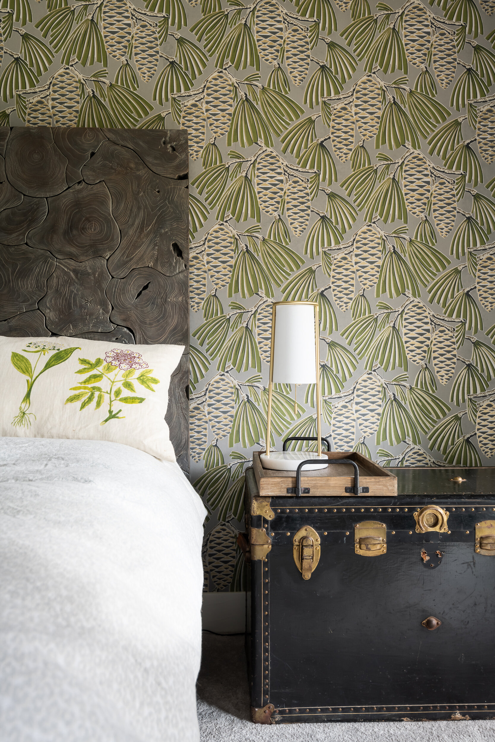
Rochelle knew the main bedroom needed a calming, relaxing vibe for both homeowners to enjoy. “I don’t spend much time in my bedroom, but I wanted it to feel like a getaway, almost like our own personal hotel room,” the wife notes. She and Rochelle chose the softest carpet they could find. A Harlequin “Foxley” wallpaper accent wall elevates the suite, complemented by walls painted in a custom gray/taupe. A tree trunk headboard in gray adds a final natural element.
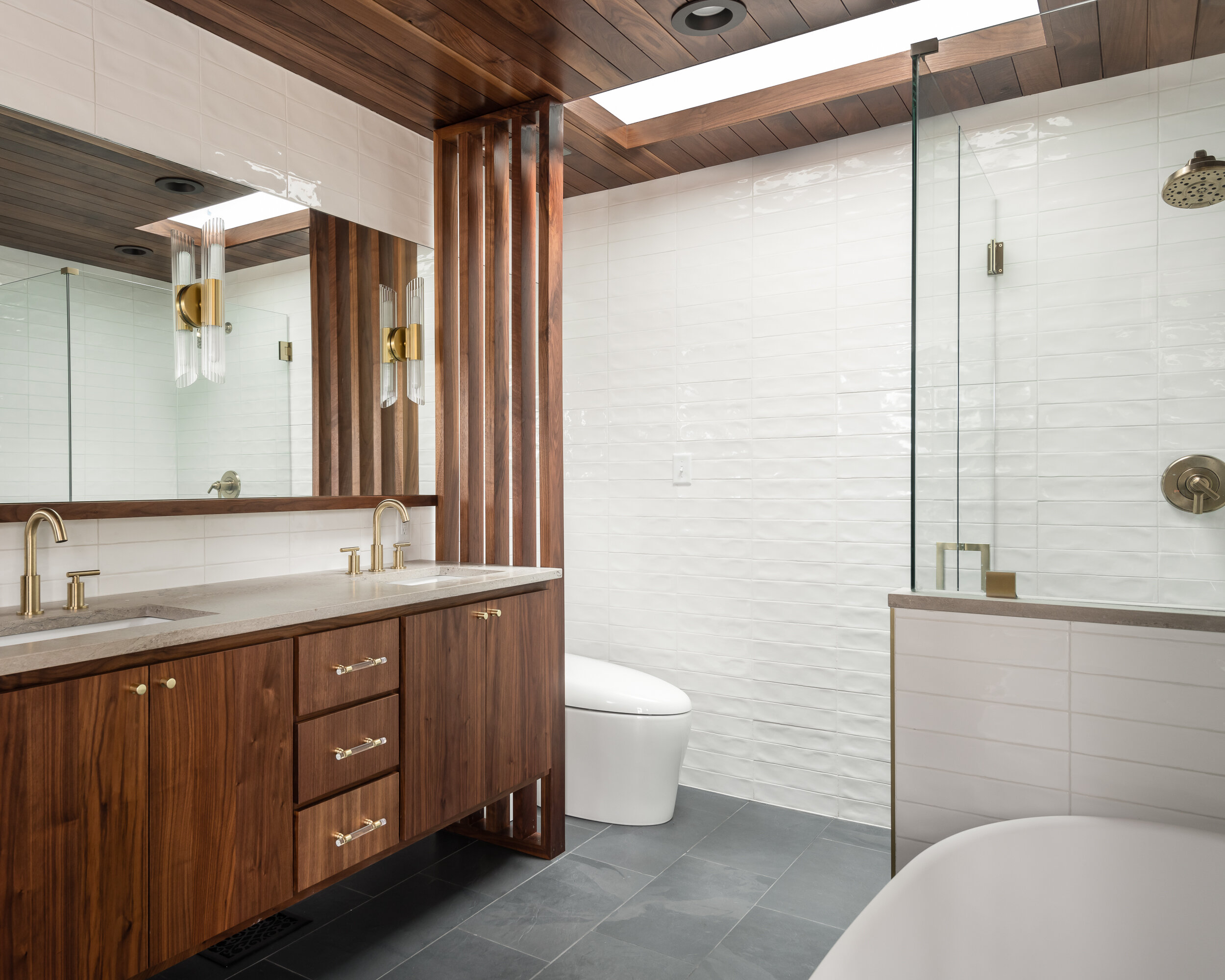
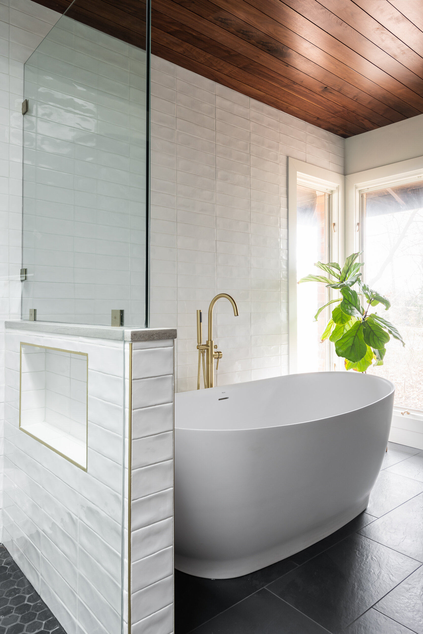
“Our last bathroom was very large, and it was always cold,” the wife says. “We wanted this bathroom to be as warm as possible.” They kept the bathroom’s layout relatively small, but it allowed enough space for all the wife’s requests, including a matte eco-friendly Perlato Vittoria tub in lapis stone, zero-entry shower and Missouri limestone vanity. Heated porcelain floors designed to mimic slate paired with high-gloss, straight stacked tile on the walls keep the bathroom both natural and eye-catching.
“This project was so organic from beginning to end,” says Rochelle. “The homeowner and I made changes to the design as we went along. Our constant collaboration is what made this home so customized for them. It really fits their personality."
“We don’t intend to move again, so with this house, we really went for it,” the wife says. “It’s everything we wanted from the start: easy to live in, peaceful, beautiful. I’m so happy every time I come home because I know this space made for us.”
Resources
Appliances: AUTCOhome
Builder: LU Design Build
Cabinetry: Hulls Cabinets
Flooring: Champion Floor
Glass/Mirror: Boujee Glass
Granite: SFI
Interior Design: LU Design Build
Tile/Granite Supplier: The Tile Shop
Window/Door: Lincoln Window & Door
Woodworking/Millwork: LU Design Build
Juniata Kitchen
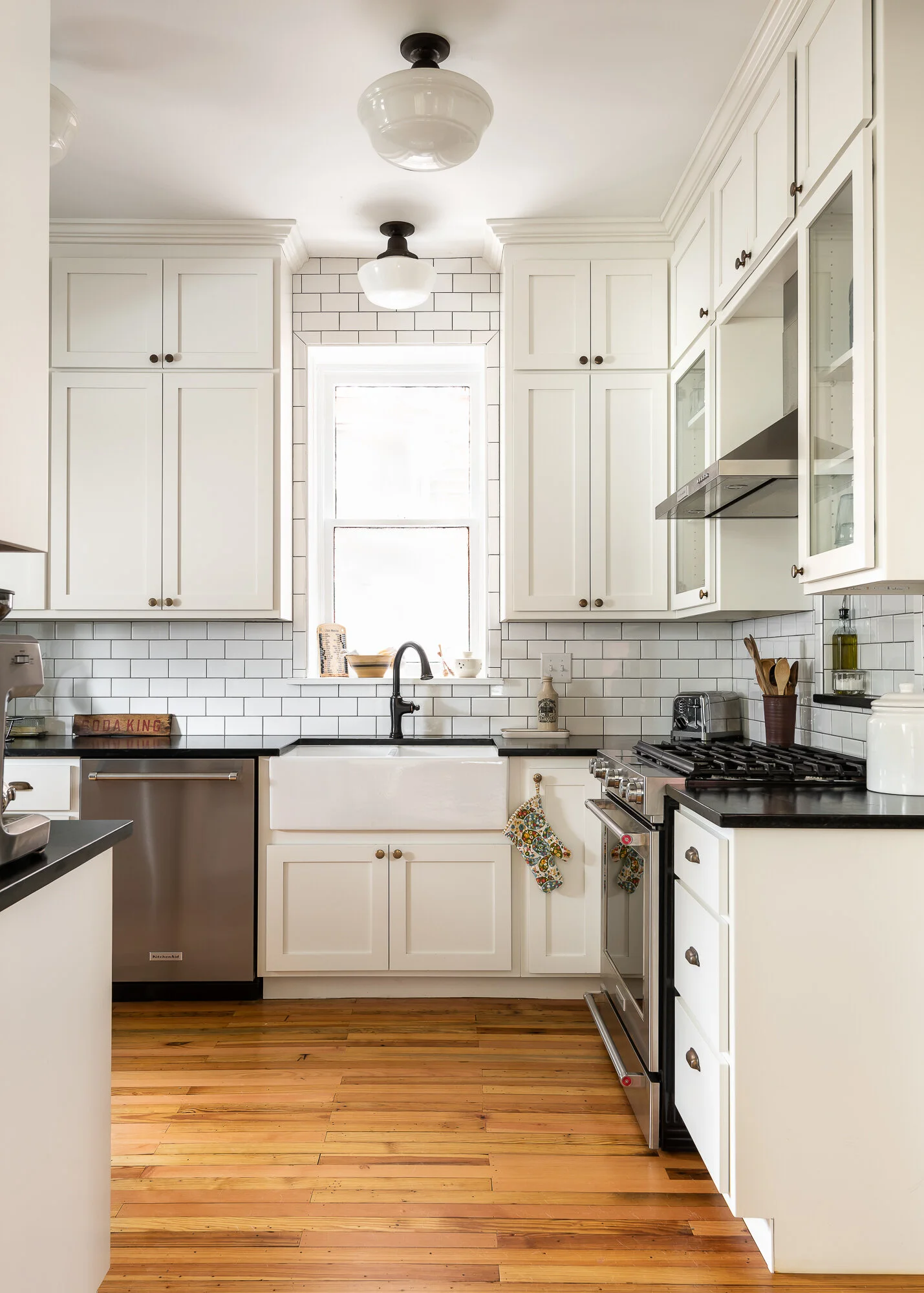
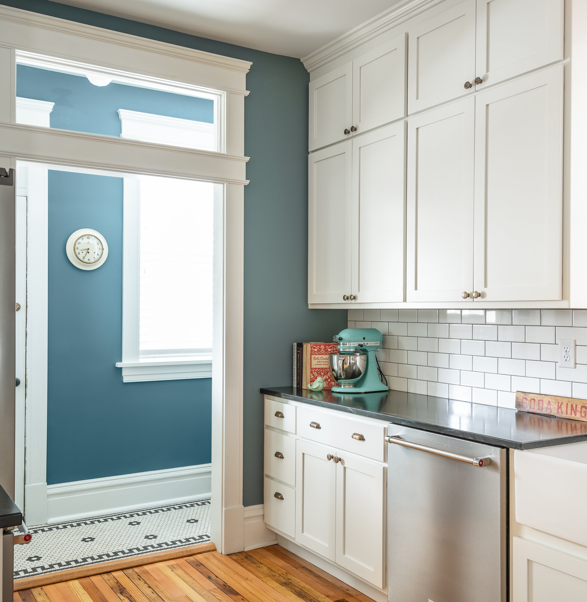
This black and white kitchen design was inspired by the historic architecture of the home.


St. Louis, MO
Designer
Rochelle McAvin
Photographer
Karen Palmer Photography
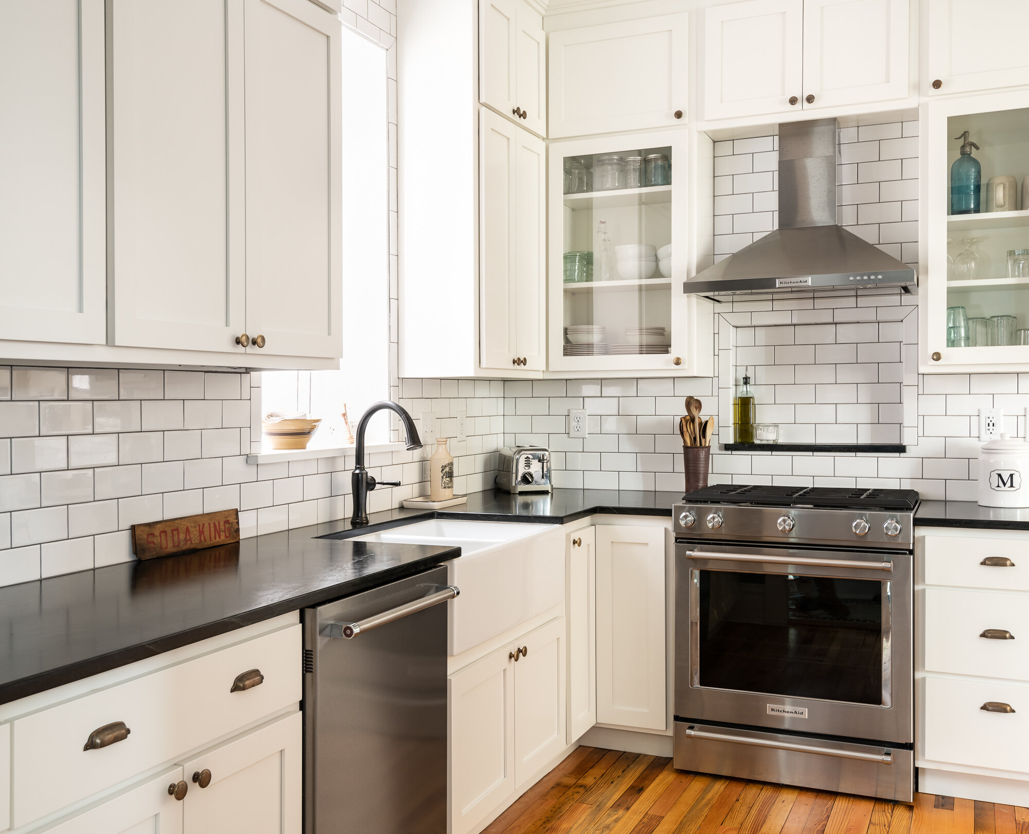
This black and white kitchen design was inspired by the historic architecture of the home. A new cabinet layout truly opens the room, allowing for more function throughout. The white subway tile was further defined with dark gray grout to tie in with the soapstone countertops. We continued the theme with antique schoolhouse lighting, and added stainless and wood elements for dimension. The transom window floods the black and white kitchen with light, which really elevates this kitchen, and the black and white antique reciprocation tile in the mudroom is a nod to the history of the home.
Springbrook Kitchen
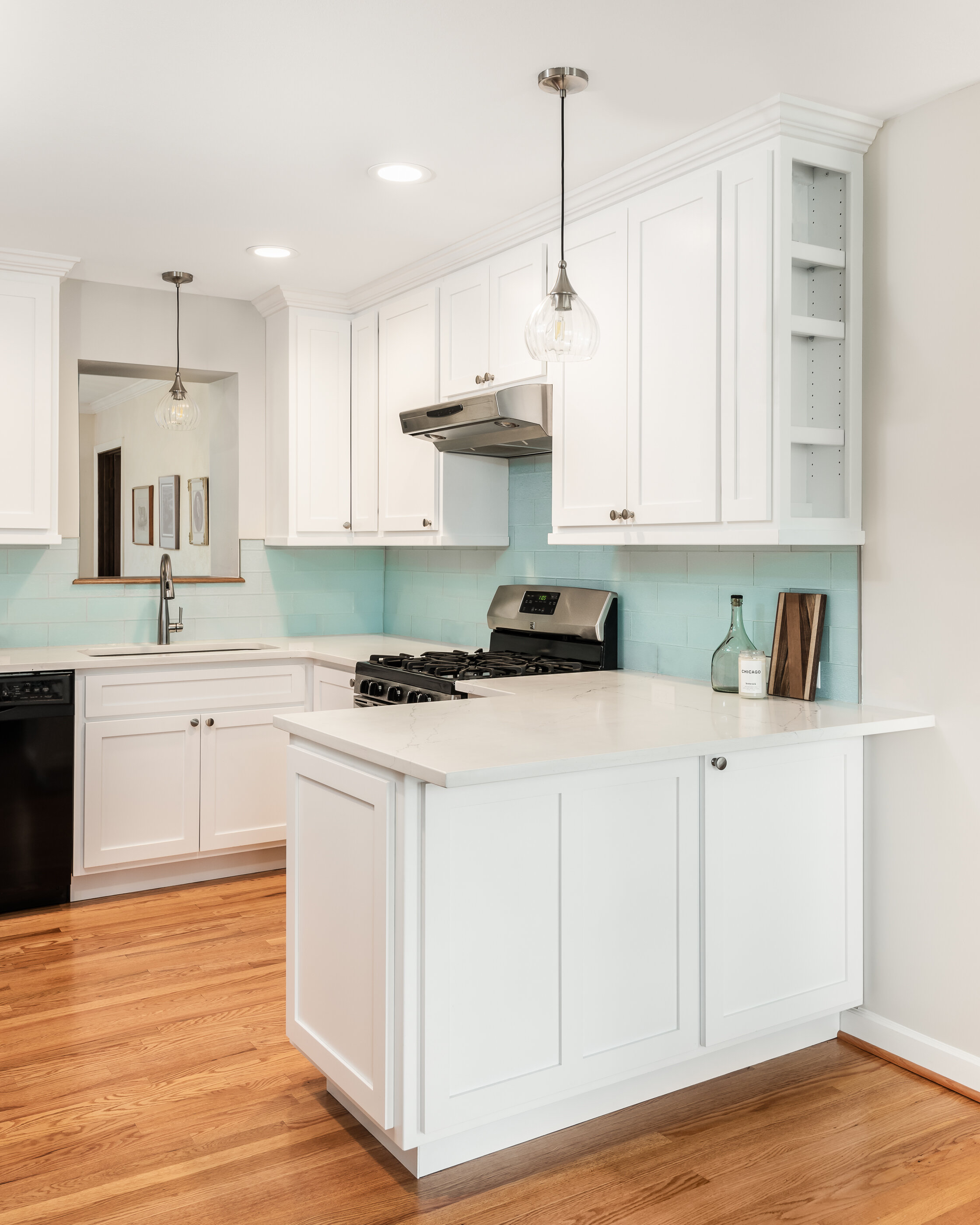
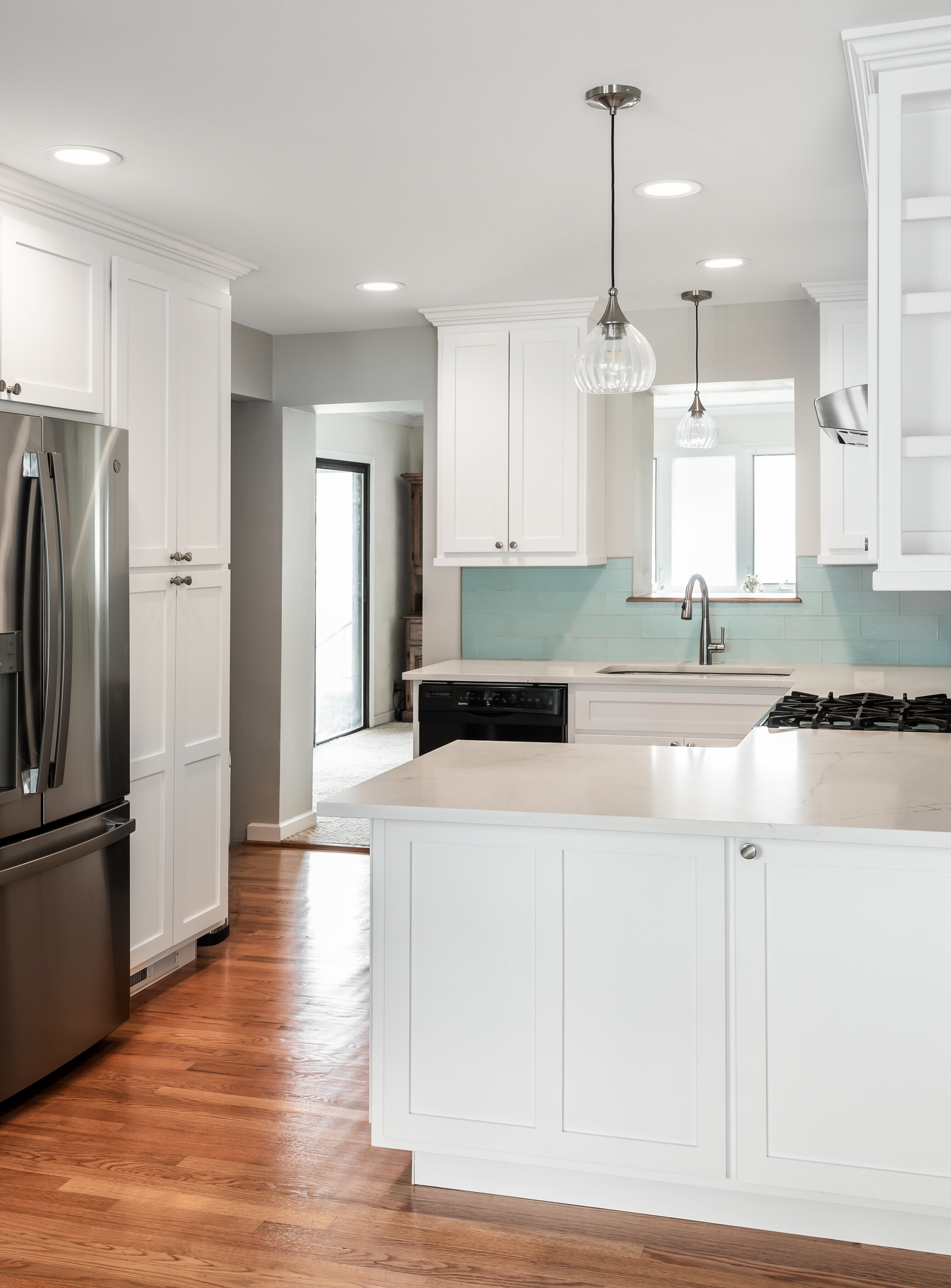
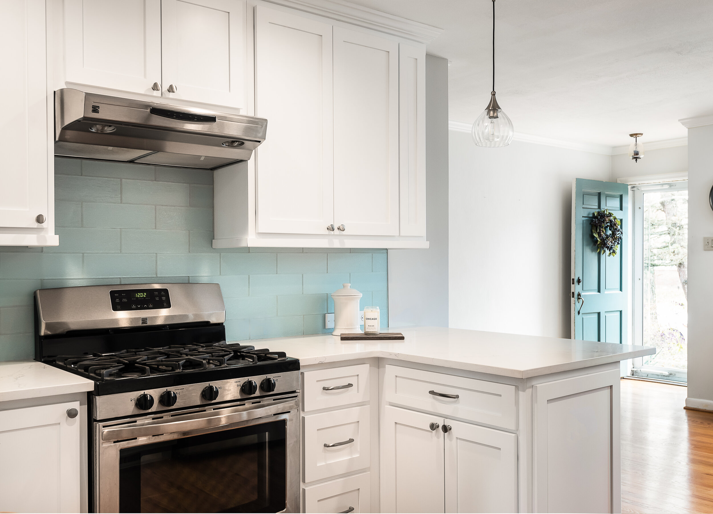
We demolished a part of the wall and created an open kitchen with an inviting and colorful seating peninsula
Webster Groves, MO
Designer
Rochelle McAvin
Photographer
Karen Palmer Photography
For this project, we demolished a part of the wall and created an open kitchen with an inviting and colorful seating peninsula.
The custom cabinets are a modern white with white quartz countertops. We uncovered the bungalow's original wood flooring below the layer of linoleum and matched them to the rest of the house. The result is a bright, warm and cozy kitchen - with much more space!
Creve Coeur Primary Ensuite Addition
Our client recently moved into this remodeled home and had dreams of adding an additional master suite with a basement.

St. Louis, MO
Designer
Rochelle McAvin
Photographer
Karen Palmer
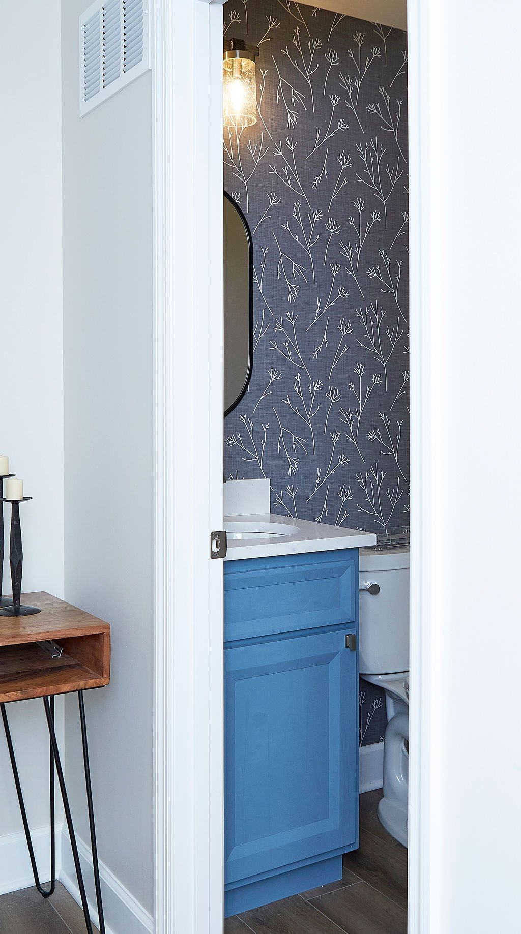
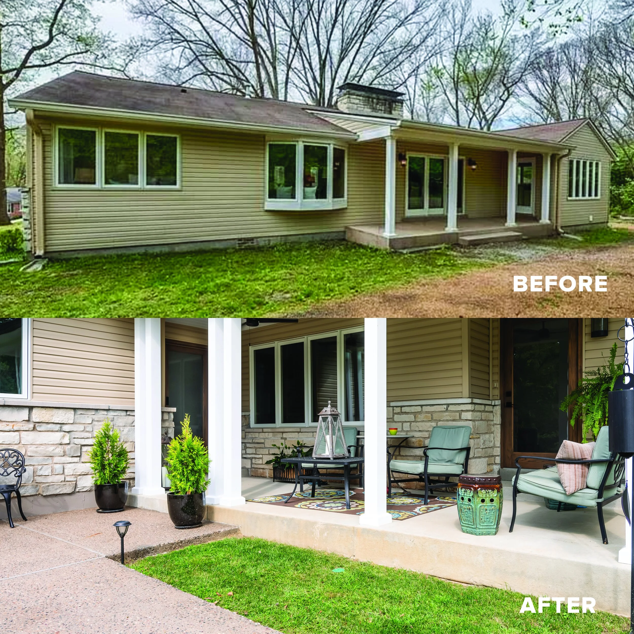
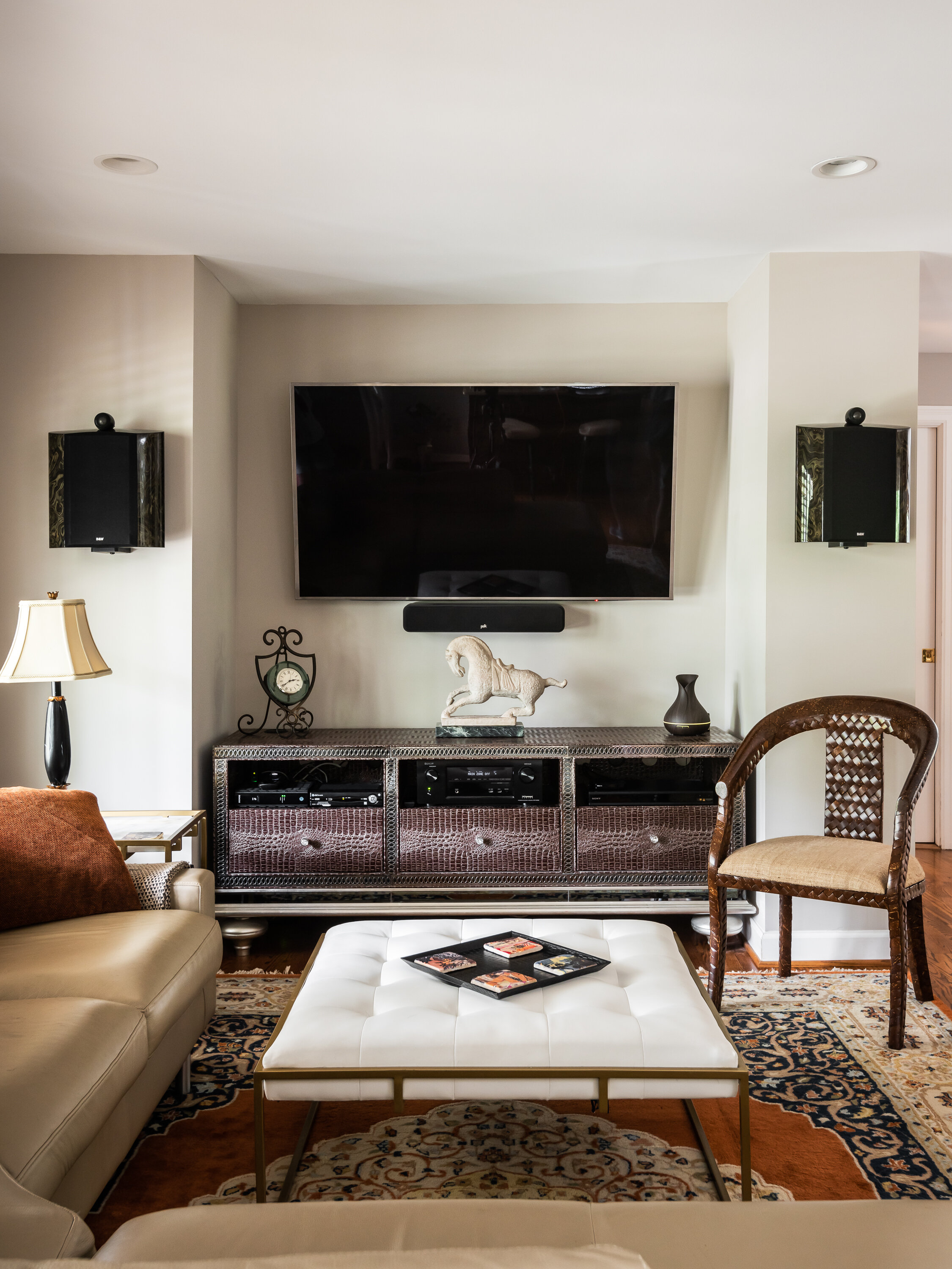
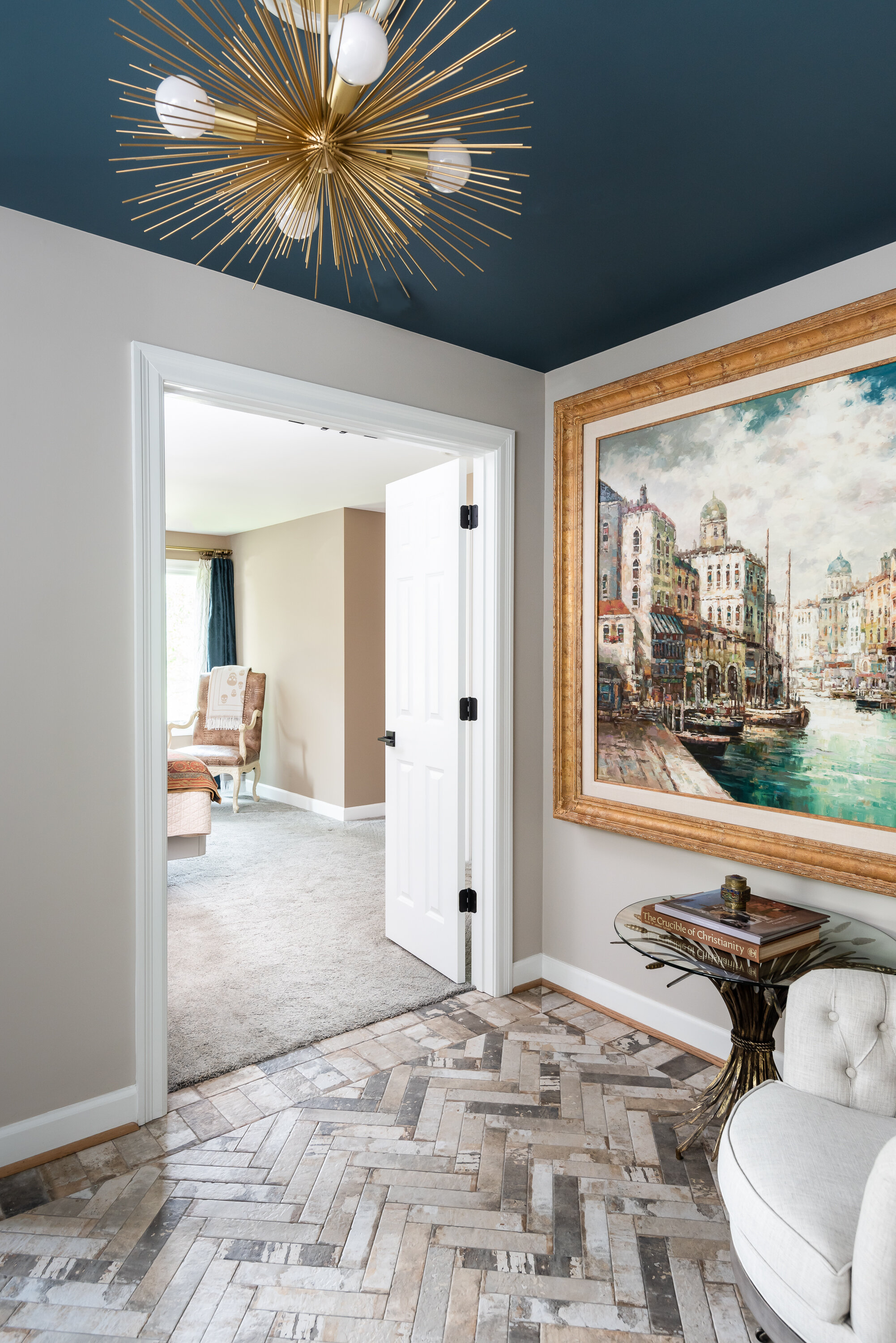
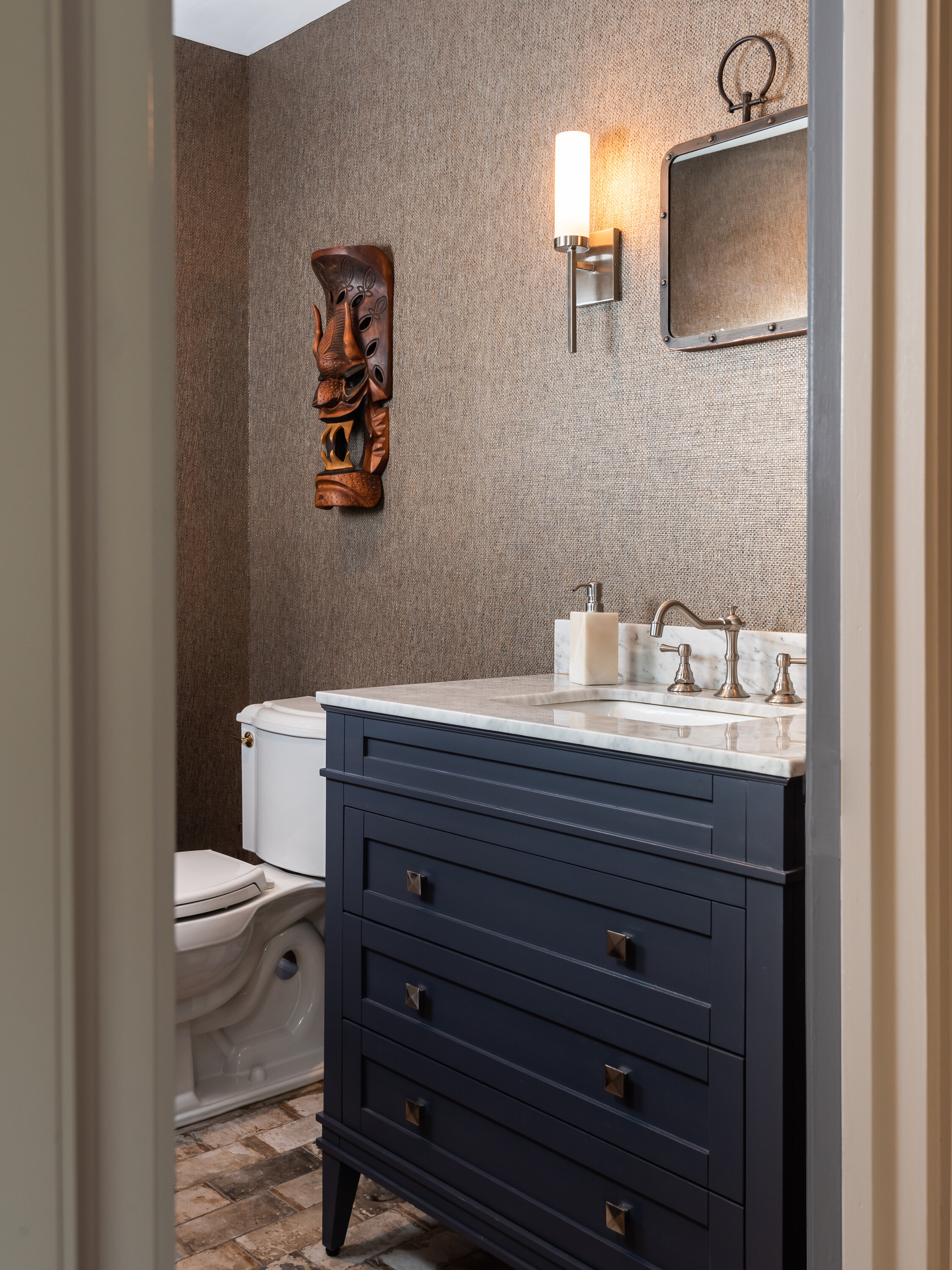
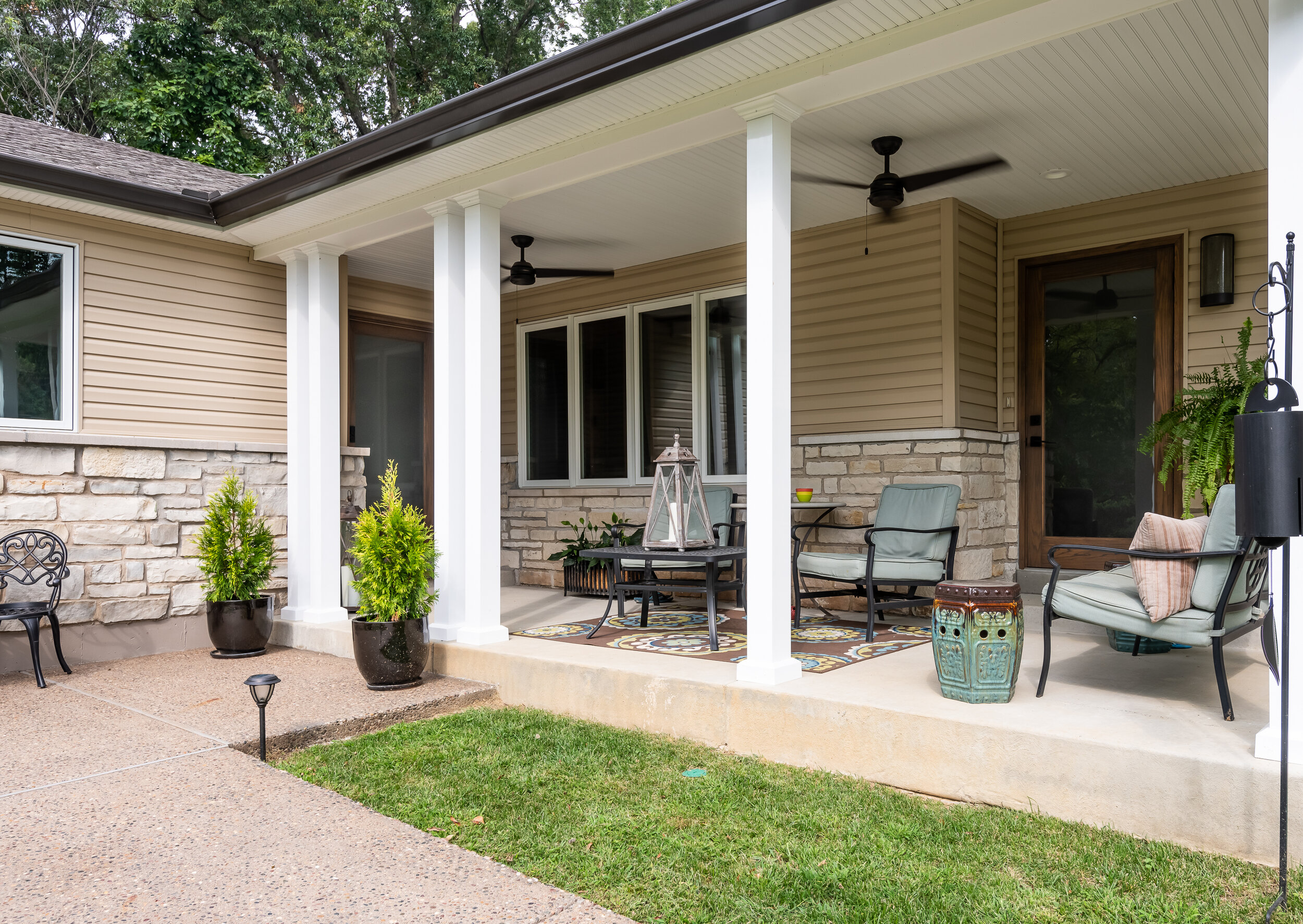
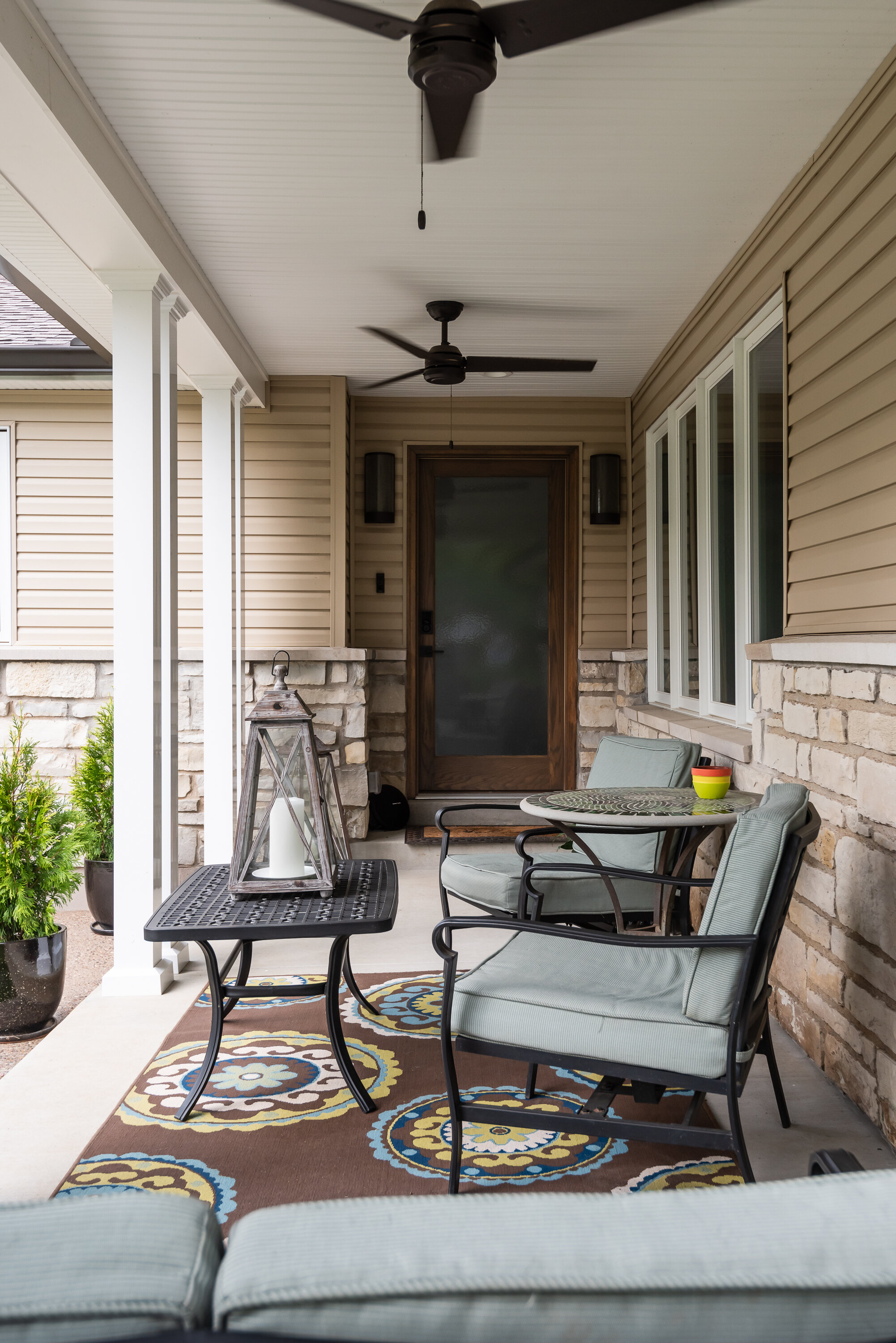
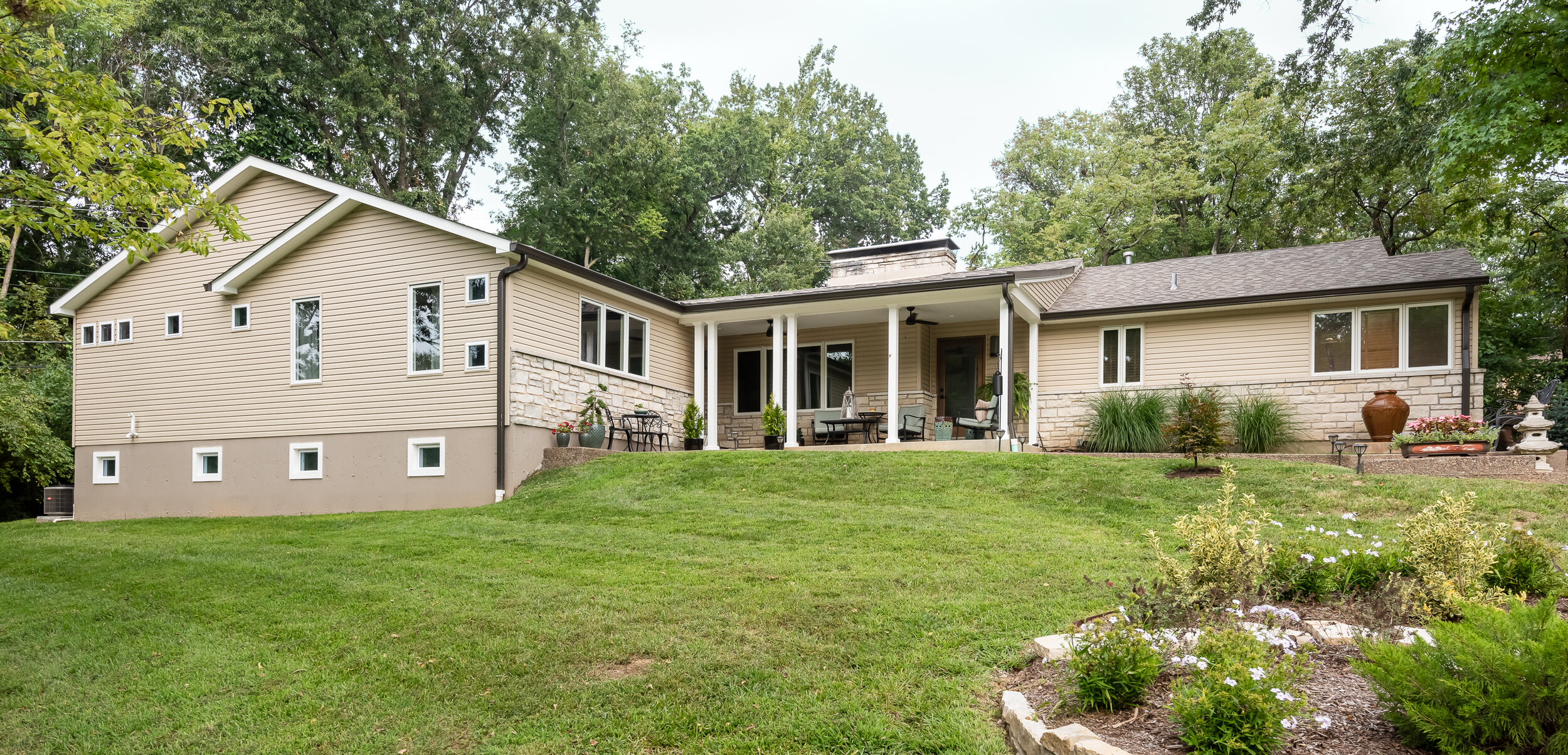
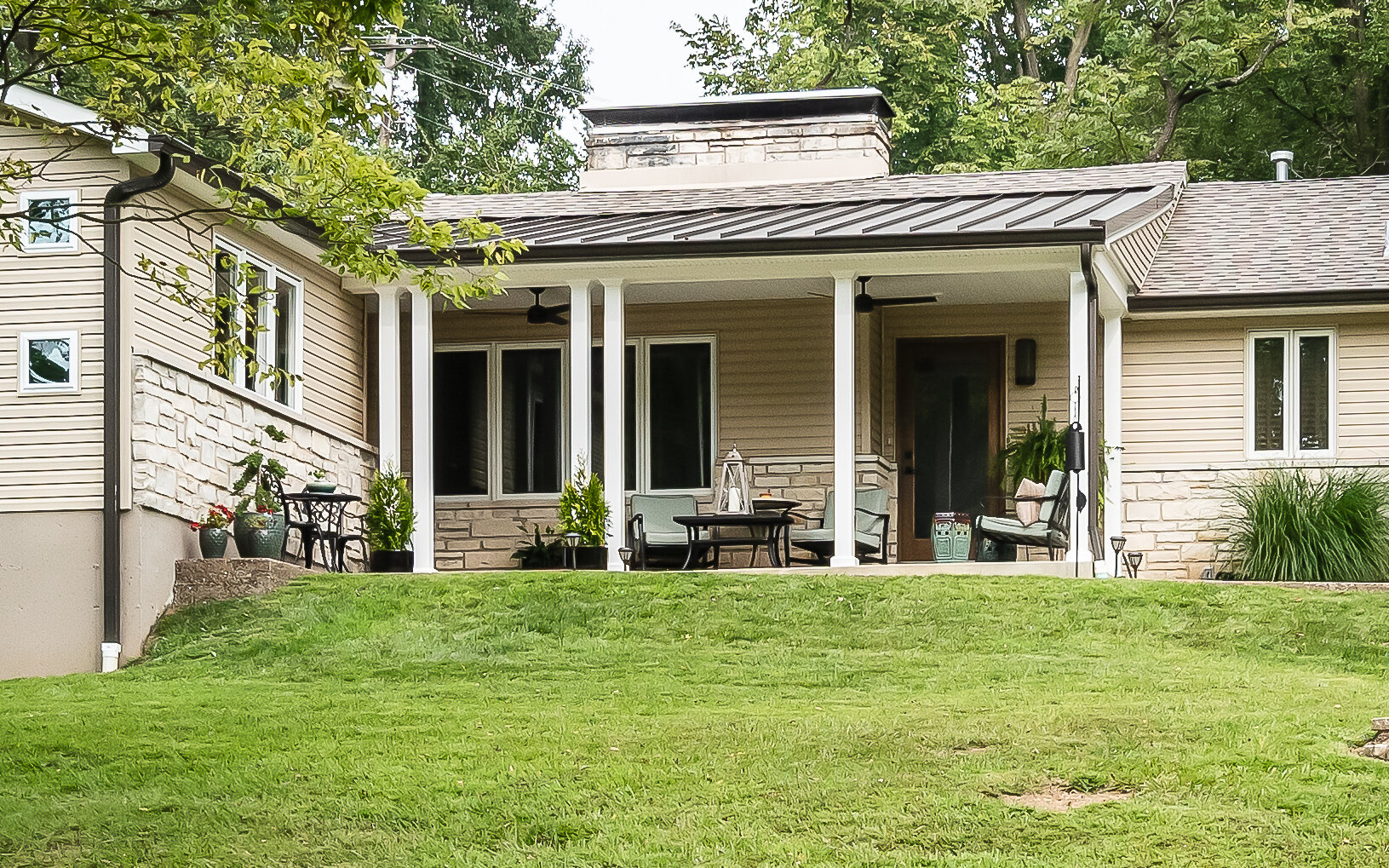
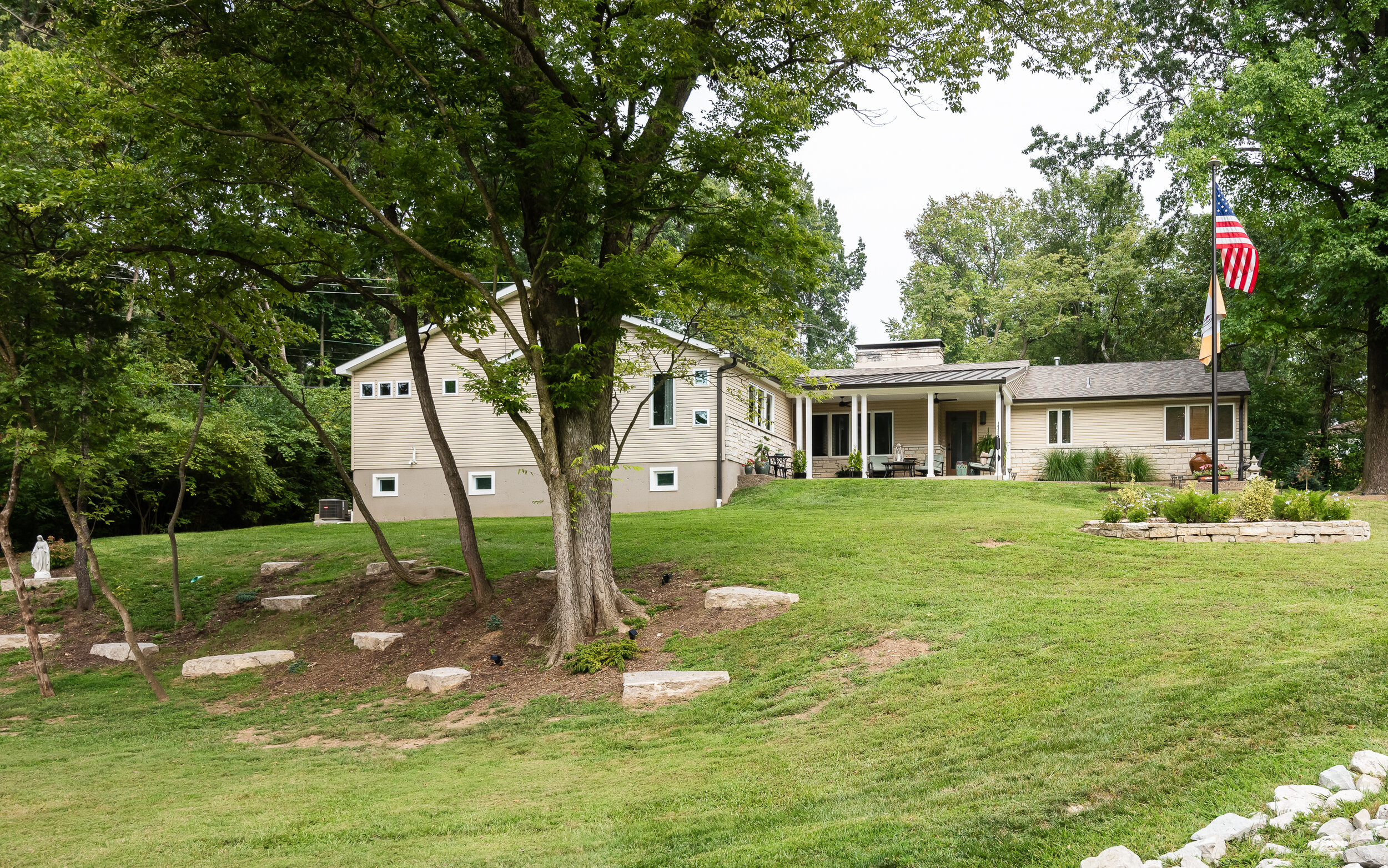
Our client recently moved into this remodeled home and had dreams of adding an additional primary suite with a basement. Our team could envision the space and we knew this would be an exciting project. The addition began by adding a new front porch our clients could use to entertain and relax, modern ceiling fans and lighting are inviting and the metal roof adds texture to the ranch home. We relocated the front entry door that leads into the new, expansive foyer and stairs to the lower level. The tile floors are reminiscent of the cobblestone they had seen on their trips throughout Europe, and they knew that incorporating old world charm and fun details would make the space feel like home. A small powder room features a soft grasscloth wallpaper, amping up the drama and we chose to paint the custom moldings the same smokey blue as the marble topped vanity.
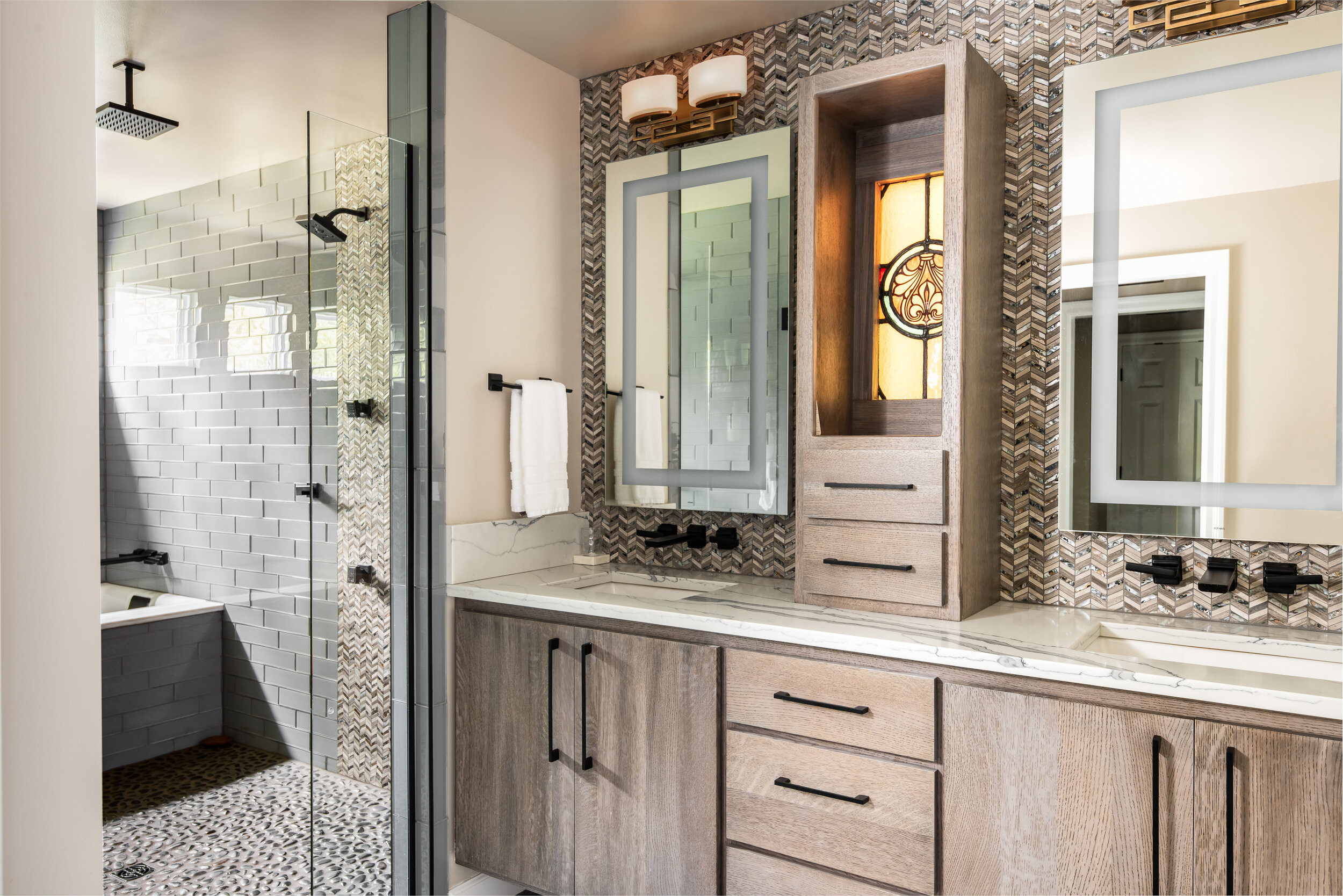
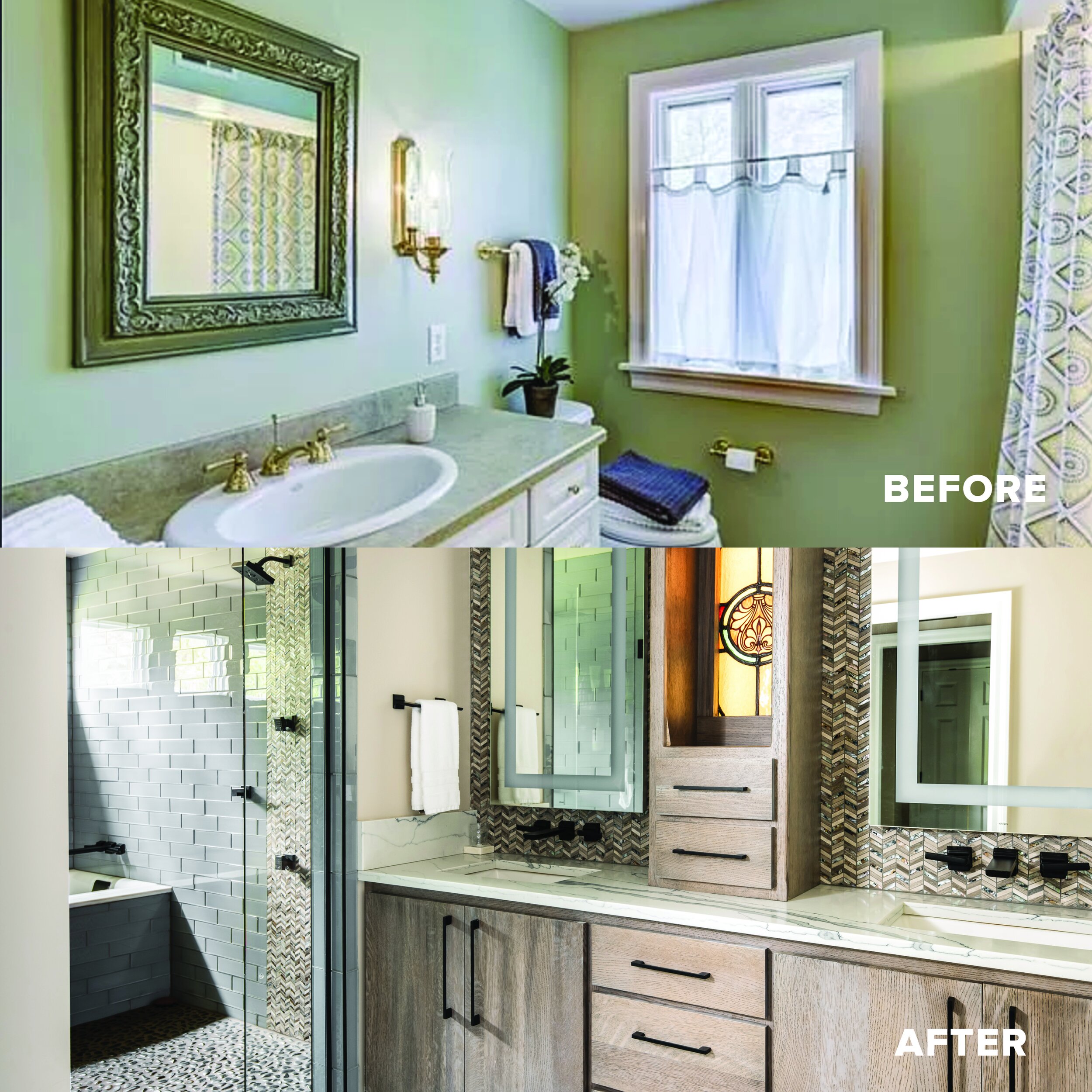
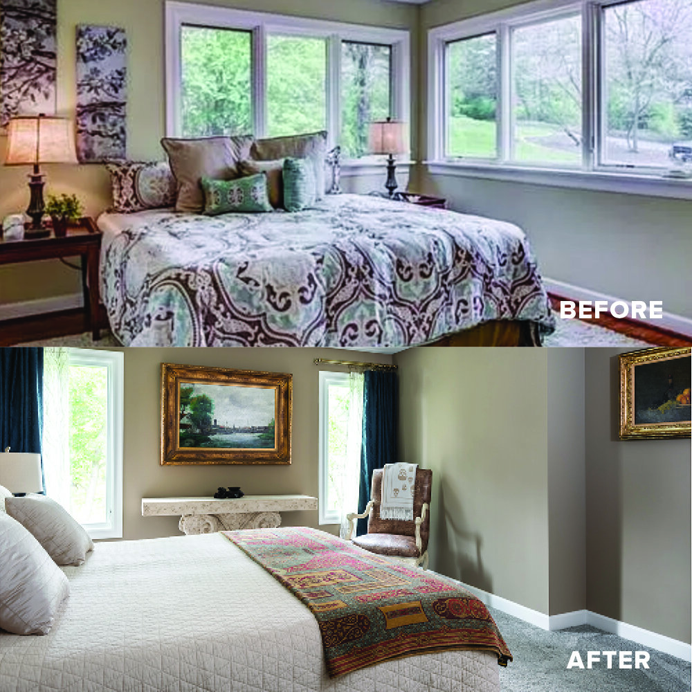
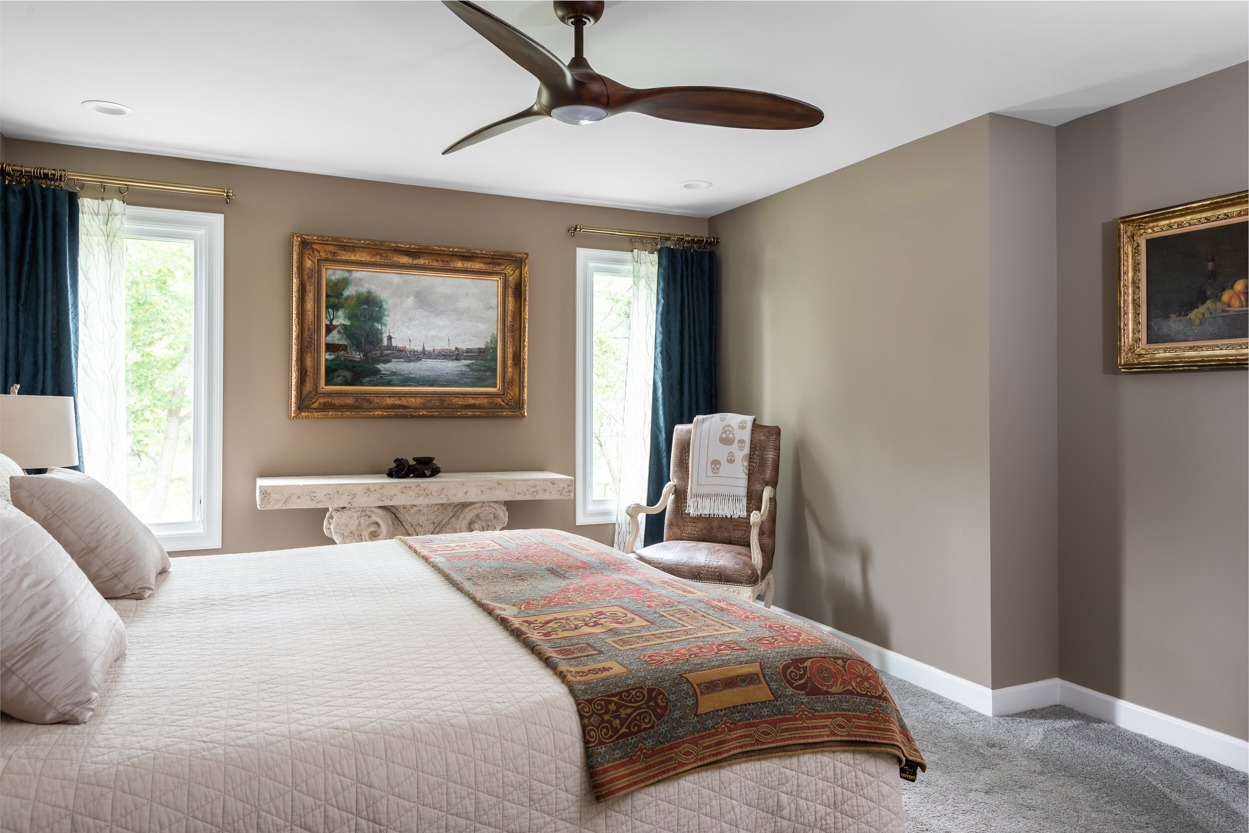
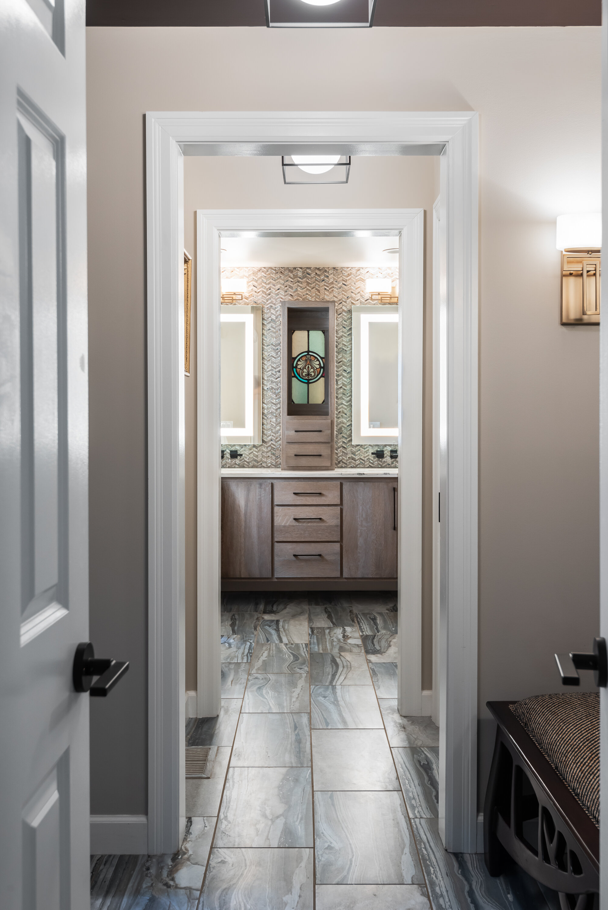
You enter the primary suite through double doors and are welcomed with carefully placed windows, and mellow, neutral tones. The hallway has berry toned glossy ceilings that reflect the afternoon sun: and as you enter the bathroom you are greeted with a custom stained glass window, built into a floating vanity as a surprise gift to each other.
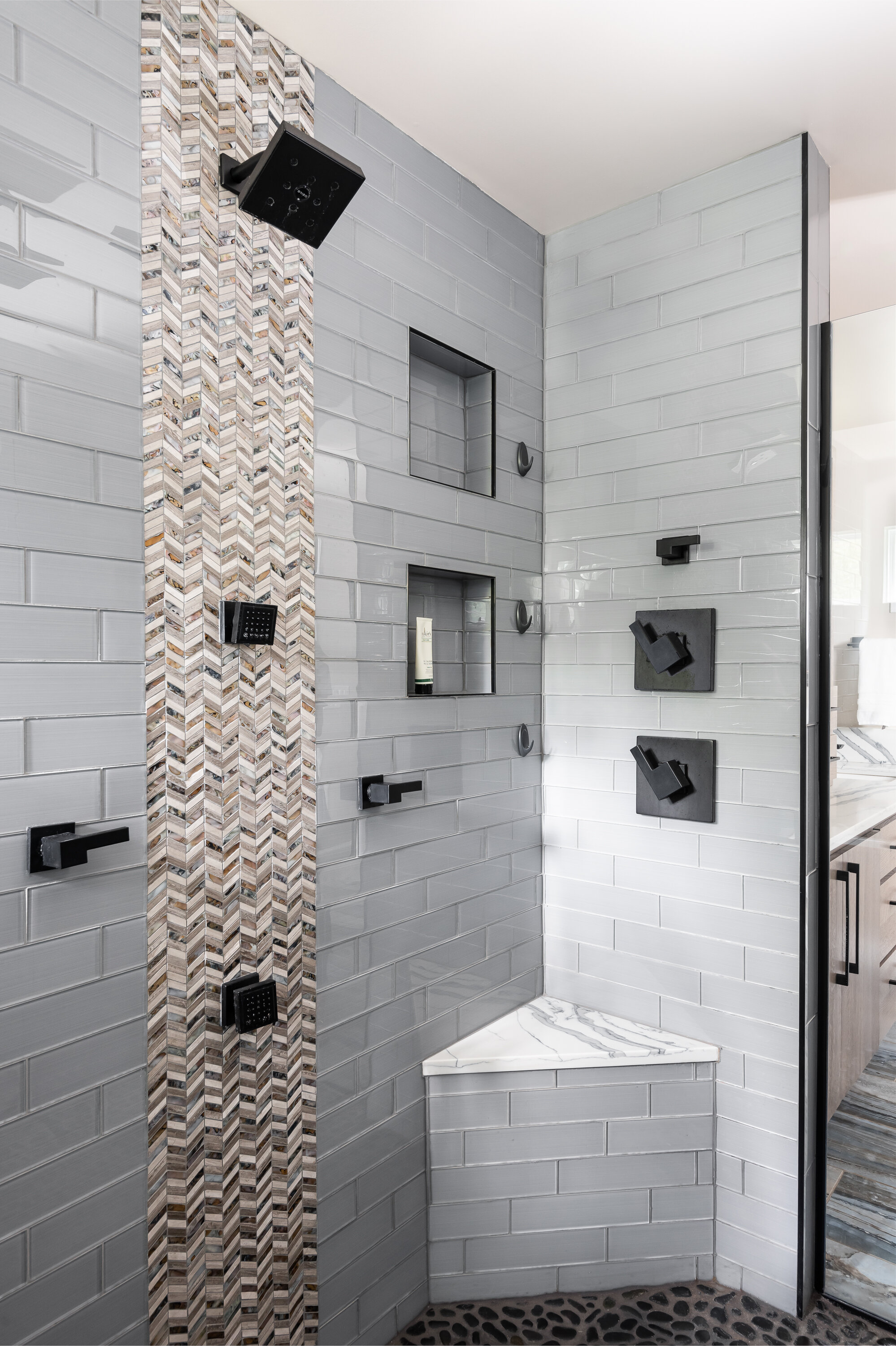
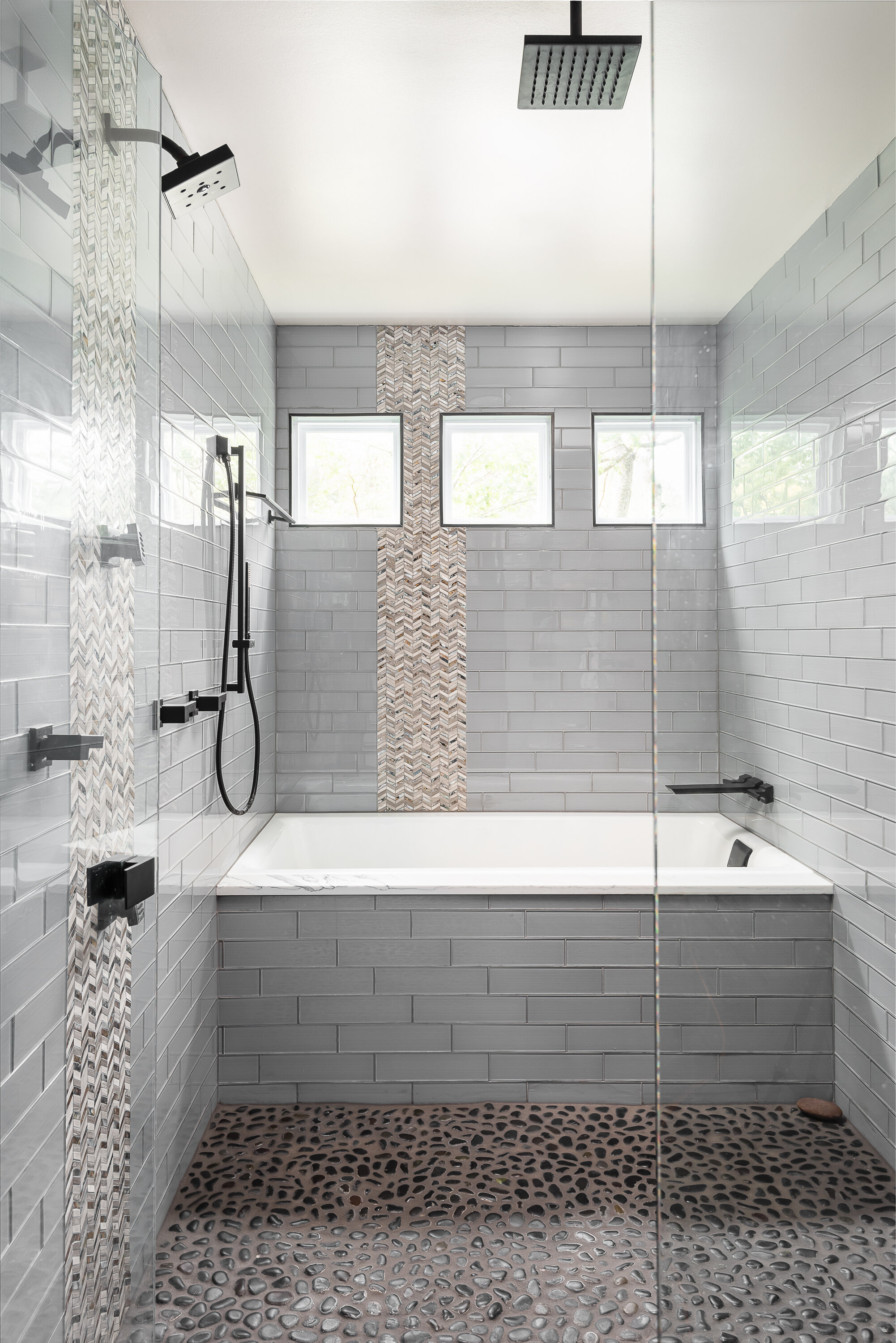
The shower is equipped with a soaking tub, rain shower, dual shower heads, dual body sprays and a massaging, river rock floor. There is plenty of room for two, but the bathroom retains the warmth you feel when you first enter the space.
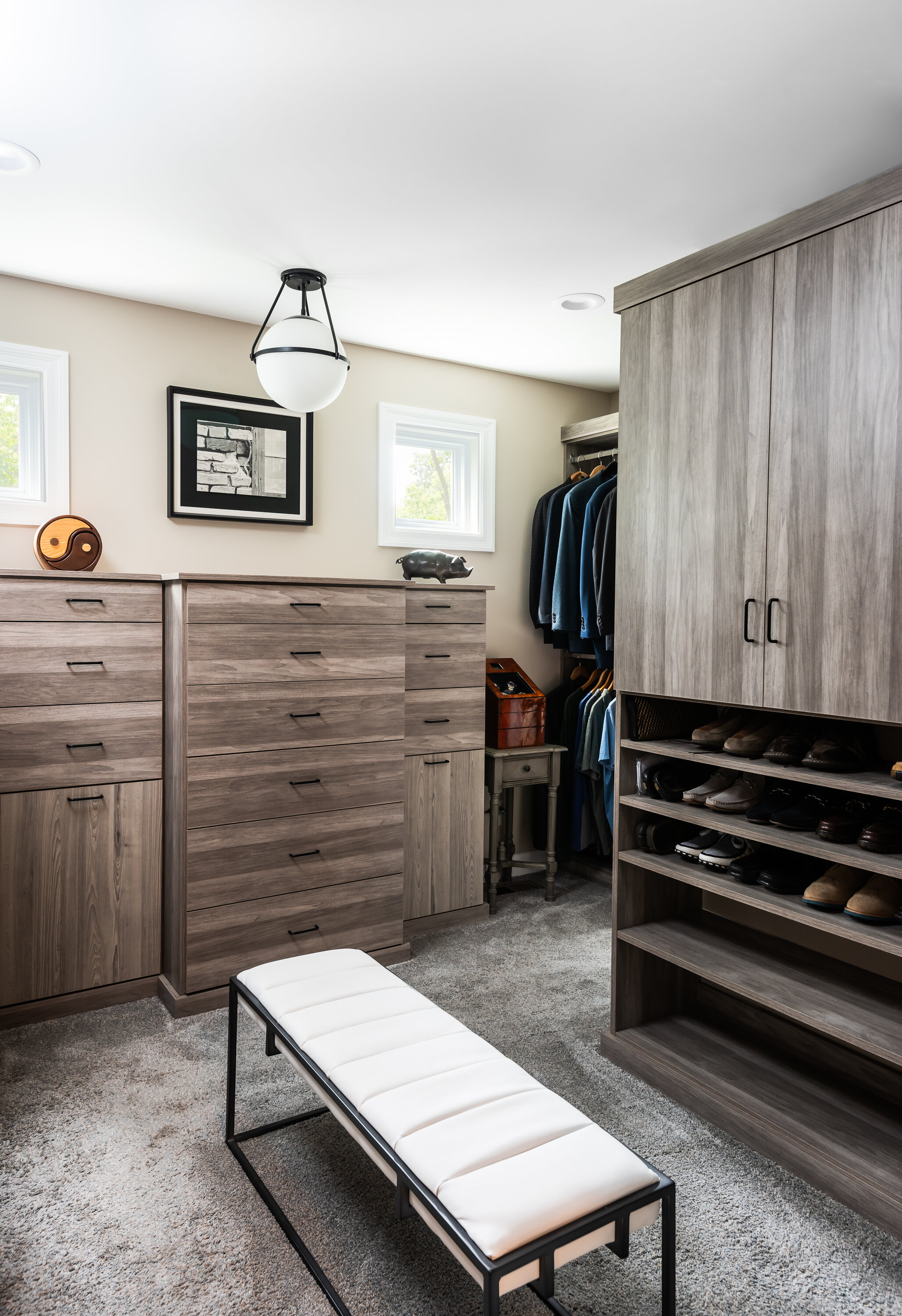
Rounding out the primary suite is a matching walk-in custom closet designed to organize every part of their lives.
By the end of the project, the home felt purposeful, warm and welcoming. The overall sensation feels relaxed and leaves you wanting to stay. Our client agrees, and is happy to call it home.
Sunny Wind
The kitchen in this 34 year old home was in desperate need of an update! It was closed off from the rest of the first floor and all of the fixtures and finishes were original to the house. Our first goal was to open up the kitchen to the great room by removing the wall separating the two.
Chesterfield, MO
Designer
Jennifer Chapman
Photographer
Karen Palmer
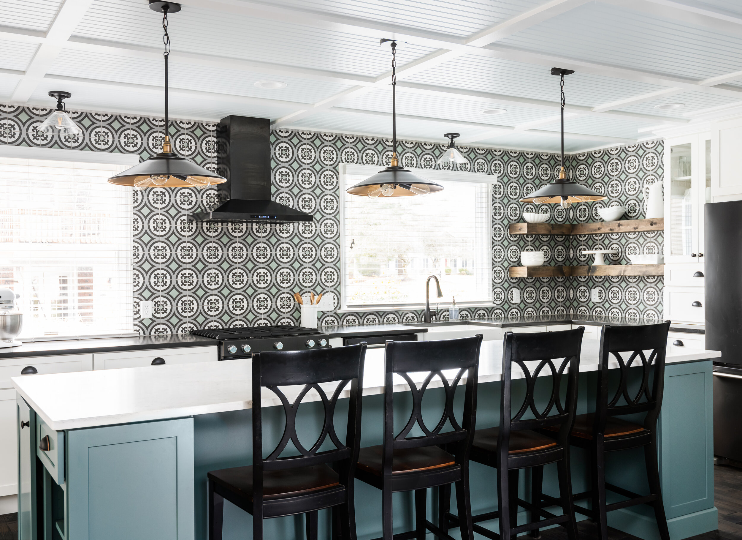
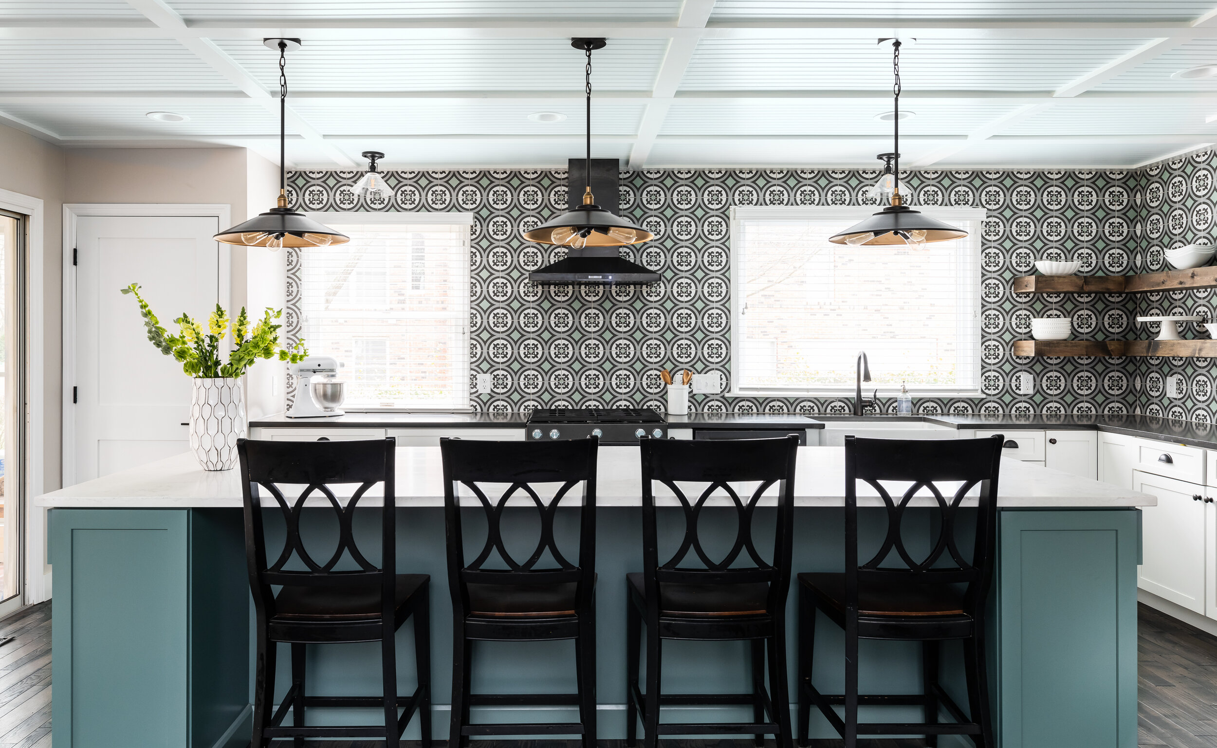
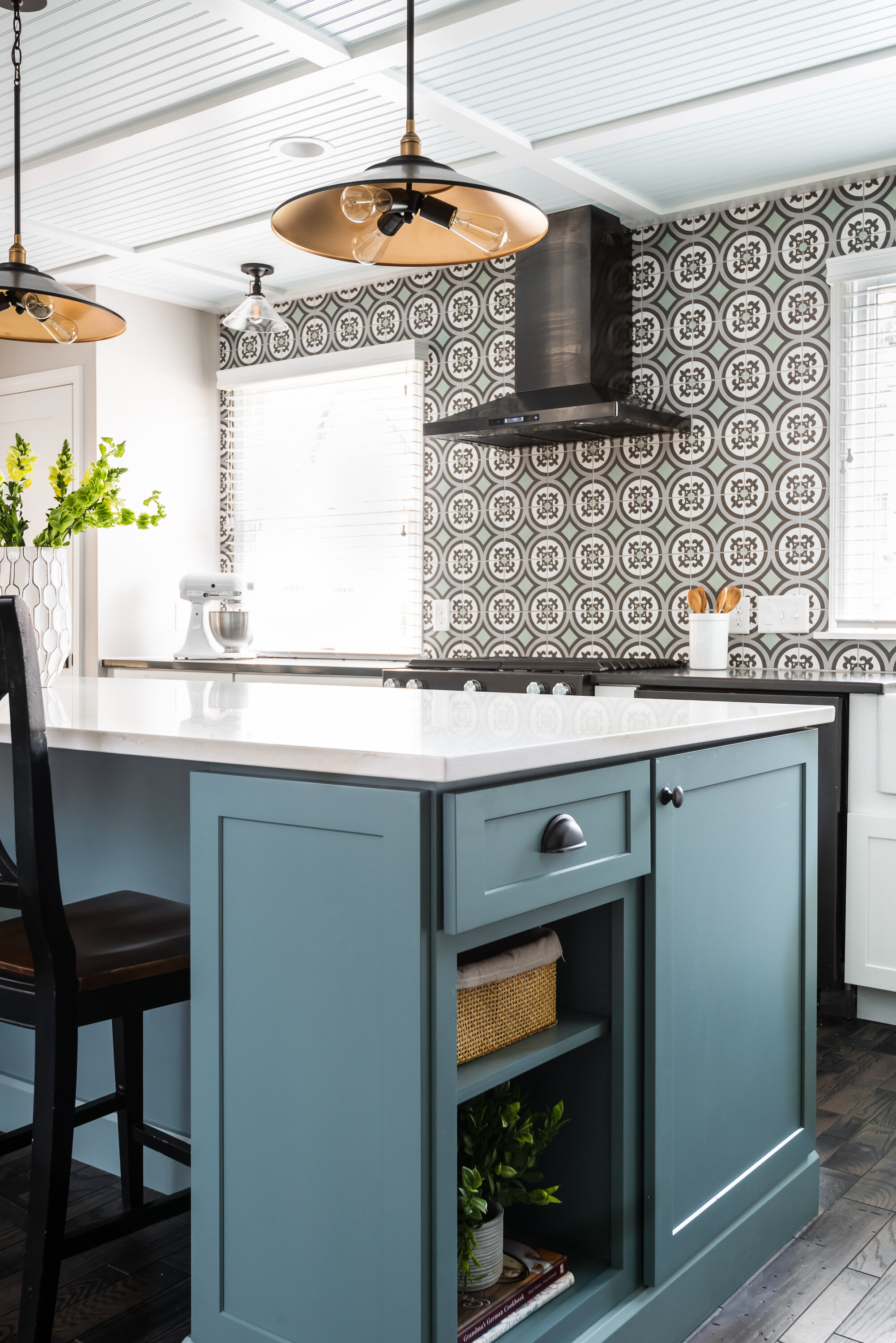
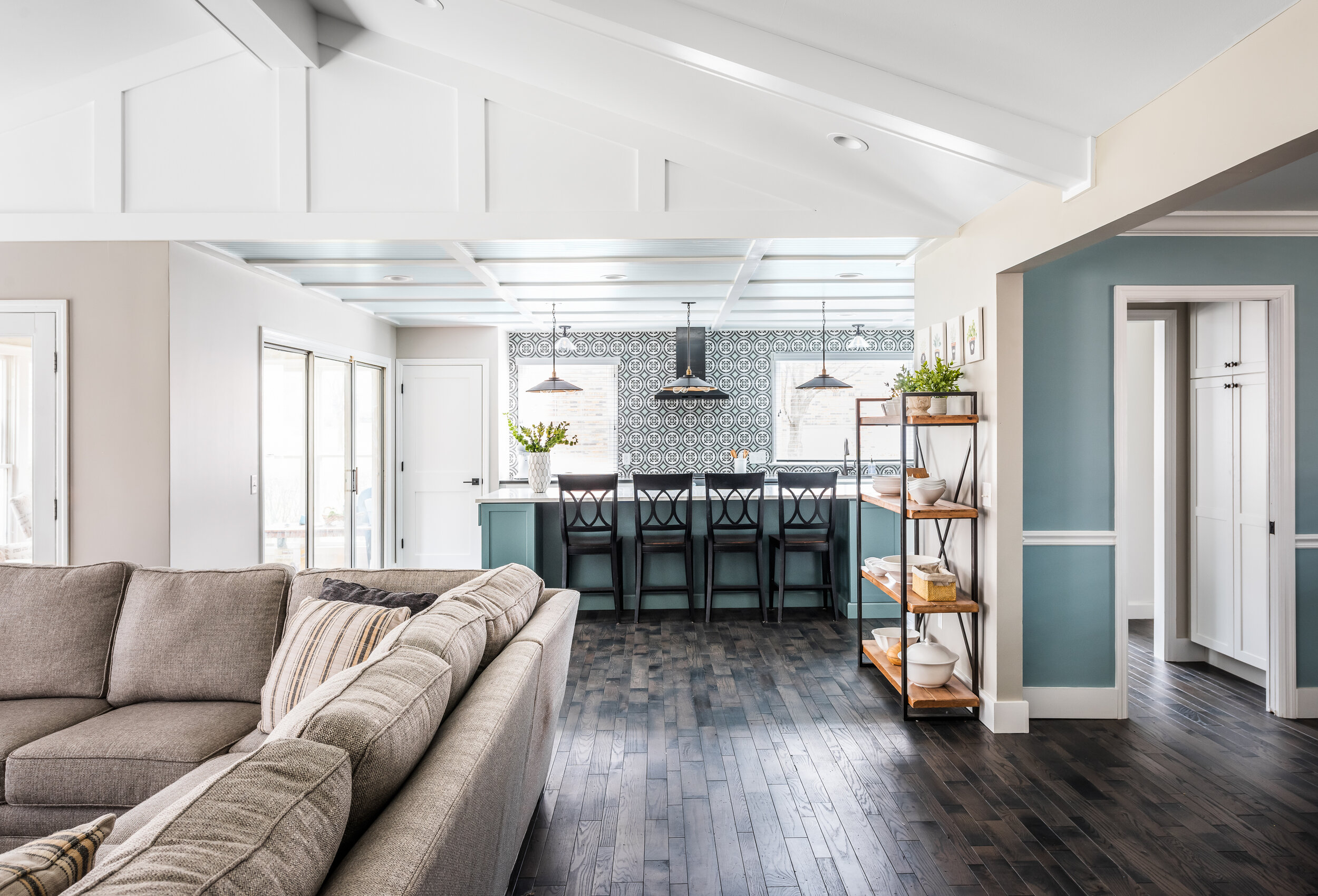
The kitchen in this 34 year old home was in desperate need of an update! It was closed off from the rest of the first floor and all of the fixtures and finishes were original to the house. Our first goal was to open up the kitchen to the great room by removing the wall separating the two. The client also wanted to make some big design statements by getting creative with the ceilings and choosing bold colors and patterns.
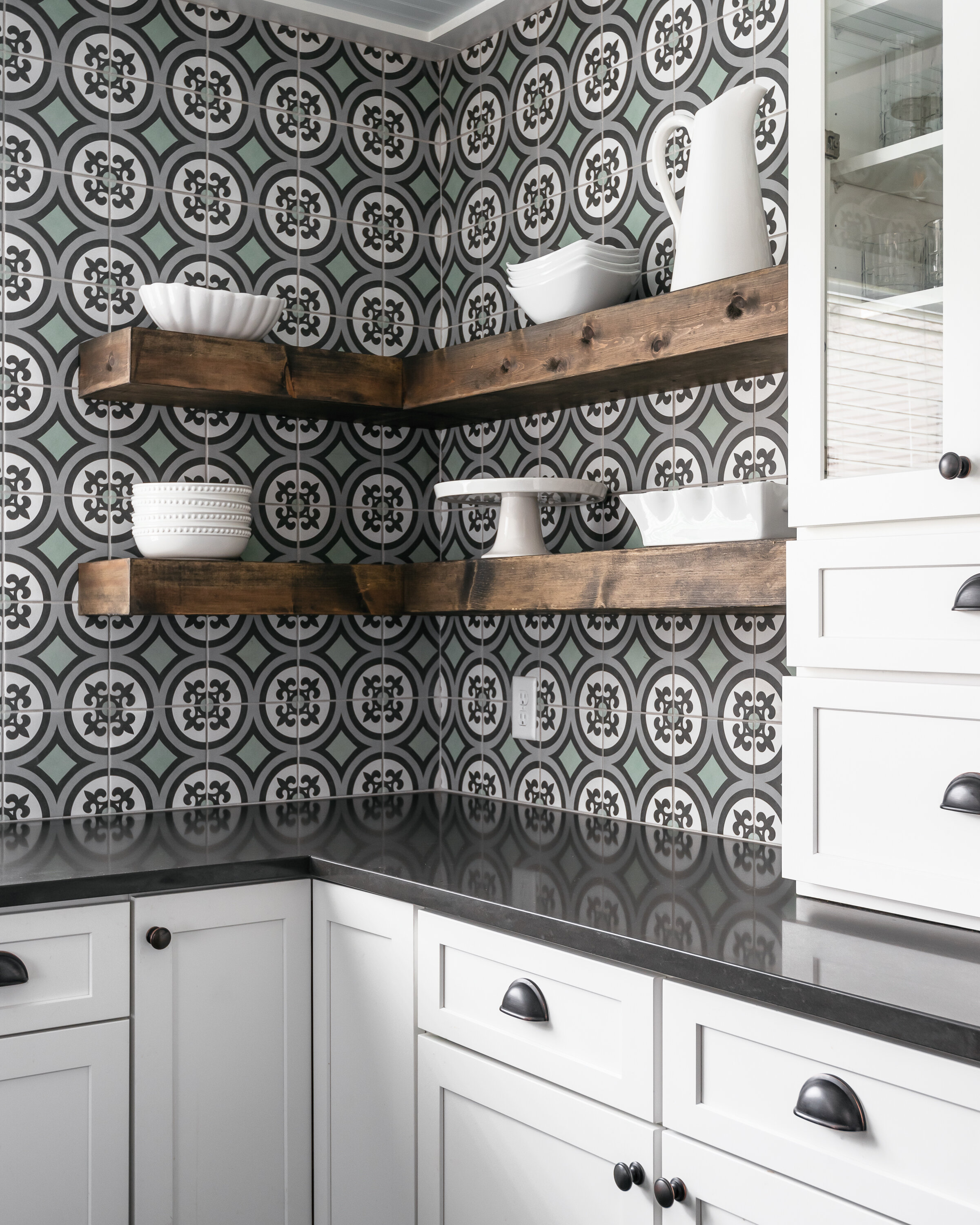
We were really inspired by the coastal cottage style when designing the ceiling and making finish selections. This kitchen is all about that tile! We instantly fell in love with it. It was the perfect match to the turquoise island and the quartz countertops. The ceiling in the kitchen is 8' which means we couldn't do an actual coffered ceiling so we created the illusion of a coffered ceiling by creating a grid out of flat stock and doing bead board in between. We painted the beadboard a really soft robin's egg blue, much like the ceilings on a traditional southern porch.
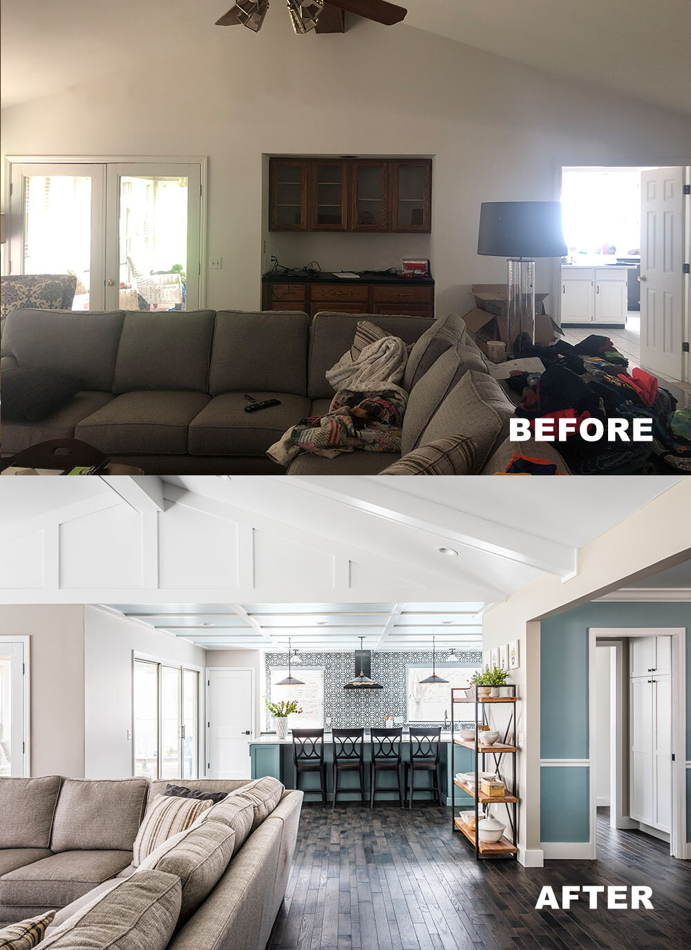
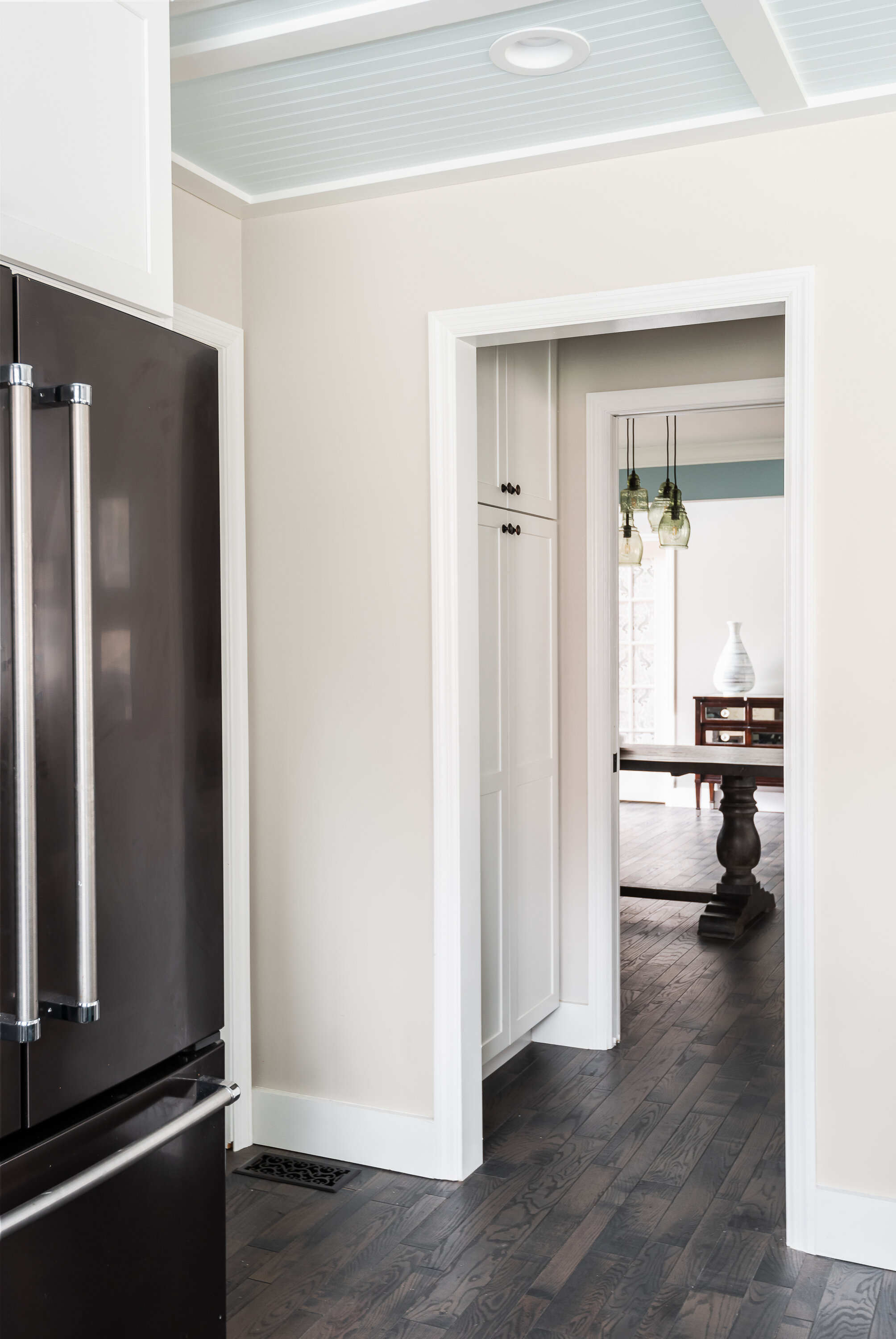
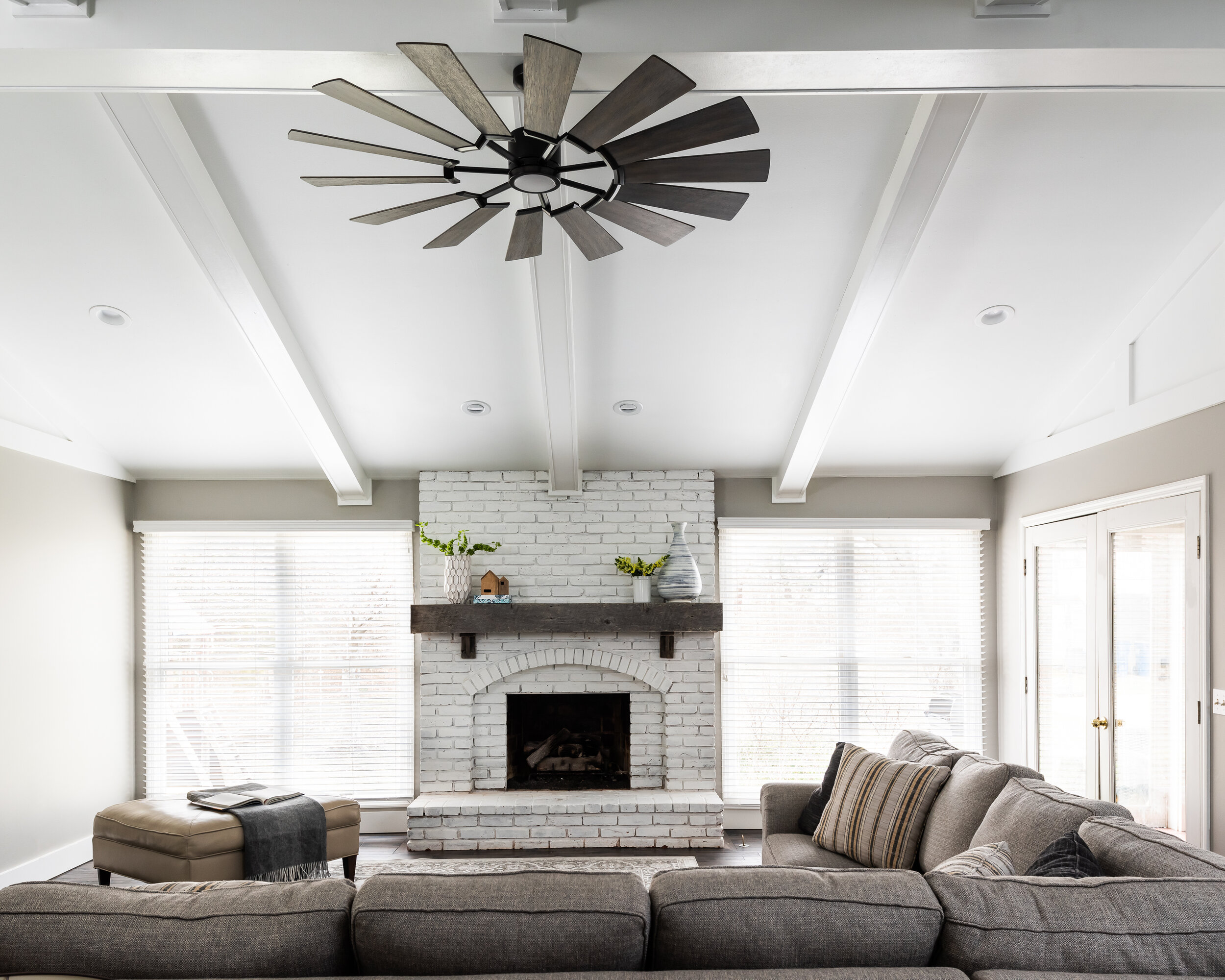
In the family room, we added six beams coming off the center beam and painted everything white. We filled in what would usually be dead wall space on the peak walls with a board and batten treatment. We created a small butler style pantry by making the dining room slightly smaller and creating a pass through between the kitchen and dining room with cabinetry. Overall, the space feels larger and way more exciting!
Oakwood
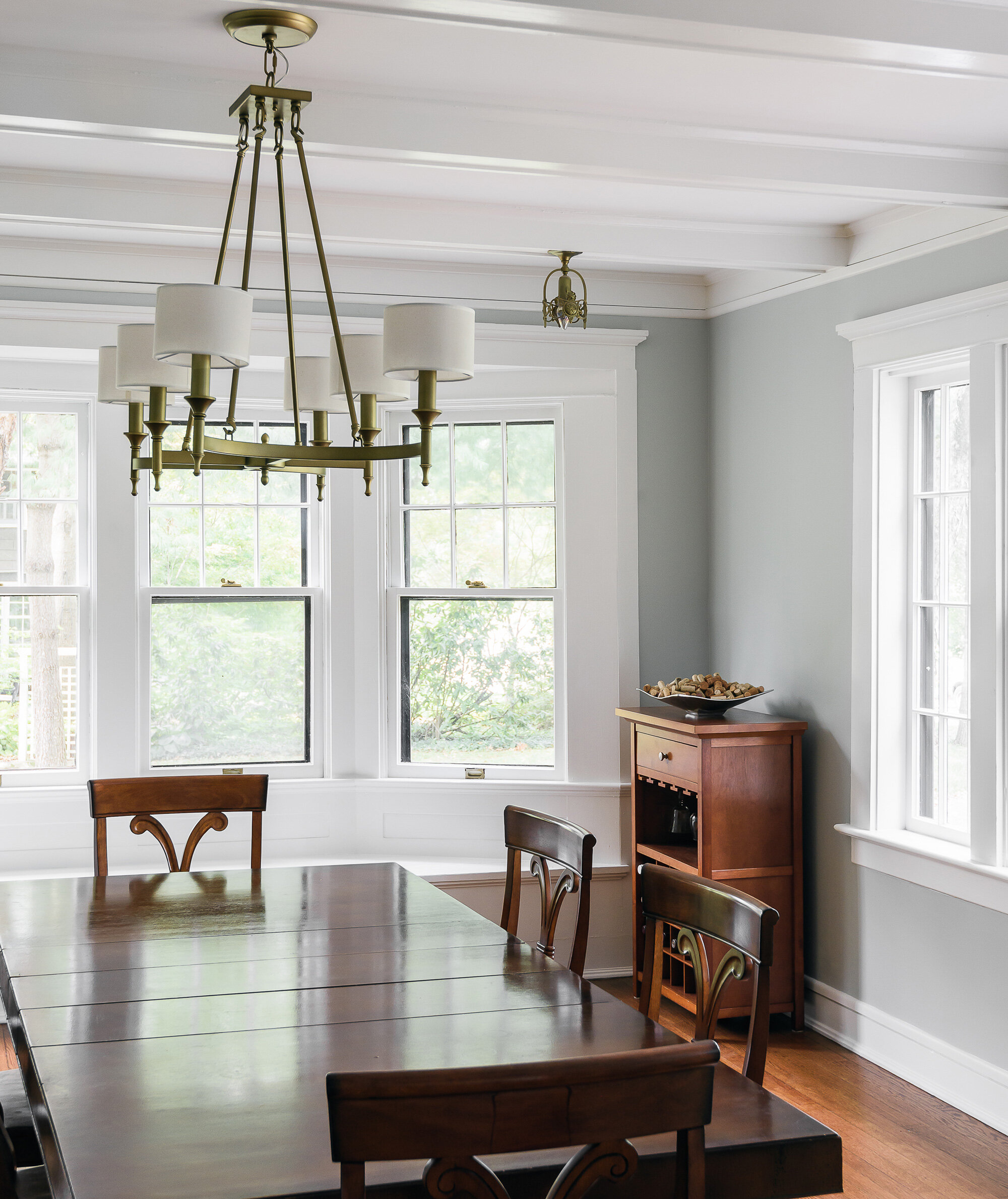
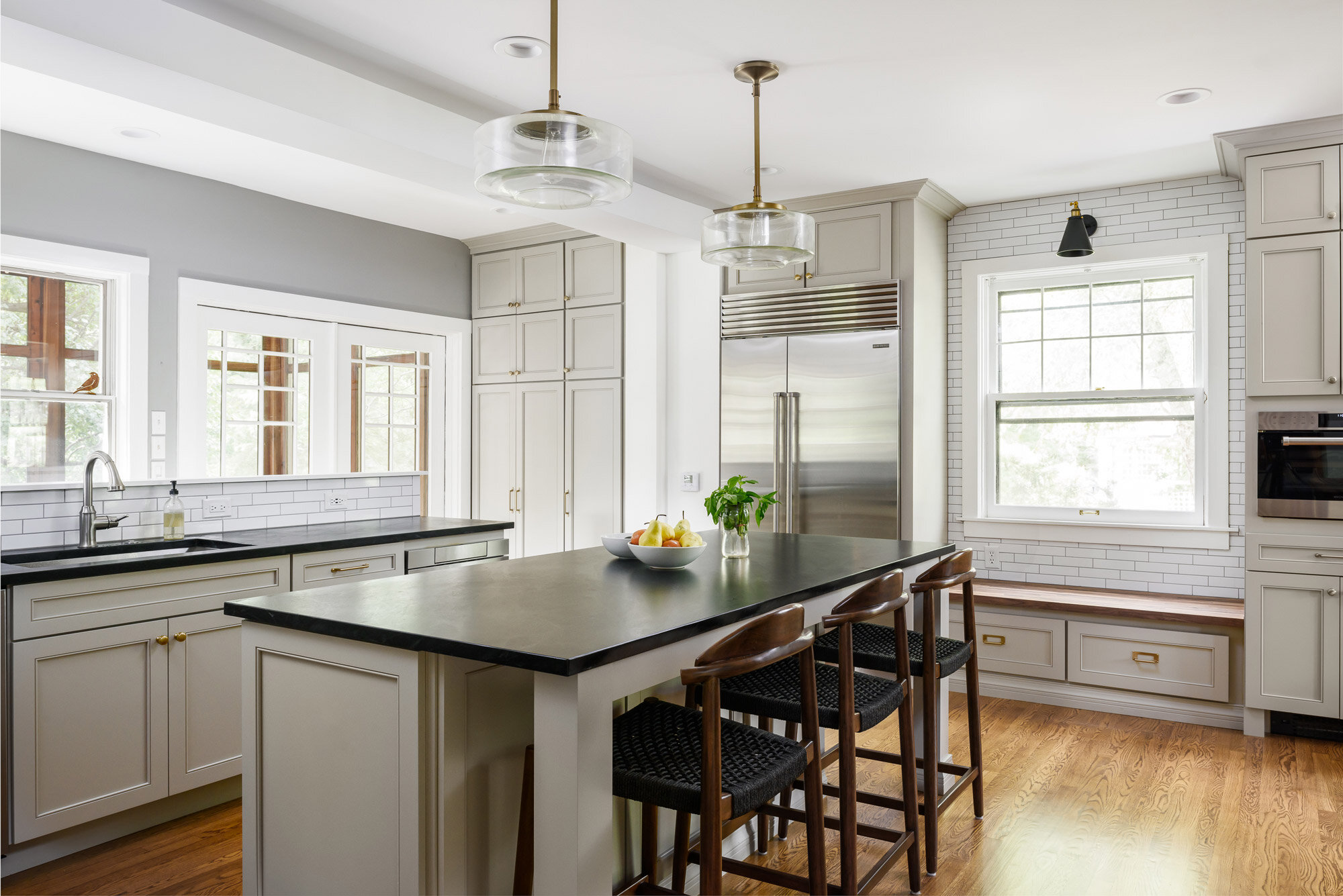
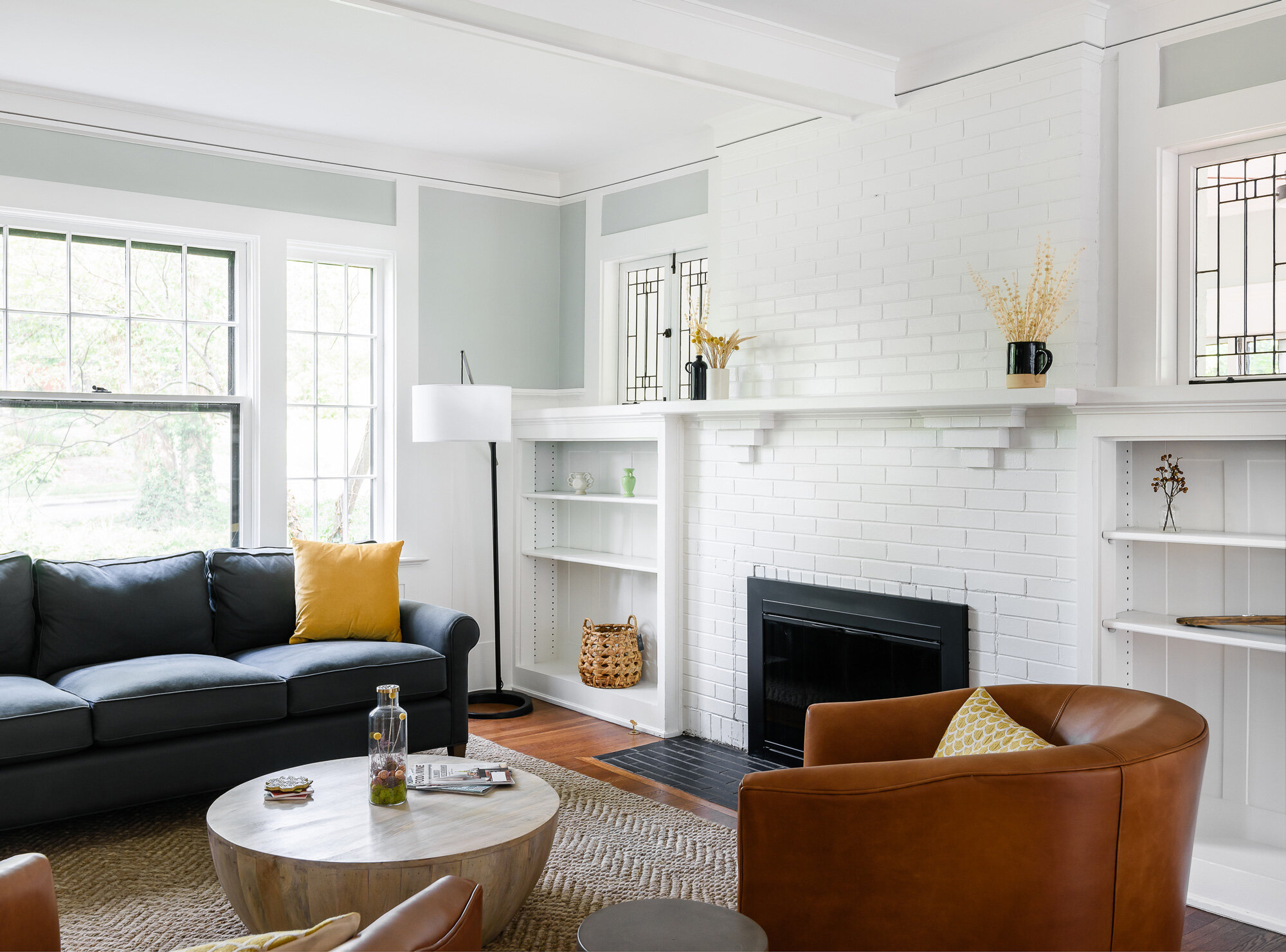
A sunroom with baseboard heaters, a bright kitchen with white subway tiles, and a living room with large fireplace.


Webster Groves, MO
Designer
Rochelle McAvin
Photographer
Karen Palmer
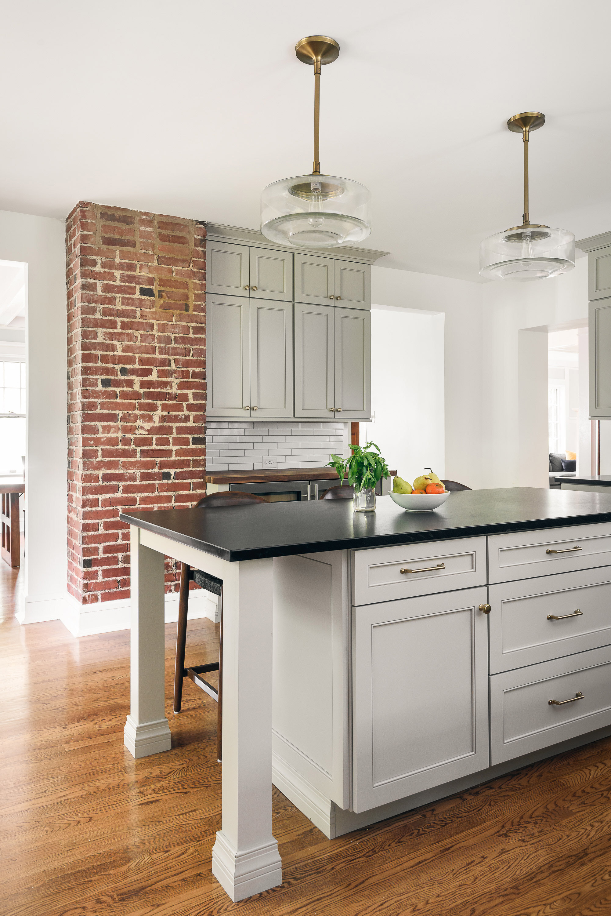
Our clients bought a beautiful century home in Historical Webster Groves, but it was in need of a modern day facelift. We took down dated walls in the kitchen and let the light in.
This family loves to cook and the old kitchen layout was closed in and choppy. The new layout is stocked with storage, professional appliances and plenty of sunlit workspace.
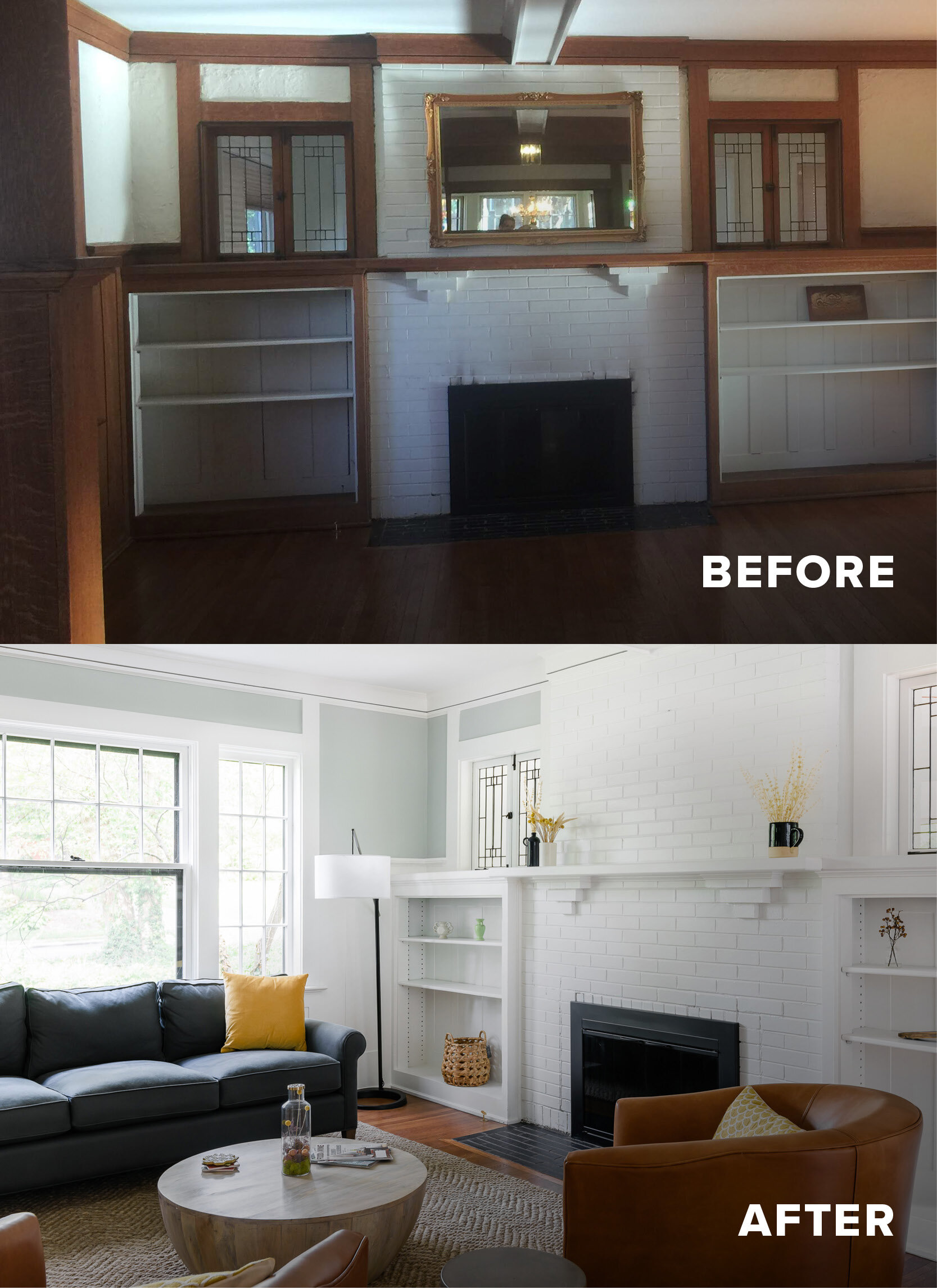
In the family room, the wood wainscotting was original and dark. We lightened up the room by painting everything a clean, clear white. The hardwood floors warm up the room and now it feels welcoming, bright and inviting.
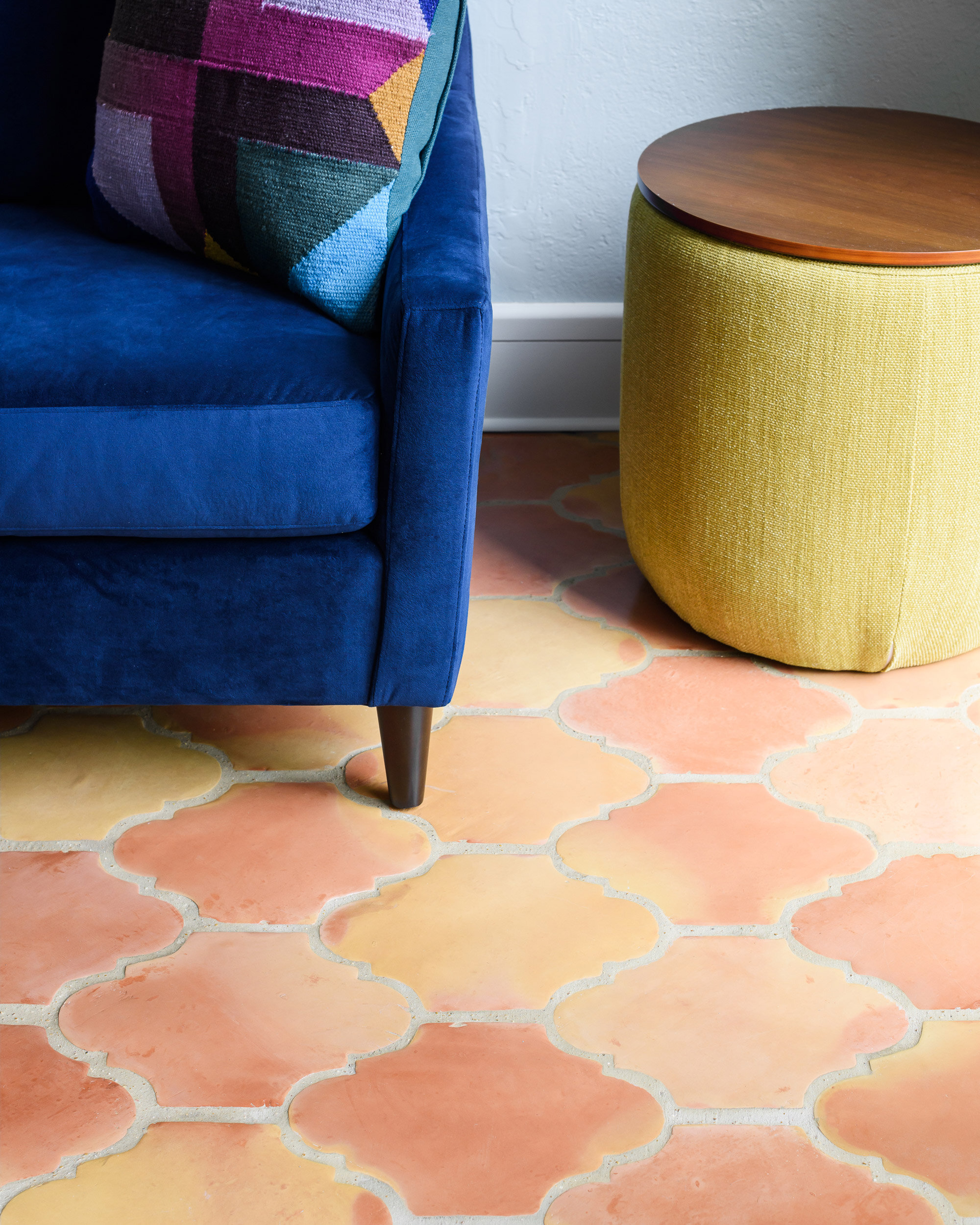
Our last stop was the sunroom. It had baseboard heaters, old blue carpet and did not feel cozy and inviting! We replaced the carpet with spanish clay tile that brings back the character of the old home - but includes a modern update - in floor heat.
We love how it turned out!
This project was recently featured in Ladue News. Check out the details here.
Fyler Airbnb
A new open kitchen, a light neutral paint color, and rich hardwood floors make the home feel light, open and airy.
St. Louis, MO
2018
DESIGNER:
Rochelle McAvin and Anna Entringer
PHOTOGRAPHER:
Karen Palmer Photography
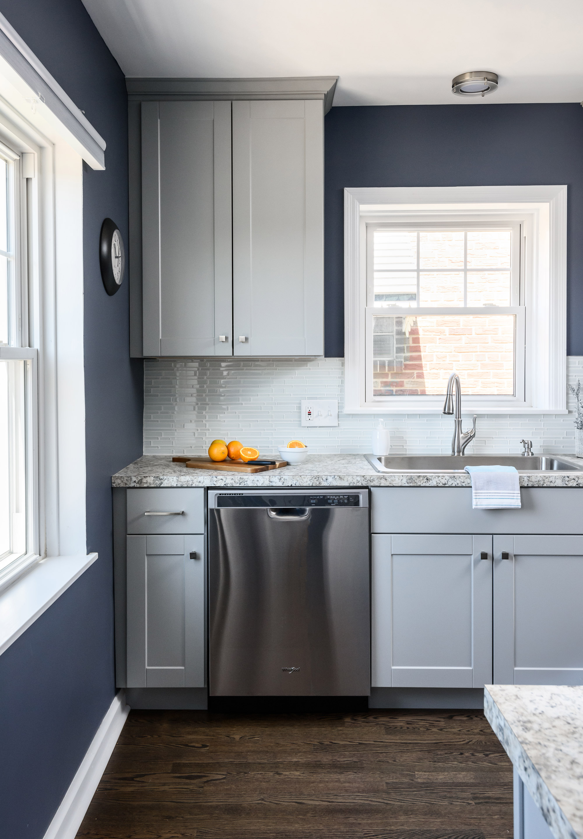
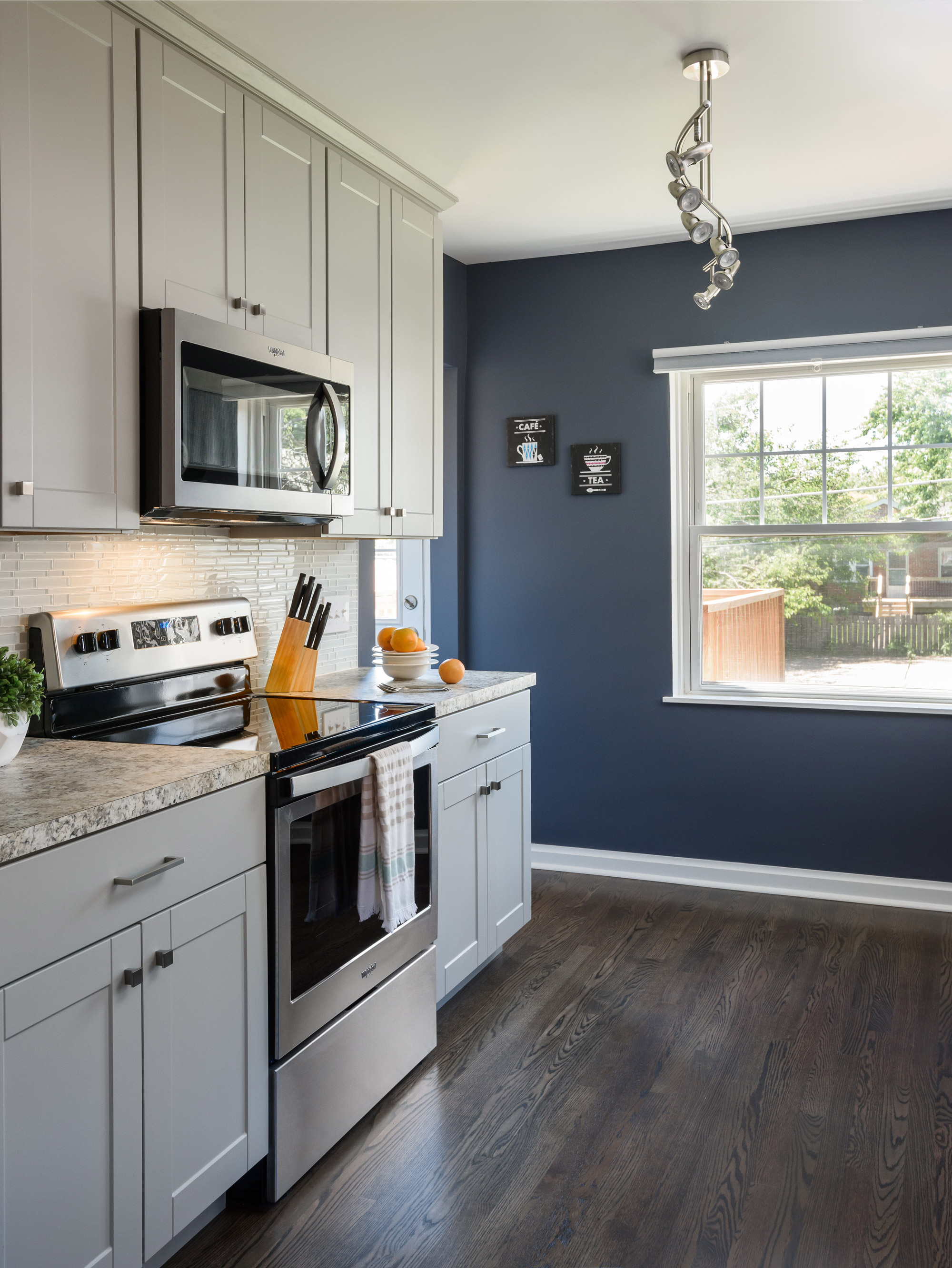
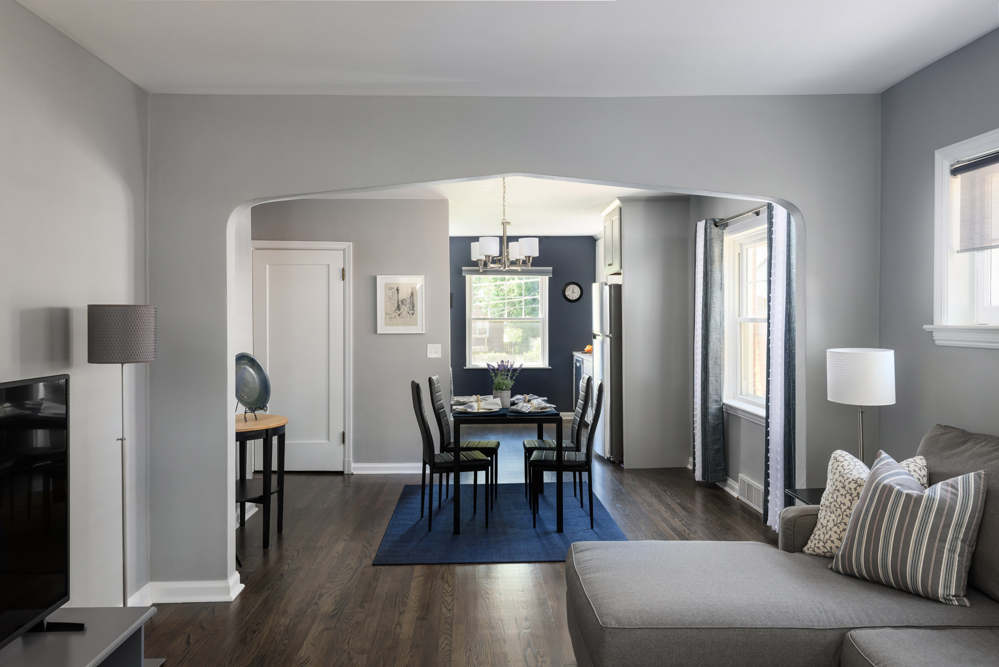
A new open kitchen, a light neutral paint color, and rich hardwood floors make the home feel light, open and airy. The dated wood trim, perked up with a fresh white, glossy coat of paint. The kitchen is open, with plenty of room to entertain and an inviting new deck is right out the back door. The end result is breezy and bright!
Mission Ct Kitchen
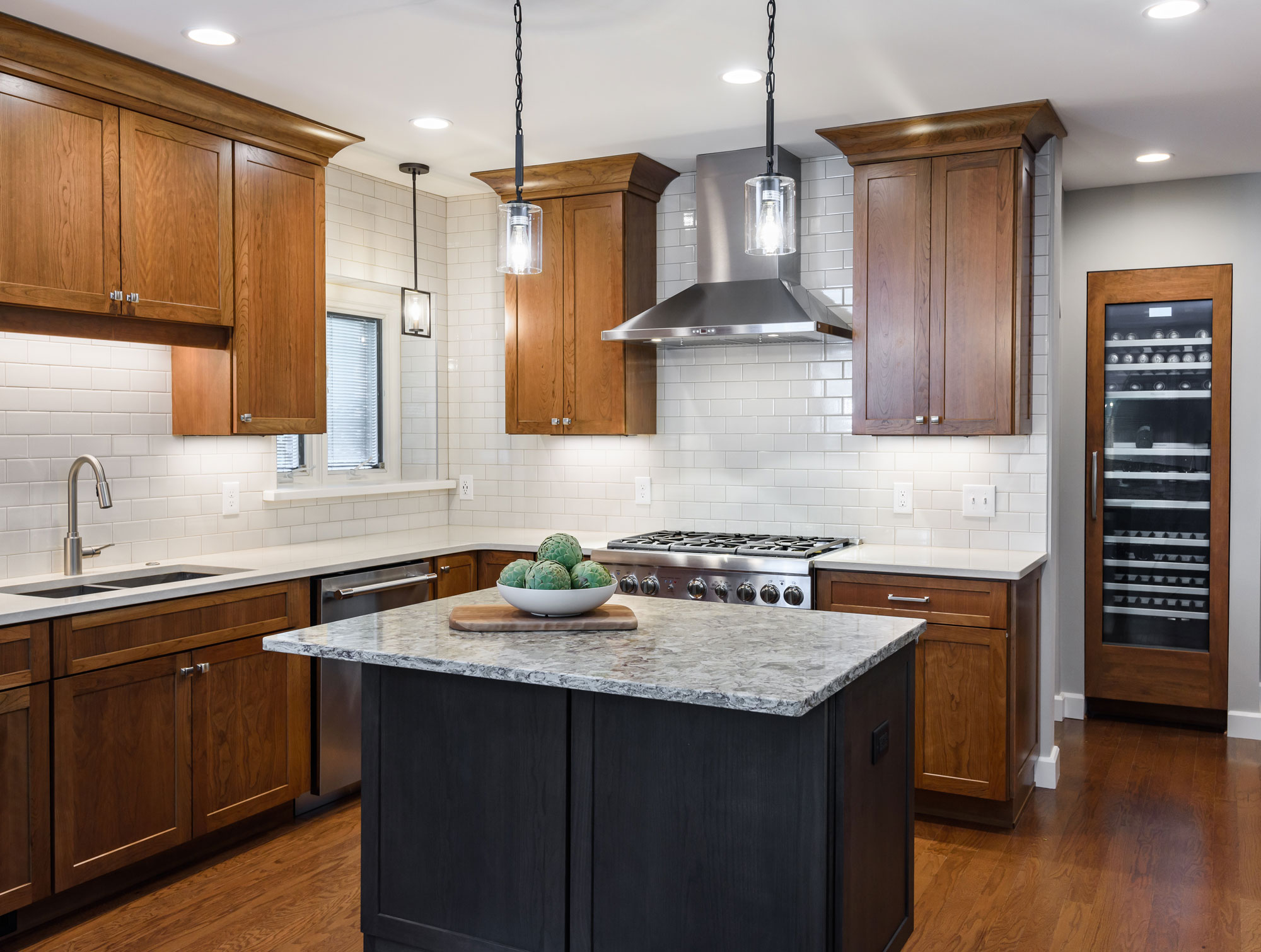
A small island is great for conversation and prep space, also hiding the microwave drawer. The built in wine storage peeks around the corner holding an impressive 92 bottles of wine. We added new hardwood flooring to match the entire first floor bringing together the old and the new. The result is a warm and inviting kitchen!
2019
DESIGNER:
Rochelle McAvin
PHOTOGRAPHER:
Karen Palmer Photography
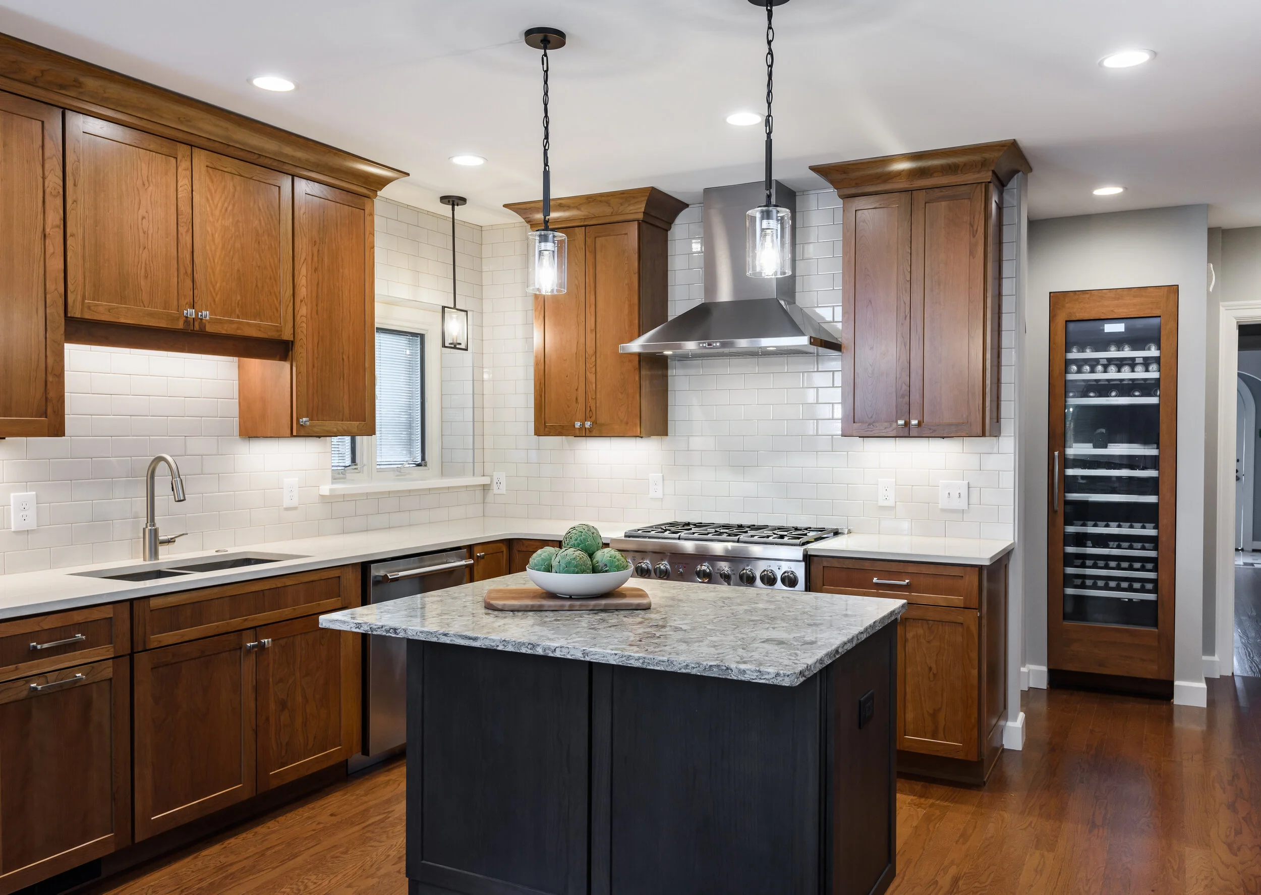
Our client wanted to remodel his outdated kitchen as soon as he moved in. The classic U City Tudor needed an update that was true to the history of the home. The existing kitchen had a bathroom right next to the island. We added a wall to create a hallway and offer privacy, that now feels like a natural extension of the home.
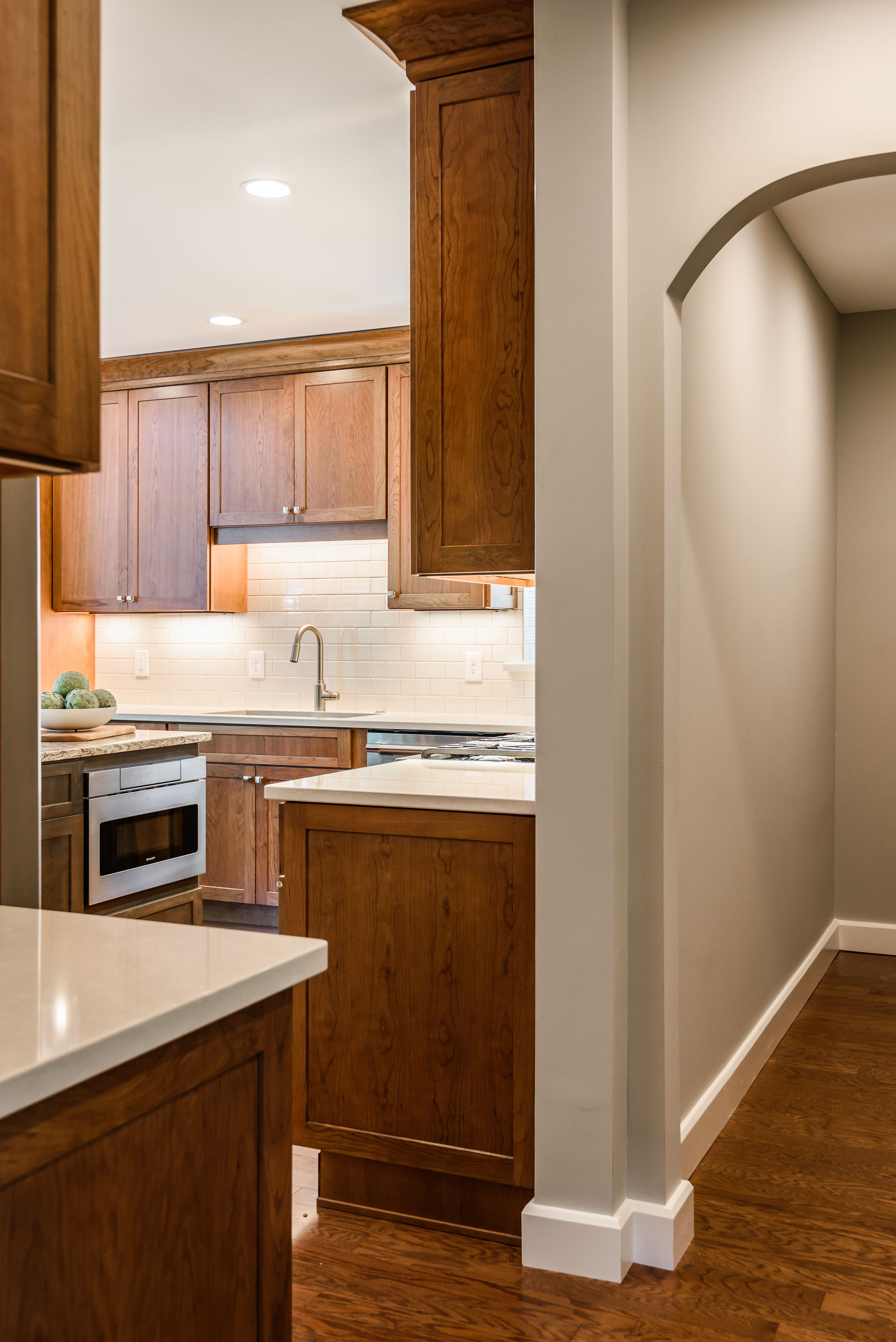
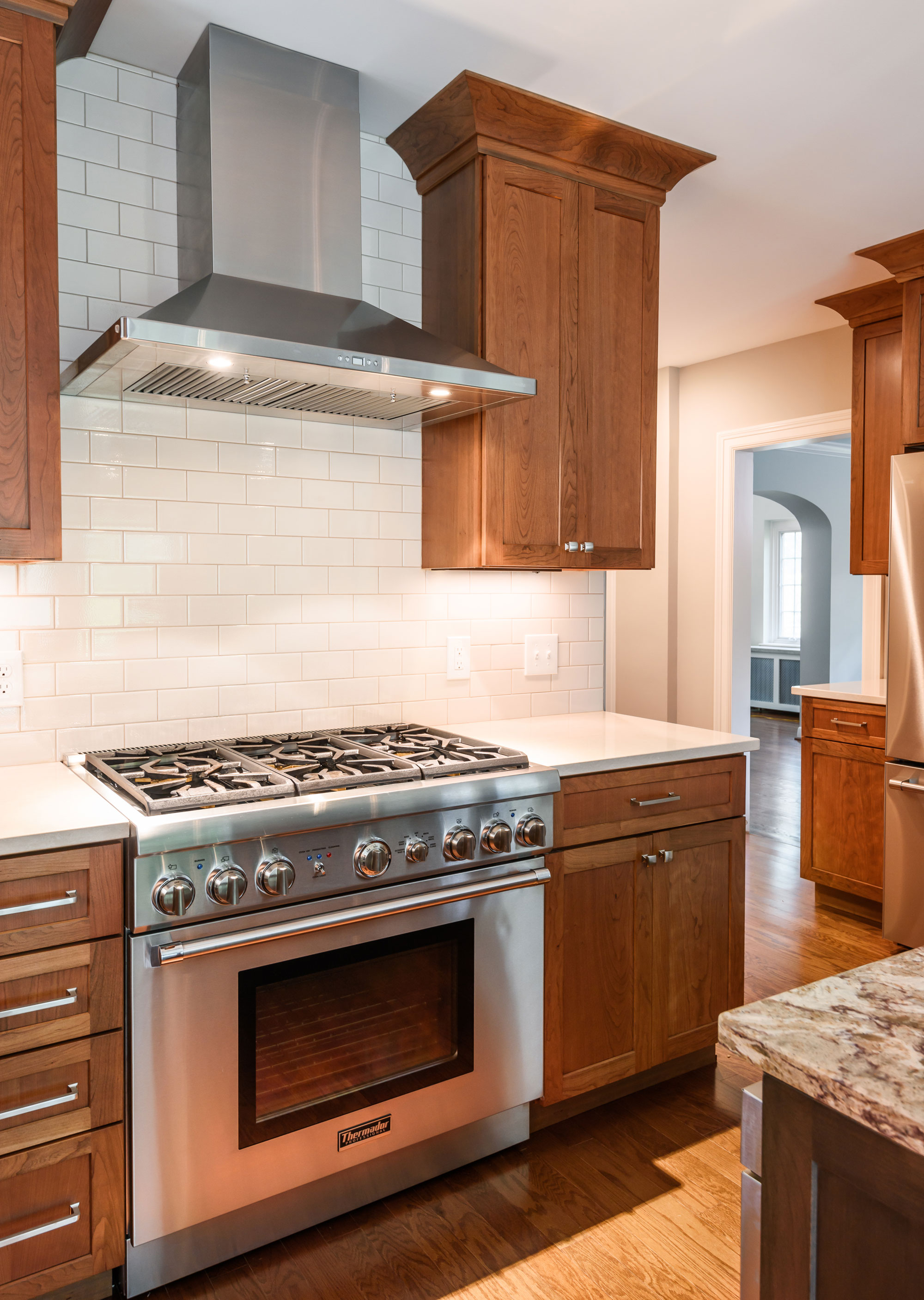
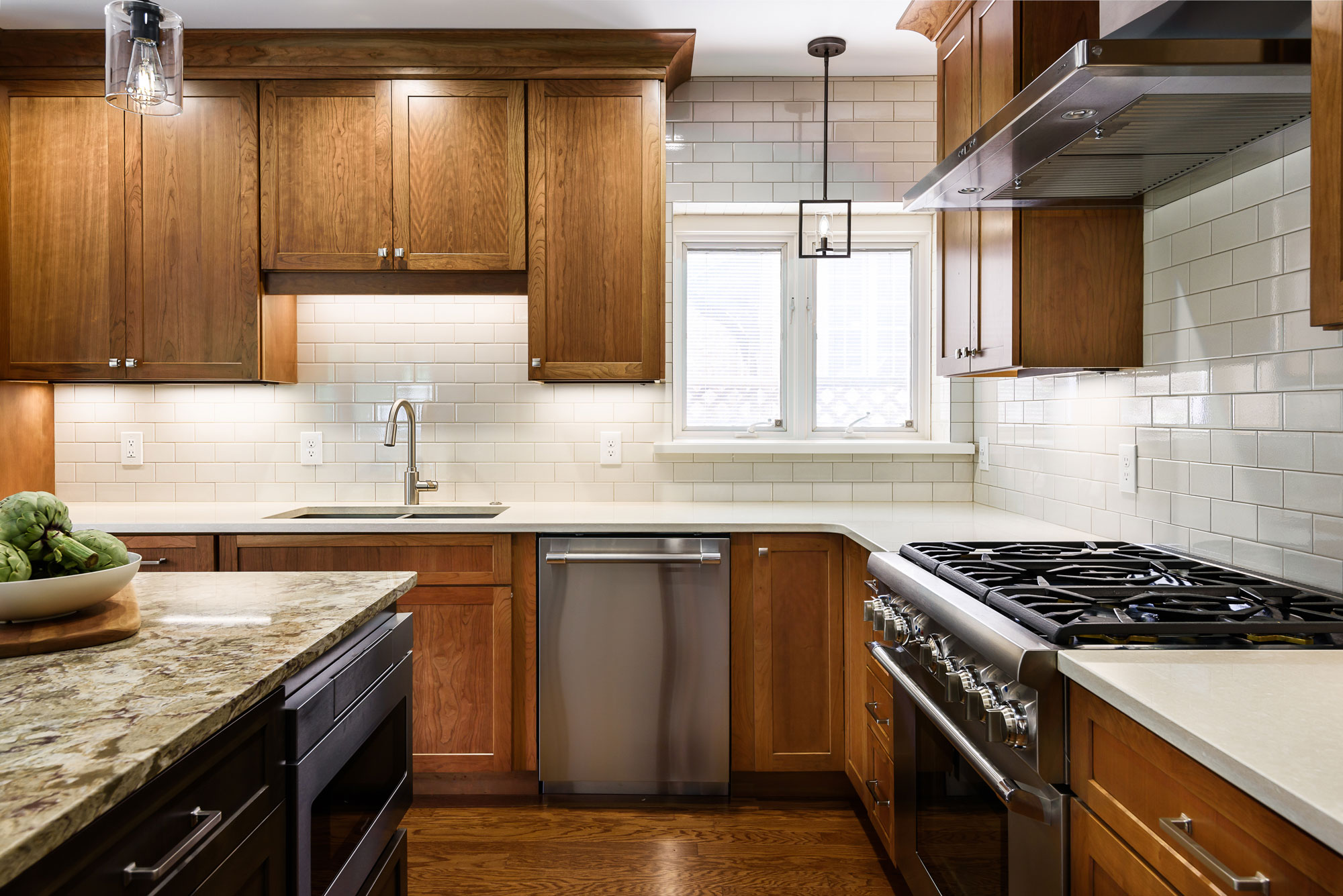
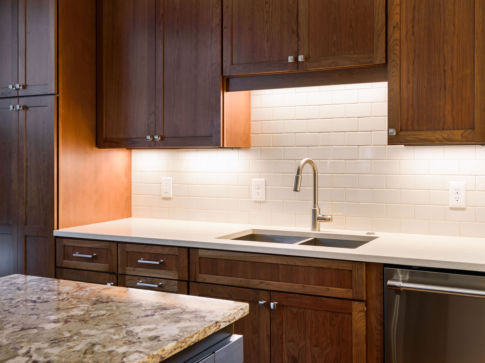
Our client loves to cook and the wall provided us a new place to incorporate a professional range and hood. A small island is great for conversation and prep space, also hiding the microwave drawer. The built in wine storage peeks around the corner holding an impressive 92 bottles of wine. We added new hardwood flooring to match the entire first floor bringing together the old and the new. The result is a warm and inviting kitchen!
Clean and Contemporary Kitchen
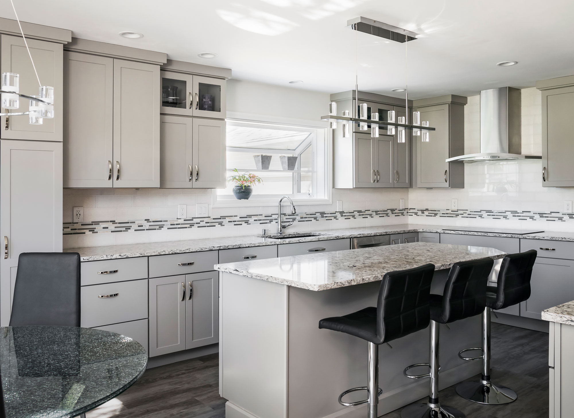
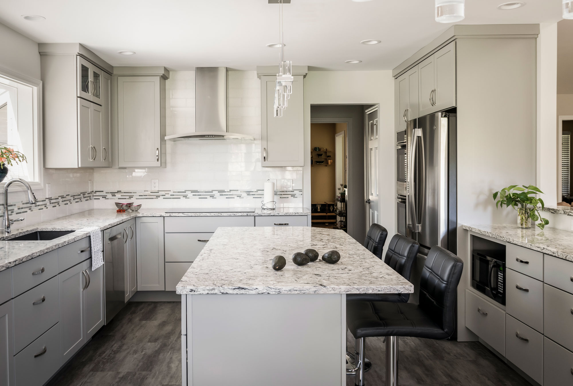
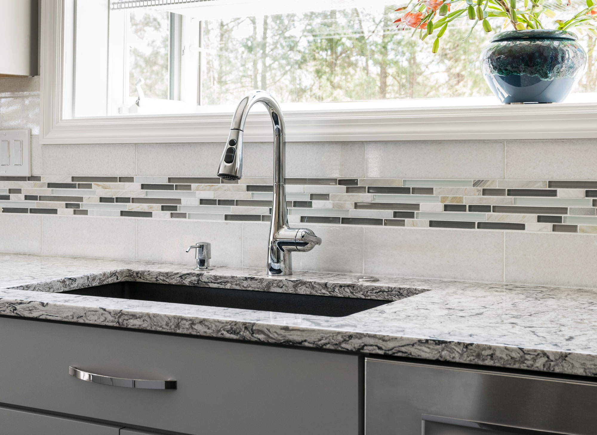
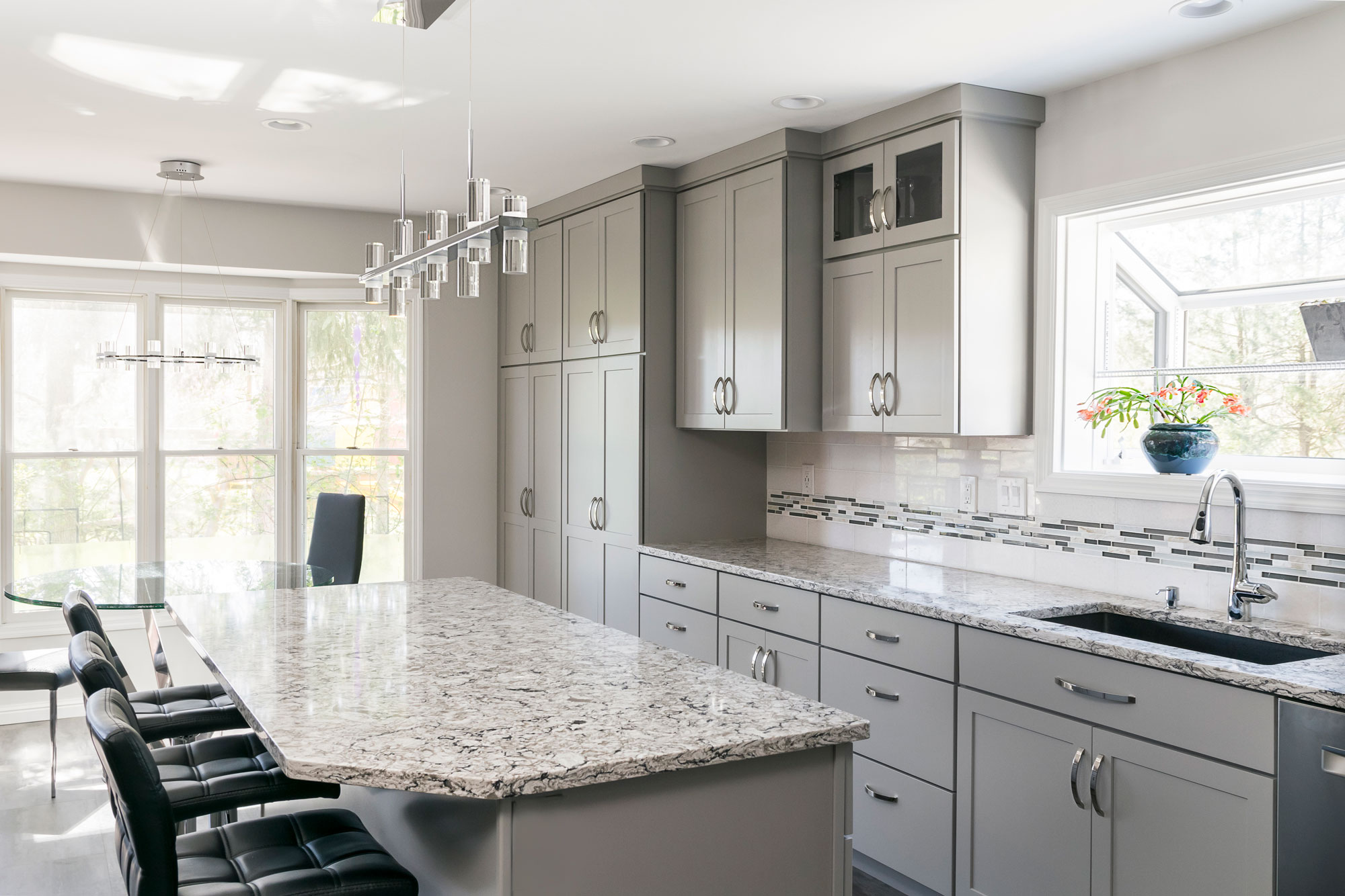
The flooring is a family proof luxury vinyl tile and the counter tops are Cambria quartz. We love how this kitchen is bright, open and modern!
2019
DESIGNER:
Rochelle McAvin
PHOTOGRAPHER:
Karen Palmer Photography
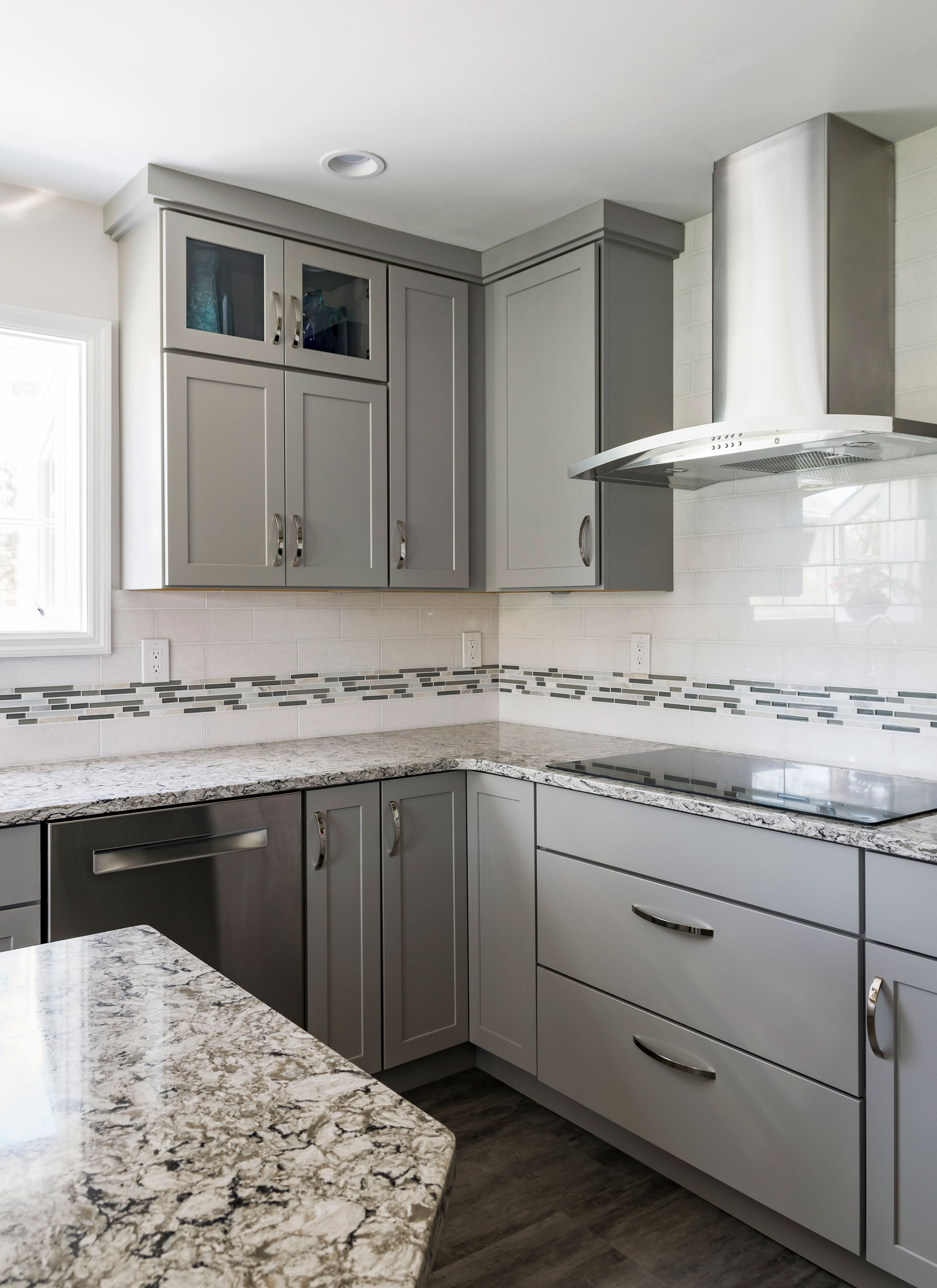
Our client loved the idea of a clean, contemporary kitchen. We opened up the wall to the living space to connect the two spaces and replaced a pantry for storage that blends seamlessly with the kitchen cabinets. She chose a neutral color palette with a mix of grays, whites and neutrals; ensuring a timeless look. The flooring is a family proof luxury vinyl tile and the counter tops are Cambria quartz. We love how this kitchen is bright, open and modern!
Cedar Springs
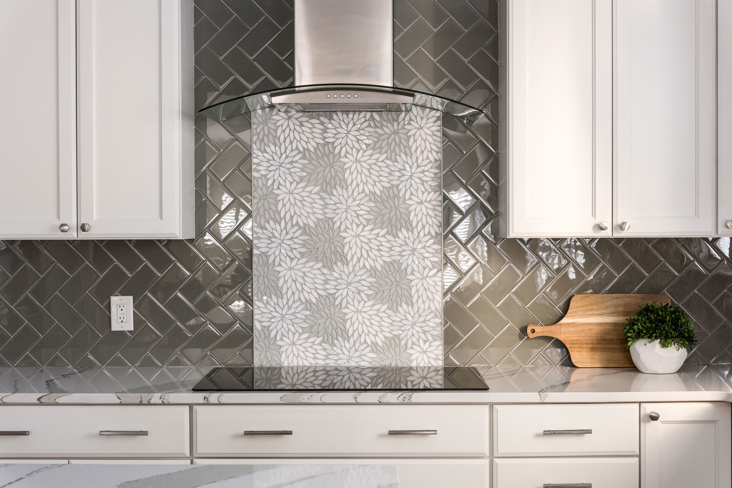
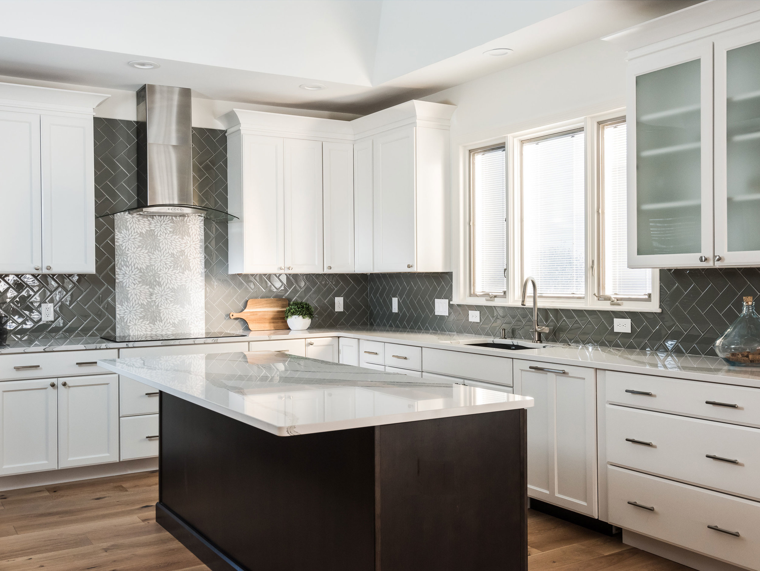
The client wanted a bright and clean but welcoming look for her kitchen. We started with a dark island that grounds the space and kept everything bright and focused on the floral back splash tile that my client fell in love with from the start.
Missouri, 2019
DESIGNER:
Rochelle McAvin
PHOTOGRAPHER:
Karen Palmer Photography
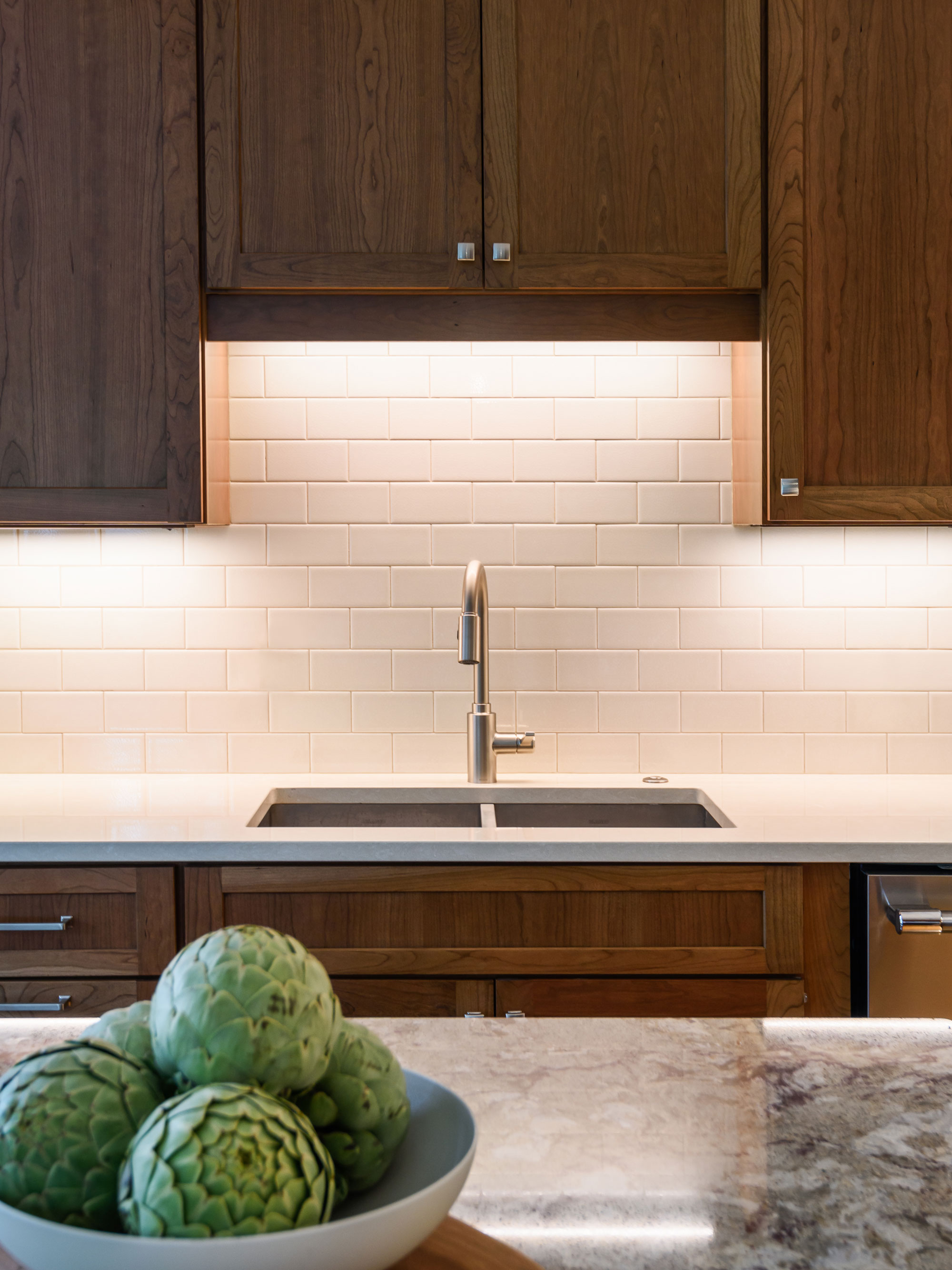
The client wanted a bright and clean but welcoming look for her kitchen. We started with a dark island that grounds the space and kept everything bright and focused on the floral back splash tile that my client fell in love with from the start.
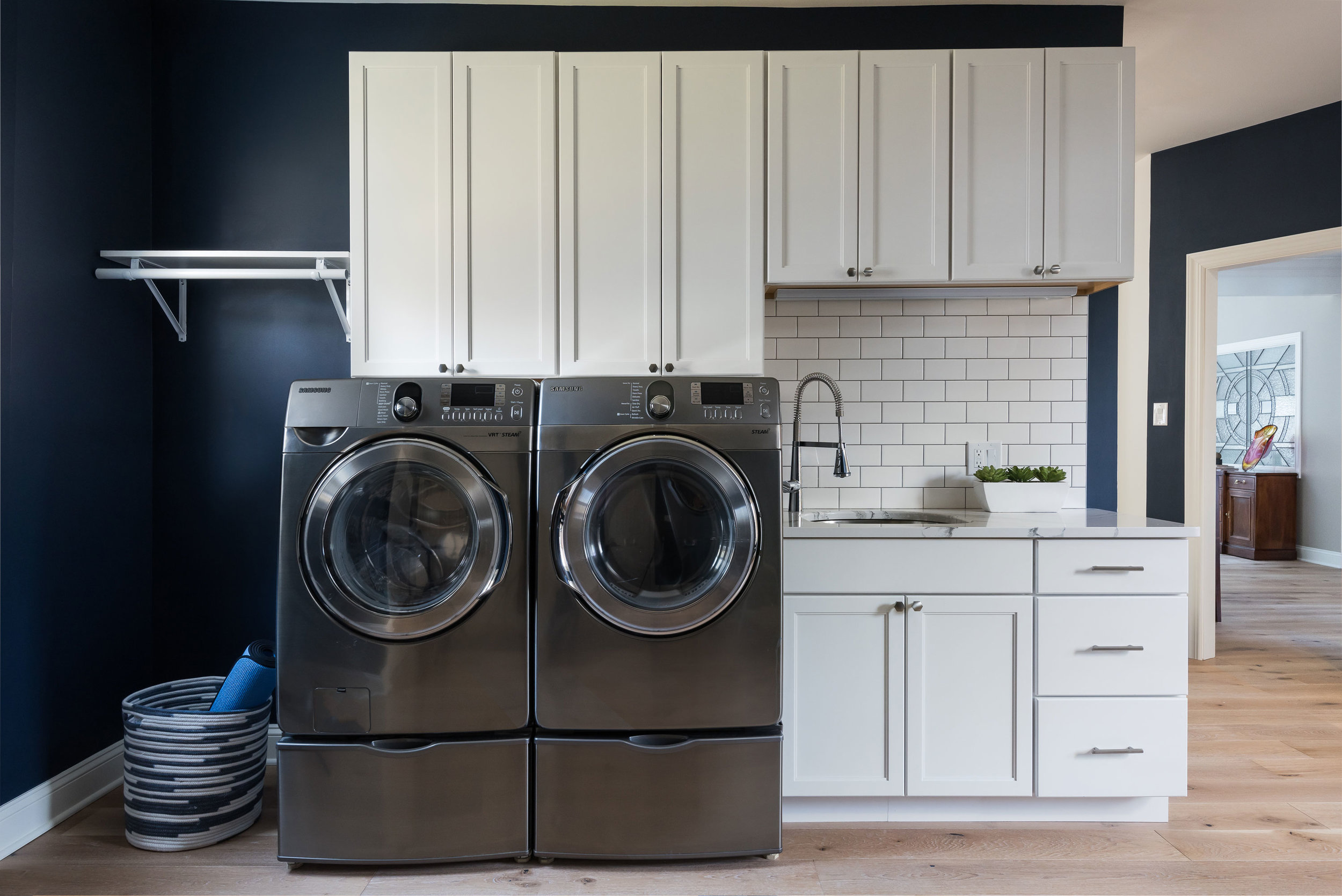
The laundry room is Sherwin Williams Naval and the white cabinets and subway tile keep the look clean and fresh!
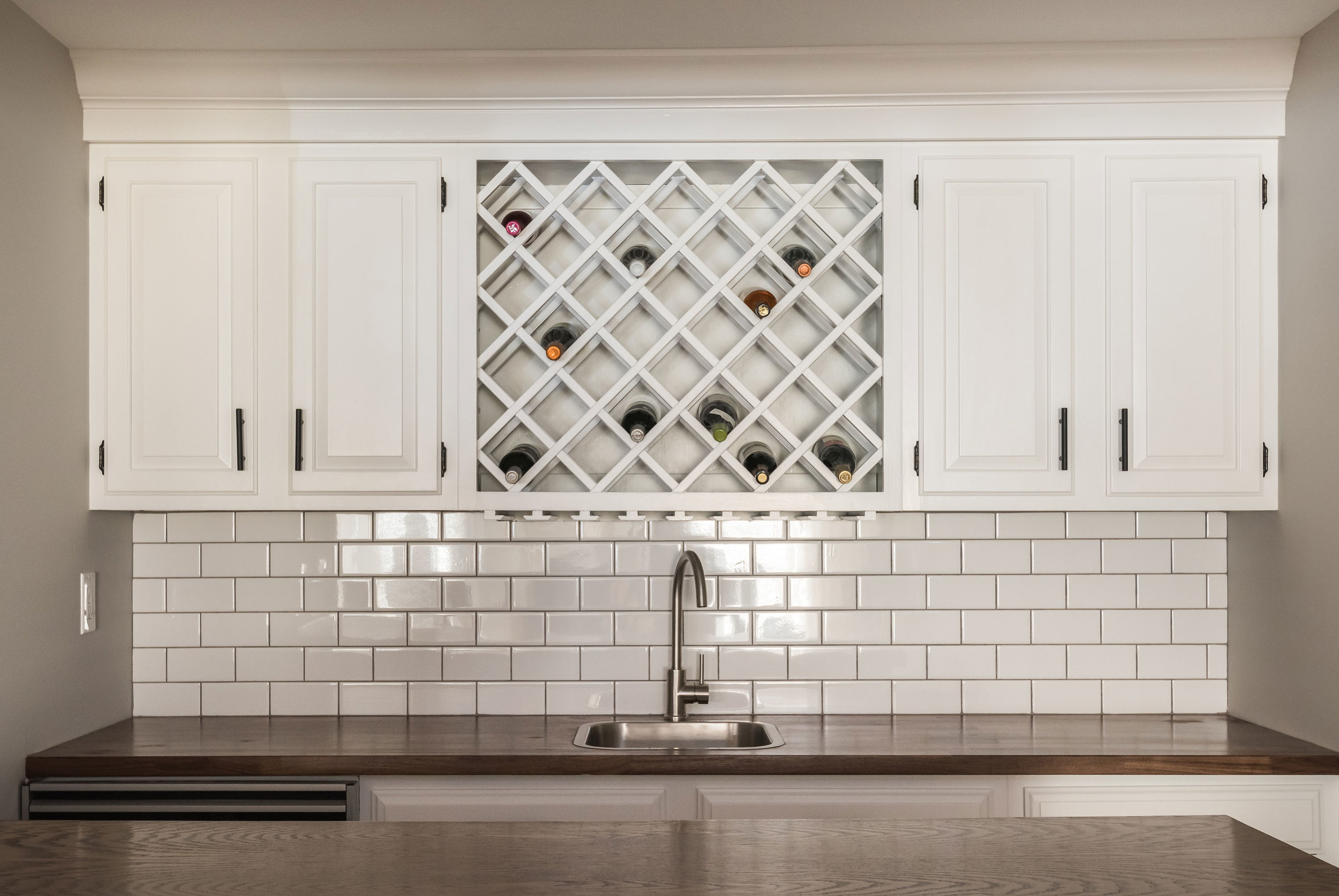
Downstairs in the bar, we freshened up the cabinetry and added a butcher block counter top to cozy up the relaxed space.
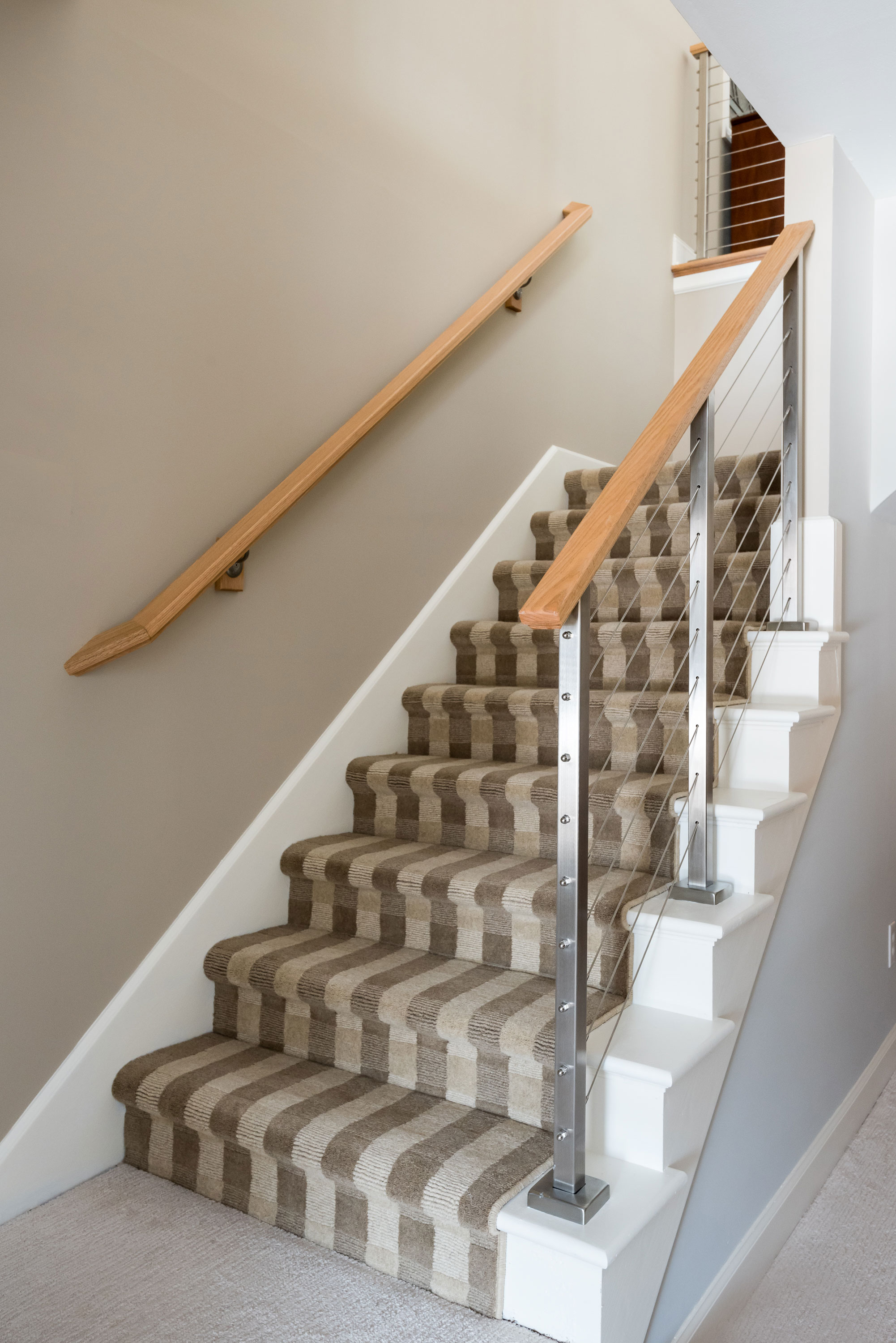
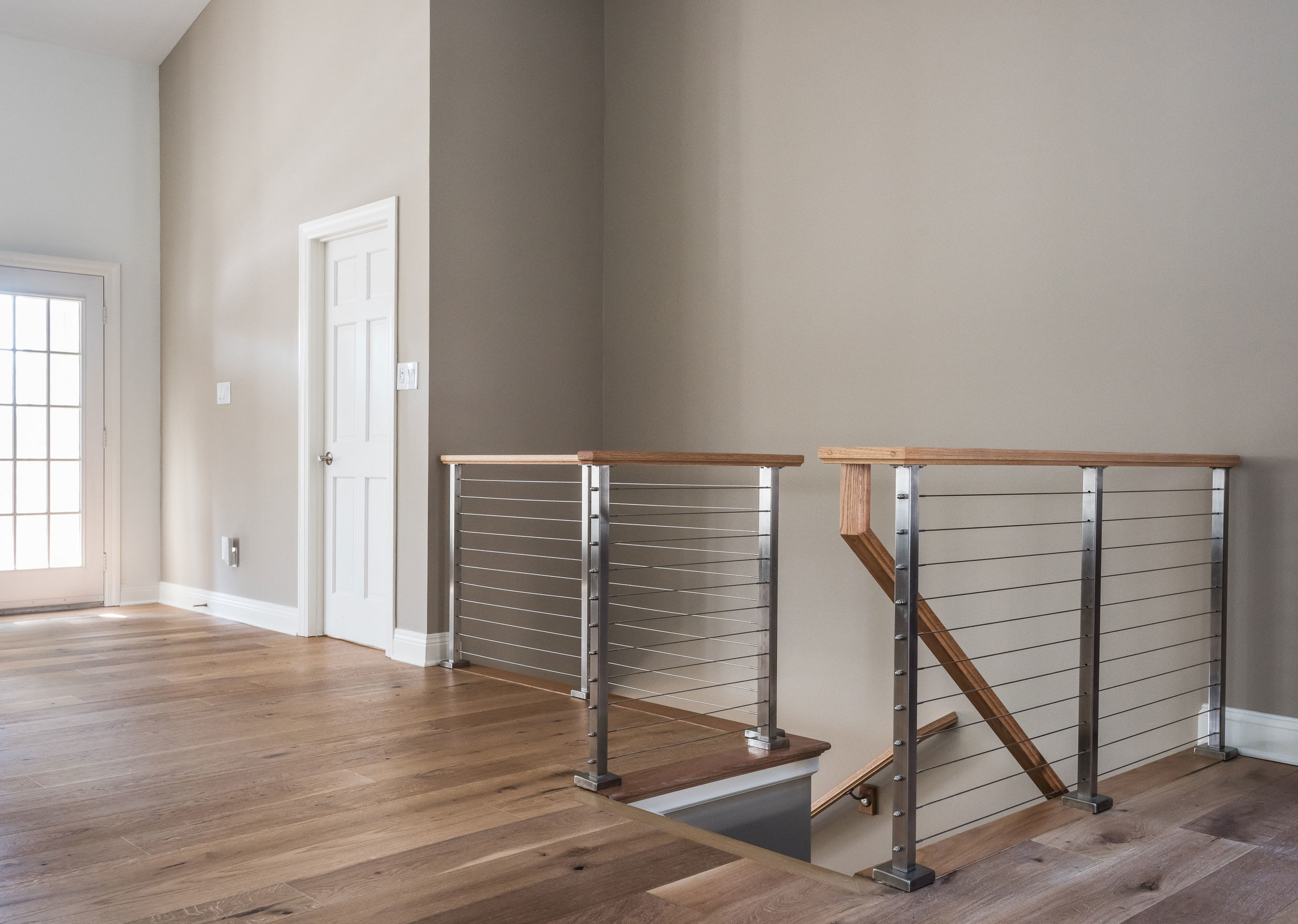
The handrail to the basement originally was a dark and dated wood. We replaced it with a cable rail system that lets the light filter down the steps onto the new textured carpeting. The light, bright space is welcoming and open!


