Vicksburg Siege Basement
Our clients wanted to turn their completely unfinished basement into a family retreat and guest space


St. Louis, MO
Designer
Jennifer Chapman
Senior Designer
Photographer
Karen Palmer
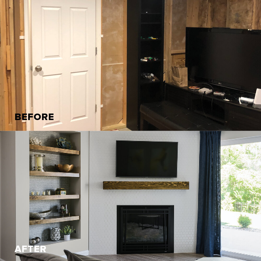
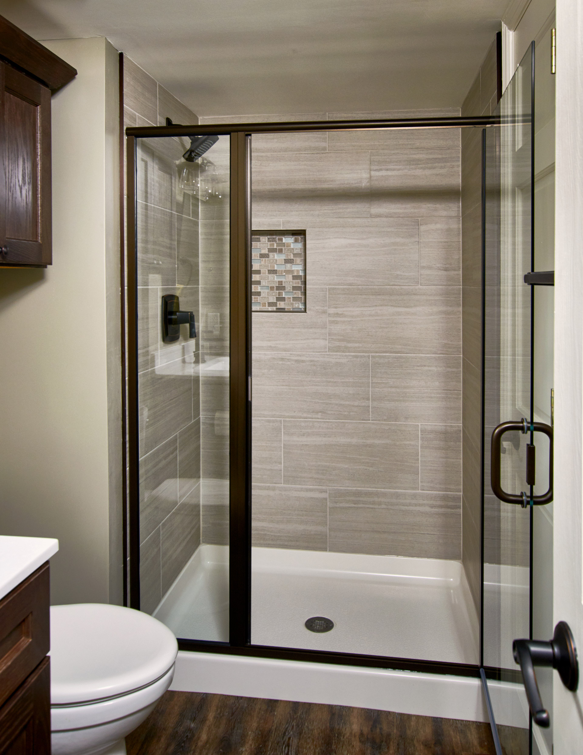
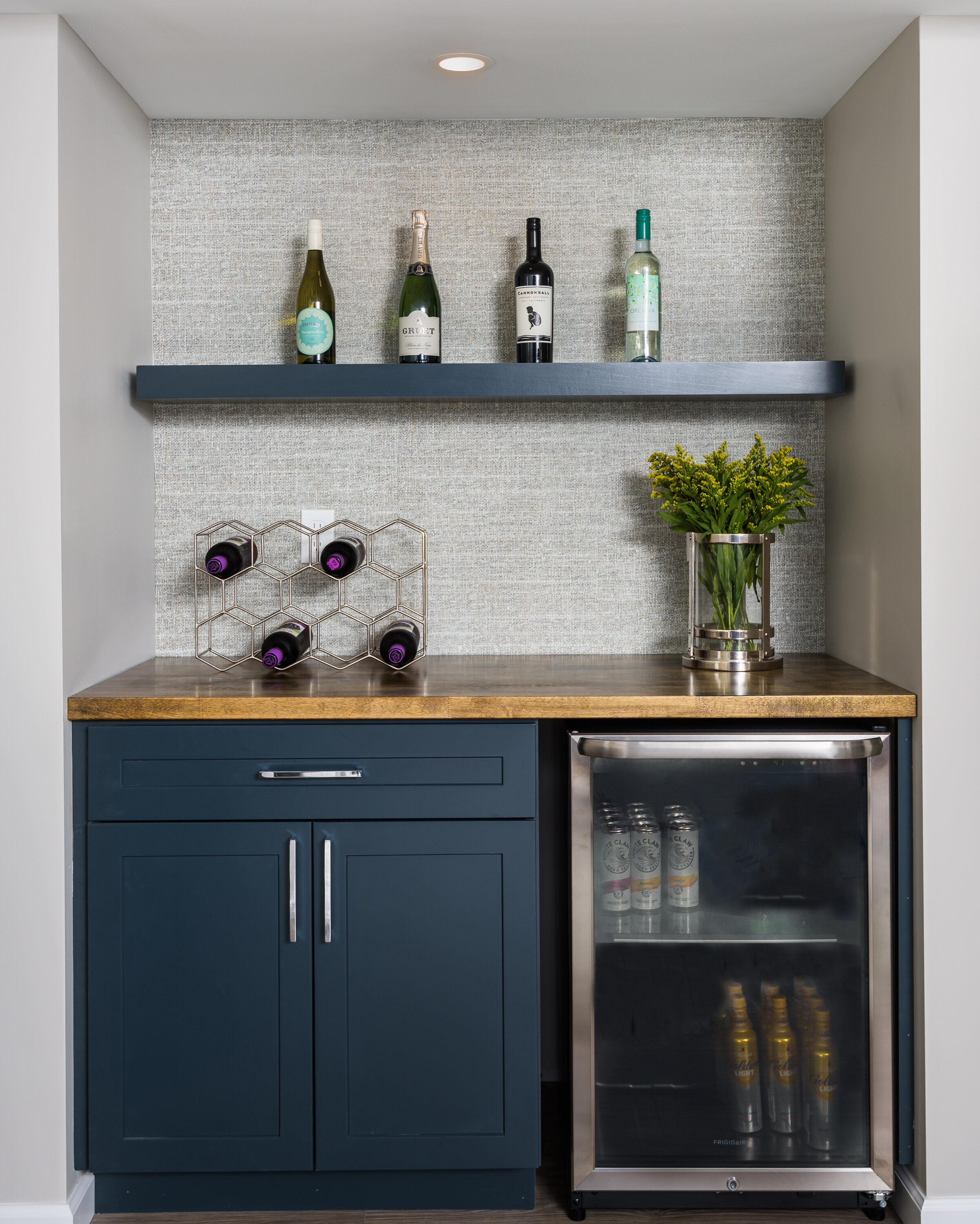
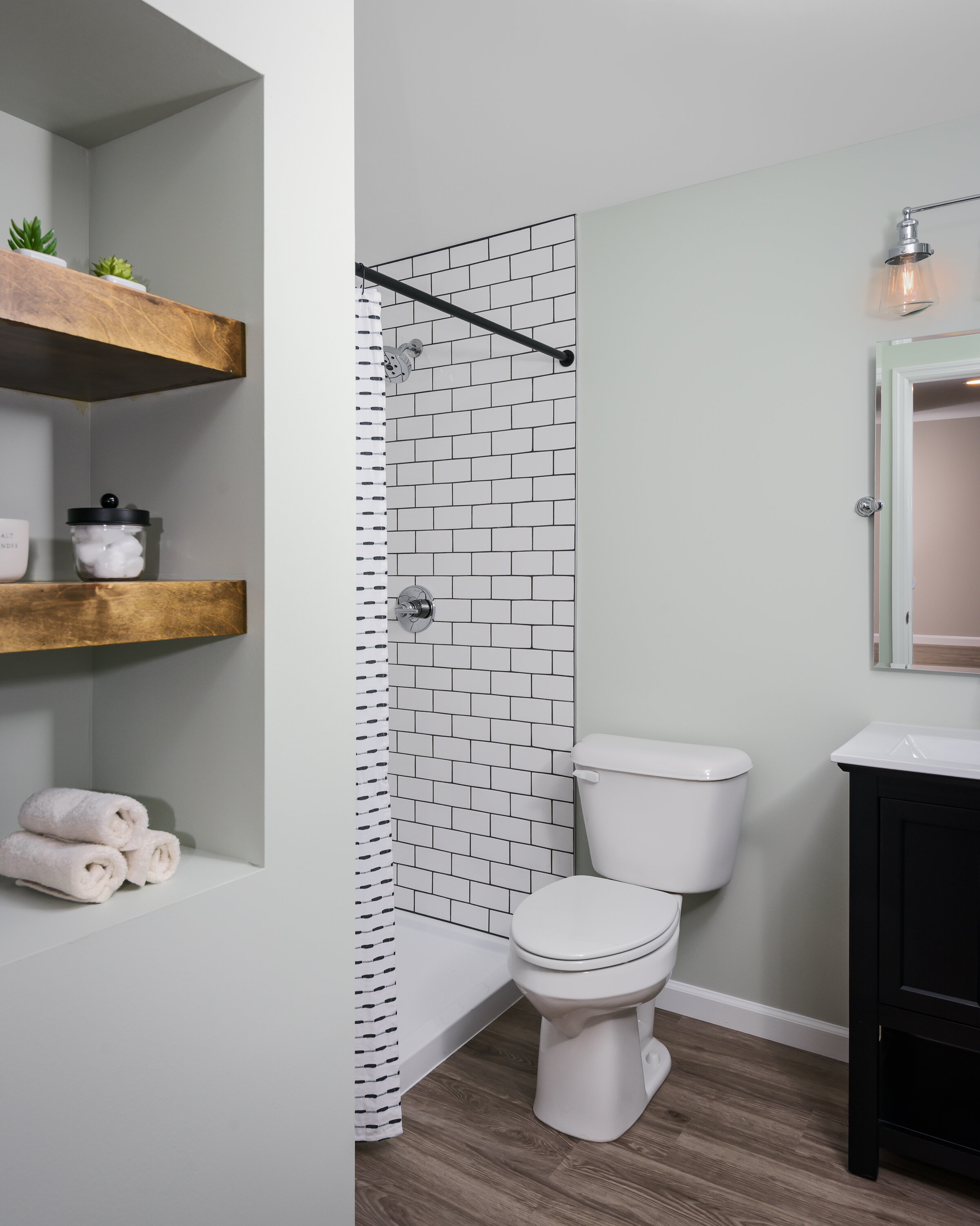
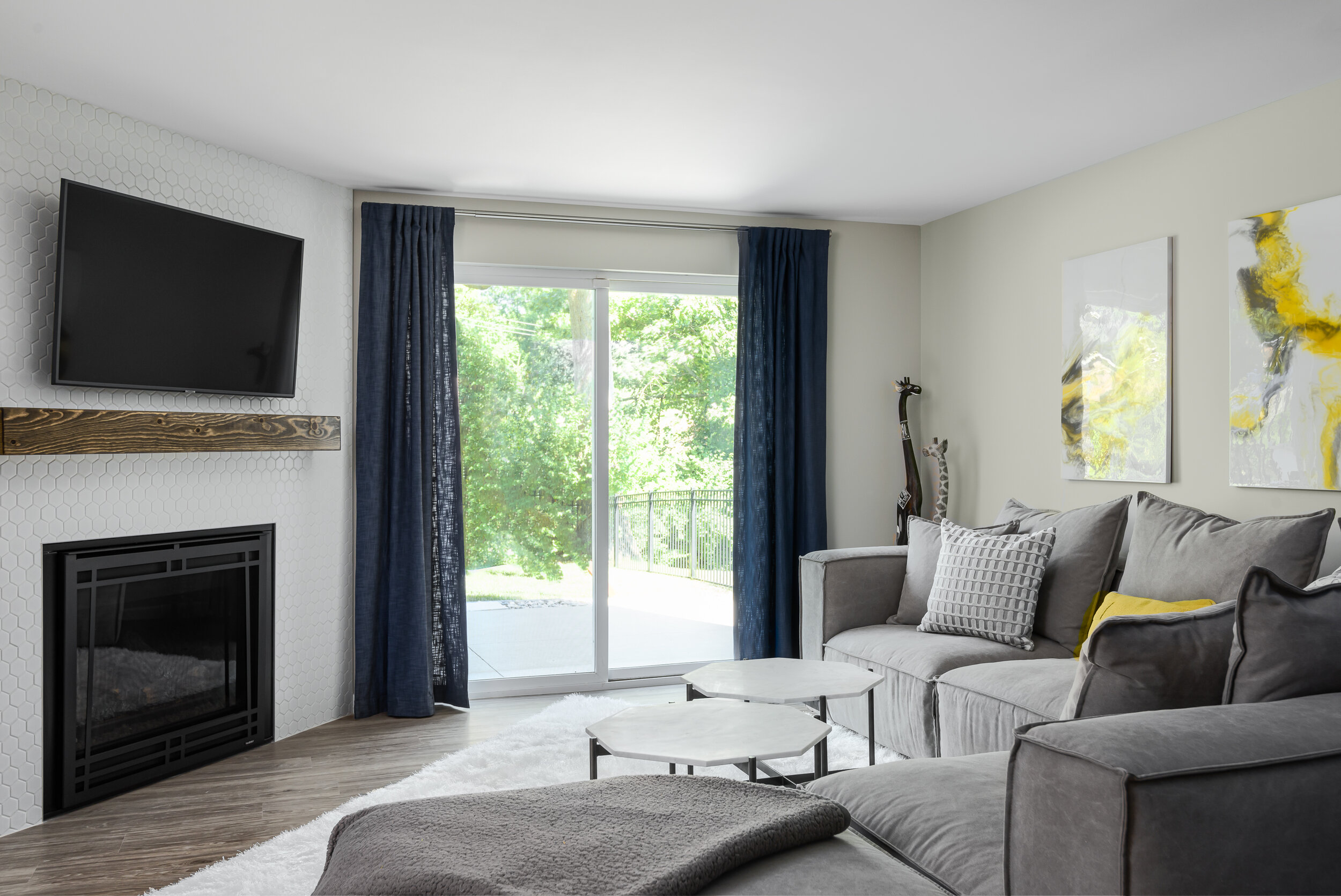
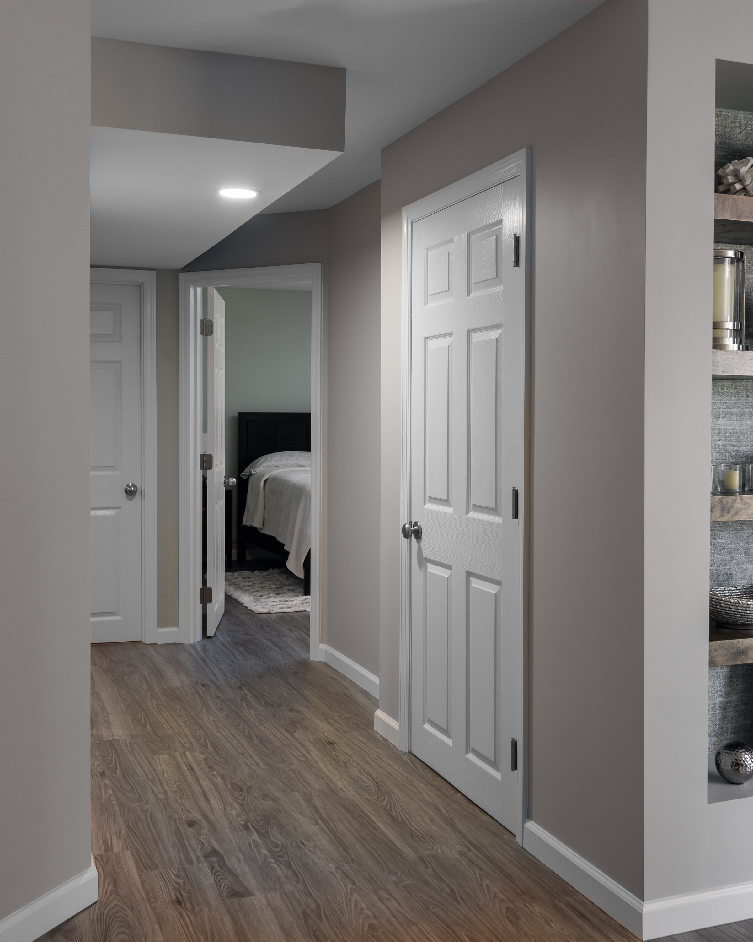
Our clients wanted to turn their completely unfinished basement into a family retreat and guest space. We really didn't want it to feel like a basement so we kept the luxury vinyl plank flooring and the wall color light and warm. We used a bright white hexagon tile for the gas fireplace surround and created a niche with floating wood shelves next to it. The textured wallpaper behind the shelving and at the bar provide a really nice design element in the space by creating depth and texture. In the bathroom, we played with contrast by using a white subway tile and charcoal grout. Overall, the space feels warm and inviting!
Chattanooga Basement
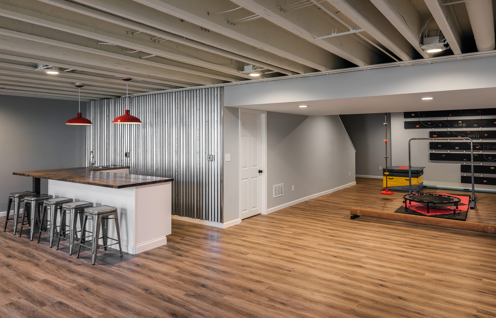
Our client's basement was ready to be finished. High ceilings and an expansive floor plan made it perfect for a fun entertaining space and built in gym for the kids.

Designers:
Rochelle McAvin
Photography:
Karen Palmer
Our client's basement was ready to be finished. High ceilings and an expansive floor plan made it perfect for a fun entertaining space and built in gym for the kids.
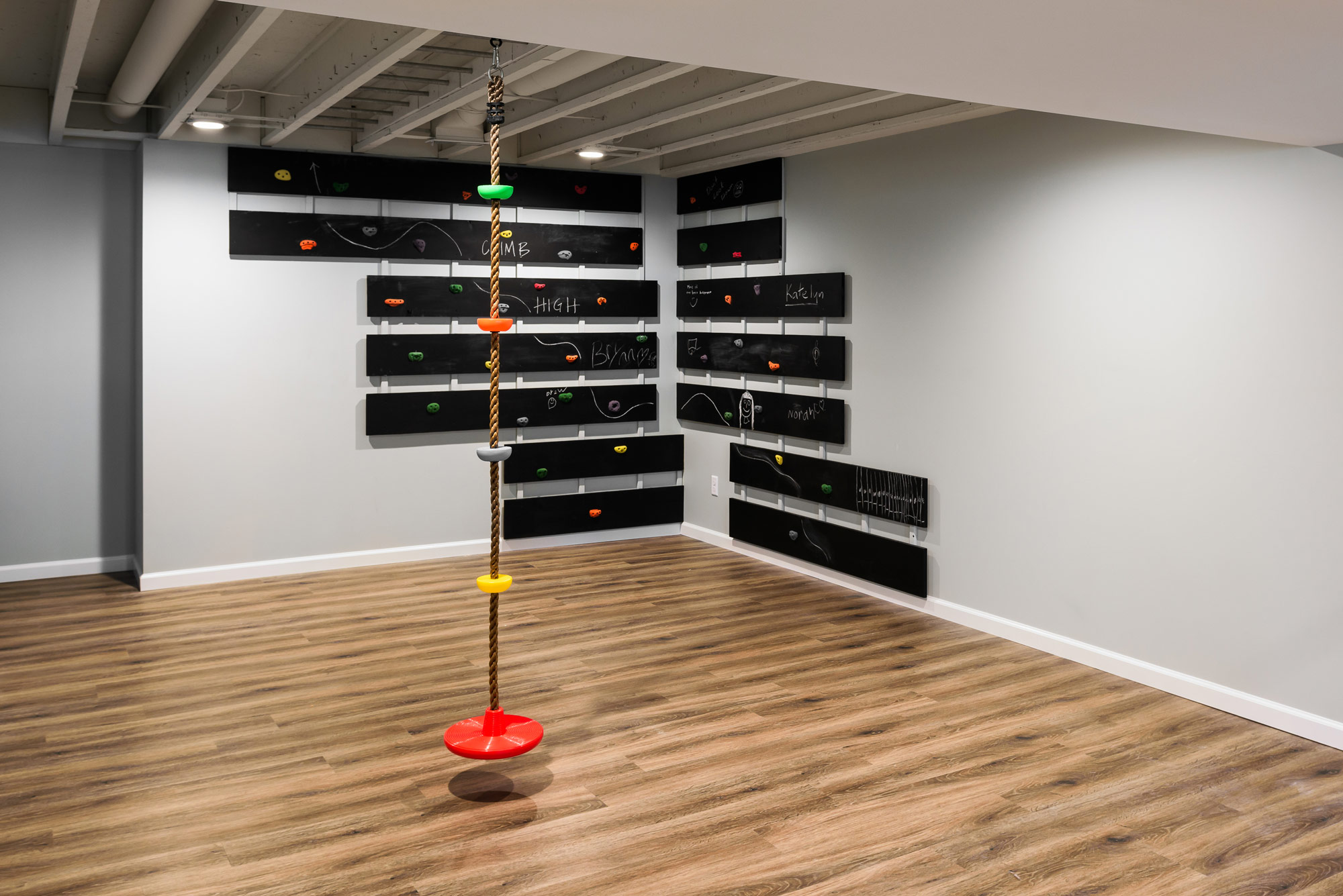
We started by making sure there was enough room for their daughter's gymnastics and a place to run! An open ceiling allowed us to integrate built in monkey bars for practice and a climbing wall completed the cool kids gym.
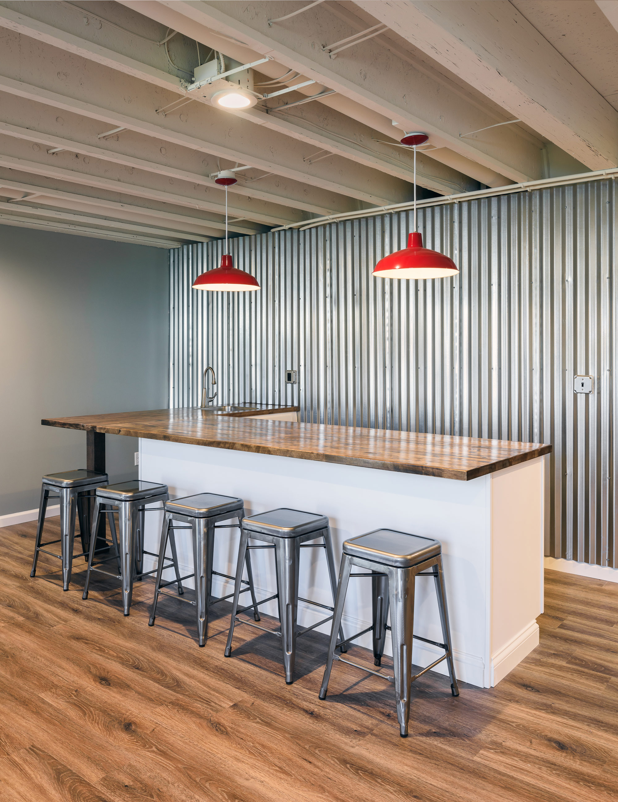
A galvanized metal wall highlights the wet bar, housing a convenient, built in undercounter beverage center, a microwave, and plenty of room for parties.
What you don't see is the is the client's concealed archery range - perfect for practicing when the kids aren't downstairs!
Family and friends can stay in the new guest suite- coupled with a cozy sectional for movie nights.
The result is a bright and welcoming basement - ready to entertain!
Log Cabin Ct. Basement
Our client wanted a modern, but cozy space for the family that includes two teenagers and their friends to hang out.
Designers:
Rochelle McAvin
Photography:
Karen Palmer
Our client wanted a modern, but cozy space for the family that includes two teenagers and their friends to hang out. The basement had been used as storage for over 30 years. Previous homeowners had tried to update the dark basement, but when we met with our client - they wanted a full overhaul of the space!
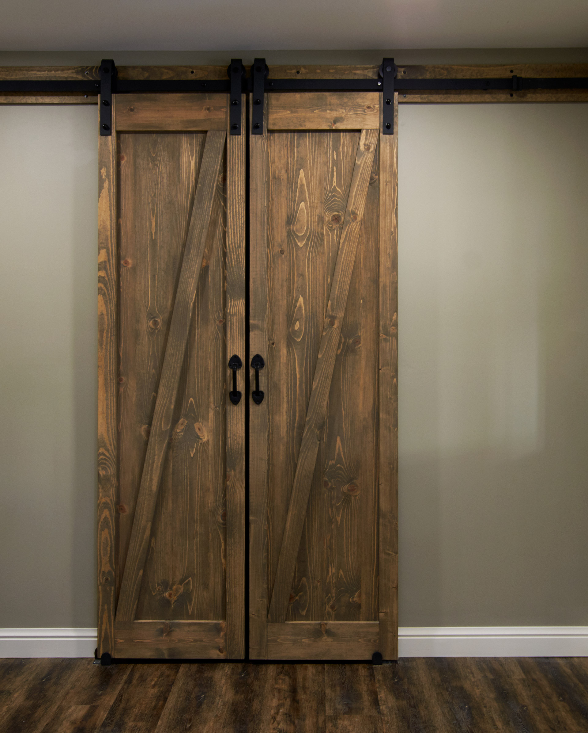
This party basement is equipped with 2 bars, a shuffleboard table, a ping pong table, integrated neon party ceiling lights, a "selfie swing", an adult beverage tasting room (complete with iron locking barn doors) and an 80" flat screen TV.
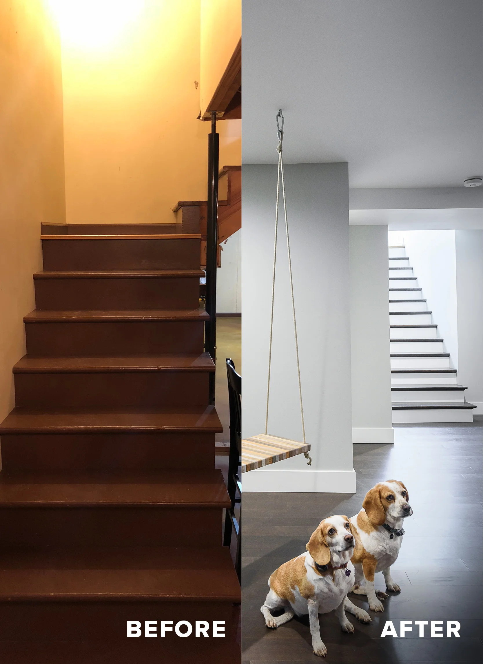
We started by relocating the stairs from the front of the house to the back, by the pool. Now, sunlight pours down the steps allowing natural light to flood the rooms and a convenient pool bathroom is right around the corner with storage for pool towels and wet suits.
Repeating wood by using it on the walls, ceilings, countertops, and posts keep the monochromatic basement warm and serene. Rich hardwood floors (yes, they can be installed in a basement!) run through out making it feel expansive and inviting for friends.
Senate Street Basement
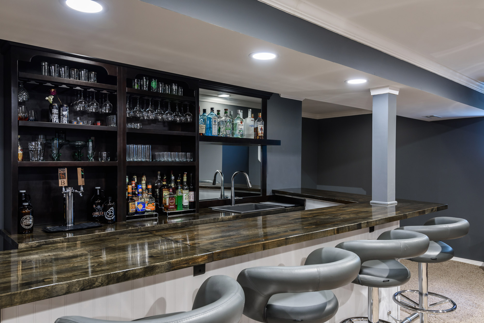
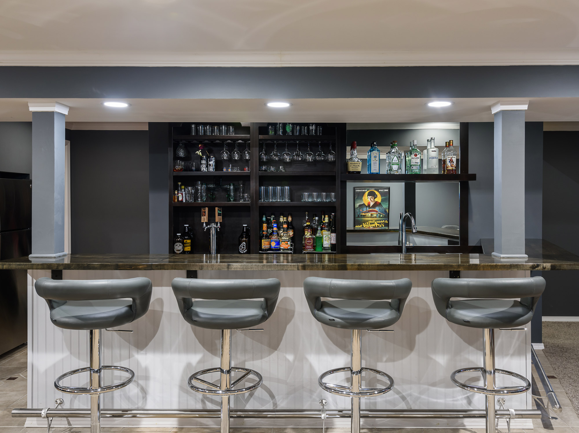
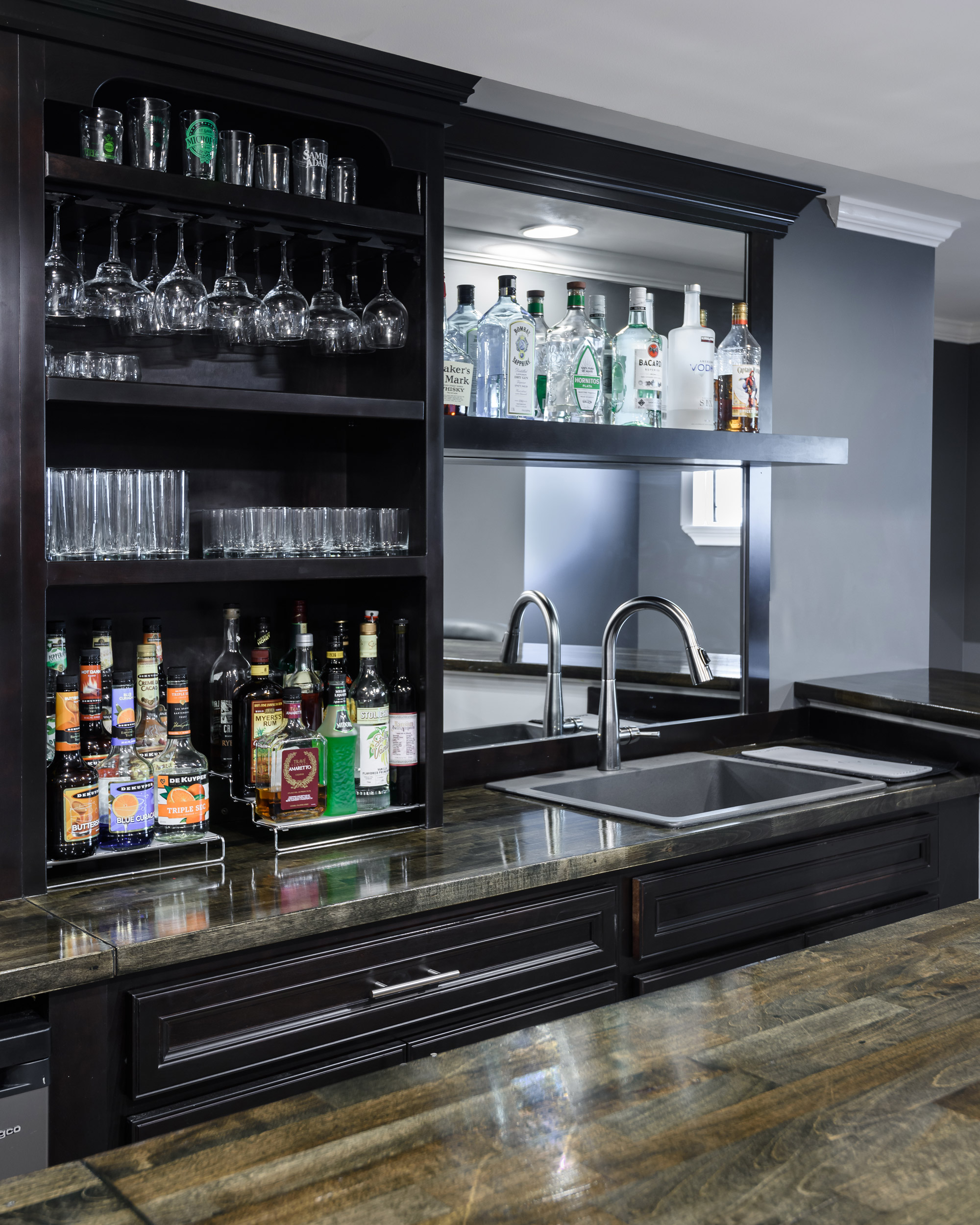
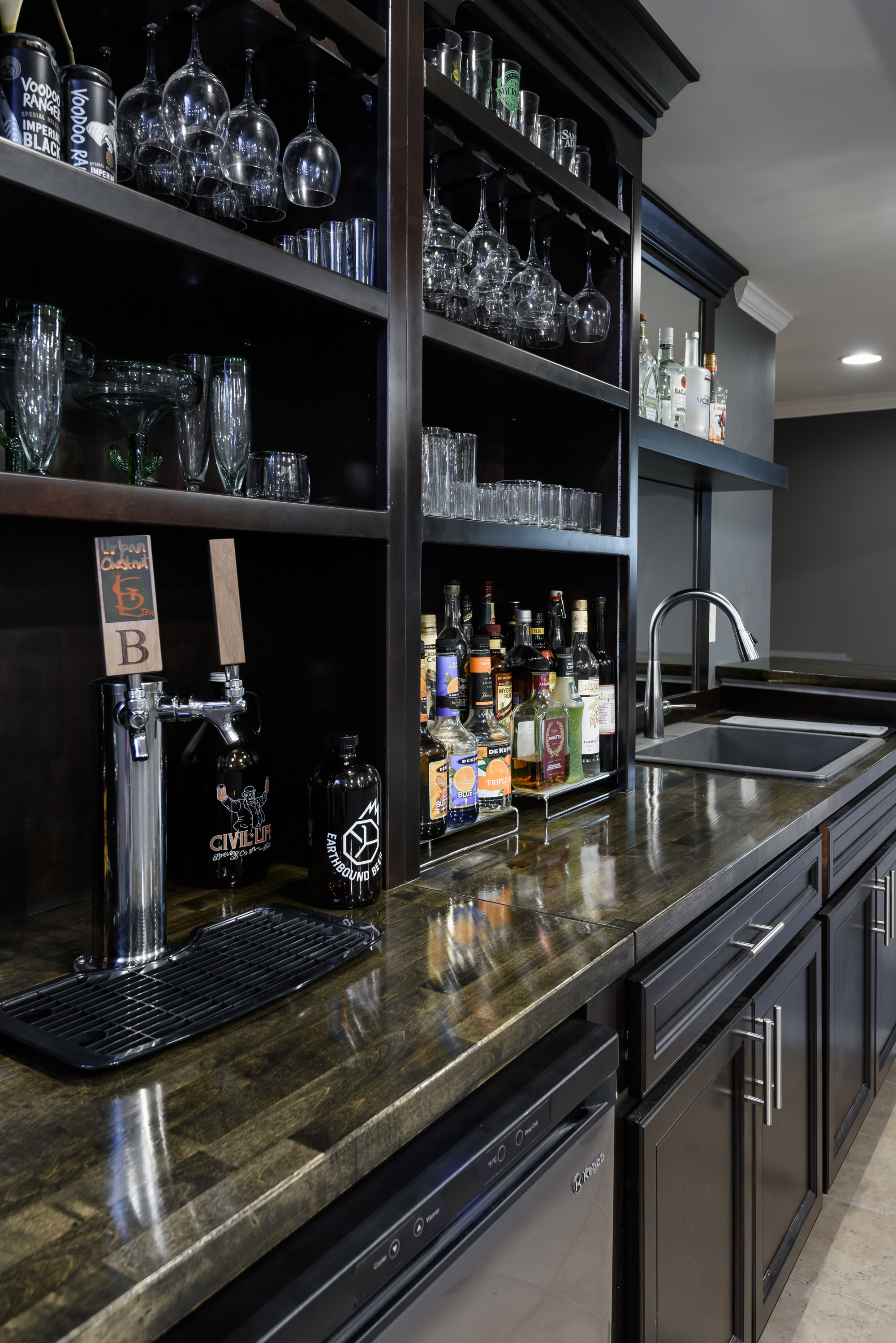
They loved the look of old English pubs, but also wanted more modernize that style a bit. We chose a dark warm gray stained cabinet and paired it with a coordinating stained butcher block top.
St. Louis, MO
2019
DESIGNER:
Jennifer Chapman
PHOTOGRAPHER:
Karen Palmer Photography
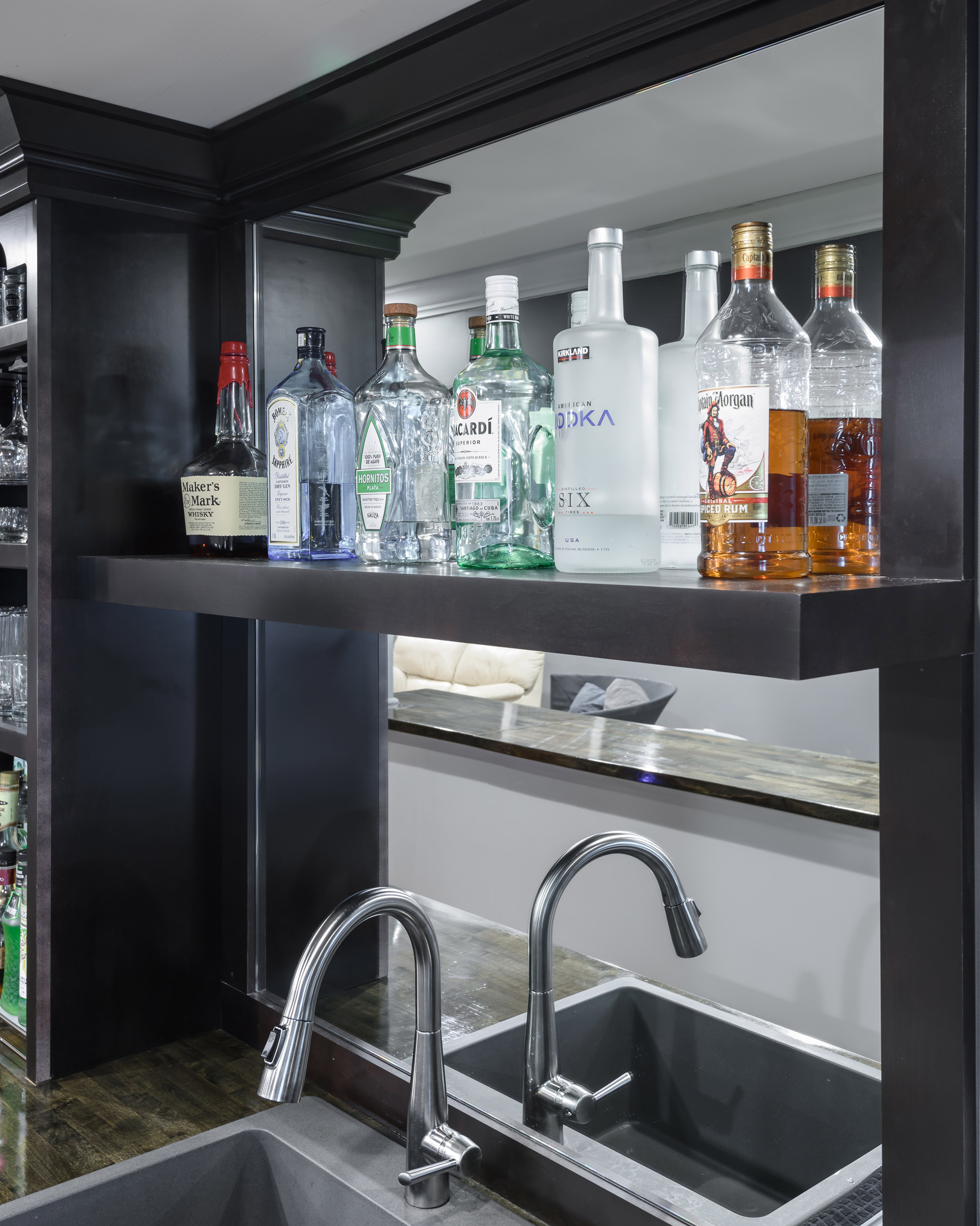
Our clients wanted to add a bar to their existing finished space where they could entertain friends and family or spend a quiet evening in. They loved the look of old English pubs, but also wanted more modernize that style a bit. We chose a dark warm gray stained cabinet and paired it with a coordinating stained butcher block top. The combination of the dark wood, open shelving, and mirrored backsplash help to create that pub feel we were going for. By chosing a stained wood without exposed grain and using a more modern cabinet hardware, we were able to give it a more updated feel as well. What a great place to have a big party, a small gathering, or a date night at home!
Arsenal Basement
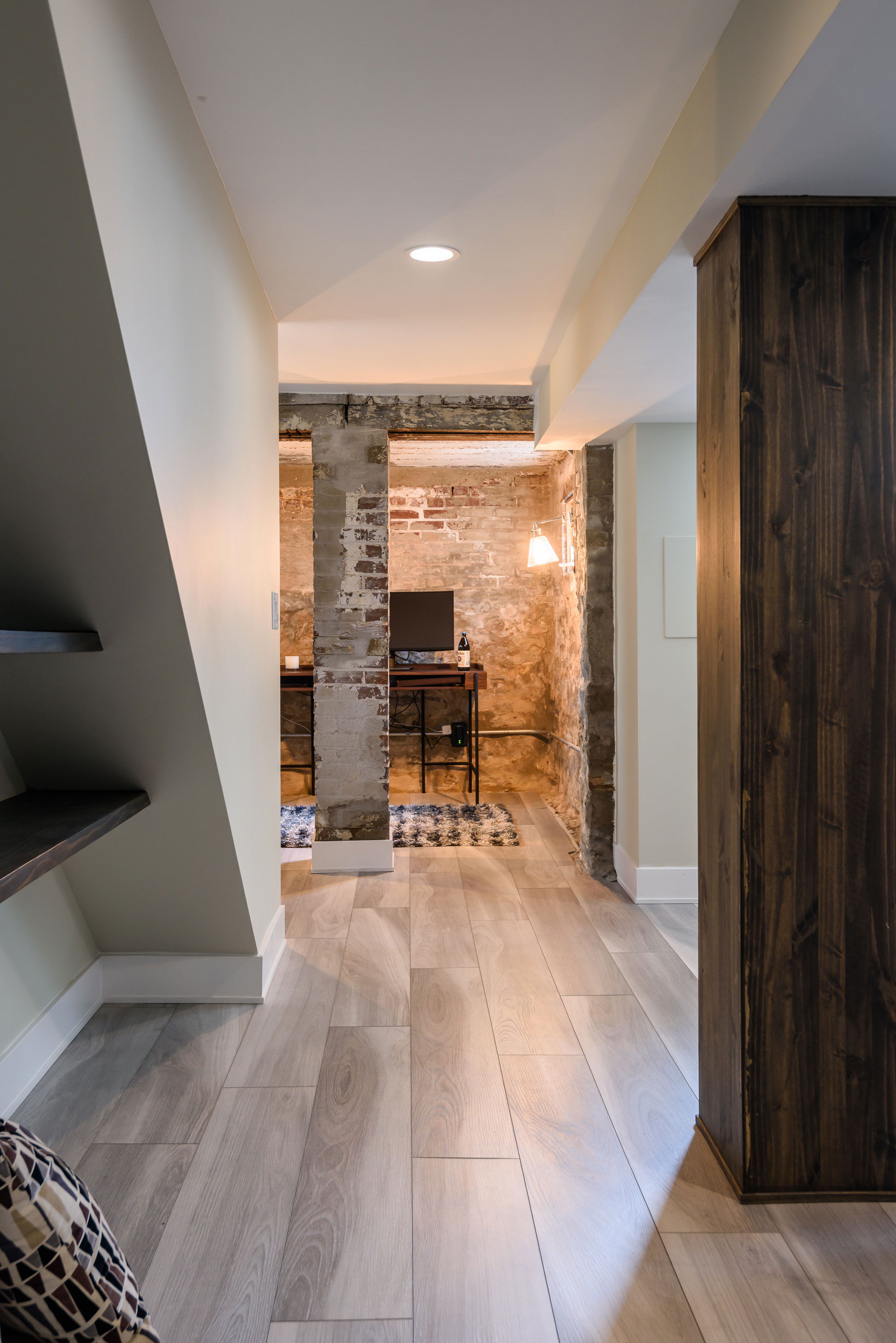
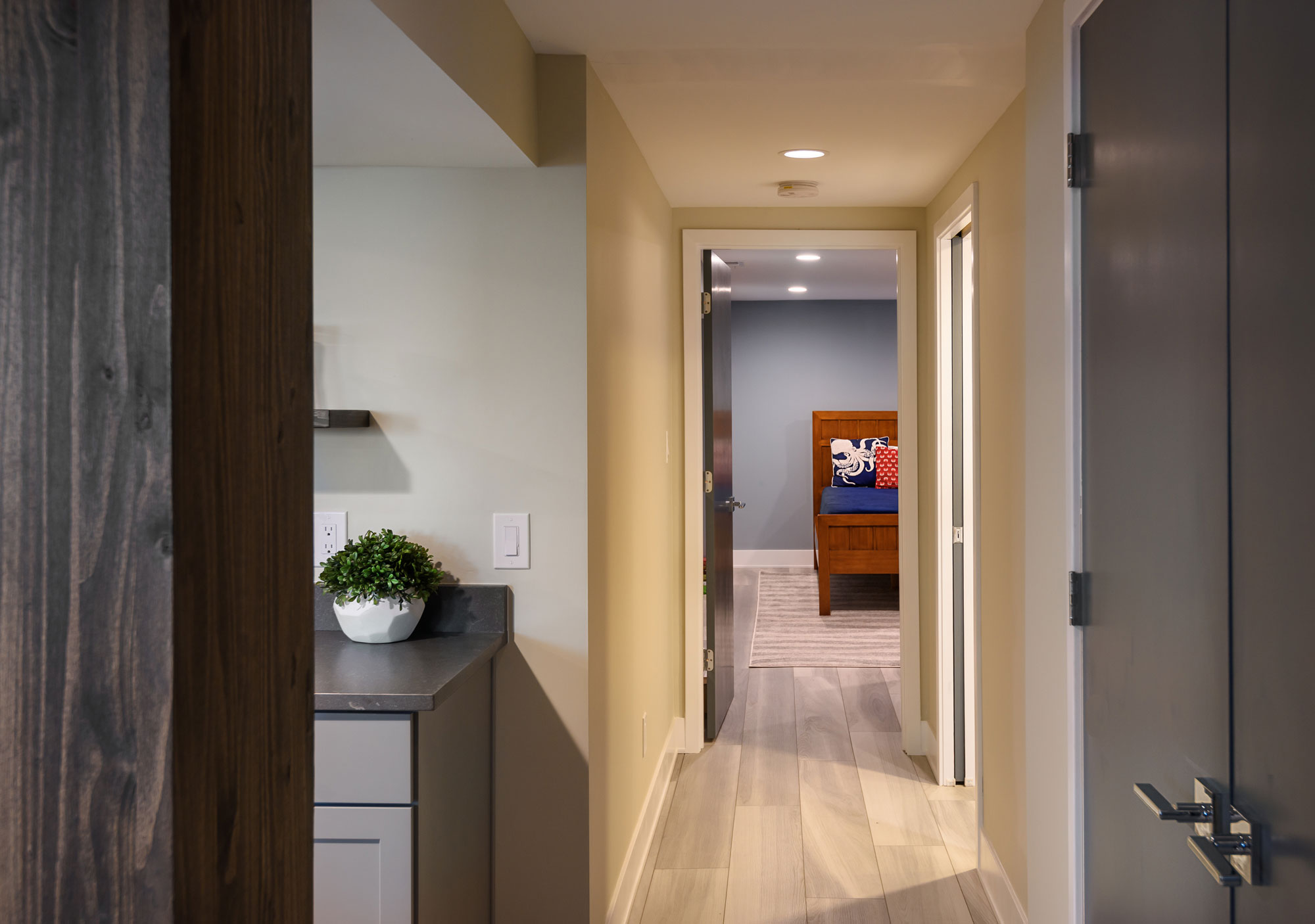
Our clients wanted to turn their century old, unfinished basement into a living space the whole family could enjoy. There is a little room under the porch that had exposed, original masonry. We wanted to leave the masonry exposed so we cleaned it up a bit — it is a cozy space for an office and it is a reminder of the home's 100 year history.

Arsenal St., MO
April, 2019
DESIGNER:
Jennifer Chapman & Rochelle McAvin
PHOTOGRAPHER:
Karen Palmer Photography
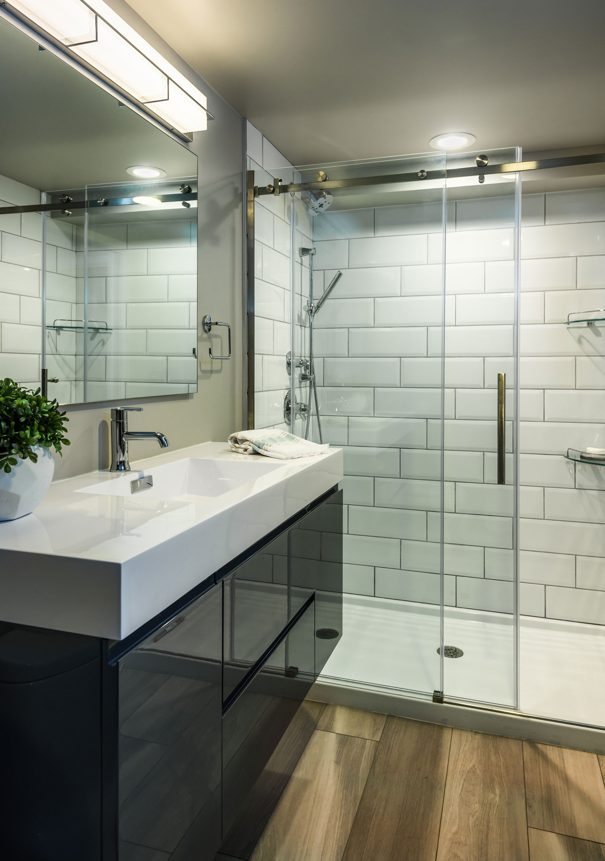
Our clients wanted to turn their century old, unfinished basement into a living space the whole family could enjoy. We set out to create a family area where they could play games, watch tv, and hang out with family and friends as well as a separate bedroom and bathroom. They love clean, modern lines and cool, serene colors.We started by selecting a luxury vinyl tile that had a very linear pattern with cool gray tones. This helped to keep the basement feel light and bright and the LVT is a durable material for an old leaky basement. We wanted to take advantage of some of the architectural elements in the space. There is a little room under the porch that had exposed, original masonry. We wanted to leave the masonry exposed so we cleaned it up a bit- it is a cozy space for an office and it is a reminder of the home's 100 year history. We didn't want to lose the space under the stairs to dark, never used storage so we created a niche with open reclaimed wood shelving. We wrapped the posts with matching wood to add warmth and character to the space. We used the same wood for the floating shelf at the bar area, as well. In the bathroom we used a sleek gray, high gloss floating vanity & oversized white subway tile. It feels fresh and bright and keeps with the clean and modern aesthetic we set out to create.
Kehrswood Basement
Our clients' finished basement needed to be brought to life! A bar made out of glass block, lack of overhead lighting, dark finishes and an old drop ceiling made for a really uninviting space. Our clients now use this space all of the time and love having friends and family over to enjoy it with them!
Chesterfield, MO
August, 2018
DESIGNER:
Jennifer Chapman
PHOTOGRAPHER:
Karen Palmer Photography
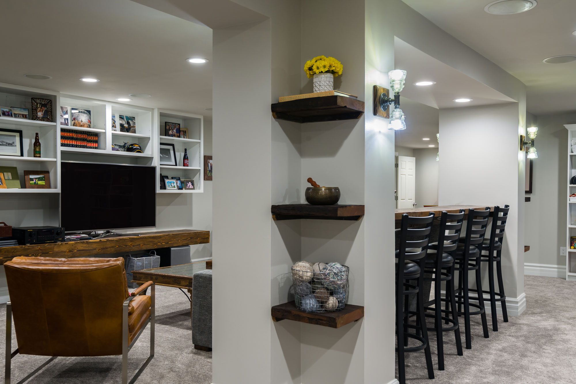
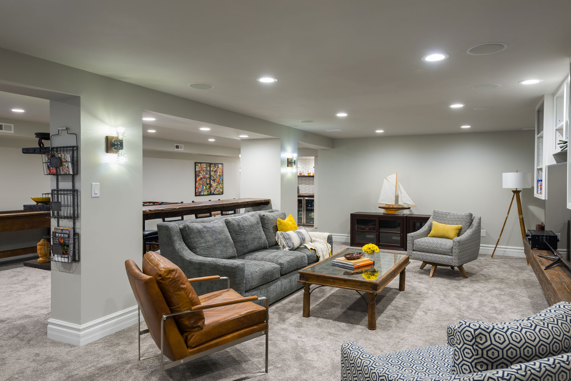
Our clients' finished basement needed to be brought to life! A bar made out of glass block, lack of overhead lighting, dark finishes and an old drop ceiling made for a really uninviting space. Not only did the basement need to be updated, but they really wanted to make it a family entertaining space — somewhere they could hang out with the kids everyday and also somewhere they could easily entertain friends and family. This family is well-traveled and has collected many items from all over the world. They wanted to incorporate that global vibe and marry it with a nautical theme to remind them of their lakehouse in Michigan.
We started by drywalling the ceiling and adding a lot more light! We increased the number of recessed can ceiling lights and added vintage looking handmade sconces at the posts. We painted the walls and ceilings all of the same light gray color to make the ceilings seem taller and the room lighter. We removed the dark, outdated carpeting and replaced it with a neutral colored carpeting with a modern texture.
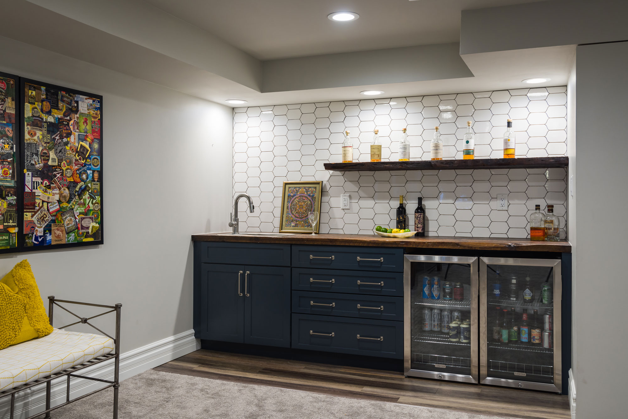
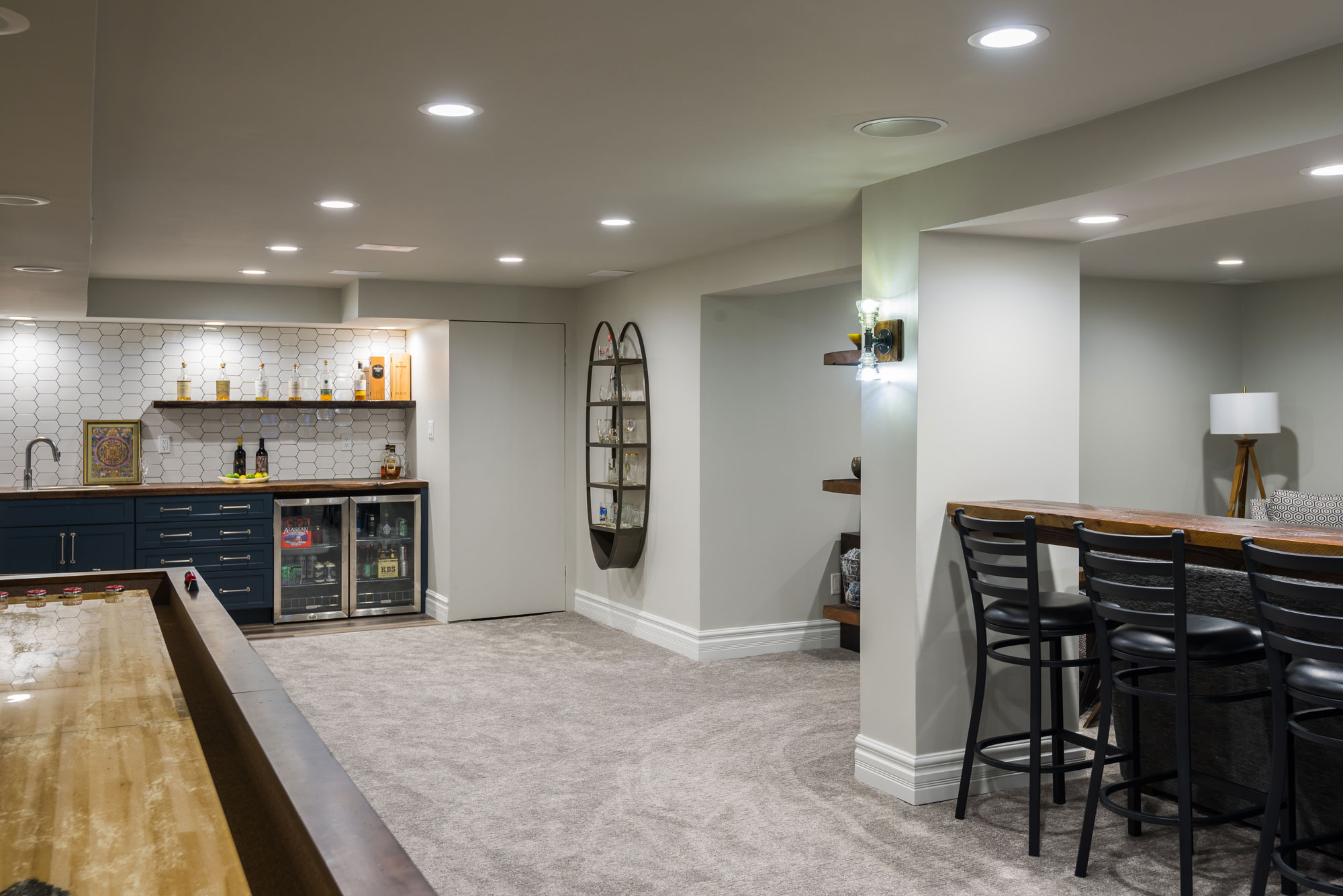
This basement has a soffit and post structure running down the center of the living space. It is a natural divider, but the space was not being utilized to its full potential. We added a bar height reclaimed wood countertop in between the large posts to create more seating for entertaining. The posts at each end created an "L" shape that did not seem to have any purpose. We added floating reclaimed shelves in this space to make it look purposeful and add an opportunity to display the items they have collected in their travels. The entertainment unit was all black and it made the space seem smaller and darker.
We painted the upper cabinets white and wrapped the TV shelf in wood to match the reclaimed wood at the bar seating and the wet bar. We reduced the footprint of the wet bar to add more space for kids to play and make the room feel bigger.
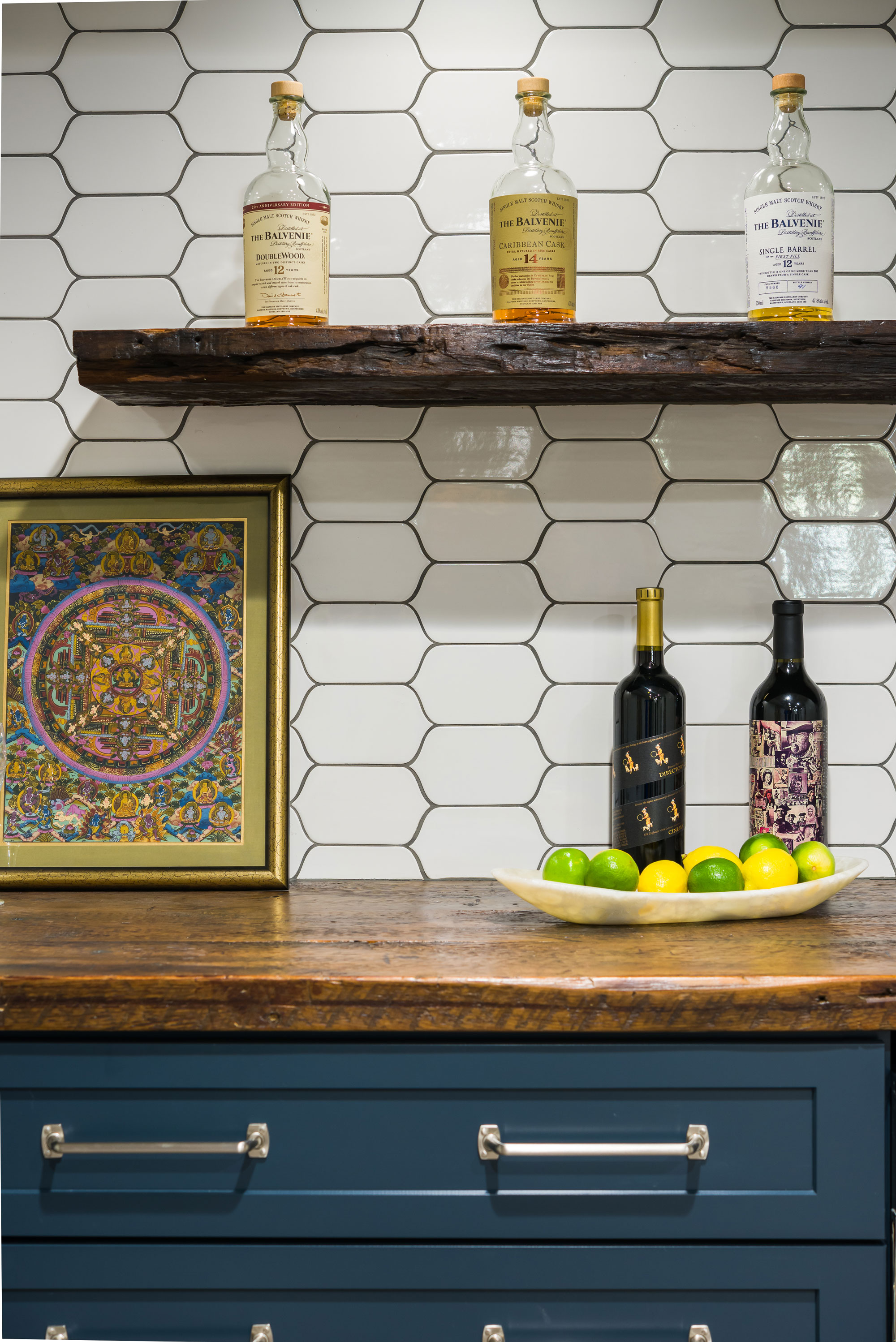
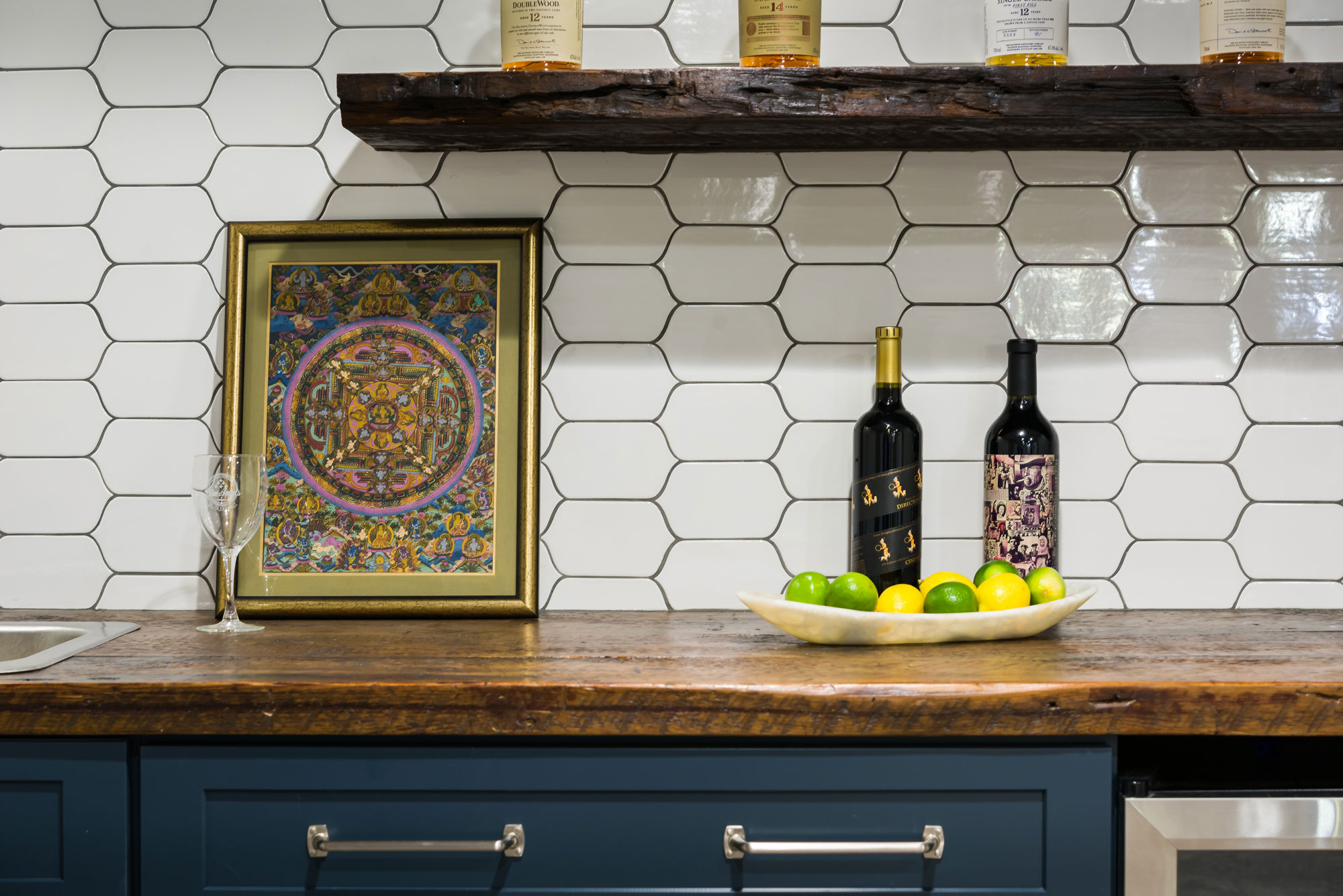
The clients really loved the idea of doing navy blue cabinets at the wet bar, which tied into the nautical theme of the space. We fell in love with the uniquely shaped white tile and used a medium gray grout to make the shape stand out even more. We used reclaimed wood countertops and a floating shelf above to display bottles or glassware. The brushed nickel pulls with exposed screws look like jewelry against the pretty navy cabinets! Our clients now use this space all of the time and love having friends and family over to enjoy it with them!
Before and After
Cedar Springs
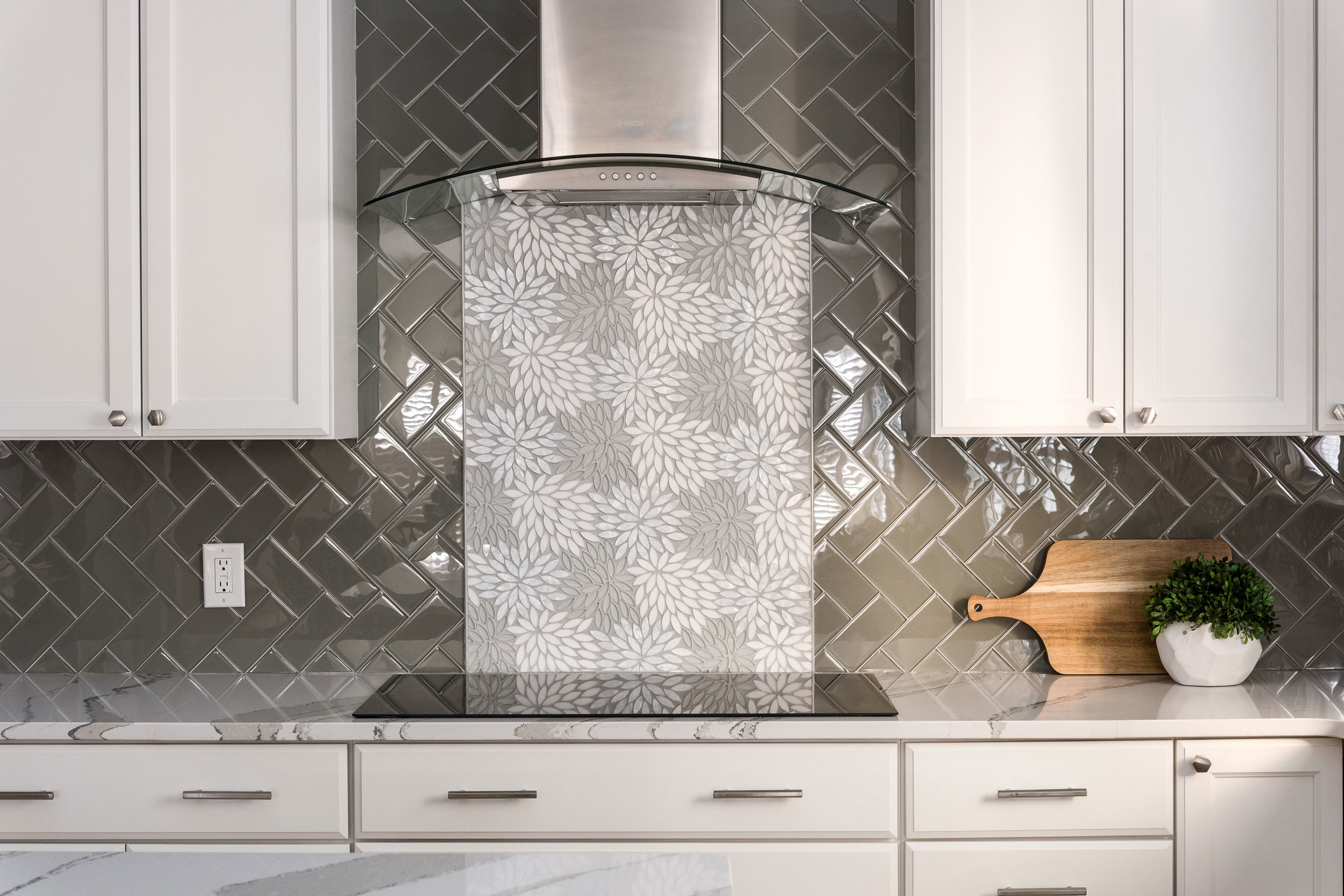
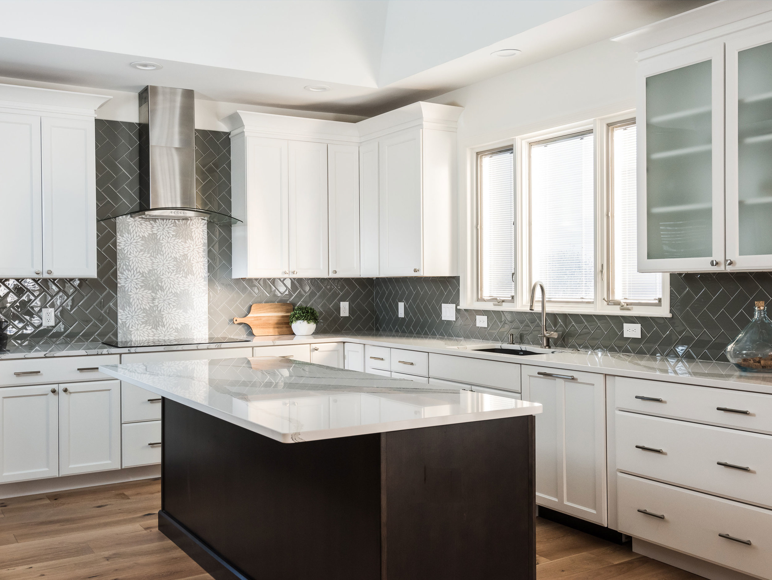
The client wanted a bright and clean but welcoming look for her kitchen. We started with a dark island that grounds the space and kept everything bright and focused on the floral back splash tile that my client fell in love with from the start.
Missouri, 2019
DESIGNER:
Rochelle McAvin
PHOTOGRAPHER:
Karen Palmer Photography
The client wanted a bright and clean but welcoming look for her kitchen. We started with a dark island that grounds the space and kept everything bright and focused on the floral back splash tile that my client fell in love with from the start.
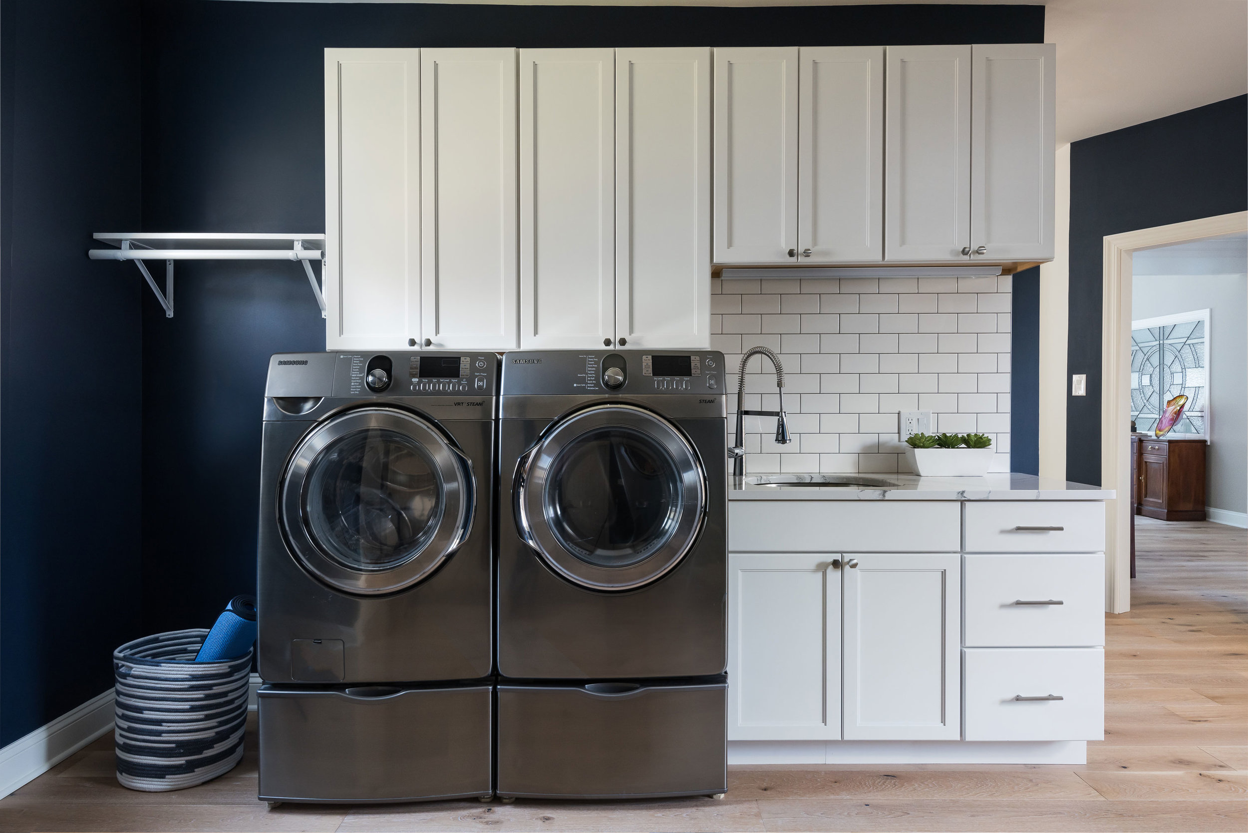
The laundry room is Sherwin Williams Naval and the white cabinets and subway tile keep the look clean and fresh!
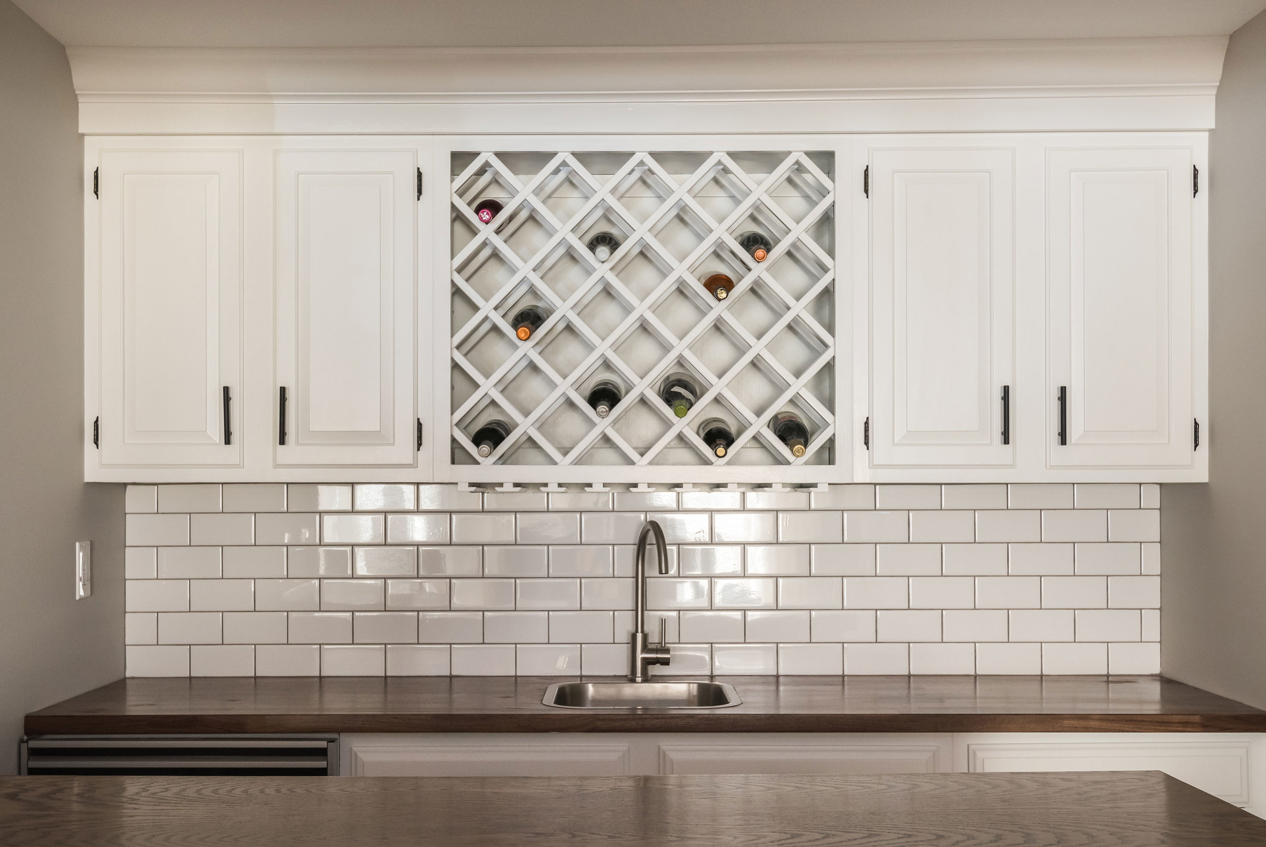
Downstairs in the bar, we freshened up the cabinetry and added a butcher block counter top to cozy up the relaxed space.
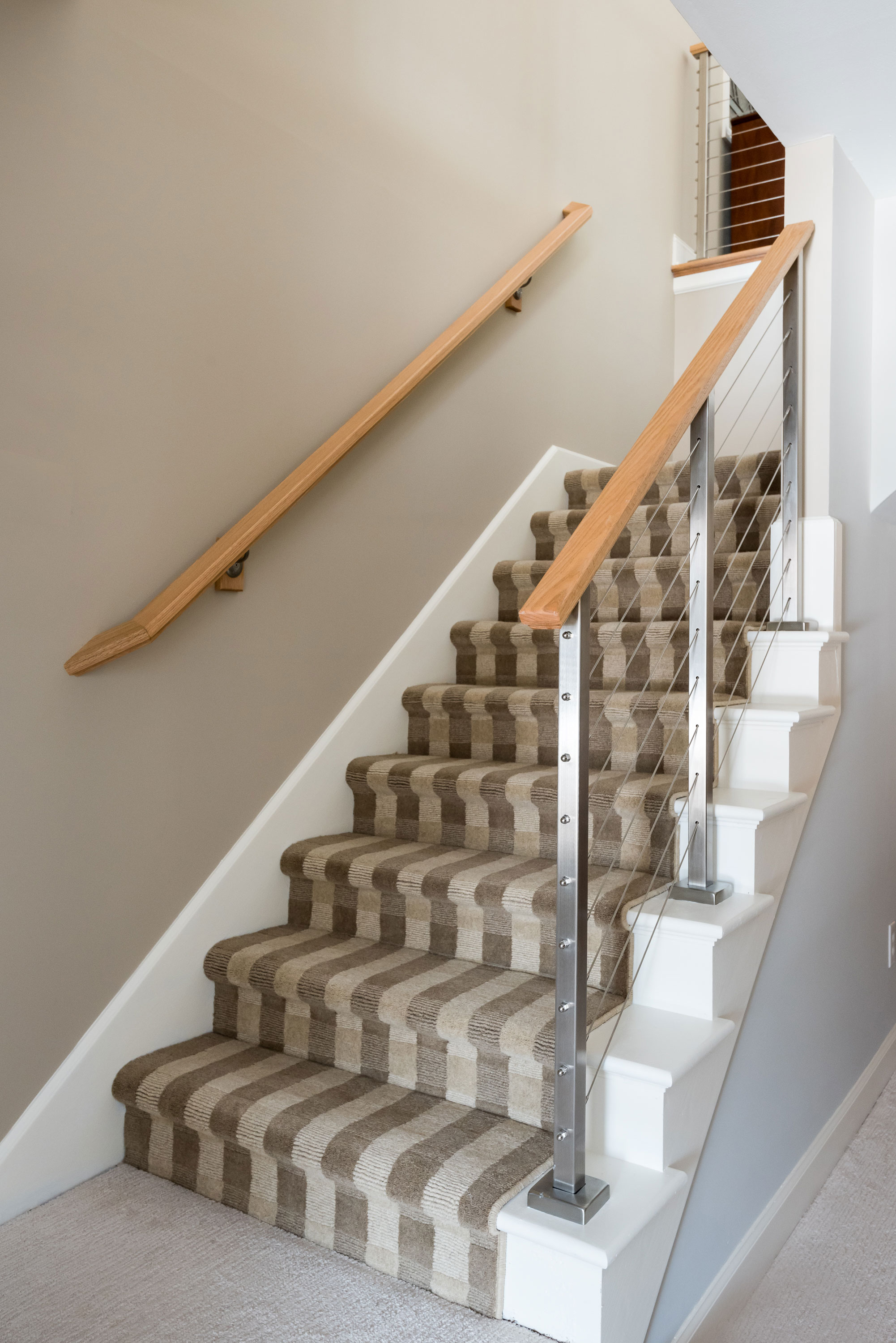
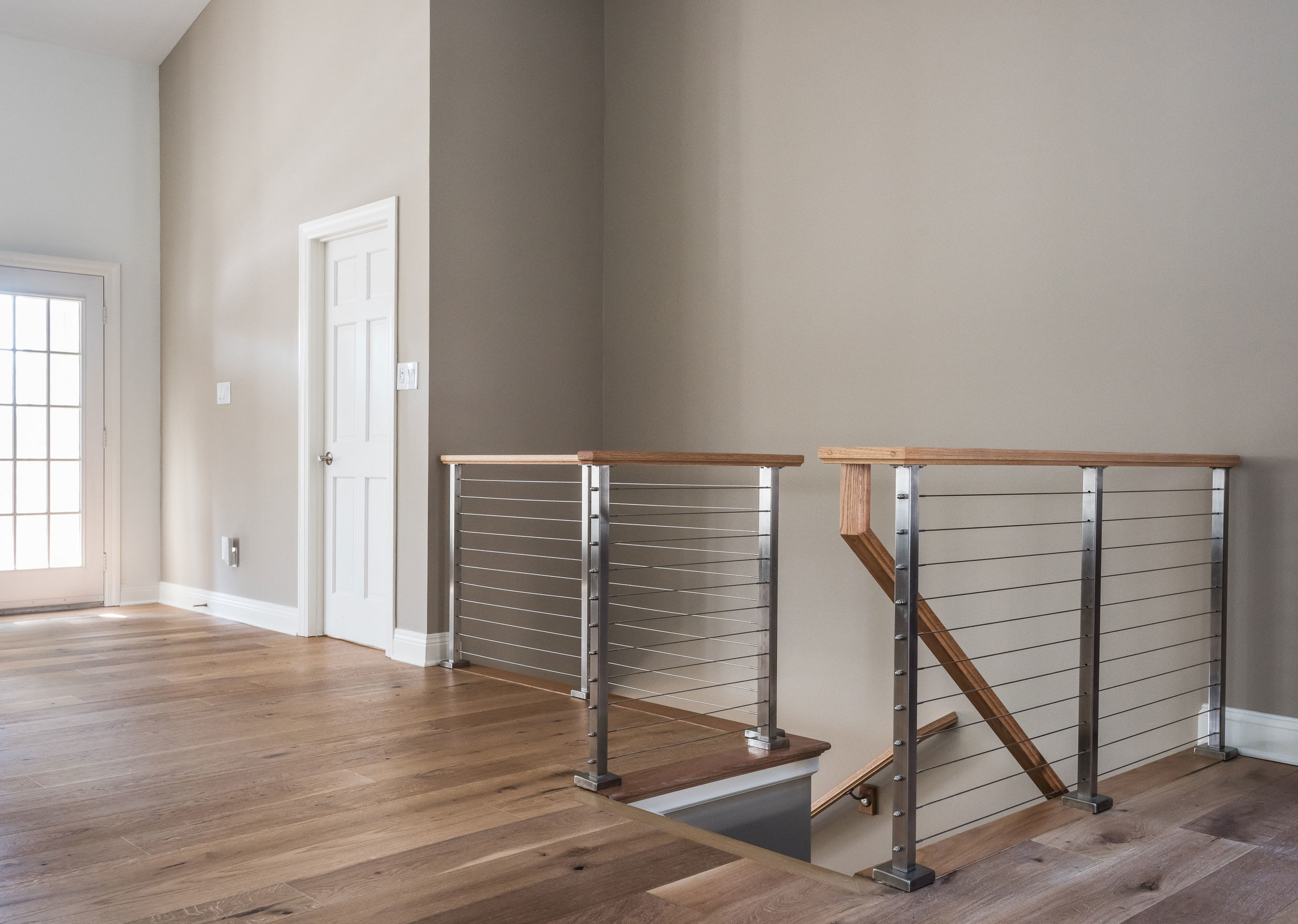
The handrail to the basement originally was a dark and dated wood. We replaced it with a cable rail system that lets the light filter down the steps onto the new textured carpeting. The light, bright space is welcoming and open!
Before and After
Rustic Entertaining Space
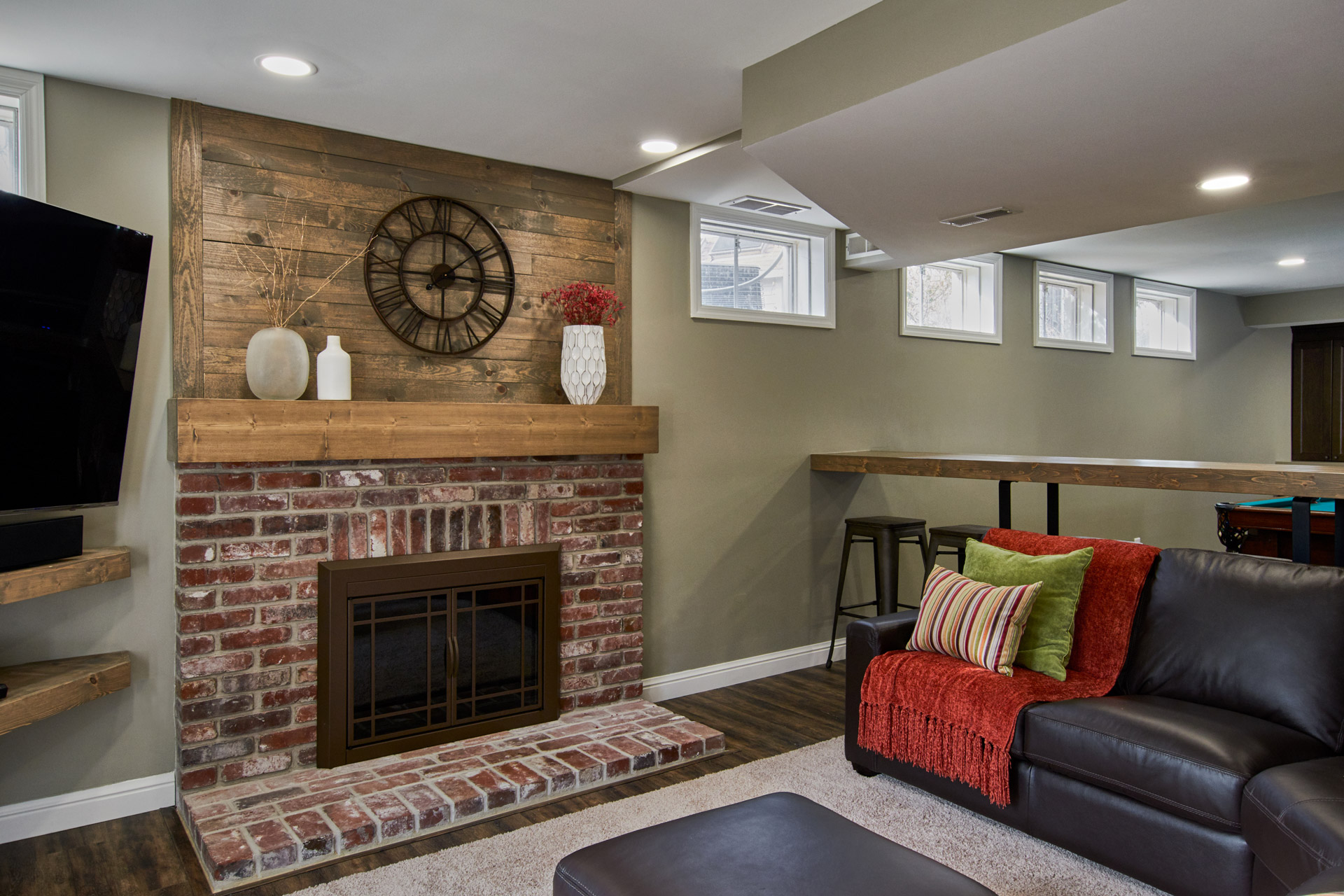
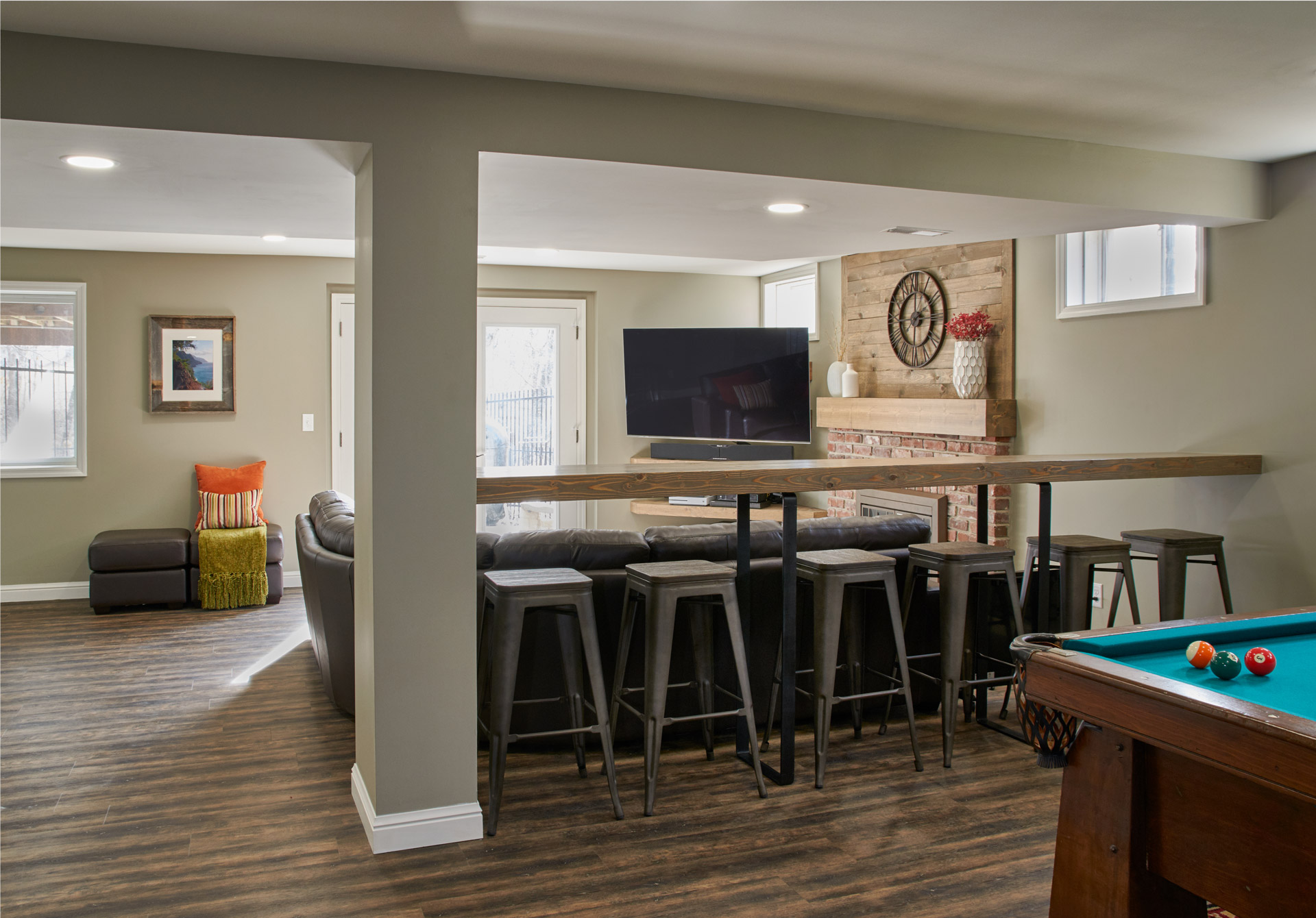
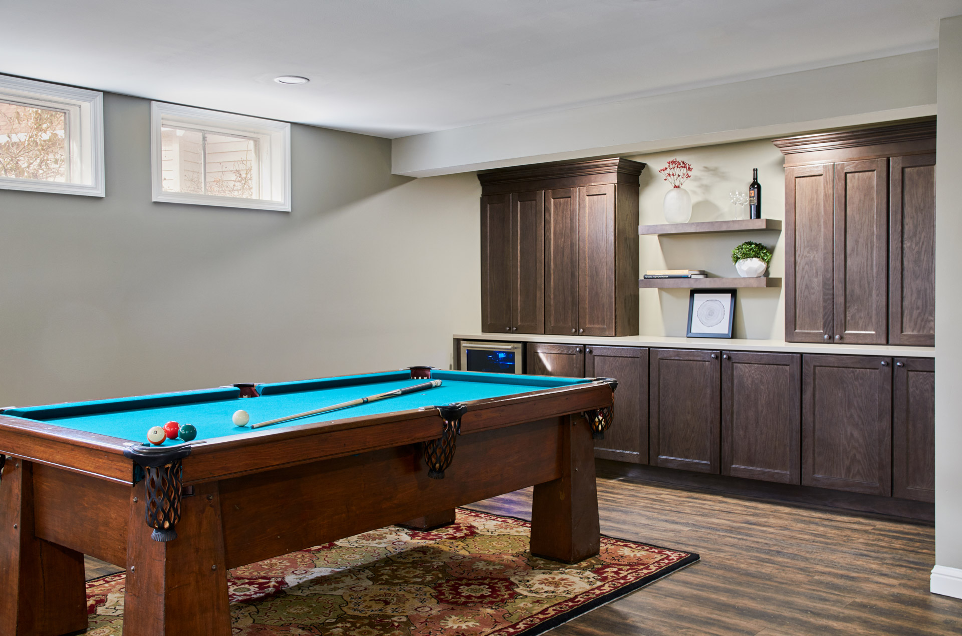
We added more storage by adding two new closets, one of which we closed off with a set of custom wood barn doors. The white built-in cabinetry was replaced with dark wood cabinets , floating shelves, and a quartz top. We added a beverage cooler beneath the countertops - ideal for entertaining! The homeowners can now enjoy the space as a family or when spending time with friends!
Rustic Entertaining Space
Missouri, 2018
DESIGNER:
Jennifer Chapman
PHOTOGRAPHER:
Karen Palmer Photography
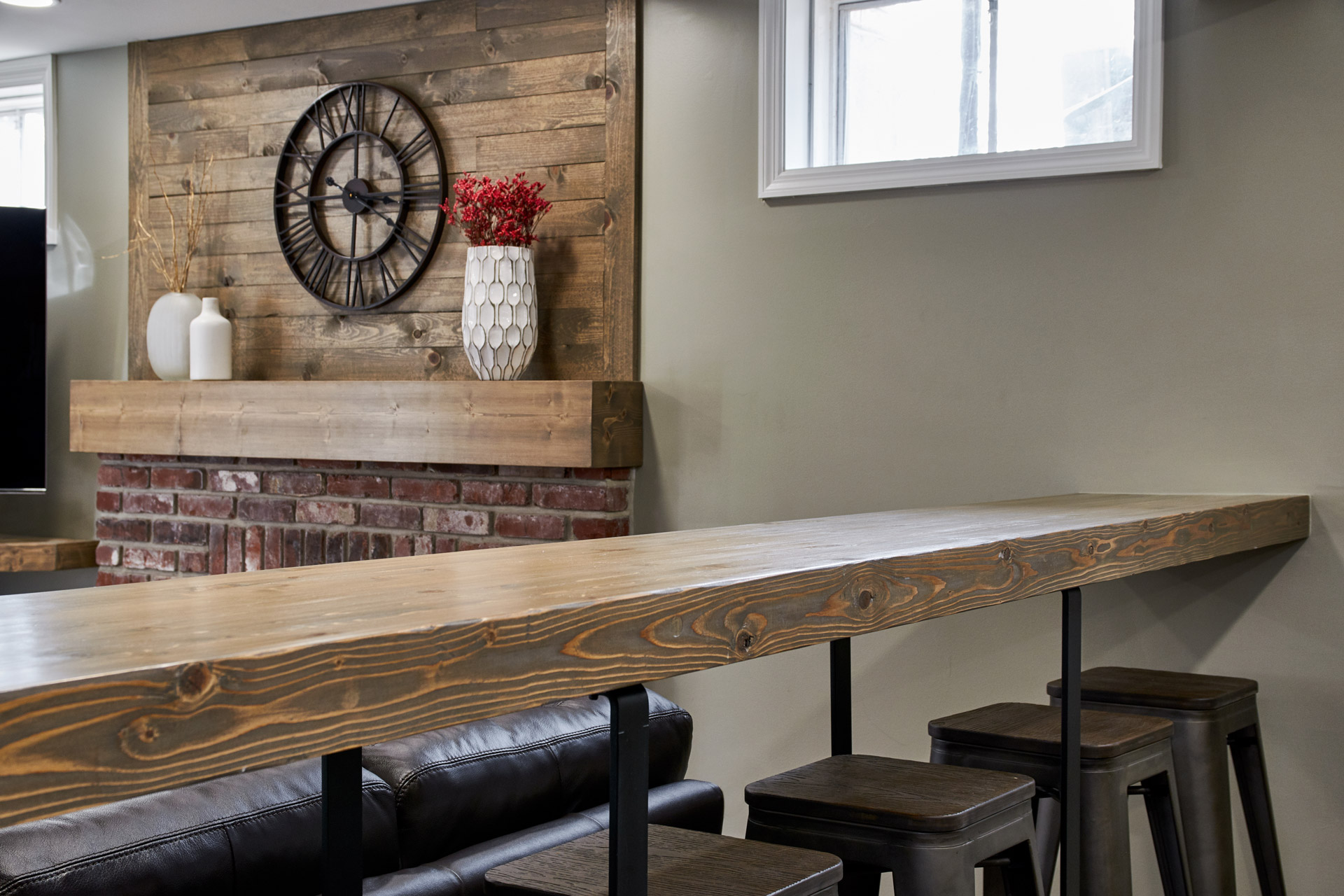
Our clients were ready for a complete transformation of their 1980's basement. Not only were they ready for an updated look to match the rest of their home, but also a change in the way the space functioned. It was time to get rid of kids' toys and make way for a more inviting space to entertain friends and family of all ages. We replaced the existing dated berber carpet with a beautiful, rustic wood-look Luxury Vinyl Tile. One of our carpenters fabricated all of the custom wood pieces in the space, including a long bar top for people to perch, set a drink and either watch tv or enjoy a game of pool. We gave the fireplace a facelift by changing out the shiny brass fireplace doors with a modern rustic set of doors in oil rubbed bronze. We replaced the traditional, white mantel with a wood beam and added rustic wood wall cladding above as a design feature. We added more storage by adding two new closets, one of which we closed off with a set of custom wood barn doors. The white built-in cabinetry was replaced with dark wood cabinets, floating shelves, and a quartz top. We added a beverage cooler beneath the countertops - ideal for entertaining! The homeowners can now enjoy the space as a family or when spending time with friends!


