Springbrook Kitchen
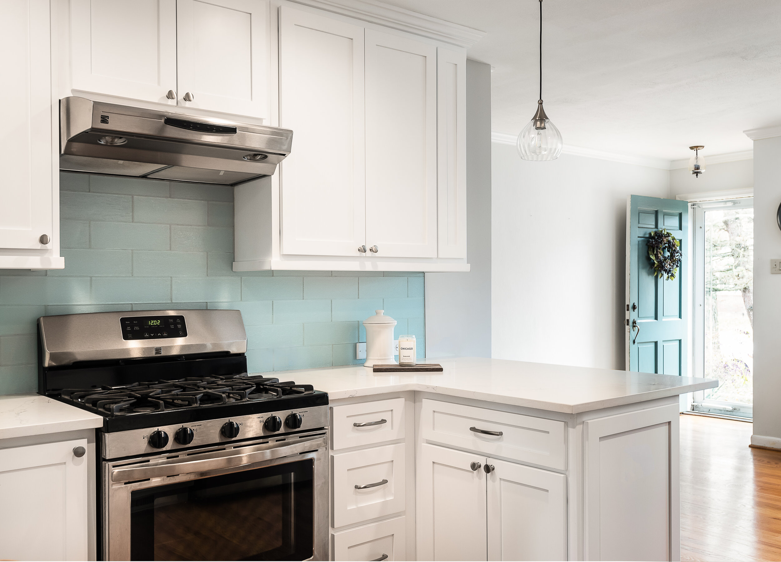
We demolished a part of the wall and created an open kitchen with an inviting and colorful seating peninsula
Webster Groves, MO
Designer
Rochelle McAvin
Photographer
Karen Palmer Photography
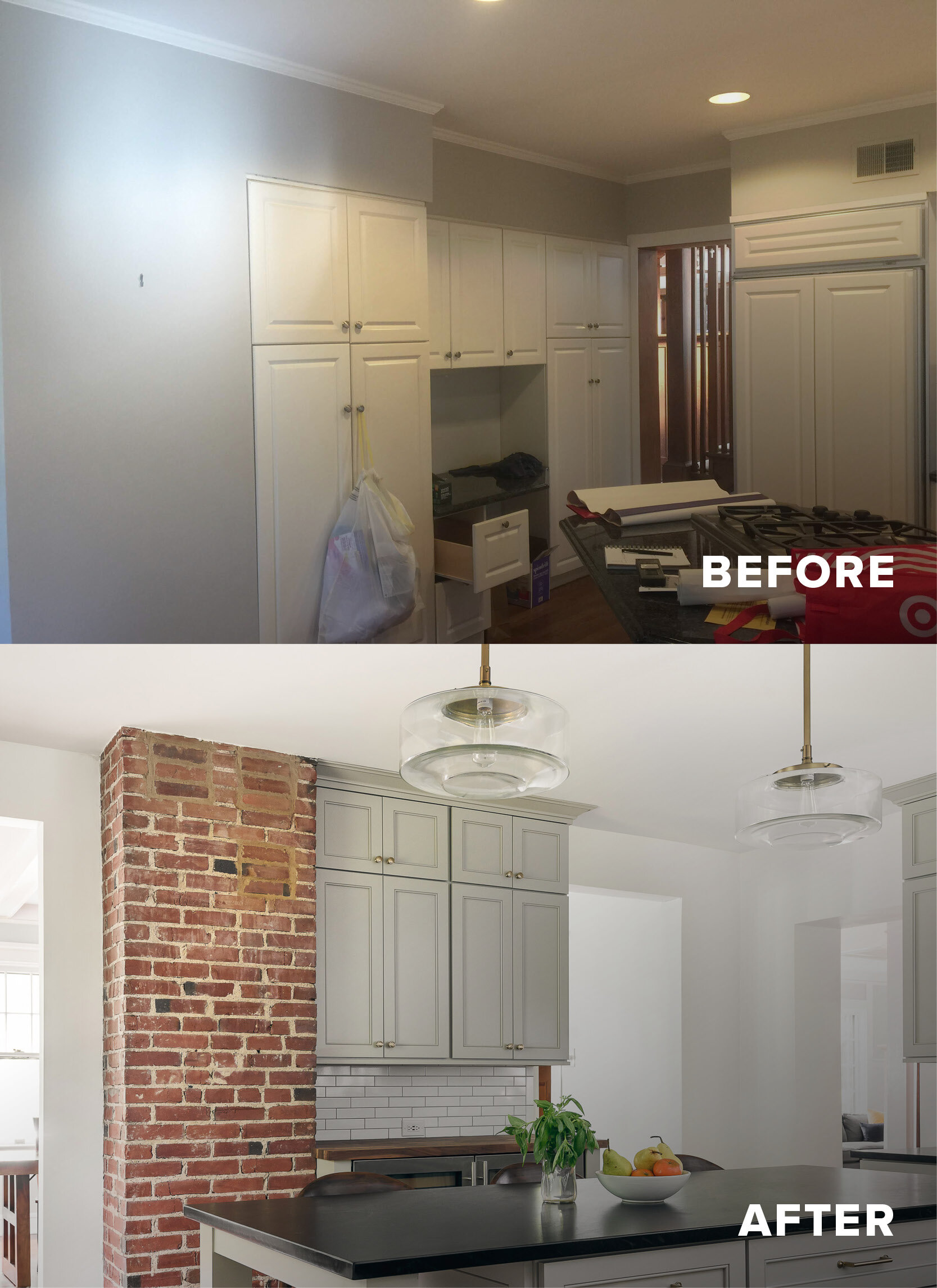
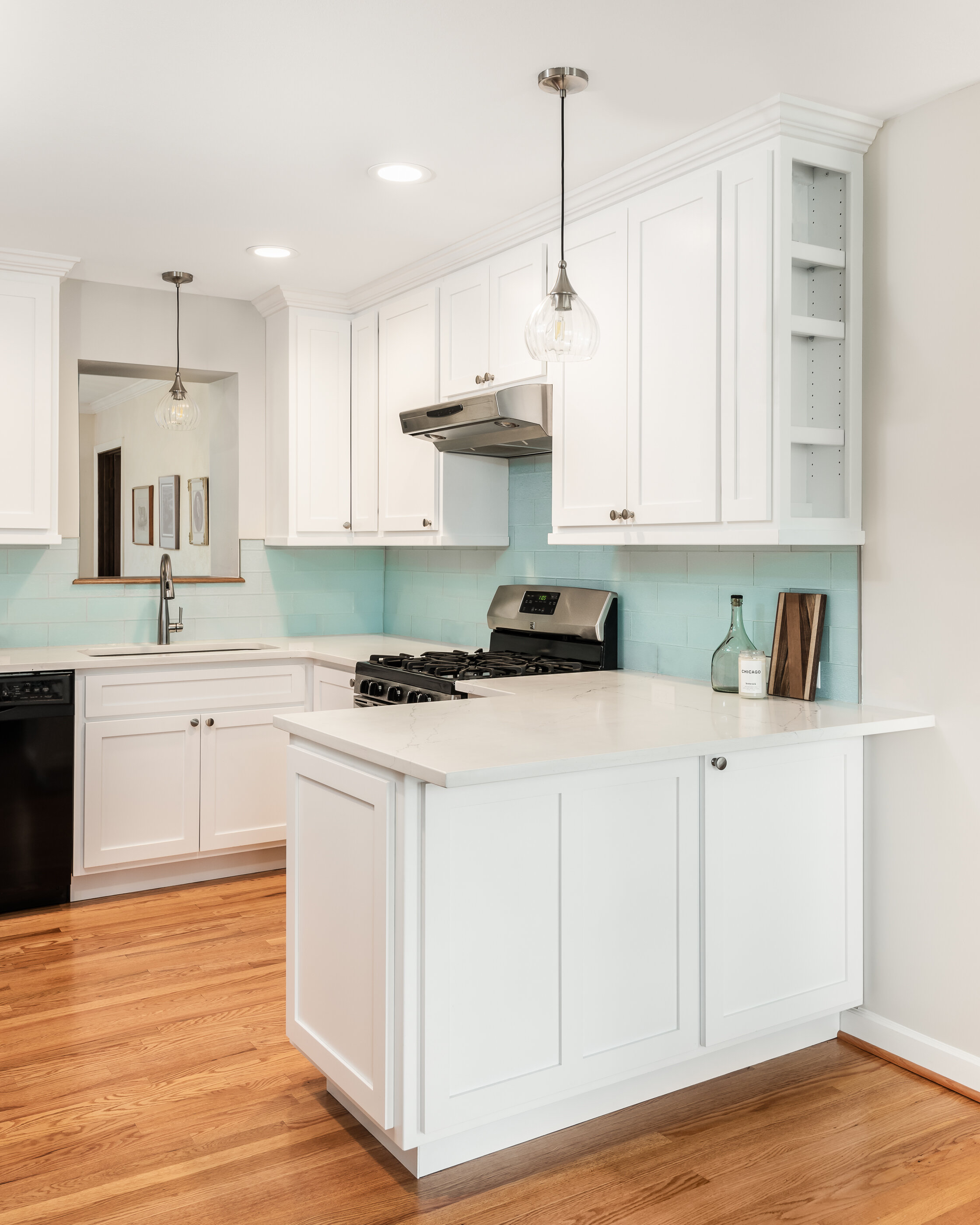
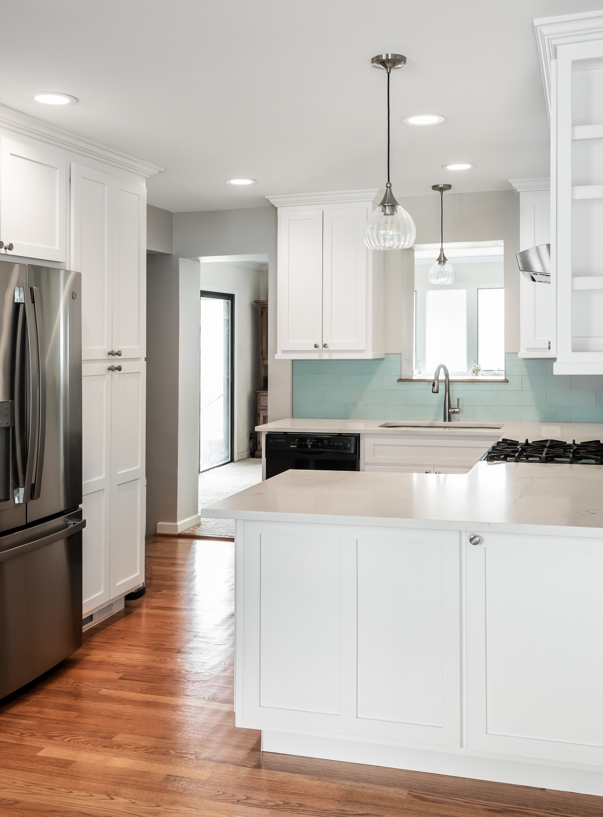
For this project, we demolished a part of the wall and created an open kitchen with an inviting and colorful seating peninsula.
The custom cabinets are a modern white with white quartz countertops. We uncovered the bungalow's original wood flooring below the layer of linoleum and matched them to the rest of the house. The result is a bright, warm and cozy kitchen - with much more space!
Glendale Primary Bath and Laundry
Our clients wanted to gain space in their small master bathroom to make it more usable and functional for their lives.
Webster Groves, MO
Designer
Jennifer Chapman
Photographer
Karen Palmer Photography
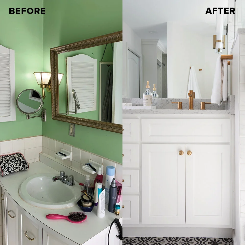
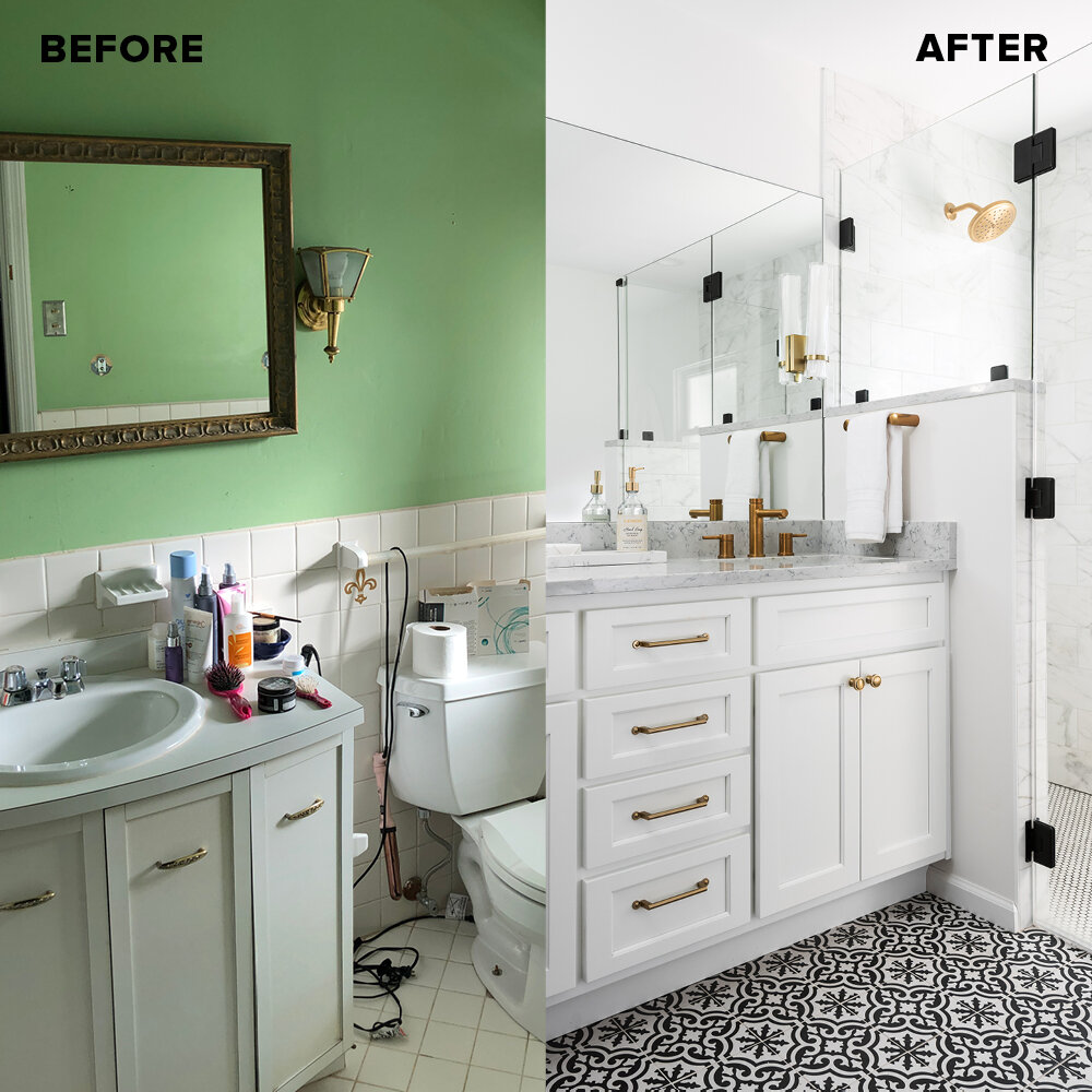
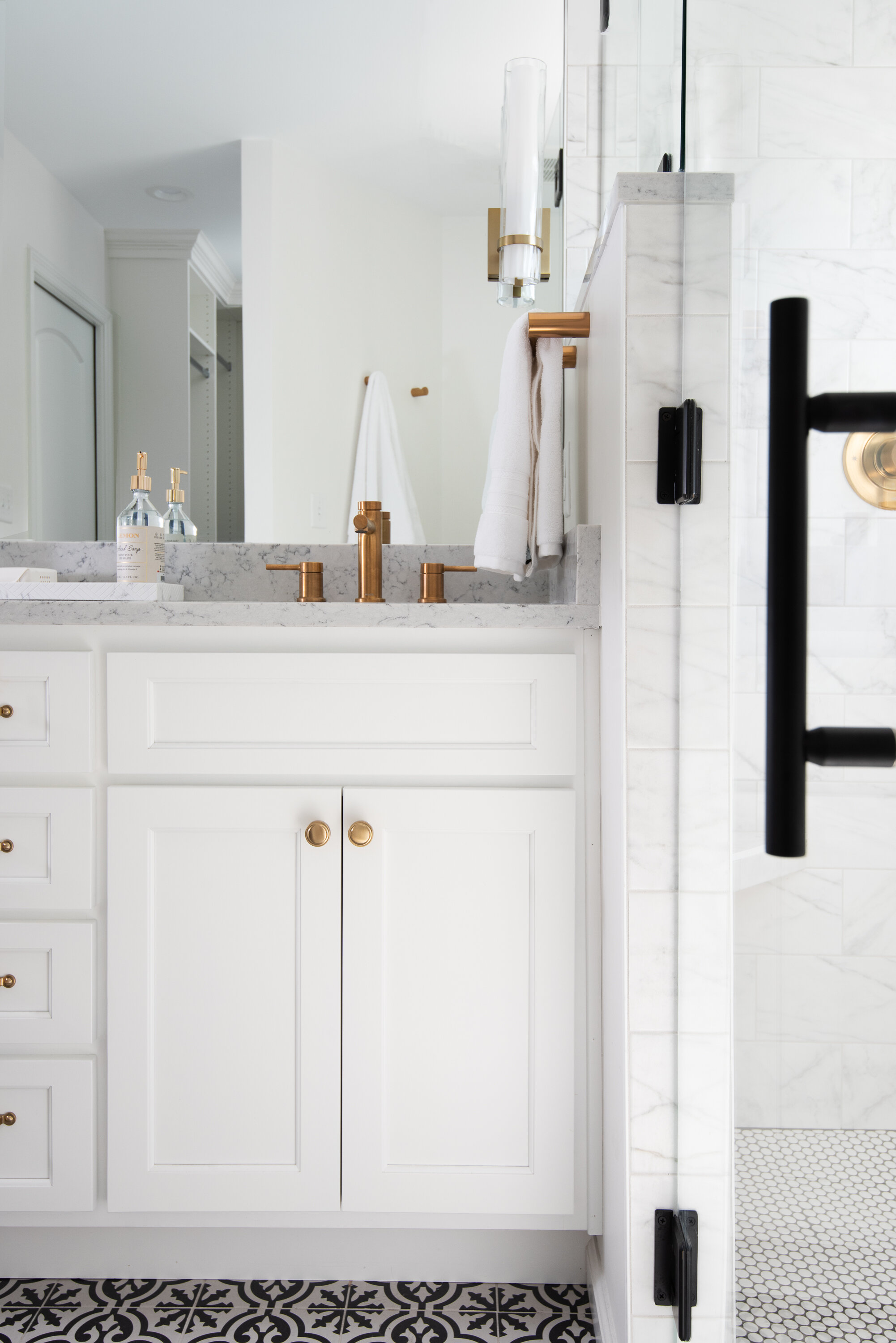
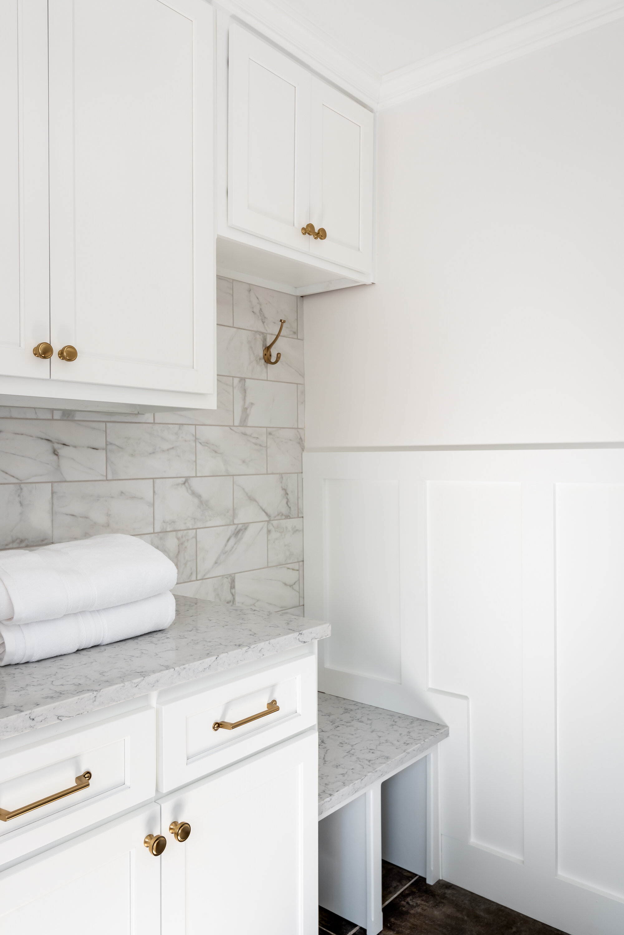
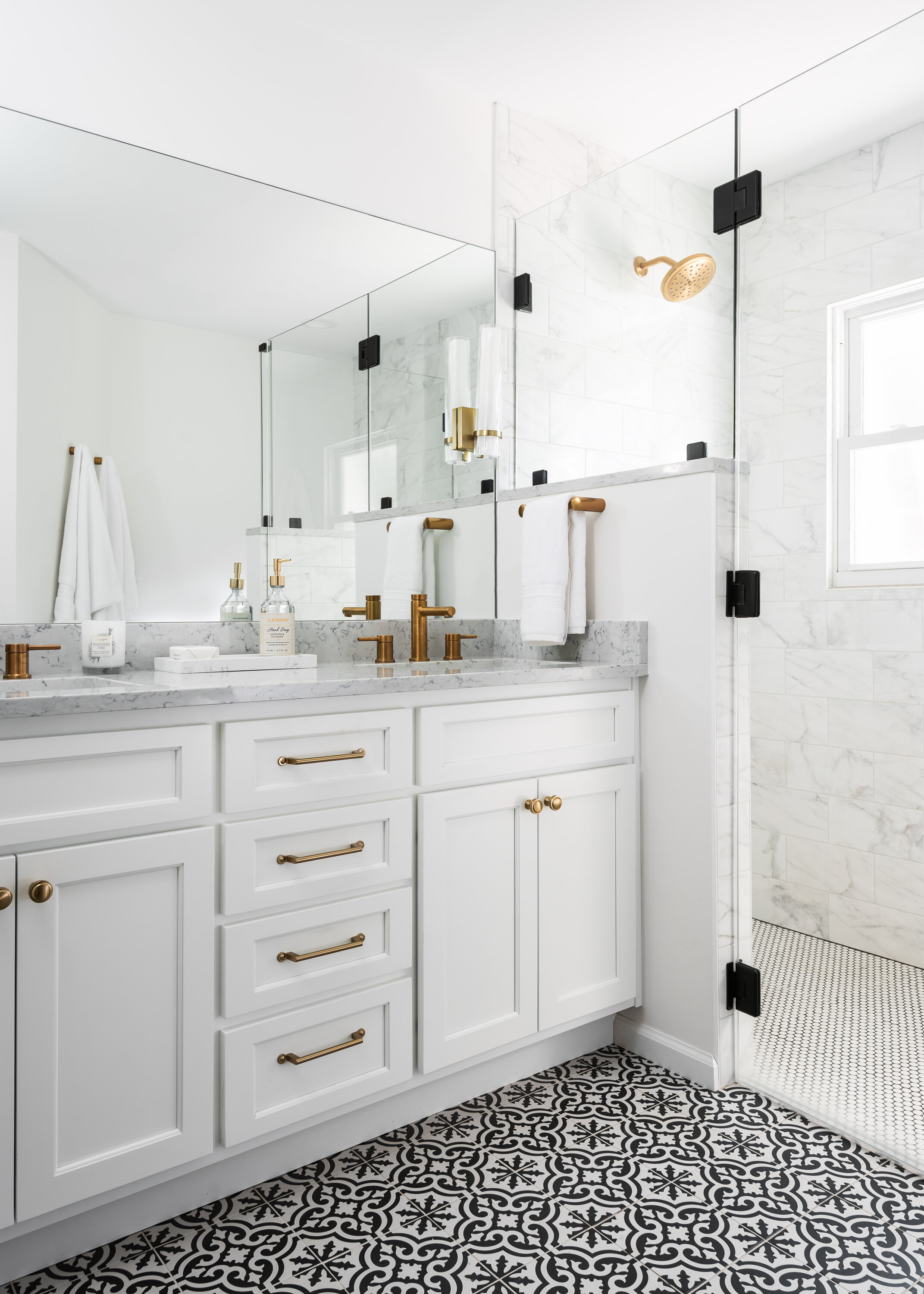
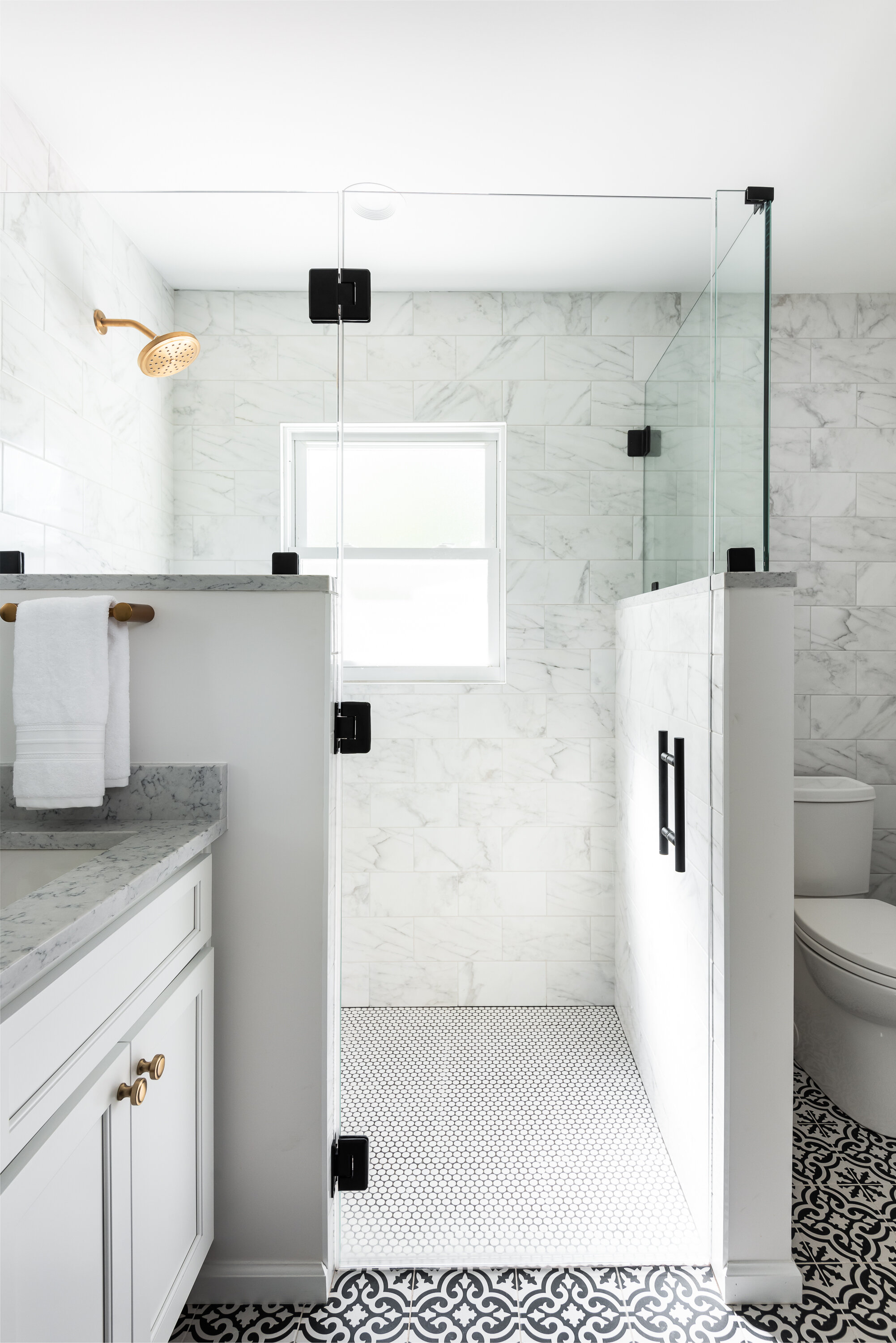
Our clients wanted to gain space in their small primary bathroom to make it more usable and functional for their lives. The bathroom had not been touched since it was built in the 1960's and was in need of a major facelift as well. We stole some space from the adjacent master closet so we could make room for a double vanity and a larger shower. We used a fun black and white black patterned tile for the main part of the bathroom and used a white penny tile on the shower floor with dark gray grout. The wall tile is a marble look 3 x 12 porcelain subway tile. We went with brass plumbing fixtures, lighting, and hardware, which warm up the white cabinets & marble look quartz countertops. The large frameless mirror and frameless custom shower glass makes the room feel much larger and more open than it actually is.
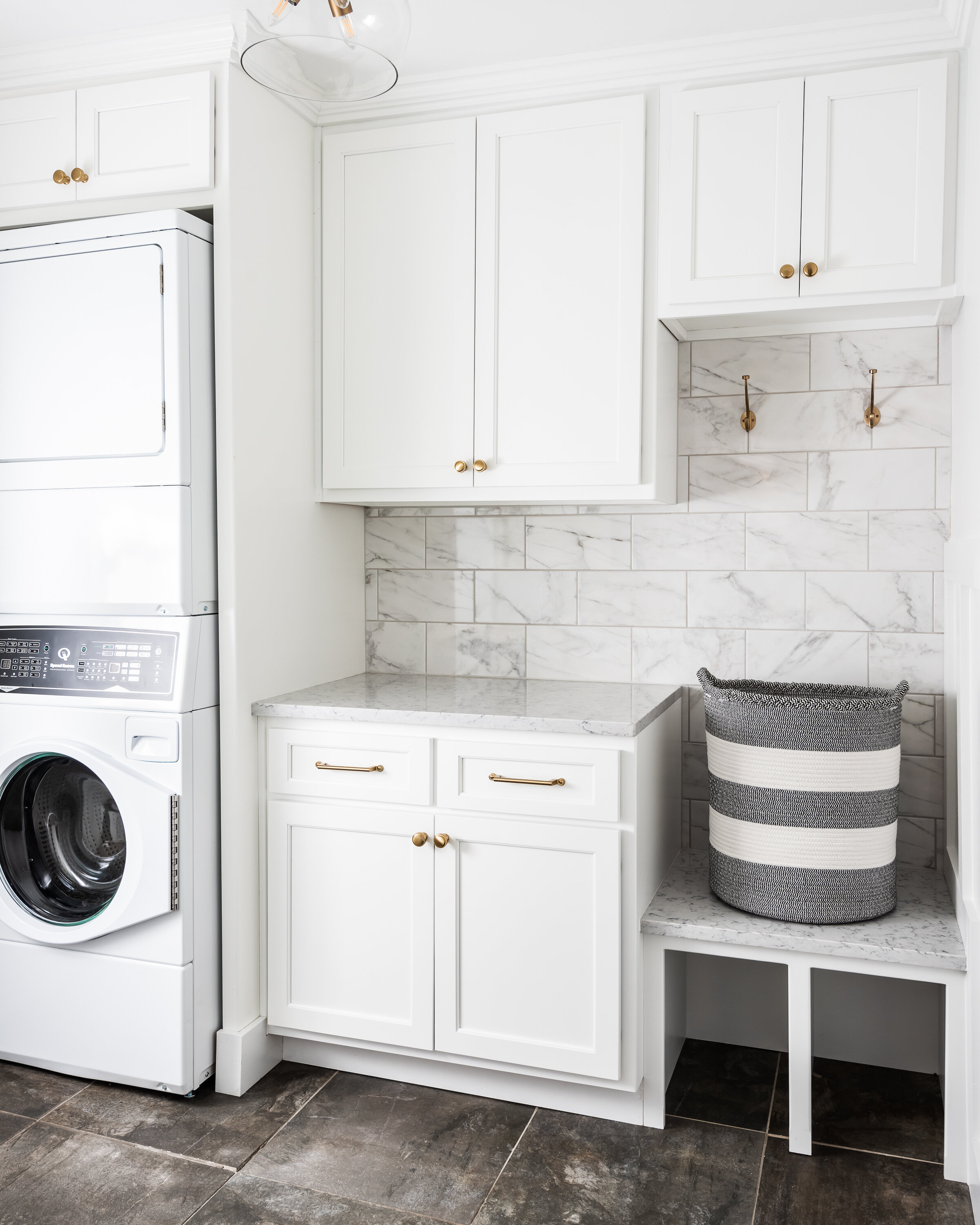
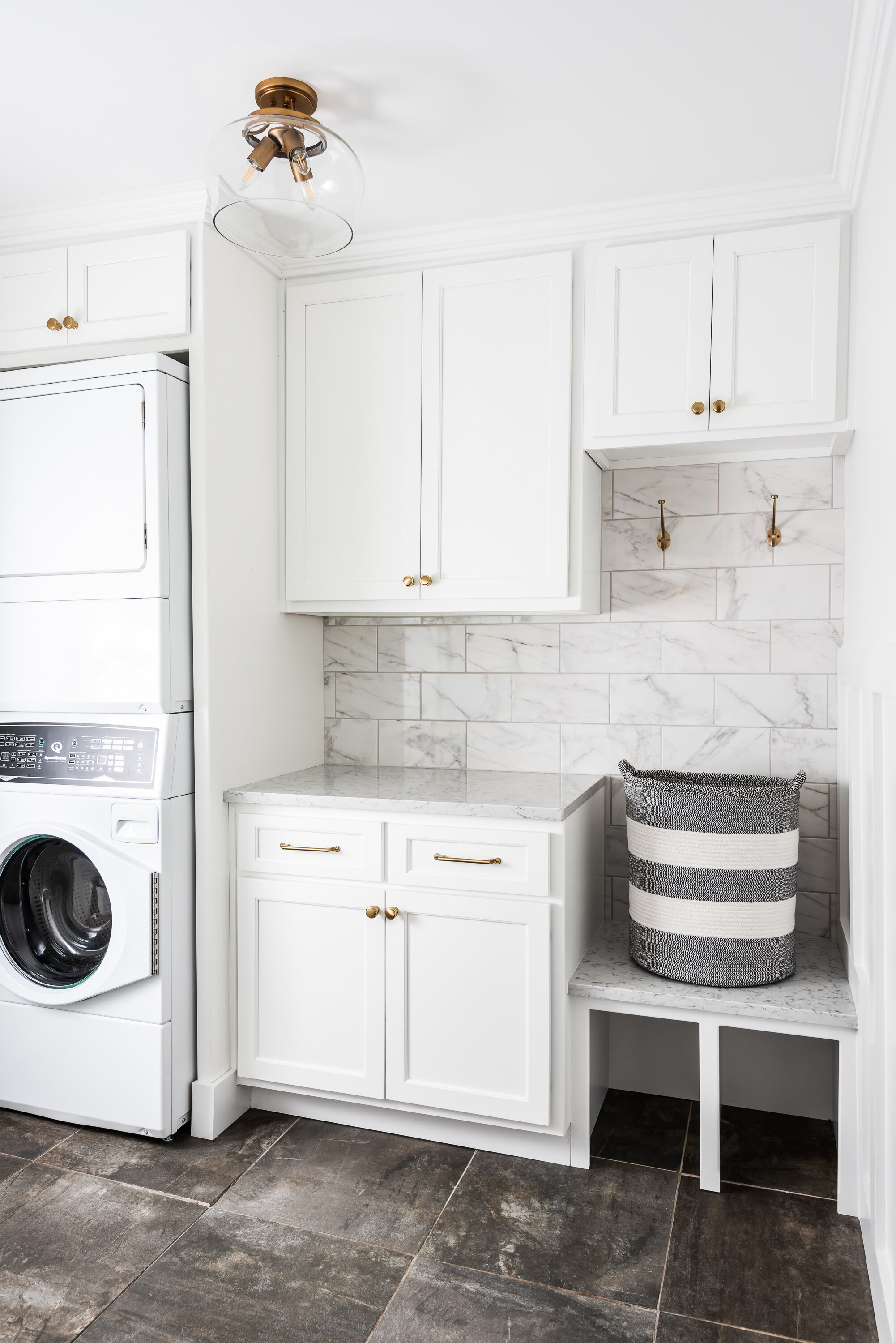
The existing laundry room was bare bones- just a washer and dryer with no storage. The clients wanted to be an extension of the rest of their home design wise and also be much more functional for them. We added cabinetry and a small bench with hooks, which allows this room to both function as a laundry room and mudroom. We added wainscotting throughout the laundry space as well.
Overall we achieved two bright, classic, functional spaces that our clients can enjoy for years to come!
Creve Coeur Primary Ensuite Addition
Our client recently moved into this remodeled home and had dreams of adding an additional master suite with a basement.

St. Louis, MO
Designer
Rochelle McAvin
Photographer
Karen Palmer
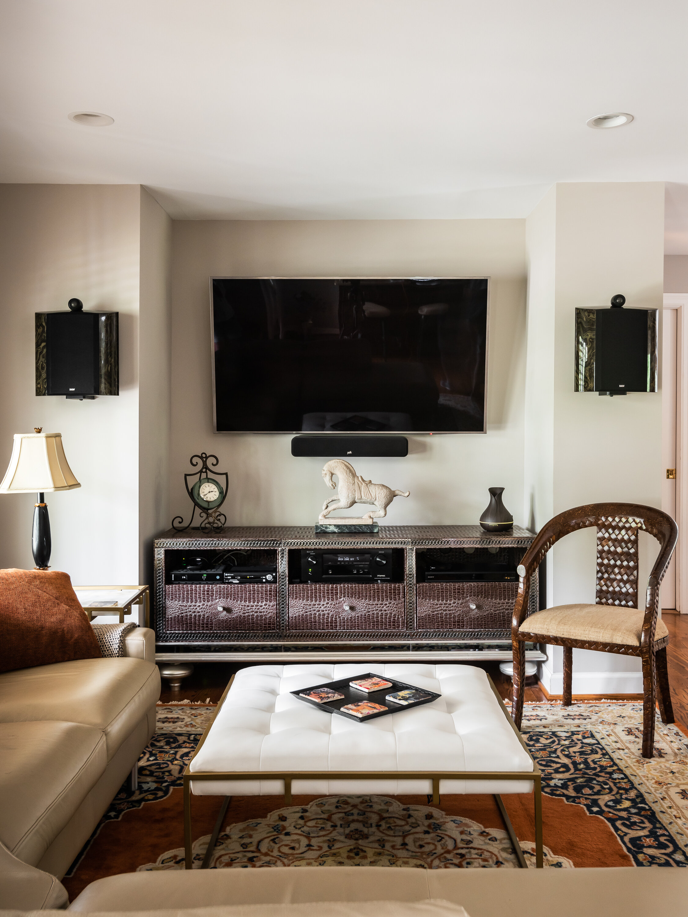
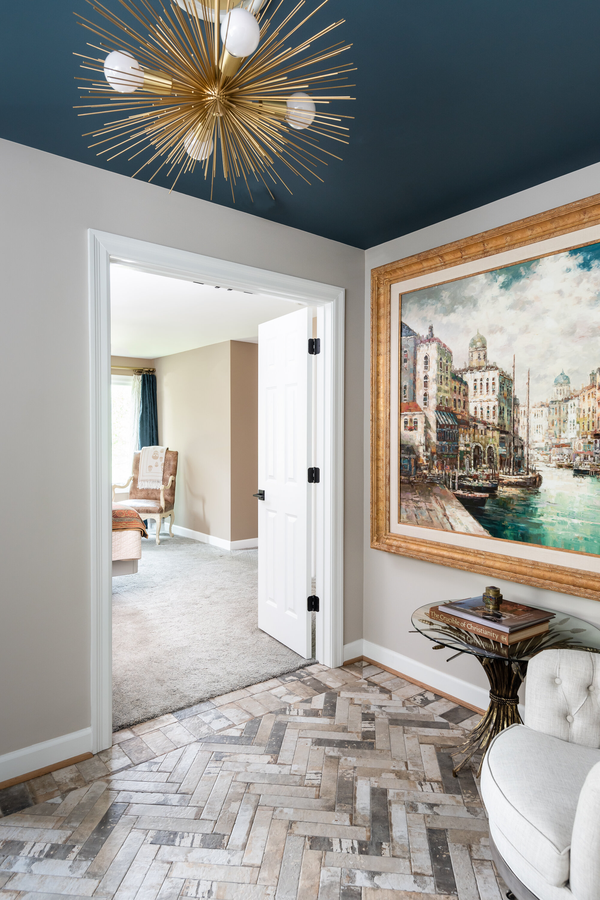
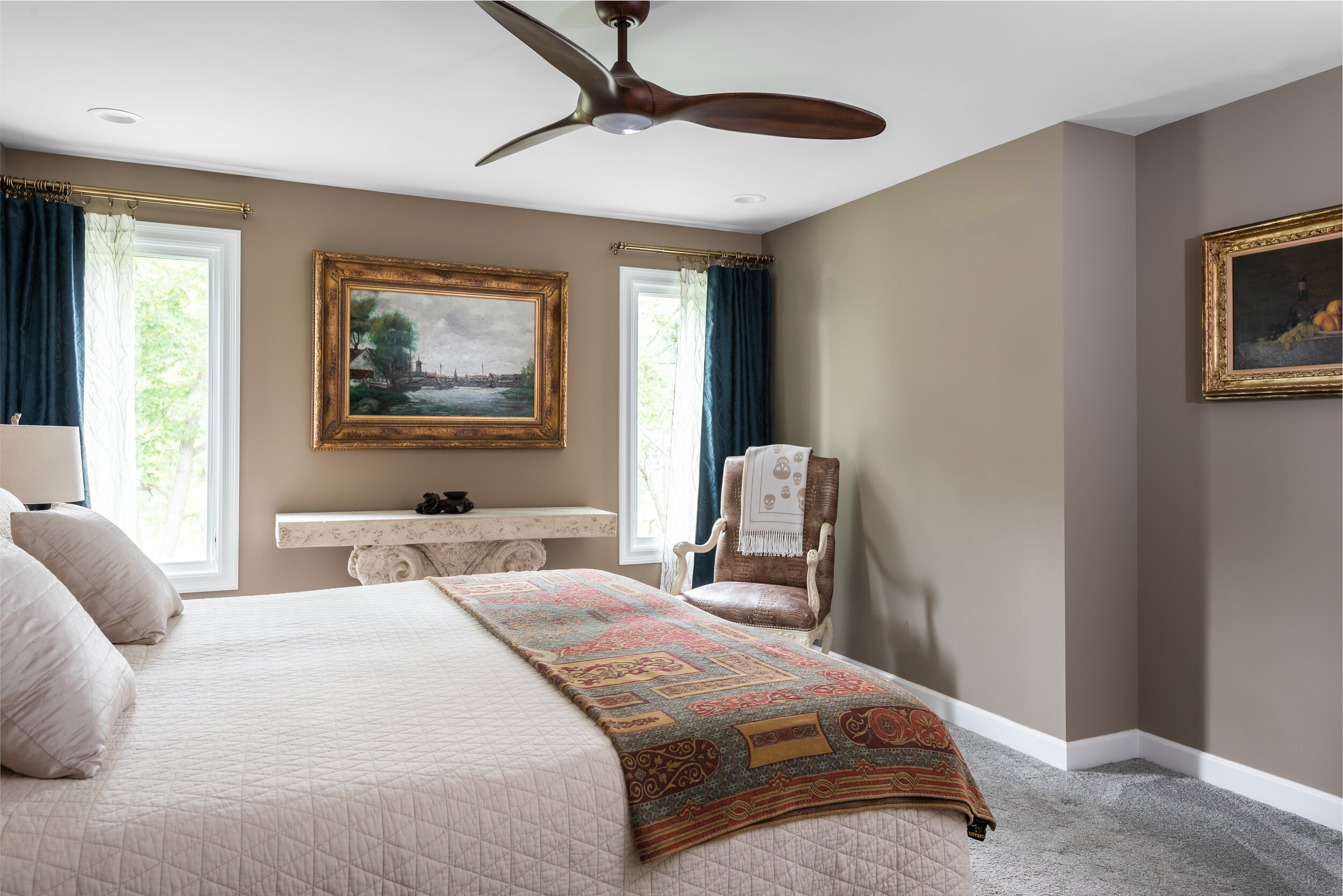
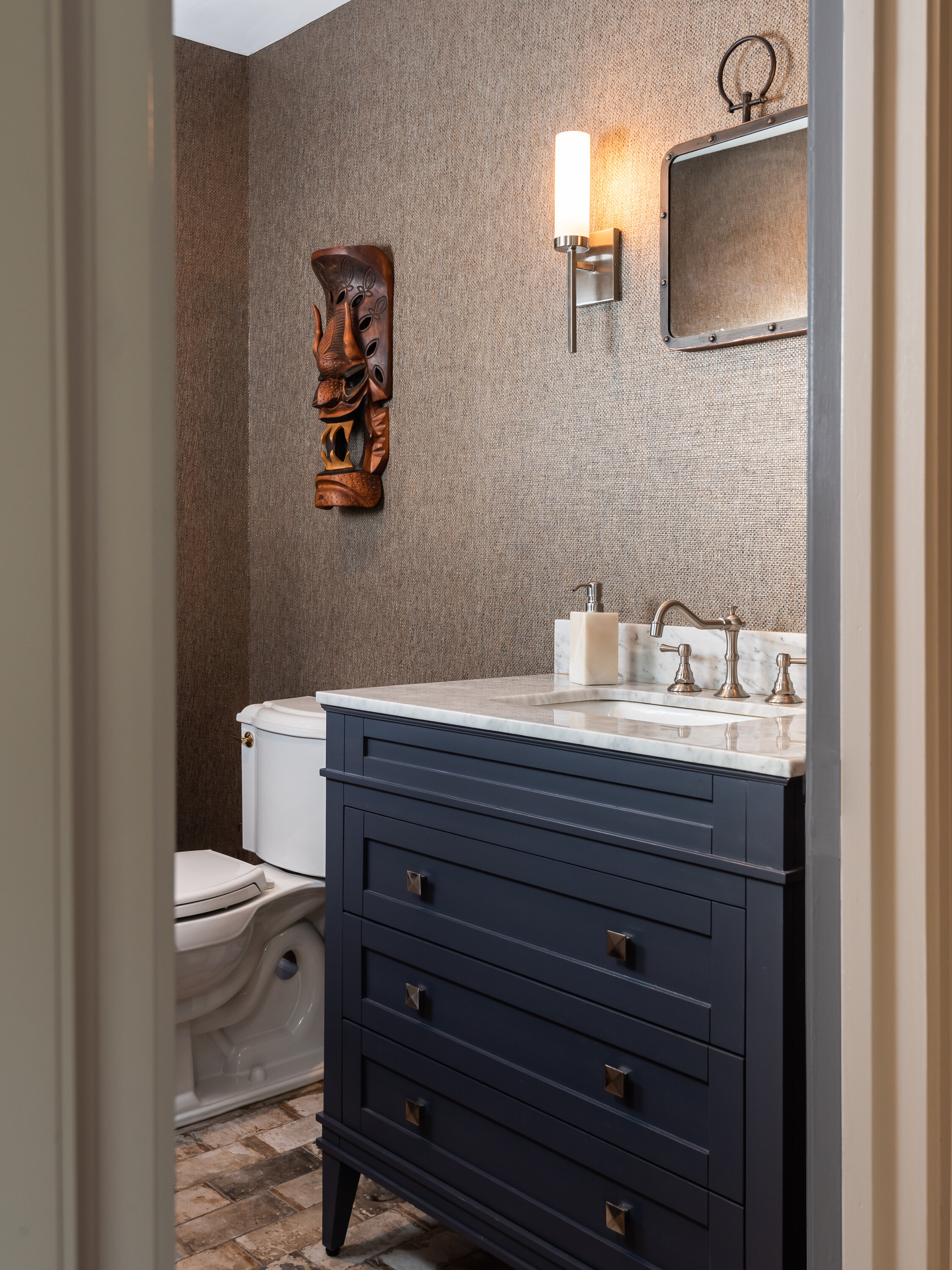
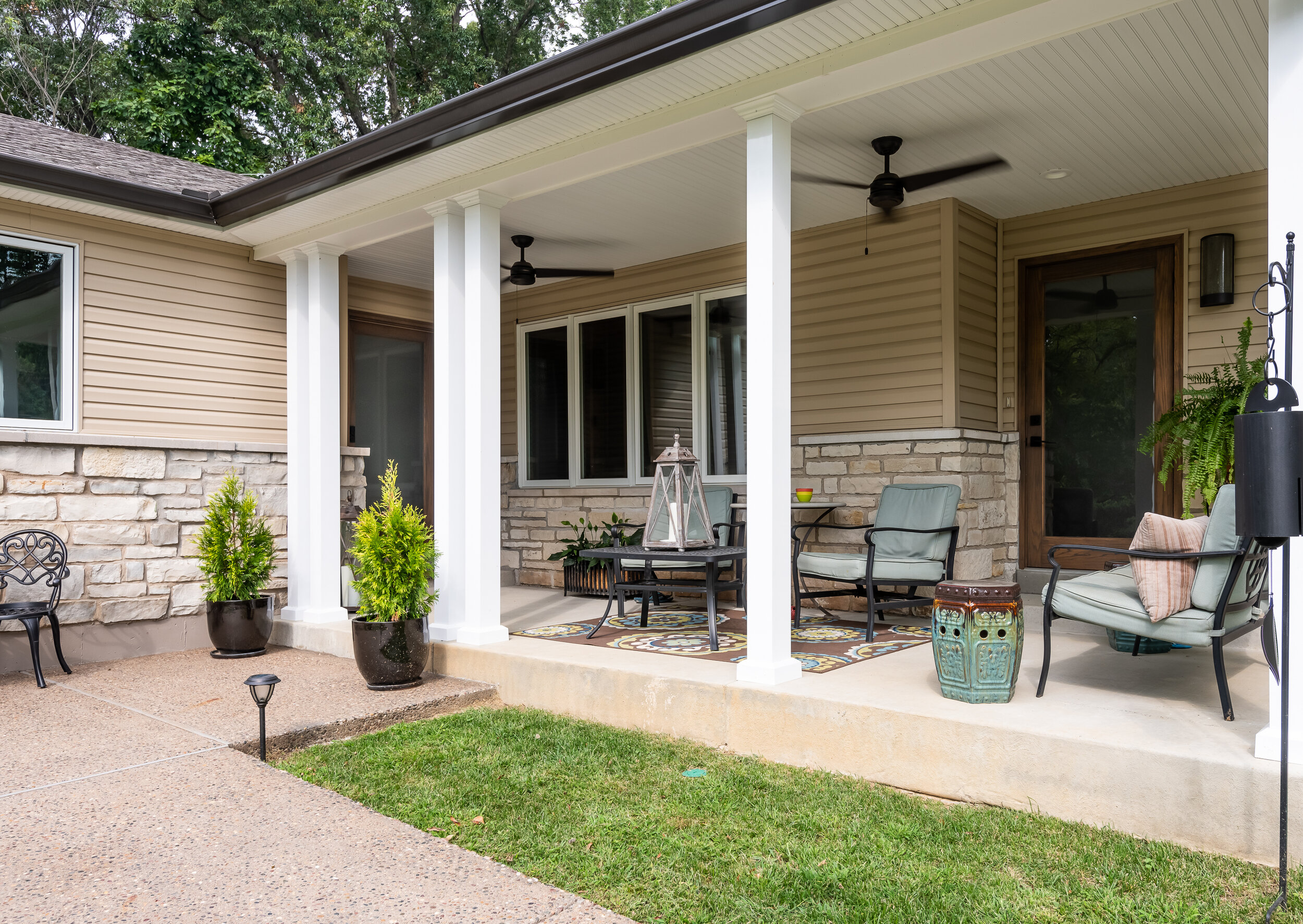
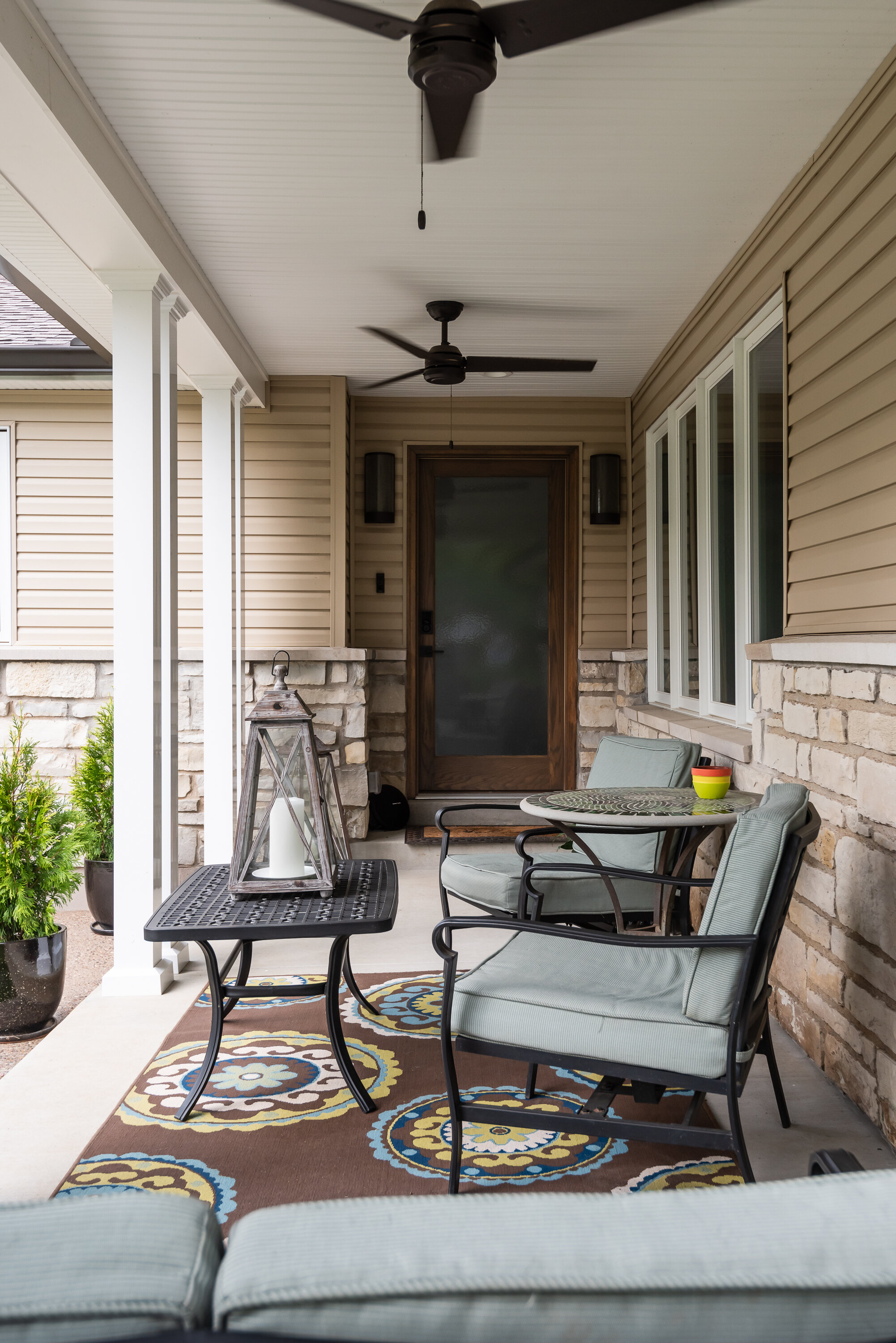
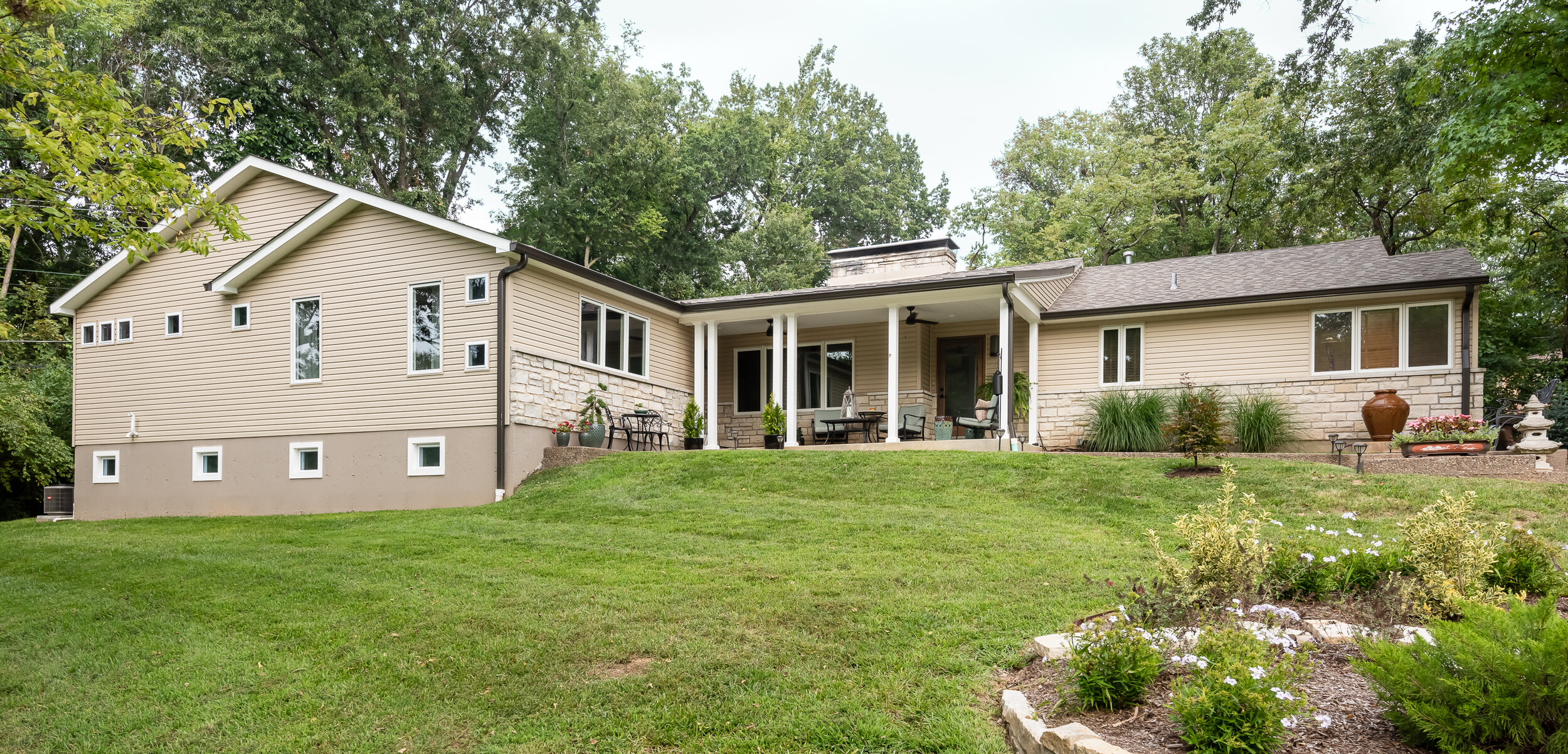
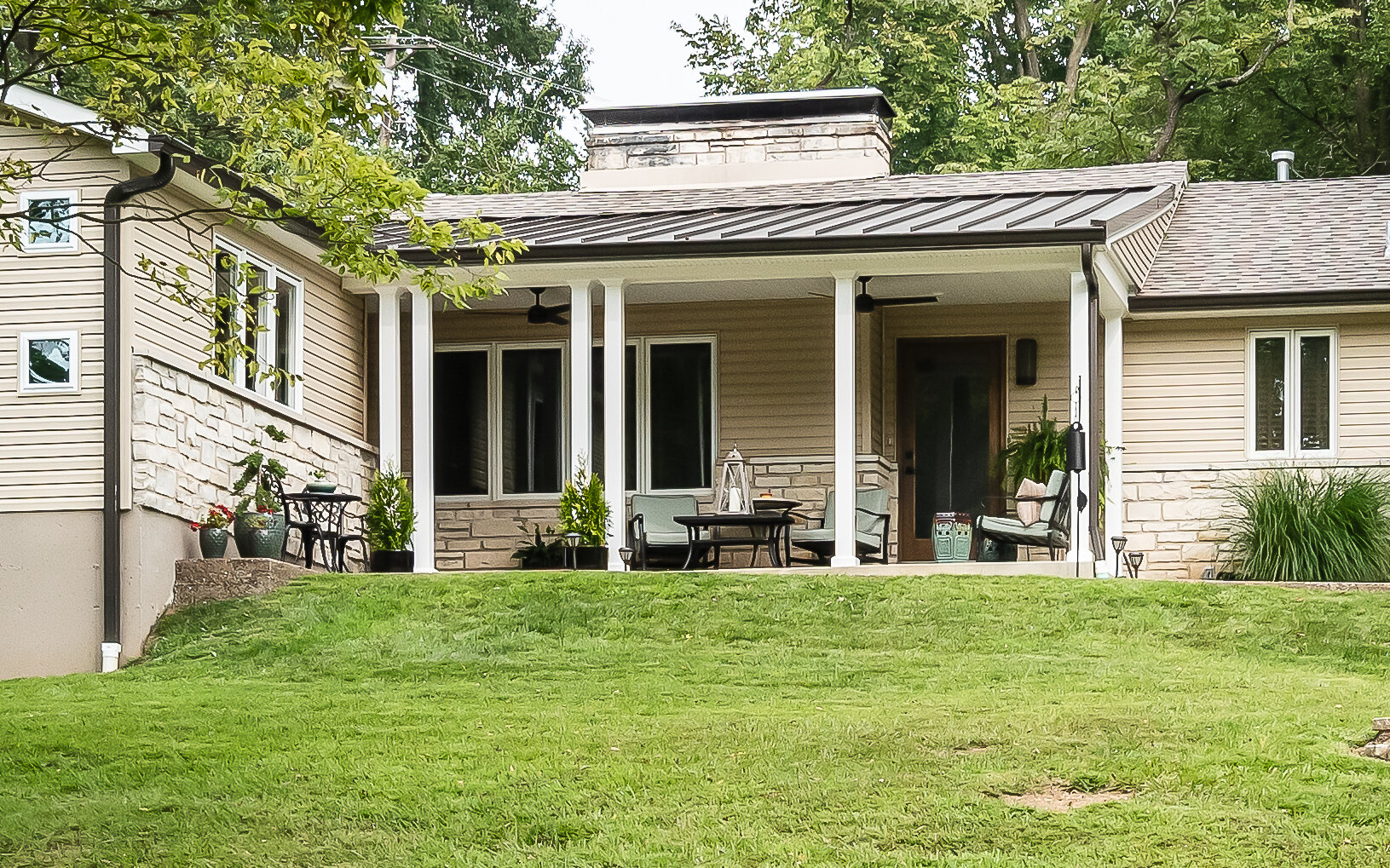
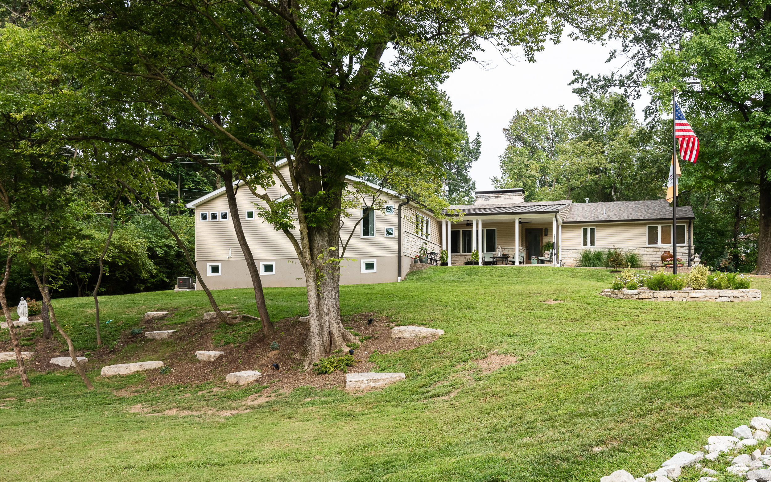
Our client recently moved into this remodeled home and had dreams of adding an additional primary suite with a basement. Our team could envision the space and we knew this would be an exciting project. The addition began by adding a new front porch our clients could use to entertain and relax, modern ceiling fans and lighting are inviting and the metal roof adds texture to the ranch home. We relocated the front entry door that leads into the new, expansive foyer and stairs to the lower level. The tile floors are reminiscent of the cobblestone they had seen on their trips throughout Europe, and they knew that incorporating old world charm and fun details would make the space feel like home. A small powder room features a soft grasscloth wallpaper, amping up the drama and we chose to paint the custom moldings the same smokey blue as the marble topped vanity.
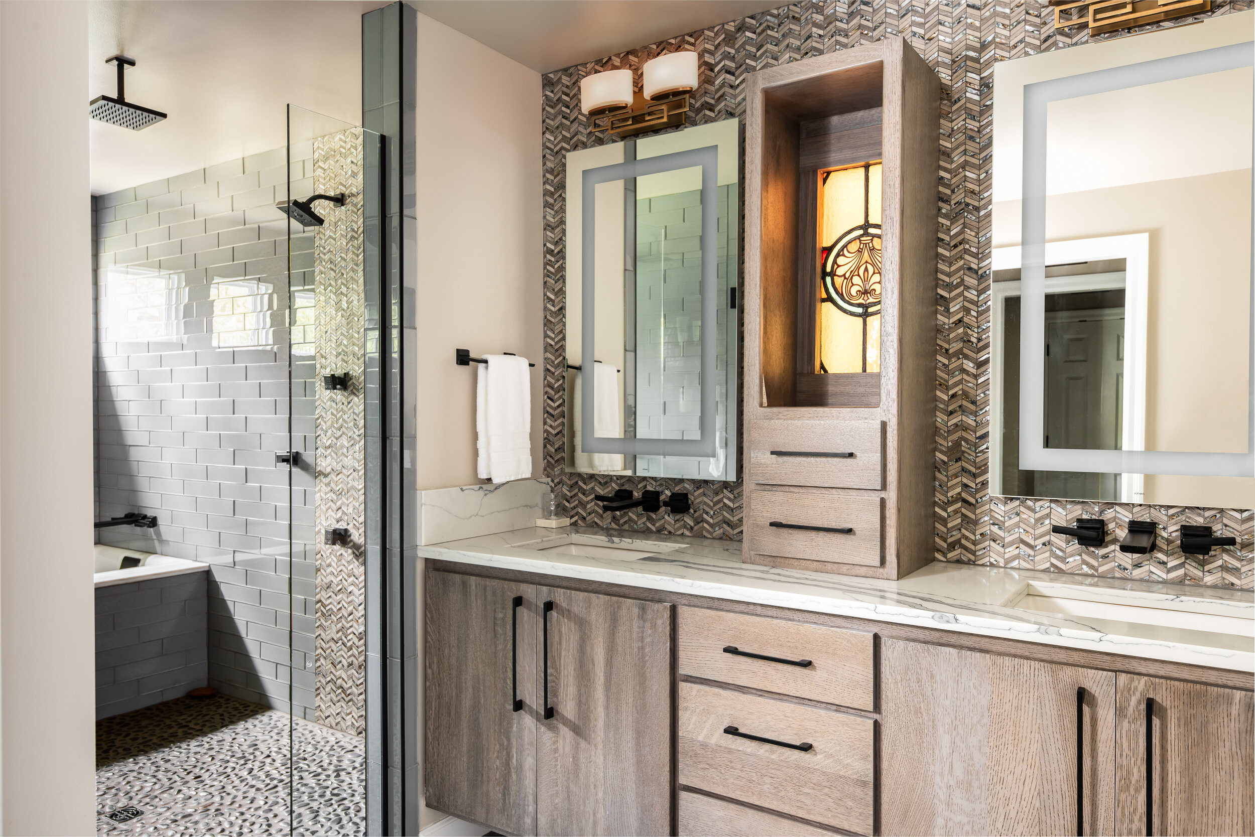
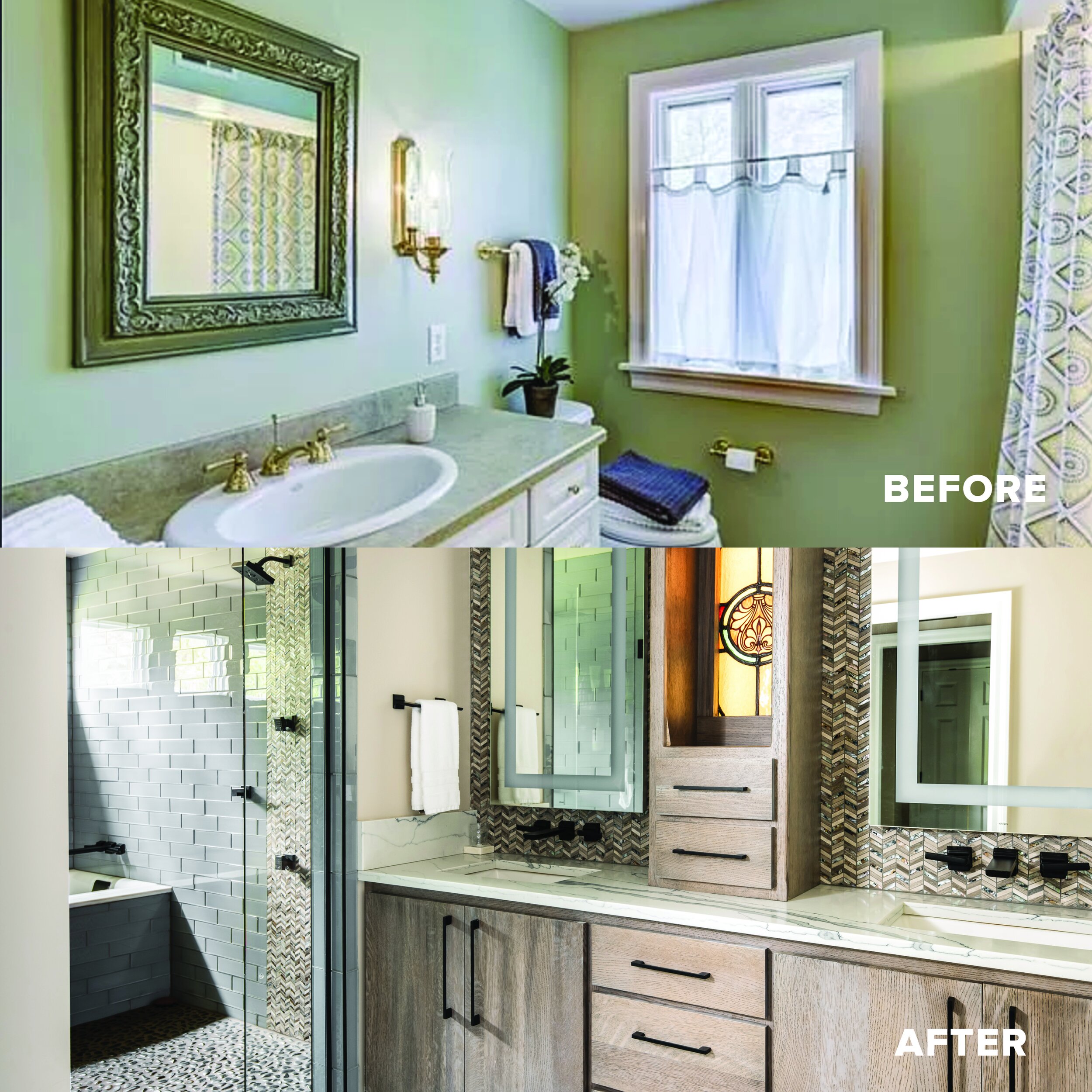
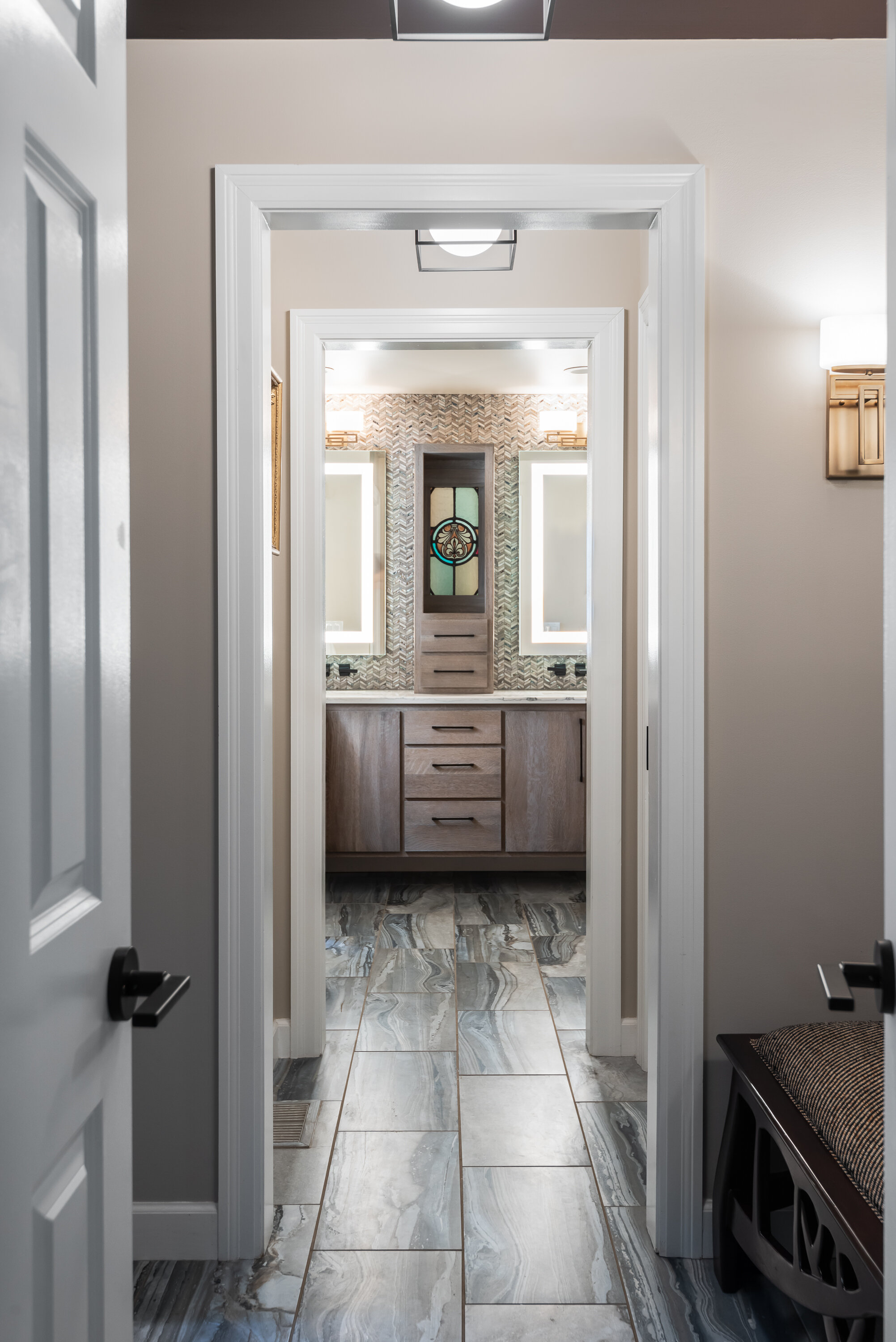
You enter the primary suite through double doors and are welcomed with carefully placed windows, and mellow, neutral tones. The hallway has berry toned glossy ceilings that reflect the afternoon sun: and as you enter the bathroom you are greeted with a custom stained glass window, built into a floating vanity as a surprise gift to each other.
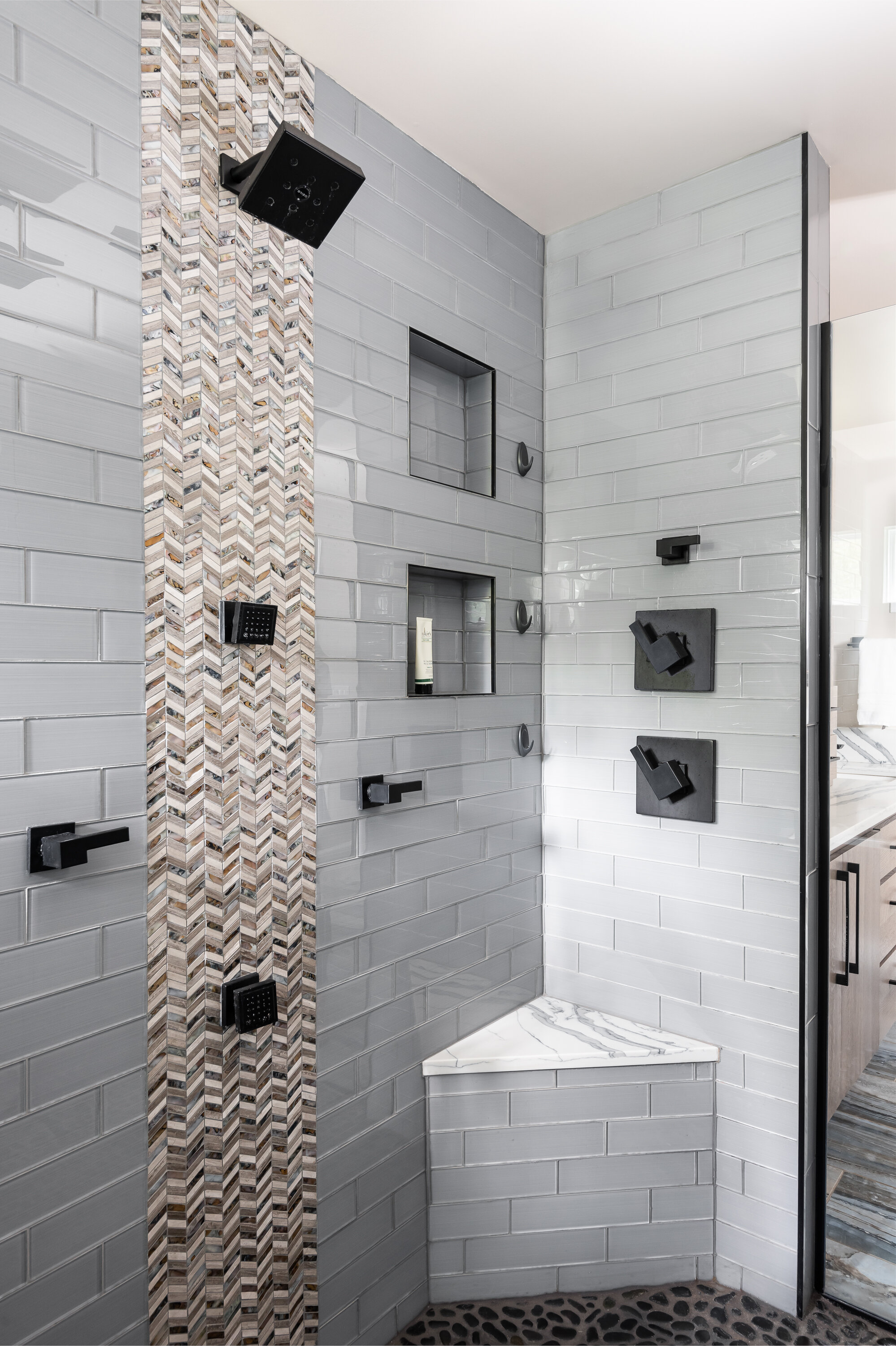
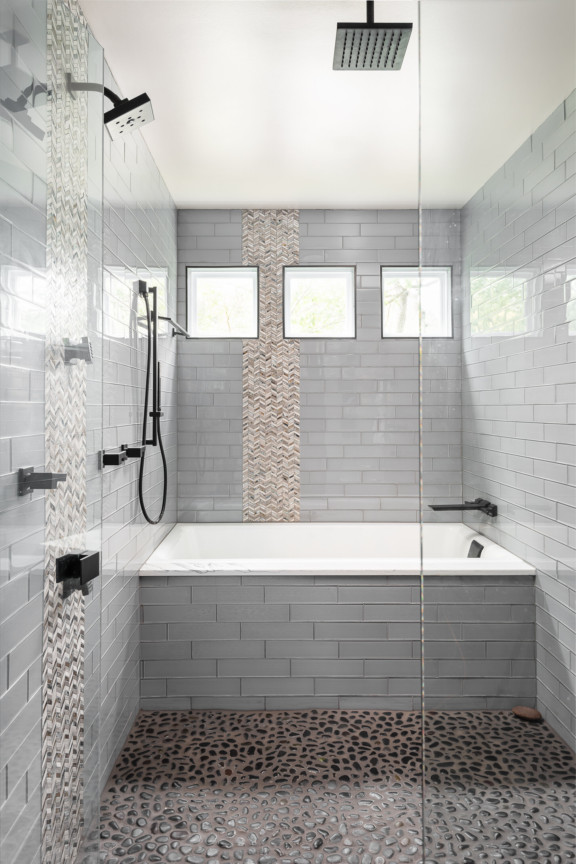
The shower is equipped with a soaking tub, rain shower, dual shower heads, dual body sprays and a massaging, river rock floor. There is plenty of room for two, but the bathroom retains the warmth you feel when you first enter the space.
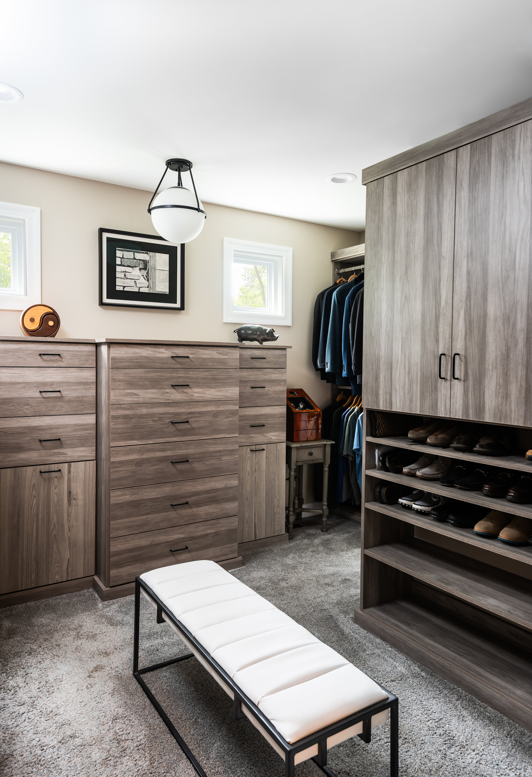
Rounding out the primary suite is a matching walk-in custom closet designed to organize every part of their lives.
By the end of the project, the home felt purposeful, warm and welcoming. The overall sensation feels relaxed and leaves you wanting to stay. Our client agrees, and is happy to call it home.
Kim's Climbing Gym
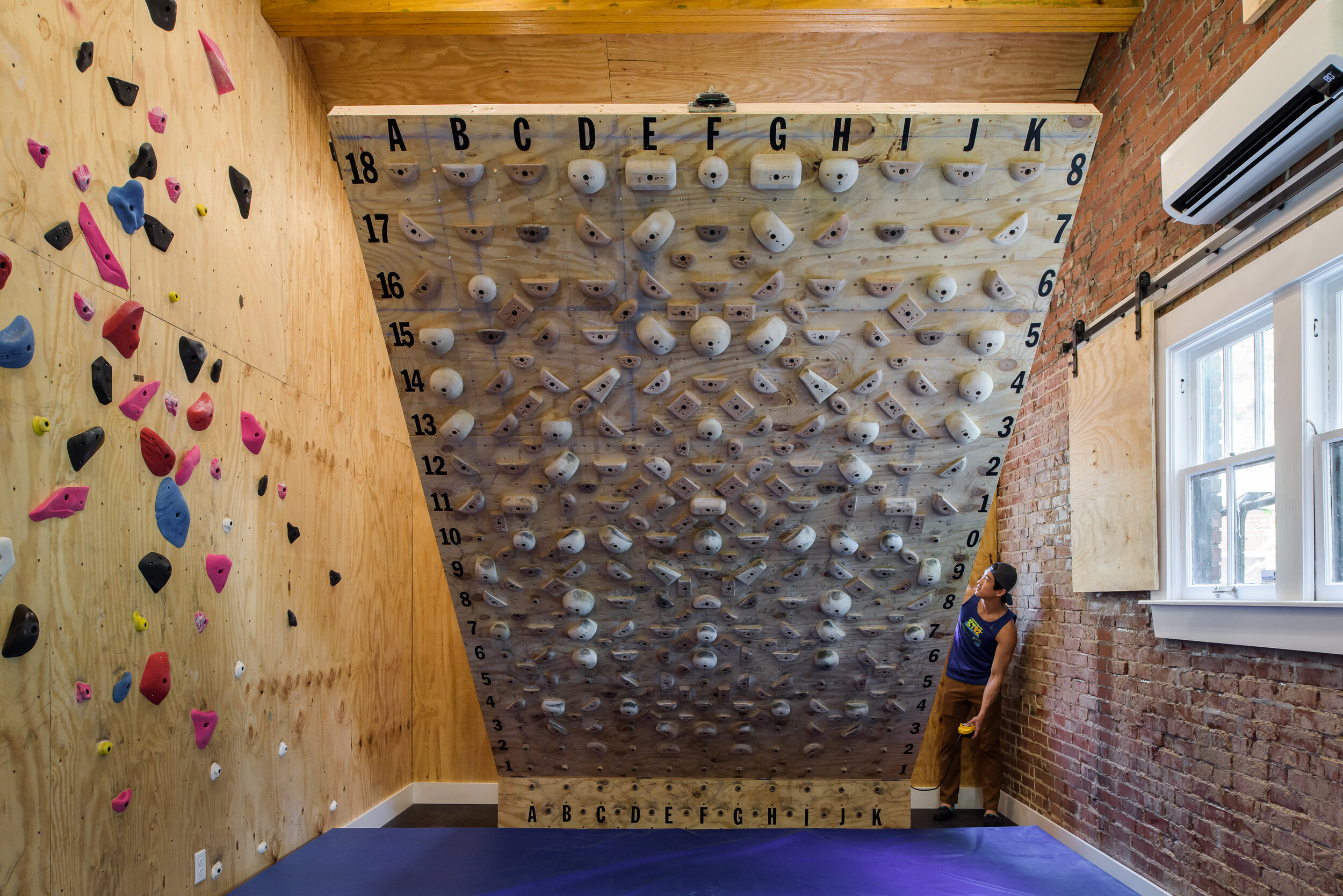
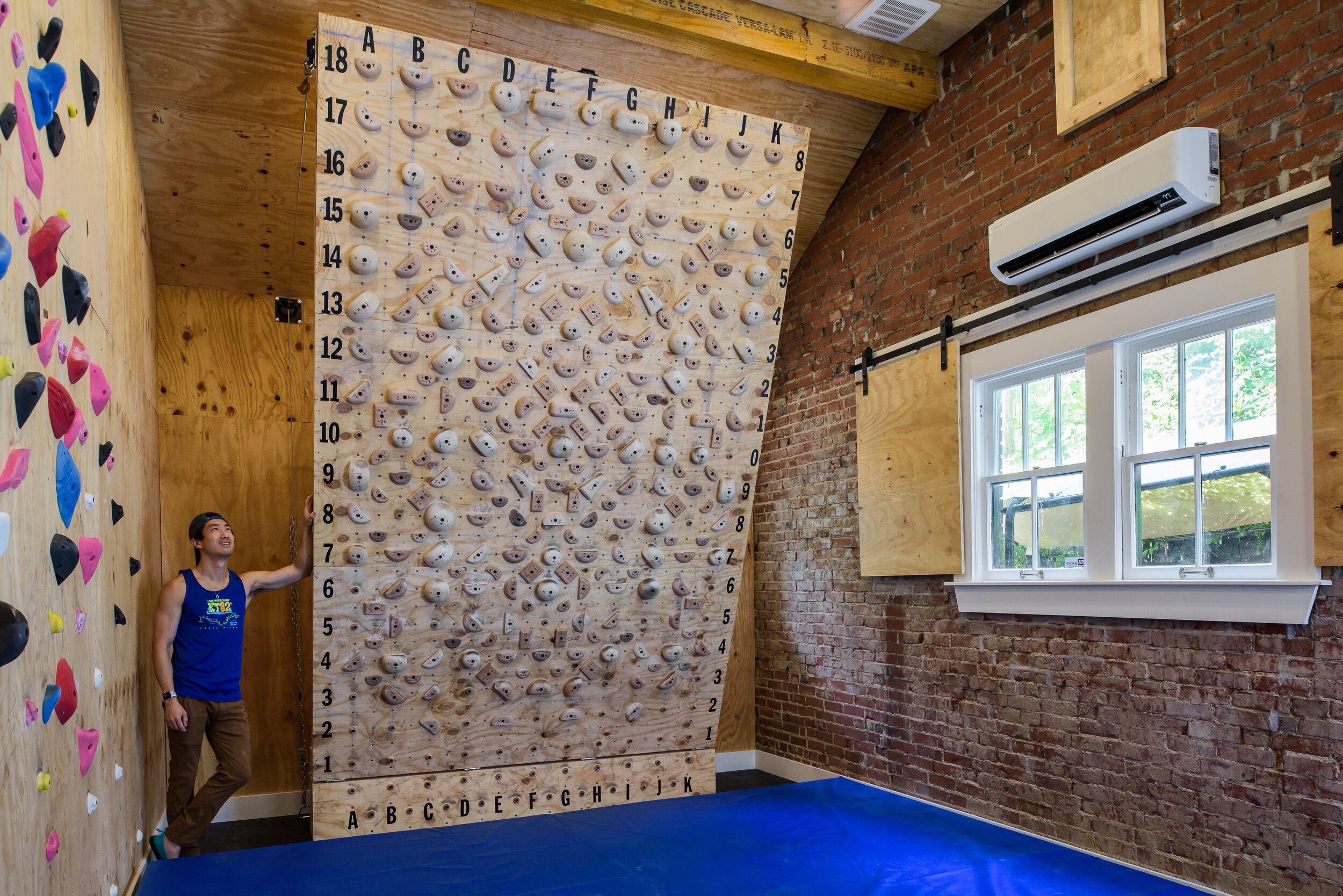
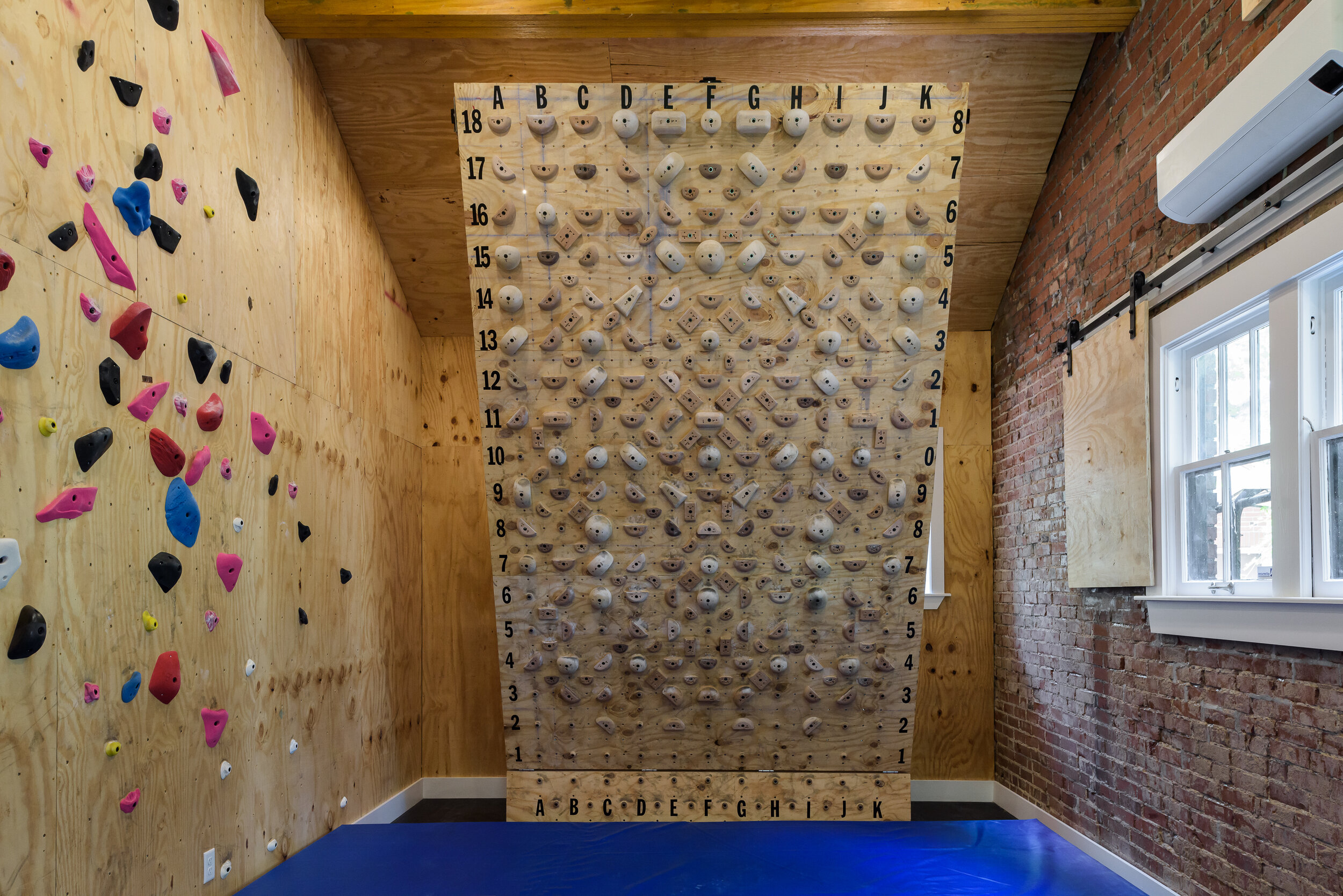
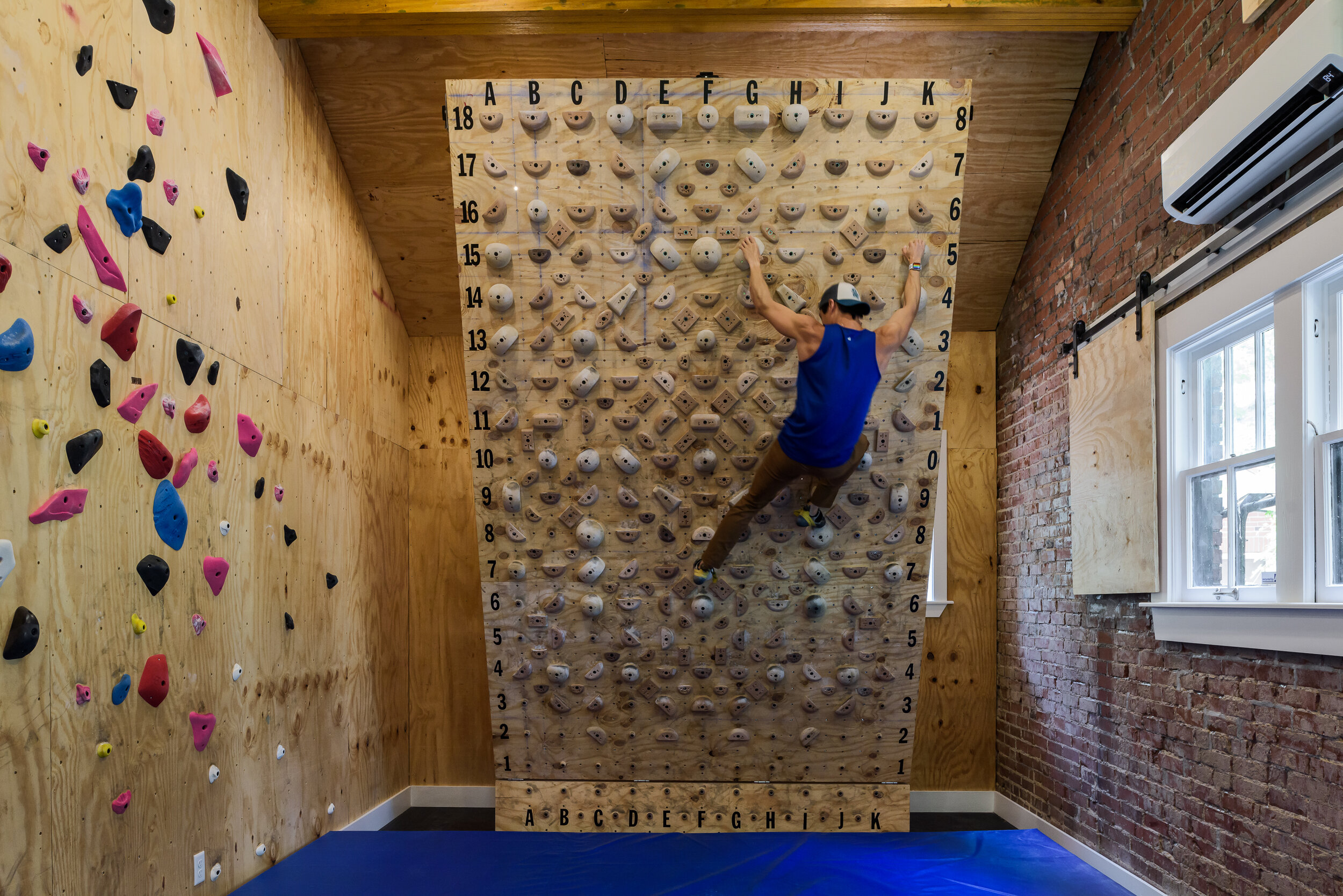
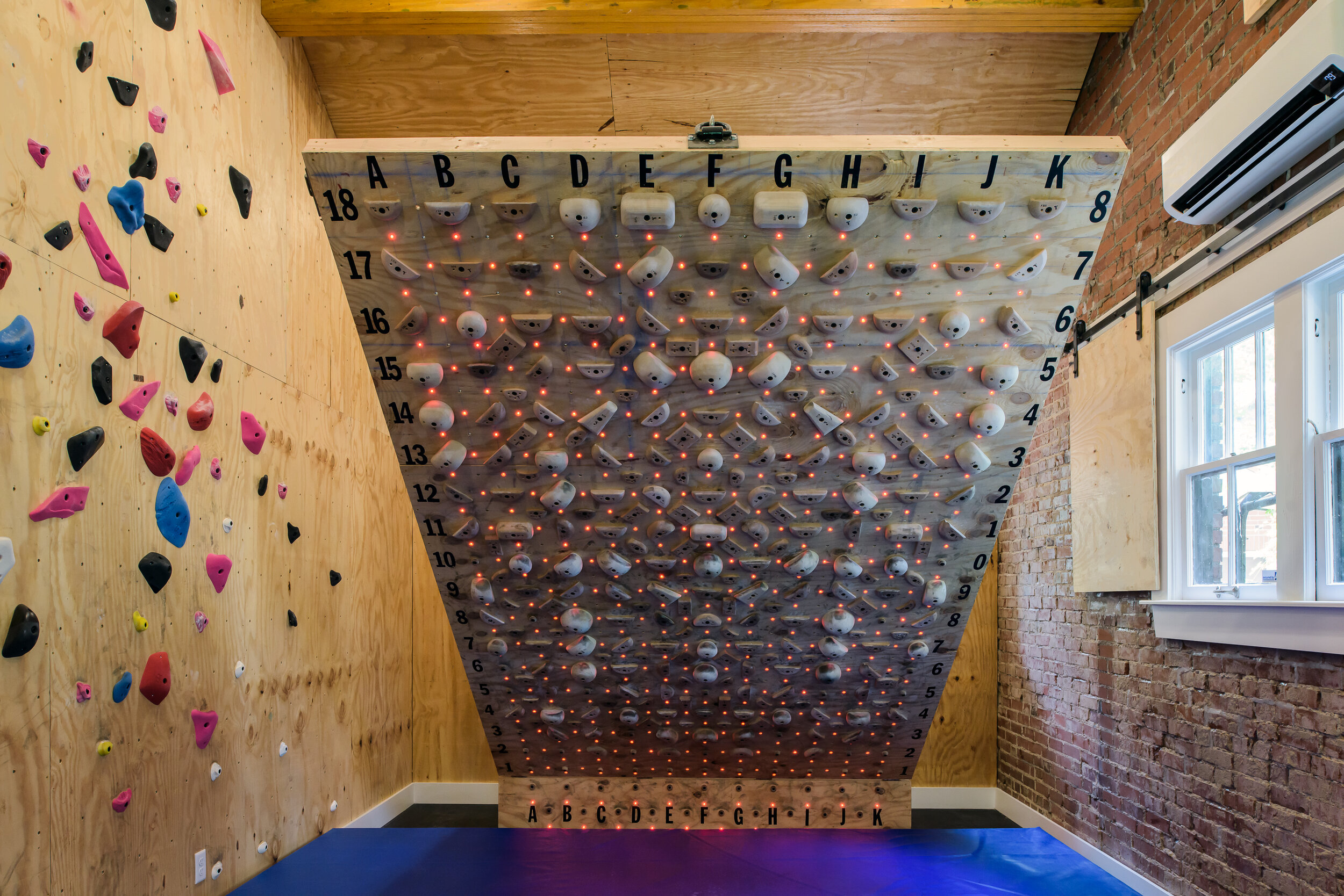
When a past client referred his friend to renovate his University City carriage house into a climbing gym, we were really excited to take on the project.

St. Louis, MO
Designer
Rochelle McAvin
Photographer
Karen Palmer
When a past client referred his friend to renovate his University City carriage house into a climbing gym, we were really excited to take on the project. The century old carriage house had previously been used as a garage and a cigar room. Our clients wanted to keep the garage, and ditch the old smoking room. We demoed the walls and ceiling to expose the original brick and 14 foot vaulted ceilings. Once open, LU Carpenters built a 12 foot tall, 8 foot wide custom climbing wall, known in the climbing community as a Moon Board. To operate the board, our team carefully positioned cables, pulleys and attached a motorized winch equipped with galvanized steel aircraft wire holding a massive 1500 pounds. When vertical, it stands at a 10 degree angle and inverts to a challenging 50 degrees! The best part is that the board is complete with an app based custom guidance system creating LED mapped pathways to lead your climb to the top.
The new walls are lined with additional plywood and climbing holds; and a barn door mechanism slides panels over the windows to ensure a safe climb.
We are so excited with how this project turned out. Thank you to our clients for the fun and unique opportunity!
Vicksburg Siege Basement
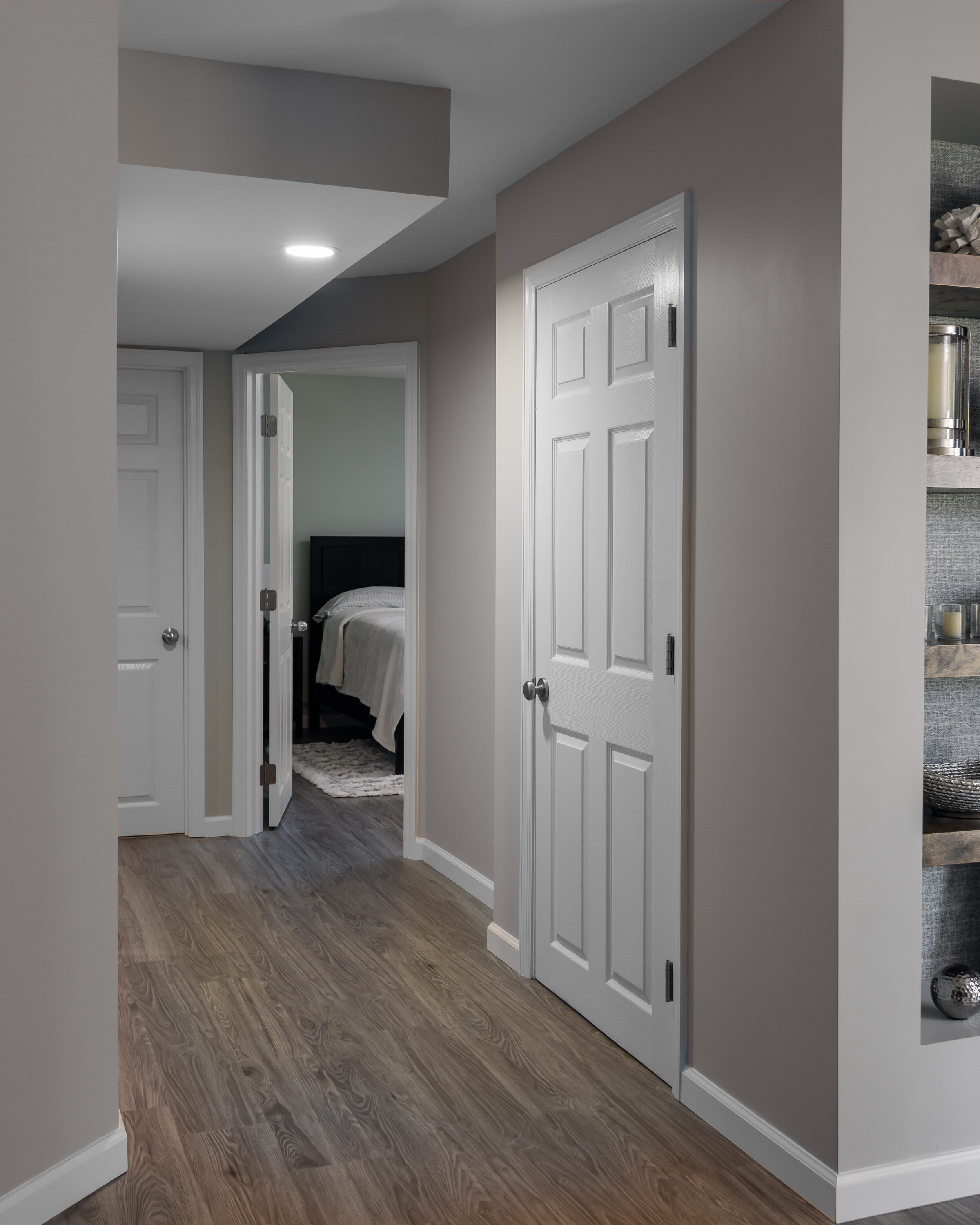
Our clients wanted to turn their completely unfinished basement into a family retreat and guest space


St. Louis, MO
Designer
Jennifer Chapman
Senior Designer
Photographer
Karen Palmer
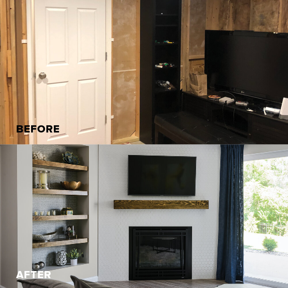
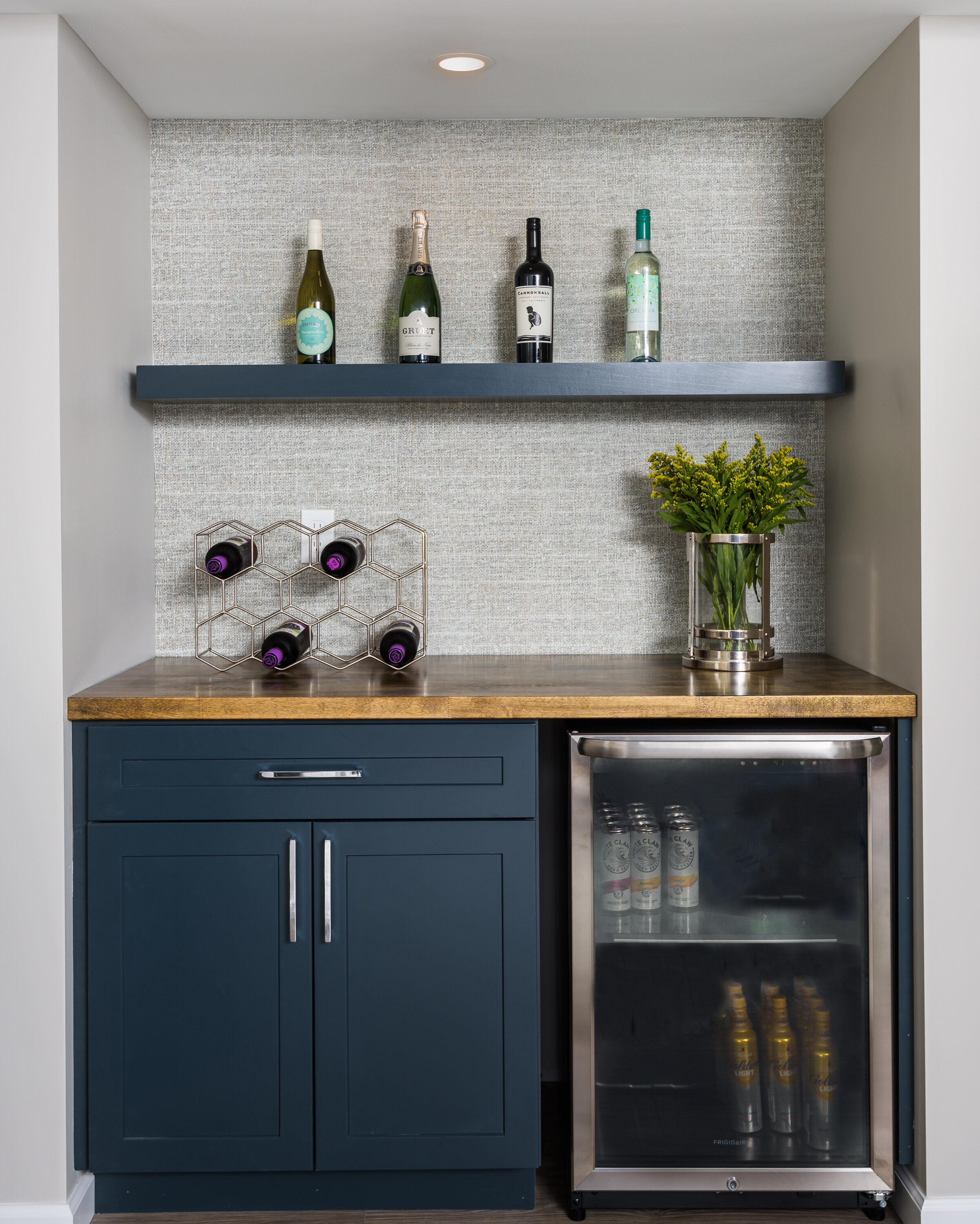
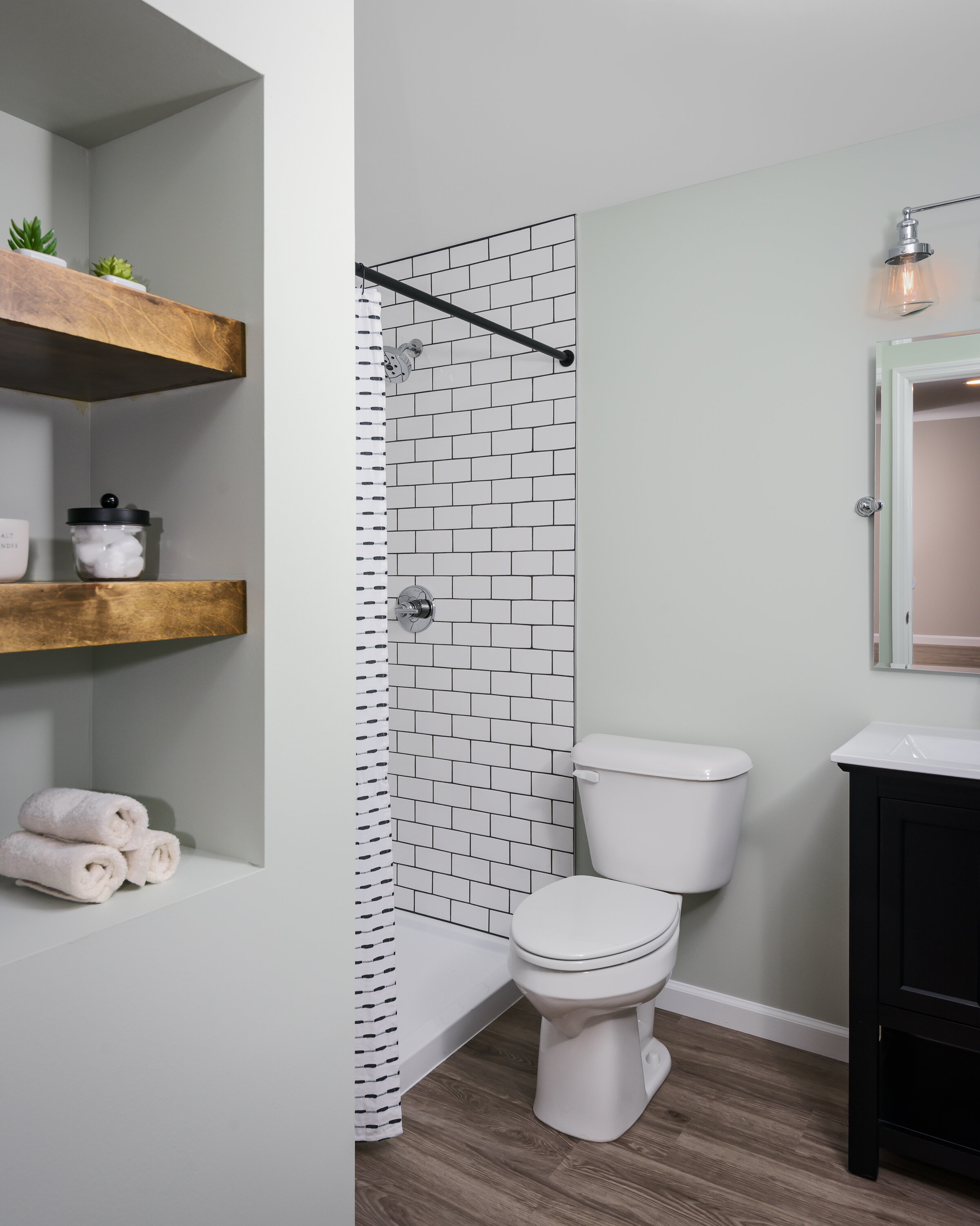
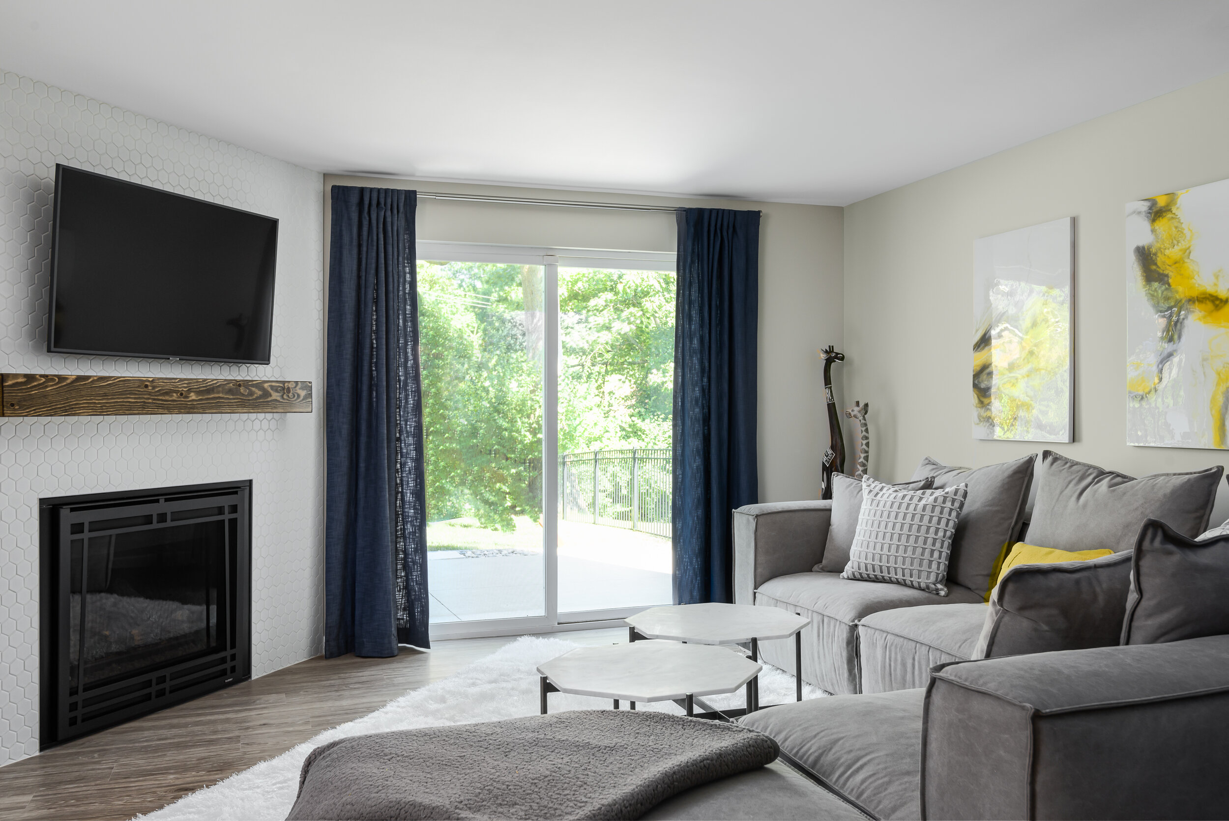
Our clients wanted to turn their completely unfinished basement into a family retreat and guest space. We really didn't want it to feel like a basement so we kept the luxury vinyl plank flooring and the wall color light and warm. We used a bright white hexagon tile for the gas fireplace surround and created a niche with floating wood shelves next to it. The textured wallpaper behind the shelving and at the bar provide a really nice design element in the space by creating depth and texture. In the bathroom, we played with contrast by using a white subway tile and charcoal grout. Overall, the space feels warm and inviting!
Millfield Primary Bath
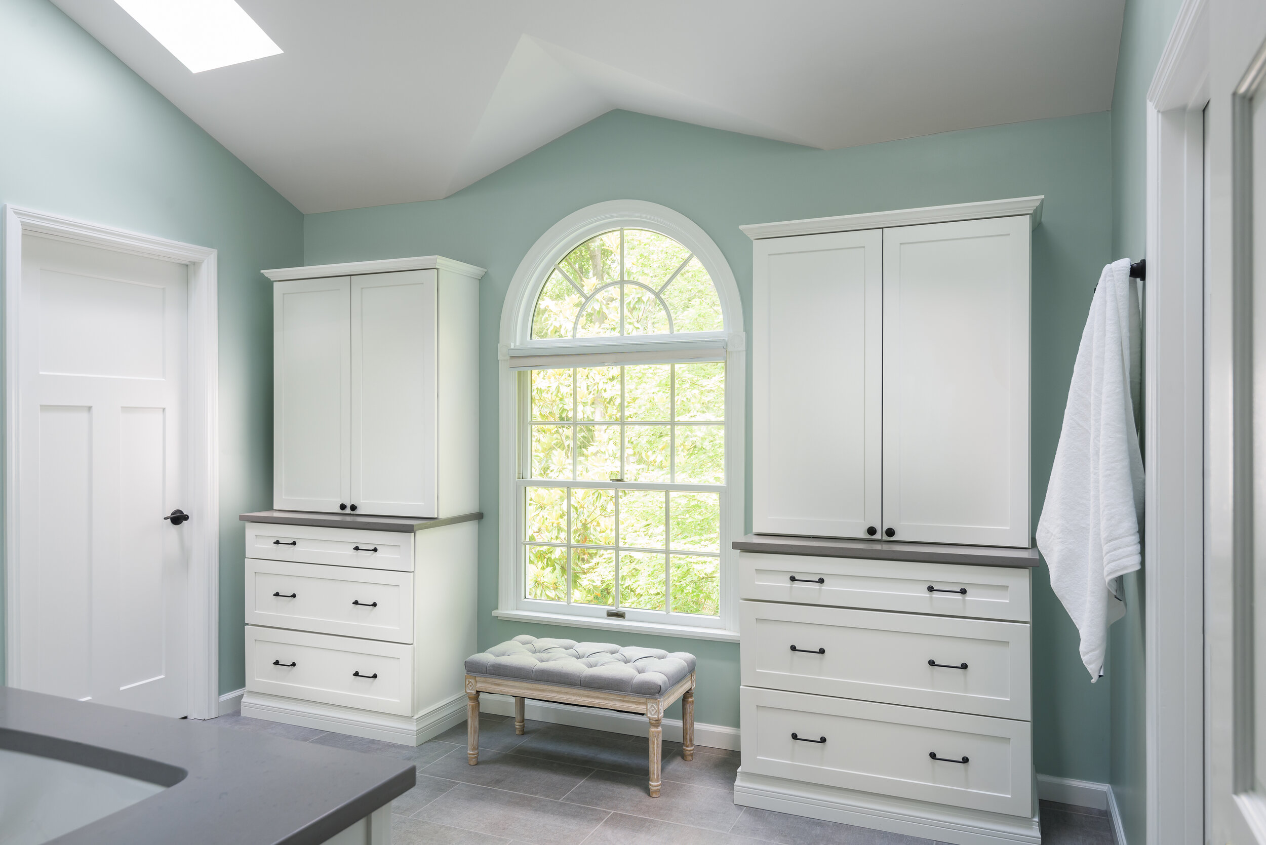
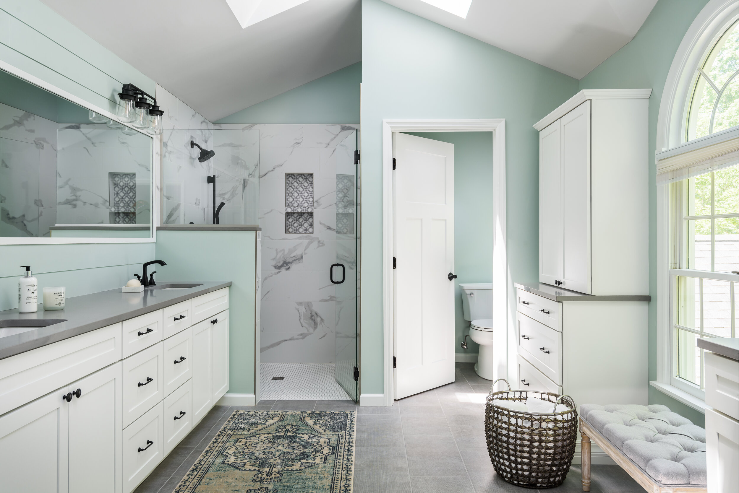
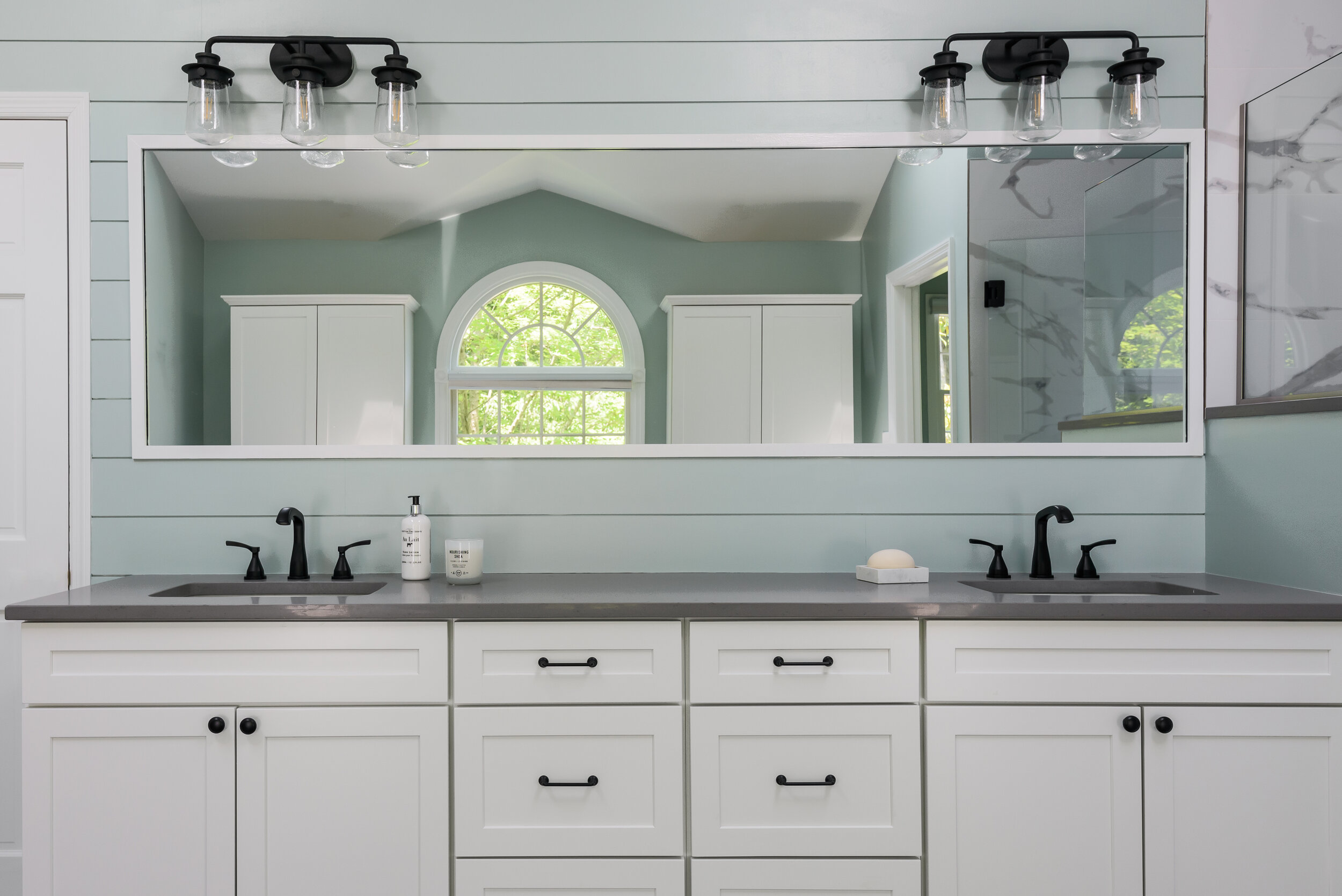
We took this master bathroom from dark and heavy to light and bright!
Town and Country, MO
Designer
Jennifer Chapman
Senior Designer
Photographer
Karen Palmer
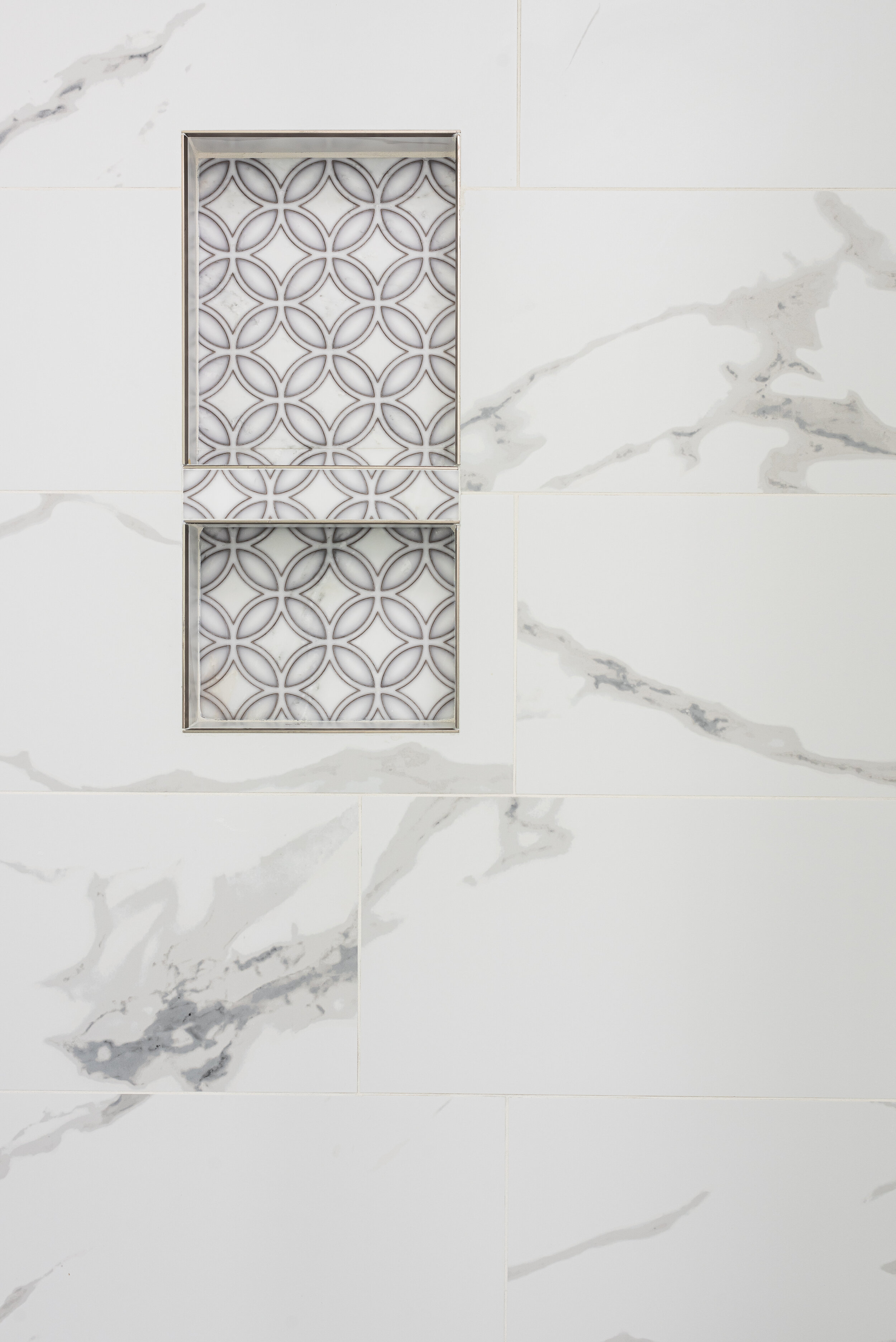
We took this primary bathroom from dark and heavy to light and bright! We started by slightly changing the layout- the water closet and the shower created a strange "V" shape where they intersected. We straightened this line out in order to create more space for each. We chose white cabinets, a large scale white porcelain tile with bold marble-like veining, and gray quartz countertops. We chose a 12 x 24 gray porcelain floor tile with a linen texture for the main flooring and complemented it with white penny tile with gray grout for the zero entry shower floor. We used matte black plumbing fixtures for contrast. The homeowner loved the idea of shiplap so we used it on the vanity wall to add some character. We painted the walls a beautiful aqua to create the feeling of a spa retreat!
“We loved working with Jennifer from LU Design Build to design our master bath! Our finished product turned out amazing. Having a team of experienced people made the whole process so much easier!”
Sunny Wind
The kitchen in this 34 year old home was in desperate need of an update! It was closed off from the rest of the first floor and all of the fixtures and finishes were original to the house. Our first goal was to open up the kitchen to the great room by removing the wall separating the two.
Chesterfield, MO
Designer
Jennifer Chapman
Photographer
Karen Palmer
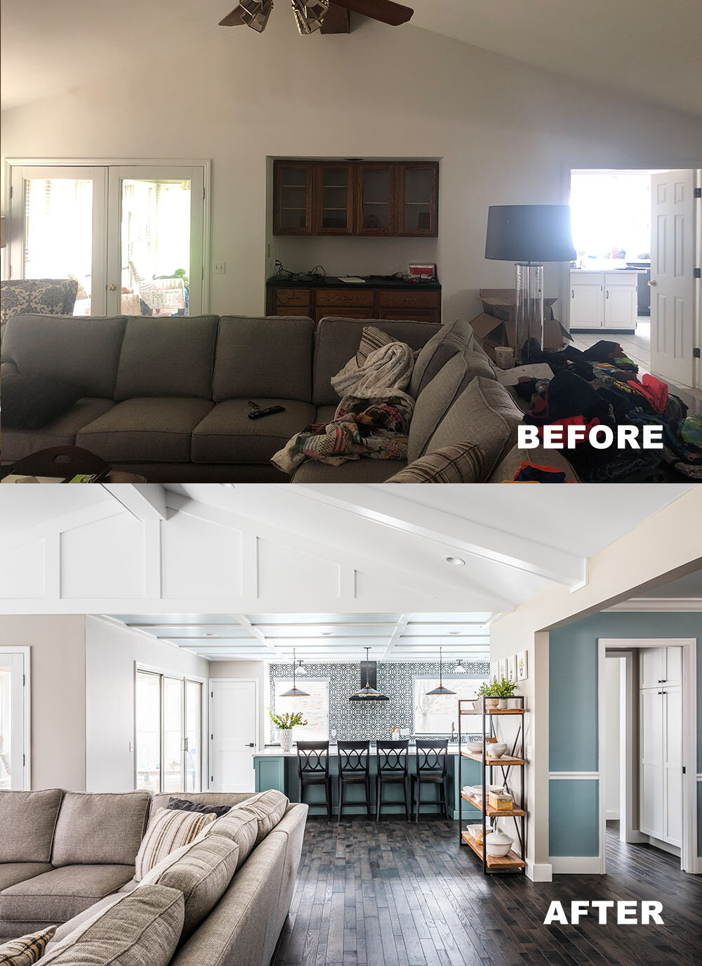
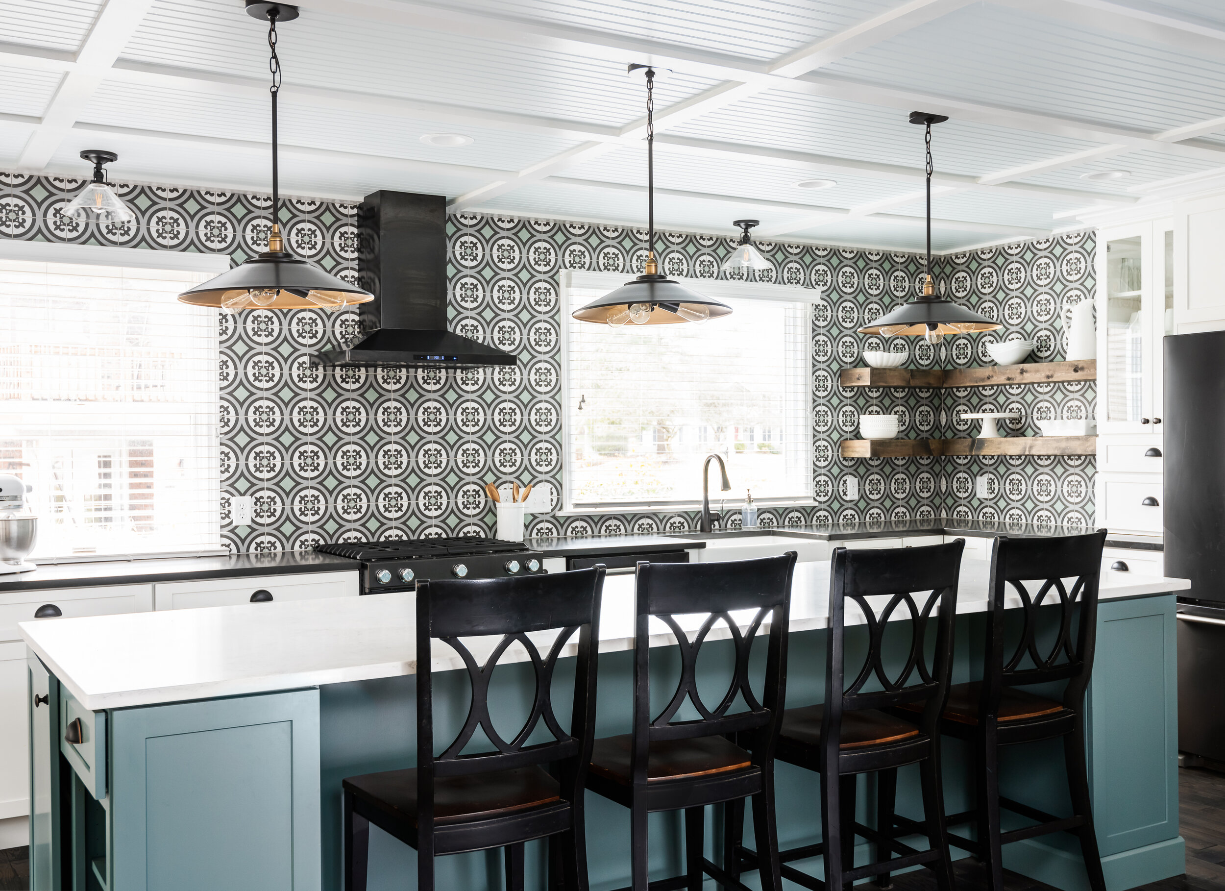
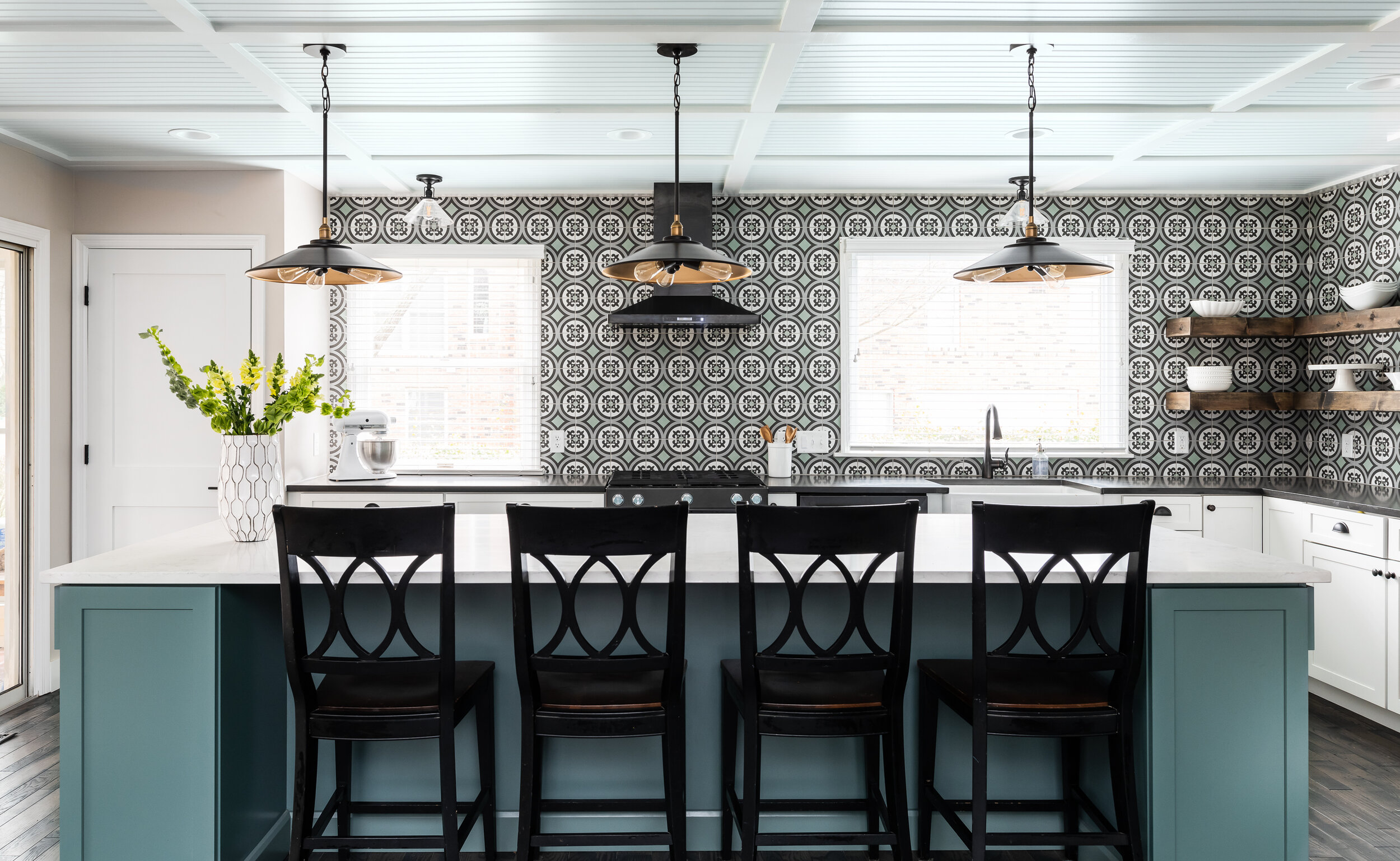
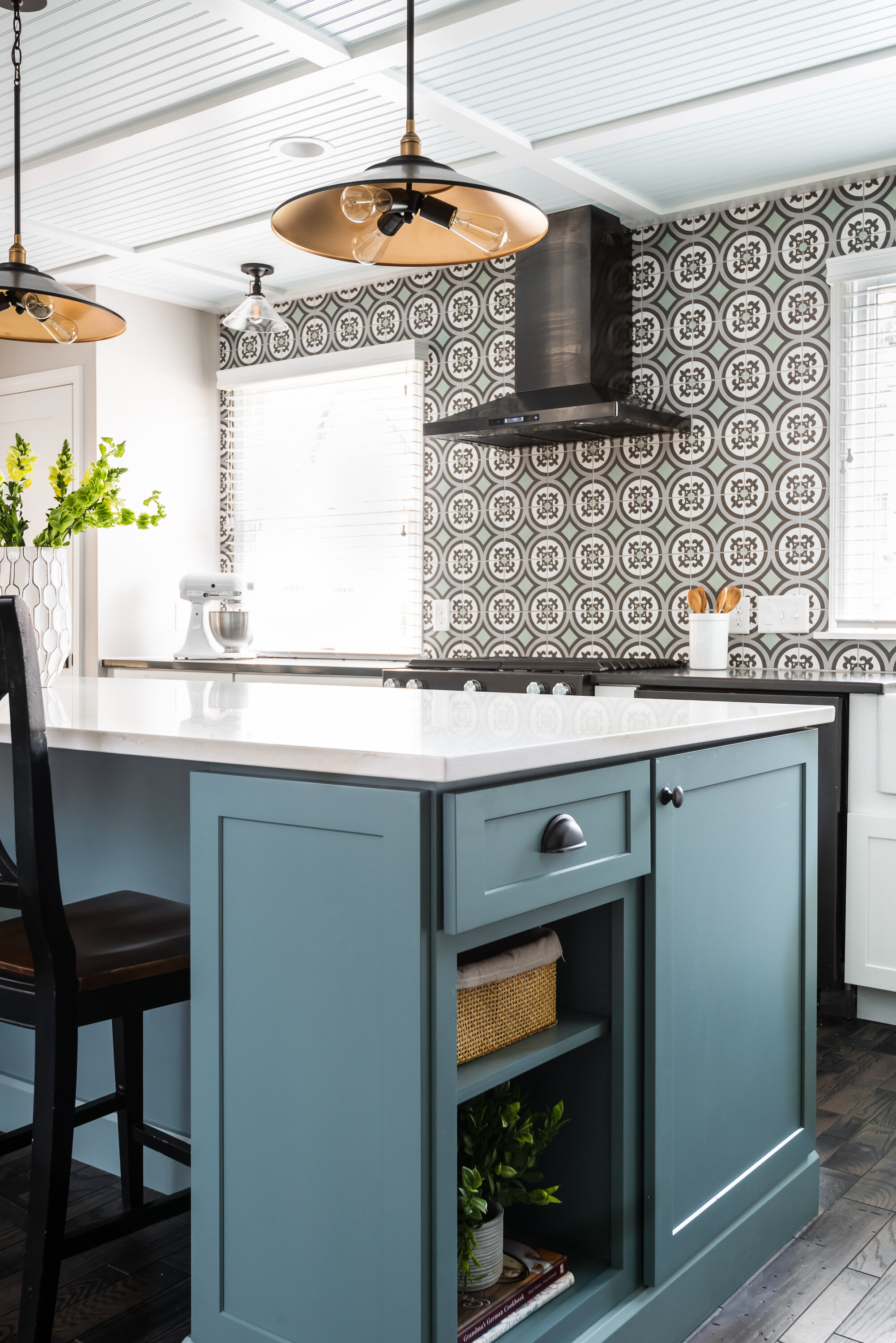
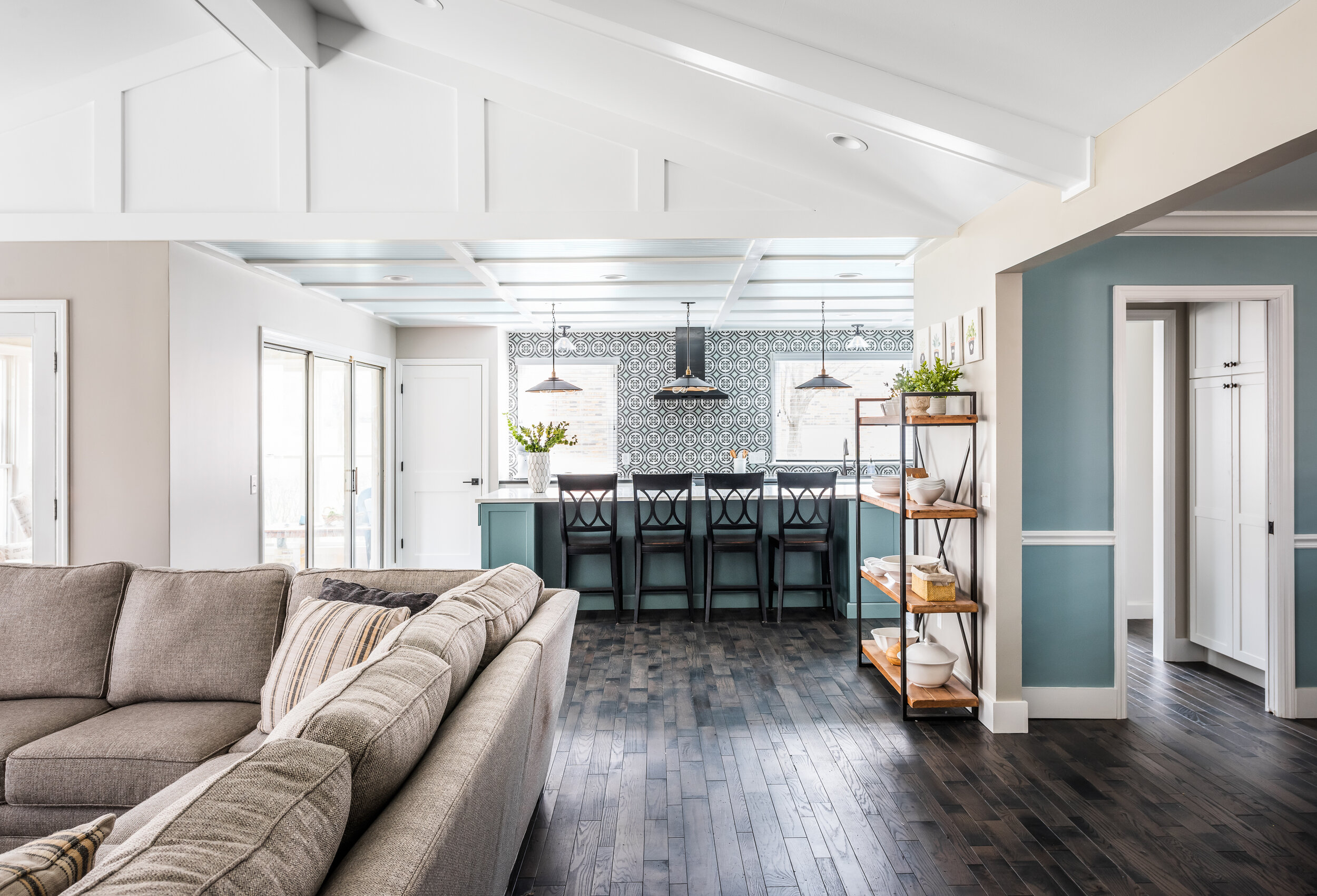
The kitchen in this 34 year old home was in desperate need of an update! It was closed off from the rest of the first floor and all of the fixtures and finishes were original to the house. Our first goal was to open up the kitchen to the great room by removing the wall separating the two. The client also wanted to make some big design statements by getting creative with the ceilings and choosing bold colors and patterns.
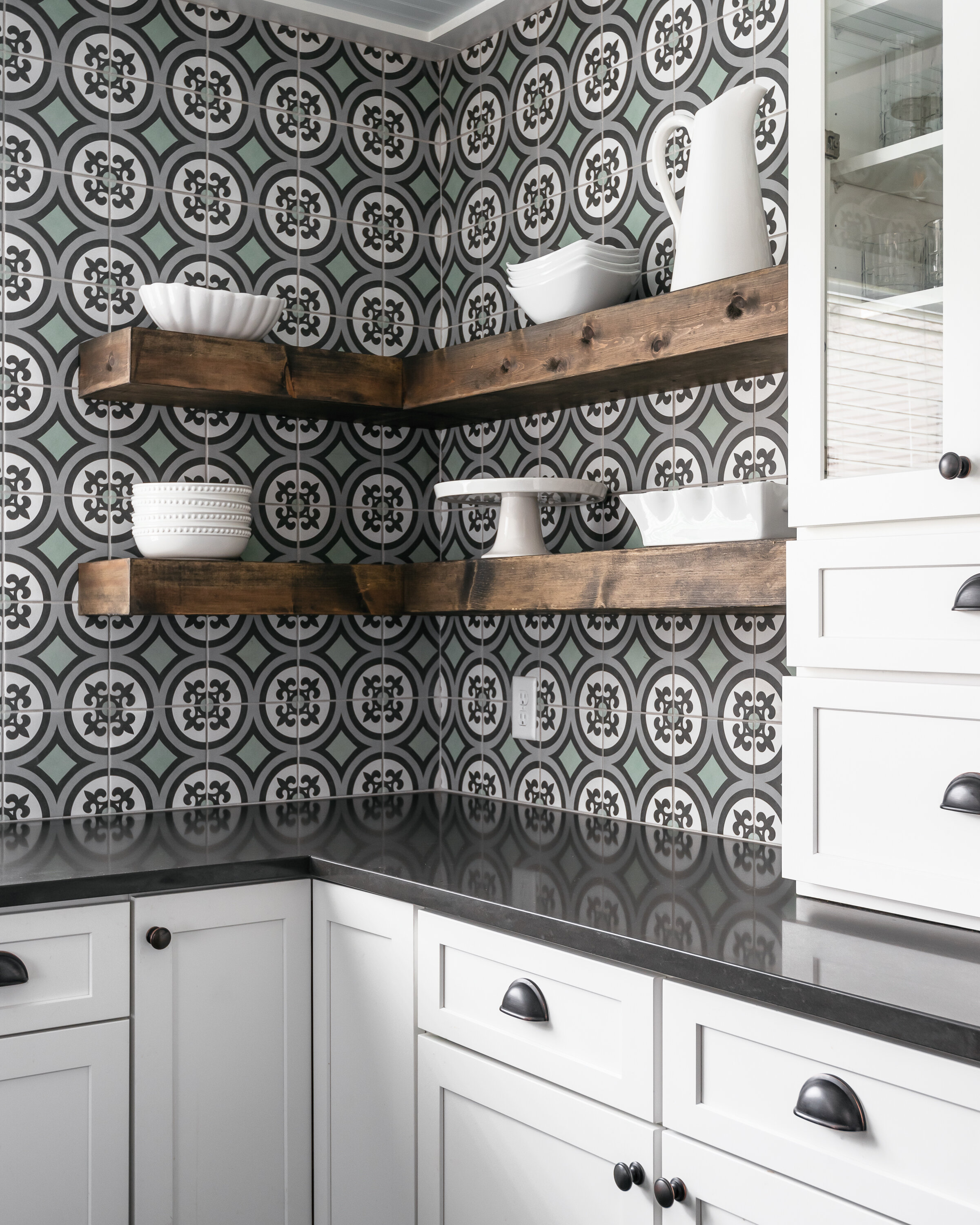
We were really inspired by the coastal cottage style when designing the ceiling and making finish selections. This kitchen is all about that tile! We instantly fell in love with it. It was the perfect match to the turquoise island and the quartz countertops. The ceiling in the kitchen is 8' which means we couldn't do an actual coffered ceiling so we created the illusion of a coffered ceiling by creating a grid out of flat stock and doing bead board in between. We painted the beadboard a really soft robin's egg blue, much like the ceilings on a traditional southern porch.
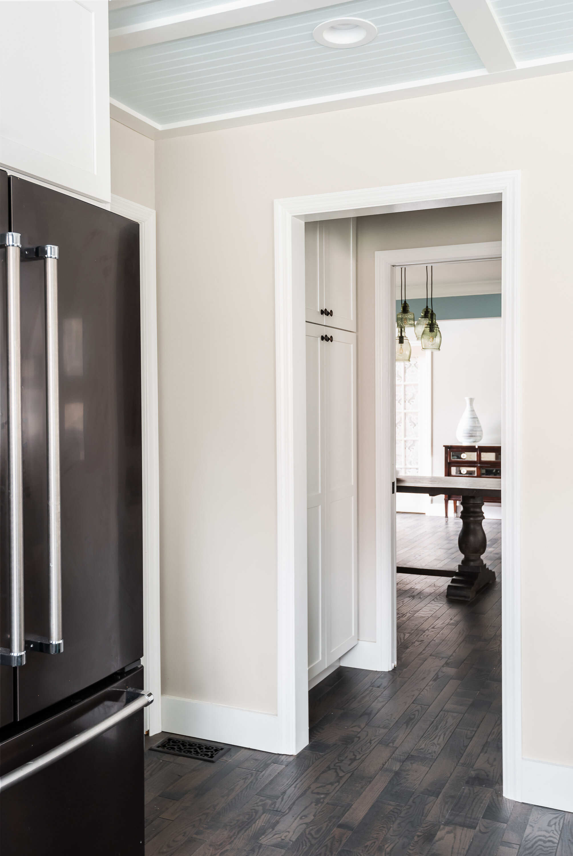
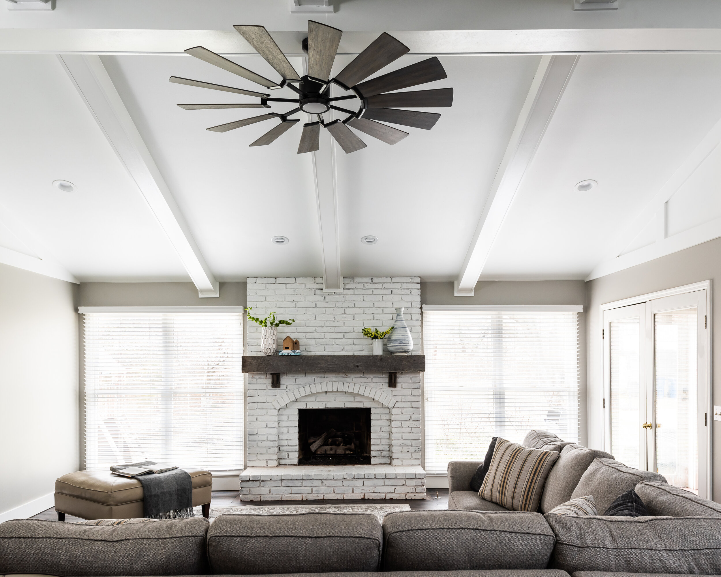
In the family room, we added six beams coming off the center beam and painted everything white. We filled in what would usually be dead wall space on the peak walls with a board and batten treatment. We created a small butler style pantry by making the dining room slightly smaller and creating a pass through between the kitchen and dining room with cabinetry. Overall, the space feels larger and way more exciting!
Oakwood
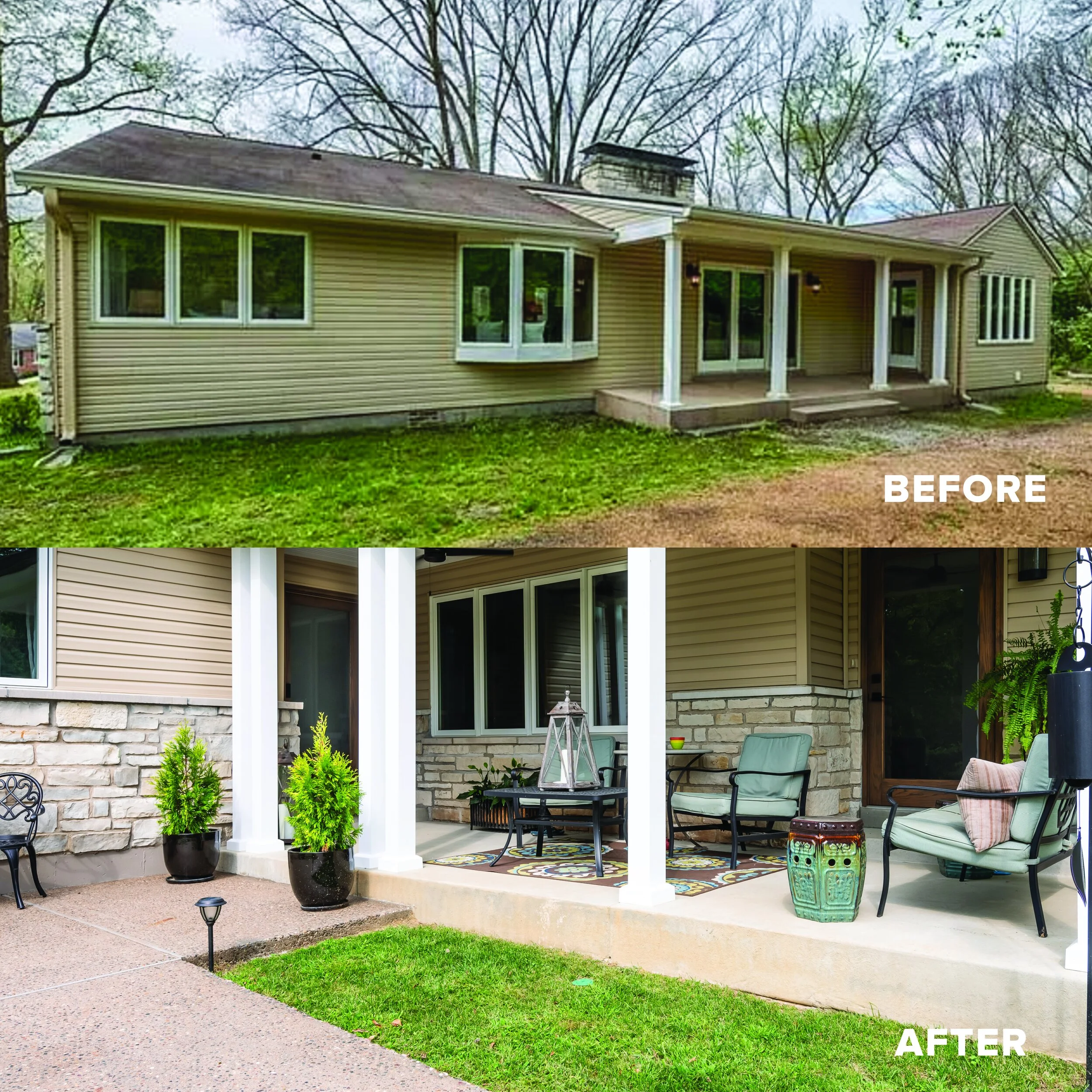
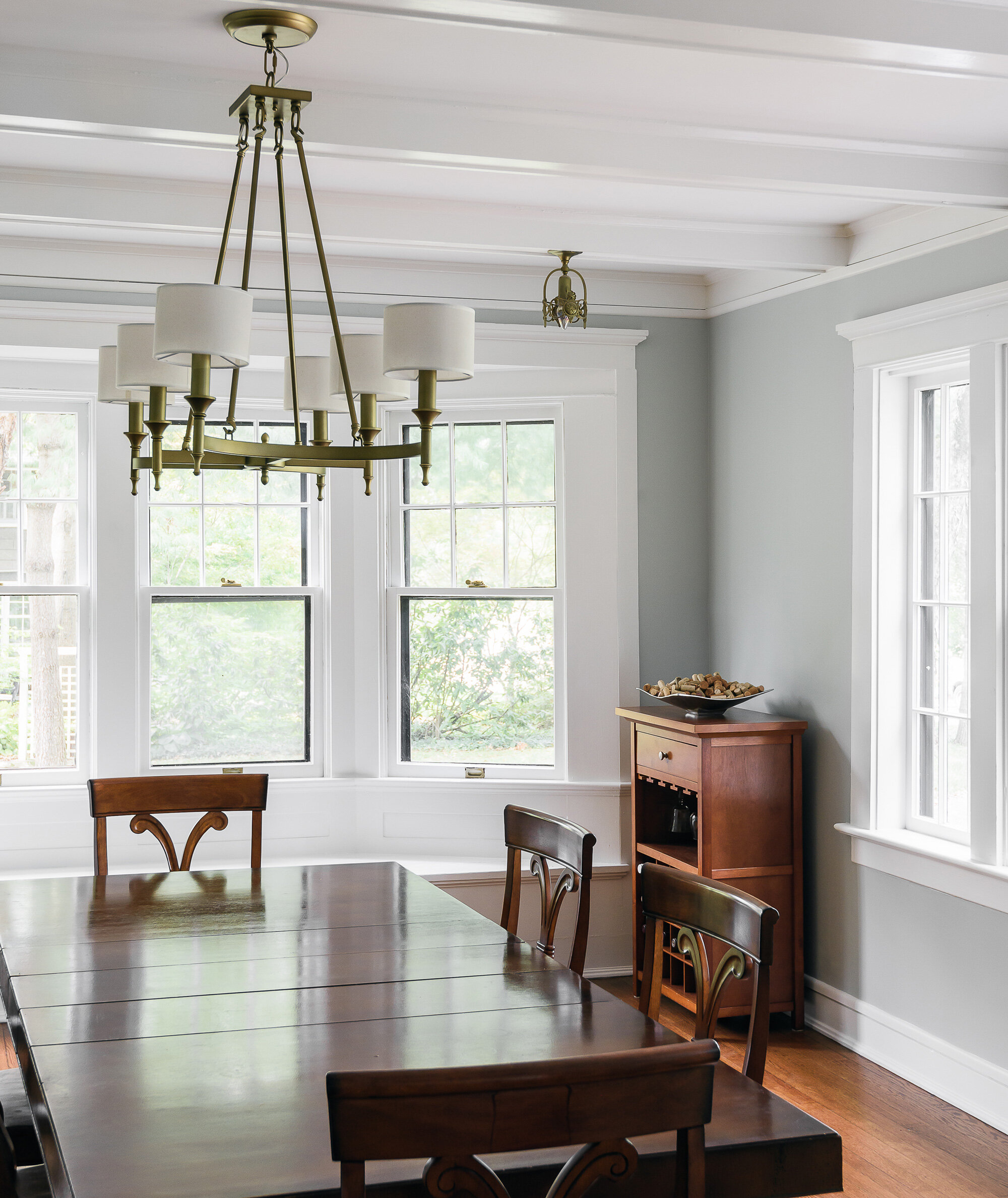
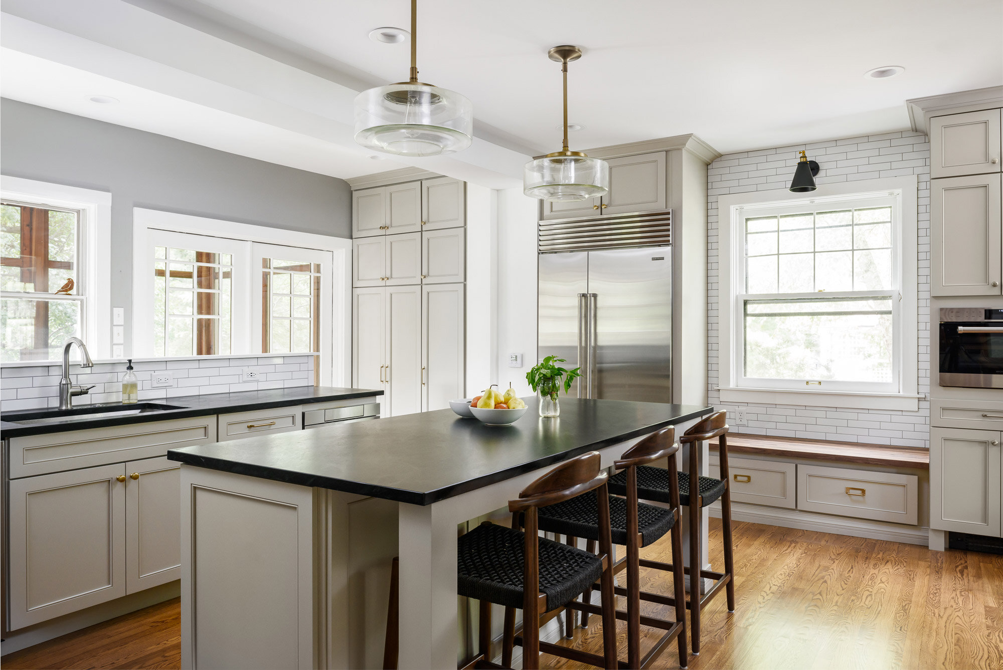
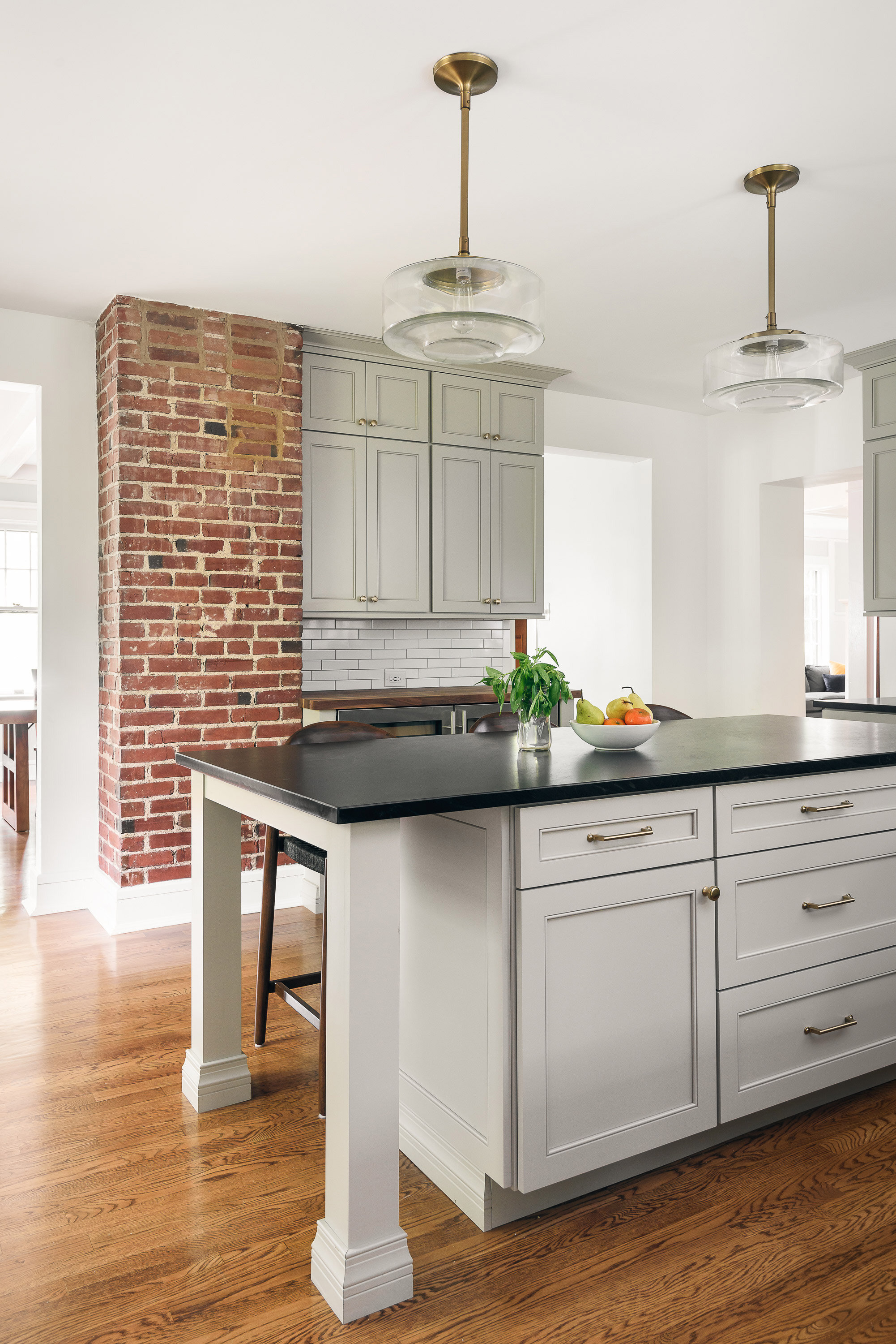
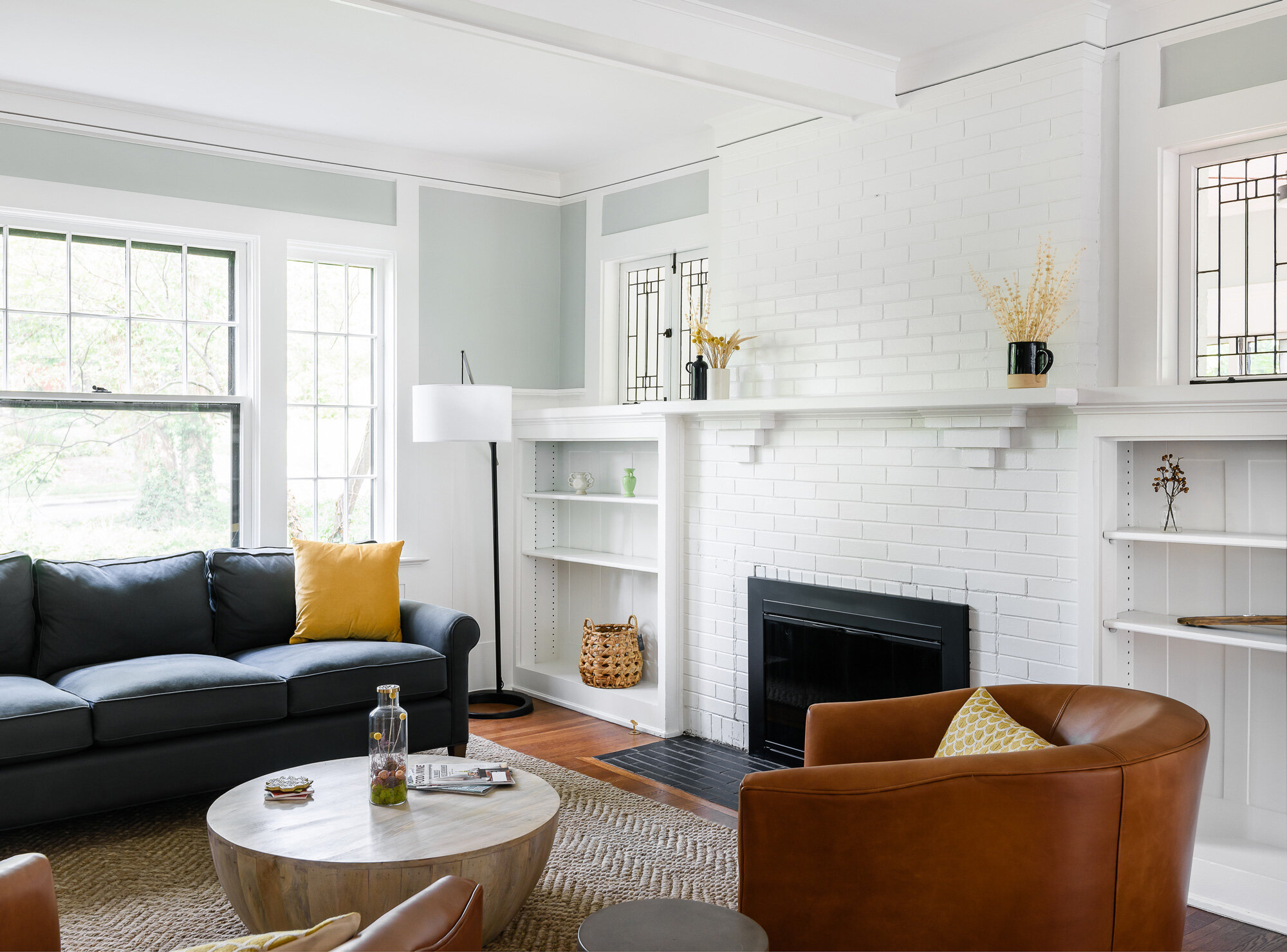
A sunroom with baseboard heaters, a bright kitchen with white subway tiles, and a living room with large fireplace.


Webster Groves, MO
Designer
Rochelle McAvin
Photographer
Karen Palmer
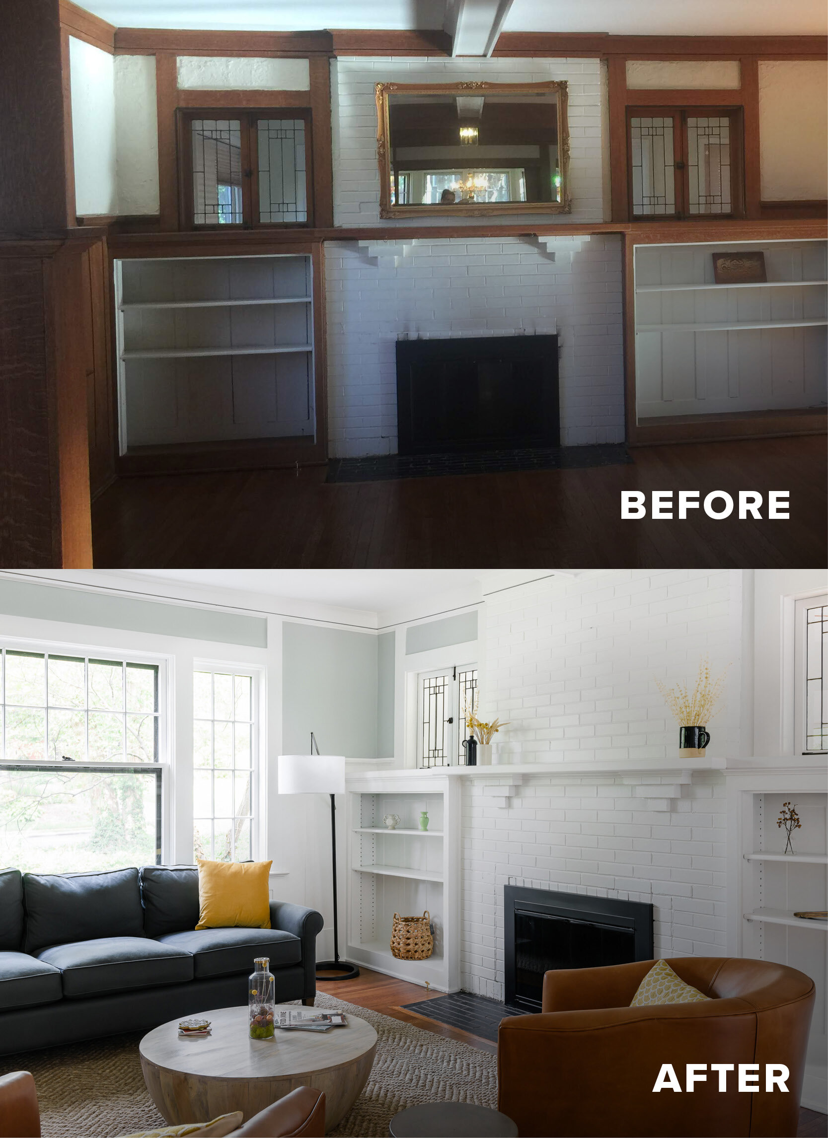
Our clients bought a beautiful century home in Historical Webster Groves, but it was in need of a modern day facelift. We took down dated walls in the kitchen and let the light in.
This family loves to cook and the old kitchen layout was closed in and choppy. The new layout is stocked with storage, professional appliances and plenty of sunlit workspace.
In the family room, the wood wainscotting was original and dark. We lightened up the room by painting everything a clean, clear white. The hardwood floors warm up the room and now it feels welcoming, bright and inviting.
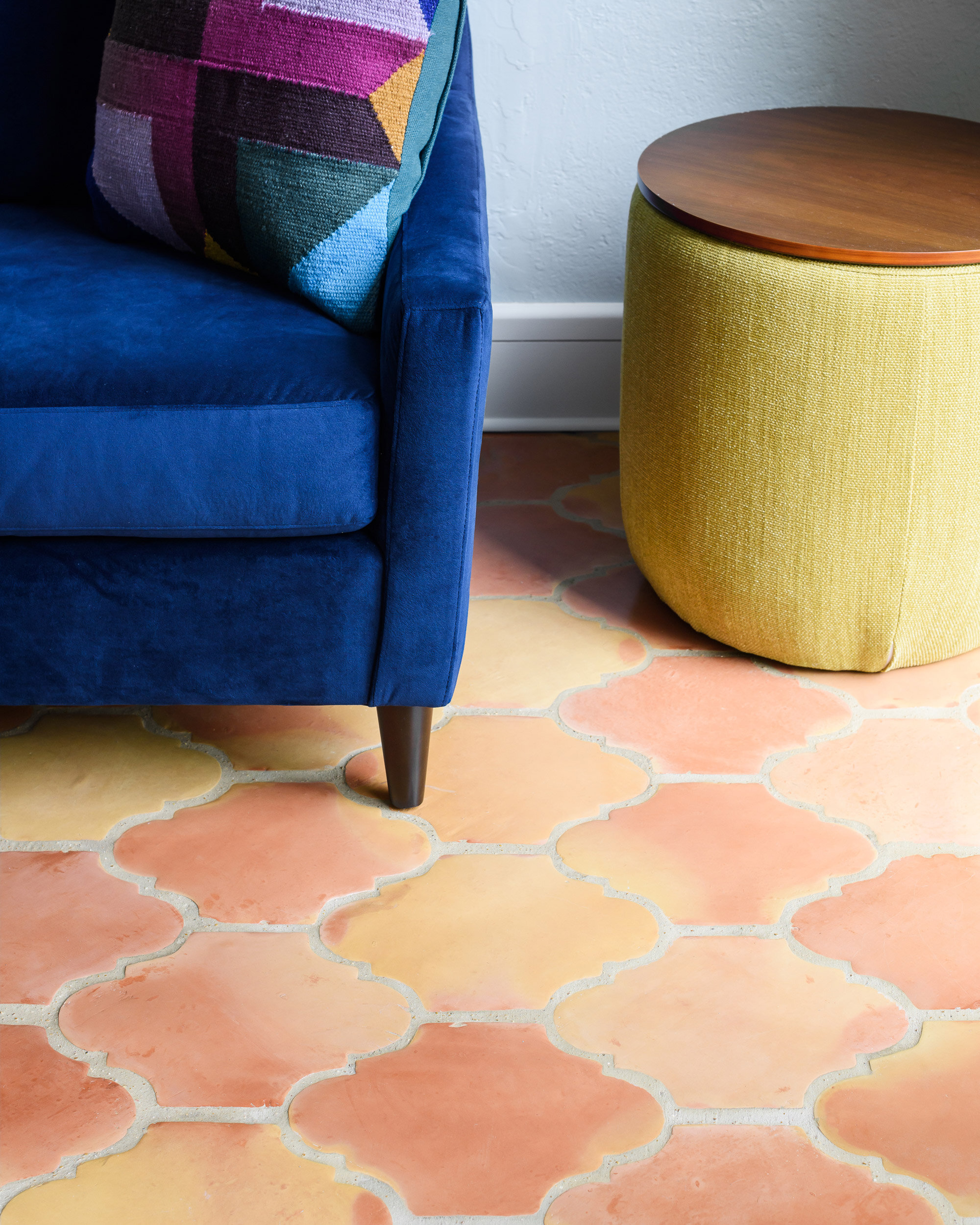
Our last stop was the sunroom. It had baseboard heaters, old blue carpet and did not feel cozy and inviting! We replaced the carpet with spanish clay tile that brings back the character of the old home - but includes a modern update - in floor heat.
We love how it turned out!
This project was recently featured in Ladue News. Check out the details here.
Lalo Salon
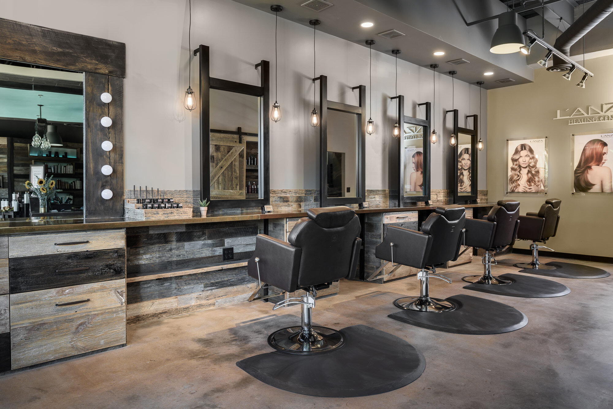
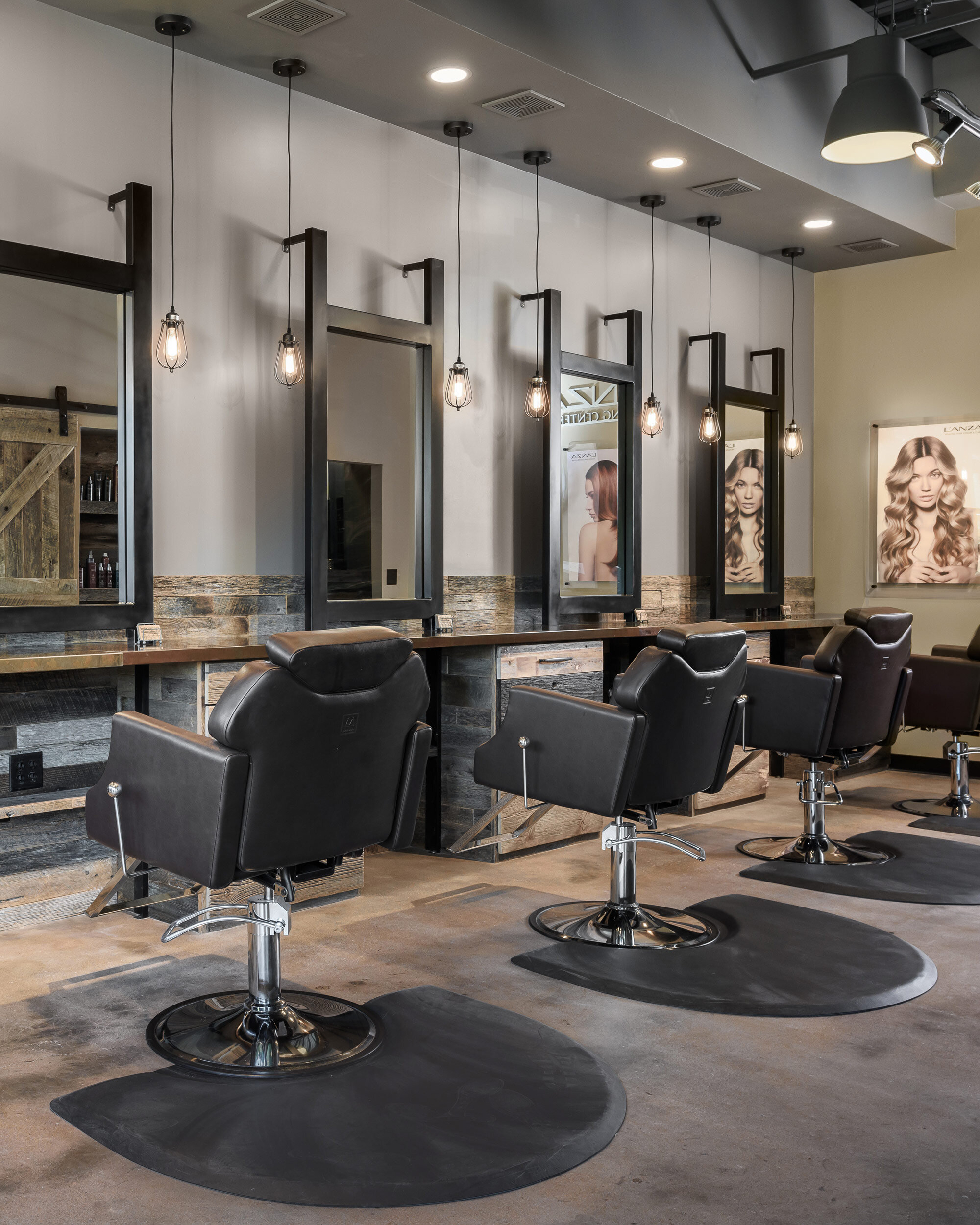
In the last four years, this salon has successfully grown to a point where they were busting at the seams. They needed to expand the space to accommodate more stylists and clients a well as a more functional makeup station.
Chesterfield, MO
Designer
Jennifer Chapman
Photographer
Karen Palmer
In the last four years, this salon has successfully grown to a point where they were busting at the seams. They needed to expand the space to accommodate more stylists and clients a well as a more functional makeup station.
When they opened the salon, they only built out a portion of the space to accommodate their needs at the time, with the hope that they would eventually need to build out the remaining portion. While this portion of the space was technically finished- it was basically an empty shell ready for design and finishes. We needed to connect these spaces with a common theme so that it felt like one cohesive space, but we also wanted to change up the design a bit to address some of the things that were just not working for them on the other side of the salon.
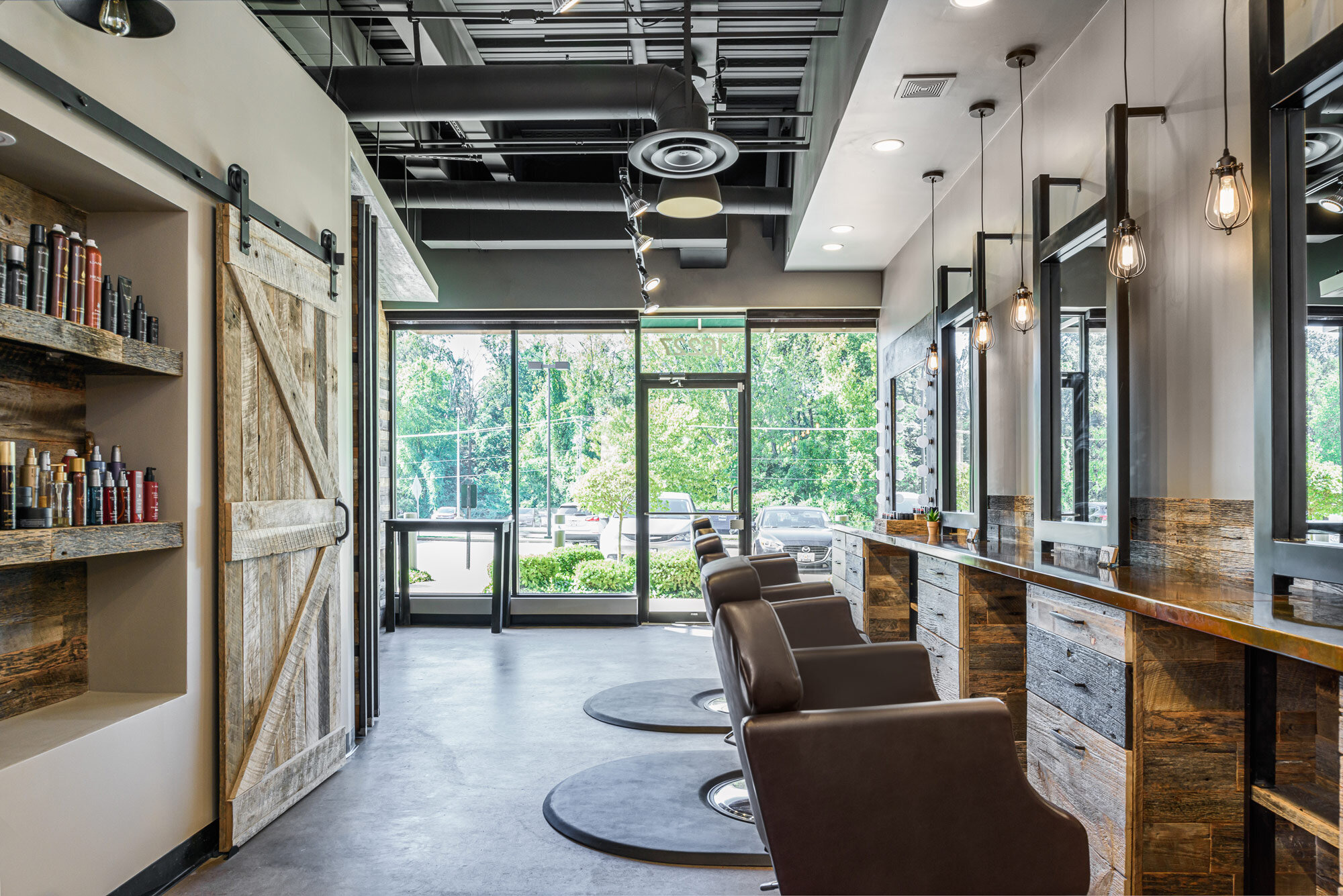
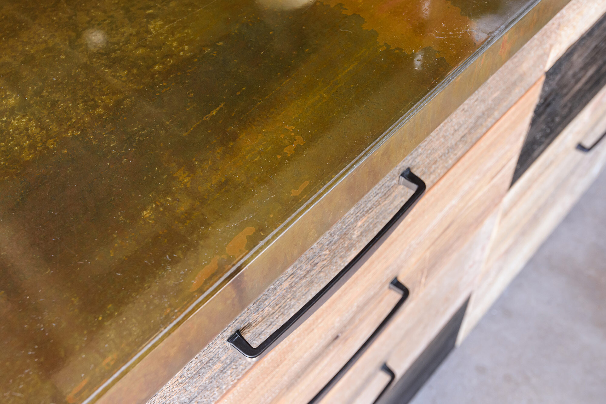
There were three main things that they wanted to improve on- the amount of counterspace, the amount of storage, and the quality of lighting. We wanted to use the same reclaimed wood they had on the other side so we worked with the original fabricator, Reclaim Renew, to create the cabinetry, wall cladding and even the metal countertops and metal frames for the mirrors.
The 28' long metal countertop is a showstopper, but it also makes the space feel much larger and it gives the stylists the counterspace they were looking for. The reclaimed wood cabinets provide more ample storage and each has a tilt-out to hold their styling tools. When designing the metal framed mirrors, we decided to hold them off the wall to create some dimension to this long, linear space. The metal legs seem to run right through the countertops to the floor, which helps to ground the dark metal frames.
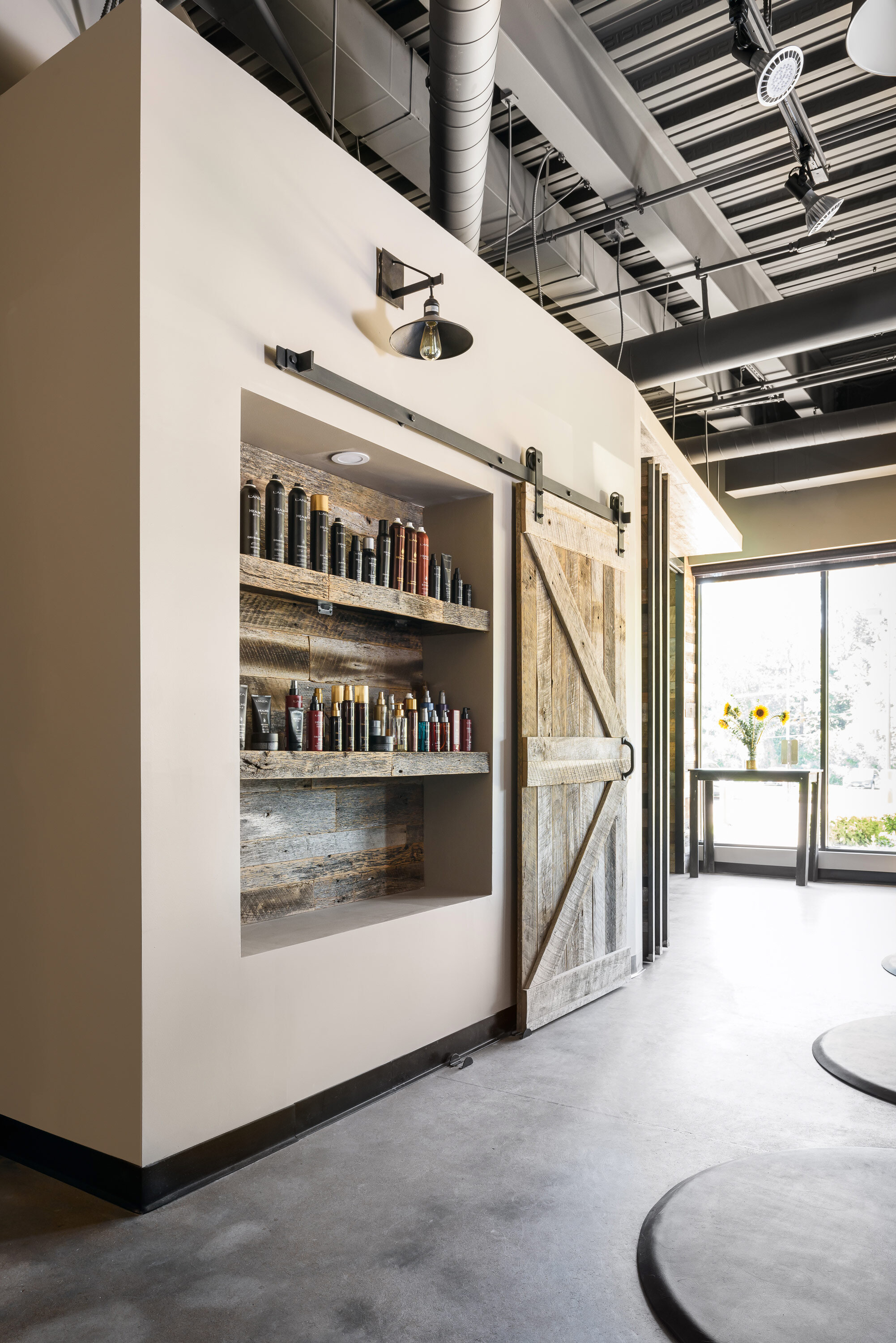
The small reclaimed wood shelves underneath the countertop provide clients with a place to plug in their phones and set their belongings. We added a custom framed wood make-up mirror with plenty of front facing lighting as well. We added both pendant lighting and recessed lighting at each station to provide them with adequate lighting. In addition, we added some additional track lighting down the main pathway. We created a recessed wall niche with matching reclaimed wood cladding to hold hair products. This keeps the countertops much less cluttered.
Overall, we achieved the rustic, industrial feel of the other side and were able to address the stylist's needs in a creative way. The space feels warm and inviting- just the space to pamper yourself!
Chattanooga Basement
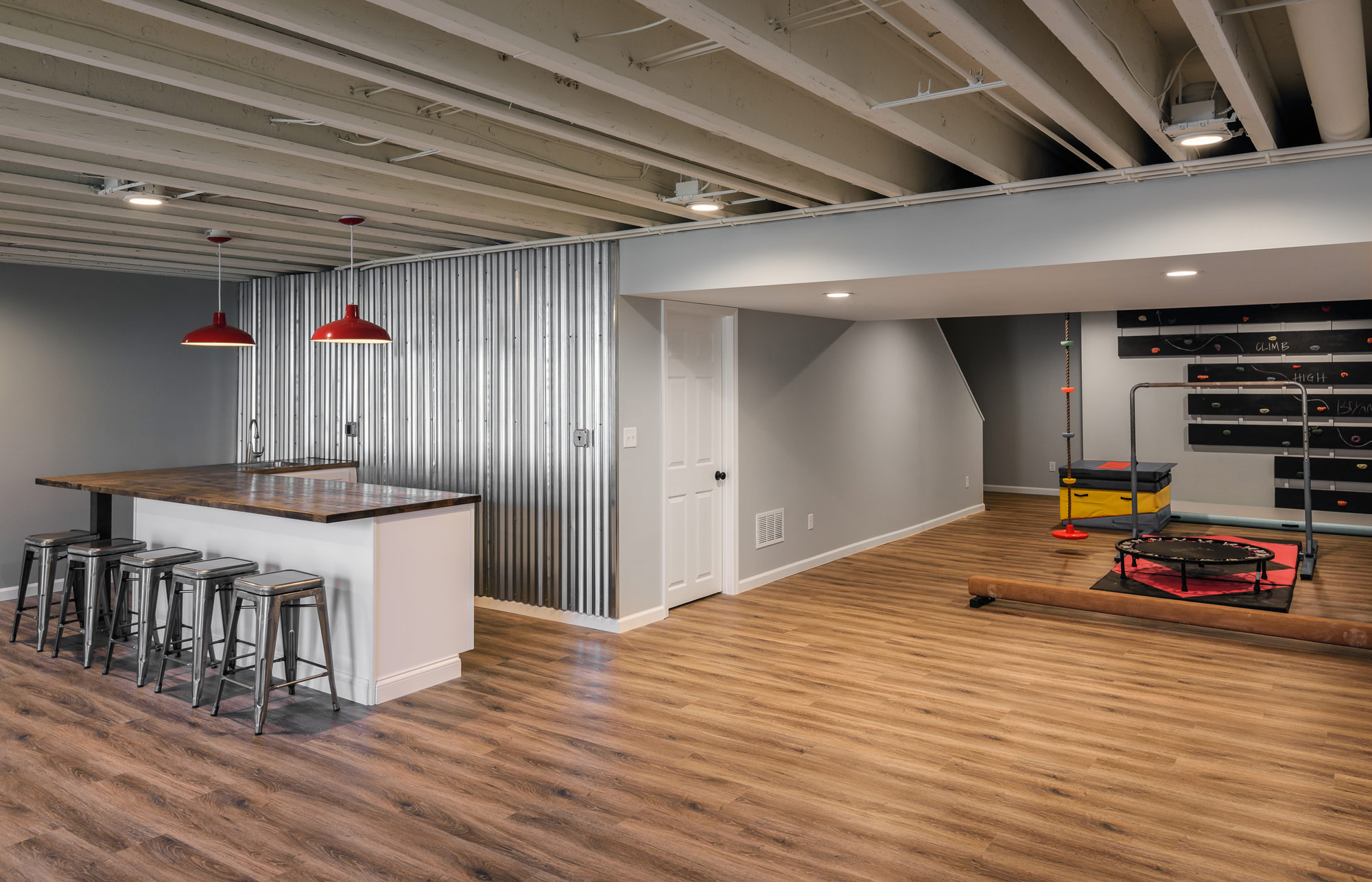
Our client's basement was ready to be finished. High ceilings and an expansive floor plan made it perfect for a fun entertaining space and built in gym for the kids.

Designers:
Rochelle McAvin
Photography:
Karen Palmer
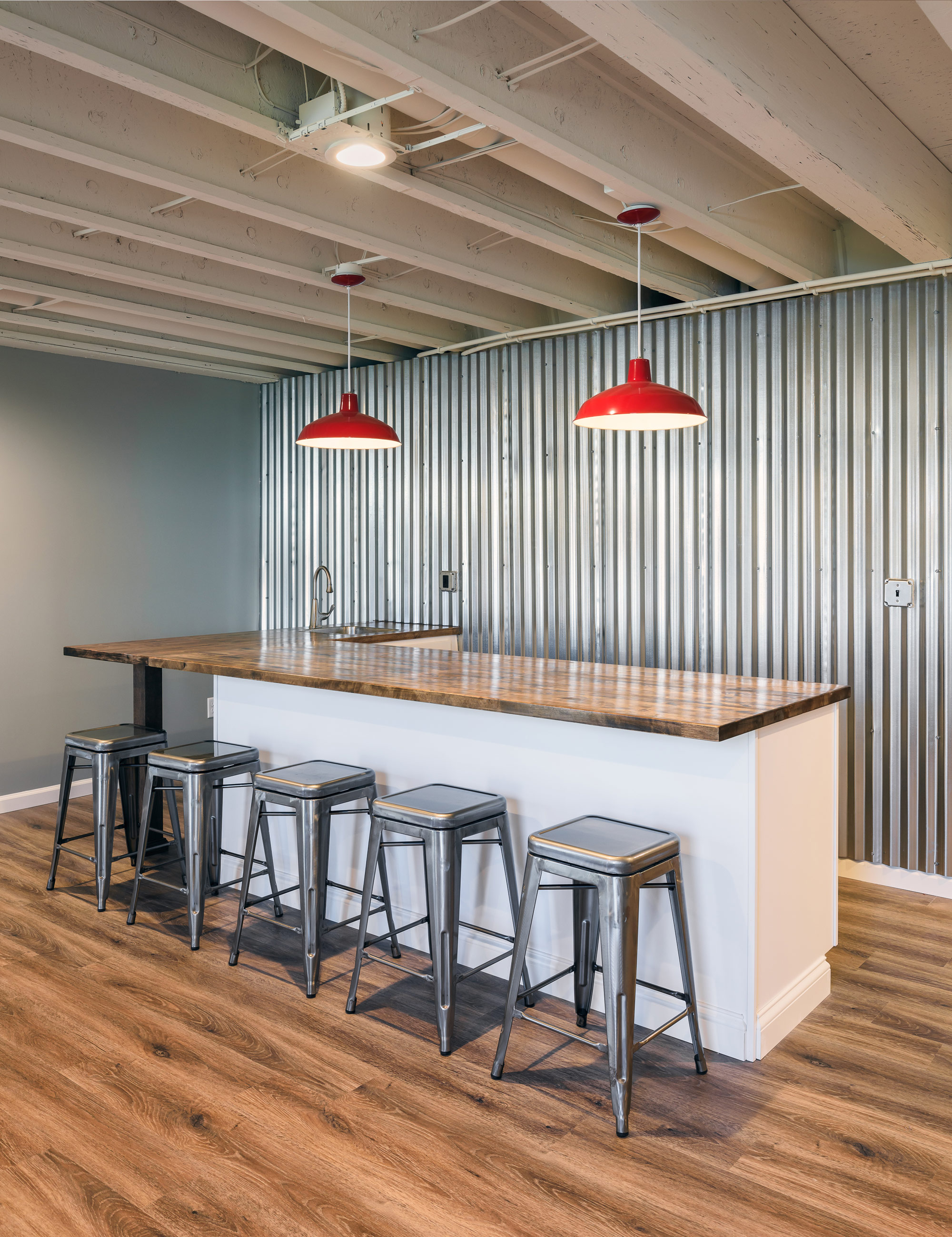
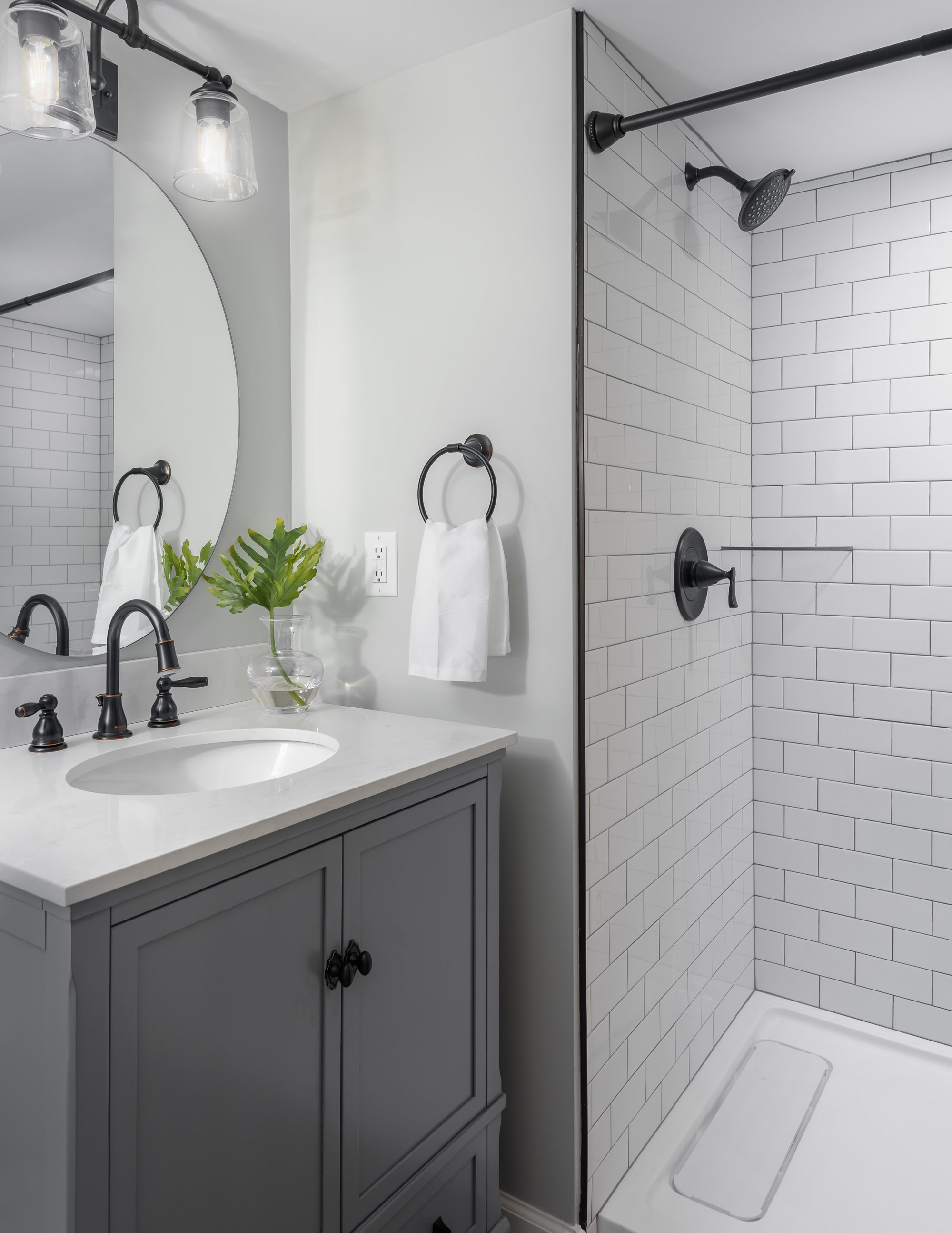
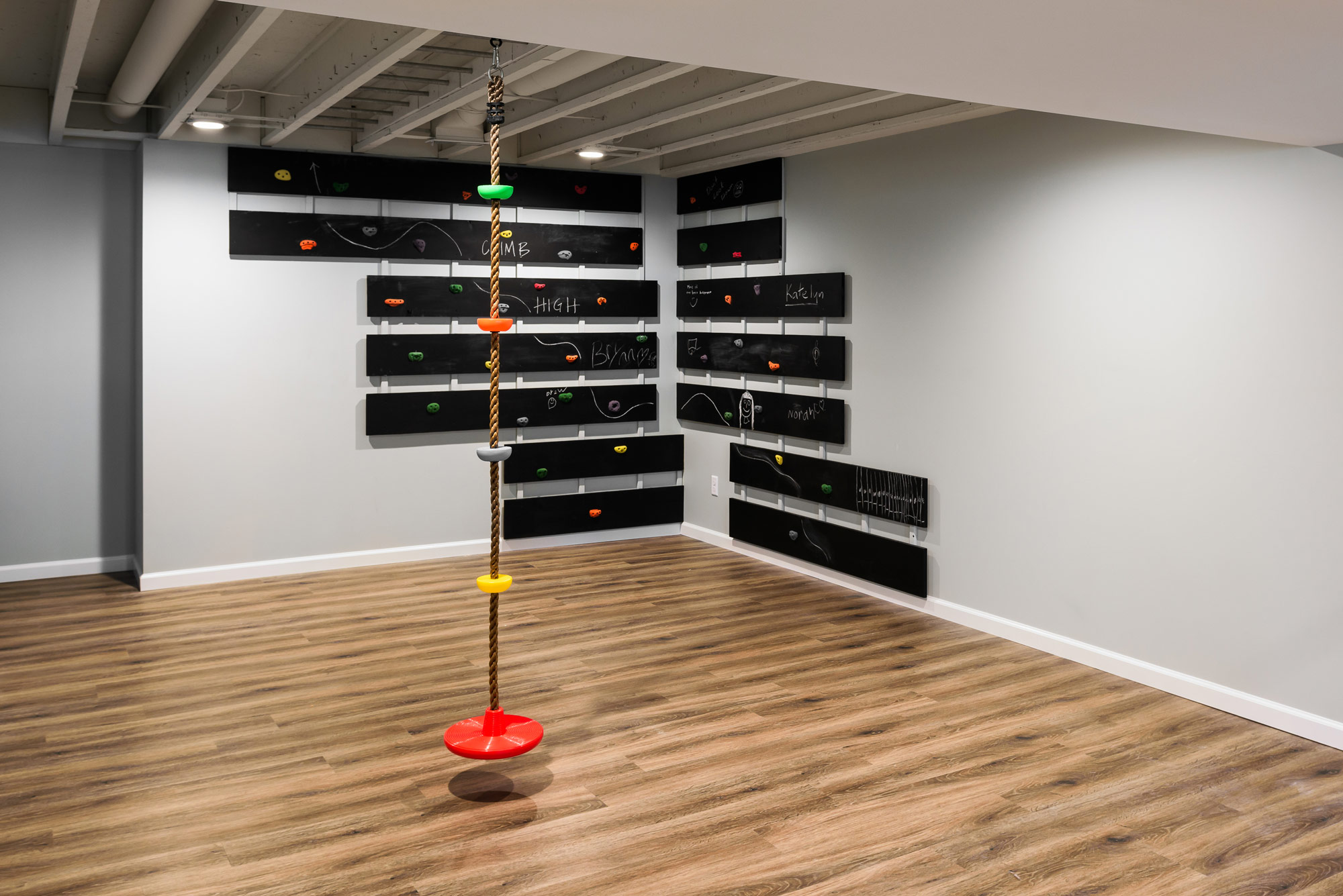
Our client's basement was ready to be finished. High ceilings and an expansive floor plan made it perfect for a fun entertaining space and built in gym for the kids.
We started by making sure there was enough room for their daughter's gymnastics and a place to run! An open ceiling allowed us to integrate built in monkey bars for practice and a climbing wall completed the cool kids gym.
A galvanized metal wall highlights the wet bar, housing a convenient, built in undercounter beverage center, a microwave, and plenty of room for parties.
What you don't see is the is the client's concealed archery range - perfect for practicing when the kids aren't downstairs!
Family and friends can stay in the new guest suite- coupled with a cozy sectional for movie nights.
The result is a bright and welcoming basement - ready to entertain!
Log Cabin Ct. Basement
Our client wanted a modern, but cozy space for the family that includes two teenagers and their friends to hang out.
Designers:
Rochelle McAvin
Photography:
Karen Palmer
Our client wanted a modern, but cozy space for the family that includes two teenagers and their friends to hang out. The basement had been used as storage for over 30 years. Previous homeowners had tried to update the dark basement, but when we met with our client - they wanted a full overhaul of the space!
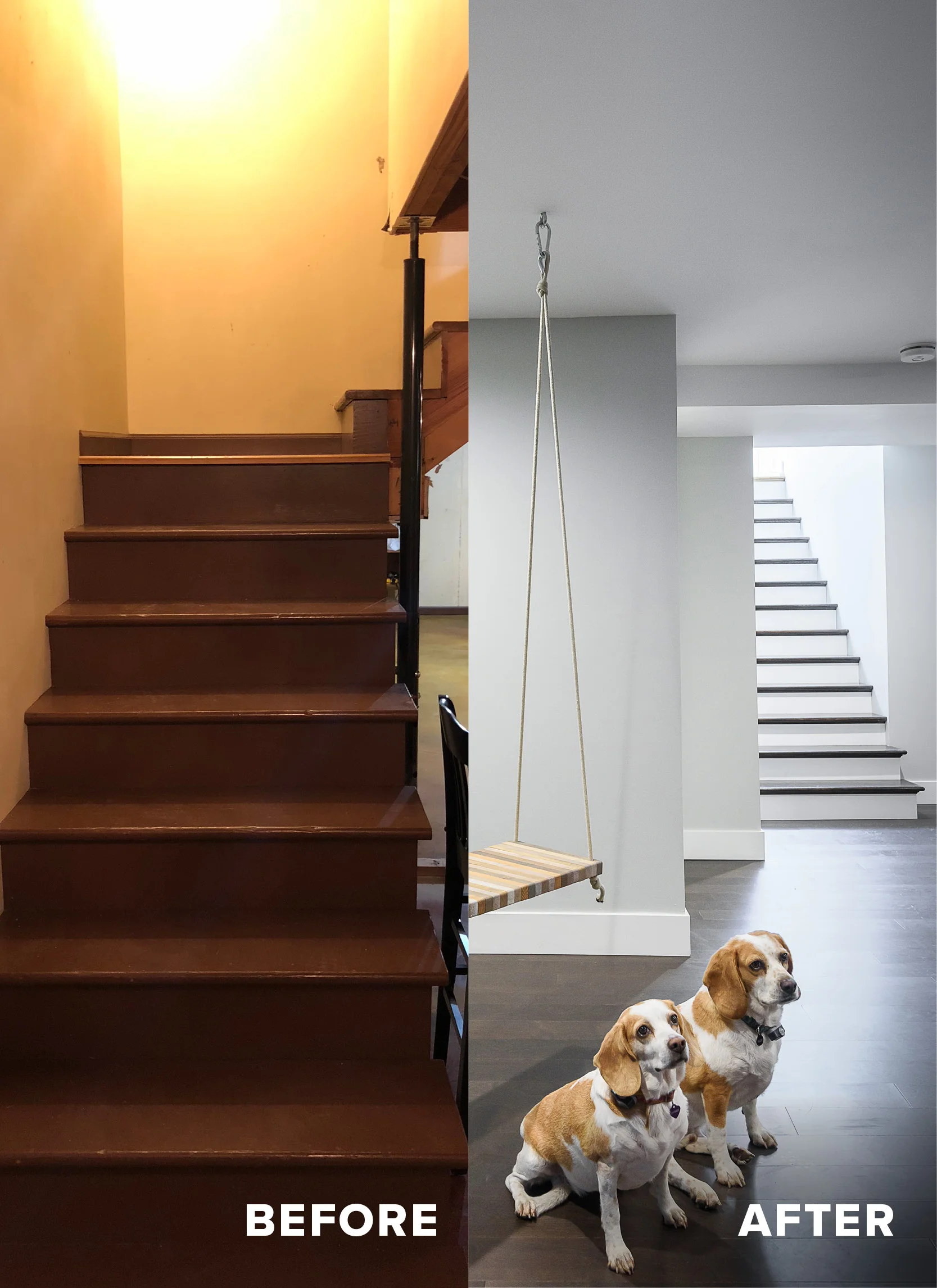
This party basement is equipped with 2 bars, a shuffleboard table, a ping pong table, integrated neon party ceiling lights, a "selfie swing", an adult beverage tasting room (complete with iron locking barn doors) and an 80" flat screen TV.
We started by relocating the stairs from the front of the house to the back, by the pool. Now, sunlight pours down the steps allowing natural light to flood the rooms and a convenient pool bathroom is right around the corner with storage for pool towels and wet suits.
Repeating wood by using it on the walls, ceilings, countertops, and posts keep the monochromatic basement warm and serene. Rich hardwood floors (yes, they can be installed in a basement!) run through out making it feel expansive and inviting for friends.
Fyler Airbnb
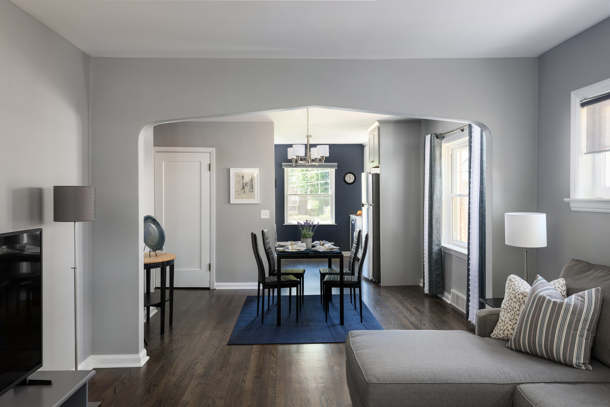
A new open kitchen, a light neutral paint color, and rich hardwood floors make the home feel light, open and airy.
St. Louis, MO
2018
DESIGNER:
Rochelle McAvin and Anna Entringer
PHOTOGRAPHER:
Karen Palmer Photography
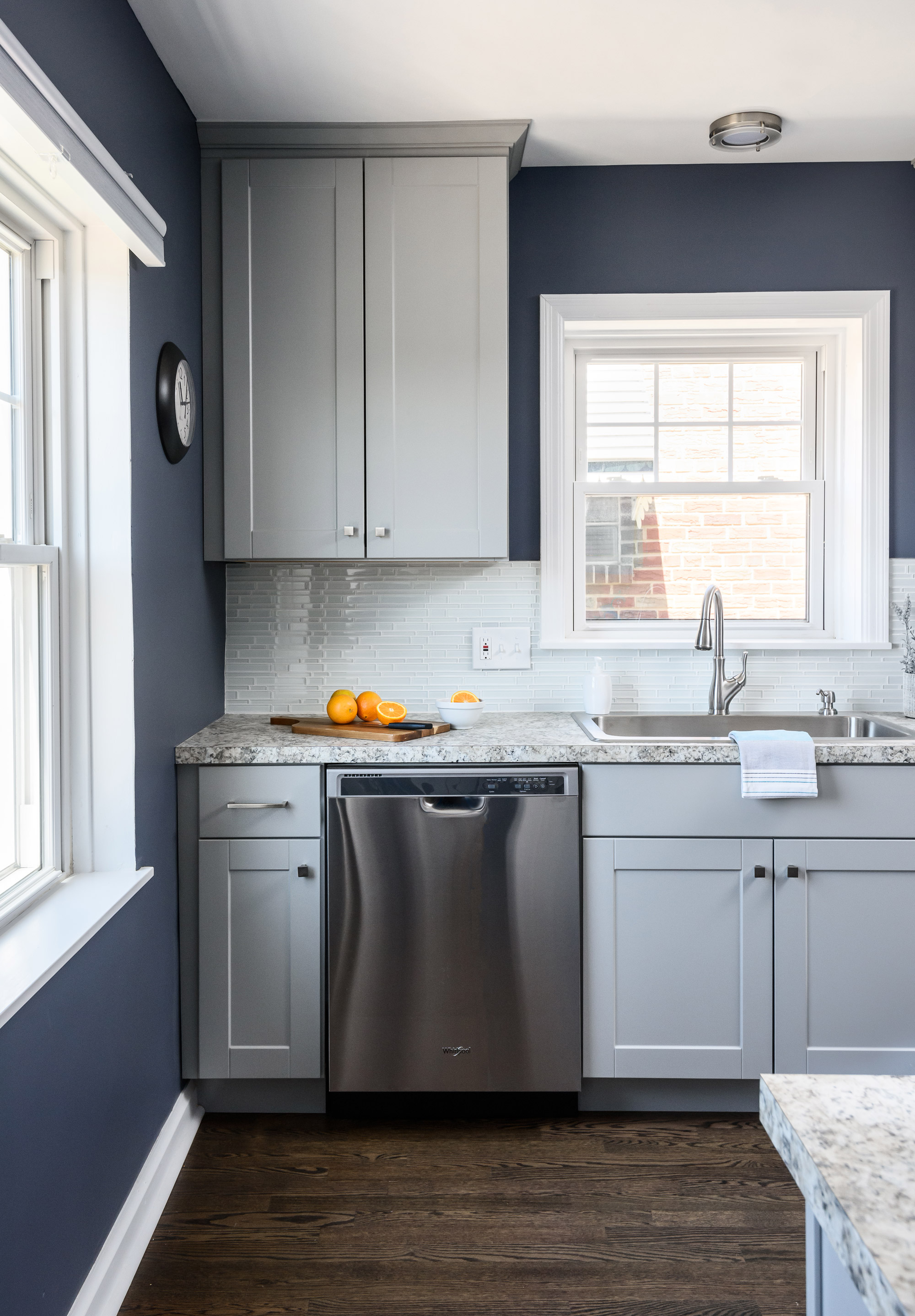
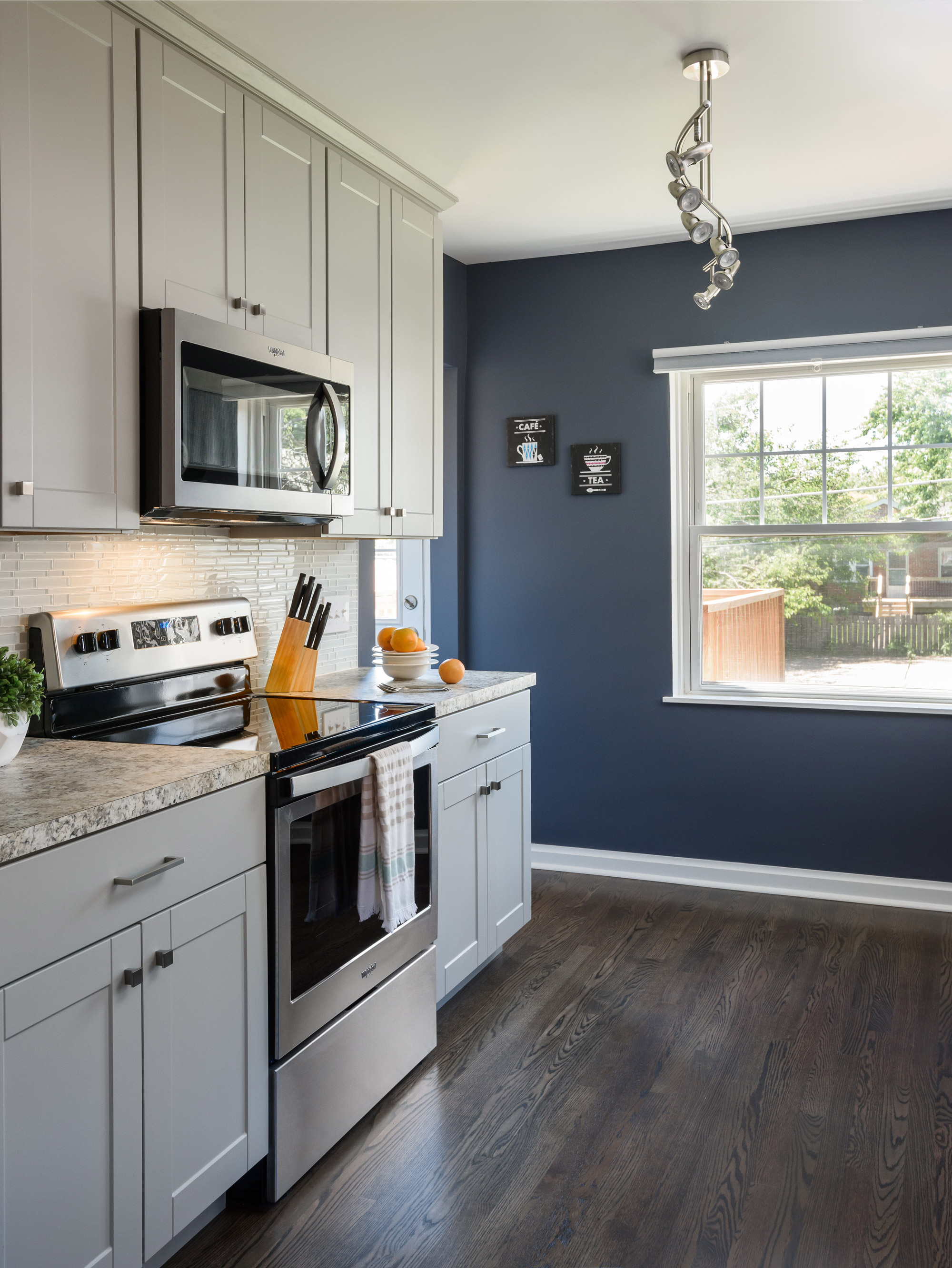
A new open kitchen, a light neutral paint color, and rich hardwood floors make the home feel light, open and airy. The dated wood trim, perked up with a fresh white, glossy coat of paint. The kitchen is open, with plenty of room to entertain and an inviting new deck is right out the back door. The end result is breezy and bright!
Gannon Small Addition & Powder Room
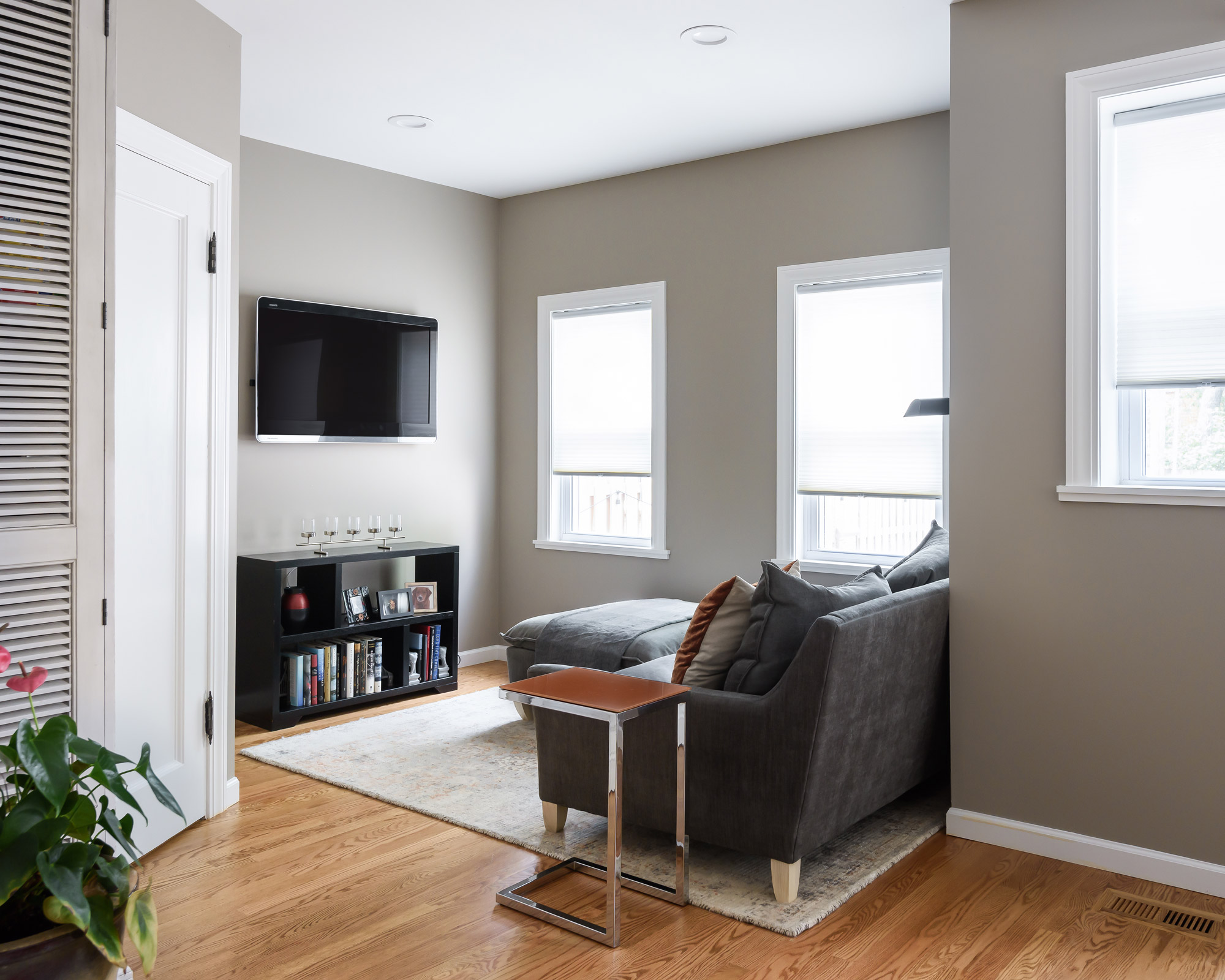
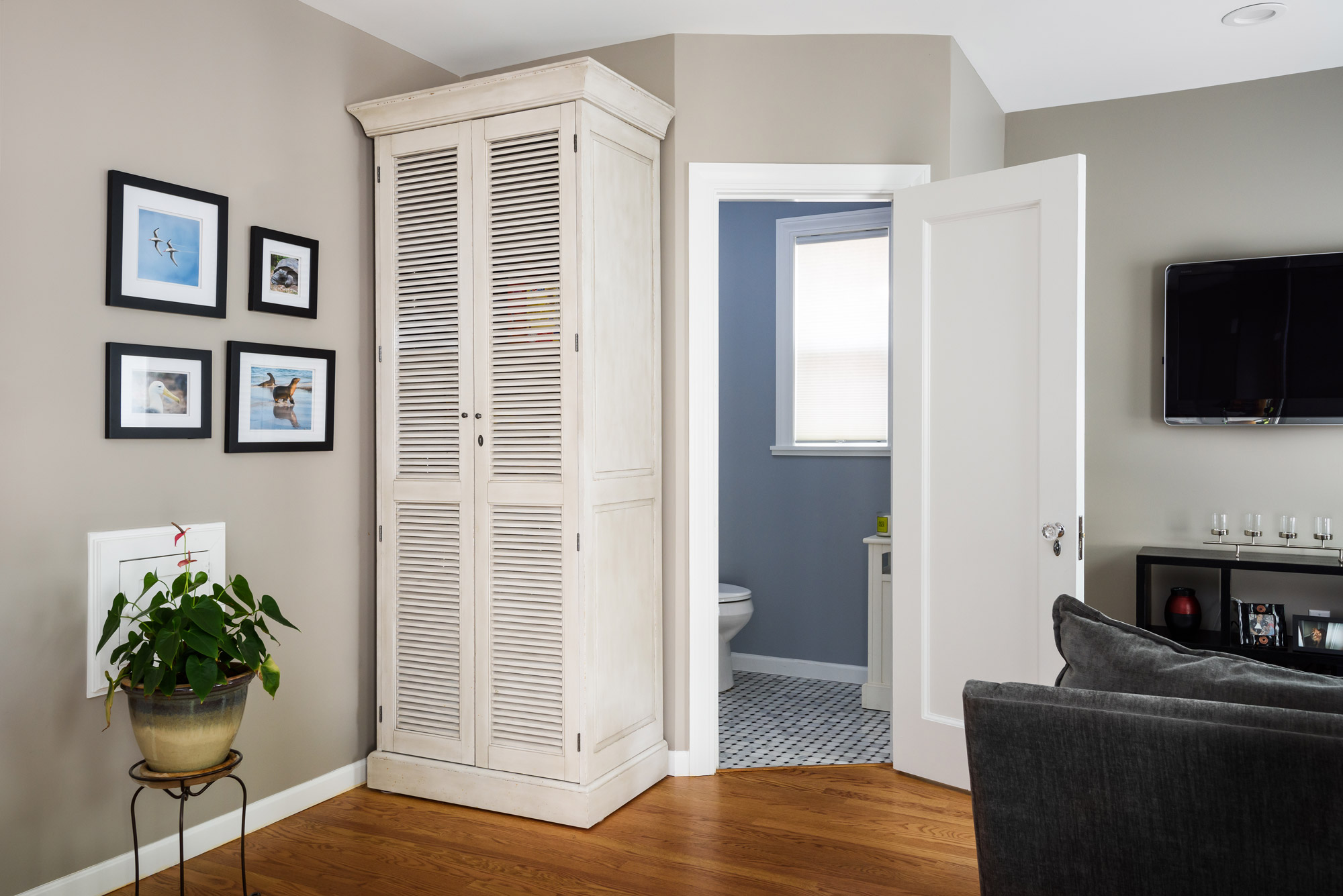
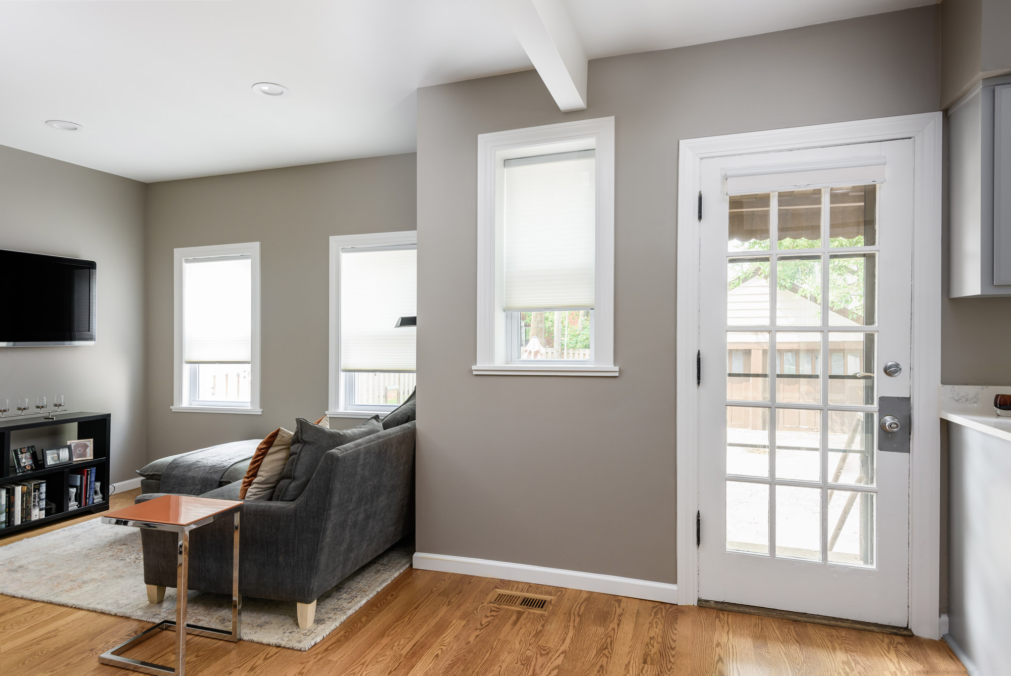
Our client's 80 year old home has a ton of charm and character. Unfortunately, the powder room that separated the kitchen from the back living space made both rooms feel smaller and made it difficult to entertain. We needed to open up this space to allow for better flow and functionality.
University City, MO
2018
DESIGNER:
Jennifer Chapman
PHOTOGRAPHER:
Karen Palmer Photography
Our client's 80 year old home has a ton of charm and character. Unfortunately, the powder room that separated the kitchen from the back living space made both rooms feel smaller and made it difficult to entertain. We needed to open up this space to allow for better flow and functionality. We started by moving the powder room into the existing footprint for the living space and then we increased the footprint of the living space itself. By moving the powder room, we not only opened up the floor plan, but it allowed for a ton more light to flood the back of the house. We didn't gain a ton of square footage with this addition as we did not want to sacrifice the patio in the back of the house. We needed just enough room to allow for more seating & for adding the powder room. We angled the powder room door in order to make the room feel more open and eliminate sharp corners that may make the back of the room feel like a tunnel. We reused the existing door and matched the original door knob to keep with the character in the home. We laced in new hardwood, where tile had been, to match the existing hardwood in the front rooms. This made the rooms feel more cohesive and much larger. Our client can now enjoy a much brighter more open space to enjoy entertaining friends or curling up with a good book.
Senate Street Basement
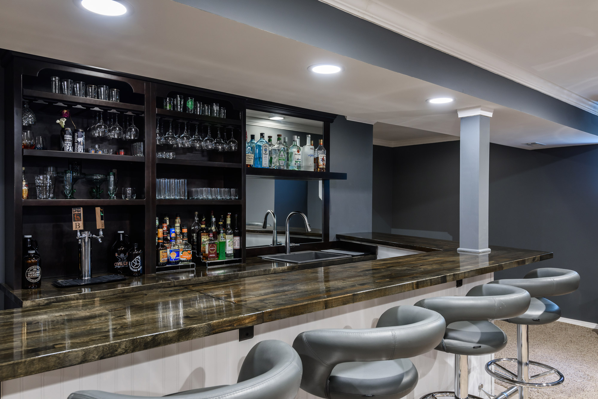
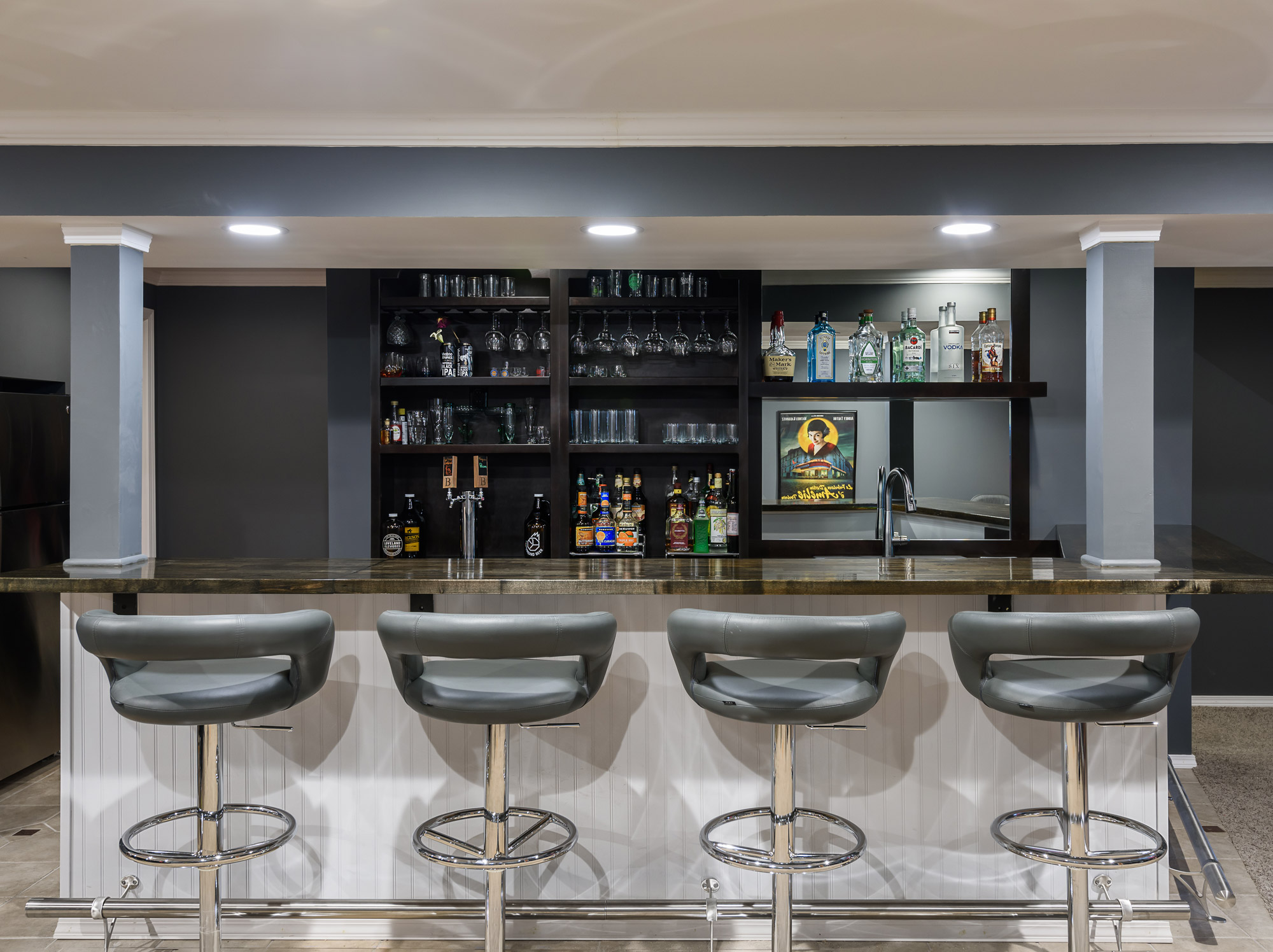
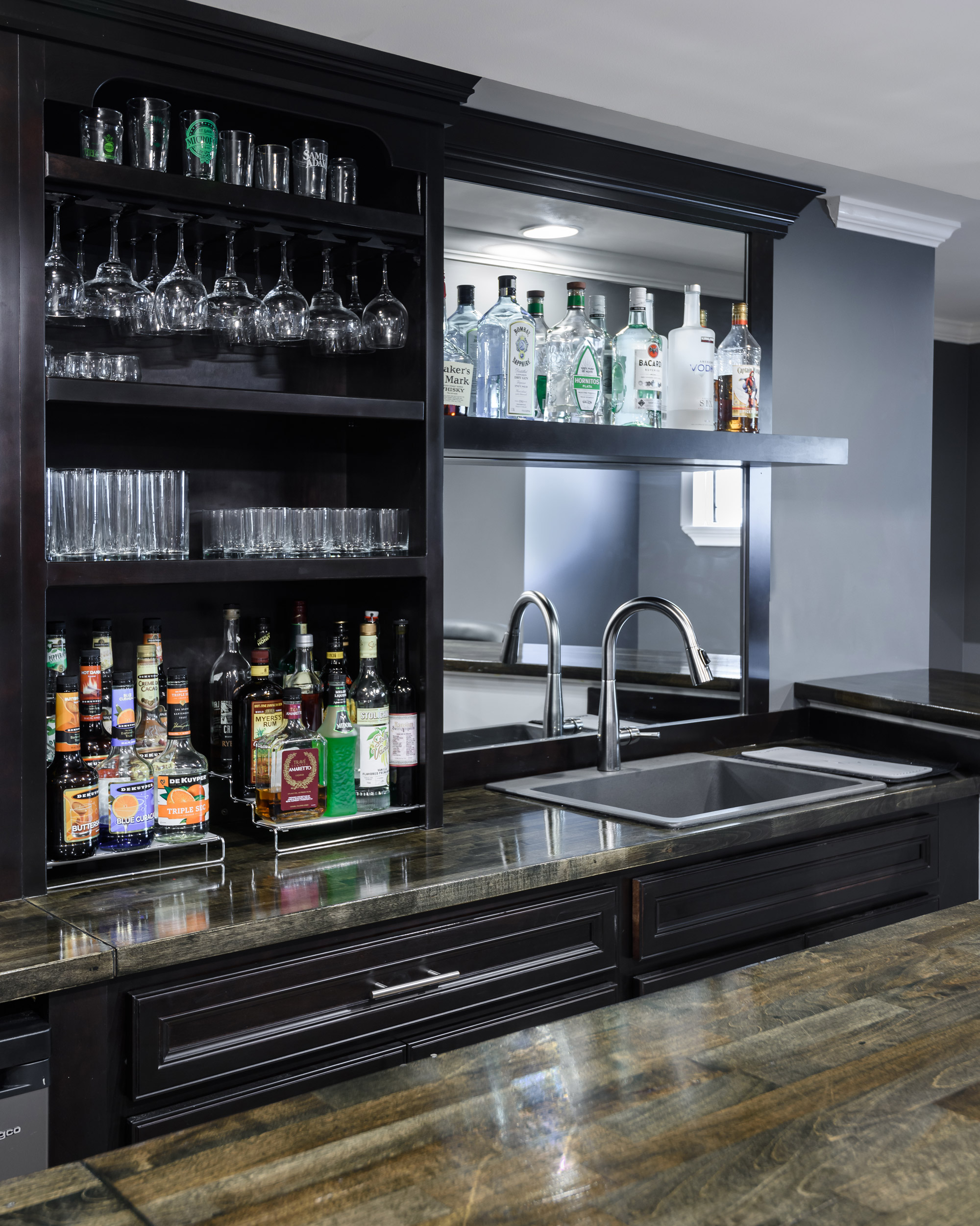
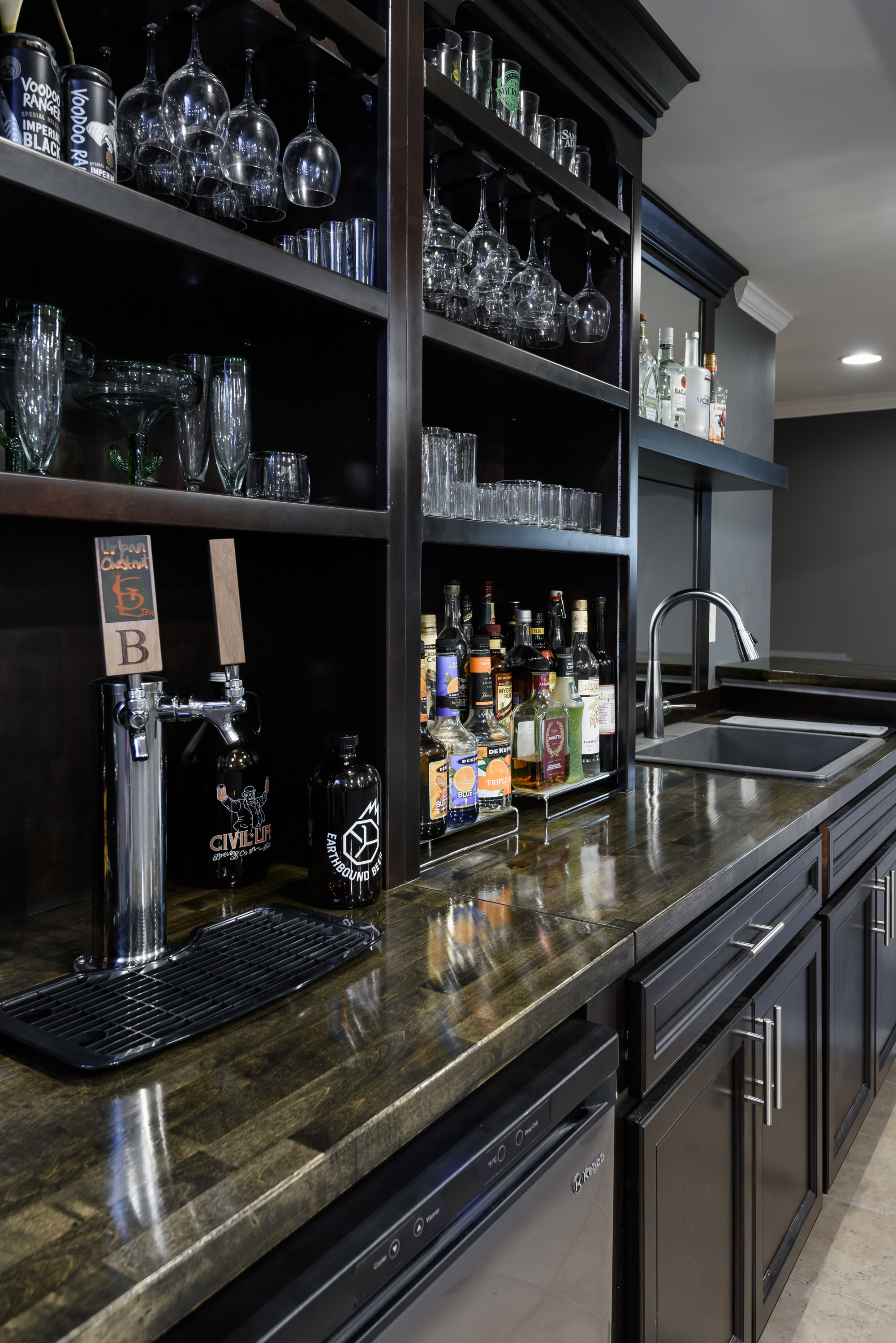
They loved the look of old English pubs, but also wanted more modernize that style a bit. We chose a dark warm gray stained cabinet and paired it with a coordinating stained butcher block top.
St. Louis, MO
2019
DESIGNER:
Jennifer Chapman
PHOTOGRAPHER:
Karen Palmer Photography
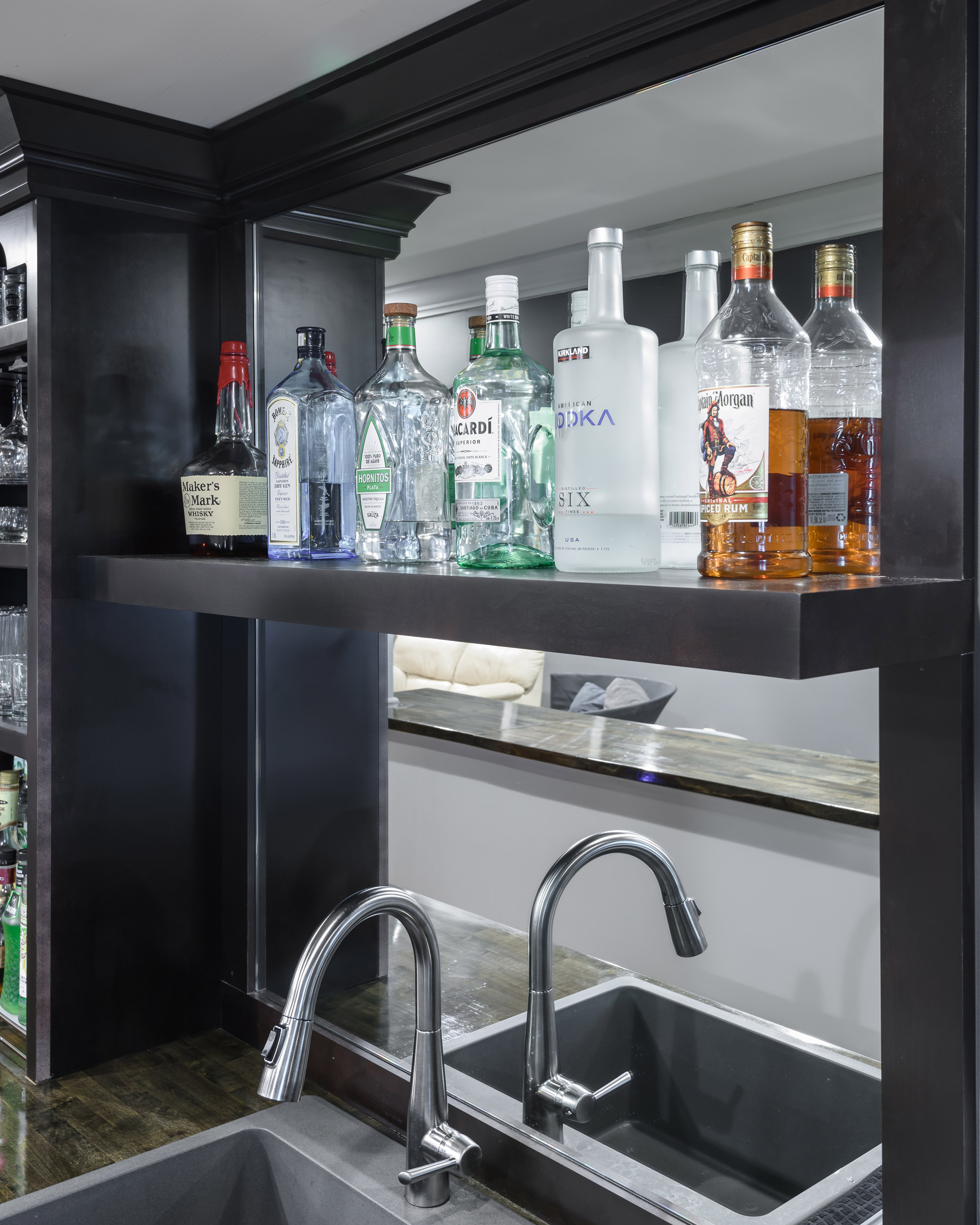
Our clients wanted to add a bar to their existing finished space where they could entertain friends and family or spend a quiet evening in. They loved the look of old English pubs, but also wanted more modernize that style a bit. We chose a dark warm gray stained cabinet and paired it with a coordinating stained butcher block top. The combination of the dark wood, open shelving, and mirrored backsplash help to create that pub feel we were going for. By chosing a stained wood without exposed grain and using a more modern cabinet hardware, we were able to give it a more updated feel as well. What a great place to have a big party, a small gathering, or a date night at home!
Mission Ct Kitchen
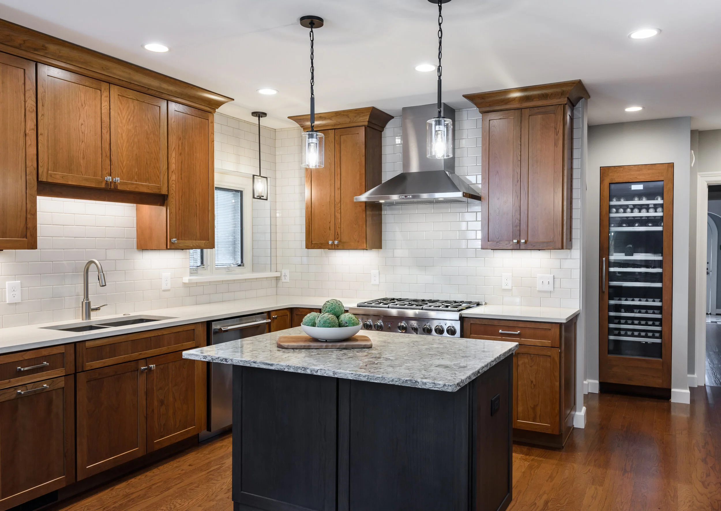
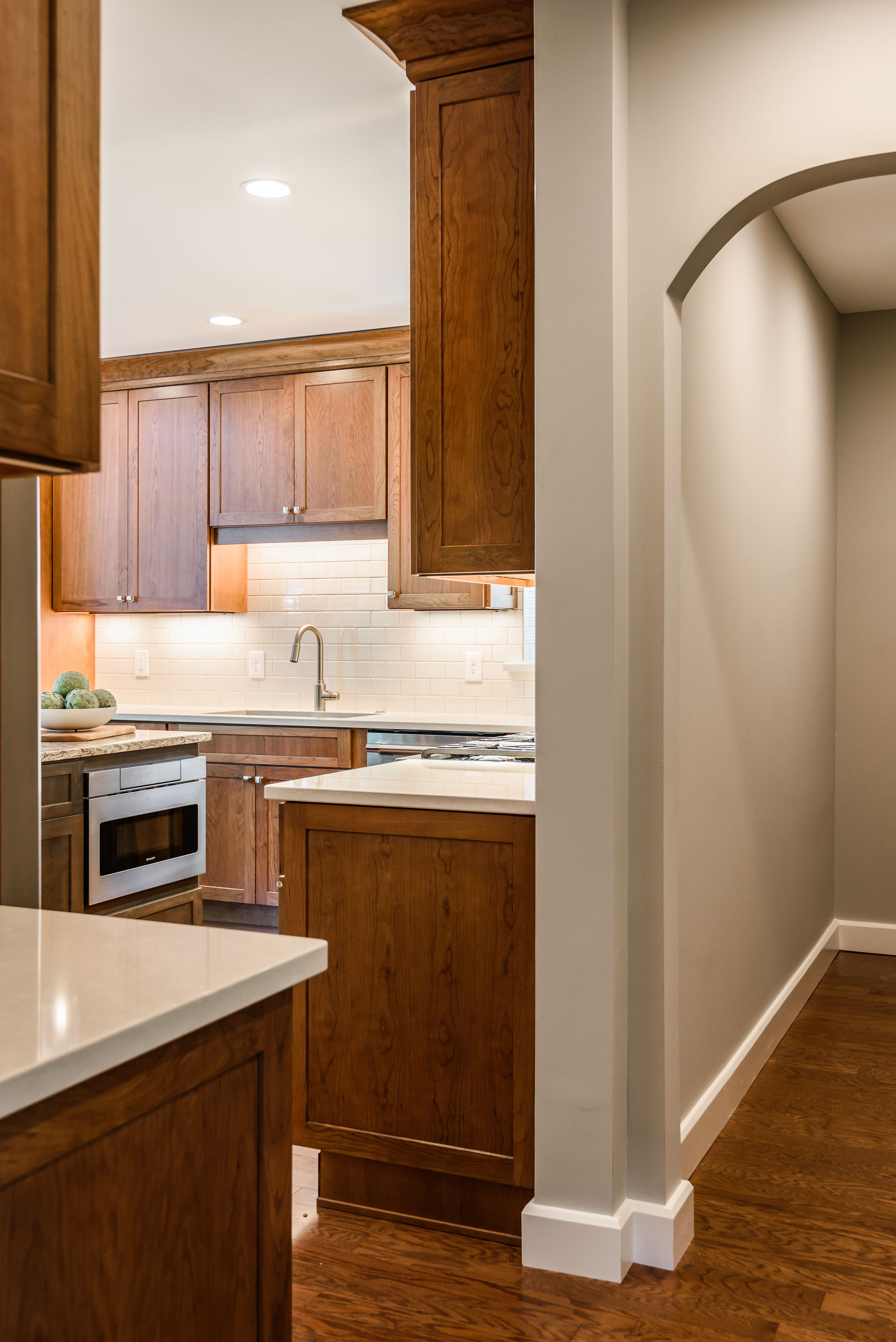
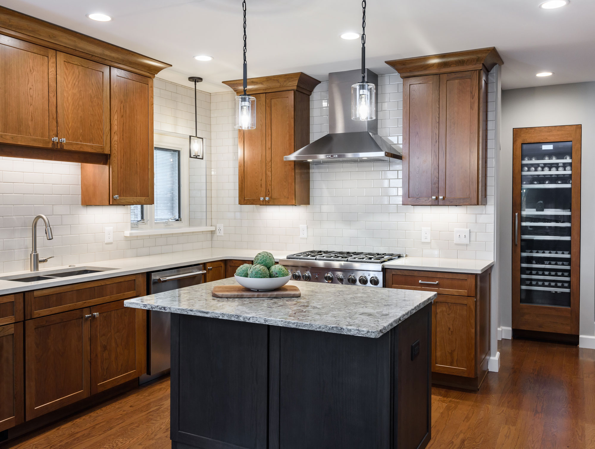
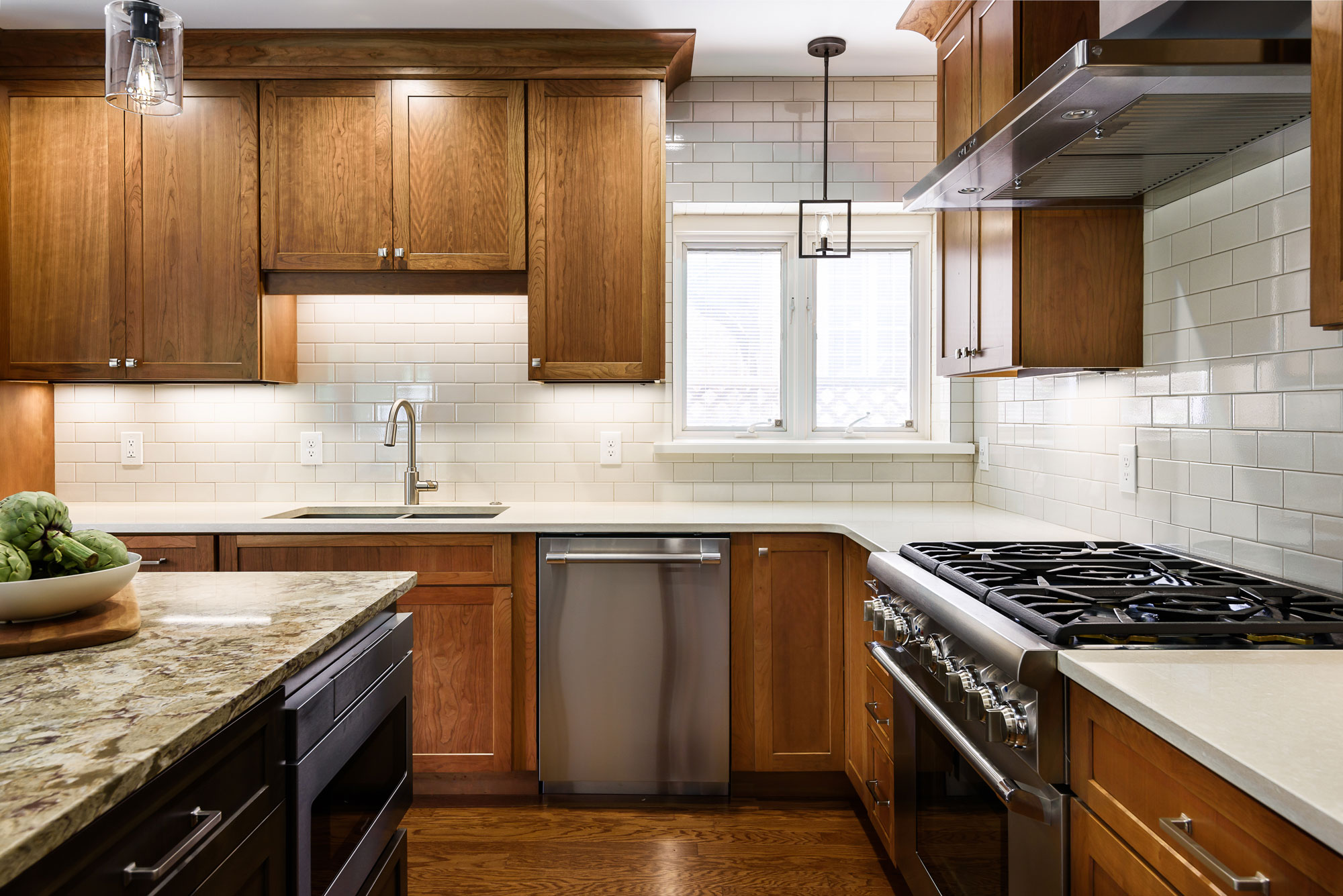
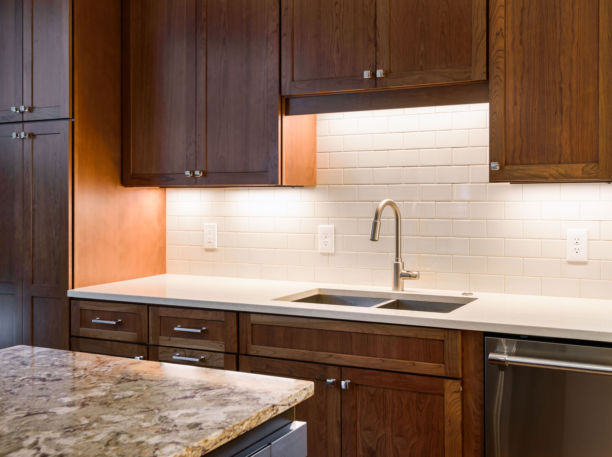
A small island is great for conversation and prep space, also hiding the microwave drawer. The built in wine storage peeks around the corner holding an impressive 92 bottles of wine. We added new hardwood flooring to match the entire first floor bringing together the old and the new. The result is a warm and inviting kitchen!
2019
DESIGNER:
Rochelle McAvin
PHOTOGRAPHER:
Karen Palmer Photography
Our client wanted to remodel his outdated kitchen as soon as he moved in. The classic U City Tudor needed an update that was true to the history of the home. The existing kitchen had a bathroom right next to the island. We added a wall to create a hallway and offer privacy, that now feels like a natural extension of the home.
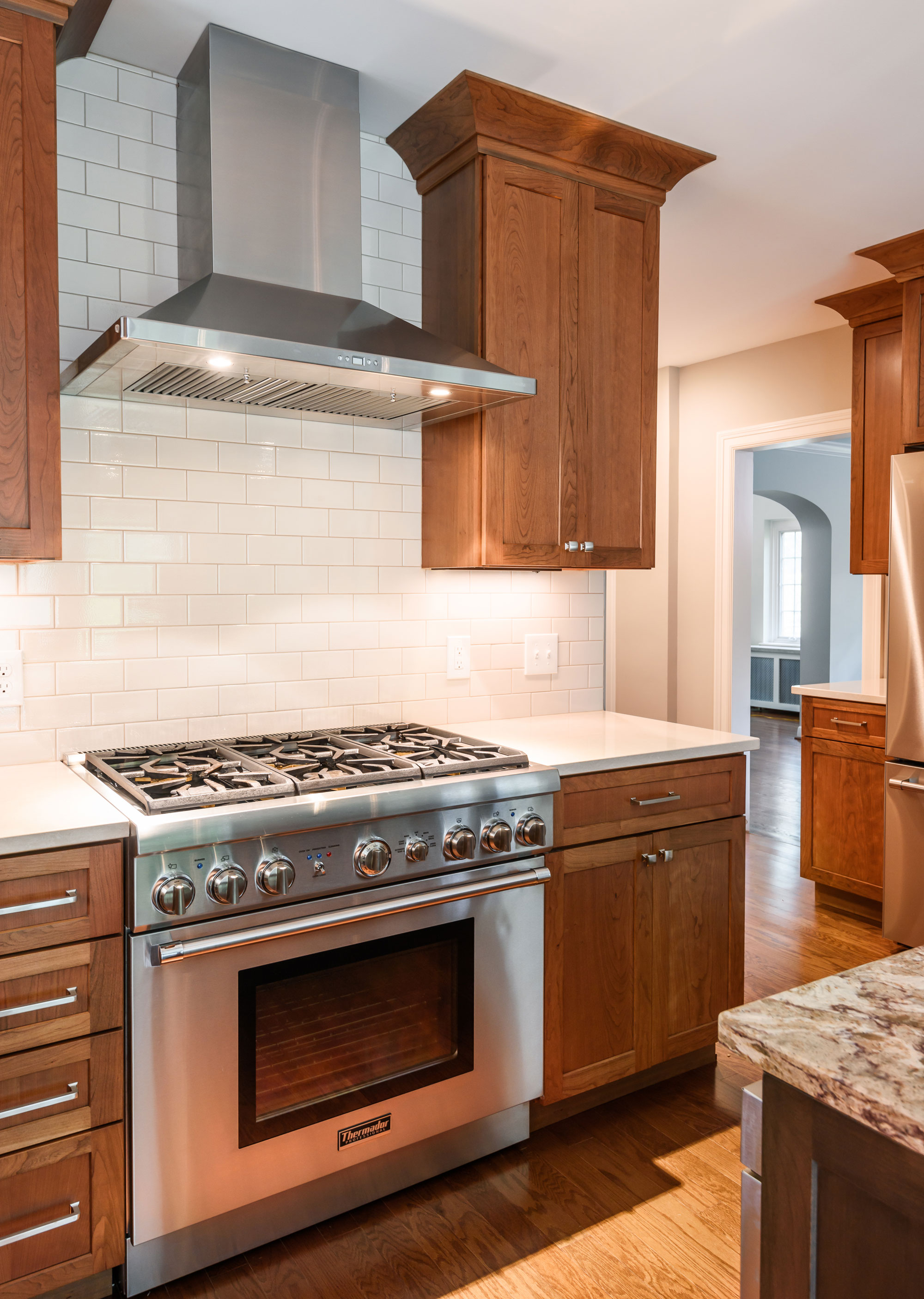
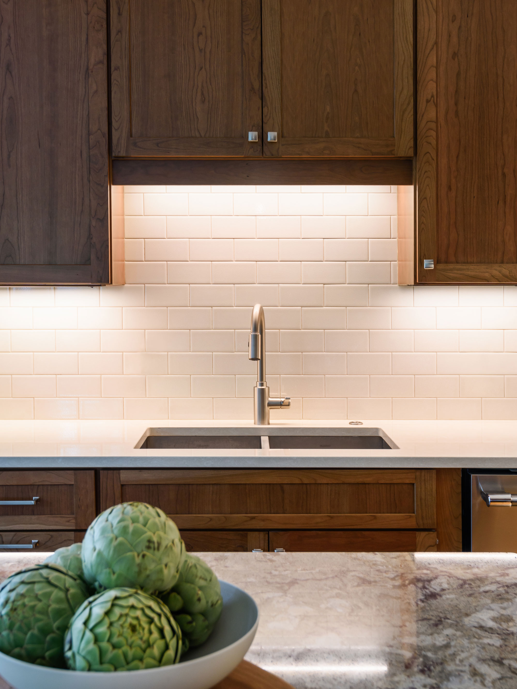
Our client loves to cook and the wall provided us a new place to incorporate a professional range and hood. A small island is great for conversation and prep space, also hiding the microwave drawer. The built in wine storage peeks around the corner holding an impressive 92 bottles of wine. We added new hardwood flooring to match the entire first floor bringing together the old and the new. The result is a warm and inviting kitchen!
Arsenal Deck
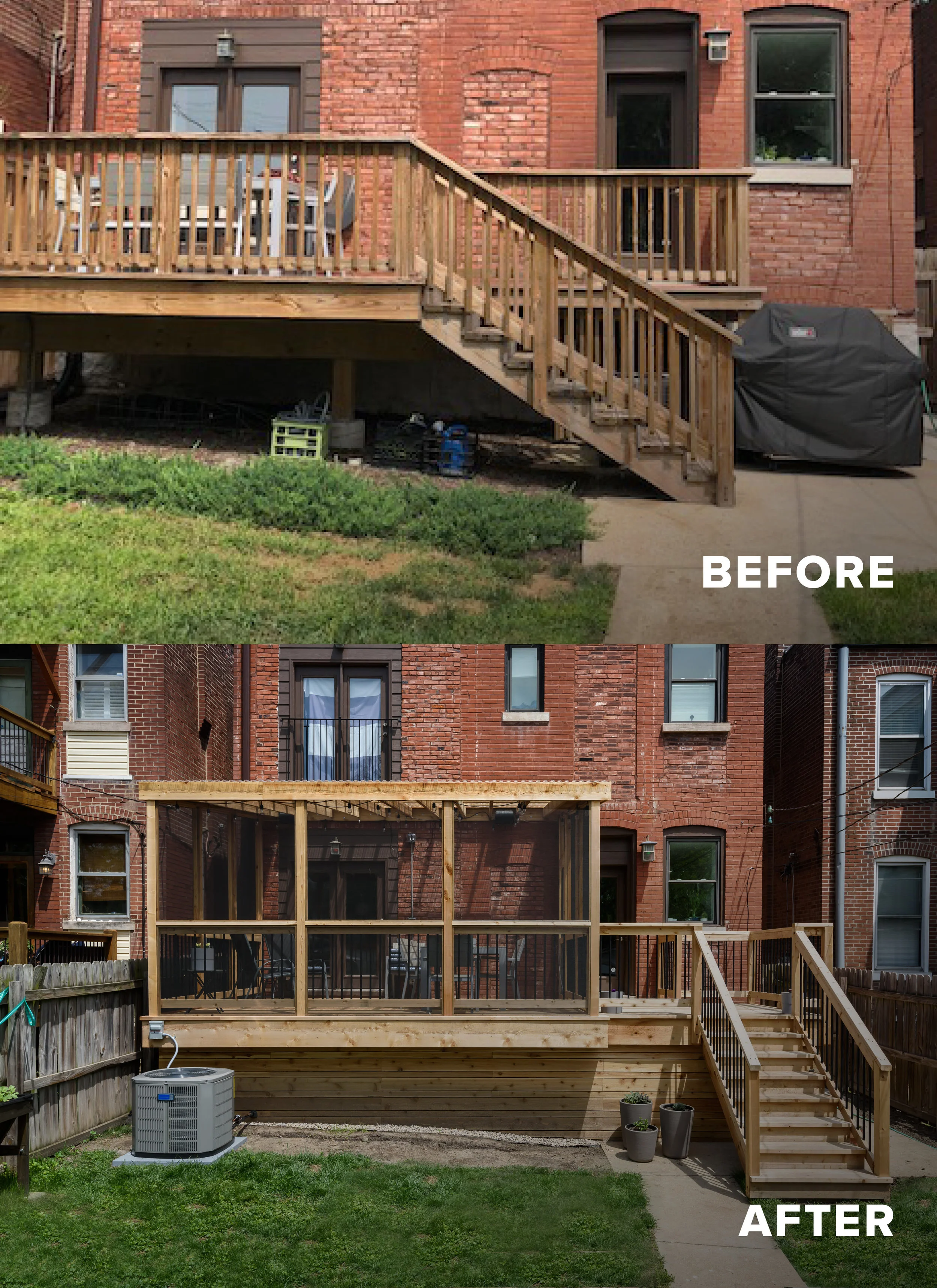
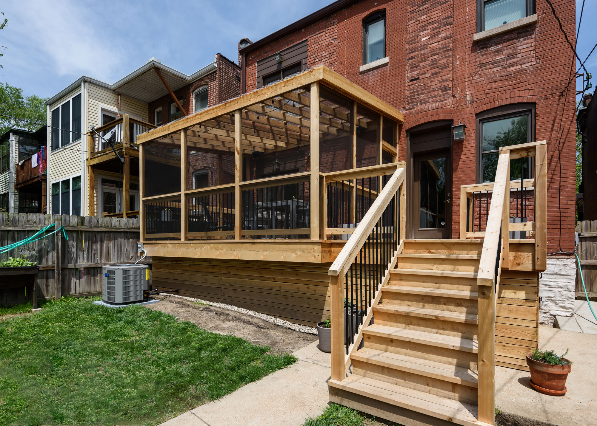
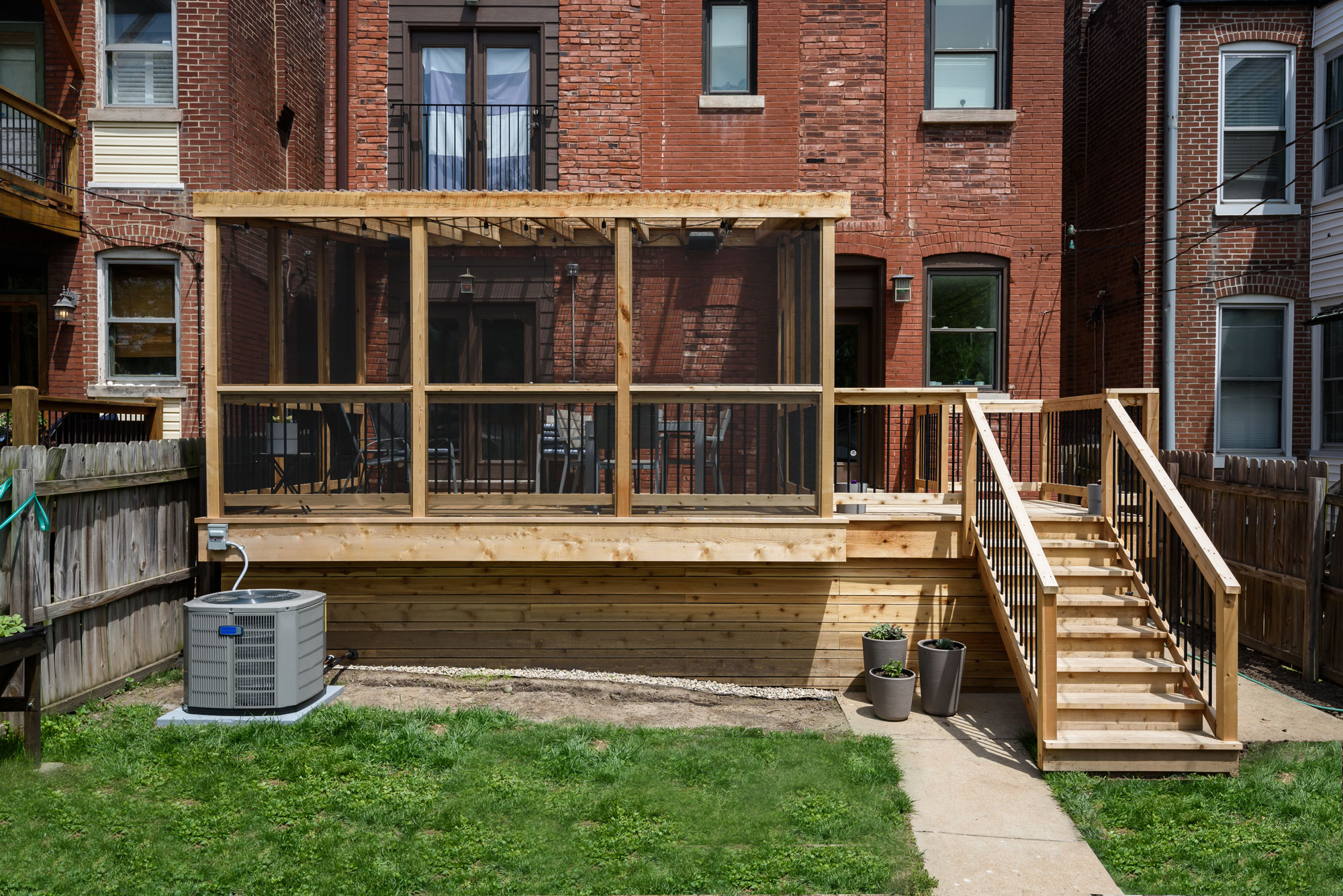
Our clients wanted a peaceful retreat in their backyard. Their current deck was too small and they wanted to be able to use it in even the most buggy of seasons. We started by increasing the deck's footprint so they could gain more seating for entertaining family and friends.
Arsenal St., MO
April 2019
Designers
Jennifer Chapman & Rochelle McAvin
Photography
Karen Palmer
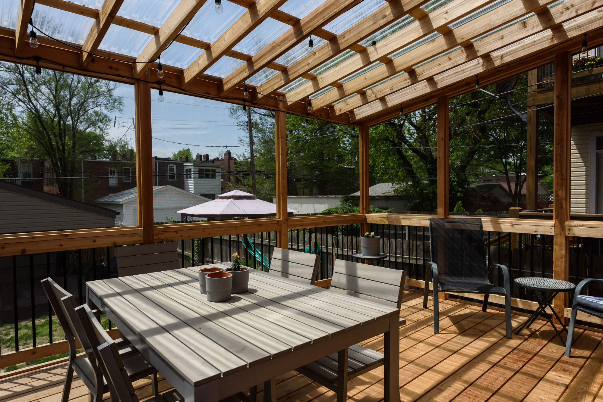
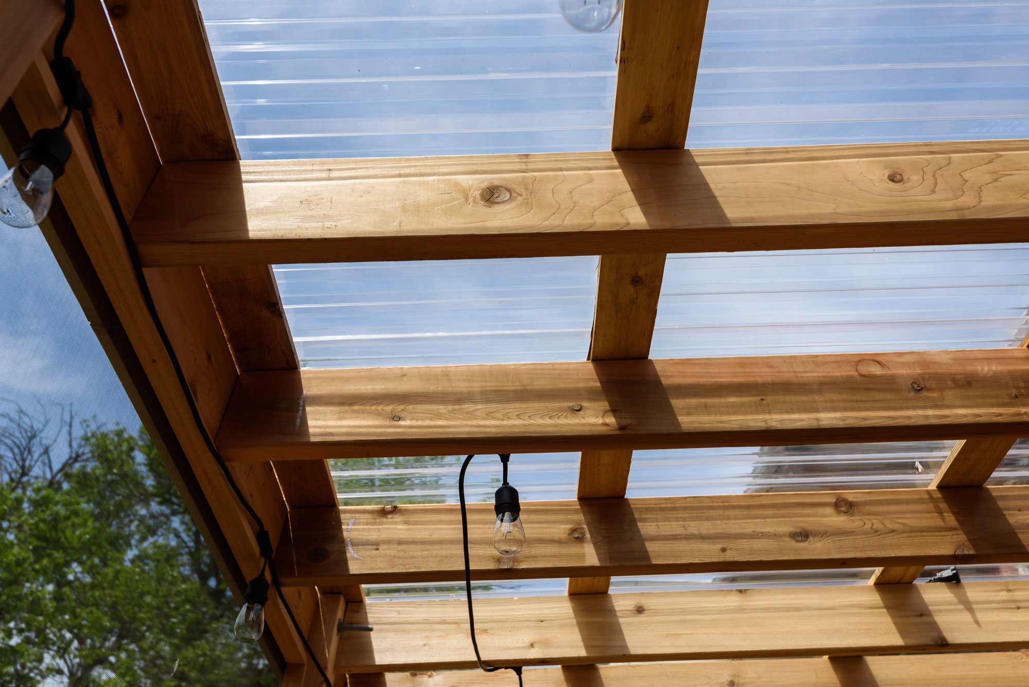
Our clients wanted a peaceful retreat in their backyard. Their current deck was too small and they wanted to be able to use it in even the most buggy of seasons. We started by increasing the deck's footprint so they could gain more seating for entertaining family and friends. They wanted to screen in the porch, but were afraid that the light would be compromised on the inside of the house. They have large windows and love the sunlight coming through. We came up with a solution that would allow them to have both! We used translucent corrugated PVC as the roofing material. The deck feels open and bright and much more like the peaceful retreat they were looking for.
Arsenal Basement
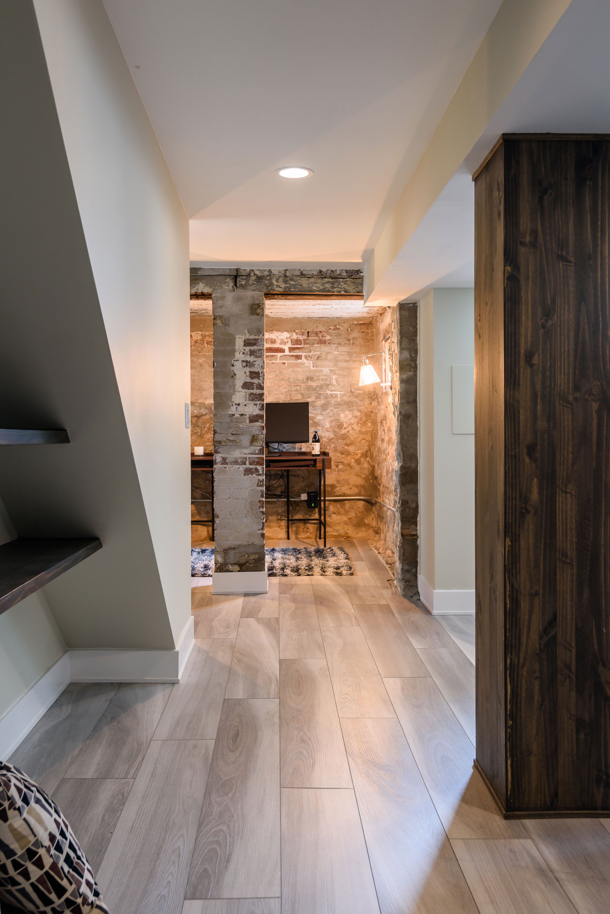
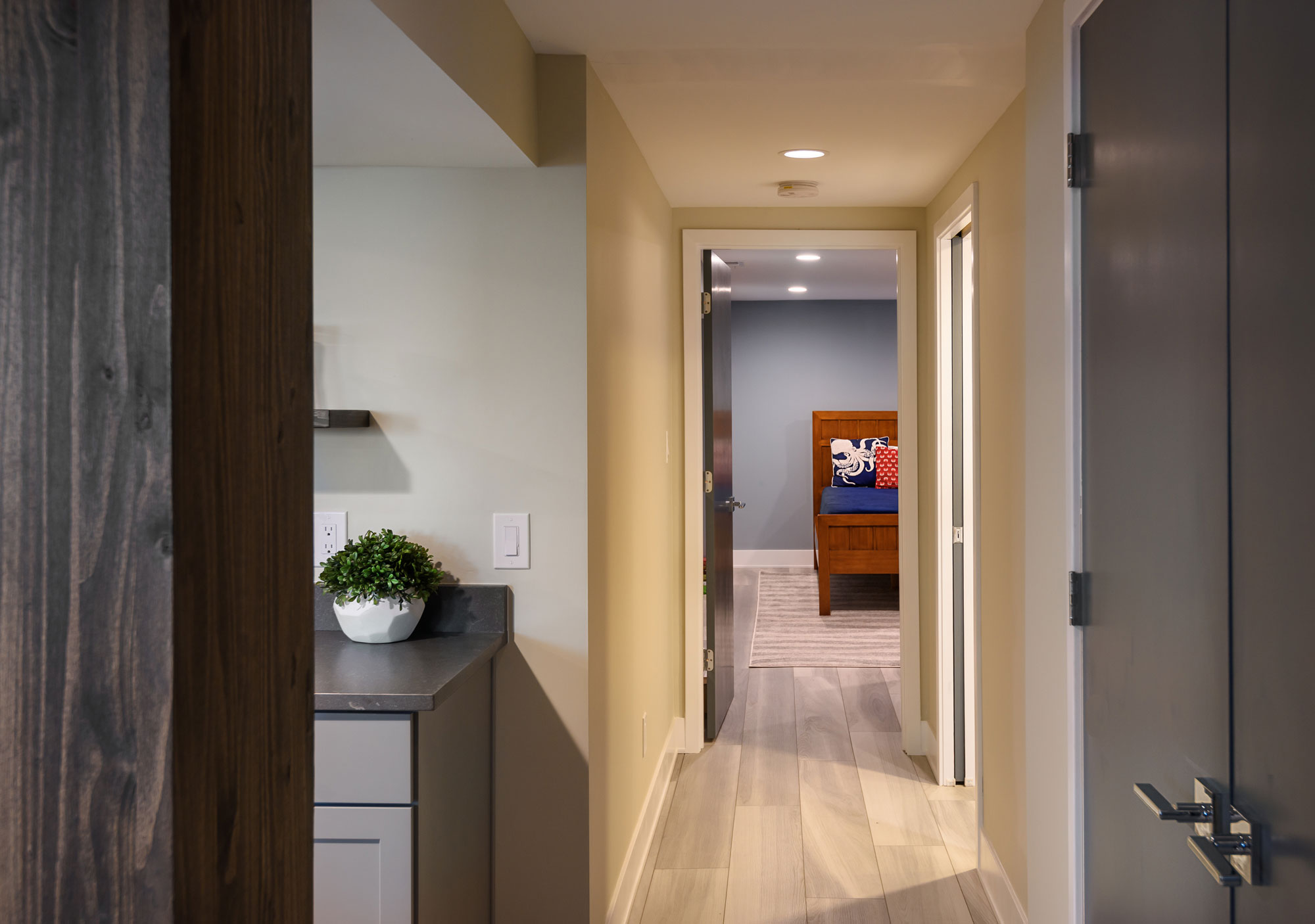
Our clients wanted to turn their century old, unfinished basement into a living space the whole family could enjoy. There is a little room under the porch that had exposed, original masonry. We wanted to leave the masonry exposed so we cleaned it up a bit — it is a cozy space for an office and it is a reminder of the home's 100 year history.

Arsenal St., MO
April, 2019
DESIGNER:
Jennifer Chapman & Rochelle McAvin
PHOTOGRAPHER:
Karen Palmer Photography
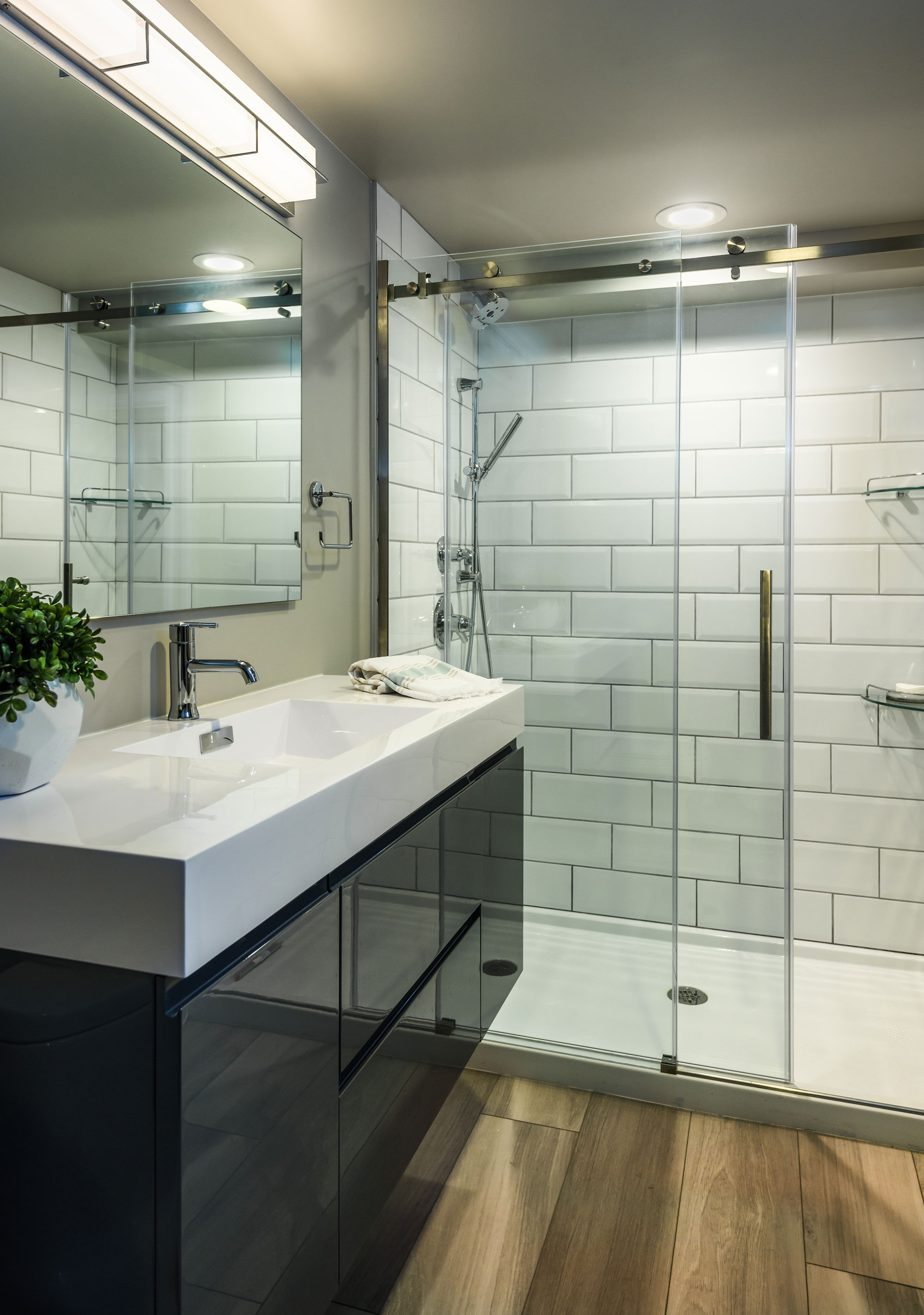
Our clients wanted to turn their century old, unfinished basement into a living space the whole family could enjoy. We set out to create a family area where they could play games, watch tv, and hang out with family and friends as well as a separate bedroom and bathroom. They love clean, modern lines and cool, serene colors.We started by selecting a luxury vinyl tile that had a very linear pattern with cool gray tones. This helped to keep the basement feel light and bright and the LVT is a durable material for an old leaky basement. We wanted to take advantage of some of the architectural elements in the space. There is a little room under the porch that had exposed, original masonry. We wanted to leave the masonry exposed so we cleaned it up a bit- it is a cozy space for an office and it is a reminder of the home's 100 year history. We didn't want to lose the space under the stairs to dark, never used storage so we created a niche with open reclaimed wood shelving. We wrapped the posts with matching wood to add warmth and character to the space. We used the same wood for the floating shelf at the bar area, as well. In the bathroom we used a sleek gray, high gloss floating vanity & oversized white subway tile. It feels fresh and bright and keeps with the clean and modern aesthetic we set out to create.
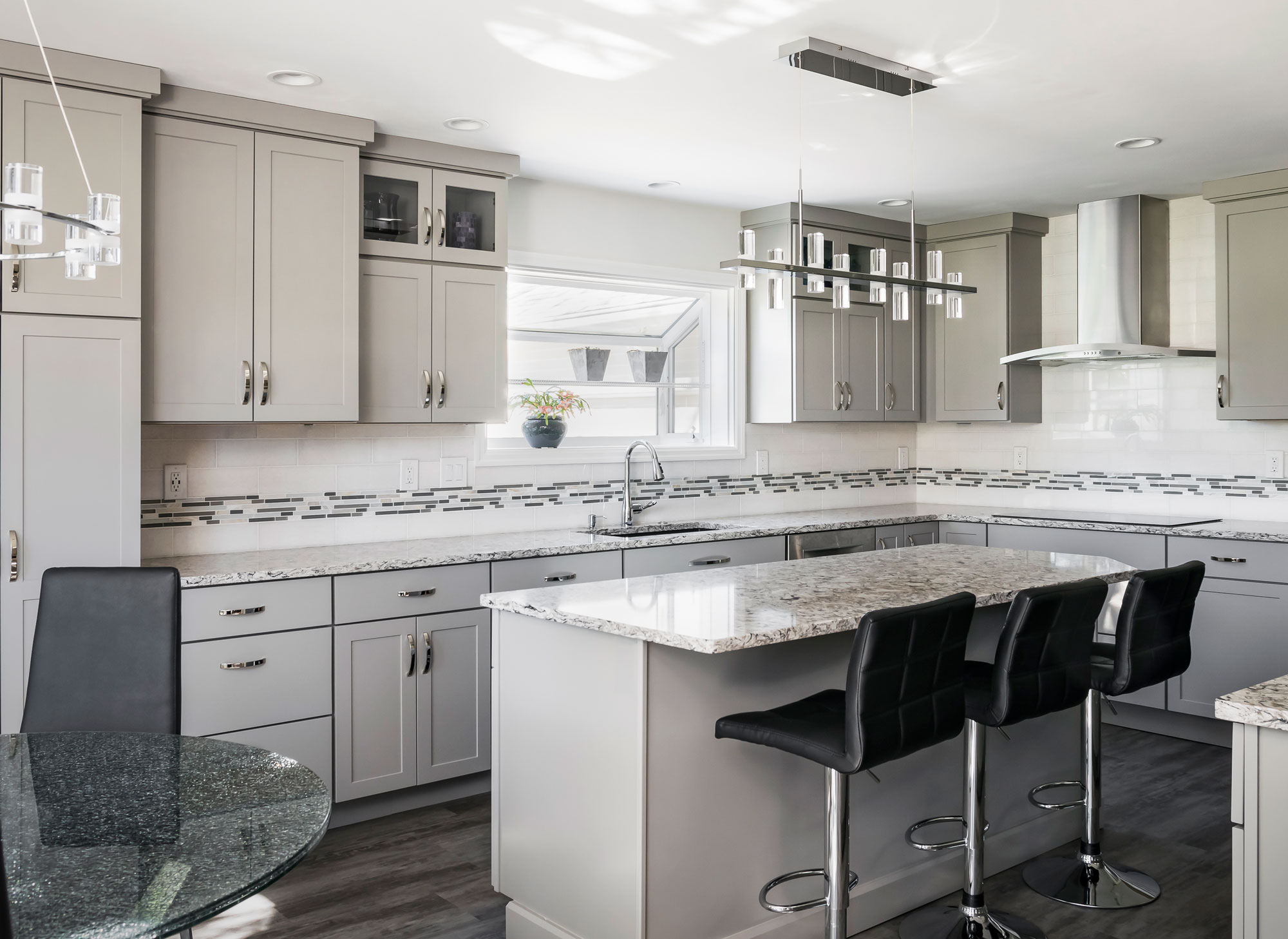
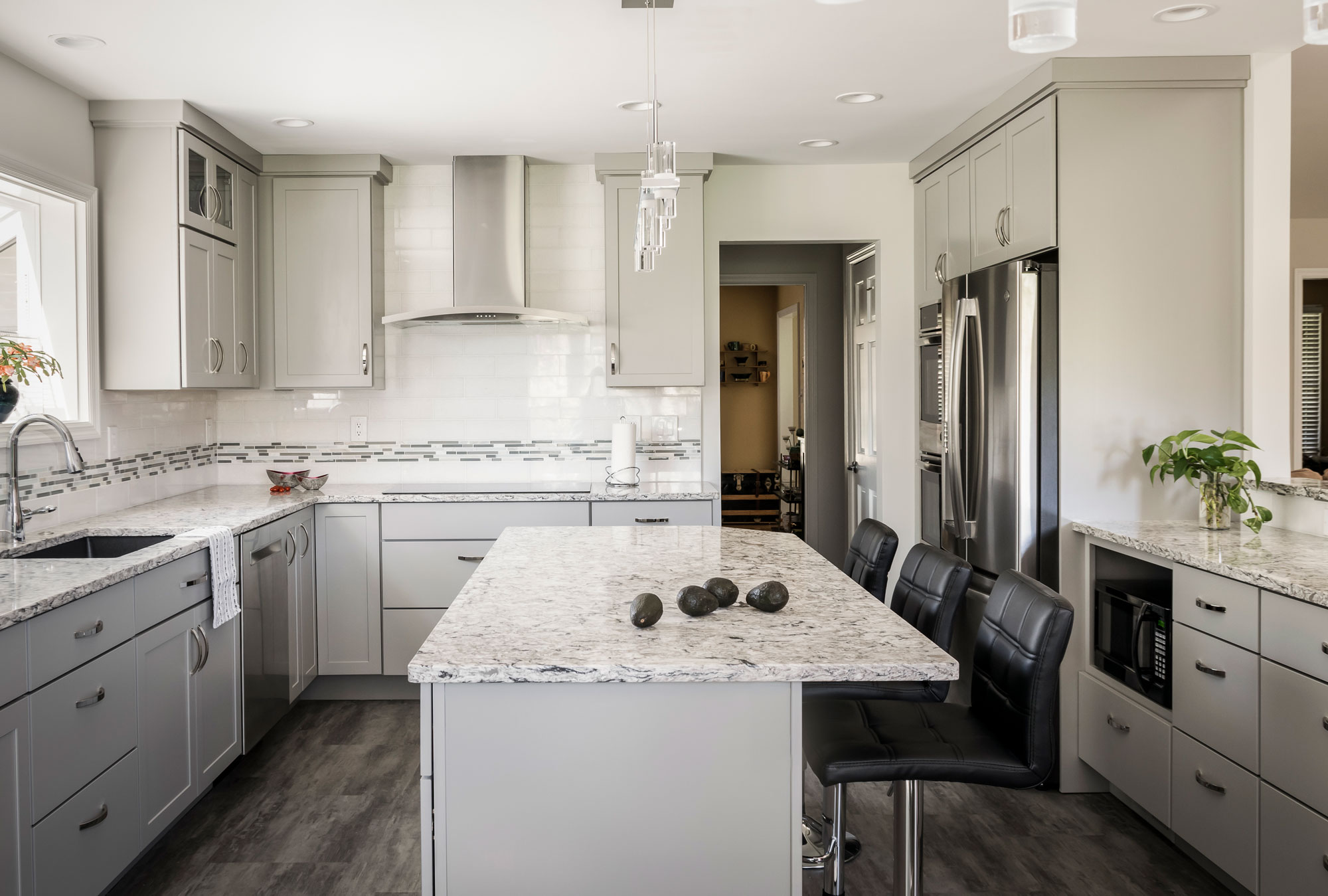
Clean and Contemporary Kitchen
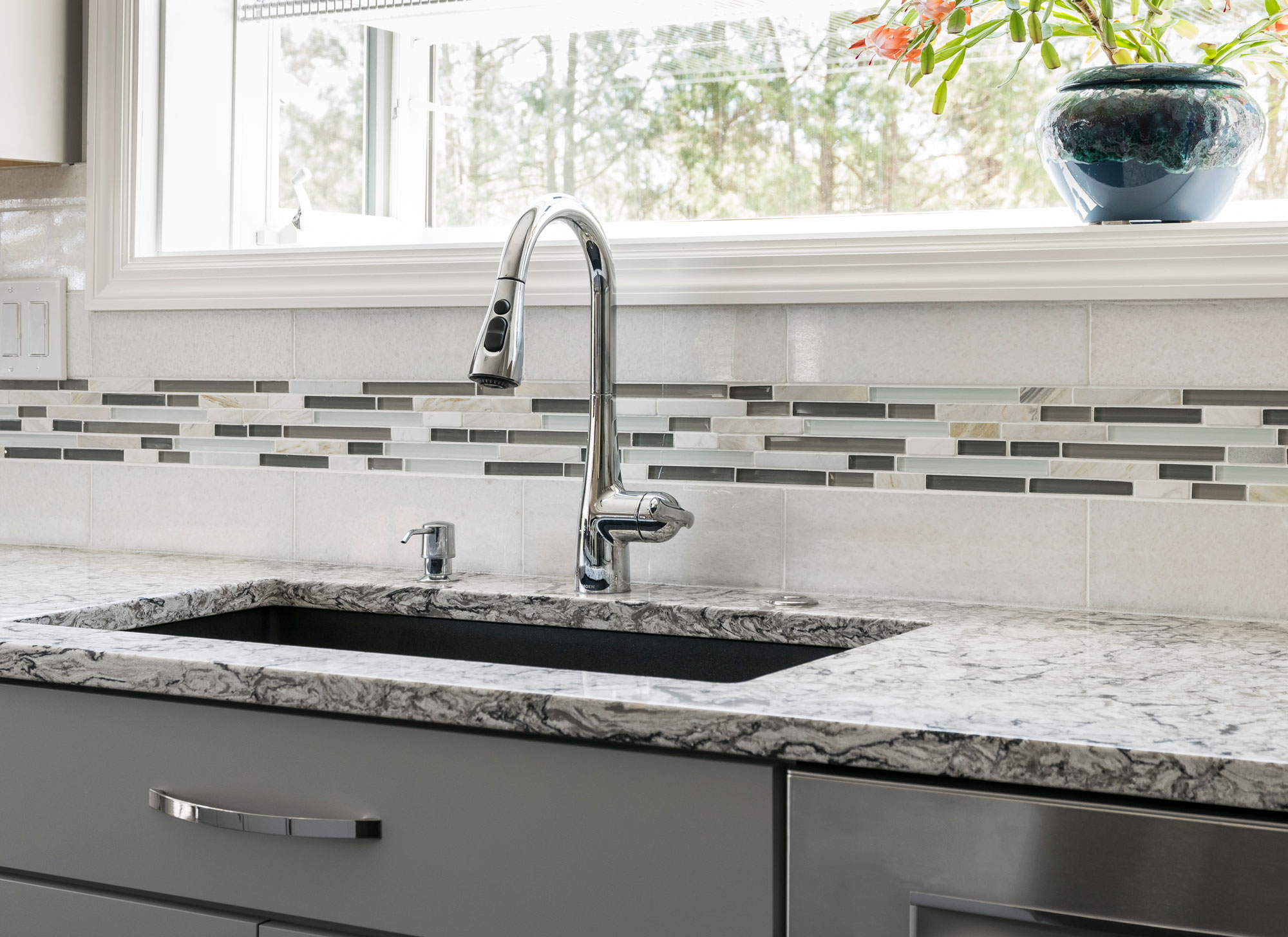
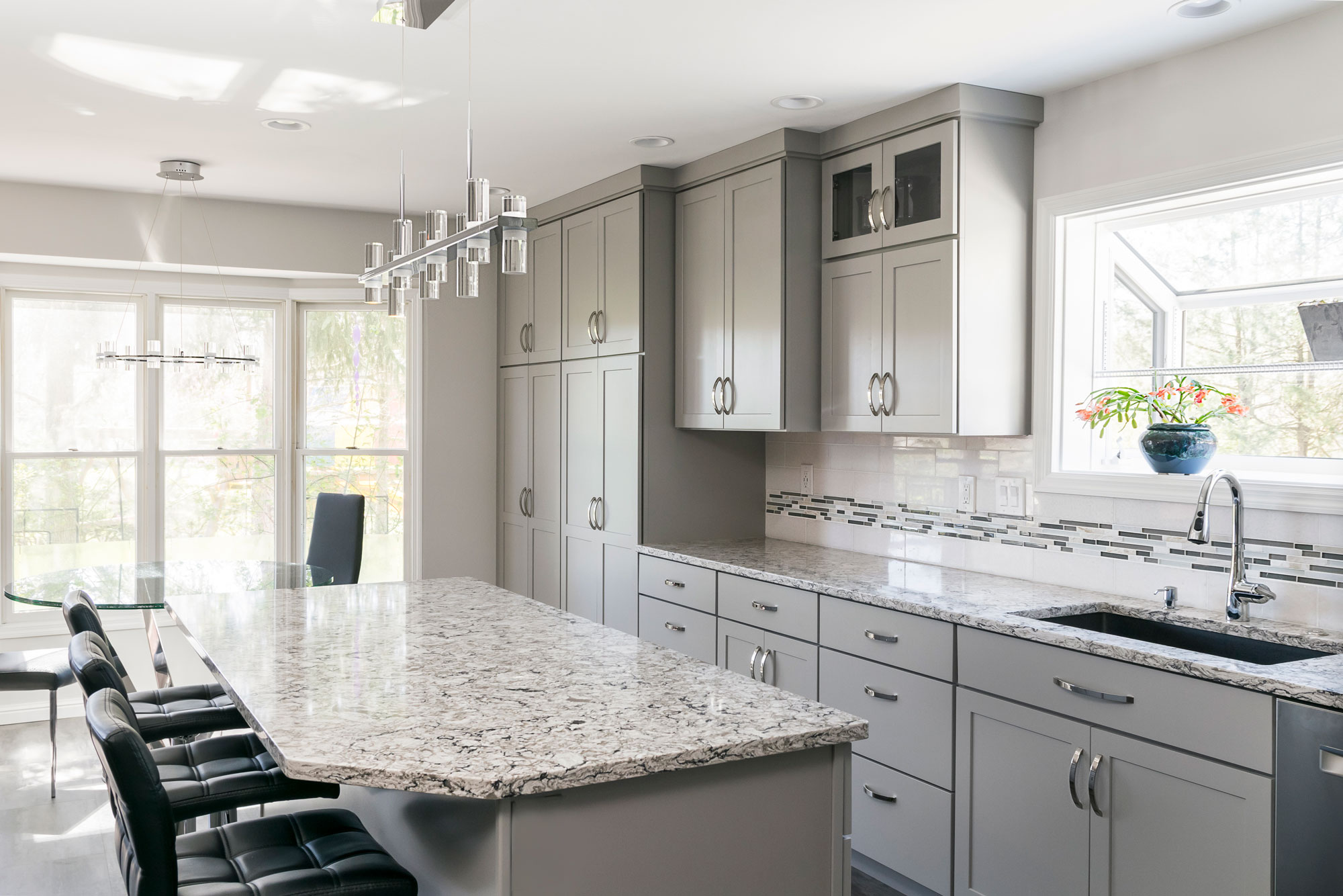
The flooring is a family proof luxury vinyl tile and the counter tops are Cambria quartz. We love how this kitchen is bright, open and modern!
2019
DESIGNER:
Rochelle McAvin
PHOTOGRAPHER:
Karen Palmer Photography
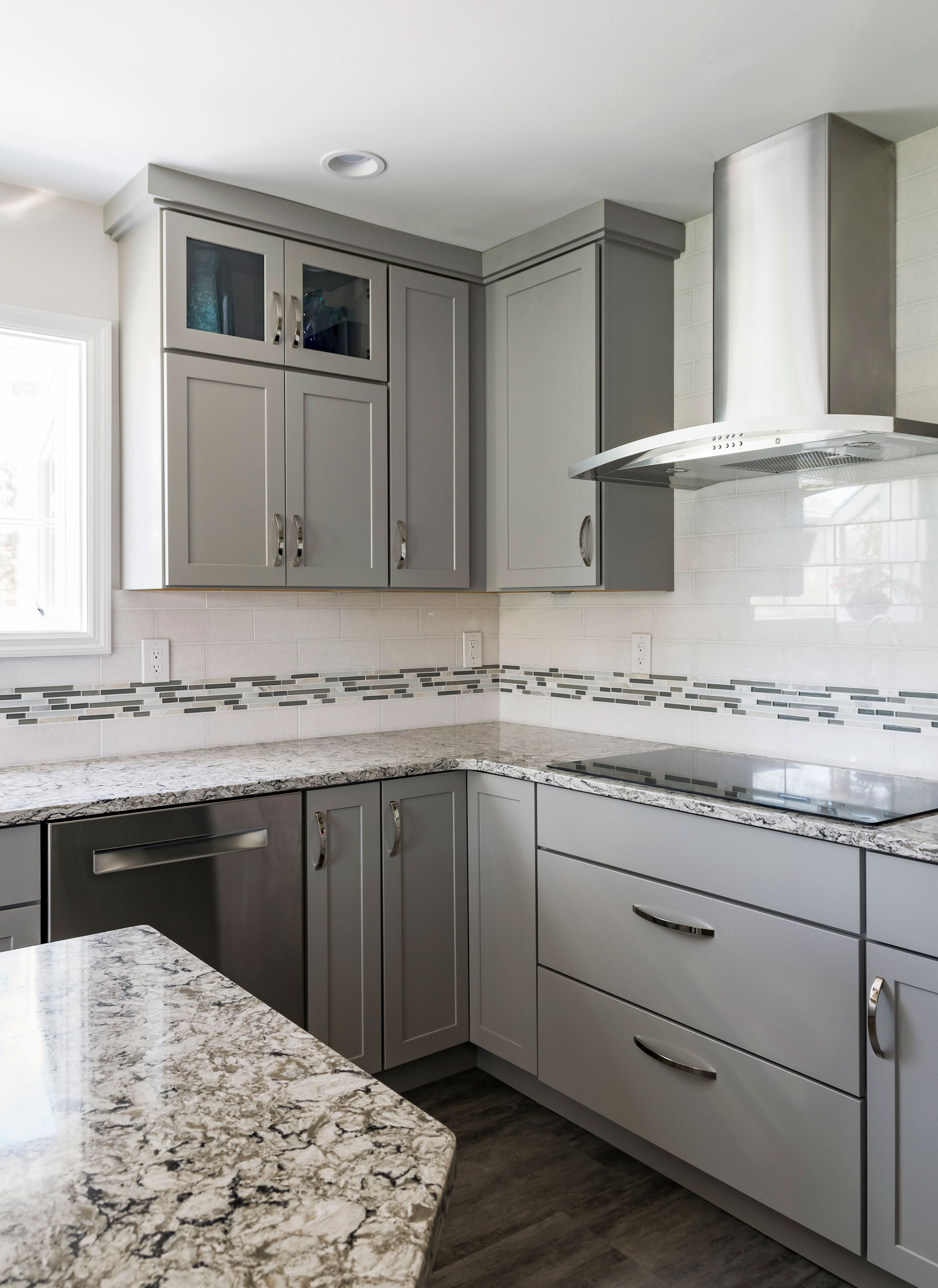
Our client loved the idea of a clean, contemporary kitchen. We opened up the wall to the living space to connect the two spaces and replaced a pantry for storage that blends seamlessly with the kitchen cabinets. She chose a neutral color palette with a mix of grays, whites and neutrals; ensuring a timeless look. The flooring is a family proof luxury vinyl tile and the counter tops are Cambria quartz. We love how this kitchen is bright, open and modern!
Kehrswood Basement
Our clients' finished basement needed to be brought to life! A bar made out of glass block, lack of overhead lighting, dark finishes and an old drop ceiling made for a really uninviting space. Our clients now use this space all of the time and love having friends and family over to enjoy it with them!
Chesterfield, MO
August, 2018
DESIGNER:
Jennifer Chapman
PHOTOGRAPHER:
Karen Palmer Photography
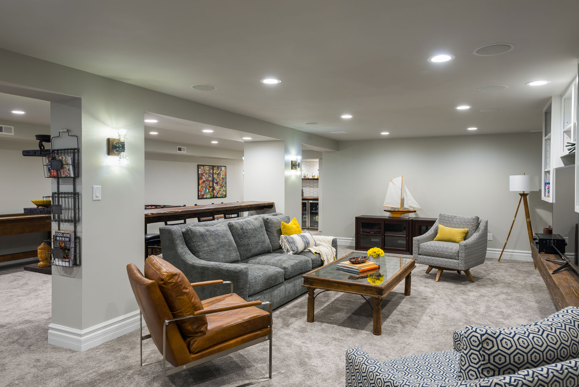
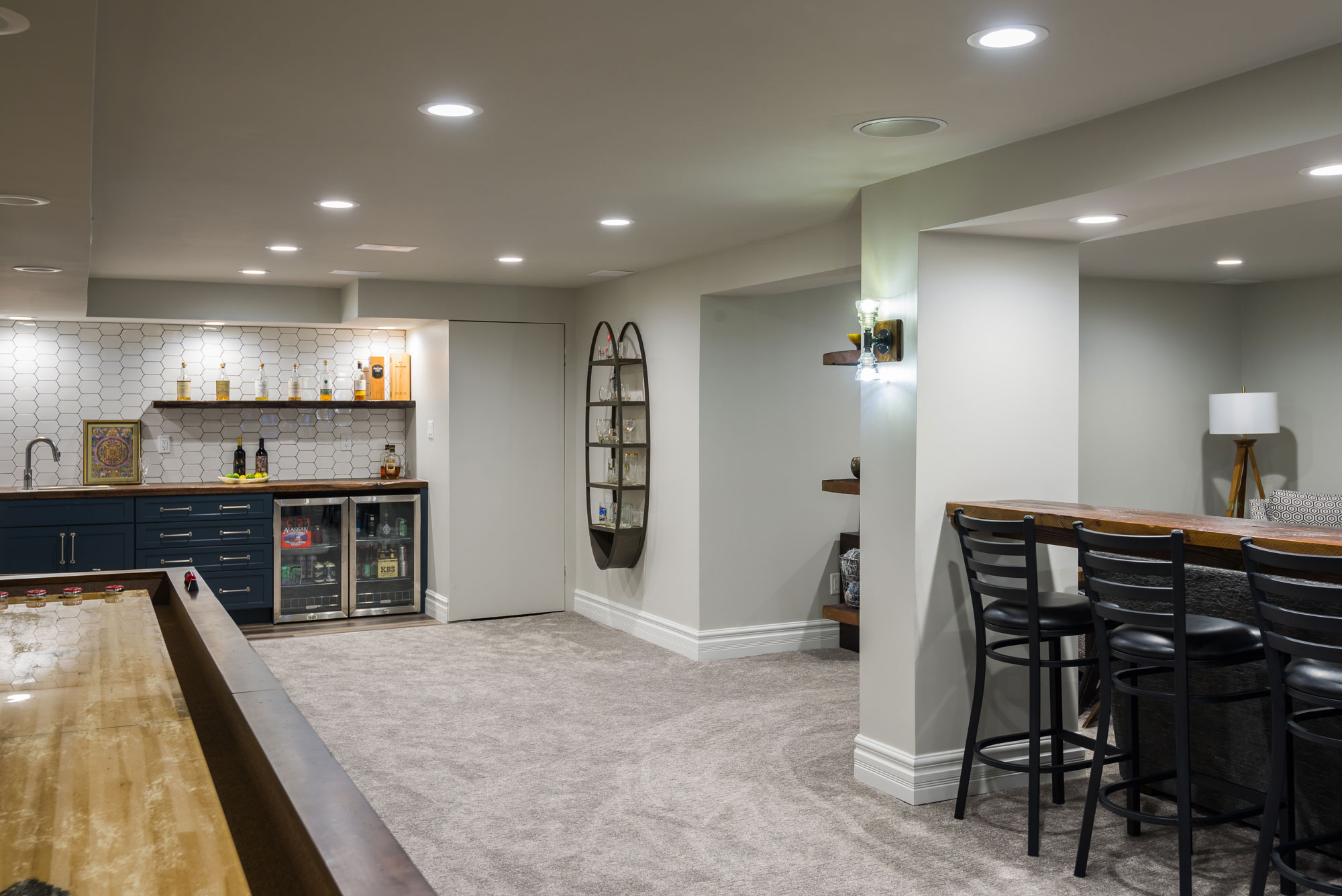
Our clients' finished basement needed to be brought to life! A bar made out of glass block, lack of overhead lighting, dark finishes and an old drop ceiling made for a really uninviting space. Not only did the basement need to be updated, but they really wanted to make it a family entertaining space — somewhere they could hang out with the kids everyday and also somewhere they could easily entertain friends and family. This family is well-traveled and has collected many items from all over the world. They wanted to incorporate that global vibe and marry it with a nautical theme to remind them of their lakehouse in Michigan.
We started by drywalling the ceiling and adding a lot more light! We increased the number of recessed can ceiling lights and added vintage looking handmade sconces at the posts. We painted the walls and ceilings all of the same light gray color to make the ceilings seem taller and the room lighter. We removed the dark, outdated carpeting and replaced it with a neutral colored carpeting with a modern texture.
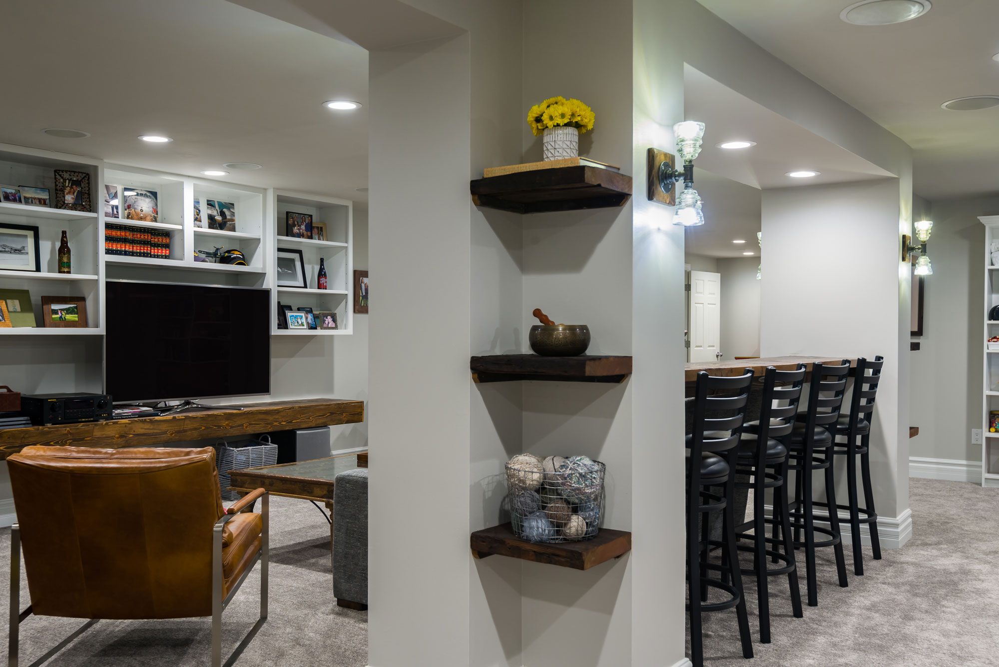
This basement has a soffit and post structure running down the center of the living space. It is a natural divider, but the space was not being utilized to its full potential. We added a bar height reclaimed wood countertop in between the large posts to create more seating for entertaining. The posts at each end created an "L" shape that did not seem to have any purpose. We added floating reclaimed shelves in this space to make it look purposeful and add an opportunity to display the items they have collected in their travels. The entertainment unit was all black and it made the space seem smaller and darker.
We painted the upper cabinets white and wrapped the TV shelf in wood to match the reclaimed wood at the bar seating and the wet bar. We reduced the footprint of the wet bar to add more space for kids to play and make the room feel bigger.
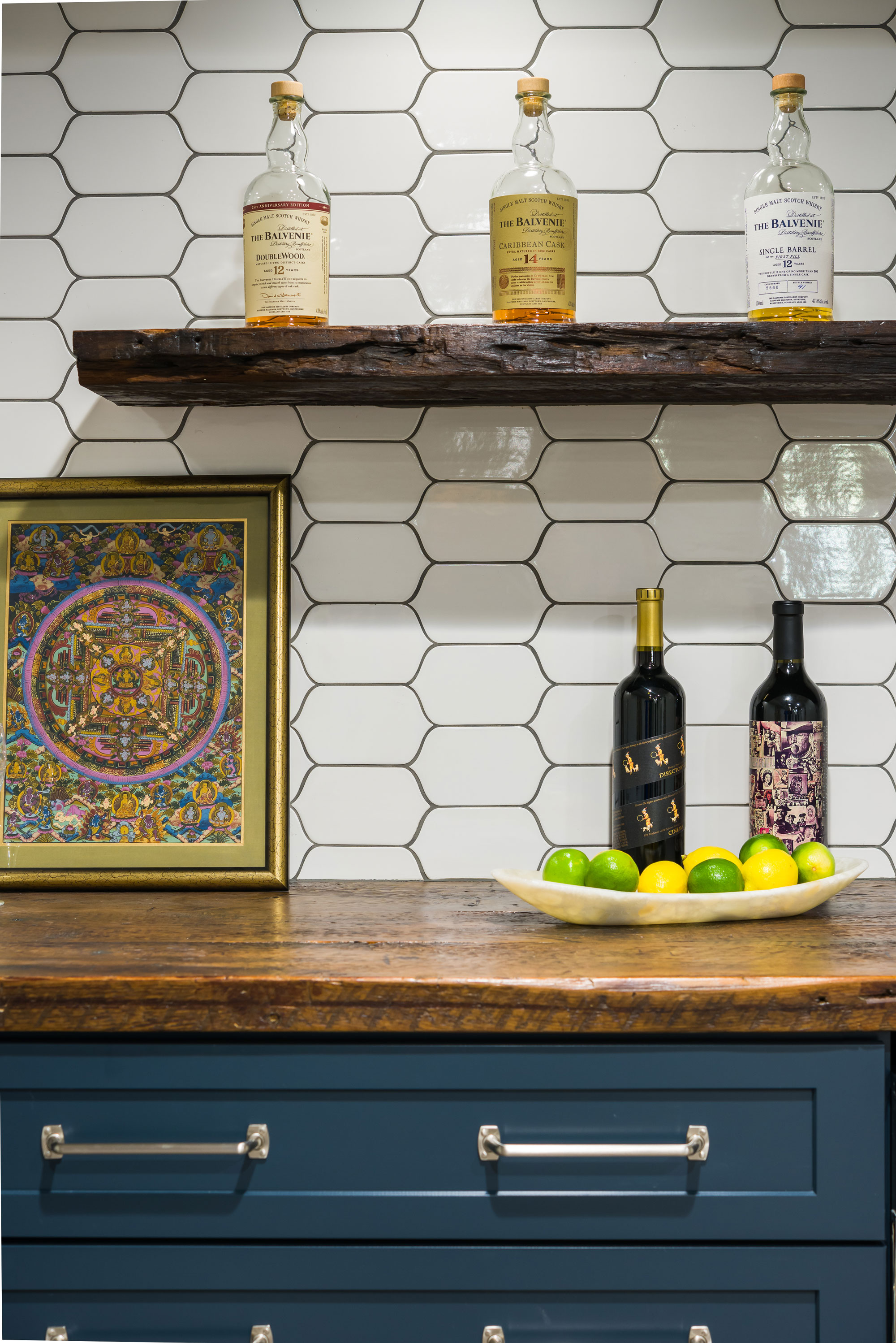
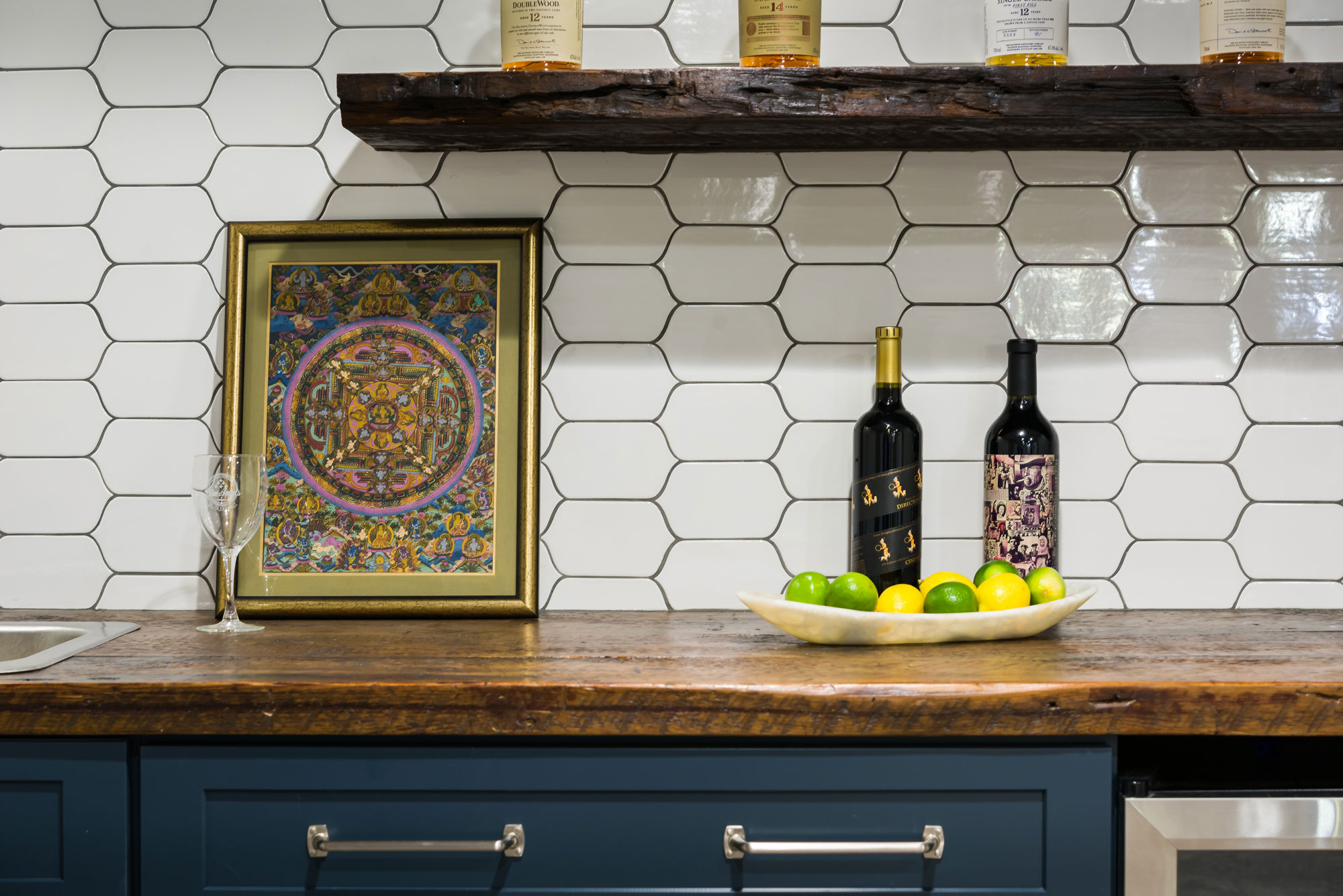
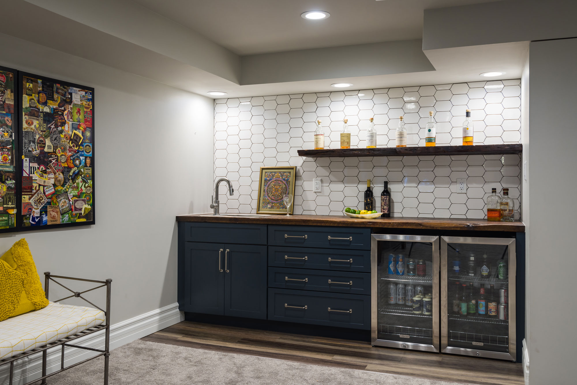
The clients really loved the idea of doing navy blue cabinets at the wet bar, which tied into the nautical theme of the space. We fell in love with the uniquely shaped white tile and used a medium gray grout to make the shape stand out even more. We used reclaimed wood countertops and a floating shelf above to display bottles or glassware. The brushed nickel pulls with exposed screws look like jewelry against the pretty navy cabinets! Our clients now use this space all of the time and love having friends and family over to enjoy it with them!
Before and After
Cedar Springs
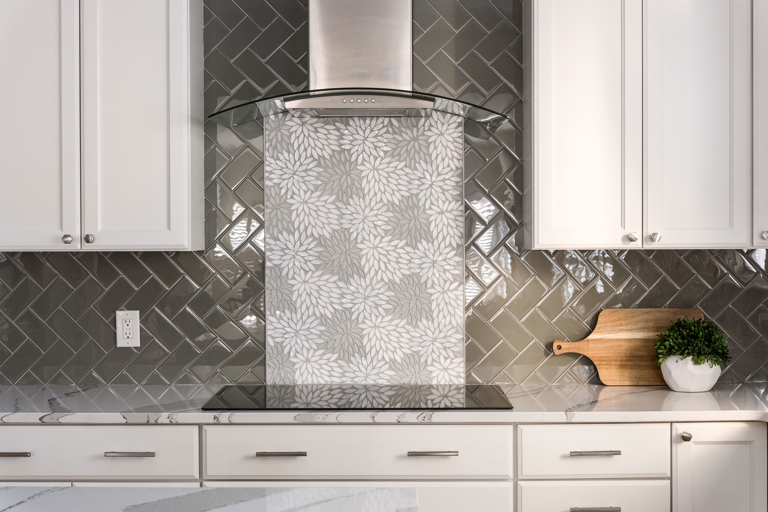
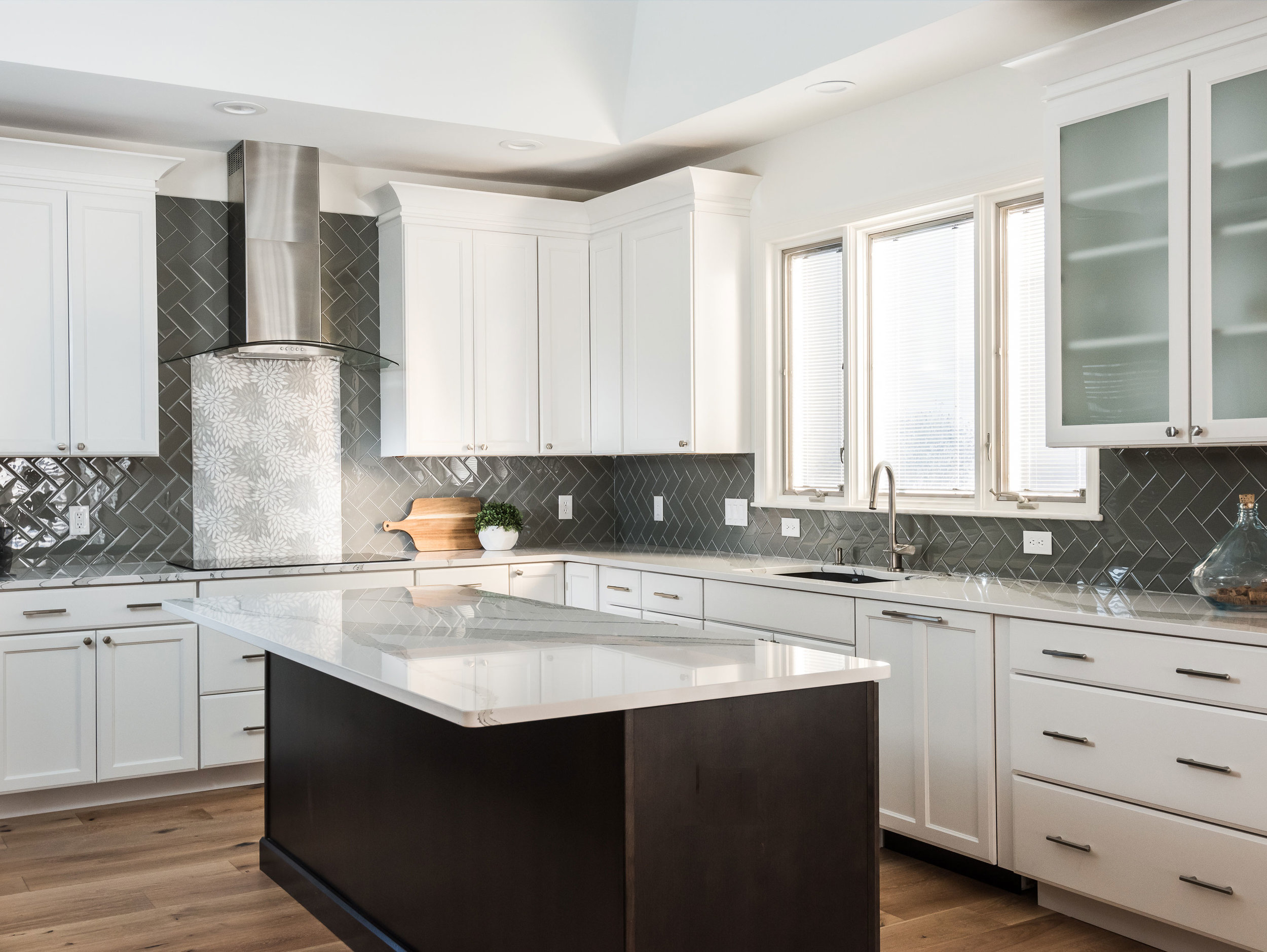
The client wanted a bright and clean but welcoming look for her kitchen. We started with a dark island that grounds the space and kept everything bright and focused on the floral back splash tile that my client fell in love with from the start.
Missouri, 2019
DESIGNER:
Rochelle McAvin
PHOTOGRAPHER:
Karen Palmer Photography
The client wanted a bright and clean but welcoming look for her kitchen. We started with a dark island that grounds the space and kept everything bright and focused on the floral back splash tile that my client fell in love with from the start.
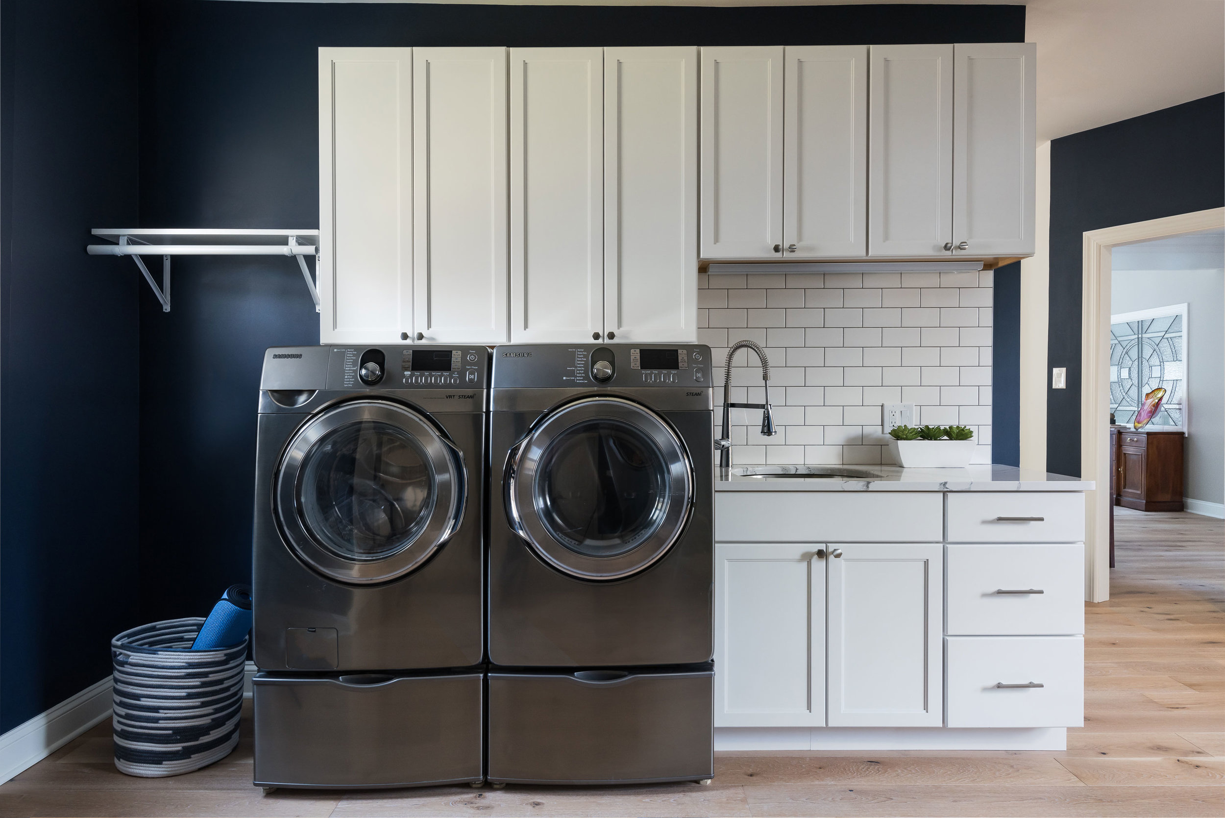
The laundry room is Sherwin Williams Naval and the white cabinets and subway tile keep the look clean and fresh!
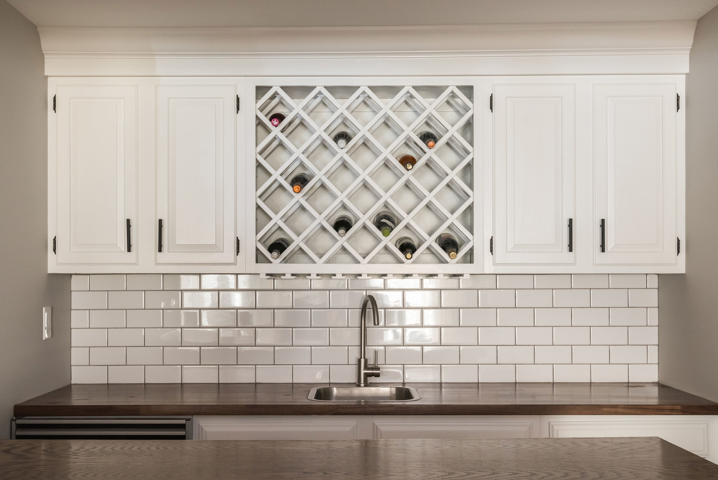
Downstairs in the bar, we freshened up the cabinetry and added a butcher block counter top to cozy up the relaxed space.
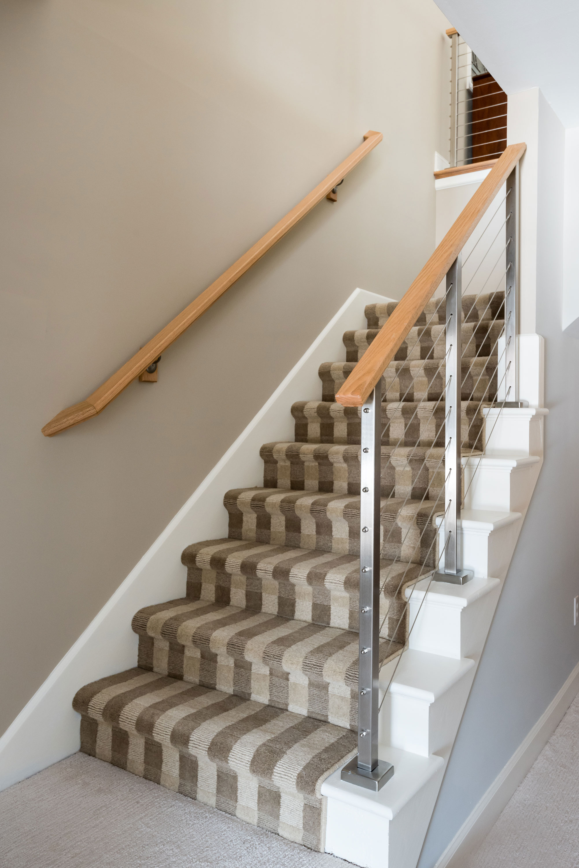
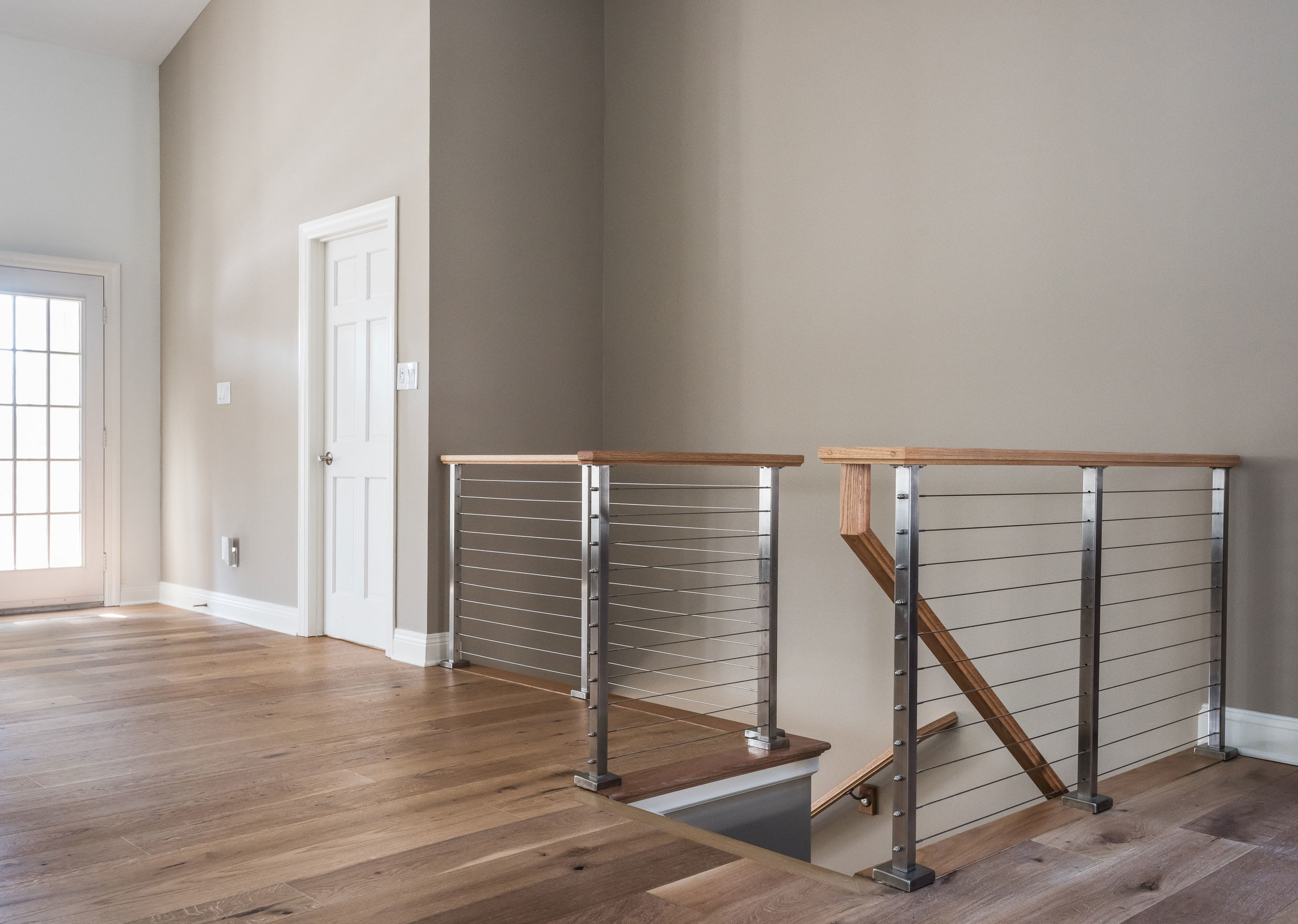
The handrail to the basement originally was a dark and dated wood. We replaced it with a cable rail system that lets the light filter down the steps onto the new textured carpeting. The light, bright space is welcoming and open!


